Introduction
Fresh color schemes bring new life and energy to your spring design projects. The arrival of spring inspires designers to refresh their styles with colors that reflect the season’s natural beauty. These schemes highlight lighter, softer tones that create inviting and uplifting spaces or visuals.
Exploring fresh color schemes for spring design refreshes can transform your work and enhance visual appeal. This article will guide you through simple and practical ways to select and apply color combinations, ensuring your spring designs stand out with clarity and charm.
Why Spring Design Needs a Refresh
Spring feels like a chance to start anew, not just in nature but in the designs we create. Updating your color schemes during this season makes sense—it’s like matching your work to the world outside your window. When everything around us springs back to life, sticking to dull or outdated colors can make a design feel out of place or stale.
Colors have a way of expressing change without words. Pale greens, soft yellows, or fresh pastels signal a shift—reflecting the subtle energy of new leaves, budding flowers, and longer days. Refreshing your palette at this time helps your work feel timely and connected, even if that’s not obvious at first glance.
Spring Brings New Energy
Growth and fresh starts dominate the season’s mood. You might sense it yourself—motivation creeps in, routines shift, and ideas often flow a bit easier. Design thrives on this. When you bring that same spirit into your color choices, it breathes life into a project.
Think beyond literal green leaves or blue skies. Use color to suggest potential or a fresh path. Even subtle shifts can encourage viewers or users to see something familiar in a new way. Spring’s energy isn’t just about bright and bold; sometimes it’s softer changes that signal growth, like moving from muted tones to warmer, lighter ones.
Impact of Colors on Mood
Colors don’t just decorate—they influence how people feel. Warm colors can feel welcoming or energizing, while cool colors might calm or soothe. Picking the right colors for spring depends on the mood you want to evoke. Do you want people to feel energized, hopeful, or maybe a bit reflective?
Sometimes you want a splash of yellow to lift spirits. Other times, gentle lavender might invite calm after a long winter. Color choice is less about rules and more about what emotions you want to stir. And because spring is tied to change, even subtle color variations can shift perception. That’s why a thoughtful refresh can make a real difference in how your design connects with its audience.
How to Choose the Right Colors for Spring
Picking colors for spring designs can feel tricky. You want shades that resonate with the season without sounding too obvious or forced. One helpful approach is to actually step outside and take a good look around. Nature offers a palette that’s both subtle and surprising—greens from fresh shoots, soft pinks of cherry blossoms, even the muted yellows of early sunlight. These colors often carry a certain softness, but sometimes they pop in ways you don’t expect. Don’t hesitate to jot down color combos you see on a walk or snap quick photos for reference later.
Then, think about who will see your design. Different groups respond to colors differently, based on culture, age, or even the mood you want to set. For example, if your audience leans toward calm and relaxation, pale pastels might feel right. But if you want to spark energy, a bolder choice could work. You might find yourself torn, depending on the message you want to send versus what your audience expects. That’s okay—it’s a balance you’ll learn to navigate with time.
Some practical tips to keep in mind:
- Note the dominant nature colors but mix in a few unexpected shades to keep things fresh.
- Test how colors look in different lights; spring sunlight can alter hues dramatically.
- Ask yourself: Does this color evoke a sense of renewal or growth, which spring implies?
- Remember the preferences of your audience, but let yourself experiment beyond those limits—you never know what might click.
Choosing spring colors isn’t just about matching the season literally. It’s about finding a harmony that feels right for your design goals and the people who will experience it. The more you observe and reflect, the more intuitive it becomes.
Monochromatic Schemes for Subtle Spring Designs
What Is a Monochromatic Scheme
A monochromatic color scheme revolves around using just one color, but with all its variations—lighter tints, deeper shades, and different tones. Think of a palette made from soft pastels like pale mint green stretching to a richer forest hue, or warm blush pink fading into dusty rose. These combinations naturally fit spring because they echo nature’s quiet transitions, like unfolding leaves or blooming petals. You might spot these schemes mimicking the gentle shifts in color on a cherry blossom tree or the stages of a fresh daffodil’s bloom. This approach doesn’t demand juggling many colors; instead, it lets a single hue carry the whole design story.
Benefits of Using One Hue
Sticking to one color simplifies your design process—you don’t have to worry about clashing tones or confusing contrast. Using multiple shades and tints of the same color brings a soothing rhythm to your design, creating a sense of unity that can feel almost calming. When you design this way, it’s easier to guide the eye because there’s no visual chaos. It’s like focusing on different notes of the same melody rather than jumping between songs.
For example, in a spring setting, you could use several blues—powder blue, sky blue, and navy—to evoke a clear morning sky. But you also avoid overwhelming viewers with too much variety. This method can work well when you want subtle elegance, or if you want your layout to feel peaceful without being boring. Sometimes, it’s tempting to add more colors, thinking it’ll make things livelier, but there’s value in restraint—less really can be more, especially in spring-themed projects.
Do you find that rich monochromatic designs can sometimes risk feeling flat? Maybe, but with a careful play of texture or pattern alongside your shades, that flatness disappears. It’s less about the number of colors and more about how those variations interact. So if you’re aiming for calm and unity, try sticking with one hue and explore its full range—you might be surprised at what depth you can achieve.
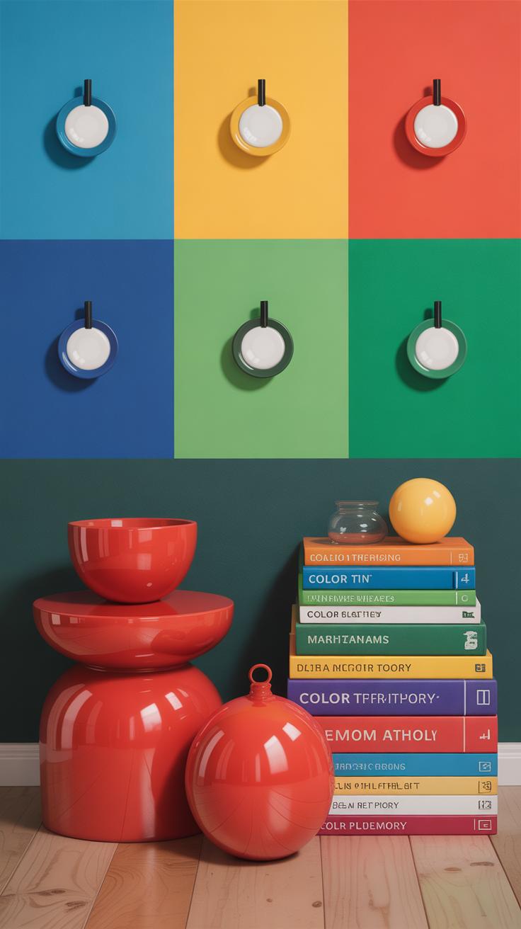
Complementary Colors to Make Your Design Pop
Understanding Complementary Colors
Complementary colors sit opposite each other on the color wheel. Think of pairs like blue and orange, red and green, or yellow and purple. This opposition creates a natural tension between the hues. When placed side by side, complementary colors intensify one another, making each tone appear more vivid. It’s not just about clashing hues—there’s a unique balance in their interaction that can bring designs to life, especially in the fresh, renewing feel of spring.
Sometimes it’s tricky to decide exactly how much contrast you want. Maybe full-on lime green against bright red is too much for your taste, but tweaking the saturation or lightness softens the clash while keeping that spark. The concept invites experimentation—there isn’t just one right way to play with complementary colors in your spring palette.
Using Contrast Effectively
Strong contrast grabs attention but can easily overwhelm. Finding a balance matters. Here are a few ways I try to keep complementary schemes bright yet manageable:
- Use one color as the dominant shade and the other as an accent. For example, a soft pastel lavender wall with small pops of yellow in accessories.
- Break up complementary pairs with neutrals or muted tones—white, beige, or soft gray can give your eyes a rest.
- Consider texture and pattern as part of contrast. Sometimes a matte blue next to a glossy orange element feels less harsh than flat blocks of color.
- Gradually shift brightness between your complementary colors instead of pure hues. Muted reds with soft greens often look more spring-appropriate than their full-saturation counterparts.
Have you ever noticed how gardens pop with the right mix of contrasting blooms? That’s a bit what complementary colors do. They feel lively without screaming for attention—if used thoughtfully. The goal isn’t just to shock but to energize and refresh, which is perfect for a spring design renewal.
Analogous Colors for Cohesive Spring Themes
What Are Analogous Colors
Analogous colors sit side by side on the color wheel. They share a common hue but shift in tone or saturation. Think about the gentle gradation from soft yellows to fresh greens, or the subtle move from sky blue to a calming teal. These combinations often echo what you see in nature during springtime—new leaves blending into buds, or early morning skies merging with dew-covered grass.
Examples fitting spring might include:
– Lemon yellow, chartreuse, and light green
– Peach, coral, and warm pink
– Lavender, periwinkle, and soft blue
Each trio feels connected without clashing. That’s part of their quiet charm. You might feel it yourself—there’s a sort of visual ease with these colors, like they belong together. But it’s tricky sometimes, because while they’re harmonious, they can also feel a bit flat if you’re not careful with balance.
Creating Flow with Similar Hues
Analogous schemes gently guide the eye across a design. There’s a natural rhythm, a gradient that seems to flow instead of jump or startle. In spring designs, this means creating spaces that feel calm, even a bit peaceful. It’s not about shouting for attention; it’s about whispering a consistent mood.

This approach encourages unity. When you work with colors close in shade, you prevent visual noise. The result often feels soothing, which can be exactly what a spring design needs—something that invites slow appreciation rather than fast distraction. I once redesigned a nursery with soft yellow, light lime, and mint tones, and the effect was surprisingly relaxing.
But, be careful—similarity can blur impact if color choices aren’t intentional. Mixing textures, patterns, or varying lightness helps keep things interesting without breaking the flow. Does your spring project ask for calm and cohesion? Analogous colors might just offer the subtlety you need to bring it all together.
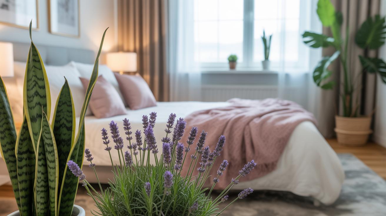
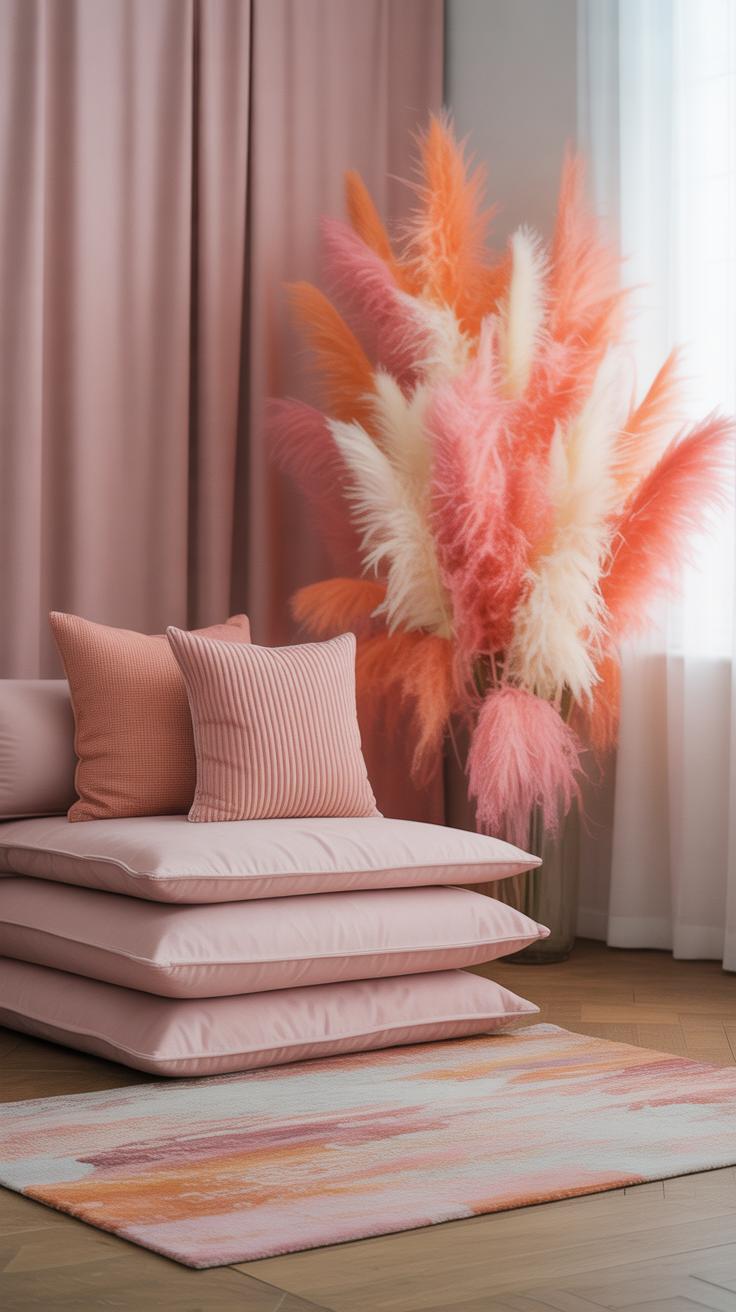
Soft Pastels to Highlight Seasonal Change
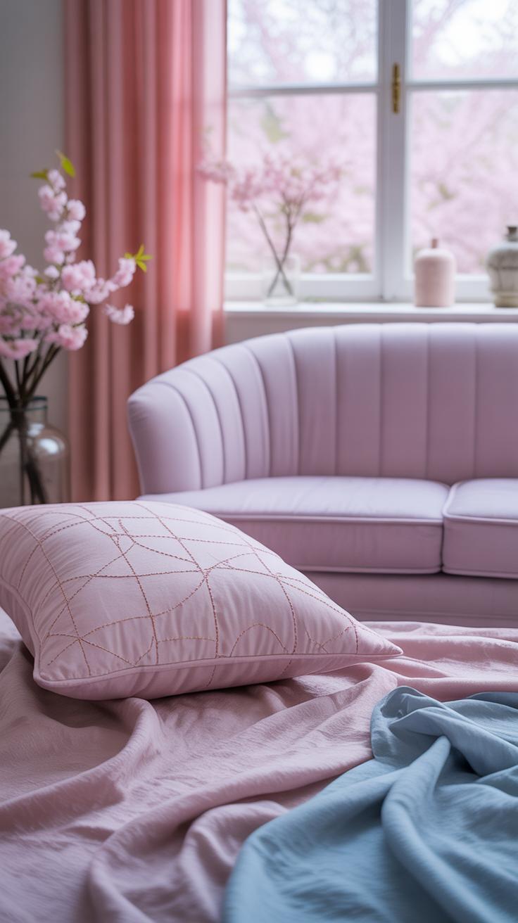
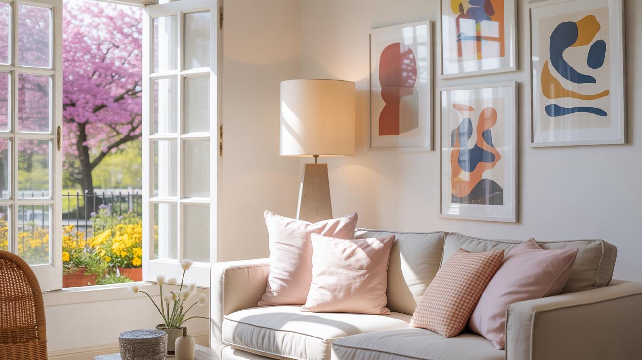
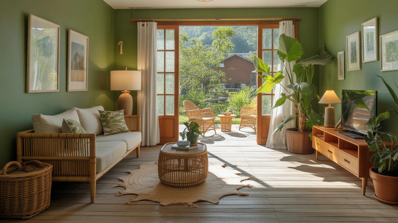
Pastel colors have a unique place in spring design, representing softness and renewal in a way few other palettes can. They don’t shout for attention but instead invite a gentle calmness that reflects the slow awakening of the season. Think of pale pinks, mint greens, soft lilacs, and light blues—they suggest fresh beginnings without overwhelming your senses.
Choosing the right pastels can feel tricky because they’re subtle by nature. You want colors that balance well without blending into one another too much. Start with a base pastel tone you like and then add two or three complementary shades that vary in warmth and depth. For example, pairing a powder blue with dusty rose and pale peach can create a visually interesting but delicate combination. Sometimes mixing pastels that share a bit of the same undertone gives the effect of harmony without losing contrast—although, honestly, it’s hard to say what will work best without seeing it in context.

Pastels work well across many design types. Website backgrounds in soft lavender or mint provide a clean canvas, letting other elements pop without harshness. In interiors, pastel walls or furnishings introduce a light feel, perfect during spring when you want spaces to breathe. Graphics employing pastel gradients or overlays can convey a mood that’s fresh yet understated. I suppose the main point is to let pastels bring a kind of softness that hints at change, rather than force it. Have you noticed how these colors can make even busy layouts feel more open?
Incorporating Natures Palette in Your Design
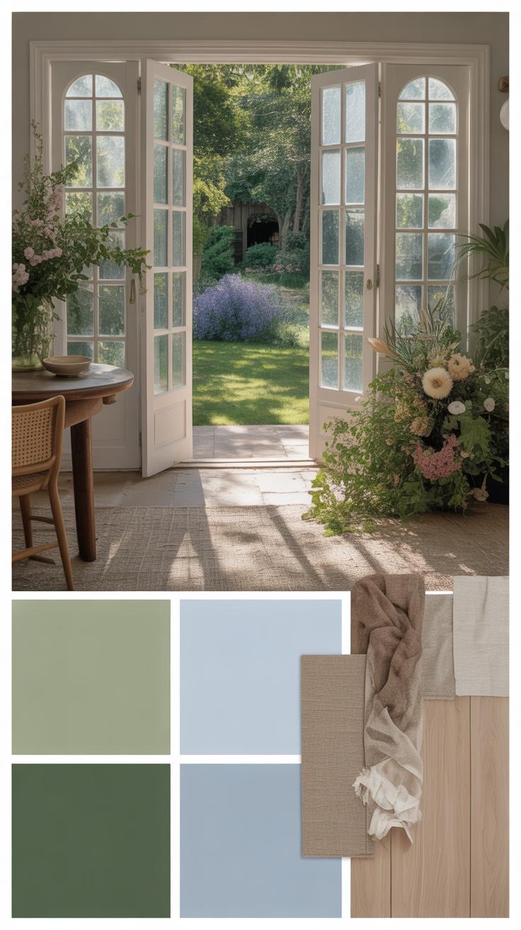
When you look at spring up close, it offers colors that feel genuine and grounded. Taking your cues from plants and flowers can bring a fresh authenticity to your designs. Think about the soft greens of new leaves, the blush of cherry blossoms, or the bright yellows of daffodils. These aren’t just pretty shades—they carry the mood of spring with them. Using these tones as your starting point can make a design feel alive, like it’s part of something real rather than just a seasonal trend.
Try exploring beyond the obvious flower colors too. The way light filters through petals or the slight variation in leaves can offer unique shades that aren’t easily found in standard palettes. Capturing these subtle differences might give your work that extra layer of depth.
Then there’s the influence of earth, sky, and water—the elements we sometimes forget but are right there shaping spring’s mood. The soft browns of thawing soil, the pale blues of a morning sky, or the muted greens of riverbanks can serve as neutral anchors within your palette. These hues keep your design grounded, balancing the floral brightness without dulling the overall effect. Including these subtle colors helps your work feel connected to nature’s ebb and flow, which again, ties back to authenticity.
How would you bring such natural palettes indoors or into digital projects? Consider mixing those earth tones with leaf greens for a calming effect or add sky blues to soften harsher color choices. The point is, nature isn’t just about bold blossoms—it’s about quiet, nuanced color moments that speak softly but clearly.
Balancing Bright and Neutral Colors
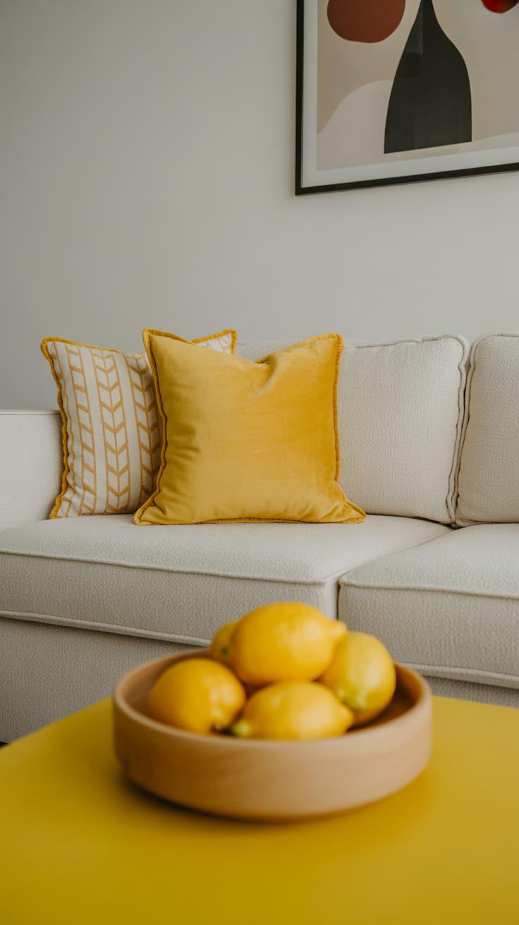
Role of Neutral Colors
Neutral colors are those shades that don’t compete for attention—they quietly sit in the background, yet they’re far from dull. Think of soft grays, warm beiges, whites, and muted browns. These tones act like the base or canvas in your design, allowing brighter colors to shine without overwhelming the eye.
When you imagine a spring palette, it’s tempting to go full-on pastel or punchy hues. But without neutrals, things can quickly feel chaotic or heavy. Neutrals give your bright colors room to breathe, making the whole design more approachable and, well, easier to look at for longer periods. Plus, they create a subtle sophistication that might be missing if you just pile on lively colors.

Pairing Strategies
How do you mix lively colors with neutrals without things feeling off? Here are some ways you might try:
- Use a neutral background—like an off-white wall or a beige canvas—and layer bright accents atop it, such as coral buttons or teal headlines.
- In layouts, designate one main neutral zone to balance several smaller pops of color to avoid visual clutter.
- Think about texture too. Pairing bright cotton with neutral linen or wood tones adds depth and keeps the eye engaged without feeling overstimulated.
- Try anchoring corners or edges with neutral colors while letting vibrant shades occupy central focus spots, like call-to-action areas or featured images.
Honestly, sometimes a design leans more into neutrals, and that’s okay—making your bright colors strategic highlights rather than the whole story can actually make things more striking.
Have you noticed how a soft gray wall makes a vivid yellow chair pop but doesn’t overwhelm it? These subtleties matter. So, when refreshing your spring designs, try to think of neutrals not as safety nets but as partners in creating a balanced, inviting space.
Using Color Psychology to Engage Your Audience
Colors do more than just fill space; they tap into emotions and can shape how people feel about your design, especially in spring. You might have noticed that green feels refreshing or yellow lifts your mood—but why? It’s because colors often come with subconscious associations, some universal, some personal.
For example:
- Green often suggests growth and calm, connected to nature and renewal.
- Yellow can bring energy or warmth, though too much might feel overwhelming.
- Soft pinks tend to evoke gentleness and comfort.
- Blue may produce trust but can also seem distant if overused.
Notice how these feelings sometimes clash or blend—it’s not always straightforward. Context matters a lot in spring designs because you’re dealing with themes of awakening and change. Matching colors to these moods can reinforce your message without you saying a word.
When applying these ideas, try to think about your audience. What reaction do you want? Do you want your viewers to feel energized or soothed? Sometimes mixing calming greens with lively yellows hits the right spot, but other times less obvious combinations work better—like pairing dusty rose with muted teal to catch attention quietly.
Don’t be afraid to experiment or trust your gut, even if it feels a bit contradictory. Color psychology isn’t a strict formula. Instead, it’s a toolbox. You pick what fits your story and goals. It’s worth observing how minor shifts impact emotions—like shifting a hue slightly warmer to make an image more inviting.
Ask yourself: does this color make you want to stay longer or look away? That reaction can guide your choices more than any “rule.” Spring palettes offer fresh chances to connect emotionally, so lean into the feelings colors bring, but also watch for surprises in how your audience might respond.
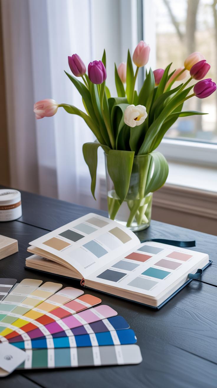
Tools and Resources to Choose Colors Easily
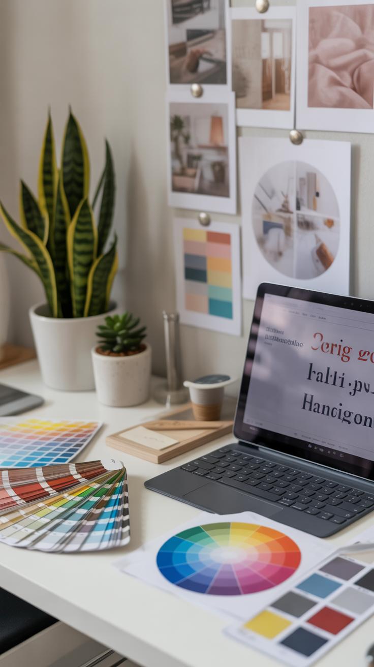
Picking colors for spring designs can feel tricky at times. You want freshness, but not chaos. Luckily, you don’t have to rely on guesswork alone. There are quite a few tools online that help you explore and organize color schemes suited for those lighter, airier spring vibes.
Sites like Coolors and Adobe Color let you generate palettes based on moods or even photos you upload—imagine snapping a blooming flower and getting matched hues instantly. I’ve found Pantone’s website useful too since their spring color trends push you toward shades that are just starting to catch on. Apps such as Paletton are nice when you want to tinker with complementary or triadic combos interactively, which makes experimenting less of a headache.
But finding colors is just step one. Testing how they play together on your actual design is where things get interesting. One easy method is to create mockups or quick layouts in design software, then step back and squint a bit. Do the colors still feel balanced? Are some too overpowering? Sometimes printing small swatches helps you see if the colors behave under different lights.
You might also want to check accessibility tools that preview your palette for contrast issues. Spring schemes often lean pastel or muted, so ensuring the text is readable or clickable elements stand out is key. Honestly, it’s a little trial and error. But having these tools handy can save time and, well, keep frustration to a minimum.
Conclusions
Spring design refreshes thrive on carefully chosen color schemes. These choices help you capture the season’s essence and make your work feel timely and relevant. By understanding color theory and knowing how to mix and match hues, you can create designs that speak to warmth and renewal.
Trying new and soft colors, balancing vibrancy with calm shades, and considering natural inspirations will lead to successful spring designs. Your fresh approach to color will engage your audience and keep your projects visually appealing throughout the season.