Introduction
Choosing the right door color can change how your house looks from the outside. A door is more than just an entrance; it’s the first thing guests notice. Your door color tells a story about your home’s style and mood.
This Door Color Guide will help you pick colors that match your siding and style. We will explore simple ways to combine colors and styles so that your front door stands out in the best way. Let’s find the perfect door color that fits your home perfectly.
Matching Door Colors with Your House Siding
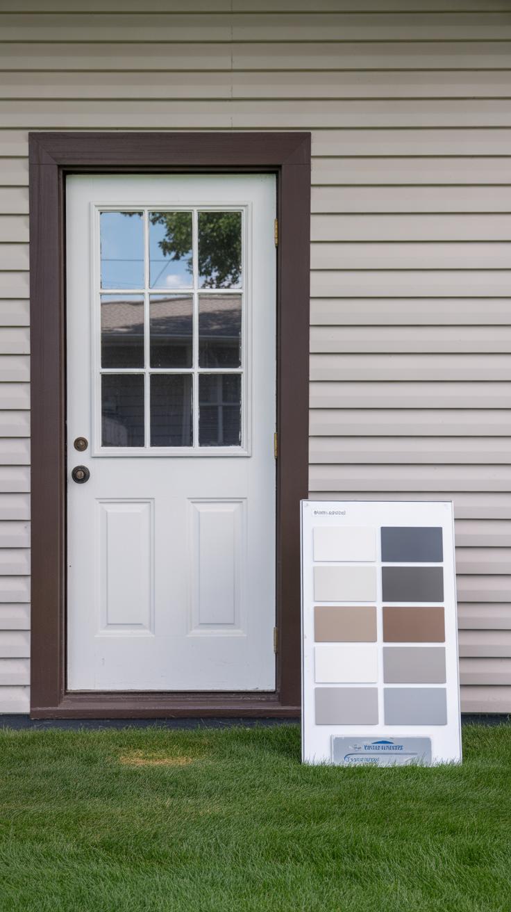
Picking door colors that fit your siding isn’t always straightforward. The material and shade of your siding play a big role in what door colors will look right or feel off. Think about wood siding—warm, natural tones often call for doors that either blend softly or boldly contrast. For example, a deep red or forest green door can highlight the warm grains of wood beautifully. Brick siding tends to have a lot of texture and a mix of earthy reds and oranges, so cooler-toned doors like navy or charcoal gray can balance that heat without competing for attention.
Vinyl siding is often neutral or pastel-toned, which gives you more flexibility but also a trap—too bright a door color can feel out of place. Soft blues or muted yellows often work well here, but going for intense neon or overly dark tones can look jarring. Stone siding, because of its natural and varied color range, really depends on the predominant stone color. Often, earth tones—like olive green, deep brown, or rusty red—complement the natural stone textures well, but experimenting with a darker shade than the stone is usually key to avoid the door fading into the background.
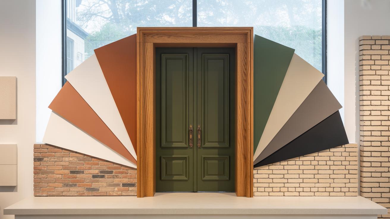
Pairs That Work: Door Colors and Siding
Here are some door colors that tend to complement common siding choices:
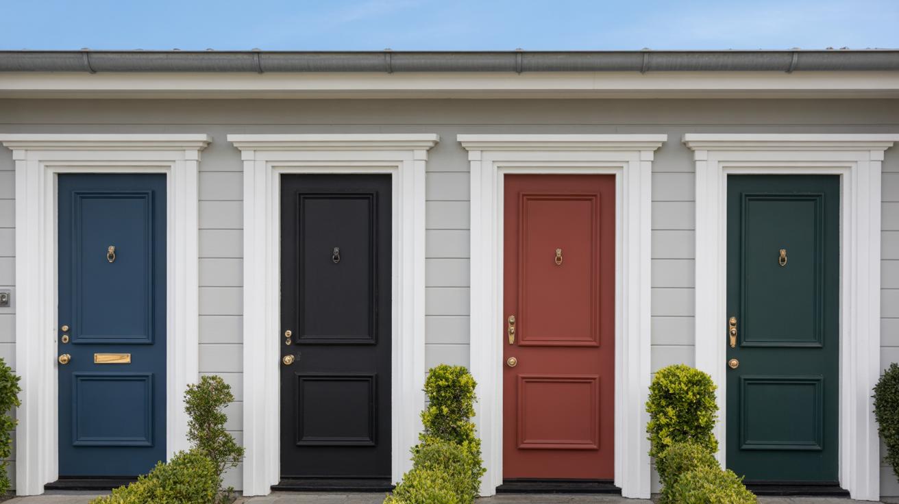
- Light gray vinyl siding pairs nicely with a navy or classic red door—both add personality without overwhelming.
- Traditional red brick works well with black, dark green, or even a bold mustard yellow door. The contrast helps the door pop.
- Natural wood siding isn’t picky but looks great with sage green, deep teal, or a burnt orange door for a cozy appearance.
- Stone siding, especially gray or beige tones, syncs with dark chocolate brown, forest green, or crisp white doors, creating a grounded but fresh look.
Basically, balance contrasts and complements but don’t overthink matching everything exactly. Sometimes a splash of unexpected color brings the most charm.
Avoiding Color Clashes with Siding
Picking a door color that jars with your siding can throw off the whole exterior vibe. It’s easy to pick a favorite color, then realize it just doesn’t cohere with your siding’s tones. For instance, a bright pink door might seem fun but can clash badly with most neutral or earth-toned siding like brick or stone. Similarly, a pastel door with dark wood can feel out of place and underwhelming.
One tricky pitfall is choosing door colors too close to the siding shade but slightly off-tone. That can make your entryway look dull or even dirty over time. Instead of blending, it kind of just muddies the look.
Also, beware of colors that visually “fight” each other—if your siding is warm-toned, avoid cold, icy door colors unless you’re aiming for a striking, deliberate contrast. Still, some attempts at contrast can feel off when the undertones don’t align, so testing paint swatches at different times of the day might prevent an awkward mismatch.
Using Color Theory to Choose Door Colors
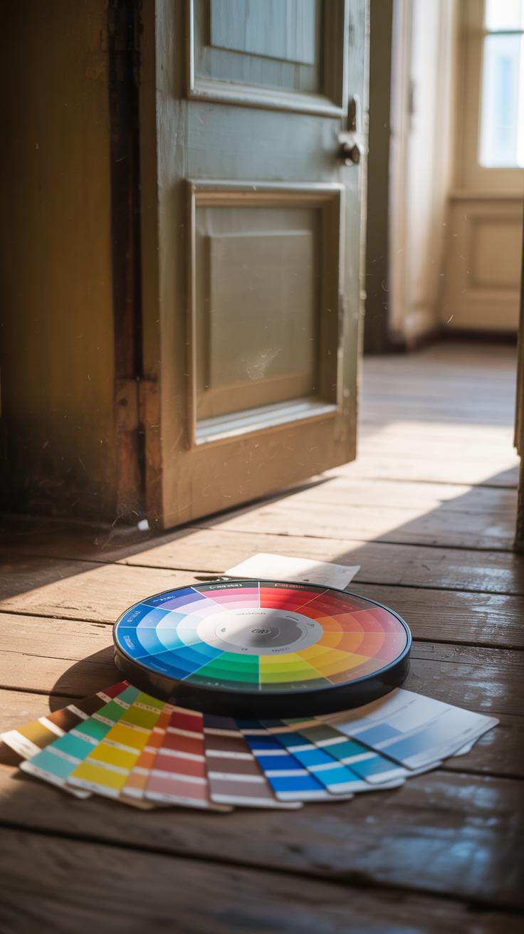
When picking a door color, understanding some basics of color theory can really help guide your choices. You don’t need a degree in art, just a bit of familiarity with how colors relate to each other. Terms like complementary, analogous, and neutral colors come up a lot—and they offer simple ways to think about what might work best for your door and siding.
Complementary colors sit opposite each other on the color wheel. Think blue and orange, or red and green. Using these on your door and siding can make the door pop in a way that’s striking and unmistakable. It’s that color clash that catches your eye—like a red door on a gray house, for example.
On the other hand, analogous colors are neighbors on the wheel—such as blue, blue-green, and green. Choosing analogous tones creates a look that’s more harmonious, softer, and a little less bold. It blends better but still feels considered.
Neutral colors often play a quiet role in color schemes. Whites, grays, taupe, and black won’t compete much but can anchor brighter hues or work well on their own to keep things simple.
You might wonder—should your door stand out or blend in? What mood are you hoping to set? Sometimes, the best choice lies in how much attention you want to draw to your front entrance—and color theory helps you decide which direction to take.
Considering Your Homes Architectural Style
Your home’s architectural style really shapes which door colors make sense, and sometimes the fit isn’t as obvious as you might think. Styles like modern, traditional, farmhouse, or cottage each carry a sort of personality, and the door color can either highlight it or clash with it.
For example:
- Modern homes often feature clean lines and minimalist looks, so simple but bold colors work best.
- Traditional styles tend to embrace deeper, richer tones that add a sense of history and warmth.
- Farmhouses usually look great with more muted or earthy hues that echo their rustic charm.
- Cottages seem to welcome cheerful, sometimes pastel shades, lending a cozy, inviting vibe.
You may find it tempting to stray from these “rules,” but sticking close to the style’s character often helps. That said, mixing styles can be fun but tricky — do you want your door to make a statement or to blend gently?
Colors for Modern and Contemporary Homes
Modern homes call for door colors that complement their simplicity. Dark tones like charcoal, matte black, or navy can make a strong but clean impression. Whites or very soft greys work too, especially if your siding is already bold.
Sometimes, a pop of color like bright red or yellow breaks the minimalism tastefully, but it risks feeling out of place if overdone. I once saw a sleek, all-white modern home with a burnt orange door — it worked surprisingly well, giving just enough character.
Gloss or matte finishes also make a surprising difference here. Matte finishes tend to feel more subdued and sophisticated, while gloss can add a flash of brightness that might disrupt the calm rhythm of modern lines.
Colors for Traditional and Classic Styles
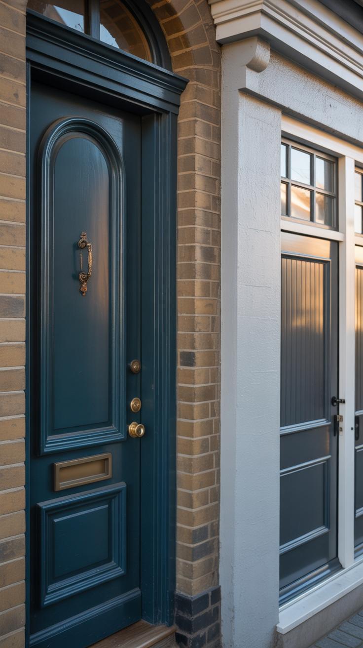
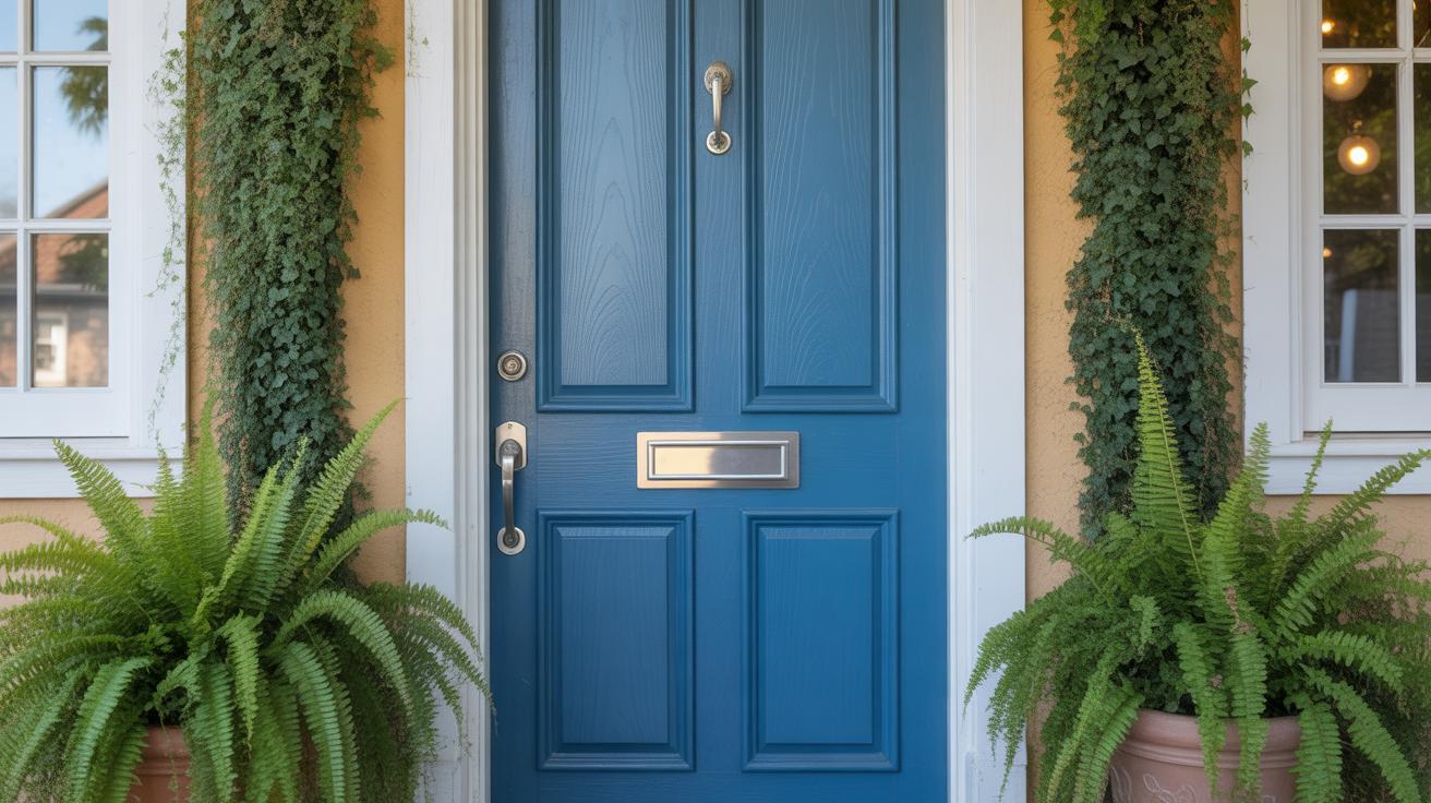
Older, classic homes often thrive on tradition, so door colors tend to be less about surprise and more about timeless appeal. Deep reds, hunter greens, and navy blues are staple choices. They enrich details like decorative trims and molding, bringing out the architecture’s character.
Sometimes black doors feel almost regal on colonial or Victorian homes, grounding them solidly in history. Though, it’s funny how a softer tone, like a muted teal or mustard, can offer a fresh twist without feeling too modern.
One thing to consider is how the door color interacts with brick or stone exteriors common in traditional homes. Earth tones or jewel shades often marry well, whereas pastels tend to look slightly off, almost like they belong to a different house. But hey, if you like pastels, maybe a touch somewhere else on the facade might be the way to go.
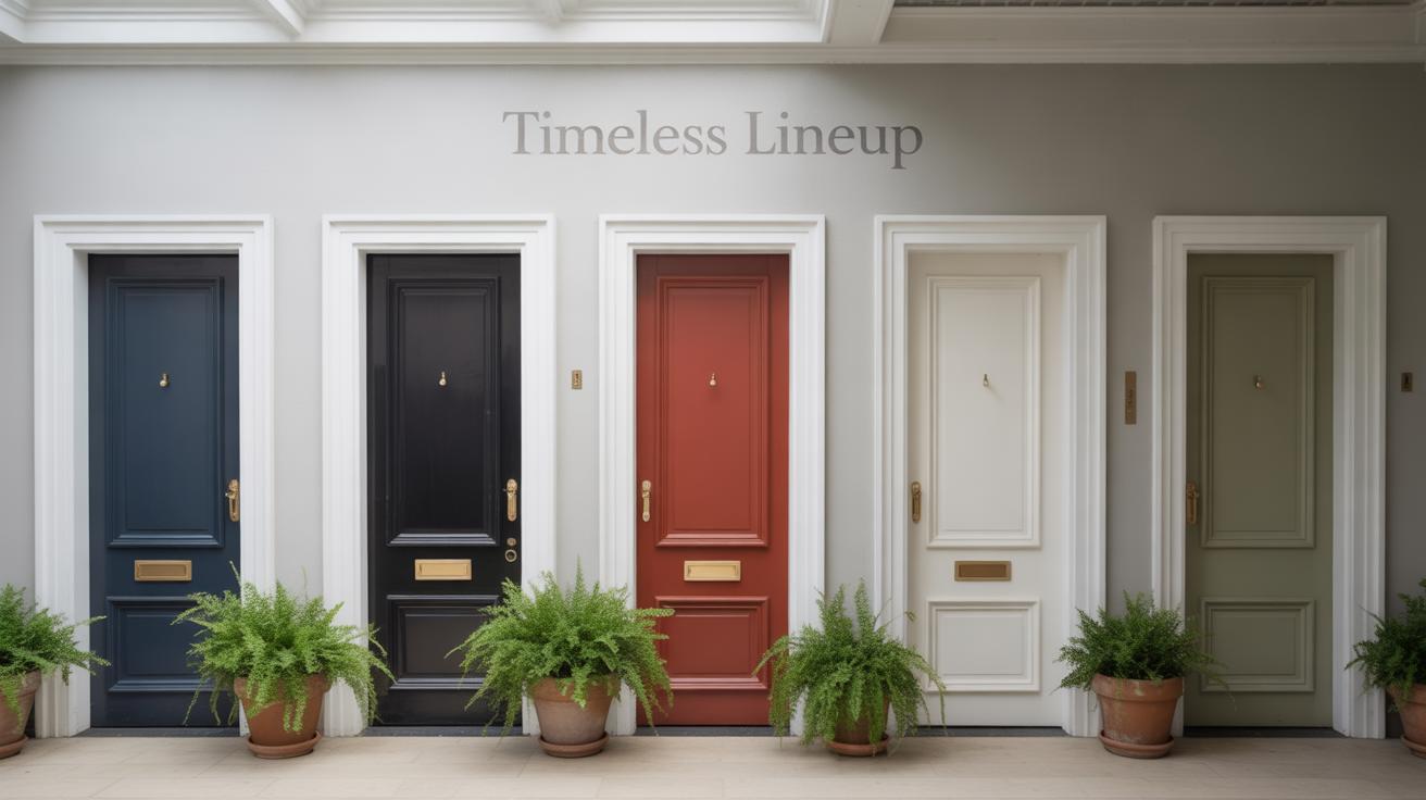
Popular Door Colors and What They Mean
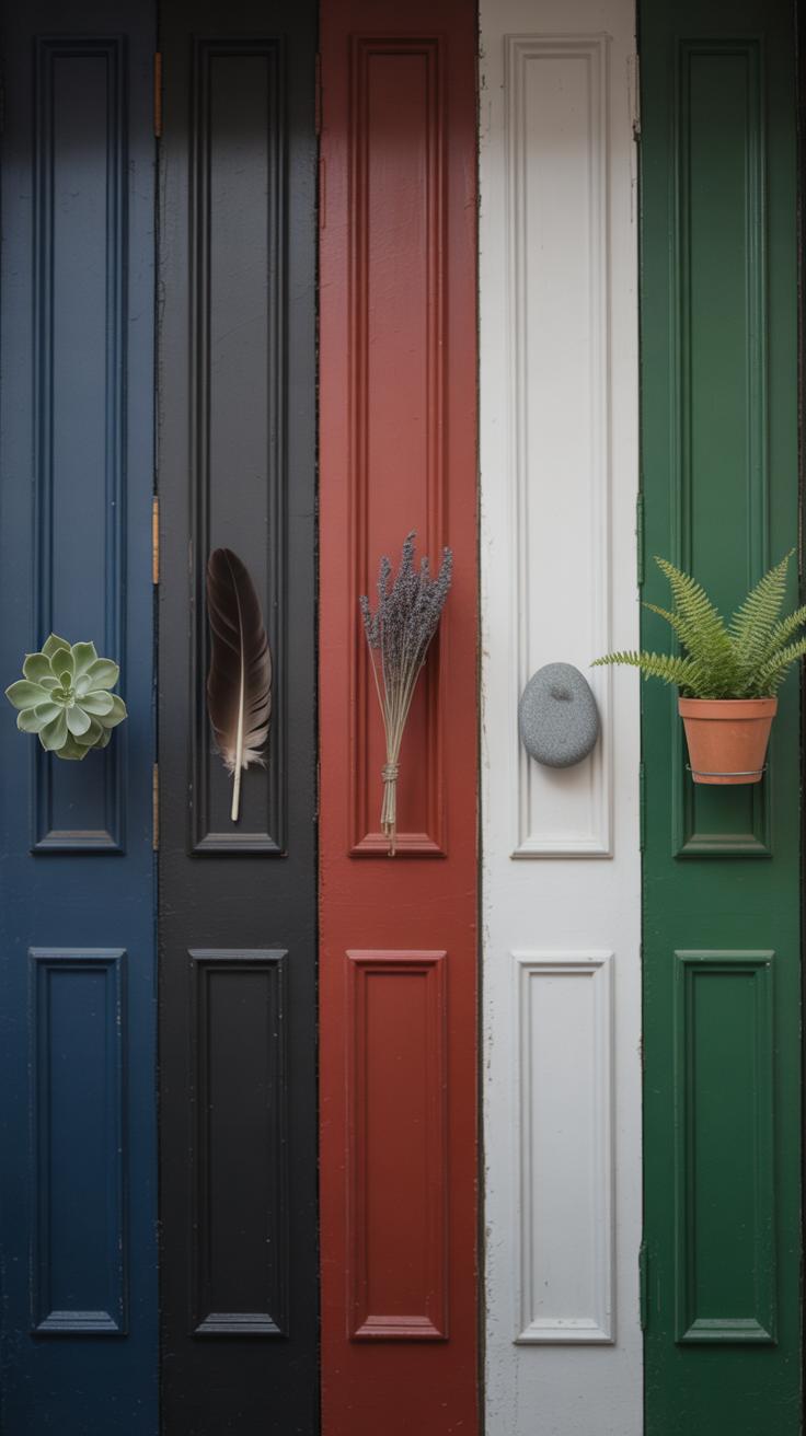
Door colors speak louder than you might think. They set a mood before anyone steps inside, giving an immediate sense of what lies beyond. Some colors shout confidence, others invite calm or curiosity. Understanding their impact can help you pick a color that really fits your home’s personality.
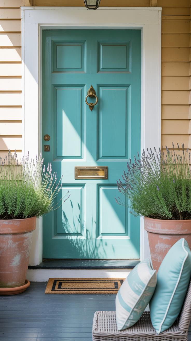
Take red for example—it’s bold, eye-catching, and almost magnetic. Visitors might feel a surge of energy or warmth heading their way. Blue doors tend to suggest tranquility, like a quiet retreat, while green often links back to nature, growth, or balance. Yellow doors radiate cheerfulness and can brighten even the dullest days, though too much might feel a bit overpowering or insincere.
Black and neutral tones aren’t flashy but bring a quiet strength instead. These colors imply stability and tradition without fuss. So, what feeling do you want your door to send? Maybe you want to stand out. Or maybe blend in, but with subtle elegance. It’s a surprisingly personal decision.
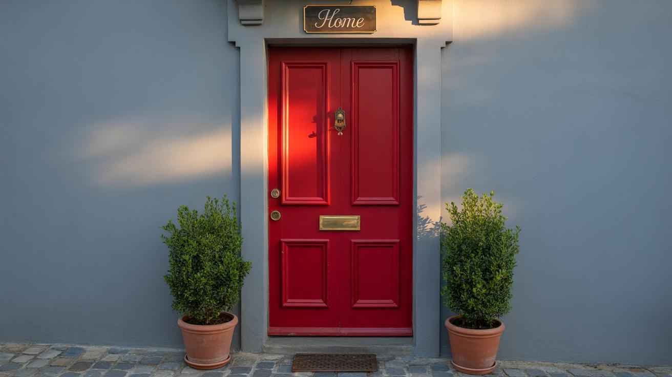
Red Doors and Bold Statements
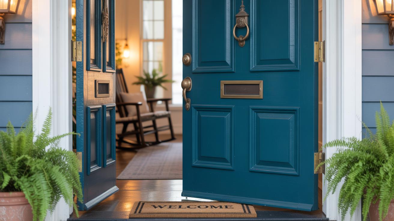
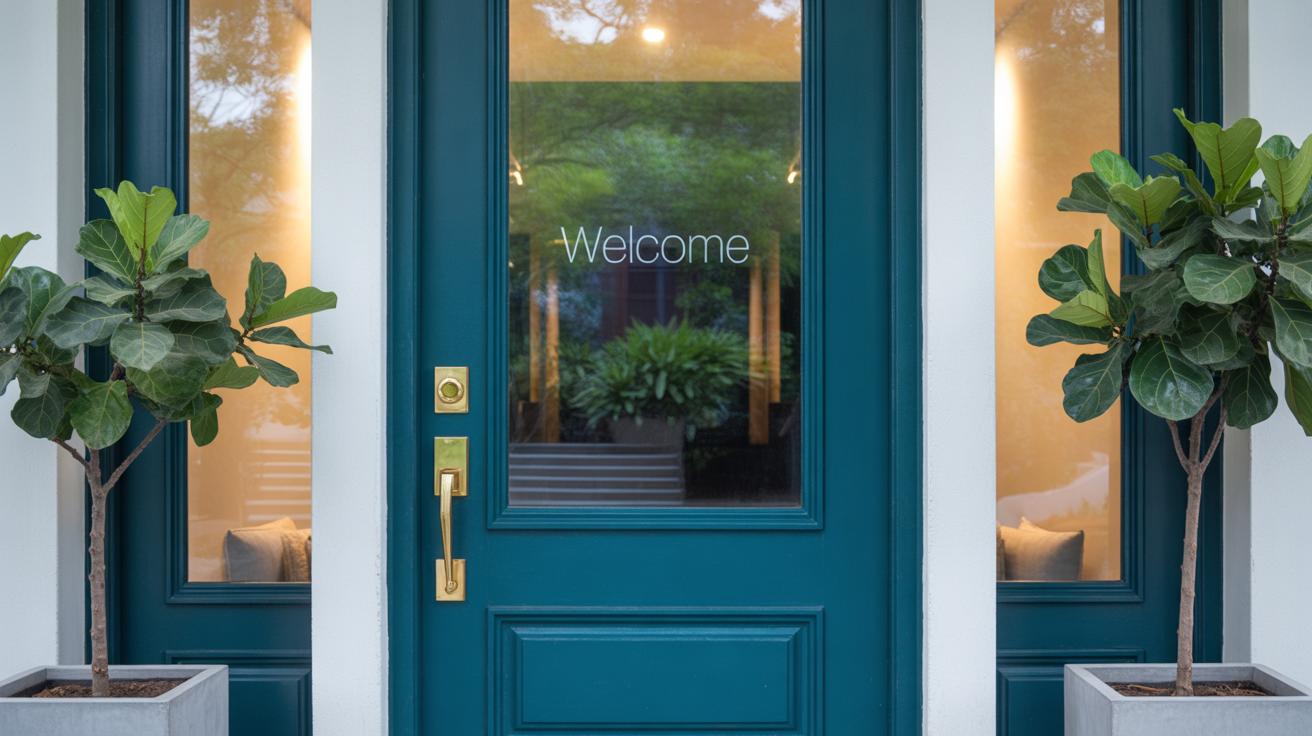
Red is one of those colors that never goes unnoticed. Its popularity comes from more than just looks. Historically, a red door meant “welcome,” a sign that travelers could find shelter. Today, it suggests confidence and warmth. It’s like the homeowner is saying, “Come on in, I’m not afraid to be seen.”
On a practical note, red works well against neutral siding or brick. It highlights the entrance without clashing. Still, red can feel aggressive if overused or chosen in a shade that’s too intense. Some people shy away from it, thinking it’s too bold — but if you want a strong statement, red is hard to beat.
One place I saw a red door stick with me: a modest farmhouse on a quiet street. It wasn’t loud, just a reassuring pop of color. It made the whole place feel alive, like the owners were proud but relaxed.
Neutral Colors for Timeless Style
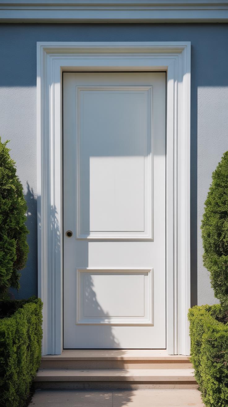
Neutral shades like black, white, gray, and brown carry a different kind of presence. They whisper stability and simplicity rather than shout. A black door can look sleek and modern, or classic and permanent, depending on the finish and hardware. It often suits a range of styles because it’s so versatile.
White doors bring a clean, fresh feeling. They’re bright but can get dirty quickly, which might annoy anyone who’s fussier about maintenance. Gray walks a line—subtle enough to blend in but moody enough to add a bit of depth, especially in cooler shades.
Brown doors channel earthiness and warmth without stealing attention. They tend to feel very welcoming in homes with natural or rustic details.
You might wonder: Do neutrals ever feel dull? Sometimes maybe—but often they just create a calm starting point, a blank canvas for your home’s personality to show elsewhere. If you like something that won’t date quickly or clash with your siding, neutrals often work best.
Tips for Painting and Maintaining Your Door Color
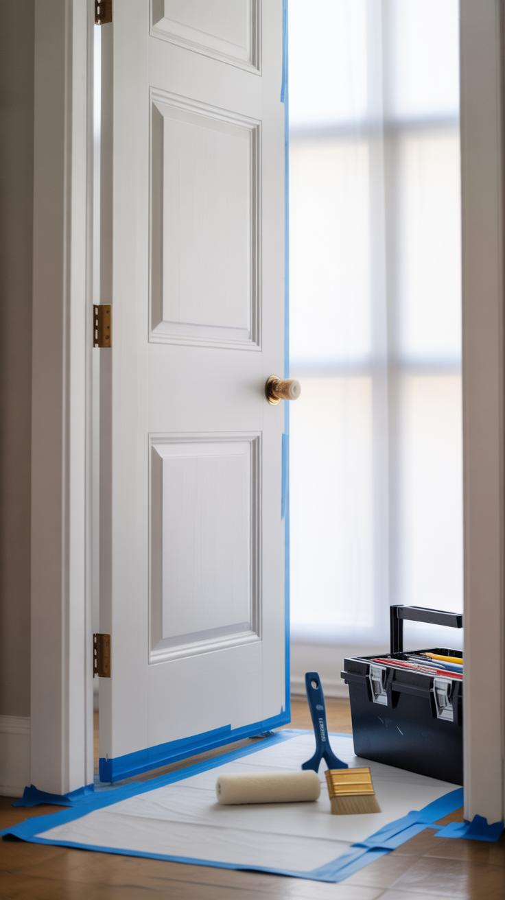
Choosing the Right Paint for Doors
Picking the right paint is more than just about color. Doors face sun, rain, and temperature swings, so you want paint that stands up to all that. Look for exterior paints labeled specifically for doors or trim—these usually have tougher formulas. Acrylic latex paints are quite popular because they resist fading and crack less over time.
Satin or semi-gloss finishes work best on doors. They offer a subtle shine that highlights your color without glaring back at you, and they clean up easier than flat paints. You might wonder if oil-based paints are better. They often provide a smoother finish but can yellow and chip sooner outdoors, so I usually lean toward water-based paints unless I want a very specific look.
Also, consider primer. Sometimes, a good primer makes all the difference in how well the finish grips and lasts, especially if you’re painting over a darker color or raw wood. Skipping it can be tempting, but your door might pay for that shortcut later.
Keeping Your Door Color Bright and Fresh
Once painted, keeping your door looking fresh isn’t a mystery but it needs regular attention. A quick wipe-down every few weeks with a soft cloth and mild soap can remove dirt and prevent buildup that dulls color. I’ve found that avoiding harsh chemicals matters—a gentle touch keeps the paint intact longer.
Small chips or scratches? Don’t just ignore them—they can grow. Keep a small jar of your paint around for quick touch-ups. It’s way easier to fix spots soon after they appear instead of repainting the whole door too often.
Weather protection also helps. If you live somewhere with strong sunlight or lots of rain, think about adding a door canopy or awning to shield the paint. It might seem like extra effort, but the less direct exposure, the better the color holds up. Have you noticed how some doors look freshly painted even years later? Chances are, they’ve been shielded somehow.
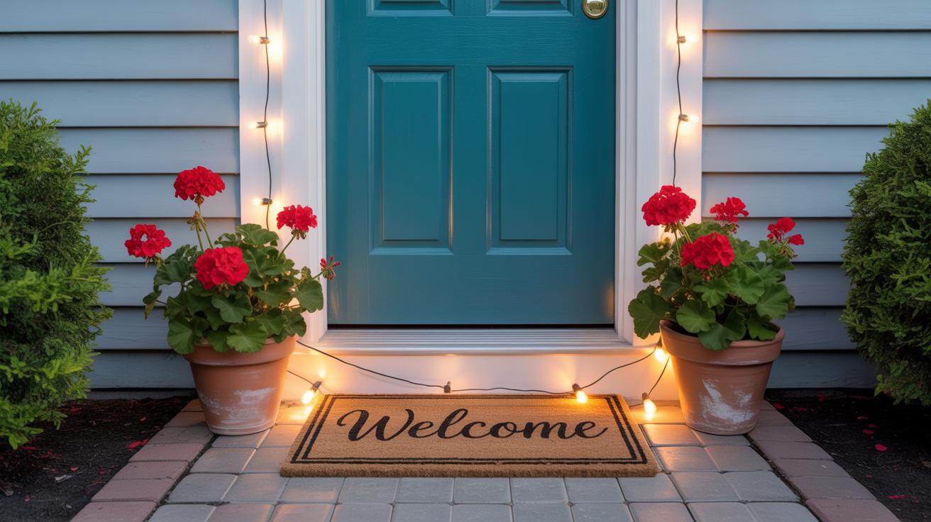
Incorporating Door Colors into Your Outdoor Decor
Using Door Color to Set the Mood
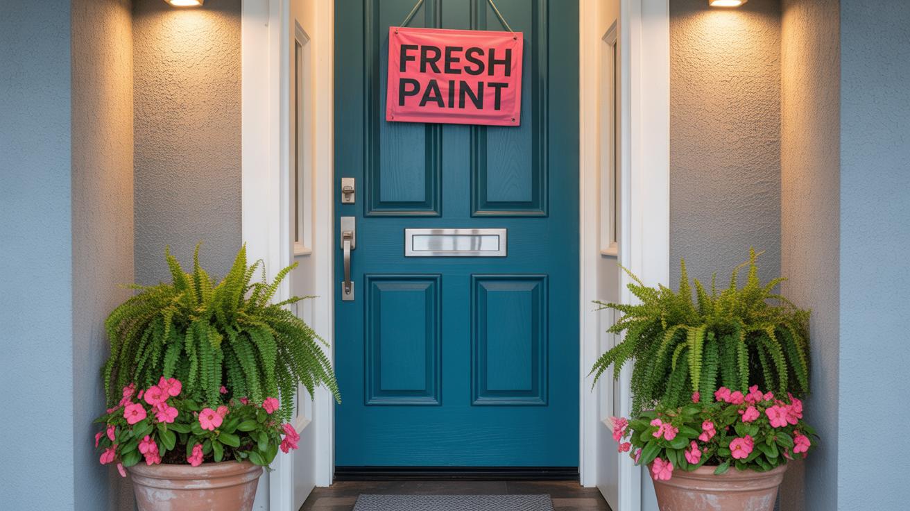
Your door color does more than just catch the eye; it plays a subtle role in shaping how your outdoor space feels. Think of it as setting the tone before anyone even steps inside. A deep navy can make the entrance feel calm, serious, and a bit mysterious, while a bright red might spark energy and a welcoming vibe. Sometimes, you want your door to whisper a quiet invitation; other times, you want it to shout “hello.”
It’s curious how a single color can pull together—or sometimes unsettle—the whole look. Matching the door’s color with garden plants, porch furniture, or even light fixtures can build a gentle harmony. But what if you want contrast? A pop of yellow against grey siding, for example, might feel cheerful but a bit jarring if there’s too much competing color around.
Decor Ideas That Complement Door Colors
Choosing decorations based on your door color can make your entrance feel thoughtfully pulled together. Here’s a quick list that might help you visualize different approaches:
- Bold colors: If your door is a strong shade like emerald green or cobalt blue, keep planters simple with neutral pots and leafy greenery. Metal or wooden lanterns add charm without clashing.
- Warm tones: Orange, red, or terra cotta doors pair well with woven welcome mats and brass or copper lighting. Adding autumnal wreaths or dried flowers feels seasonal but also timeless.
- Soft pastels: Pale pink or mint doors look great with white or pastel-colored pots and delicate flowers. Subtle string lights or soft-glow bulbs can enhance the gentle vibe.
- Black or dark shades: These doors invite bold, geometric mats or colorful pots for contrast. Lighting that throws shadows, like sconces, adds drama without overwhelming.
Sometimes, it’s less about rules and more about what feels inviting to you. An oddly shaped planter or a quirky doormat might clash with perfect color matching, but it could still make your entrance uniquely yours. Don’t be afraid to experiment a bit. After all, the door is the first impression, but it should also be true to your personal style.
Mistakes to Avoid When Choosing Door Colors
Choosing the right door color might sound straightforward, but a few common mistakes can seriously undercut your efforts. One classic error is picking a color that clashes with the siding. For instance, a bright red door might seem striking by itself, yet it can feel jarring if your siding is a muted gray or pale blue. It’s easy to get carried away by what looks appealing on its own, but the door should harmonize with the entire exterior mood.
Another slip-up many make is ignoring the overall style of the home. You might love a bold orange door, but does it really suit a traditional colonial or a sleek modern design? Sometimes sticking out from the architectural vibe diminishes the charm instead of boosting it.
Paint quality also matters more than you’d think. Skimping here can lead to fading, peeling, or color shifts that undo months of planning. A door color meant to pop can turn dull and tired fast if the paint isn’t up to the demands of weather and wear.
Have you ever seen a stunning door that just looks off against the house? Probably a mix of these mistakes in play. Paying attention to the bigger picture, style cues, and durability usually makes the difference.
Color Choices That Can Hurt Curb Appeal
Some door colors may appear stylish alone but don’t sit well with certain siding or architecture. Take neon tones—for example, a lime green door might feel out of place against classic cream or stone exteriors. It draws attention, yes, but often for the wrong reasons.
Dark doors on very dark siding, like navy on charcoal, can also backfire. They tend to blend and lose the impact doors are generally meant to have. Similarly, overly pale doors on very light siding risk feeling washed out and uninspired.
Reflect on your neighborhood or the style you want to reflect—does a bright, unconventional color fit, or does it leave an uneasy impression? Sometimes playing it safe isn’t such a bad idea when it comes to curb appeal.
Ignoring Practical Needs for Door Colors
Beyond style, practical considerations often get overlooked. A color that looks great in a showroom might not hold up well under harsh sun or heavy rain. For example, darker colors absorb more heat, potentially causing paint to crack or warp over time, especially in hot climates. You’ll want to think about how much sun exposure your door gets daily.
Maintenance is another factor. Light shades show dirt more easily, which means more frequent cleaning. If you’re okay with regular upkeep, fine; if not, picking a forgiving hue might save future headaches. Don’t forget about paint types either—some formulas offer better resistance to fading and moisture but tend to be pricier.
It’s worth asking yourself: how much effort will it take to keep this door looking fresh? Sometimes a color that’s appealing in theory doesn’t work well practically, and that’s a frustration you want to avoid.
Conclusions
Door color changes how your home looks and feels. The right color can brighten your house, welcome guests, and boost curb appeal. When you match door colors to siding and style, your home looks more put together and cared for.
Think about your siding color, home style, and personal taste when choosing door color. Bright or bold doors can make a point, while neutral colors keep things calm. Your door is a chance to be creative and make your home feel like yours. Use this guide to make smart and beautiful color choices.