Introduction
Red is often linked to being loud and energetic. But red rooms do not have to shout. You can have a red room that feels calm and inviting. This article will help you understand how to transform red spaces into areas of peace and quiet.
You will learn how to use different shades of red, colors that go well with red, and other design elements. By the end, you will have the tools to create a red room that feels warm and calm, not loud.
Understanding the Color Red and Its Effects
The color red tends to stand out, grabbing your attention right away. It’s often associated with passion, strength, and even danger, but it’s not all about intensity. Red can evoke warmth and comfort too, depending on how it’s used. Some people say red fuels creativity or stimulates appetite, while others find it a bit overwhelming. So, red has this interesting dual nature—sometimes energizing, sometimes grounding.
When you bring red into a room, it doesn’t just change the look; it changes the feeling. It can make you feel more alert, maybe even restless if it’s too bold. Yet, in some contexts, red can feel cozy, like a warm embrace. That feeling of calmness in a red space might surprise you, but it’s possible.
Red’s Psychological Impact
Studies show red can raise your heart rate and boost adrenaline. This effect makes you feel more awake or ready to act. But it’s a double-edged sword. For some, this kick of energy turns into agitation or stress if the color is too intense or overused. Ever noticed how a bright red wall can sometimes feel like it’s closing in? That’s red pushing you to respond, maybe even on edge.
Still, in moderation, red can lift your mood or increase confidence. It’s often used in environments that want to encourage quick thinking or physical activity. But this intensity means red needs balance. Without it, you might find yourself exhausted rather than calm.
Why Some Reds Feel Calmer Than Others
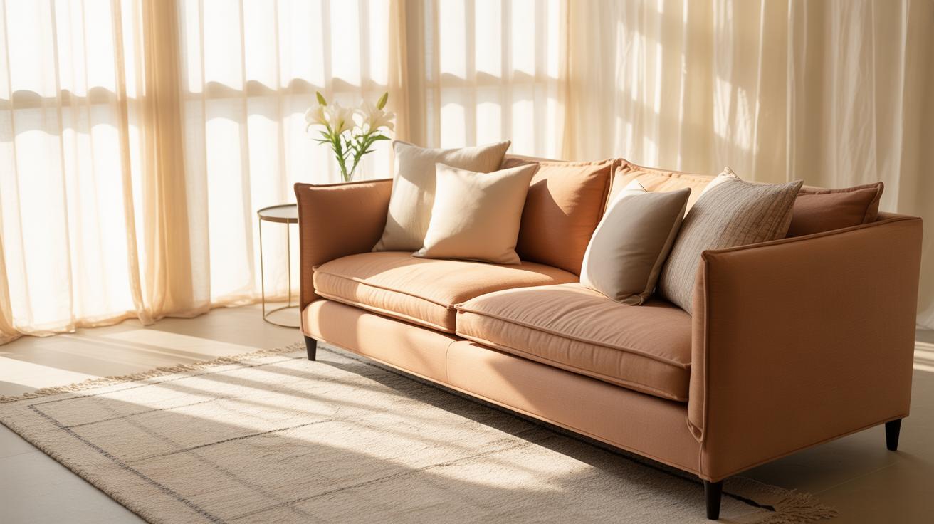
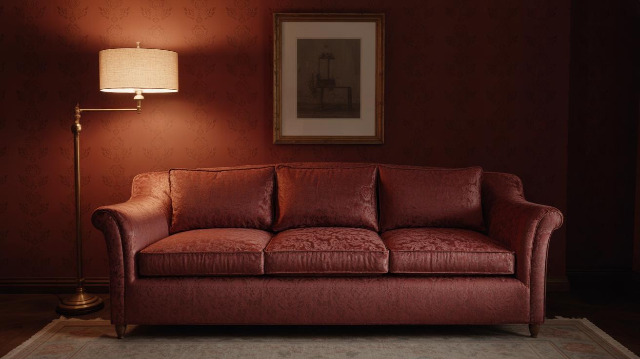
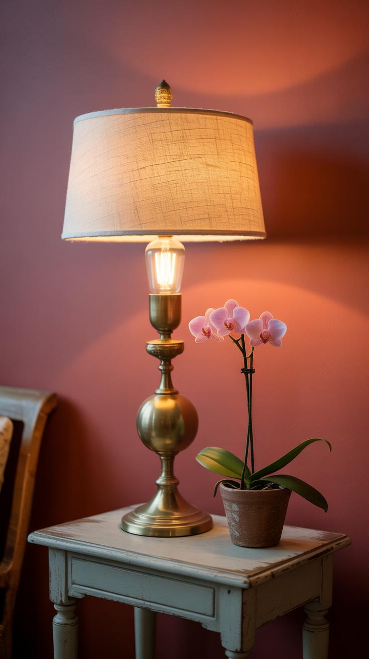
Not every red shouts. Lighter or muted reds tend to whisper rather than yell. Think dusty rose or soft brick tones. These shades have enough depth to feel warm but lack the harshness that drives your pulse up. They create a more relaxed vibe, almost like red took a step back and softened its voice.
In practical terms, these gentler reds work well where you want warmth without overstimulation—bedrooms, reading nooks, or calm dining spaces. If the red leans more pastel or has slight gray undertones, your space won’t feel loud or aggressive. Instead, it settles you, maybe even invites a slow, quiet breath.
So, if you wonder why some red rooms feel “calm,” it often comes down to the shade and how your body reacts—not all reds are created equal. It’s worth paying attention to these subtle differences when you’re aiming for peace in a red room.
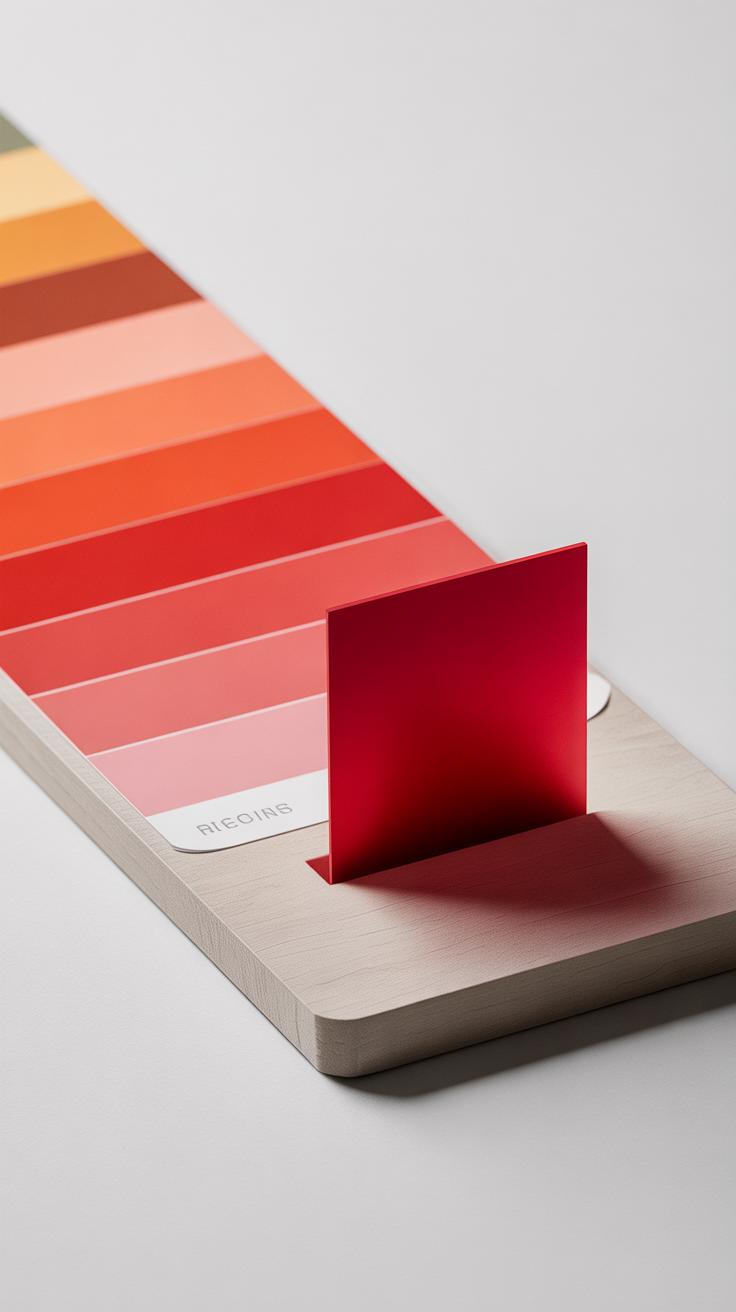
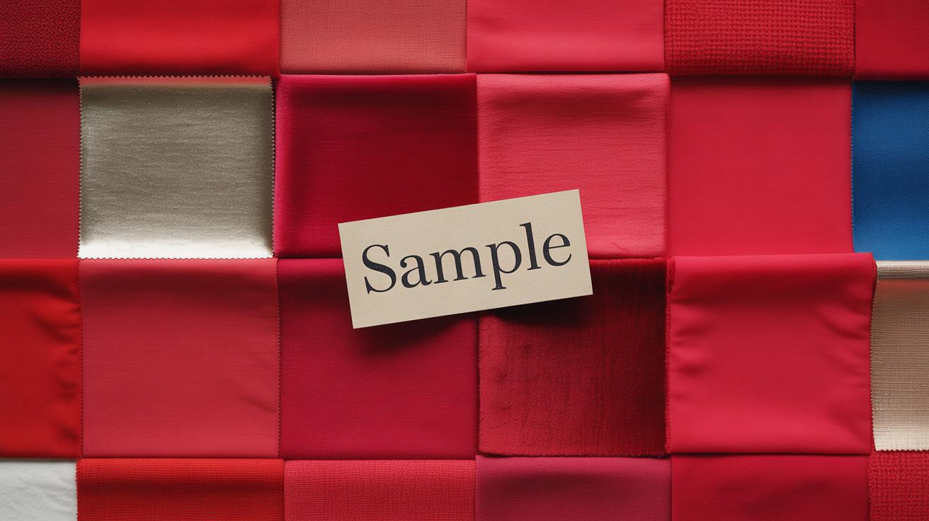
Choosing the Right Shade of Red for Calmness
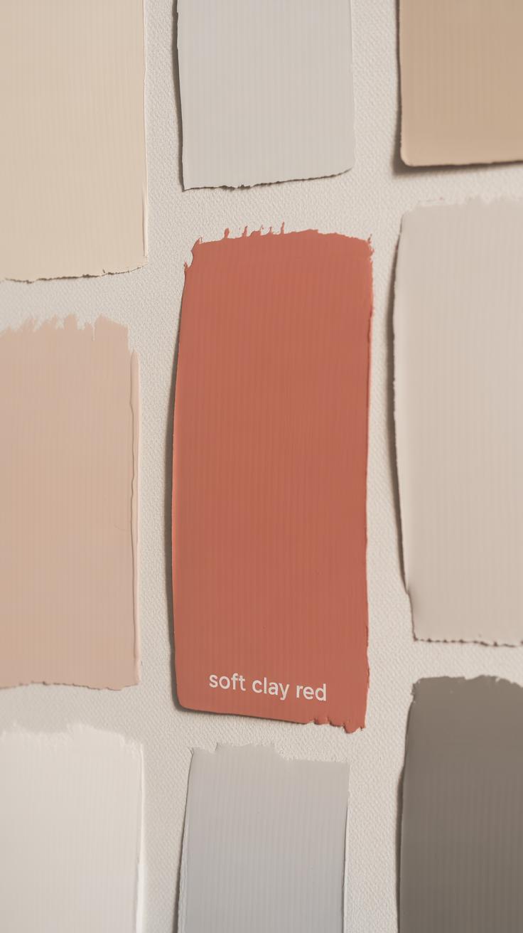
Not all reds shout. Some whisper. When you want a red room to feel peaceful, the key lies in picking softer, muted, or pastel reds that ease the intensity. Think of shades like rose, coral, or brick red. These versions of red aren’t as bold; they bring warmth without the usual energy buzz.
Rose, for instance, edges toward a dusty pink—a subtle invite rather than a demand. Coral carries just a touch of orange, lending a friendly softness. Brick red reminds me of weathered walls, grounding and steady, less likely to provoke restlessness.
Pastel reds, on the other hand, bring warmth wrapped in quiet tones. These shades don’t overwhelm; instead, they nudge the space toward comfort. You might use a pale red in a bedroom or a reading nook where calm matters more than excitement.
Ask yourself: where do you want energy, and where should it take a step back? Soft reds fit spaces needing cozy intimacy. Pastels serve well when subtlety is the goal. Both have their place, depending on the vibe you want to hold onto, even in a red room.
Pairing Red with Soothing Colors
Red can feel intense, no doubt about it. But when you combine it with the right colors, that intensity softens into something surprisingly calm. Think of it less like a loud shout and more like a warm, steady heartbeat. You don’t have to shy away from red just because it can be overwhelming.
Using Neutrals Like White and Gray
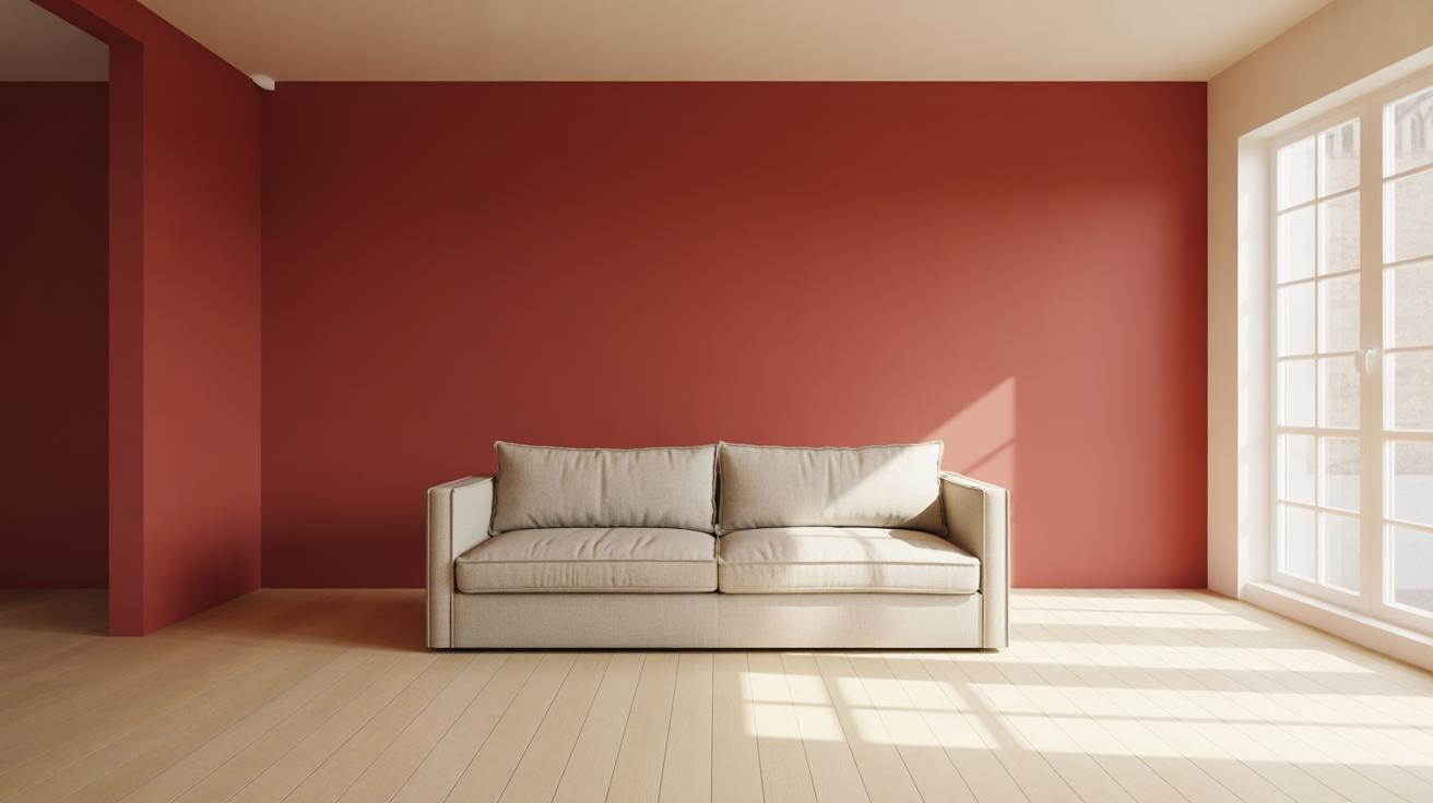
Neutrals like white, cream, and gray can do a lot of the heavy lifting when it comes to calming red. Imagine a deep red accent wall paired with crisp white trim — the white pulls some energy out of the room, giving your eyes a place to rest. Cream tones, on the other hand, bring a gentle softness that makes the red seem less aggressive.
Gray is interesting because it almost acts like a buffer. It dampens the boldness without making the space feel cold or dull. If you think about a room with a medium red sofa against soft gray walls, the combo feels balanced. You get the warmth from the red but the gray keeps it grounded.
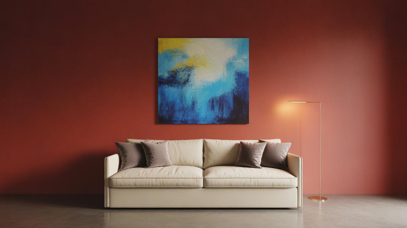
Adding Cool Colors Like Blue and Green
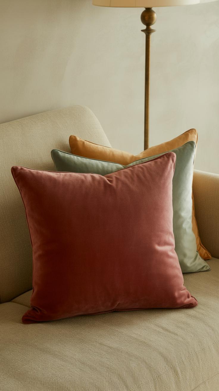
Blue and green tones have a calming effect that can really tone down red’s energy. Not all blues or greens work, though. Muted shades like a dusty blue or a sage green tend to play nicely with red. They invite you to slow down, which might be just what you need in a red room.
For example, a red dining room with blue-gray cushions or green houseplants can feel surprisingly peaceful. The cool colors contrast with red’s warmth in a way that settles the space. Of course, too much blue or green could clash or mute the red altogether, so moderation is key.
Have you noticed how some rooms with red walls seem instantly calmer when there’s a touch of greenery nearby? It’s almost like nature’s cool tones quietly whisper to keep things balanced.
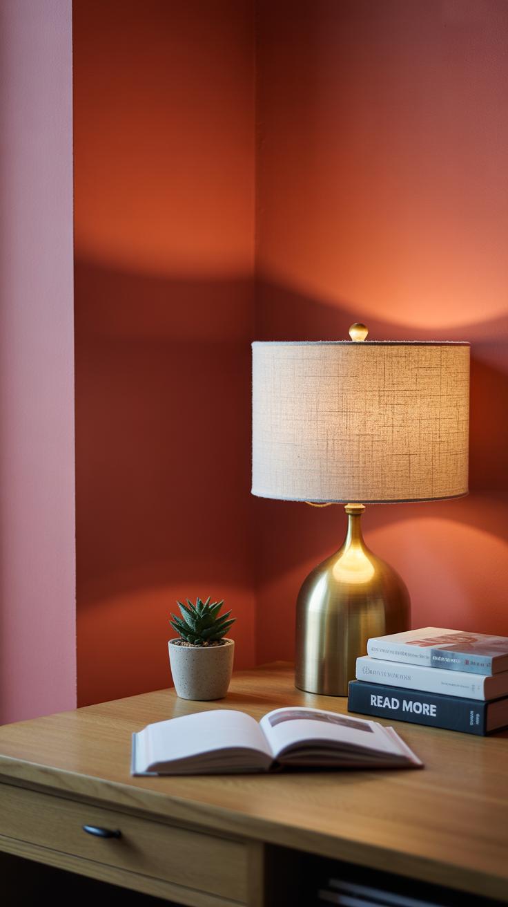
Lighting Choices to Soften Red Rooms
Lighting plays a huge role in how red rooms feel. Red can be a strong color, sometimes too intense, but the right light can make it feel calmer, even almost gentle. Natural light tends to work wonders here. Sunlight hitting red walls softens the boldness, almost like it mellows out the energy. If you have windows, let the daylight flood in. The shifting light throughout the day changes how the red looks, so it never feels static or overwhelming.
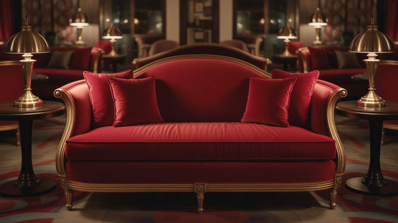
Artificial light, on the other hand, needs a bit more thought. Bright, cool light can make red feel glaring and sharp—usually not what you want if peace is the goal. Instead, using warm lights, like those with a yellow or amber tint, tones down red’s intensity. Lamps with dimmer switches are great options. They let you adjust brightness depending on your mood or time of day. Sometimes the room might feel just right with a soft glow; other times, a little more light helps.
Think about layering your lighting too—combining ceiling lights with table lamps or floor lamps. This mix breaks up harsh shadows and distributes a comfortable warmth. Have you noticed how lowering lights can make even bold colors feel intimate? It’s a simple trick that works well with red.
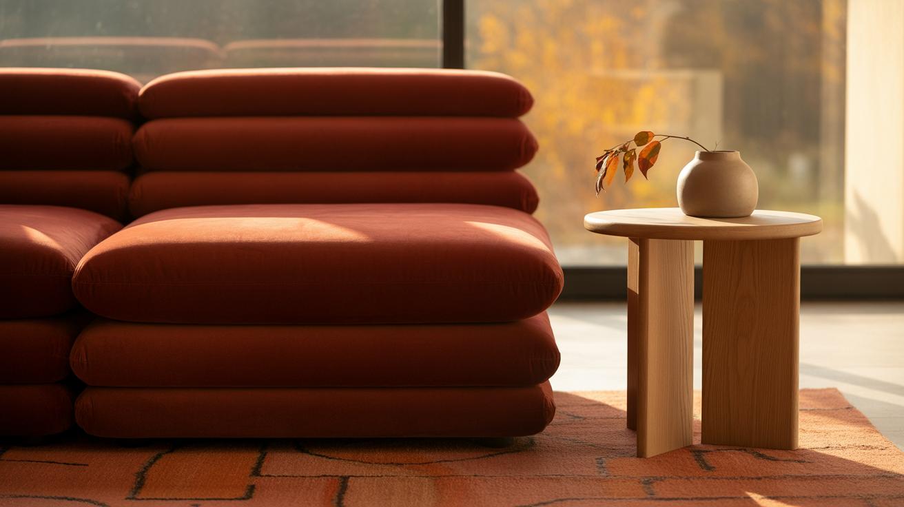
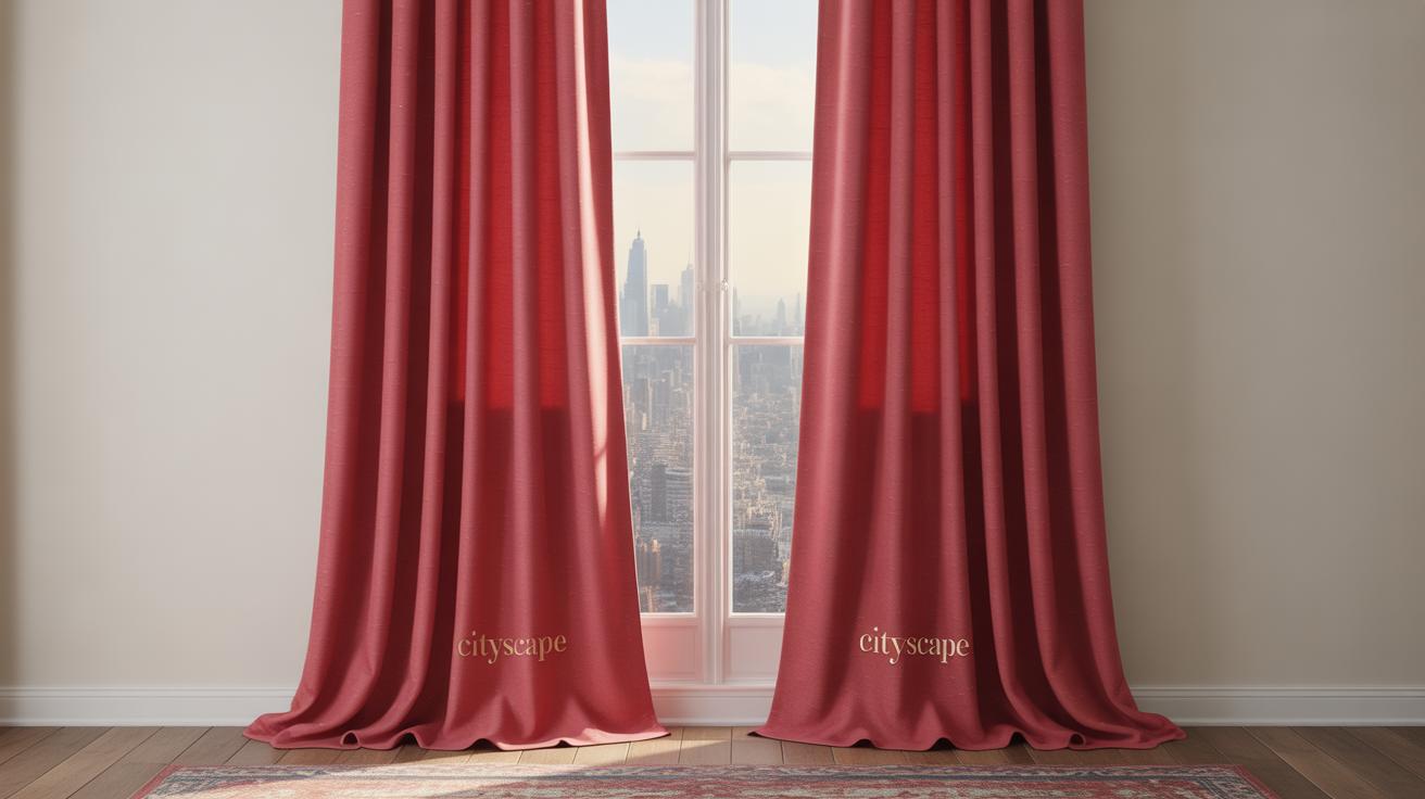
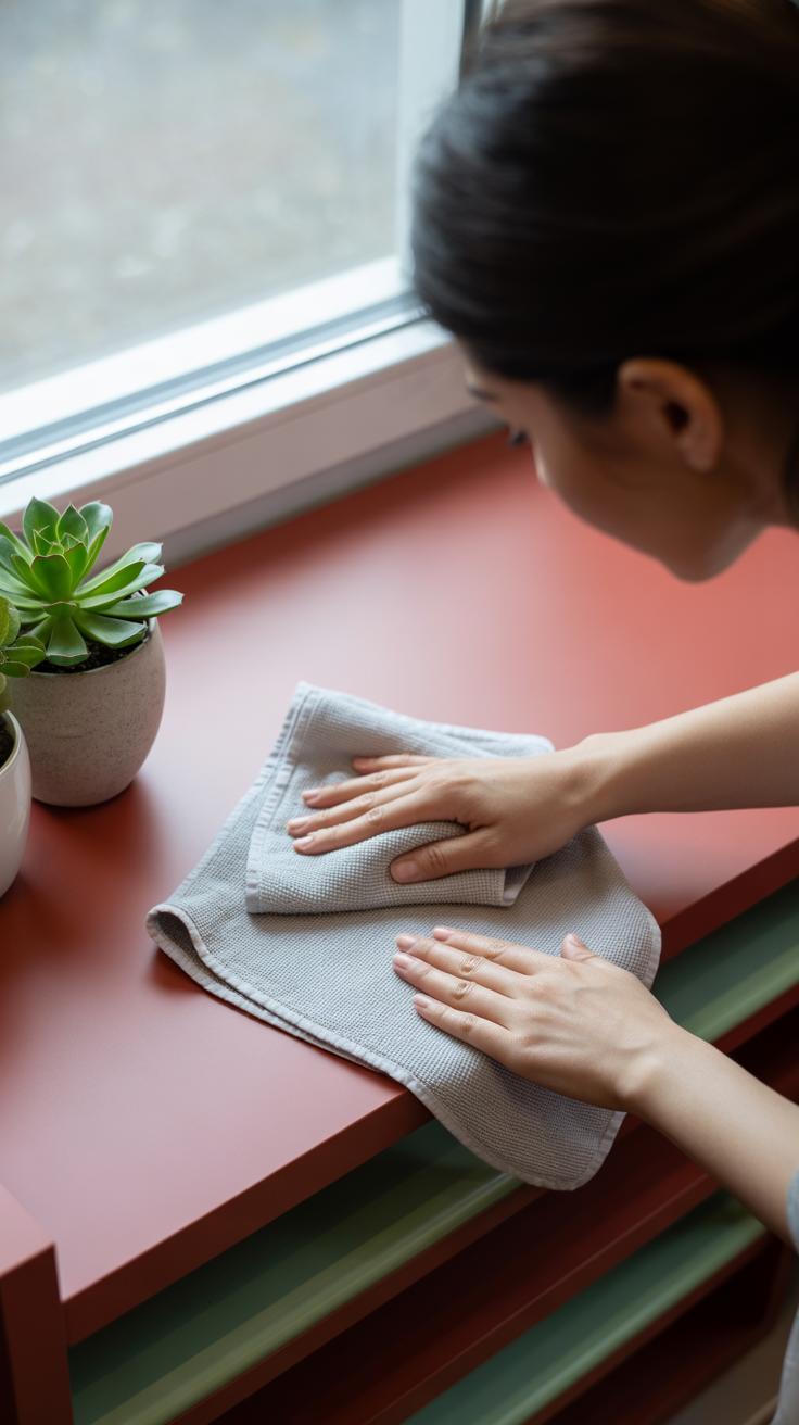
Texture and Fabric Choices in Red Rooms
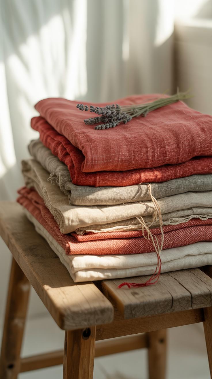
Red can feel quite loud in a room if not handled carefully. One way to soften that impact is through your choice of fabrics and textures. Soft materials like velvet and cotton play a subtle but key role here. They absorb light rather than reflect it harshly, which helps tone down the intensity of red walls or furnishings. Noise absorption is another plus—plush fabrics make rooms feel quieter and more intimate, almost like a gentle buffer against the energy red tends to bring.
When I think about my own space, adding a velvet throw or soft cotton curtains made the red feel less aggressive, more restful even. It’s almost as if the texture makes the color breathe instead of shout. But it doesn’t stop there. Layering different textures adds a kind of balance. Combining rough and smooth—say, a coarse linen pillow with a silky red blanket—introduces depth and complexity without overwhelming your senses.
This layering also keeps the room from feeling flat or one-dimensional. It can be surprising how a jute rug or slightly worn leather chair next to a sleek velvet cushion changes the vibe. You might wonder if mixing textures makes a space too busy. Sometimes, yes, but with red, the right balance usually cools things down rather than competing too loudly.
Minimalist Decor to Balance Red Intensity
Red is a strong color—there’s no denying that. When you paint a room red or bring in red furniture, the energy can feel intense. To keep that feeling calm, using fewer items is a good move. Spaces with less clutter give the eye a place to rest. I’ve noticed that in red rooms, a single well-chosen piece stands out more without overwhelming you.
Fewer decorations and furniture mean the red doesn’t shout at you from every corner. Think of a red wall paired with just a simple chair or a low table. The fewer objects you have, the easier it is for the space to breathe. It might seem strange to leave some walls or areas empty when working with such a bold color, but it actually helps the room feel open, not suffocating.
Simple shapes and clean lines play a part here too. Furniture with straight edges and uncomplicated forms keeps things calm. Complex or overly ornate furniture might fight with the red, making the space feel busy. I remember trying a minimal, geometric-style bookshelf next to a deep red wall—it immediately softened the overall vibe.
- Choose furniture with straight, clean edges over curvy or intricate patterns.
- Keep decorations to a minimum—each piece should earn its place.
- Use open shelving or minimalist tables to avoid visual clutter.
Minimalism in a red room might feel limiting at first. But once you sit in such a space, the calm it offers is clear. Maybe it’s about balance—how much red your eye can take before it demands simplicity elsewhere. Have you tried simplifying a room like this? What felt right to you?
Red Rooms for Different Purposes
Creating Calm Bedrooms with Red
Using red in a bedroom feels tricky at first. Red can be intense, but soft, muted reds—like dusty rose or gentle terracotta—change the game. They don’t shout; instead, they quietly warm the room. Combine these softer reds with calming decor: think smooth linens, simple furniture, and natural textures that invite rest rather than demand attention.
Sometimes, it’s less about the red itself and more about what surrounds it. You might notice that a pale red wall paired with neutral bedding and soft lighting creates a surprisingly peaceful vibe. A few well-chosen accents, like a cushy rug or delicate curtains, help the red fade into the background instead of dominating.
It’s curious—red usually energizes, but toned down, it can actually soothe, encouraging you to unwind. So, what if you tried red in your bedroom, but kept everything else quiet and simple? That’s where calm really begins.
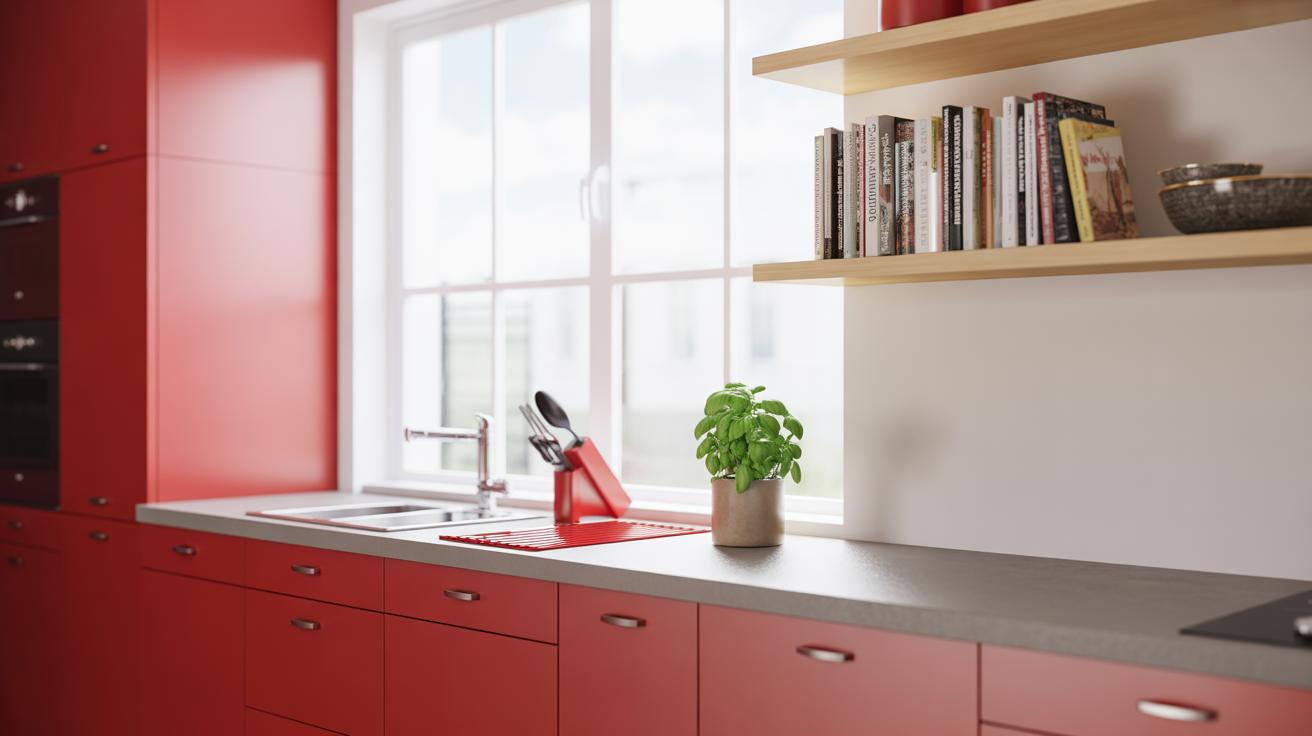
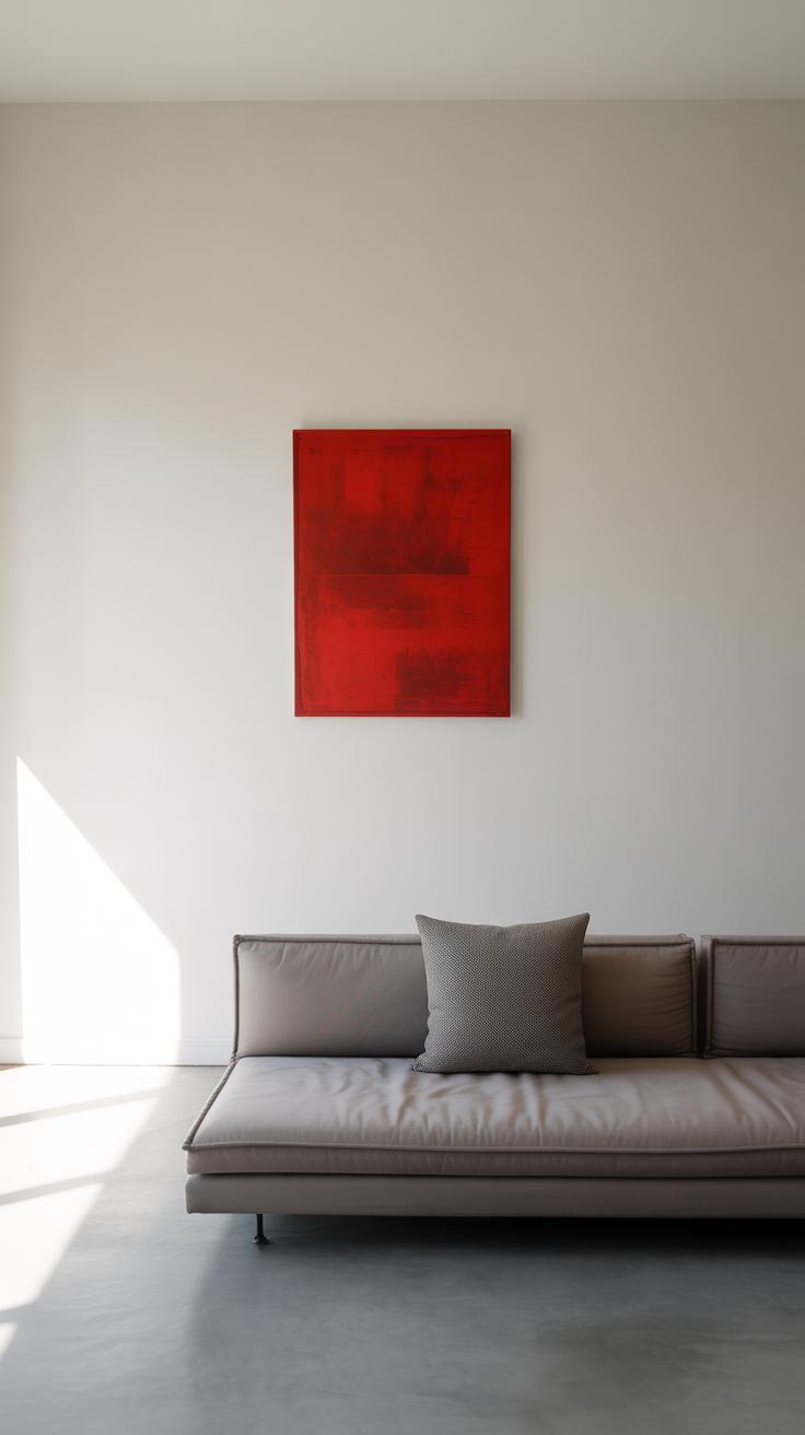
Living Rooms and Workspaces in Red
For social or work areas, red deserves careful placement. You probably don’t want a full red wall in a workspace—it can feel overwhelming or distracting. Instead, use red in smaller doses to spark focus or conversation. A red chair, a rug, or a splash of art can quietly anchor a room.
In living rooms, red can invite connection without yelling for attention. It helps to balance red with comfortable seating, soft throws, and natural lighting to keep the energy gentle, not jittery. You might try pairing red with warm woods or pale walls to keep things grounded.
Workspaces benefit from red accents that stimulate energy without chaos. A red desk lamp, organizer, or wall calendar can help focus your attention, but too much red risks burnout. After moving to a red accent, pause—does it feel motivating or draining? Because sometimes, red can pull you in, but other times, it just pulls too hard.
Maintaining Your Calm Red Room Over Time
Once you’ve created a red room that feels peaceful, the next step is, well, keeping it that way. Red can be intense, but it doesn’t have to shout endlessly. The trick is in small, regular tweaks that prevent the space from feeling static or overwhelming.
Refreshing Paint and Fabrics
Paint on walls doesn’t last forever—even if it looks fine at first glance. Over time, colors can fade or just feel… stale. Think about touching up the paint every few years, or even trying a slightly different shade of red to keep things interesting but still calm. It’s subtle, but noticeable.
Rugs, pillows, and throws are your best friends here. They change the feel without committing to anything hardwired. Maybe swap a deep red pillow for a softer hue once in a while, or pick a rug with a bit of pattern that breaks up the red but in a gentle way.
Adjusting Lighting and Decor Seasonally
Lighting plays a huge role in how the red feels. As seasons change, natural light in your room shifts too. You might want warmer bulbs in the winter to soften the red, cooler or dimmer lights in summer to keep things restful. Sometimes, swapping out a lampshade or adding string lights can do the trick.
Decor doesn’t need to be permanent. Seasonal accents—simple vases, fresh flowers, or artwork—help the room evolve without losing its calm essence. Changing these with the seasons keeps your senses engaged in a quiet way. You might not notice the difference at first, but on reflection, the room feels more alive and yet just as peaceful.
In the end, keeping a calm red room means staying curious about your space, not letting it settle into something dull, nor letting it become too much. Balancing these makes red a color you can live with comfortably, day after day.
Conclusions
Red is a strong color that can change the mood of a room. When used right, red rooms can feel calm and warm instead of loud. Choosing soft reds, pairing red with gentle colors, and adding soft lighting all help to make a red room relaxing.
Remember, your red room should be a place where you feel peaceful. Use these tips to make your red room a bright yet quiet space. Try your ideas and see how red can bring calm to your home.