Introduction
Red walls can transform your space by adding warmth and energy. When done the right way, they create a sense of elegance and sophistication. This article explores different red wall ideas that look high end, helping you achieve a stylish effect in your home or workspace.
We will cover how to choose the right shade of red, what decorations and furniture work best, lighting tips, and how to blend red walls with other colors. By understanding these key factors, you can confidently create a red wall design that impresses and elevates your space.
Understanding Red Wall Basics
A red wall means painting an entire wall or a large part of a wall in any shade of red, from deep burgundy to bright scarlet. It’s not just about color; a red wall immediately becomes a focal point in a room. It adds character and energy where there might otherwise be none.
Red is known to influence how you feel in a room. It can stir up warmth, enthusiasm, or even urgency. Sometimes, it feels cozy and inviting, while at other times, it might elevate tension or excitement. This psychological effect means red walls can shift the mood strongly—and that’s why they often work best when balanced with softer, neutral tones.
Yet, red walls don’t have to be overwhelming. They can adapt to many spaces, from lively living rooms to intimate bedrooms or even kitchens. The mood red brings depends largely on how you use it, and where. Have you noticed how a red dining room seems more energetic compared to a red bedroom? It’s fascinating how the same color can act so differently, room to room.
What Makes Red a Powerful Color
Red grabs attention like no other color. Its energy feels physical, almost like a pulse in the room. Think of it as a color that demands notice, creating warmth that draws people closer rather than pushing them away. Red’s strength comes from this boldness.
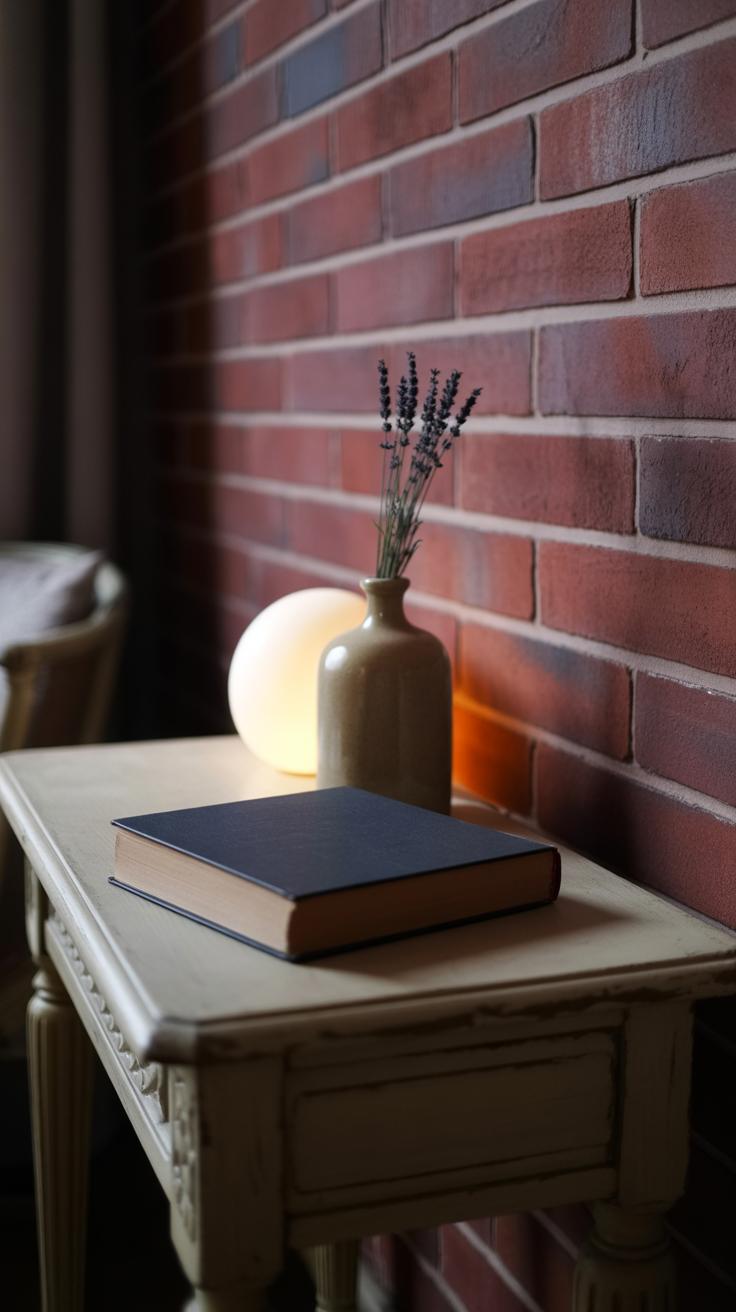
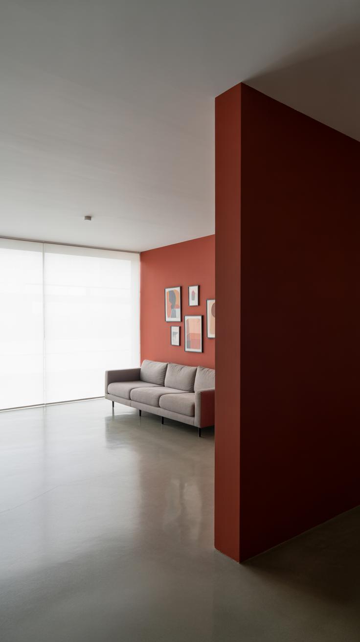
But not all reds are created equal. A bright cherry red can spark energy and spark conversation, almost jolting the space awake. Meanwhile, a muted rust red radiates comfort and history—maybe even a subtle sophistication that doesn’t shout but whispers instead. The tone you pick can shift the entire atmosphere.
Red’s ability to evoke different feelings hinges on its shade and finish. Matte reds absorb light and feel softer; glossy reds reflect light and magnify energy. That subtle difference can change how a room feels drastically.
Rooms That Benefit from Red Walls
Certain rooms seem to welcome red more naturally. Dining rooms, for example, often wear red well. The color is thought to stimulate appetite and conversation, making meals feel more vibrant. I’ve seen a dining room with deep red walls that felt both dramatic and warm—perfect for entertaining.
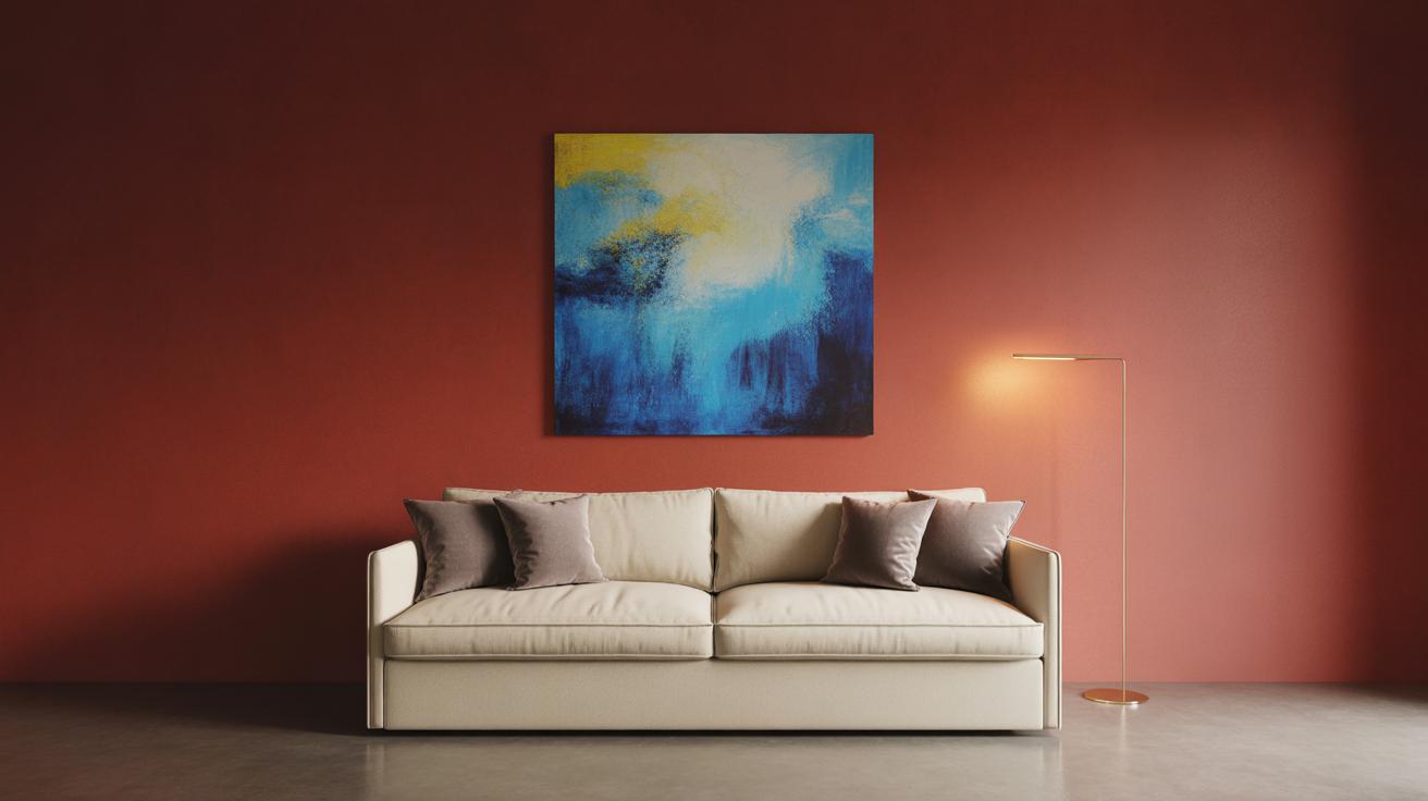
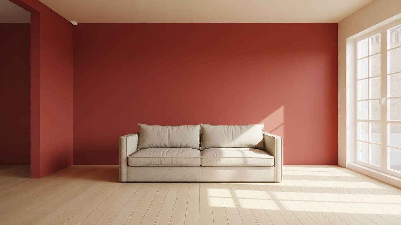
Living rooms, too, can handle red, especially if the space is large enough to balance the intensity. A red living room can feel inviting, encouraging socializing and warmth during gatherings. Yet, if the room is small, you might feel a bit boxed in, which is something to think about.
Bedrooms with red walls are an interesting choice. They can create intimacy and passion, but some find the energy a bit too intense for restful sleep. Again, it depends on the exact shade and how much red is present.
The kitchen can also be a surprising spot for red. Bright reds can energize morning routines, especially in modern or eclectic kitchens that are all about bold statements.
As you consider using red walls, ask yourself: What feeling do you want to bring into the room? How large is the space? These questions help unlock whether red is a good fit—and which red might suit best.
Choosing the Right Shade of Red
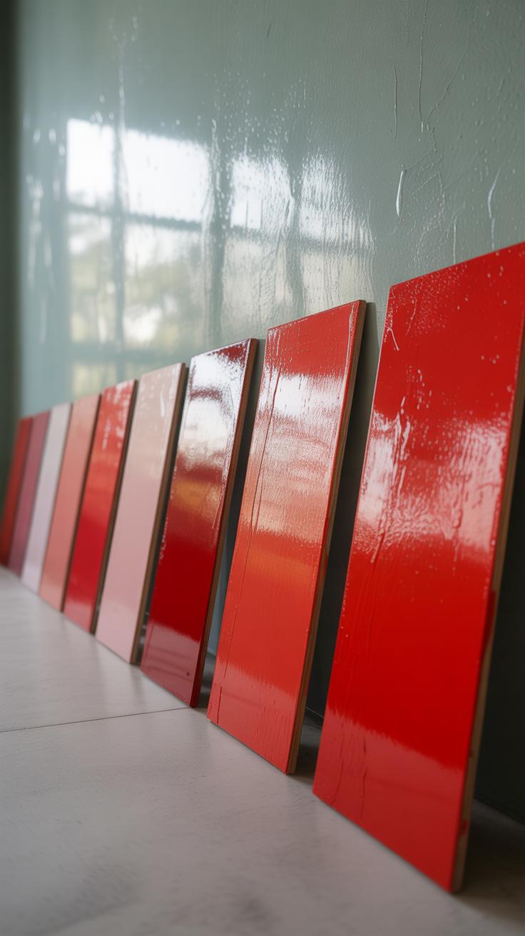
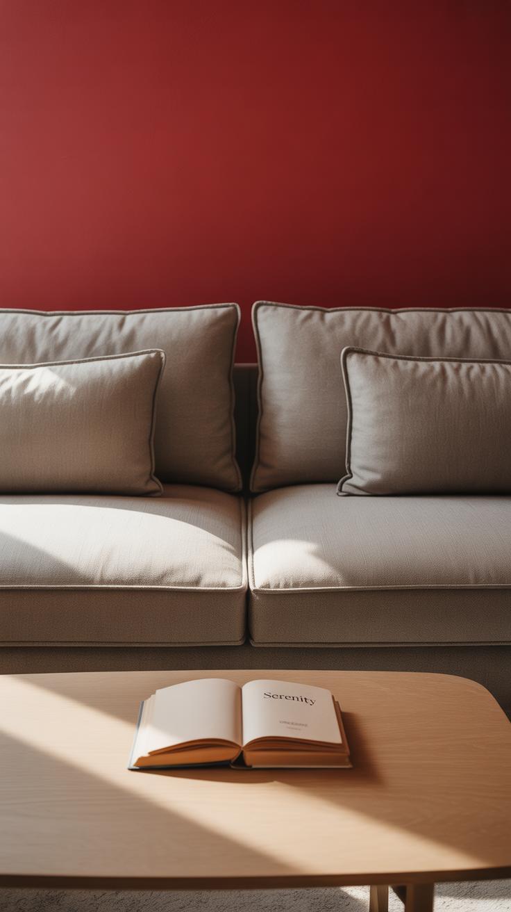
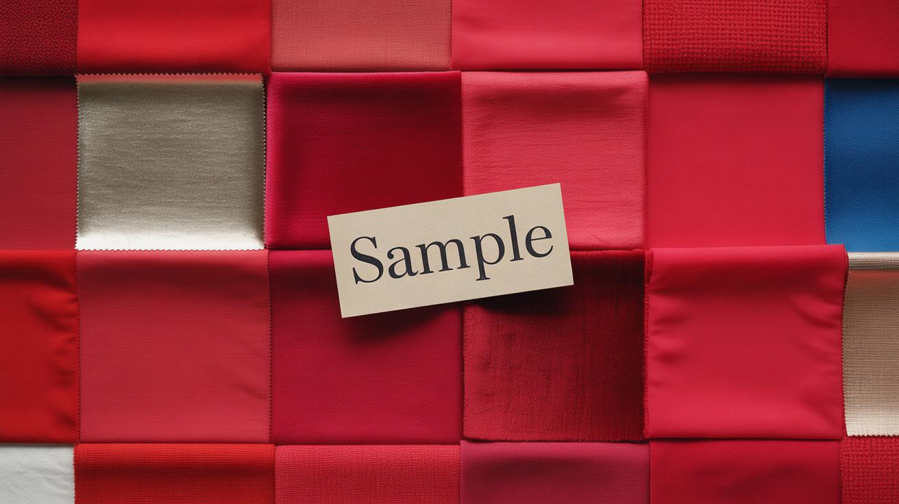
Picking the right red for your wall isn’t as straightforward as it seems. Red comes in so many hues, each shifting the room’s mood in subtle ways. If you want calm and sophistication, deep reds like burgundy or maroon are probably your best bet. These shades feel settled, almost grounding, and often add a hint of classic charm. I find that these darker reds work great when paired with neutral furniture—think soft grays, creams, or even muted browns. It keeps the focus on the wall but prevents the room from feeling heavy or overwhelming.
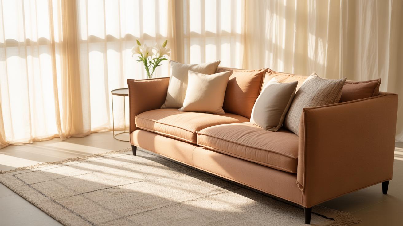
On the other hand, bright reds burst with energy. They bring life to a space, but that energy can sometimes feel… a bit much. To stop your room from turning into a visual overload, it helps to soften things with plush cushions, drapes, or rugs in gentle tones like pale beige or soft blush. That balance lets the red do its thing without overstimulating your senses.
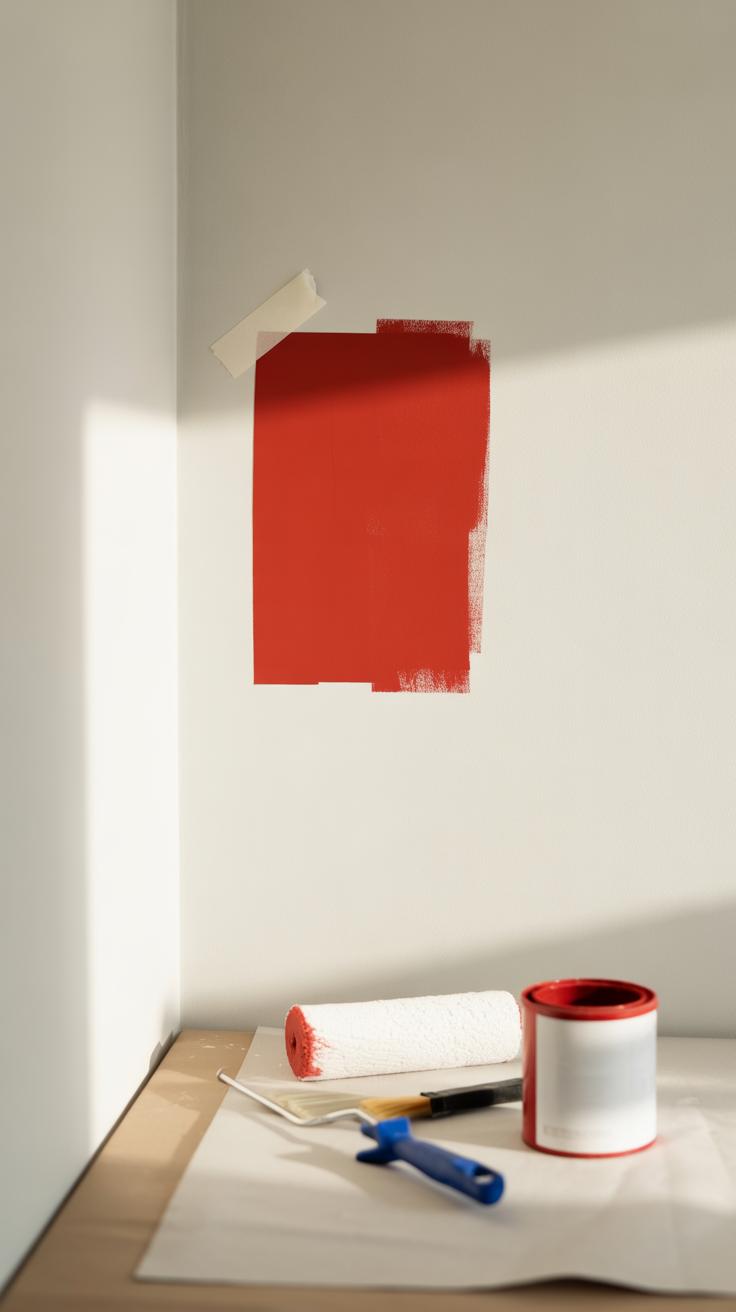
When you’re choosing, testing paint samples is almost mandatory. Paint a strip on the wall at different times of the day, and watch how it changes in morning light versus evening glow. Sometimes, a shade that seemed perfect in the store can feel totally different once it’s on your wall. It’s a little bit trial and error, but worth taking the time. You don’t want to commit to a red that doesn’t quite fit once everything else is in place.
Pairing Red Walls with Complementary Colors
Red walls make a bold statement on their own, but the way you pair them with other colors can really define the mood and style of a room. Choosing the right companions for red can soften its intensity or turn it into something unexpectedly elegant.
White and Neutral Colors
White and neutrals act like a breath of fresh air next to strong red walls. They calm things down, creating a sense of balance. Imagine a deep red wall framed by crisp white trim or pale beige furnishings. Suddenly, the red feels less overwhelming and the space brightens up.
This pairing works well because the neutrals don’t compete with red for attention. Instead, they lighten the atmosphere, making the red wall a feature without dominating the room. You might notice how a soft gray accent can mellow red’s warmth, offering a quiet, stylish contrast that feels refined yet approachable. I’ve often found that white ceilings with red walls keep a room feeling open rather than closed in.
Bold Colors Like Black and Gold
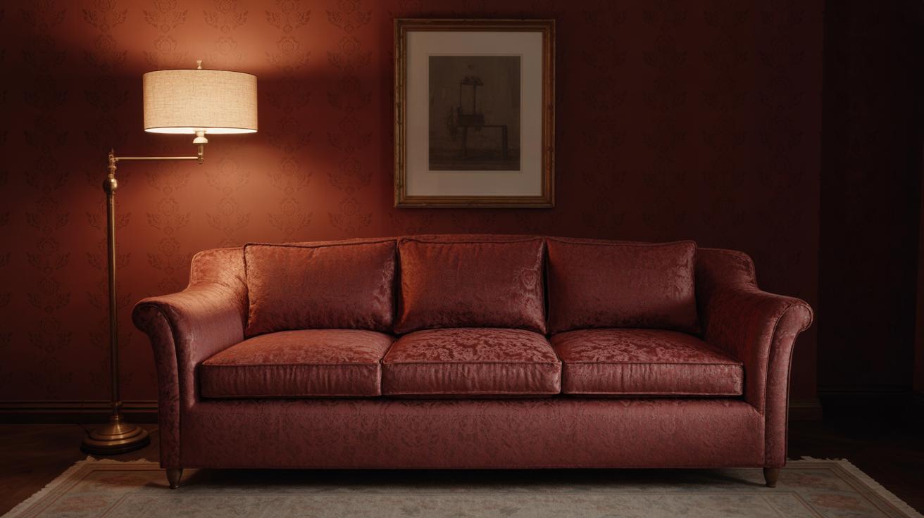
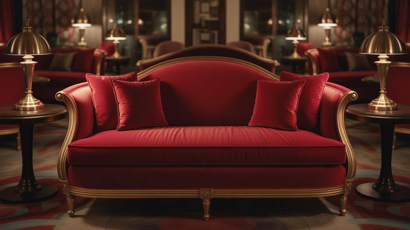
Using black and gold with red walls adds a layer of drama. Black gives weight and a modern edge to red’s passion, making a space feel intimate and powerful. For instance, pairing red walls with sleek black furniture or black picture frames can give a room that moody, stylish vibe. Although it risks feeling heavy if overdone, when carefully accented, black enhances red’s boldness without clashing.
Gold, on the other hand, introduces a touch of luxury. Think of gold light fixtures, mirrors, or hardware against red walls—they lift the space, injecting warmth and subtle glamour. It’s not just about opulence but about a refined playfulness. The shimmer of gold breaks up the solid red, making the room feel more layered and interesting. If you want to try something a bit unexpected, pairing red with both black and gold can create a rich, sophisticated environment that feels both classic and contemporary.
Lighting and Its Impact on Red Walls
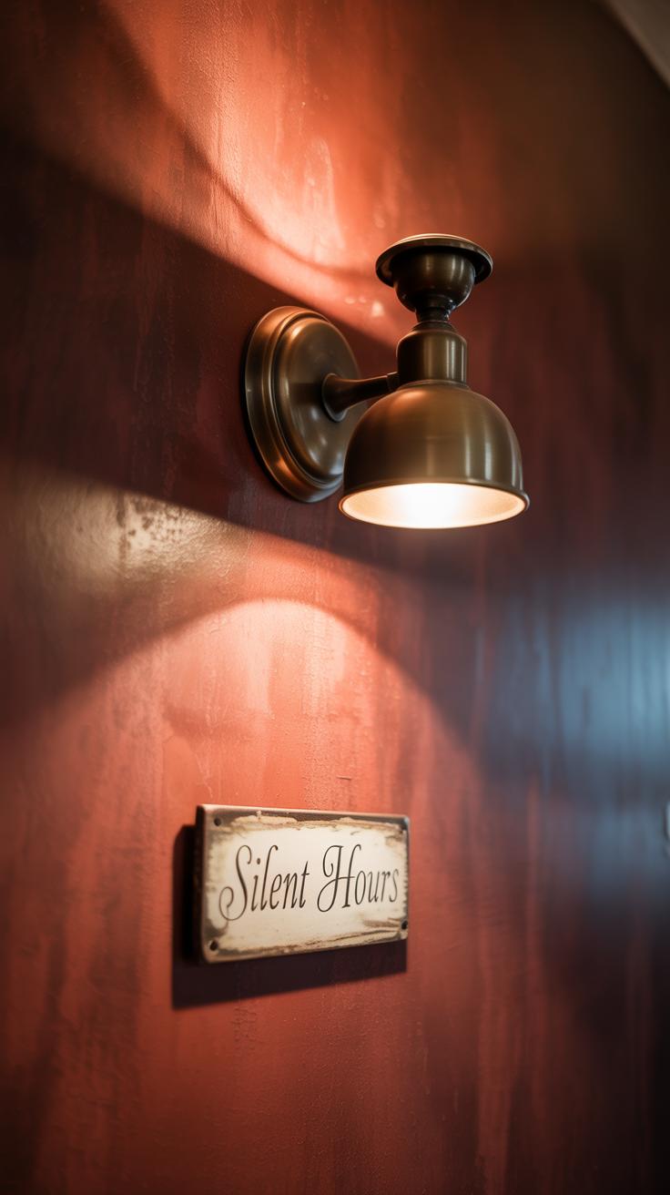
Lighting shapes everything about red walls. It can deepen the richness or dull the vibrancy, sometimes in ways you might not expect. Natural light doesn’t just bathe a room evenly—it changes the red hues dramatically throughout the day. Morning light tends to bring out softer, pinkish undertones, while midday sun makes reds feel more intense, almost fiery. By evening, reds can appear warmer, almost rust-like in low natural light. So, placing red walls in rooms with varying exposure could shift the mood just by the hour. It’s interesting to watch—a wall almost feels alive as daylight moves across it.
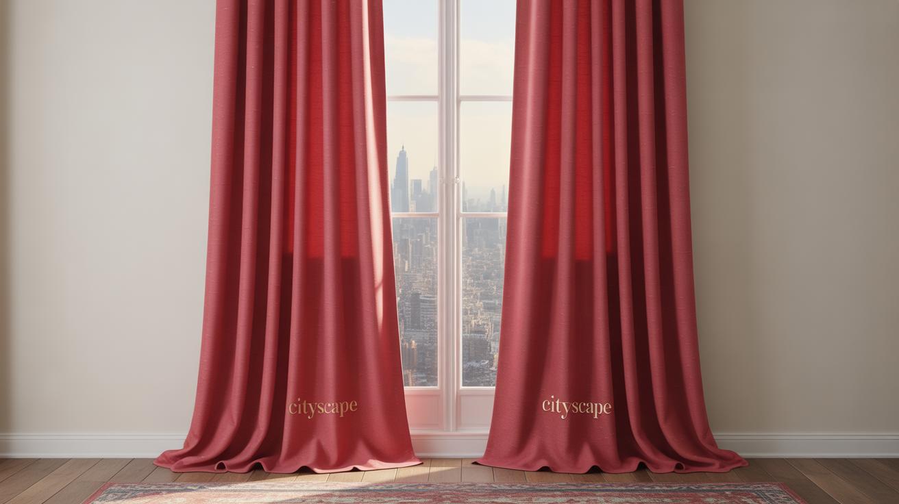
Making the most of natural light means thinking about windows and their treatments. Sheer curtains might soften harsh midday rays without muting color too much. You could also try reflective surfaces opposite the red wall to bounce light back and keep shadows balanced. But remember, a red wall in a dim room tends to swallow light, making the space feel smaller and darker—something to keep in mind for breakfast nooks or bedrooms.
Artificial Lighting Options
Artificial light comes next, and the choice between warm and cool bulbs has a bigger impact with red walls than you might guess. Warm light bulbs—those closer to 2700K or 3000K—usually bring out a cozy glow, enhancing the warmth in reds. But in some cases, warm light can muddy brighter reds, making them look almost brownish. Cool light bulbs, say 4000K or higher, can sharpen red hues, lending a bit of modern crispness.
Which to choose? It depends on the vibe you want. Warm lights pair well with classic or rustic styles, while cooler lights suit contemporary spaces. Lampshades matter too—white or cream shades help keep the light pure, while darker or colored shades might tint the red walls further, sometimes in odd ways. I once tried a deep amber shade in a red room and it threw the color off more than it added warmth.
Consider a mix: overhead lighting with warm bulbs and targeted cool LED spots for contrast. Layering light like that lets you fine-tune how your red walls feel throughout the day and night. Play around with dimmers too. Red walls react strongly to intensity shifts, so adjusting brightness can help you avoid overwhelming the room or losing the elegant depth you’re aiming for.
Furniture Choices to Highlight Red Walls
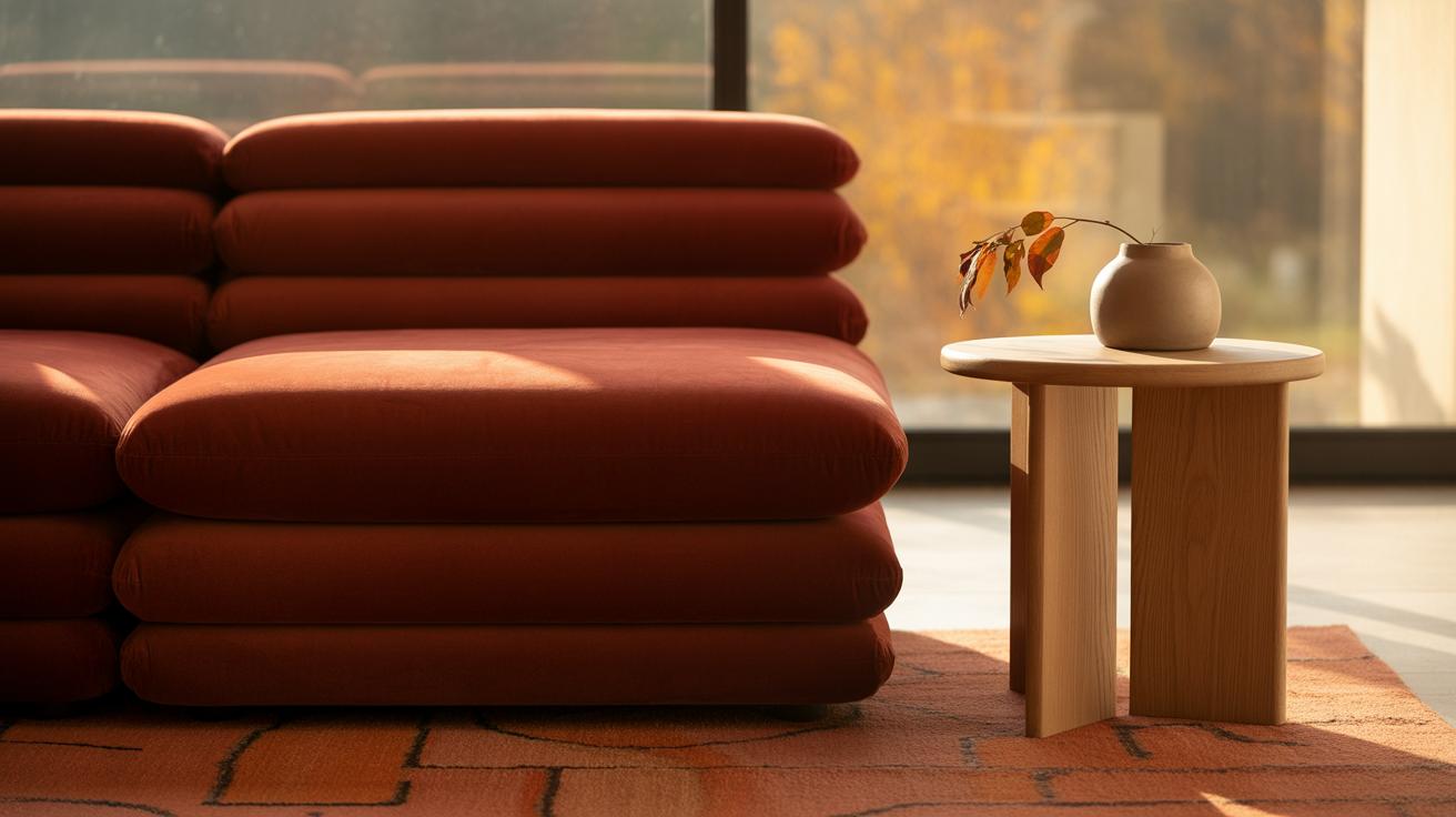
Choosing the right furniture to sit against a red wall can be a bit tricky. Red demands attention, so your furniture should either complement it or provide some visual relief. One safe bet is wood. Wooden furniture brings in warmth and a timeless feeling that tames the vividness of red without competing with it. Think of mid-tone woods like walnut, oak, or teak. They tend to sit well with red, giving the space a grounded, inviting vibe.
Neutral-colored upholstery—creams, beiges, soft greys—works well alongside wooden frames. These hues offer a subtle contrast so the red doesn’t feel overwhelming, yet the room remains cozy and balanced. I’ve noticed that purely dark woods, say ebony or espresso, can sometimes feel heavy next to red walls unless offset with lighter details elsewhere.
On the flip side, metallic and glass elements add a different kind of energy. Metal finishes like brushed brass, matte black, or even chrome introduce a sleek, modern edge. They catch the light differently, which can break up the intensity of red walls. Glass tabletops or furniture pieces add openness, preventing the space from feeling too closed in or intense. They almost reflect the color back in a softer, less dominant way.
So, if you’re debating between styles, wood and neutrals create warmth and calm, while metallic and glass weave in brightness and subtle shine. Mixing these thoughtfully might produce the balance you’re after, but be wary of going too heavy on one side. Do you want your red walls to hold the spotlight, or would you prefer the furniture to share the stage?
Decorative Elements for a HighEnd Red Wall
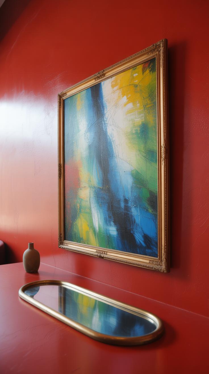
A red wall demands attention, so what you hang on it matters a lot. For artwork, try pieces with simpler color palettes or monochrome schemes. Think black and white photography or muted metallic prints. These don’t compete with the red but rather let it shine through. Large frames with clean lines work better than busy, ornate ones that might feel too much. I’ve found that abstract art with hints of gold or cream manages to stand out without fighting the wall’s intensity.
Mirrors are another way to elevate red walls. Choose frames in matte black, brushed nickel, or antique gold to add contrast. Mirrors soften the boldness of red by reflecting light, making the space less heavy. Oddly enough, sometimes a slightly distressed or textured frame adds character rather than a glossy one, which can feel too formal.
When it comes to rugs and textiles, focus on balancing warmth and softness. Pick cushions and throws that bring neutral shades—think beige, soft greys, or deep charcoal—but maybe with subtle patterns like herringbone or simple geometrics. Rugs with a low pile and understated patterns prevent the floor from competing with the wall. Overly bright or schismatic rugs can easily overwhelm.
Texture plays a big role here. Velvet cushions, nubby wool rugs, or linen fabrics give depth without busying the eye. Mixing smooth and rough surfaces creates interest. Perhaps you’ll find it tricky to stop after one cushion or throw, but layering different textures usually adds sophistication.
Maintaining and Caring for Red Walls
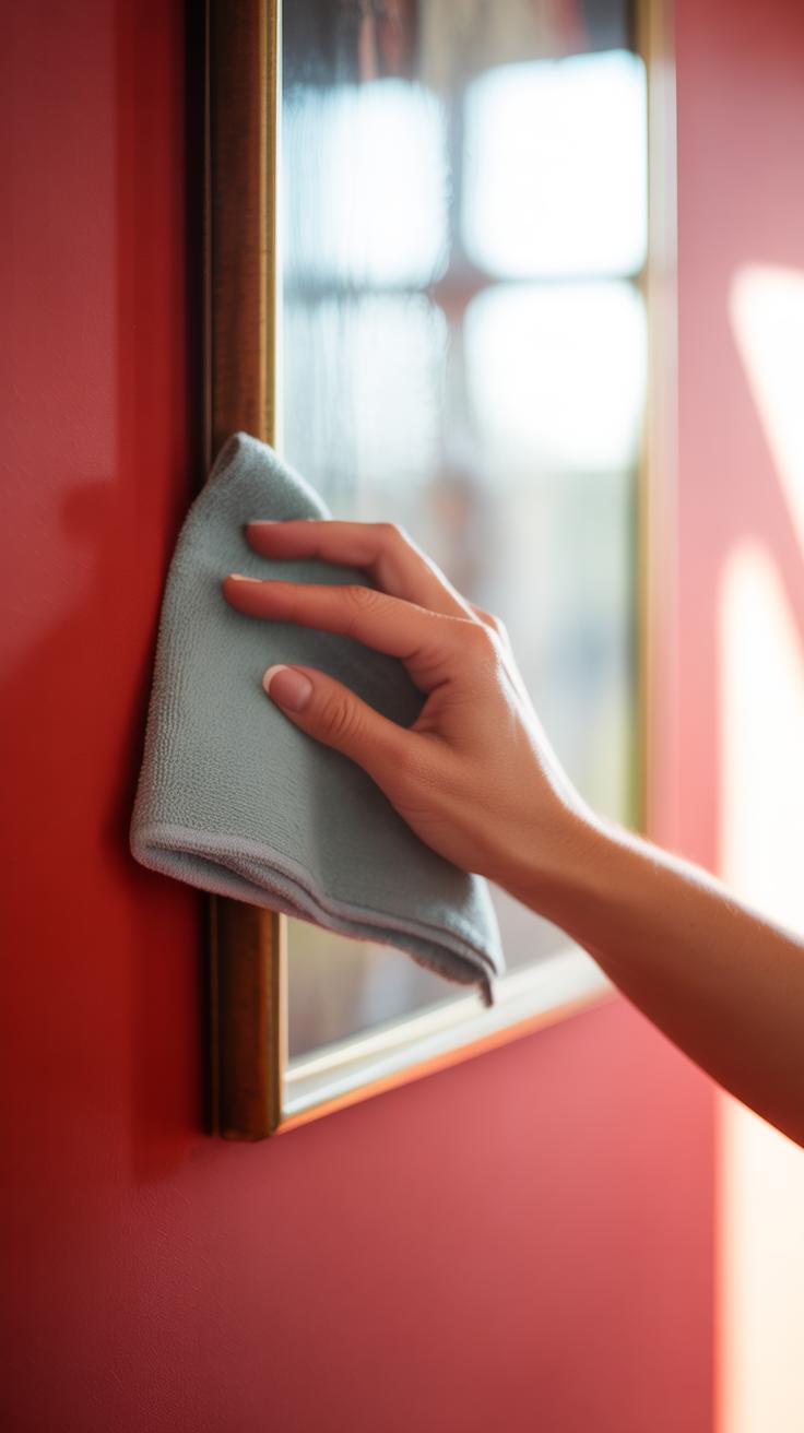
Red walls can really make a statement, but keeping them looking fresh takes a bit of effort. Over time, even the best paint can fade or pick up scuff marks, especially in busy areas. You might notice dull spots or minor scratches that can dull the whole look. What’s tricky is that red paint often shows wear more clearly than lighter colors.
When it comes to cleaning, gentle is best. Start with a soft cloth or sponge and mild soap mixed with water. Try to avoid harsh scrubbing—that can wear down the paint. Sometimes, a magic eraser might do the trick on stubborn spots, but use it sparingly, and test a small area first. You don’t want to accidentally dull the finish.
Knowing when to repaint isn’t always obvious. If you start seeing cracks or the color looks uneven, it might be time. Touch-ups require matching the exact shade and finish, which isn’t as simple as picking the color from the can. If you saved some original paint, that helps, but paints fade differently with time, so fresh paint can look slightly off.
The type of paint for touch-ups matters too. Satin or eggshell finishes work well to hide minor blemishes without being overly shiny. Sometimes repainting a whole wall is better than patching to avoid noticeable differences.
One small thing I’ve learned: controlling sunlight exposure on red walls can make a big difference. Too much direct light can fade the color faster. Think about blinds or UV-protective window films if fading seems to trouble your red walls.
Incorporating Red Walls in Modern Spaces
Red walls can make a striking impression in modern interiors. They bring a sense of depth and personality that often feels missing in minimalist or contemporary rooms. When you introduce a red wall into a sleek, modern space, it immediately adds an unexpected layer of warmth and intensity, breaking up what might otherwise seem a bit cold or clinical.
The way red fits into minimalist designs is particularly interesting. In a room stripped down to basics—think clean lines, neutral tones, and minimal furniture—a single red wall acts like a powerful focal point. It’s bold without being cluttered. You don’t need much else to make the room feel alive. I once saw a living room where one deep red wall stood behind a white sofa and a few simple black-and-white prints. It was enough to give the entire space a sharp edge without overwhelming.
On the other hand, contemporary styles use red walls differently. In rooms with modern furniture—sleek metals, glass, and understated shapes—red walls create a rich backdrop that anchors the design. Pairing them with neutral textiles like grays or taupes can balance the intensity. Or, you might see touches of gold or brass that contrast with the red, adding a touch of sophistication. Sometimes, the interplay between those materials and the red makes the room feel more curated, like every element was chosen with intention, even if it feels effortless.
Red isn’t always about making a scene; it can also shape the mood in subtler ways. Are you aiming for a cozy nook or a lively work area? The shade of red and its finish can steer the vibe differently. Matte reds mute the energy slightly, while glossy reds throw light around and add a bit more drama. And maybe that’s why red walls can be tricky but rewarding; they ask you to think about how the color interacts with everything else around it.
Conclusions
Red walls do not have to be overwhelming or hard to style. By selecting the right shade and pairing it with suitable décor, you can create a high-end look that feels inviting and stylish. Think about your room’s lighting and materials as you plan your red wall design.
Remember, your red wall is the focal point. Use it as a backdrop for carefully chosen furniture and accents. This approach will help you achieve a polished and elegant space that reflects your personal style.