Introduction
Red decor can add energy and warmth to any space. It captures attention and brings a bold touch to your home. But using red in the wrong way may make a room feel heavy and overwhelming. Exploring red decor ideas that feel fresh, not heavy, helps you strike the right balance. You can create vibrant rooms that remain comfortable and inviting.
In this article, you will find simple tips on how to use red effectively. Learn about mixing colors, picking the right shades, and incorporating red pieces that lift the mood. You’ll see how red can work in small doses or as a statement color. These ideas will inspire your decorating projects and help your home feel fresh with red decor.
Understanding Red in Interior Design
The meaning of red color in decor
Red in interior design often stirs strong emotions. It’s linked to energy, passion, and even excitement. You might find that a red wall or an accent piece can make a space feel alive, like it’s charged with some kind of urgency or warmth you can’t ignore. But at the same time, red can bring a sense of comfort and coziness—it depends on how and where it’s used. I’ve noticed rooms with red elements sometimes make people feel more alert or intensify conversation, which is why you see it often in dining rooms or social spaces. On the flip side, too much red might feel overwhelming or even stressful. It seems like red asks something of you, whether it’s attention or emotion, so it’s not a color you just walk past without noticing.
How red changes room atmosphere
Not all reds are created equal when it comes to shaping a room’s vibe. Bright reds can splash energy and playfulness into a space, but those same shades might shrink the feel of a room, making it seem busier or smaller. Deeper reds, like crimsons or burgundies, often create a sense of richness and warmth, almost like wrapping yourself in a thick blanket—comfortable but a bit heavy. Sometimes, people want a red that feels lively but without that pressing weight, and that’s where mid-tones or reds with a hint of orange can work well. I’ve noticed that in a small room, even a splash of fiery red can change the whole mood, making the space feel intense, not necessarily welcoming. There’s a balance to strike, but I think it also depends on how you respond personally—what’s invigorating for one might feel overpowering to another.
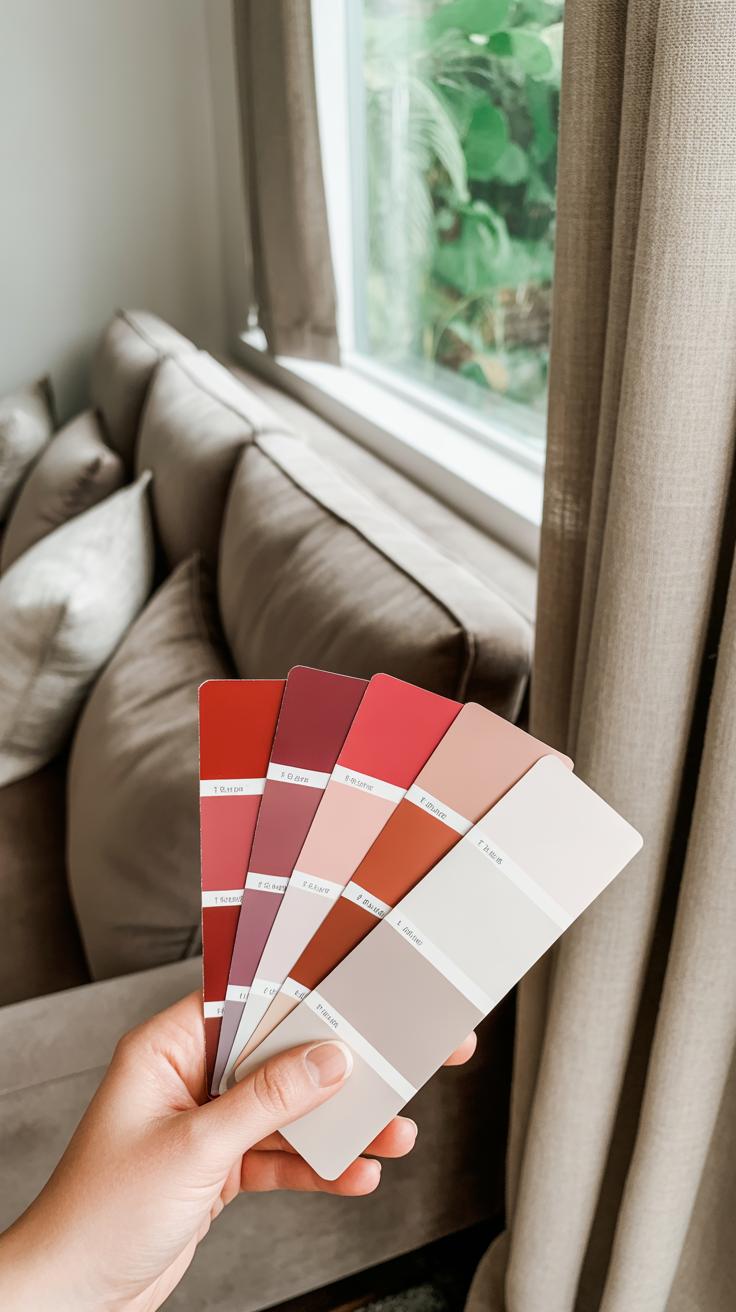
Choosing the Right Shade of Red
Bright and Light Reds to Energize
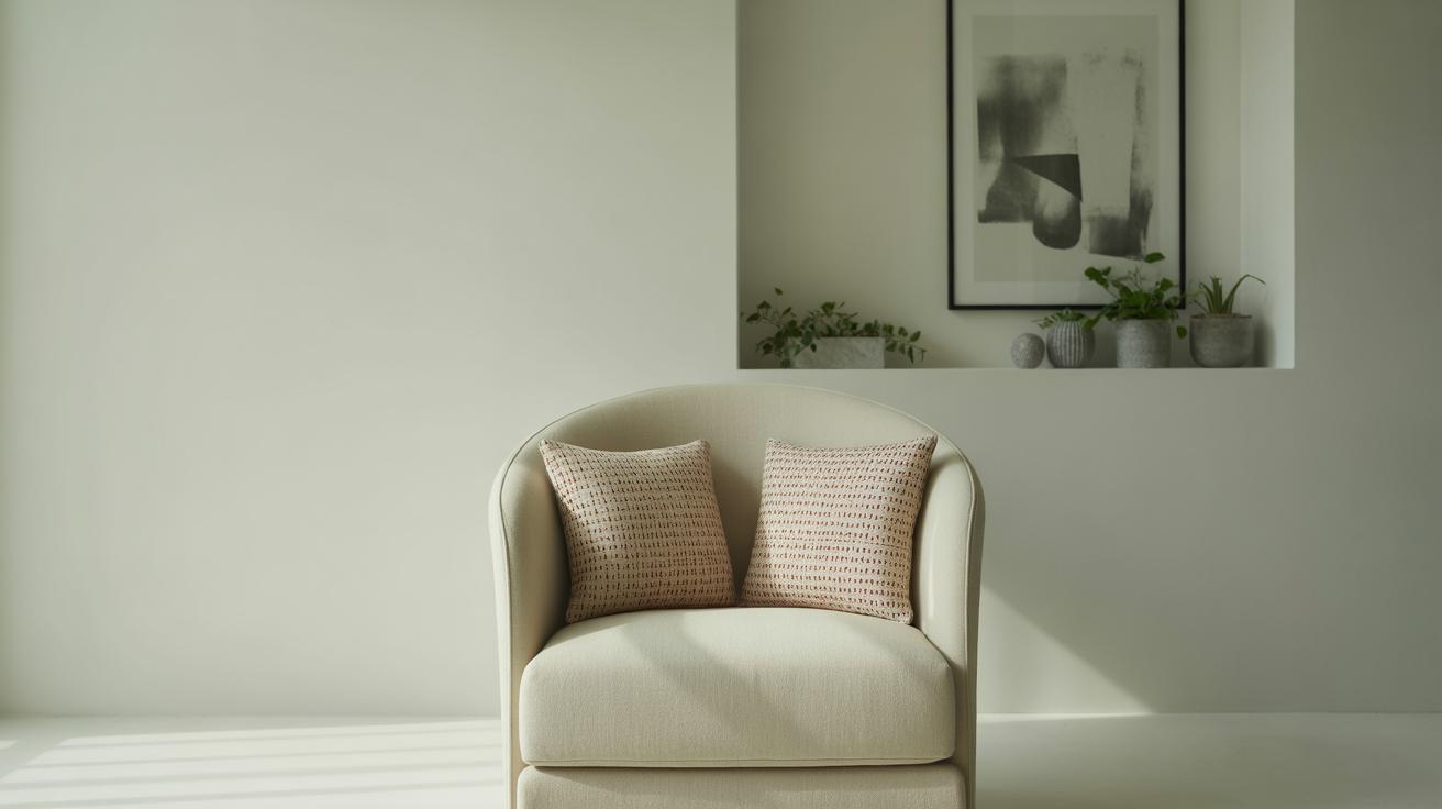
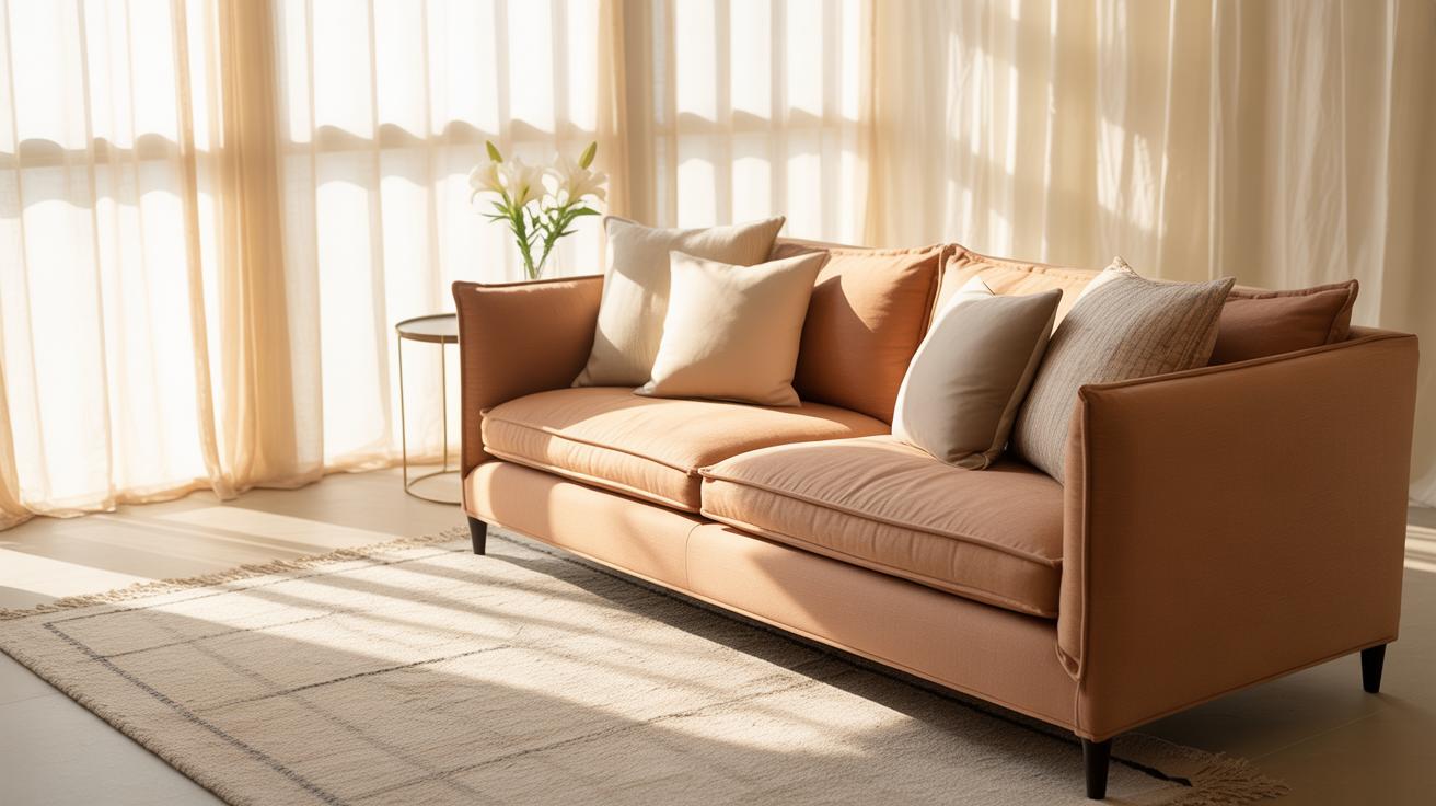
Bright reds and pinks can bring energy to a space without making it feel heavy—if you pick them carefully. Think of a cherry red or a coral shade. These colors have enough punch to wake up a room but don’t demand full attention all the time. Using these lighter reds in smaller doses, like throw pillows, artwork, or a single accent chair, can add freshness without overcrowding.
Also, pinkish reds tend to feel softer and more playful than your typical fire-engine red. They’re great for spots where you want a subtle vibrancy—a kitchen nook, perhaps, or a workspace that could use some lift. But be cautious—too much brightness can tire you out, so mixing in neutral tones or softer textures helps calm things down.
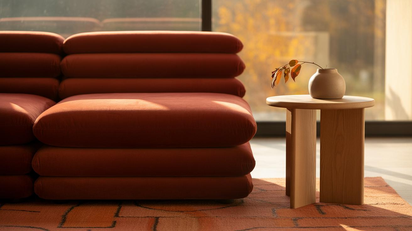
Deep Reds for Warmth and Coziness
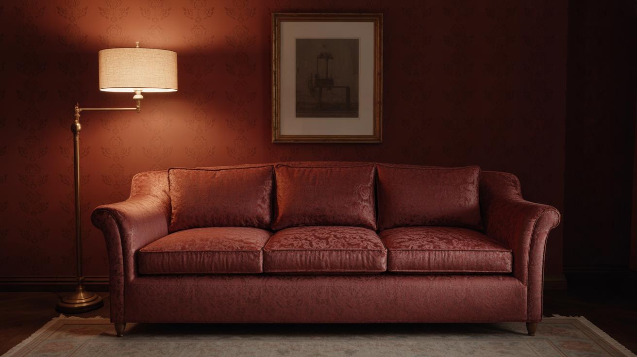
Deep reds, like burgundy or oxblood, bring a sense of warmth and comfort. They can make a room feel inviting but run the risk of looking heavy or oppressive if overused. These shades work best in spaces where you want intimacy—a reading corner, a bedroom, or even the dining room.
Balancing is key here. Deep reds need some light or cool tones nearby—think pale walls or natural wood—to stop them from dominating. You might add a textured throw or matte finishes to soften the effect. Oddly enough, these deeper reds can feel fresh when paired with unexpected elements, like a sleek metal lamp or bright, crisp linens. It’s about contrast, really.
Choosing the right red isn’t just about the color itself—it’s about where and how you use it. What mood are you trying to create? Sometimes a small splash of bright red surprises the eyes more than an entire wall of deep crimson. What’s your space asking for?
Mixing Red with Neutral Colors
When you bring red into a room, it can easily feel too strong or overwhelming. That’s where neutral colors come into play. Whites, grays, and beiges offer a kind of quiet backdrop that lets red stand out without shouting. Soft neutrals lighten the mood and make red feel more approachable, less like it’s demanding all the attention.
Think about a cozy living room with a pale gray sofa paired with a deep red throw pillow. The gray calms the intensity of the red, making the whole space more inviting. Or picture a beige wall with a red vase on a shelf—not too much, just enough to give warmth, but never heavy. It’s the kind of balance you might not notice at first, but once achieved, the room just feels right.
Textures matter too. Red velvet cushions, paired with smooth linen curtains in off-white, bring a subtle contrast that blends the colors naturally. Rougher materials like woven jute or soft wool in neutral tones can ground the space while allowing red accents to pop without feeling jarring.
- Combine red painted wood furniture with cream-colored rugs or throws to soften the look.
- Use red in small upholstery details, like a chair seat, while keeping the frame neutral.
- Mix matte and shiny textures within your reds and neutrals to keep visual interest without overload.
In practice, you’re playing with tension between bold and calm. You might hesitate with too much red, but pairing it with neutrals takes the edge off. Have you ever noticed how a simple off-white wall can completely change the mood of a red piece? It’s subtle but powerful, and it might just be this little trick that makes your space feel balanced rather than burdensome.
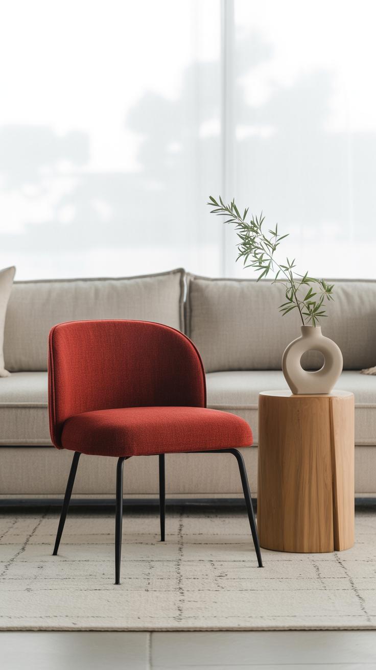
Using Red for Small Touches
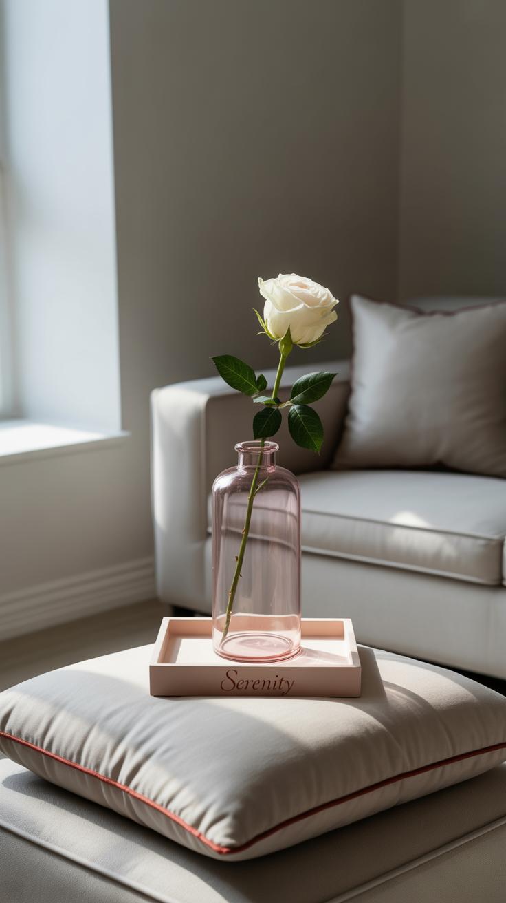
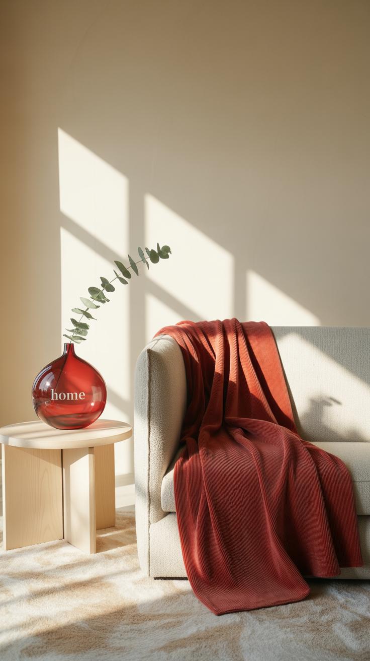
Red doesn’t have to shout to make an impact. Sometimes, just a few well-placed accents bring a room to life without feeling overpowering. Try adding red through pillows on a neutral sofa—you’ll get that pop of color that draws the eye but doesn’t take over. Small art pieces with red tones scattered on a gallery wall can refresh a space quietly. Or consider a red vase on a shelf or side table; it’s subtle but adds warmth and interest. These small touches keep things lively without going overboard.
When mixing red with other colors, it’s a good idea to think beyond just neutrals. Sometimes pairing red with soft blues or gentle greens can soften the intensity. The cool tones make the red seem less heavy, almost bright and playful instead of weighty or aggressive. You might even see how red pairs surprisingly well with unexpected shades like taupe or muted yellow, adding freshness without clutter.
It’s tricky sometimes; you want red to stand out, but not feel out of place. So, ask yourself: how much red is too much? Is that red pillow balancing the room or tipping it? You might find it’s easier to start small and add more little red accents over time, feeling out what works rather than committing to one bold piece right away. It’s a subtle art, but red in small doses often feels the freshest of all.
Red in Different Room Types
Red in living rooms
Red in living rooms can really spark energy in a way that feels lively without going overboard. It’s tricky because you want the space to feel inviting and warm, not like you’re stepping into a fire engine. I’ve seen spaces where a red accent wall or a few red cushions can lift the whole mood, especially in rooms with lots of natural light.
Try these ideas to keep red balanced in social spaces:
- Use deep reds like burgundy for subtle richness rather than bright crimson that might shout too loudly.
- Scatter small red elements, such as throw pillows or artwork, to catch attention without demanding it.
- Pair red with neutral tones—think soft grays or warm beiges—to calm the intensity.
- Consider red in lampshades or vases where the color feels like a deliberate touch, not a takeover.
Sometimes I found that too much red can exhaust the eye after a while. But when done thoughtfully, it keeps gatherings charged and conversations flowing. Red in living rooms feels fresh when it’s part of a thoughtful rhythm, not the star of every piece.
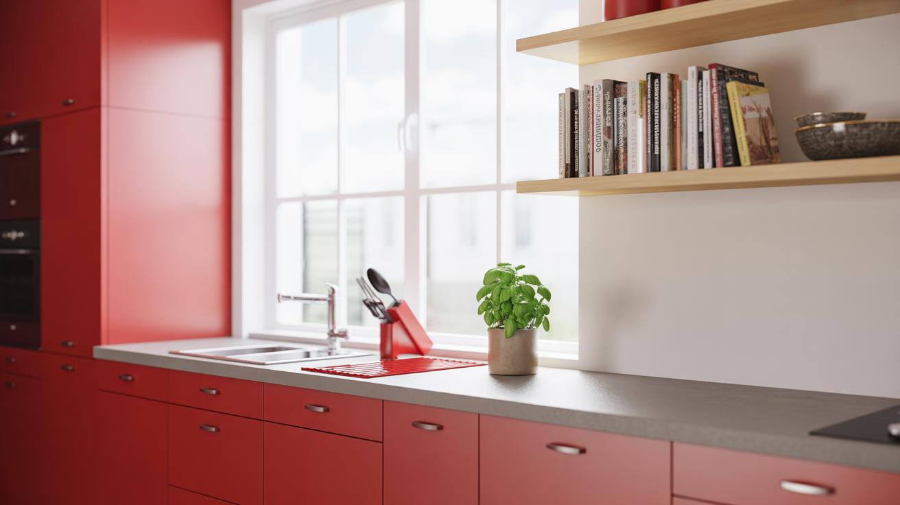
Red in bedrooms and kitchens
In bedrooms, red has a different role. It’s more personal, more subtle maybe. You want to avoid red making the space too stimulating, or you might find it harder to wind down. But a bit of red can add warmth and even a sense of intimacy. A red throw blanket or a patterned rug can do that without turning the room into a “red room.” I guess it’s about choosing pieces that invite comfort, not adrenaline.
Kitchens, on the other hand, kind of welcome red naturally. Think red utensils, a kettle, or even cabinetry detail. Red is linked to appetite and activity, so it kind of encourages movement and energy where it’s needed. But again, too much can feel overwhelming when you’re trying to focus on cooking.
Some practical tips:
- Add red backsplash tiles in small patches rather than full walls.
- Use red as a pop in open shelves or small appliances.
- Pick red dining chairs to invite liveliness without cluttering the visual field.
In both bedrooms and kitchens, red works best when it thinks about the room’s purpose. Maybe you want energizing in the kitchen, cozy relaxation in the bedroom. And in both, red should feel intentional, not accidental.
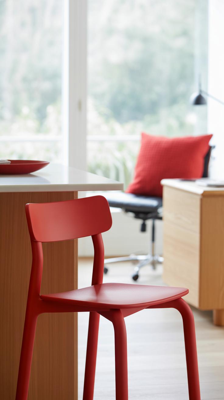
Red Furniture Ideas
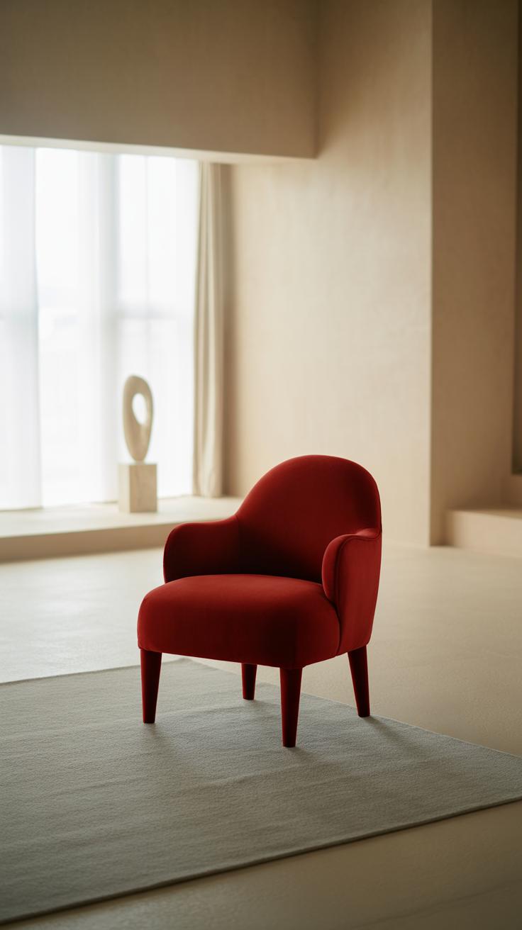
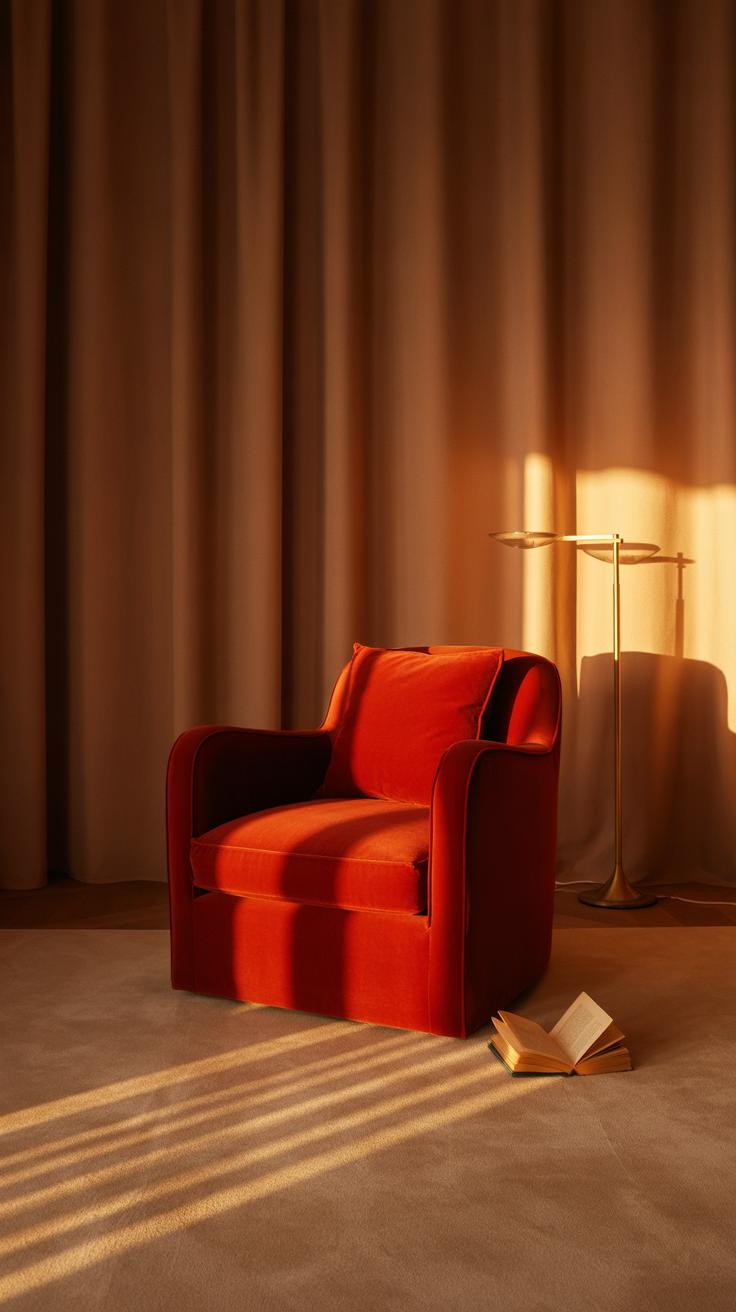
A red sofa or chair instantly draws your eye, becoming a fresh focal point in a room. It doesn’t just sit there; it commands attention without necessarily overpowering everything else. When I first placed a deep red armchair in my living space, it shifted the entire vibe—suddenly, other colors felt more alive, and the room seemed less predictable. That’s the kind of subtle impact red furniture can have.
But picking red furniture isn’t about grabbing the brightest shade and calling it a day. Think about the tone of red—whether it’s a soft brick, a muted cranberry, or a bold scarlet. Each sets a different mood and works with different styles.
Mixing Red Furniture with Other Elements
To avoid red furniture overwhelming your space, pairing it with neutrals often works best. Creamy whites, cool grays, or earthy browns can soften the intensity while letting red stand out. For example, a red sofa against a light gray wall feels balanced, not confrontational.
You might also play with complementary colors, like touches of blue or green in cushions, rugs, or art. These contrasts add interest without turning the room into a clash of loud colors. Sometimes, layering textures helps too—like a red leather chair next to a soft beige throw or a wood coffee table, which anchors the bold color.
But here’s the tricky bit: red can feel both warm and cold depending on the shade and context. So, don’t rush to match everything perfectly. Sometimes leaving a little visual “breathing room” around the red piece creates that fresh, alive feeling you’re after.
Red Wall Decor Choices
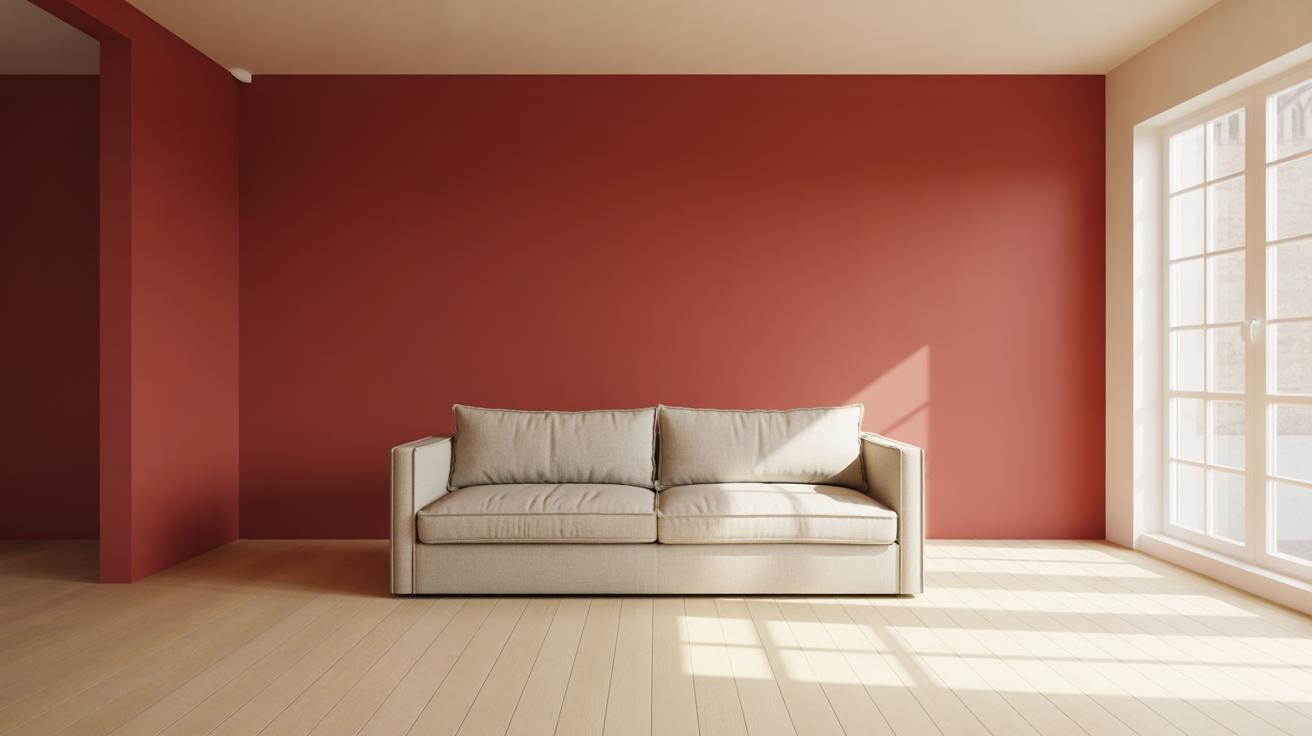
Painting a wall red can feel intimidating, especially if you worry the color will make your room seem smaller or heavier. But picking the right shade—think softer reds, like terra cotta or muted tomato—can actually open up a space more than you’d expect. Pairing red walls with plenty of natural light or bright, neutral trims helps keep things airy. I once tried a deep brick red in a boring, north-facing room and was surprised how it felt cozy without closing in.
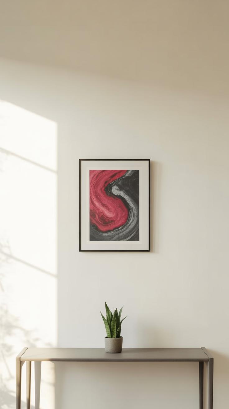
When it comes to red wall art, don’t feel you have to go big or bold all at once. A single red canvas or print can serve as a focal point without dominating. Red floral prints or abstract splashes work well because they spread the color in ways that feel organic rather than overwhelming. Pair these with simple frames, and you have a pop that feels intentional but not shouty.
Wallpaper is another way to bring in red without painting entire walls. Patterns with reds mixed in—like subtle geometrics or soft stripes—add rhythm to a room. It’s a bit easier to change wallpaper than commit to paint, so you can experiment. You could even wallpaper a single accent wall for a fresh vibe that doesn’t crowd the room. Sometimes, I think wallpapers can feel tricky, yet the right pattern really adds life without just covering walls blindly. It’s worth trying.
Incorporating Red Textiles
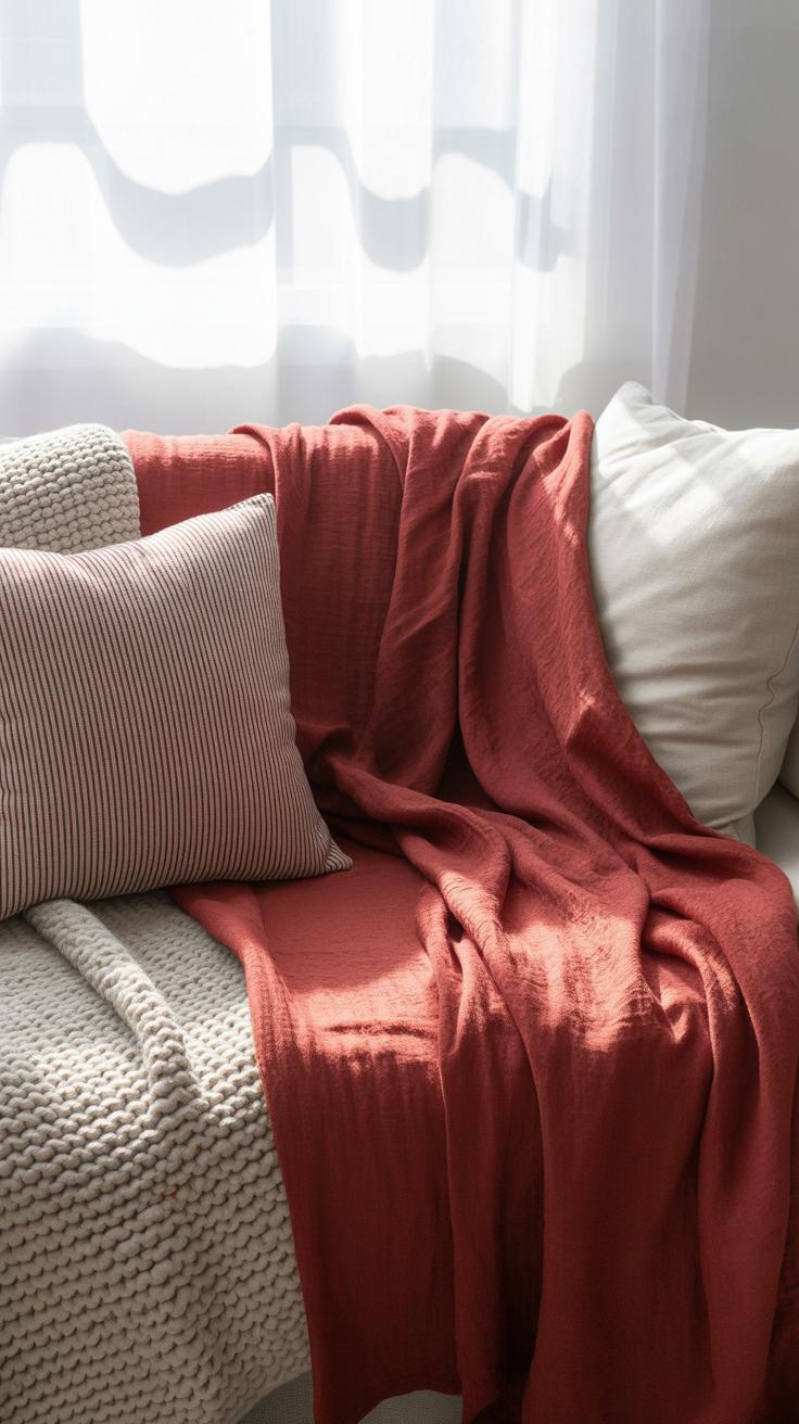
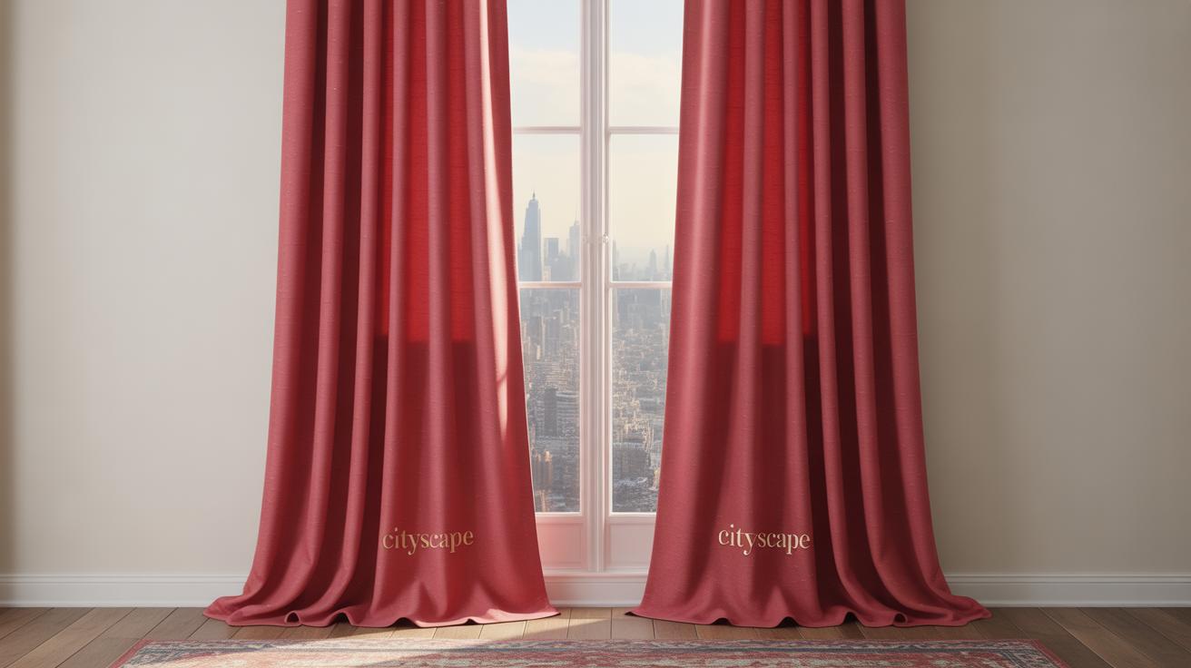
Red textiles—think curtains, rugs, or cushions—can instantly warm up a room without making it feel too heavy, but it’s a fine line to walk. Choosing the right fabrics can soften red’s intensity. For example, lightweight red curtains in a slightly sheer material let light filter through, which prevents the color from dominating the space. On the other hand, a deep red rug with a textured weave can ground a room nicely, especially if the rest of the décor keeps to neutral or softer tones.
Mixing patterns with solids is another approach that works well here. You might try a red floral or geometric pattern on pillows combined with solid-colored furniture or drapes. That contrast helps the red stand out but keeps the overall look from feeling cluttered. Sometimes, patterned reds feel more playful and less overpowering than big blocks of one shade. I’ve noticed that using red patterned fabrics with a touch of white or beige brings a sense of balance that feels fresh, not overdone.
Ask yourself: does your red textile choice create a focal point or just add background warmth? Playing with scale is key—larger patterns can energize, while smaller motifs tend to calm. It’s tricky but worth experimenting to see what makes you, well, feel comfortable in the space over time.
Lighting to Complement Red Decor
Natural Light Benefits
Natural light works almost like a secret weapon when you have red decor. It highlights the richness of red without letting it feel too heavy or oppressive. You might notice how a room with ample daylight makes red tones look lively rather than dull or dark. There’s just something about sunlight that brings out layers in reds—subtle shades that artificial light often misses.
Of course, it depends on where your windows face. Morning light tends to be softer, giving red a gentle glow, while afternoon sun can make red pop strongly, which might be too much if you’re sensitive to brightness. If you’re unsure, try leaving sheer curtains on windows to soften the light. That balance helps keep your space feeling open and airy, even when reds are bold.
Artificial Lighting Tips
When natural light isn’t enough or at night, the kind of bulbs and fixtures you choose really influence how your red decor feels. Warmer bulbs—think in the 2700K to 3000K range—tend to blend well with red, but sometimes they push it towards looking too intense or almost orange. If you want a fresher vibe, cooler LED bulbs around 3500K can soften red’s warmth and make the room feel less heavy.
What about fixtures? Lighting that spreads light broadly avoids harsh shadows on red surfaces, which can otherwise make reds look patchy or overwhelming. Consider layered lighting: overhead fixtures paired with wall sconces or lamps that add dimension without overdoing it. Adjustable lamps are handy too, letting you change the focus depending on the time of day or mood.
In my experience, combining natural daylight with well-chosen artificial lighting stops red from dominating. Sometimes, subtlety in lighting is the key to letting those reds breathe. Do you find yourself noticing how light changes your mood around color? It’s worth experimenting a little—you could stumble on a setup that makes red feel just right, not crushing.
Personalizing Your Red Decor
Picking red decor that truly fits your personality can be tricky. Red isn’t just one color—it ranges from warm, rusty tones to bright cherries and deep crimsons. Think about how red makes you feel. Do you want bold statements or quieter hints that show up here and there? It’s okay if you’re still figuring it out. Try small pieces first—a red throw pillow or a vase. See what feels right for your space and your day-to-day life.
Reflect on your lifestyle too. If your home is often busy and bustling, maybe calm, muted reds work better than flashy reds that shout for attention. Sometimes, I’ve found that a glossy red object feels exciting for a few weeks, then it just sits there, unnoticed. So consider durability and your energy around the space.
Refreshing red decor doesn’t have to mean overhauling everything. Swapping out covers or moving certain objects around can make a room feel different without draining time or money. Seasonal updates might help—switching to warmer reds in winter, lighter reds in spring. Or, pair your red with different accent colors over time. It’s okay if your tastes shift a bit. Red can follow you, changing as you do.
Have you noticed how some red pieces suddenly stop feeling right? It happens—red’s impact can feel heavy if you don’t update thoughtfully. Think about versatility when choosing items. Maybe a red lamp with a neutral base or red dishes that work with varying settings. This way, your red decor grows with you, not against you.
Conclusions
Choosing red decor with care changes how a room feels. Using light updates, mixing red with softer colors, and selecting the right reds keeps the energy bright, not heavy. Remember, small touches can add interest without overpowering your space. You can balance boldness with calmness for a look that lasts.
Try the ideas described and explore how red makes your space uniquely yours. As you decorate, think about your personal style and the statement you want to make. With fresh approaches, red decor can bring color and joy without weighing you down.