Introduction
Red wall art can add a bold and vibrant touch to any room. It is a powerful color that draws attention and brings energy. Choosing the right red wall art helps you to finish your room beautifully and make it stand out without overwhelming the space.
In this article, you will find practical ideas on using red wall art. You will learn how to select pieces that fit your style, arrange them for maximum impact, and combine them with other elements in your room. These tips will inspire you to add a unique and lively finish to your home.
Understanding The Impact Of Red In Wall Art
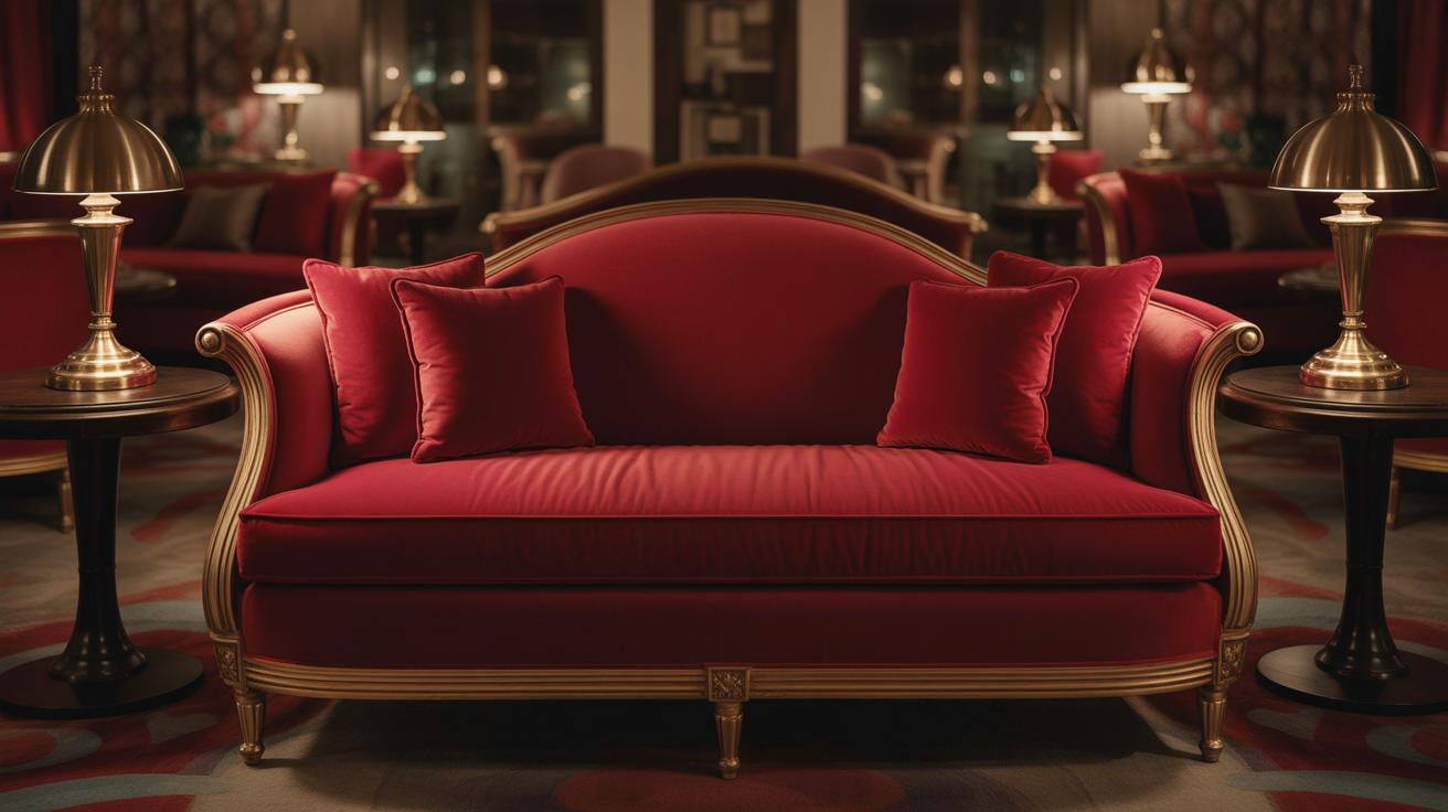
Red is a color that grabs attention. When used in wall art, it often stirs a strong reaction—sometimes energy, sometimes tension, sometimes warmth. Many people feel a quickened pulse around red, and it’s no surprise. Psychologically, red is linked to excitement and passion. It can make a room feel alive or even a bit intense. At the same time, red brings warmth, creating an inviting space that draws you in rather than pushing you away.
Think about how a simple splash of red in a painting can suddenly make a room feel more personal, as if the art holds emotion and movement. It’s that mix of power and coziness that makes red so unique. On the other hand, it can feel overwhelming if overdone—sometimes the same energy that’s invigorating can become too much.
Why Choose Red For Wall Art
People pick red wall art for very clear reasons. It establishes a focal point quickly. Walk into a room with red on the walls or in a piece of art, and your eyes are drawn there, without effort. It also adds energy, which is why many use red in social spaces like living rooms or dining rooms.
The moods red creates can vary wildly, depending on the shade, style, and setting:
- Deep reds often feel rich and passionate, perfect for creating drama in a study or bedroom.
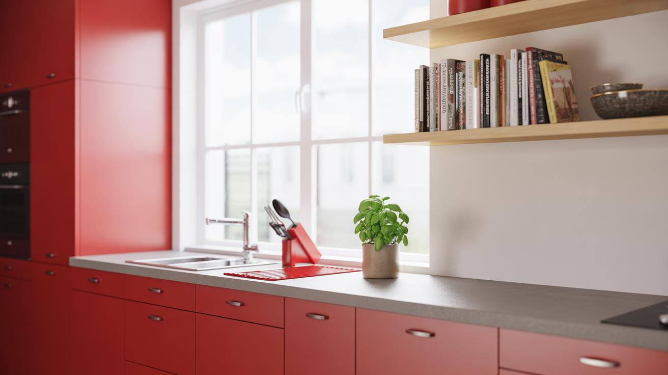
- Bright reds infuse a playful intensity, lighting up kitchens or home offices.
- Muted, rusty reds lean toward warmth and nostalgia, fitting in cozy, rustic spaces.
Red’s boldness means it’s rarely a subtle choice. But that’s exactly why it appeals—it’s not shy.
How Red Influences Room Atmosphere
Introducing red art to a room changes the feel in almost undeniable ways. Small rooms might feel a little smaller or busier with lots of red, so it’s often better to use red art as a single highlight rather than covering a whole wall. Bigger spaces can handle larger or multiple red pieces, which can keep the room from feeling cold or empty.
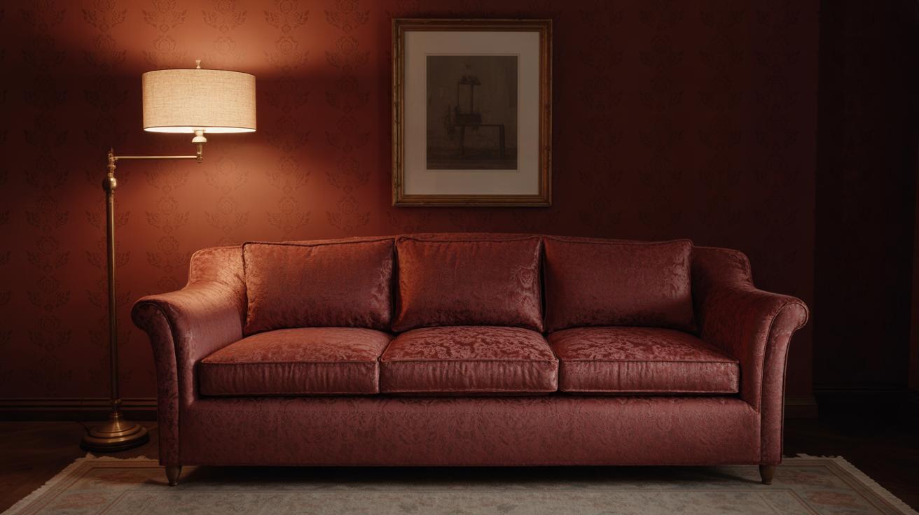
Light plays a role too. Natural light tends to soften red’s intensity, making it appear warmer and less aggressive. In dimmer rooms, red art can seem heavier, demanding more attention without relief. When I tried a large red canvas in a north-facing room, it gave the space warmth I hadn’t expected, but it also felt like it pressed in on me a little.
Matching red wall art with neutral tones offers balance. Pairing red with whites, greys, or even natural wood tones helps temper it, making the energy approachable rather than jarring. So, how much red feels right? That might depend on your mood on any given day—or just how much you like being surrounded by passion and energy.
Selecting The Right Red Wall Art Pieces
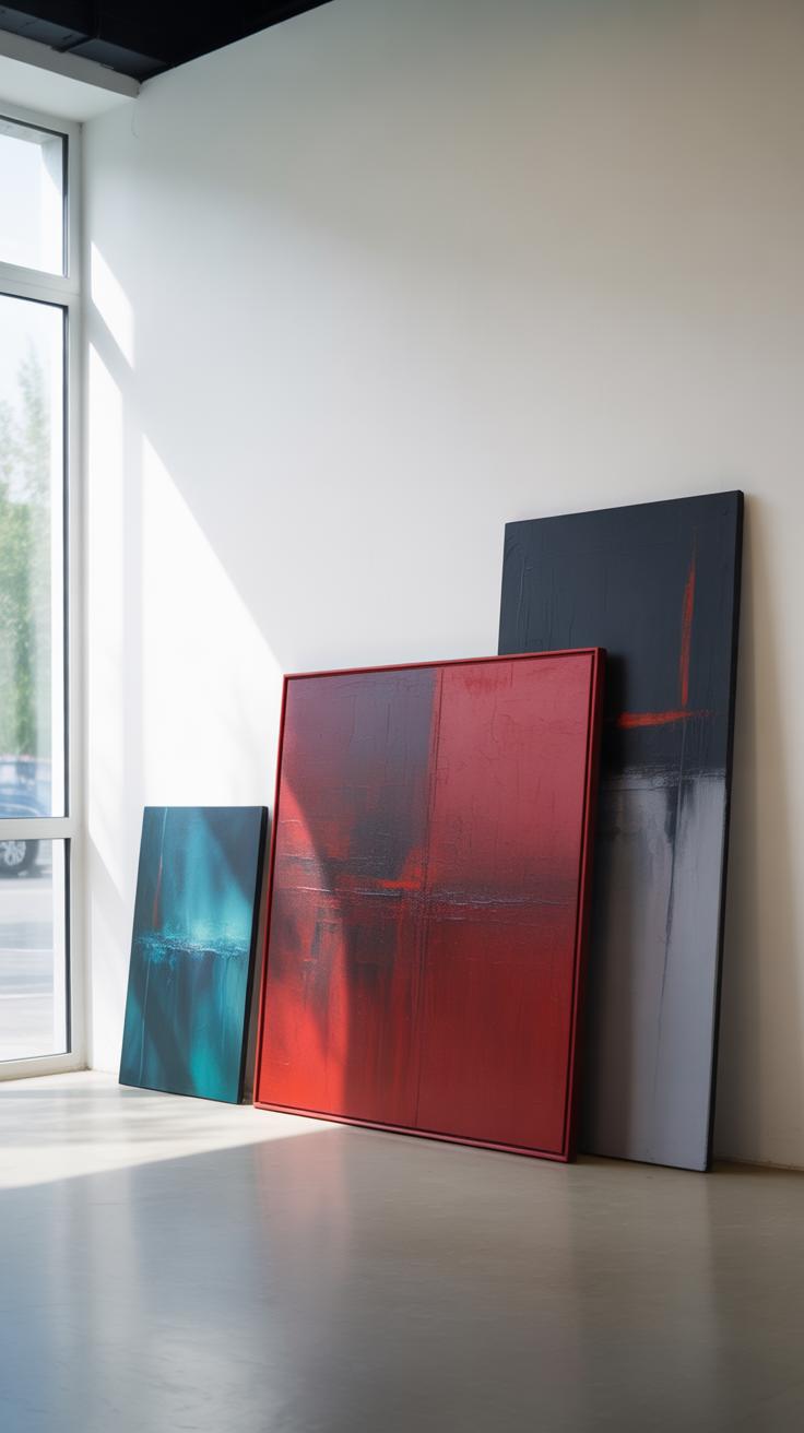
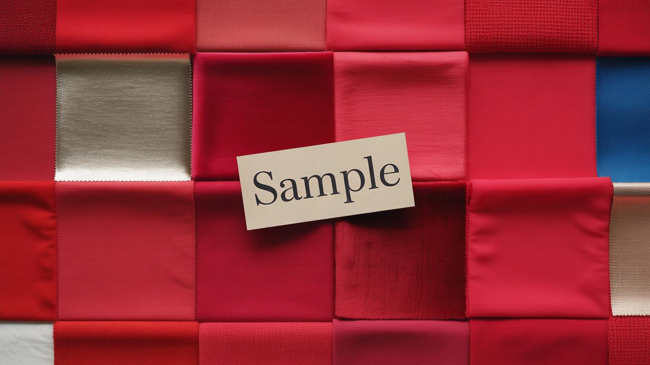
Choosing red wall art can feel a bit tricky, especially when you want it to complement your room’s size, style, and color scheme. Start by thinking about the type of red art that resonates with you. Paintings tend to bring texture and depth—whether they’re abstract splashes of bright red or detailed still lifes. Prints offer versatility and often are easier to switch out if you want a fresh look. Mixed media pieces combine materials and can add an unexpected dimension, which sometimes works well in eclectic or modern spaces but might feel out of place elsewhere.
Matching the art style to your existing decor helps avoid clashes. A sleek, modern sofa works better with bold, minimalist red art, while traditional rooms often call for classic prints or more ornate paintings. Eclectic spaces? They can sometimes handle quirky or fragmented red pieces—but be careful not to overcrowd the visual field. Look at your furniture finishes, patterns, and colors. Does your room have warm tones or cooler hues? A cooler tone with red art can create contrast, but too many reds might overwhelm.
Size matters. Large walls invite big statement pieces that draw the eye, but smaller walls might only need a subtle red accent. If your space feels cramped, one oversized red canvas may feel suffocating rather than stylish. On the other hand, a cluster of smaller red pieces can inject energy without dominating. Your safest bet might be to measure your wall, then imagine the art’s scale to help decide. Sometimes a bold red frame around a modest print can make a small piece feel substantial.
Placing Red Wall Art For Maximum Effect
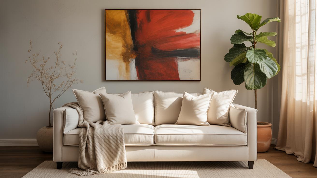
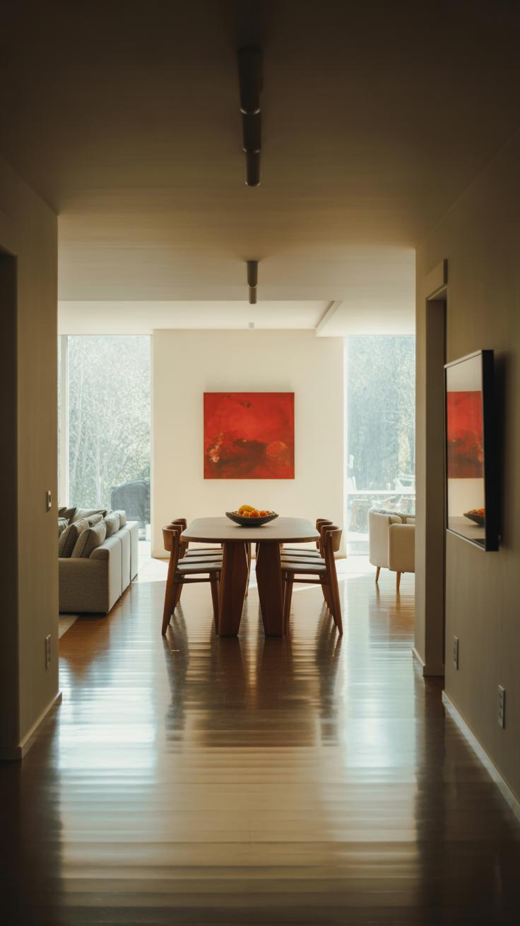
Red wall art brings energy and focus to a space, but where you hang it really shapes its impact. Focal walls naturally draw the eye, so placing bold red pieces there feels like a smart move. Think of the wall behind a sofa or the largest blank wall in your living room—this spot lets the art dominate without competing. But don’t limit yourself. Hanging red art above furniture like a console or fireplace can anchor the piece, making the entire area feel pulled together.
Sometimes, the most memorable use of red art happens in unexpected places: above a hallway bench, inside a powder room, or even over stairs. These surprising spots catch people off-guard, creating little moments of visual joy. I once placed a vivid red abstract print above a narrow shelf in a reading nook, and it completely transformed that otherwise overlooked corner.
Highlighting Focal Points
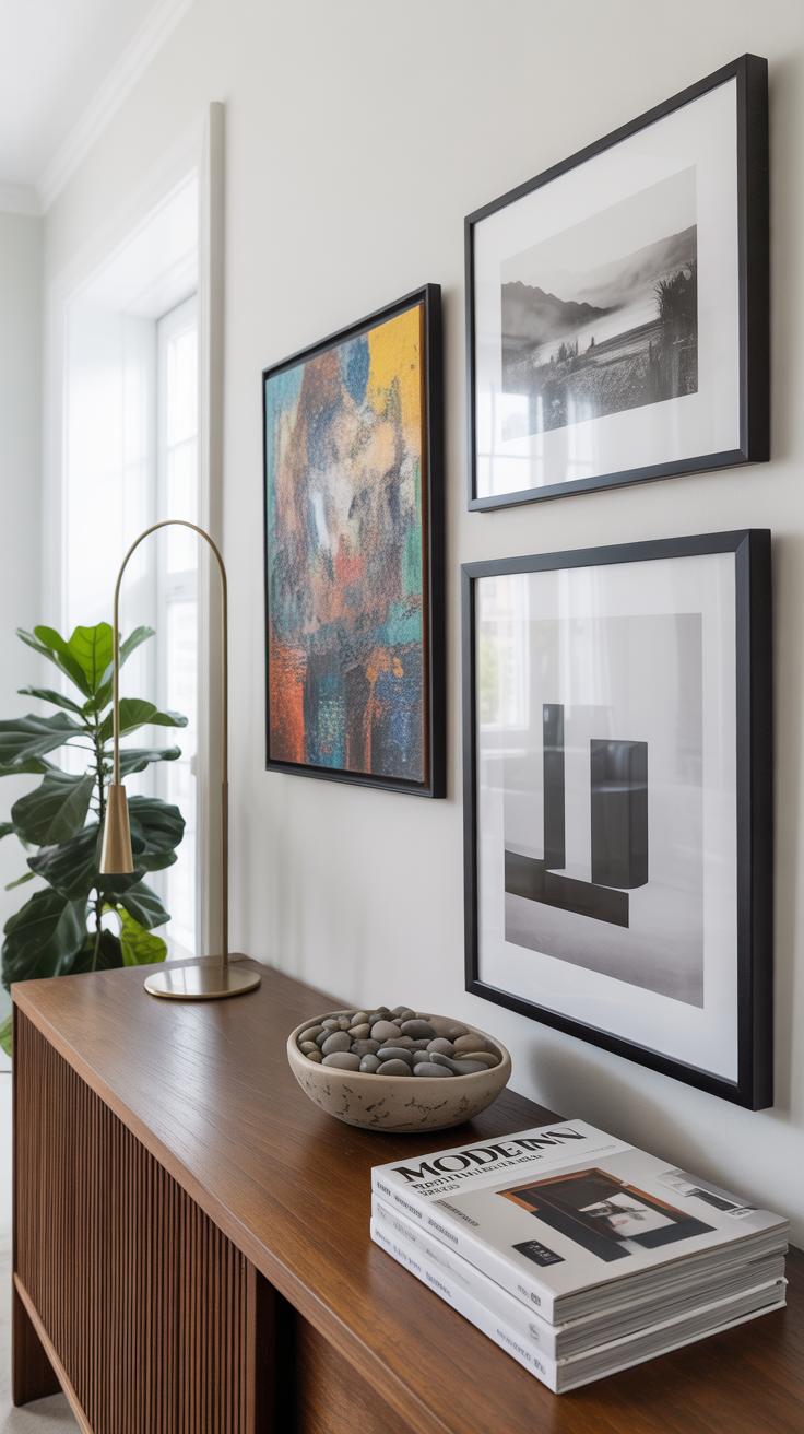
To highlight key areas such as an entryway or the main living wall, consider hanging your red art at eye level—usually around 57 to 60 inches from the floor to the center of the piece. This height comfortably meets the average visitor’s gaze without strain. When working with multiple pieces, leave about 2 to 4 inches between frames to allow each artwork room to breathe yet maintain a connection.
In entryways, a striking red piece becomes a statement, setting the tone for the entire home. In living rooms, groupings of red prints can emphasize seating zones or break up large expanses of wall. Try mixing sizes but keep the spacing consistent to avoid chaos.
Creating Balance With Other Room Elements
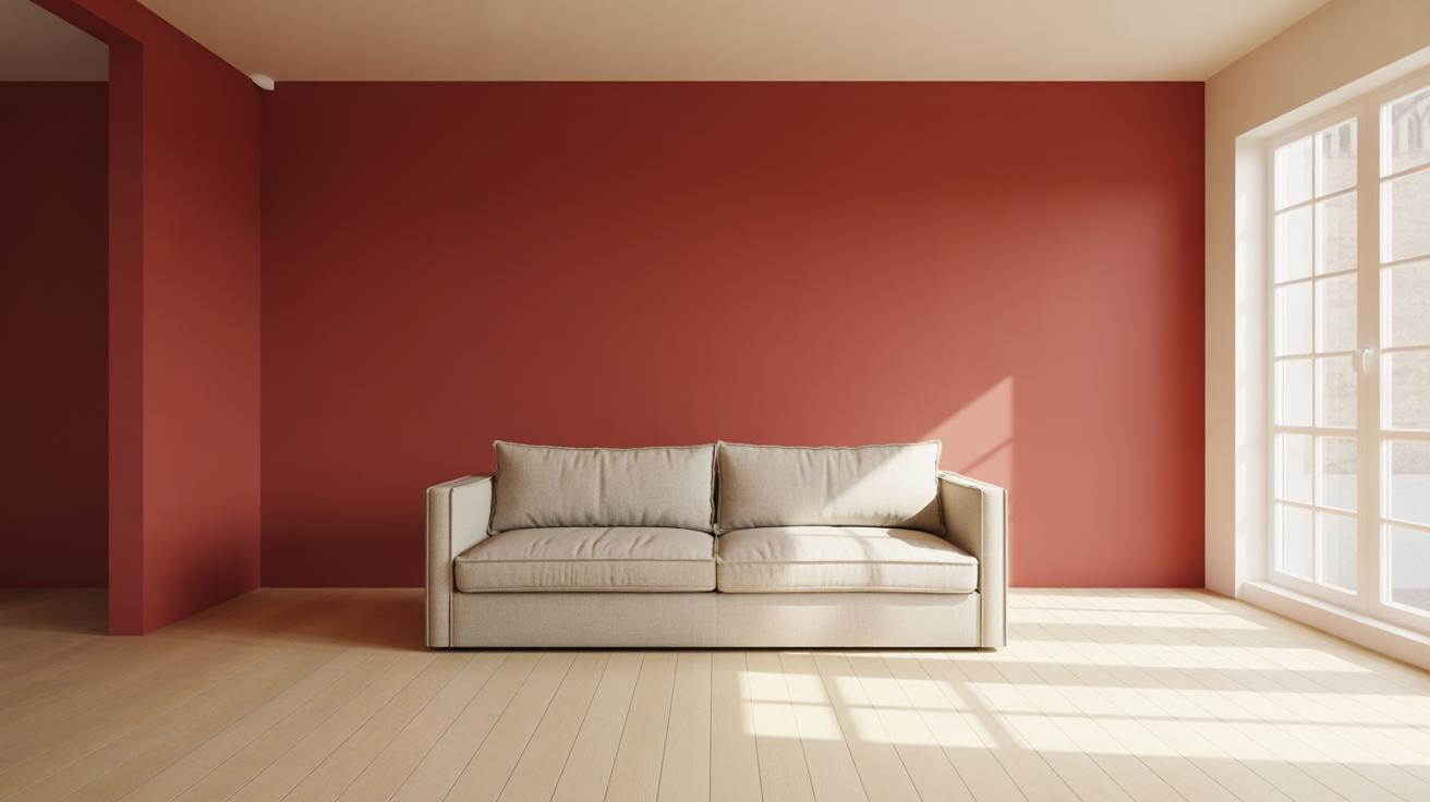
Red demands attention, so balancing it with neutrals is usually wise. Soft grays, creams, and browns mellow the intensity and let your art shine without overwhelming. If the walls or furniture are already bold, position your red art so it complements rather than competes.
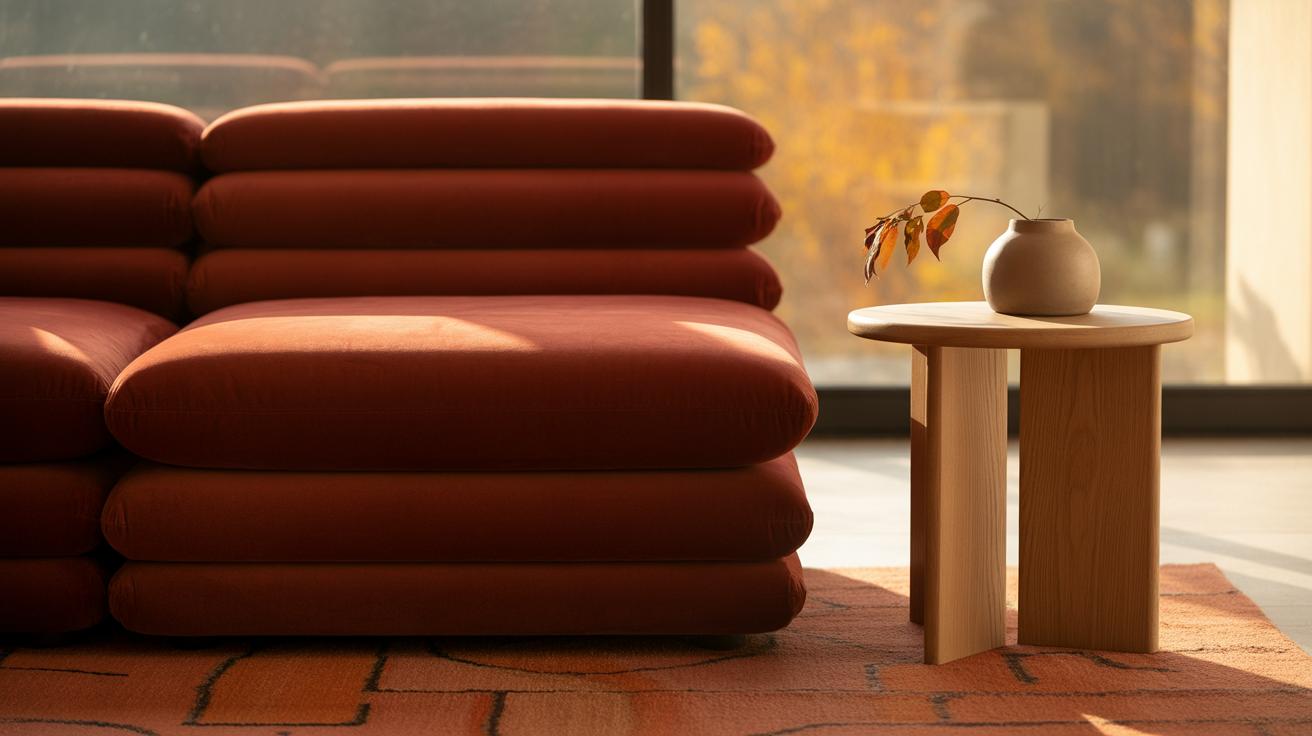
Textured elements, like woven rugs or linen cushions, provide a subtle counterpoint to smooth, shiny red surfaces. Natural light plays a role, too. A spot flooded with daylight makes red tones appear warmer and more inviting; in dimly lit spaces, red art can feel heavier. I’ve found that layering light and texture around red art prevents it from dominating a room the way it might if left on a flat, stark surface.
Combining Red Wall Art With Other Colors
Using Neutral Backgrounds To Enhance Red
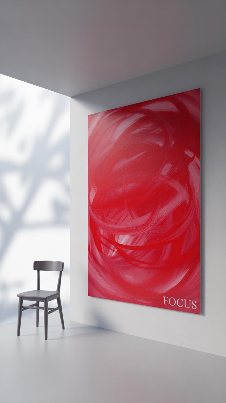
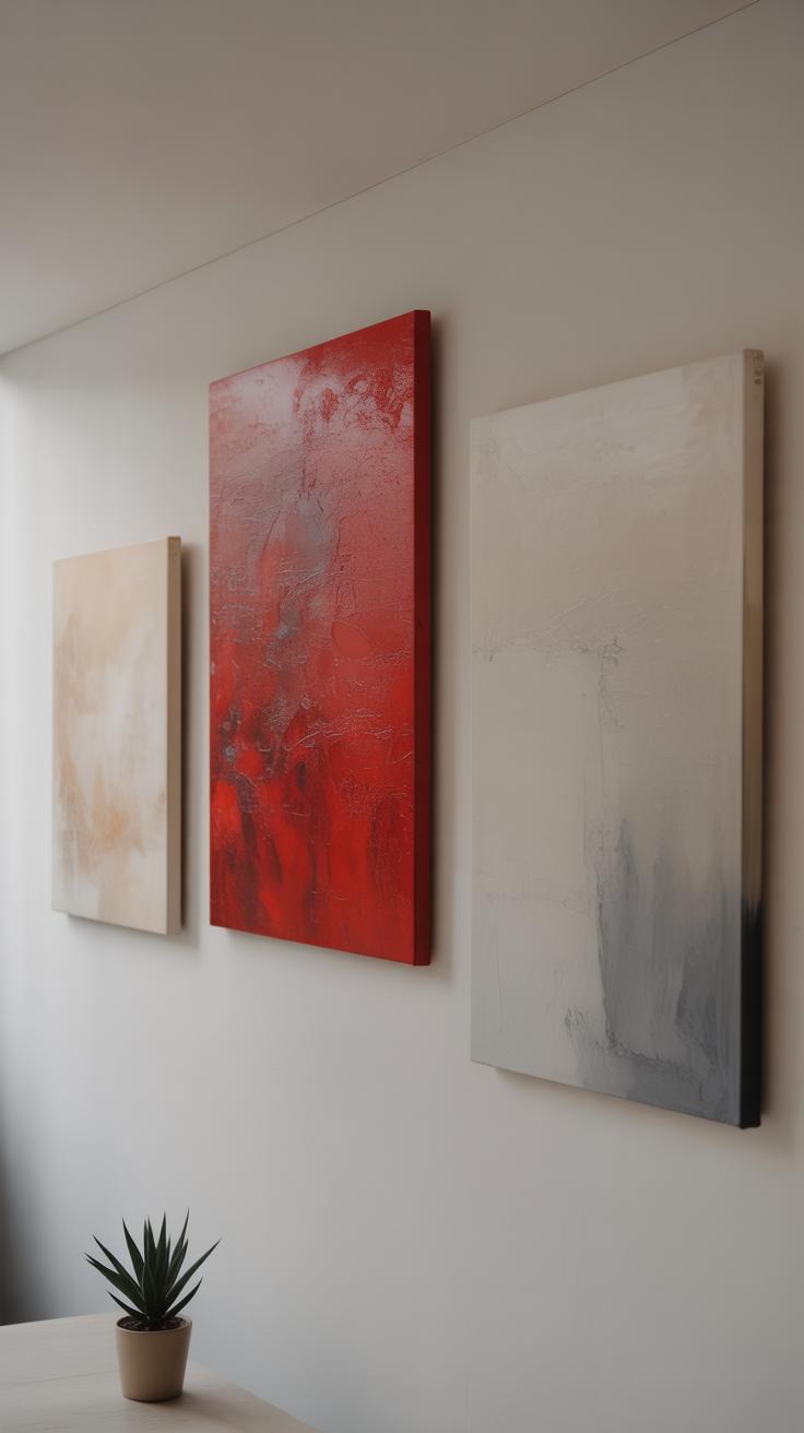
Red has this way of demanding attention, but it really needs the right stage. Placing red wall art against neutral walls—think white, soft grey, beige, or pale tones—lets the color pop without overwhelming the room. I’ve noticed that white backgrounds often give red a clean, fresh look, almost like it’s glowing. Grey tones add a bit of sophistication, while beige or warmer neutrals lend a cozy, inviting feel.
These neutral shades don’t compete with red; instead, they gently push it forward, making the artwork the star. So, if you want your red piece to catch the eye immediately, keep the wall simple. It’s tempting to experiment with patterned or textured walls, but sometimes less is more here. The contrast helps you avoid the room feeling cluttered or chaotic, which can happen if too many strong colors are fighting for attention.
Pairing Red With Other Bold Colors
Mixing red with other bold colors isn’t as tricky as it sounds, but it’s a bit like cooking—you have to watch your portions carefully. Blue and green are classic companions. Because they’re cooler tones, they can balance red’s heat without dulling it. For instance, a deep navy sofa with red artwork overhead can look grounded and exciting at the same time.
Metallics, like gold or brass, can add a subtle shimmer that complements red’s intensity. A red painting framed in gold, for example, often feels richer and more layered.
That said, too much bold color together can feel chaotic, or just plain tiring to be around. If the red wall art is large or very vivid, scale back other colors in the room. Maybe keep furniture neutral and save interesting cushions or lamps for blue or green. Playing around with this balance can really pay off, but if you go overboard, it might clash or fight for attention—and I can’t say I’ve found a hard rule that fixes that. Sometimes it just comes down to trusting your eye and tweaking things until they feel right, even if logic suggests otherwise.
Incorporating Red Wall Art In Different Room Types
Red Art In Living Areas
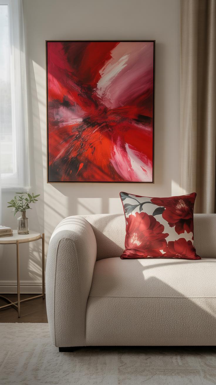
Red wall art naturally draws attention in living rooms, giving these shared spaces a sense of warmth and liveliness. It can energize conversations or add a splash of excitement to a neutral palette. Placing a bold red painting above a sofa or near the fireplace often becomes a focal point that invites people in.
You might want to try abstract or geometric styles for livelier vibes, or even cultural prints that bring personality and depth. Large-scale pieces work well here since living rooms usually offer space to breathe and showcase the artwork. But then again, a thoughtfully grouped gallery wall with different red accents can create an interesting rhythm and prevent one piece from overwhelming.
One thing I find curious is how red encourages social interaction—maybe it’s something subtle about the color influencing mood? Either way, it suits lively rooms where people gather.
Red Art For Relaxing Bedrooms
Bedrooms are trickier because red can quickly overstimulate. Instead, softer shades like muted crimson or faded scarlet, especially in small or medium-sized artwork, maintain calm without losing charm. A single, modest painting or print placed on a quiet wall—think above a nightstand or dresser—can bring warmth without demanding attention.
Smaller pieces also prevent the room from feeling chaotic. You might want to experiment with red accents in more delicate media like watercolor or subtle fabric prints to add texture without tension.
If you’re unsure, try living with a red piece for a few days and see if it affects your sleep or relaxation. Sometimes red’s emotional pull varies day to day; it’s a bit unpredictable, really. But with gentle tones and restrained size, red art can comfortably coexist with the restful purpose of a bedroom.
Using Different Materials For Red Wall Art
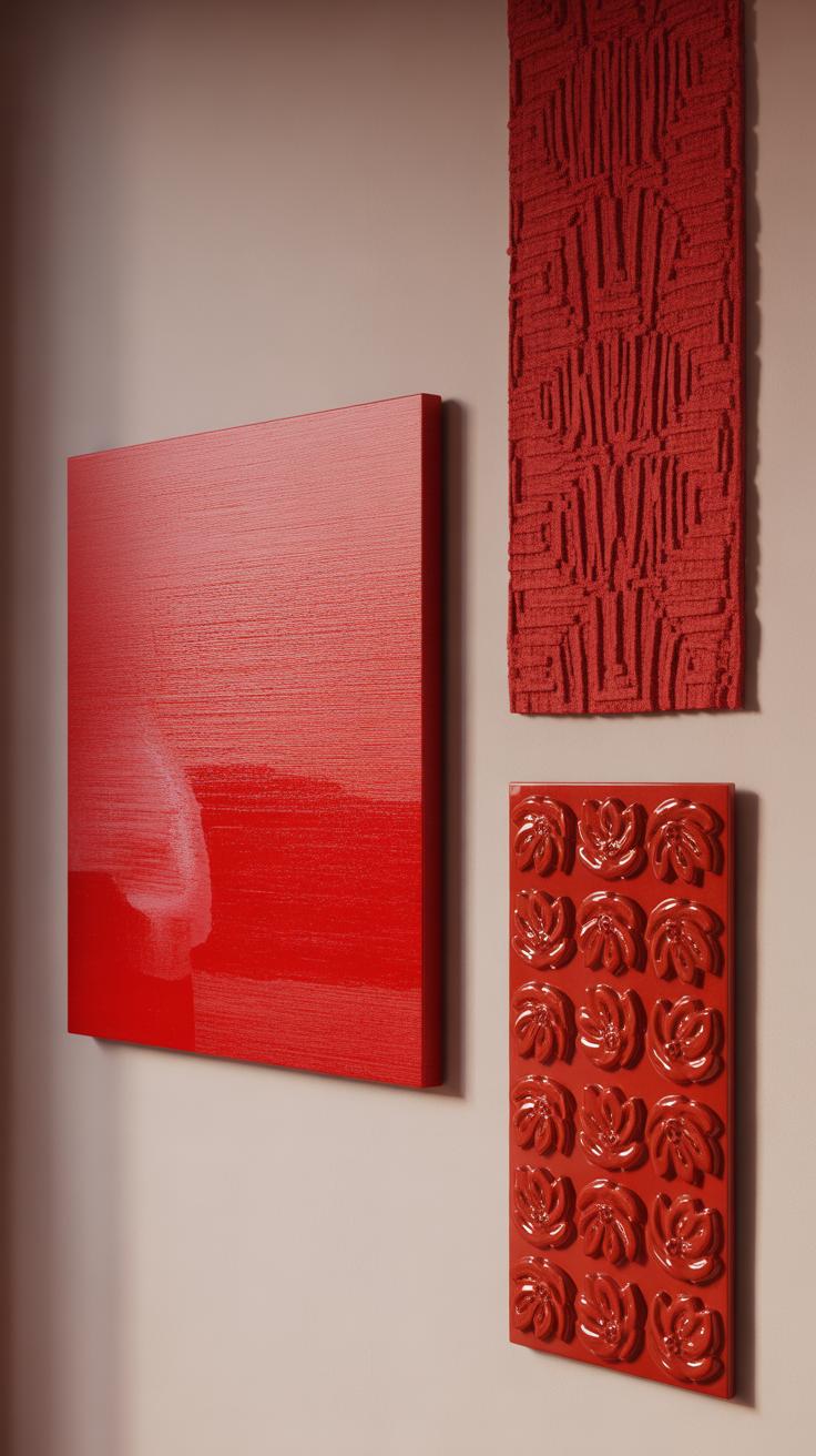
When you think about red wall art, the material it’s made from shapes a lot of how it feels and fits into your space. Canvas and prints are often the go-to because they’re flexible and come in countless styles. You can find everything from abstract reds splashed across a canvas to detailed prints that bring a sharp pop of color without overwhelming the room. They’re usually easier on the budget, too, which is perfect if you want to refresh a room regularly or try out several styles before settling.
Metal and wood pieces offer something a bit more tactile and, well, real. For instance, red-painted metal art can reflect light differently, giving a room subtle depth that flatter art might miss. Wood, especially when painted or carved with red tones, adds warmth and earthiness. It can soften or balance out bold reds, which might sometimes feel too intense on canvas. I find wooden red pieces especially great in rooms that lean toward rustic or eclectic styles.
Textiles, like tapestries or fabric wall hangings in red shades, introduce texture that catches the eye in a softer way. They bring a sense of comfort and movement. Choosing fabric art works well if your room needs something less rigid but still striking. Of course, picking textiles means thinking about care differently, but the texture can really make a room feel lived-in rather than staged.
So, when deciding on material, consider what kind of mood you want. Are you after sleek and modern or something warmer and inviting? How much effort are you willing to put into upkeep? Each material tells its own story through color and form, and red, with all its intensity, shows that off in unique ways.
Caring For And Maintaining Red Wall Art
Red wall art can brighten a room in ways that few other colors can, but keeping that color fresh takes some attention. You might notice red tones start to dull or shift with time; that’s quite common if the art faces too much sunlight or gets dusty. Protecting your red art means thinking beyond just hanging it on the wall.
When cleaning, be gentle. Dust buildup might seem harmless, but it can quietly wear down pigments. For a canvas piece, a soft, dry microfiber cloth works best. Avoid water or cleaners that could smear or stain those rich reds. Metal art needs a bit more care—wiping it with a damp cloth followed by drying instantly can prevent rust, but don’t soak it. If you have framed prints or photographs with red hues, dust regularly and occasionally check if the glass traps moisture inside.
Sunlight is probably the biggest enemy. Even indirect sunshine can fade red pigments unpredictably. If your red art is near a window, consider UV-filtering films or curtains. Another thing to watch is humidity. Too much moisture can warp canvases and frames, while too little might cause cracking. A room with stable humidity, somewhere around 40-50%, can help prolong the life of your art.
Have you noticed your red wall art looking different through the seasons? Sometimes it’s worth rotating pieces or moving them to less sun-exposed spots. It’s a bit of extra work but might be what keeps those reds vivid longer than you’d expect.
BudgetFriendly Red Wall Art Ideas
Adding red wall art doesn’t have to drain your budget. In fact, some of the most striking pieces can come from just a little creativity or a bit of smart shopping. You might be surprised at how easy it is to bring that bold red into your space without overspending.
DIY Red Art Projects
If you enjoy a hands-on approach, consider simple DIY projects using supplies you probably already have or can get cheaply. For example:
- Paint a few small canvases with different shades of red—try splattering, layering, or geometric shapes. It’s fun and you get totally unique pieces.
- Create paper art by cutting out red shapes and layering them, or fold paper for subtle texture. These can be framed easily and switched out if you want a change.
- Use red fabric or yarn to make wall hangings or minimalist textile art. It adds warmth and softness, and often costs less than framed prints.
I once tried splatter painting a canvas using leftover red acrylics. It was surprisingly easy, but the imperfect look gave the room a casual edge that felt refreshing. Maybe not perfect, but perfect for me.
Finding Low-Cost Ready-Made Art
If DIY isn’t your thing, you’re not out of luck. Many stores and websites offer affordable red-themed art without skimping on style. Some places to check include:
- Online marketplaces like Etsy or Society6, where artists sell prints at various price points. You can even find limited edition prints for under $30.
- Discount home stores or outlets sometimes have framed red abstract pieces or photography. These can often appear more expensive than they are.
- Thrift shops or flea markets — it’s almost a game to find something interesting with a pop of red. You might find quirky frames or vintage posters that suit your style.
Don’t hesitate to zoom in close on low-priced art to check texture and detail—they can surprise you. A little patience here might uncover a striking piece that works perfectly, even if it’s not from a big name gallery.
Trends And Timeless Red Wall Art Styles
Red wall art continues to capture attention, though its appeal can vary depending on how it’s styled. Right now, you might notice abstract red pieces gaining ground—bold splashes of color, irregular shapes, and sometimes chaotic energy. They feel fresh and energetic, perfect if your space is minimalist or you want to inject some character. Geometric red art also finds its place, appealing with sharp lines and repetitive forms. Street art influences mix in, too, especially with graffiti styles or stenciled designs, adding an urban touch that’s hard to ignore.
But not all readers want their walls to feel like a pop-up gallery, right? Classic red themes like floral prints and landscapes with red hues still hold their ground. These subjects feel familiar and comforting. A red rose or a warm sunset scene can fit many décor styles and usually won’t date quickly. They tend to bring warmth without overpowering a room. If you’re not ready to commit to something trendy, these timeless options might be a safer bet for long-term satisfaction.
Where does that leave you? Choosing between trendy or timeless can be tricky. Maybe start by considering your current décor and your willingness to refresh your art periodically. You might even blend both—display a classic piece alongside a more modern red accent. Does that mix feel contradictory? Perhaps. But sometimes that interplay creates the most intriguing spaces.
Conclusions
Red wall art offers many ways to enhance your room. It can serve as a focal point, add warmth, or highlight your personality. When you pick the right pieces and place them thoughtfully, red wall art can transform your space and make it feel complete.
Remember to balance the boldness of red with other colors and decor. Let red art inspire creativity and passion in your room. With attention to placement and style, you can create a room that looks finished and feels inviting.