Introduction
Choosing paint colors for your living room can shape the entire look and feel of your home. For many, selecting neutral paint colors offers a balanced and timeless backdrop that complements various furniture styles and decorations. Using house color palettes can help you mix and match shades easily, ensuring harmony across rooms.
This article will cover how to pick the best neutral colors for your living room, explain the role of house color palettes, and guide you through practical steps to create a style that suits your space and personality.
Choosing The Right Living Room Paint

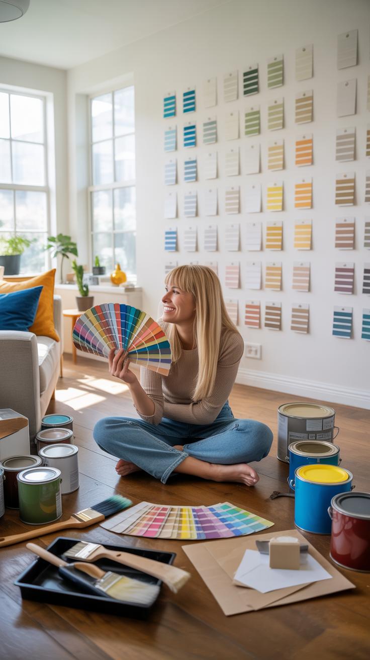
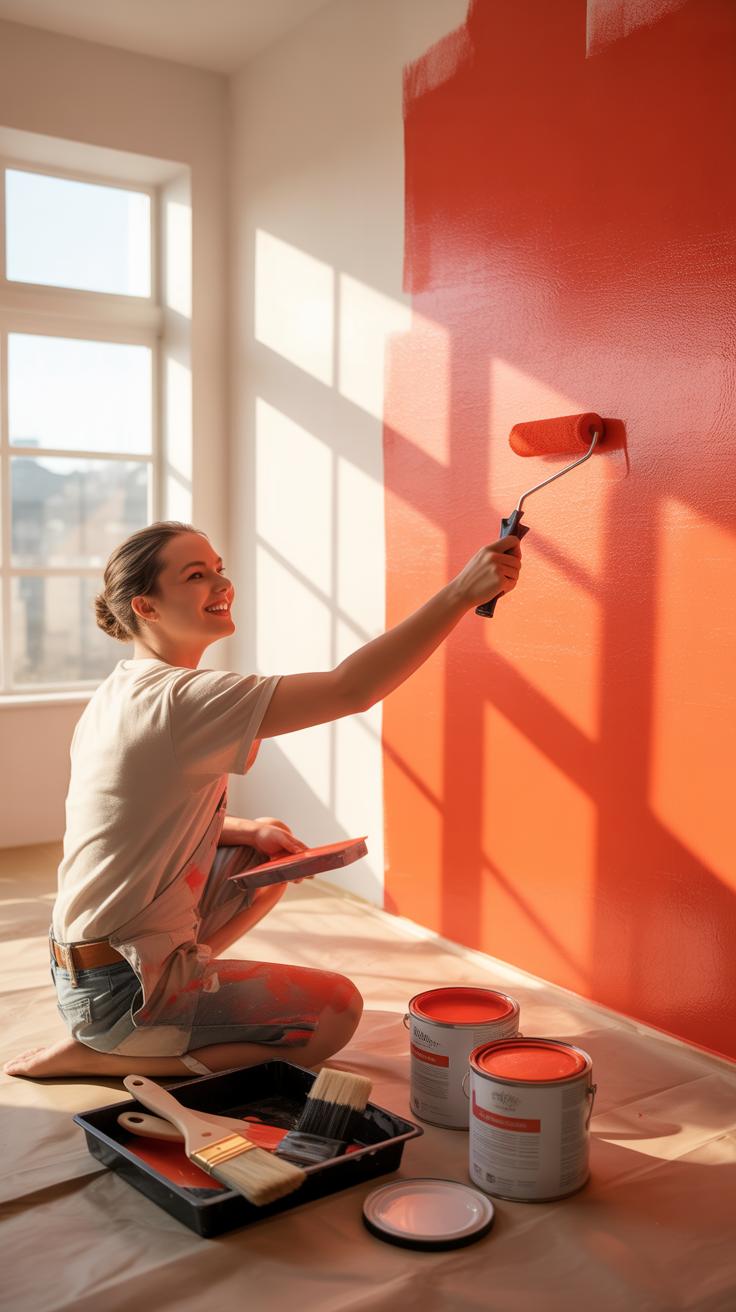
Picking the perfect paint color for your living room can feel like a puzzle. You have to think about the size of the room—smaller spaces often benefit from lighter shades to open them up. But larger rooms? They can handle deeper, cozier hues. It’s not just size; natural and artificial lighting changes everything. A color that looks warm and welcoming on a sunny morning might seem cold or dull by evening. Then there’s your furniture and décor. If you have bold pieces, maybe a neutral wall color is the way to go to prevent clashing. On the flip side, subtle furnishings might call for a pop of color to add character.
And mood—this one’s tricky. Do you want calmness? Energy? Something in between? Paint can influence how you feel, so think about the atmosphere you want to create. When testing paints, don’t rush. Try samples on different walls, watch how they look at various times during the day, and consider finishes too—matte, satin, or gloss each reflects light differently and affects the room’s vibe. Also, gather a second opinion; sometimes, what looks amazing to you might read differently to someone else. Planning carefully here saves a headache later.
What To Consider Before Choosing Paint
Before you commit, pause to consider a few vital things. Natural light varies by room orientation—south-facing rooms flood with sun, which can wash out some colors, while north-facing ones stay cooler and darker. Wall texture is another factor that sometimes gets overlooked; rough or uneven walls might work better with flat paint that hides imperfections, while smooth walls might shine with something glossier.
Think about your living room’s purpose too. If it’s a high-traffic area, durability matters—look for paints that can stand up to wear and tear. And personal taste? That sometimes shifts with time, so consider whether you’ll still love that bold teal three years down the road or if something more neutral and timeless suits you better. It’s weird how what you like today might not be what you want tomorrow.
Steps To Test And Select Paint Colors
Testing paint color isn’t just about slapping some swatches on the wall. To get a genuine sense of your choice, start small:
- Paint large swatches on different walls and observe them throughout the day—morning, afternoon, and evening lighting changes everything.
- Look at your swatches under your main light source, not just daylight; artificial lights can alter colors drastically.
- Live with the samples for at least a few days. You might notice new things—maybe a color feels too cold after a couple of evenings.
- Don’t hesitate to ask friends or family for their thoughts, but remember, it’s your space.
- Think about the finish once you pick a color. Matte hides imperfections, satin adds warmth, and gloss pops but shows flaws.
It’s a bit of trial and error, sure, but that’s part of the process. Paint a tiny patch on your wall—it’s not permanent, and it helps you avoid costly mistakes. After all, it’s just paint, but getting it right feels significantly better.
Paint Colors For Living Room
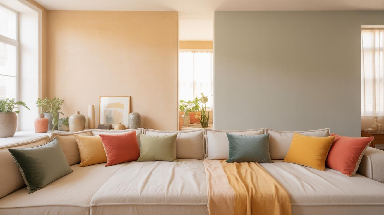
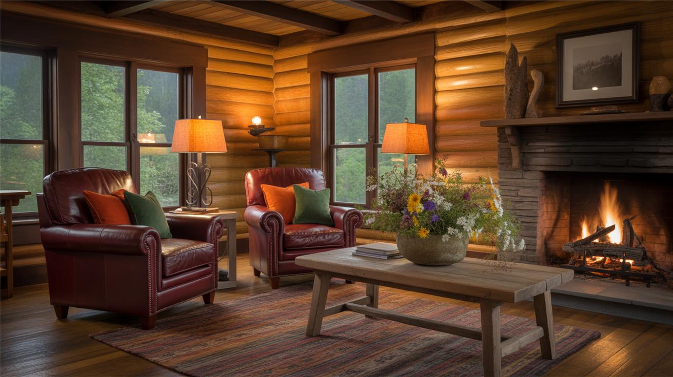
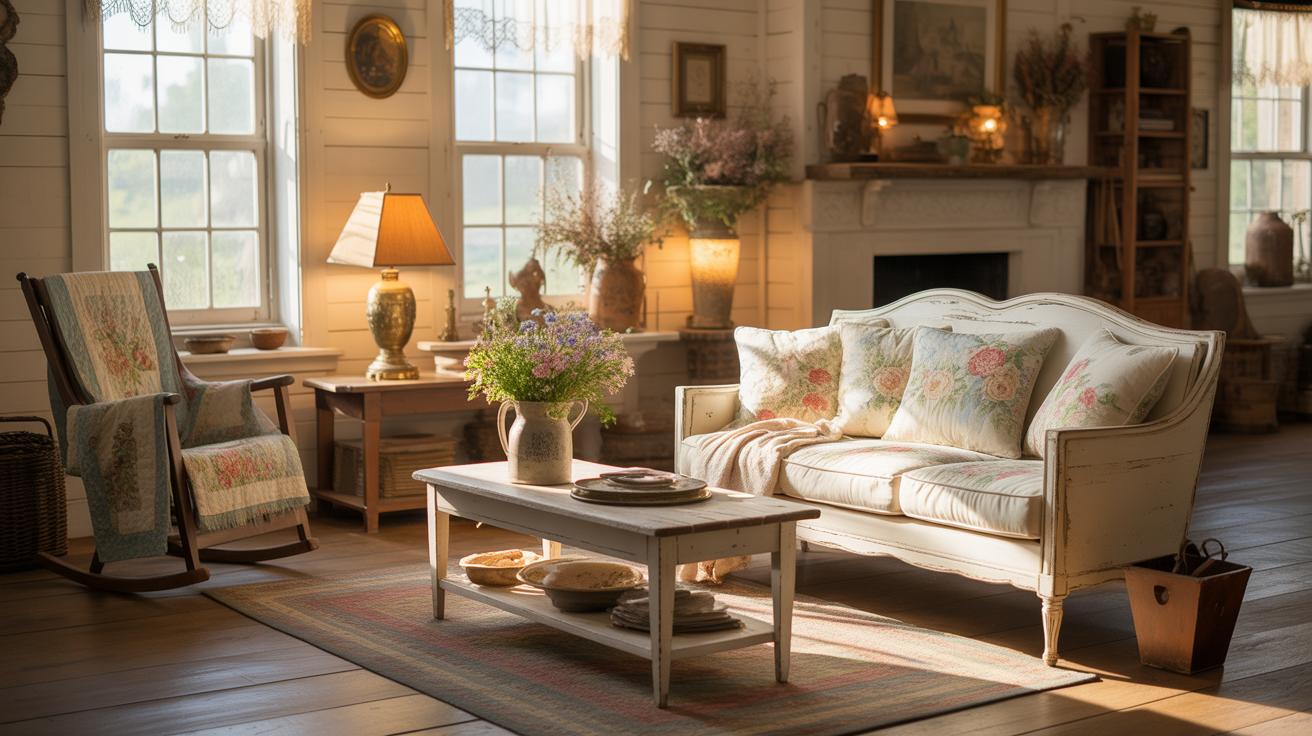
When picking paint colors for your living room, neutrals really do stand out for many reasons. Perhaps the biggest advantage is their adaptability. You can change your furniture, decorations, or even the room’s purpose without worrying if the wall color clashes. Neutrals provide a soft backdrop that allows other elements to shine.
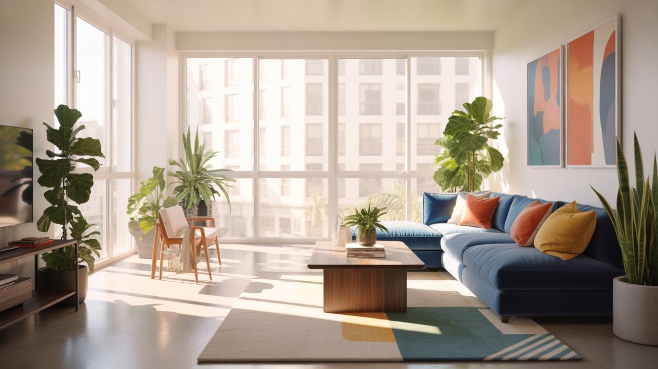
They also make it easier to coordinate with various furnishing styles and colors. Whether you lean towards modern, rustic, or traditional décor, neutral walls seldom pose a problem. This ease of matching can reduce stress when shopping for new pieces or rotating existing ones.
Plus, neutrals tend to have what I’d call a sort of quiet timelessness. Unlike some bright hues that might feel trendy and fade out of style, shades like beige, gray, or taupe can weather style shifts and still look fresh. This means you might not need to repaint as often, saving time and money.
There’s also something to be said about the atmosphere created by neutral colors. They often bring calm, which can be soothing after a hectic day. A calm living room invites relaxation, conversation, and may even help focus your thoughts better.
So, if you want a living room that can grow and shift with your tastes and lifestyle — neutrals should be high on your list. What kind of vibe do you want to create? Sometimes, even subtle changes in neutral shades can influence how open, warm, or cozy a space feels.
How House Color Palettes Guide Selections

House color palettes are essentially curated sets of colors designed to work well together within a home. They serve as a roadmap for coordinating paint colors across different rooms, helping to maintain a visual flow or unity. Think of them as a color family — choosing paint within the same palette means your living room won’t clash with adjoining spaces, but rather feels part of a whole.
Palettes usually include a base color like a neutral tone, plus accents and complementary shades that can be used on walls, trims, or accessories. By sticking to a palette, you simplify decisions and reduce the chance of random mismatches. Still, not every palette fits every home or taste, so it’s worth thinking about which colors resonate with your lifestyle and lighting.
Using Pre-Made Palettes Versus Custom Combinations
Pre-made palettes come ready to use, often developed by designers or paint brands. They’re convenient, reliable, and can remove a lot of guesswork. Yet, they might feel a bit generic or not fully express your personality. Meanwhile, custom combinations allow you to experiment more freely, mixing hues that speak exclusively to you. This, however, demands more time, confidence, and sometimes trial-and-error.
Weighing the two, pre-made choices save time and can be less risky, but custom blends offer uniqueness though riskier. Some people start with a pre-made set, then tweak it to better suit their space — a compromise between ease and originality.
Examples Of Popular House Color Palettes
Popular palettes frequently center around neutral tones such as soft beiges, warm greys, or muted taupes, which provide a calm backdrop for living rooms. These neutrals often pair well with dusty blues, sage greens, or gentle blushes as complementary colors.
- Classic Neutral: Cream walls, deep charcoal trim, and soft taupe accents.
- Coastal Calm: Light sandy beige, cool seafoam green, and crisp white details.
- Modern Earth: Warm greige walls with terracotta and olive accent pieces.
Each of these palettes helps create spaces that feel inviting and balanced, though the actual effect depends a lot on lighting and furnishings. When you pick a palette, consider how the colors feel at different times of day. It might seem subtle, but it really affects the mood.
How Lighting Affects Paint Color Perception
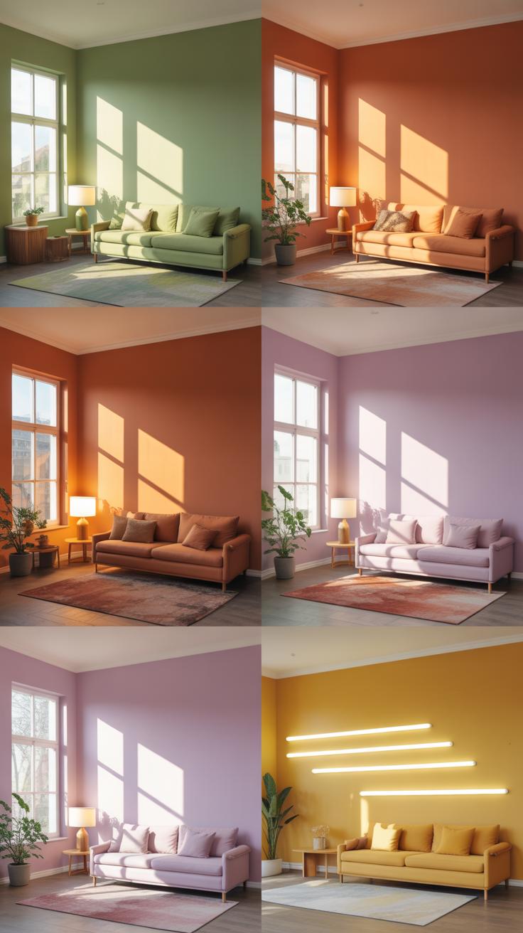
Lighting plays a huge role in how paint colors appear in your living room. It’s kind of tricky because the same color can look quite different depending on how much light you have and what kind it is. Maybe you painted your walls a lovely soft gray, but under certain lighting it feels almost blue or greenish. That happens a lot.
Here are a few things to keep in mind:
- Natural Light Changes Throughout the Day: Morning light is cooler and can make colors look crisp or even a bit muted. Afternoon sunlight tends to warm things up, making walls appear richer or more inviting. But the size and direction of your windows also matter a lot here. A south-facing window floods the room with brightness, while north light is softer and more consistent all day.
- Artificial Lighting Variations: Not all bulbs are created equal. Incandescent bulbs cast a warm yellow glow that enhances reds and oranges but might dull blues. LED bulbs come in many color temperatures and can be cool or warm. Fluorescent lights, on the other hand, often give off a cooler, sometimes harsh light altering the paint’s undertone unexpectedly.
- The Intensity of Light: A dimly lit room can make colors look flatter or darker, while a glare of bright lighting might wash them out. It’s a balancing act.
Because of all this variety, testing paint samples on your walls and observing them at different times and with different lights is really important. I remember once choosing a beige that looked perfect in a showroom but turned slightly pinkish at home after sunset. It was a bit of a surprise, honestly. So you might want to grab those small paint pots and try them out under your specific lighting conditions before committing. This way, your living room color feels just right, no matter the hour.
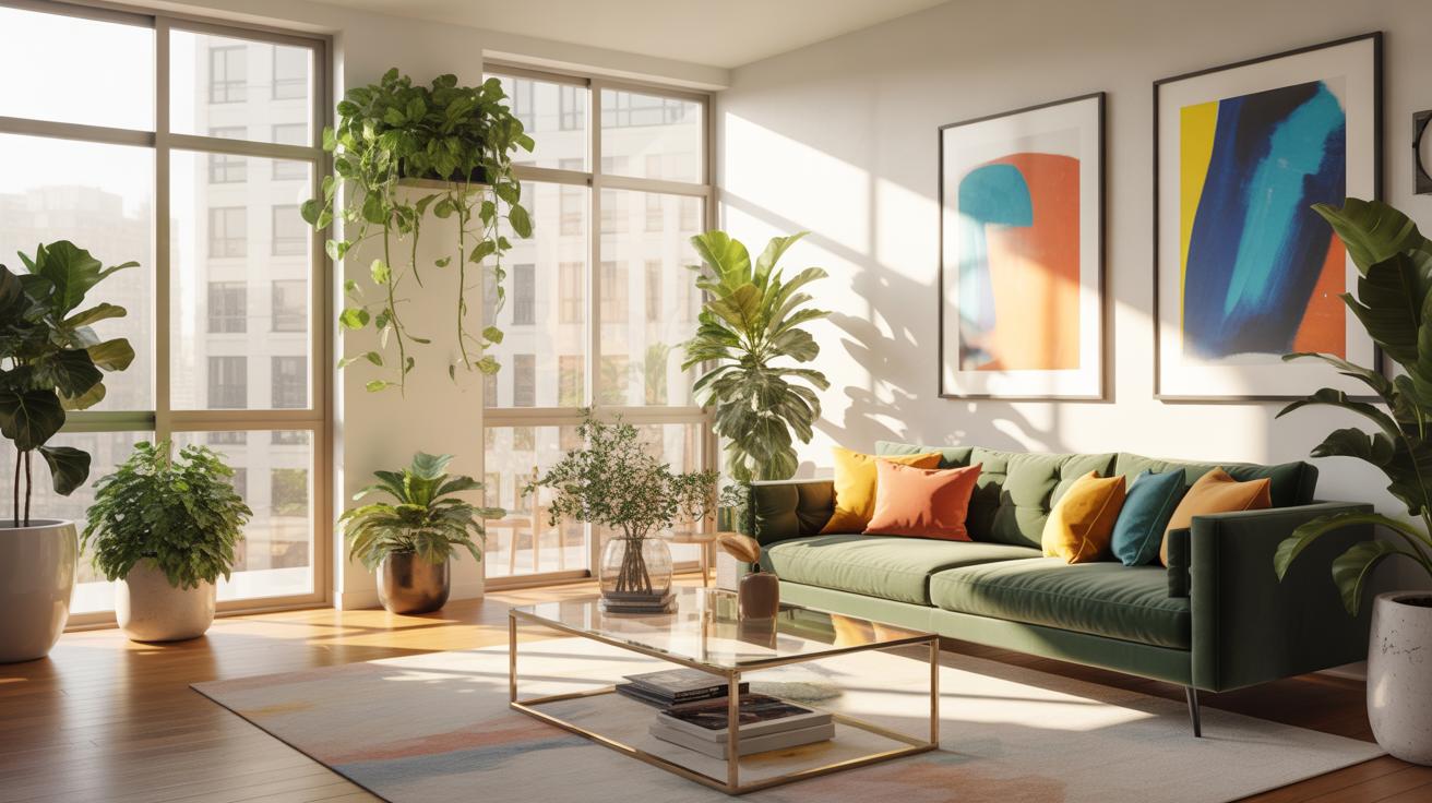
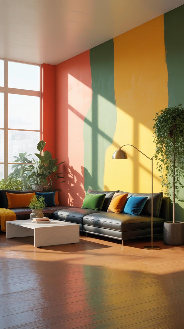
Tips For Combining Neutral Colors With Accent Colors
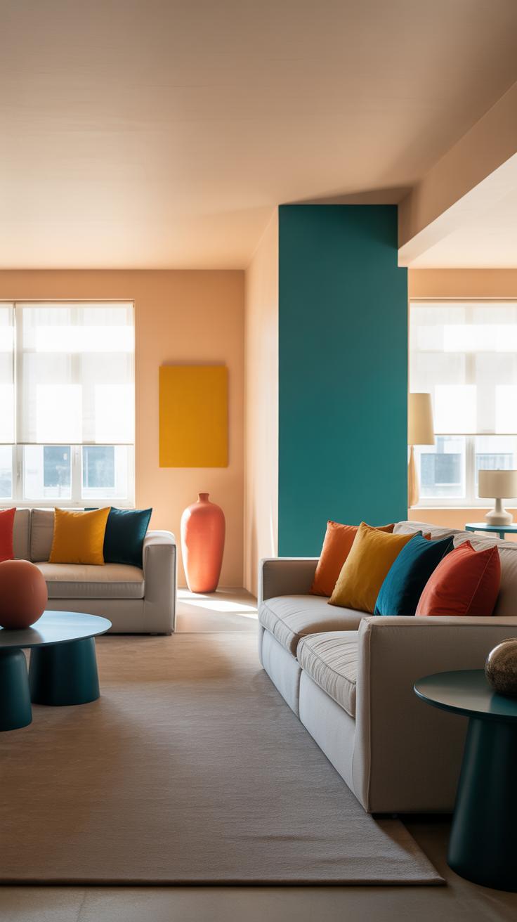
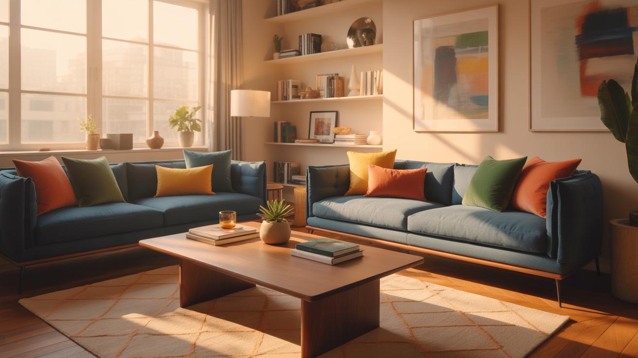
Pairing neutral walls with accent colors can add a compelling layer of depth to your living room without overwhelming the space. One effective way is through furniture and décor. For example, imagine a beige wall softened by a teal velvet sofa or dusty rose throw pillows. Such accents catch the eye and bring life without clashing with your background.
An accent wall is another option, but it requires subtlety. Rather than selecting a bold, overpowering color, opt for a muted shade that harmonizes with the neutrals. This way, it creates a focal point, not a fight for attention.
Layering texture helps too. Think linen curtains or a woven rug — they introduce interest through tactile contrast while maintaining the calm that neutral paint provides. You want to avoid making things too busy; it’s a delicate balance between harmony and visual excitement.
Choosing Accent Colors That Complement Neutrals
Picking accent colors for neutral paints is a bit like tuning an instrument—you want the tones to blend, not clash. Warm neutrals like beige or cream pair well with earthy colors—think muted greens, burnt oranges, or soft browns. Cool neutrals such as gray can support blues, purples, or even bright yellows if you’re feeling daring.
A tip? Look at the undertones of your neutral paint. For instance, a gray with blue undertones will respond better to blue or cool accents than to something fiery like a bold red. Sometimes, testing samples in your actual room lighting saves a lot of guesswork.
Where To Use Accent Colors In Living Rooms
Accent colors rarely need to dominate to make an impact. You can strategically place pops of color in common areas like:
- Pillows on sofas or chairs
- Area rugs with patterns or bold colors
- Artwork or framed prints
- Throws or blankets casually draped
- Decorative vases, lamps, or smaller knick-knacks
- Feature walls, but stick to subtlety here
Remember, these accents should invite you in, not shout. They should feel like the punctuation in a calm conversation within your living room’s visual story.
Common Mistakes When Selecting Living Room Paint
You might think picking paint for your living room is straightforward, but there are some frequent missteps people fall into that can really throw off the whole vibe. One classic mistake is ignoring how natural and artificial lighting influence the color you choose. A shade that looks soft and welcoming in daylight might turn harsh or dull once the sun sets or when your lamps switch on. Also, the room’s size matters—small spaces can feel cramped with dark tones, though sometimes a deep hue adds unexpected coziness. It’s a tricky balance, and skipping this step can leave you staring at walls you don’t quite like.
Another thing people often overlook is the paint finish. Whether you pick matte, satin, or gloss does more than add shine; it changes how the color interacts with light and affects durability. Matte hides imperfections but might look flat. Satin offers a gentle glow, good for rooms where you want warmth without too much shine. Gloss finishes are durable but can highlight flaws, which might not be ideal for older walls. Reflecting on where and how your room will be used can guide your choice here. It’s not just about looks; it’s about living with the paint every day.
Paint Colors For Living Room
Choosing the right paint colors for your living room involves more than just picking what looks nice in a store. It’s about how colors make you feel and how they fit with the rest of your home. Neutral paint colors are often a safe bet because they create a calm, versatile backdrop that complements various styles and décor. Whites, beiges, soft grays, and muted taupes often work well, giving the space a sense of openness and light without overwhelming it.
But there’s something to think about here – how do these colors interact with your furniture and lighting? A beige that looks warm on a paint chip might feel too dull in natural light. And gray can sometimes come off as cold if you’re not careful with undertones. That’s why it’s useful to try samples on your walls first and observe them throughout the day. It can be surprising how the same color can change with the setting sun compared to bright afternoon light.
Some people shy away from bold colors in living rooms, yet certain muted blues, soft greens, or calming pinks can add personality without distraction. Baker-Miller Pink, for instance, has been noted in some studies to have calming effects. While you may not want a bright pink wall, subtle shades inspired by this tone could contribute to a soothing atmosphere.
Still, there’s no one-size-fits-all. Some homeowners find comfort in cool tones while others prefer warm neutrals. What matters most is that you feel relaxed when you’re in the space. Are you someone who likes crisp, clean whites or do you gravitate toward warmer off-whites with a hint of yellow? These small preferences can shape the entire character of your living room.
Thinking long-term is key when selecting paint colors. Will you want to change furniture soon, or are you looking for a timeless backdrop that grows with your style? These questions can help steer your decision away from fleeting trends toward a choice that suits your space over time.
Maintaining Painted Walls For Longevity
Keeping your living room walls looking fresh isn’t just about the initial paint job. Over time, walls face all sorts of wear—fingerprints, dust, even the occasional accidental scrape. So, how do you keep those neutral hues vibrant without risking damage? It’s a bit of a balancing act.
Start with gentle cleaning. A soft cloth or sponge dampened with mild soapy water often does the trick. You want to avoid anything abrasive or harsh chemicals because they can dull the finish or even remove some color. Remember, blot rather than scrub. If you’ve got stubborn marks, patch test in an inconspicuous spot first—it’s better to be safe than sorry.
For touch-ups, it’s crucial to keep leftover paint from your initial job. Matching colors later can be frustrating, sometimes impossible if the paint has faded. When you see chips or small blemishes, address them sooner rather than later. Dab carefully with a small brush; applying large strokes can make the patch even more noticeable. Occasionally, though, larger sections or areas near high-traffic spots might need a fresh coat. If repainting, try to blend edges smoothly into the current paint.
Over the years, your walls will tell a story, both through their color and their maintenance. Sometimes, the odd imperfection adds character, but taking good care prolongs that “freshly painted” feeling longer than you’d expect.
Conclusions
Neutral paint colors provide a solid foundation for any living room design. They help create a serene environment and make it easier to update your decor without repainting. Using house color palettes gives you a clear path to select colors that work well together, preventing mismatches and enhancing the room’s appeal.
By following the guidance on choosing paint, understanding neutral tones, and utilizing palettes, you can confidently select colors that bring warmth and style to your living area. Remember, well-chosen paint colors make your home more inviting and personal.