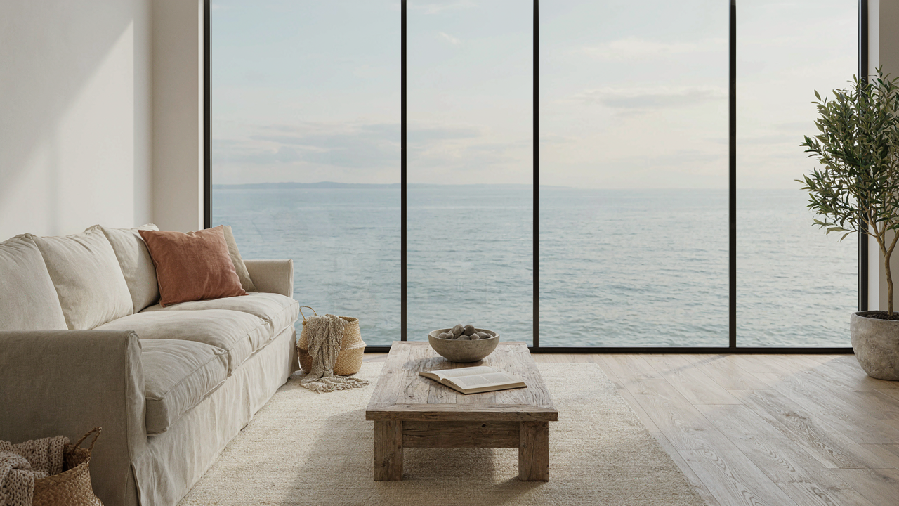
The Cognitive Dissonance Of “Coastal Calm”
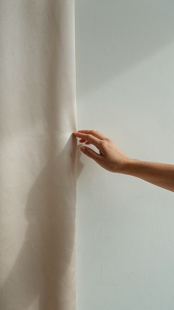
Neutral Isn’t Passive, It’s Active Deception
You want neutral because you think it keeps options open. It doesn’t. Neutral palettes are a choice that eliminates contrast, and contrast is what your brain actually processes as visual information. The common advice that “neutrals create calm” is incomplete. Neutrals create uniformity, which your eye interprets as low stimulation. That’s different from calm. Calm requires intentional visual rest points, not the absence of decision-making.
Beach cottage interiors rely on sand, shell, and driftwood tones precisely because these materials already exist in the environment outside your windows. The palette isn’t passive—it’s selective compression. You’re not avoiding color; you’re narrowing the bandwidth so the eye doesn’t fight between interior and exterior. This works only if you understand the mechanism: neutral palettes succeed when they create coherence with the built landscape, not when they abdicate design responsibility.
Light Determines Your Palette Before You Choose It
Light is the variable that makes or breaks every neutral interior, and designers rarely name this plainly. Physics doesn’t care about your color preference. A north-facing beach cottage receives cool, diffuse light that makes warm sand tones read as flat. A south-facing space with direct sun transforms the same palette into something visually active. You don’t select your neutral palette in isolation. You audit the light path first, then match palette intensity to what the space actually receives.
Reflectivity matters more than the color itself. Matte surfaces absorb light and disappear into shadow. Semi-gloss finishes on trim or cabinetry bounce light and anchor the room visually. In a beach cottage, this means your off-white walls might need satin rather than flat if the room gets indirect southern exposure. The mechanism is simple: measure light entry at three times of day, then choose whether your neutrals need to absorb or reflect based on what the space demands.
Deconstructing The Sandy Neutral Myth
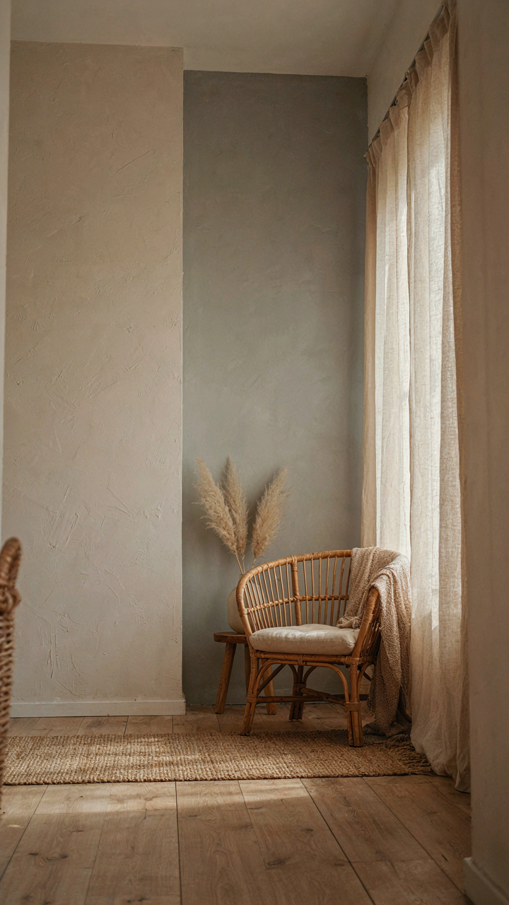
Beyond Beige: Introducing Strategic Off Whites And Greys
You want a beach cottage interior that doesn’t look like every other rental property or Instagram clone. That’s the real motive here. The mechanism is this: beige fails because it’s a compromise color with no purpose. Off-whites and greys work because they have directional temperature and depth. Warm off-whites (creams with yellow undertones) anchor coastal spaces without feeling dated. Cool greys (those with blue or green undertones) create visual separation between surfaces and make rooms feel larger. The difference matters tactically. A space painted in pure beige reads as indecisive. The same space in a strategic off-white or grey reads as intentional.

Walls take beige and make it passive. Choose off-white with warmth for trim, cabinetry, and larger wall areas. Use a cooler grey on a single accent wall or for built-ins to create depth without introducing new colors. This setup gives you flexibility for furniture and textiles without fighting your base layer. The constraint forces better decisions downstream because you’re not hiding behind neutrality anymore.
Texture As Color: Depth Without Explicit Hue
Physics teaches us that surface properties determine how light behaves, and in beach cottage interiors, texture functions as a secondary color system through light absorption and reflection. Rough surfaces scatter light and read darker. Smooth surfaces bounce light and feel brighter. You can stack five different materials all in the same off-white or grey family and create a room that feels rich without adding a single pigmented hue. Linen, jute, weathered wood, plaster, and concrete each occupy different visual weight despite matching the neutral palette. This is your real tool for avoiding the sterile, flat look that kills most beach cottages.
Layering texture is a protocol. Start with walls in matte off-white or grey to establish a base that kills shine. Add natural fiber rugs in jute or sisal for ground-level texture. Introduce weathered wood through exposed beams, flooring, or furniture pieces. Incorporate linen textiles on seating. Finish with plaster or concrete accents on fireplaces or feature walls. Each layer adds visual interest without requiring color variation, which means your space compounds in depth the moment you execute this sequence.
The Beach Home Interior Luminosity Protocol
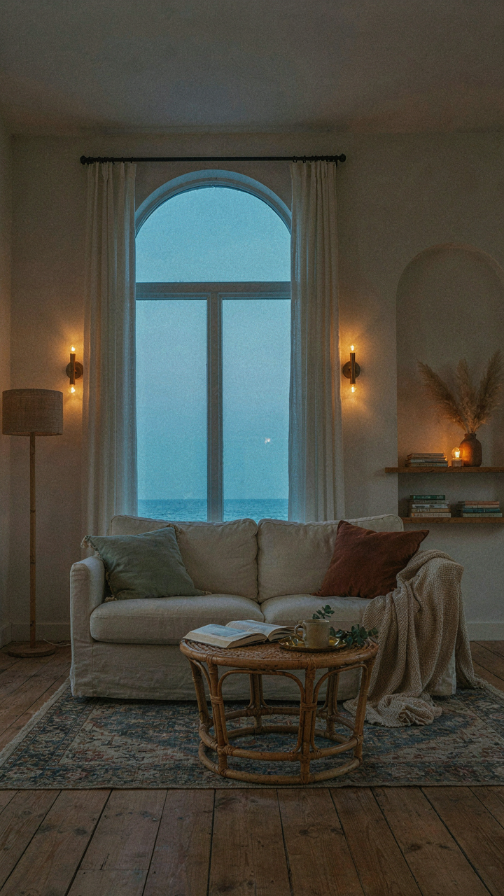
How Light Travels Through Sand Colored Rooms
You want this section because you’re afraid your cottage will feel dark and cheap. Here’s the real mechanism: light behaves according to physics, and your room is a system. Reflection works on a simple principle—light bounces off surfaces at predictable angles based on their finish. Matte surfaces diffuse light in all directions, which softens shadows but reduces overall brightness. Glossy surfaces concentrate reflection into specific angles, which amplifies perceived luminosity but creates glare. Sandy neutrals (cream, beige, warm white) reflect 50 to 80 percent of light depending on finish. Dark surfaces absorb that same light, making rooms feel smaller and dimmer.
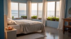
The tactical move is finish selection before color selection. A flat matte cream wall absorbs more light than a satin finish cream wall in the same space. In beach cottages, satin and eggshell finishes on walls perform better than flat paint for this reason. Pair this with high-quality white or off-white trim in semi-gloss or satin, which acts as a secondary reflector. Your ceiling should be white or near-white at 85 to 90 percent reflectance to bounce overhead light back down into the room. This compounds the effect across the entire space without adding a single lamp.
Layered Artificial Light After Dark
Most beach cottage advice stops at “add more lamps”—garbage guidance that creates harsh shadows and uneven spaces. Artificial light strategy borrows from film lighting: you need key light, fill light, and accent light working in concert. Key light is your primary source—usually overhead or a table lamp at eye level that illuminates the main activity zone. Fill light reduces shadow depth by softening contrast—use wall sconces or indirect light that bounces off the ceiling or walls. Accent light draws attention to texture or architectural features, making the space feel intentional rather than lit by default.
The protocol is this: install dimmers on all artificial light sources. Brightness should range from 30 to 100 percent depending on time of day and activity. A sandy neutral cottage at full brightness at 8 PM feels sterile and wrong. At 60 percent brightness with mixed sources—overhead at 40 percent, sconces at 70 percent, a single accent light on a shelf at 50 percent—the same room feels inhabited and dimensional. The goal is never “bright enough to see”—it’s controlling the quality of light so the space reads as intentional after sunset.
Modern Beach Cottage Interior: The Visual Hierarchy Playbook
Where Your Eye Goes First
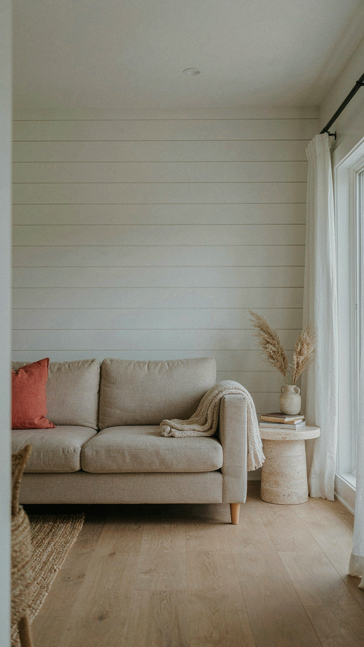
You want people to notice the good bones of your space, not get lost in clutter. Visual hierarchy works like military strategy: concentrate force on the objective, leave the flanks bare. In beach cottage interiors, this means one focal point per room commands attention, and everything else recedes. A whitewashed beam, a statement window, a low-slung linen sofa. Pick one. The mechanism is contrast. Your eye moves toward difference, away from sameness. A dark wood accent wall in a room of soft neutrals becomes magnetic. A piece of driftwood sculpture on an otherwise blank shelf stops the wandering gaze.

The mistake most people make is treating every surface like it deserves weight. It doesn’t. A beach cottage thrives when 70 percent of wall and floor space stays visually quiet. Whitewashed shiplap, pale sand-colored linens, unfinished pine. This isn’t minimalism for its own sake. It’s strategic emptiness that makes the focal point impossible to ignore. When you enter a room, your attention should land on one thing within two seconds. If it doesn’t, you’ve added too many competing elements and killed the visual chain.
Negative Space As Working Inventory
Most design advice tells you to “add more” to fill a room. Wrong. Negative space in a beach cottage interior isn’t wasted real estate, it’s functional. Like inventory management in supply chains, empty space stores visual value. When you use it sparingly, it amplifies impact. A bare mantel except for three items reads as intentional. The same mantel crowded with ten items reads as unfinished. The math is simple: fewer objects means each object gets more cognitive attention.
This applies to color density too. If your walls, trim, and large furniture are all neutral tones within the same range, the eye has permission to rest. Then a single accent color or material pops without shock. Coastal interiors work because they respect this principle instinctively. The sand, the white ceiling, the pale wood create a stage where one coral throw pillow or one brass lamp fixture becomes the event. Don’t fight this. Embrace the emptiness and watch how much more memorable the space becomes.
Coastal Cozy Kitchen: The Ergonomic Imperative
Kitchen As A High Performance System
You want a beach cottage kitchen that looks effortless because you’re terrified of spending a week cooking in chaos. The mechanism is workflow: how many steps you take, how often you reach, whether your hands cross paths. Borrow from factory logistics here. In manufacturing, they call it “line balancing”—arranging stations so material moves without backtracking. Your kitchen layout does the same thing with prep, cooking, and plating.

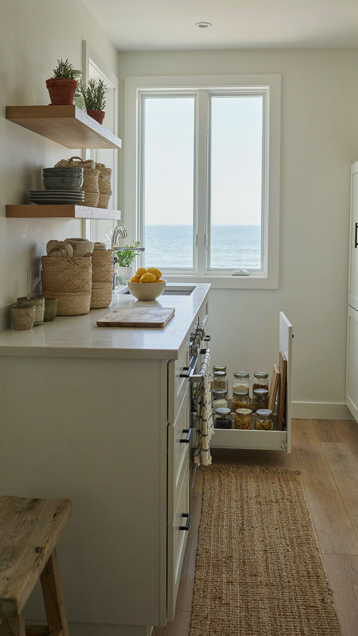
The galley layout dominates beach cottages for one reason: it works. Prep zone on one side, cooking in the middle, plating and serving on the other. One path, no wasted motion. Neutral palettes fade into the background precisely because they don’t distract from function. Open shelving above the counter creates speed—grab what you need without opening cabinet doors. This isn’t decoration. It’s removing friction.
Storage That Hides Clutter Without Hiding Access
Most beach cottage advice tells you to embrace “minimal” storage, which is code for leaving things visible and calling it style. That’s incomplete. You need to hide what doesn’t earn its place while keeping what you use accessible. The difference between a cluttered kitchen and a calm one isn’t the amount of stuff—it’s whether you see it or not.
Deep drawers with dividers beat cabinets for daily use. You store more per linear foot, and items don’t slide around. Sand-colored woven baskets on open shelves contain small items while maintaining the palette. Pull-out pantries in corner spaces recover dead zones. Built-in spice racks on the inside of cabinet doors keep bottles accessible but invisible. The concrete mechanism: if you use something more than twice a week, it gets drawer or pull-out space. Everything else gets a closed cabinet, labeled and organized by category.
Rustic Beach House Interior: The Material Authenticity Framework
Unfinished Wood, Stone, And Rope Define The Space
You want people to walk in and know you didn’t hire a decorator to make things look “beachy.” That’s the real driver here. The mechanism is material honesty: spaces built from raw, visible materials signal restraint and inherited knowledge instead of purchased taste.

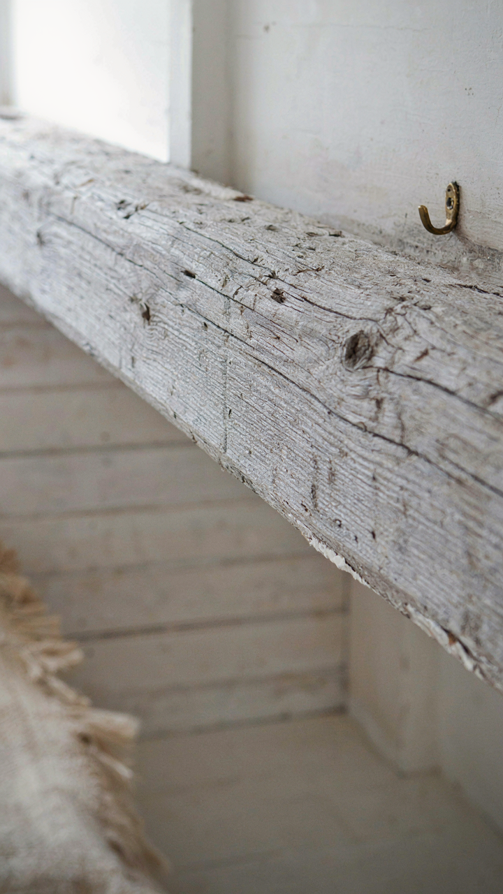
Wood in beach cottages works because it weathers predictably. Reclaimed timber, driftwood trim, or new wood left unfinished all read as authentic because they refuse the glossy coating. Stone—limestone, slate, or local fieldstone—grounds a room by refusing to compete. Natural fiber ropes, sisal, and jute on stairs or railings function as both structure and texture. These materials don’t need narrative. They sit and do their job.
The Visible Wear Becomes Your Design Brief
Borrow a term from materials science: fatigue. Not human fatigue, but material fatigue—the predictable way things break down under stress and salt air. Most design advice tells you to protect against this. That’s backwards. You design for it.
Patina isn’t damage you tolerate. It’s the feedback loop proving your materials choice worked. A wooden beam darkens and splits slightly from salt exposure—that proves it’s doing its job, not failing it. Linen fades. Rope frays at edges. Walls develop soft staining from humidity and salt spray. Stop fighting these outcomes. Specify materials that age into character rather than decay into ruin. The protocol: choose materials you’ll prefer looking worse, then leave them alone to prove it.
Small Beach Cottages: The Spatial Compression Hacks
How Light Rewires Your Space
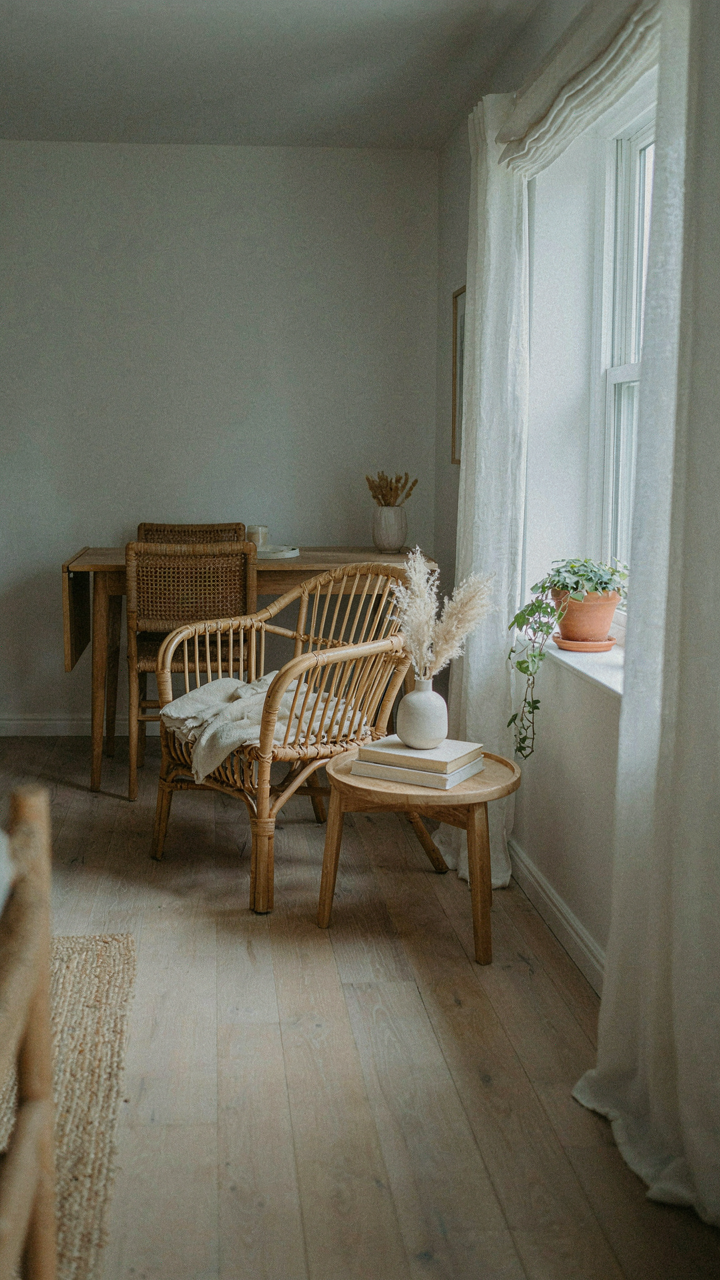
You want your cottage to feel bigger because you’re afraid you wasted money on something cramped. Here’s the mechanism: psychology calls this spatial perception, and it relies almost entirely on how light distributes itself through a room. A small cottage with poor light reads as a box. The same cottage flooded with natural light reads as open. The light doesn’t change the square footage, but it changes whether your brain registers the space as hostile or breathable.

Neutral palettes amplify this effect because they don’t compete with light. When walls, trim, and large furniture sit in sand, cream, or pale gray, light bounces across surfaces instead of being absorbed. Glossy finishes on cottage-appropriate pieces like driftwood side tables or whitewashed cabinetry act as secondary light sources. The mechanism is reflection. Maximize it. Position seating to face windows. Strip heavy curtains and install simple linen Roman shades that pull up completely.
Furniture That Justifies Its Footprint
Every piece in a small cottage must pull double duty or get removed. Common advice says “use vertical storage,” which is accurate but incomplete. The real optimization happens when you identify what activities actually occur in that room, then eliminate the furniture that serves only one of them.
- Nesting tables: Pull out only what you need. Store one under another when unused. Frees floor space while maintaining surface area for drinks, books, or lamps.
- Upholstered storage benches: Seating and hidden compartments replace traditional coffee tables. Lift tops store blankets, board games, or seasonal items without adding visual mass.
- Wall mounted shelving: Replaces floor-standing bookcases entirely. Open shelving with sandy-toned baskets provides storage that reads as decoration rather than clutter.
- Convertible daybed frames: Functioning as both sofa and guest bed, these reduce the need for separate furniture in bedrooms or dens. Pair with fitted cushions in neutral linen.
- Drop leaf dining tables: Expand for meals, collapse to console size for everyday use. Works in spaces where a permanent dining table would consume the entire footprint.
The real protocol is ruthless inventory. Walk through your cottage and ask: does this piece serve two functions, or does it occupy space for one job? Furniture that does one thing gets replaced or removed. This isn’t minimalism as philosophy. It’s spatial math.
The Beachy Cottage Exterior: The Unseen Influence
Where Your Interior Actually Begins
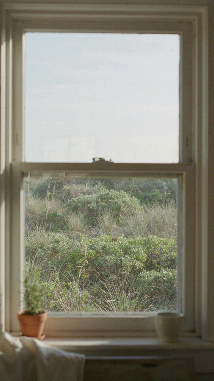
You care about this section because you sense that a cottage interior lives or dies based on what happens outside its walls, and you’re right to feel that way. Think in terms of visual continuity: in architecture and landscape design, sightlines operate like supply chains. What the eye encounters moving from outdoors to indoors determines whether your interior reads as finished or fractured. Most people obsess over interior color palettes while ignoring the fact that your sandy neutrals mean nothing if the view through the window contradicts them.

The exterior isn’t decoration. It’s the frame that either validates or undermines every design choice you make inside. Your cottage interior doesn’t exist in isolation, suspended in a vacuum. It exists in relationship to what surrounds it. A carefully chosen linen sofa loses impact if the view beyond the glass shows chaos, neglect, or visual conflict. The sand, vegetation, and hardscape elements outside function as extended surfaces of your interior scheme. Control what people see when they look out, and you control how they feel when they’re inside.
Threshold Design Shapes Interior Perception
The threshold between exterior and interior is not a boundary to cross. It’s a transition zone that either compresses or expands the perceived space of your cottage. Landscape architects call this technique visual permeability. When plants, pathways, and views align with interior sightlines, the interior feels larger and more coherent. When they conflict or stop abruptly, the interior contracts psychologically. Most beach cottage owners treat the exterior as afterthought, which destroys the entire spatial logic of their interior design.
Position ground-level plantings and hardscape to echo your interior material palette. Use native coastal grasses in muted tones near windows and doors. Align deck or patio levels with interior floor heights where possible to eliminate visual interruption. Place seating areas where they face views that complement your interior colors. This isn’t aesthetic preference, it’s optical continuity. When a person sits inside and looks out, their brain reads the interior and exterior as one system. Design them as one system, or accept that your interior will feel incomplete.
Eye Movement Follows Landscape Architecture
Landscape design functions as visual direction. Your eye enters the property and moves along lines created by plantings, hardscape, and terrain. Whatever path the landscape establishes determines where people look from inside the cottage, which means it determines what they see when they’re seated, standing at the kitchen counter, or lying in bed. Directional failure here ruins interior atmospherics. If the landscape pulls attention toward an ugly neighbor’s fence or a cluttered storage area, that’s what your interior view becomes, regardless of your wall color.
Create sight corridors that lead toward water, trees, or open sky. Use ground covers and low shrubs to frame views rather than obstruct them. Plant tall screening strategically to block eyesores and guide focus toward positive elements. A simple three-plant line of tall native grasses or shrubs placed fifteen feet from a window can completely reframe what someone sees while sitting inside. The landscape becomes the backdrop for your interior. Make it work for you. That single landscape move compounds the impact of every interior design decision you’ve made.

The True Failure Isn’t A Lack Of Beige, But A Lack Of Intention
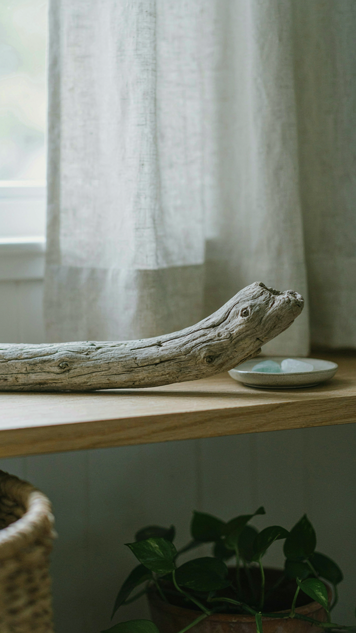
Most people fail at beach cottage interiors because they treat color as decoration instead of decision. You pick beige because it’s safe, not because you actually want to wake up and live there. Pull one object from your home that makes you feel something. A worn chair. A faded textile. A piece of driftwood. Now build your entire cottage around that single thing. The space won’t feel generic because you didn’t design it to please everyone. You designed it to please you, and that’s the only strategy that ever worked.