
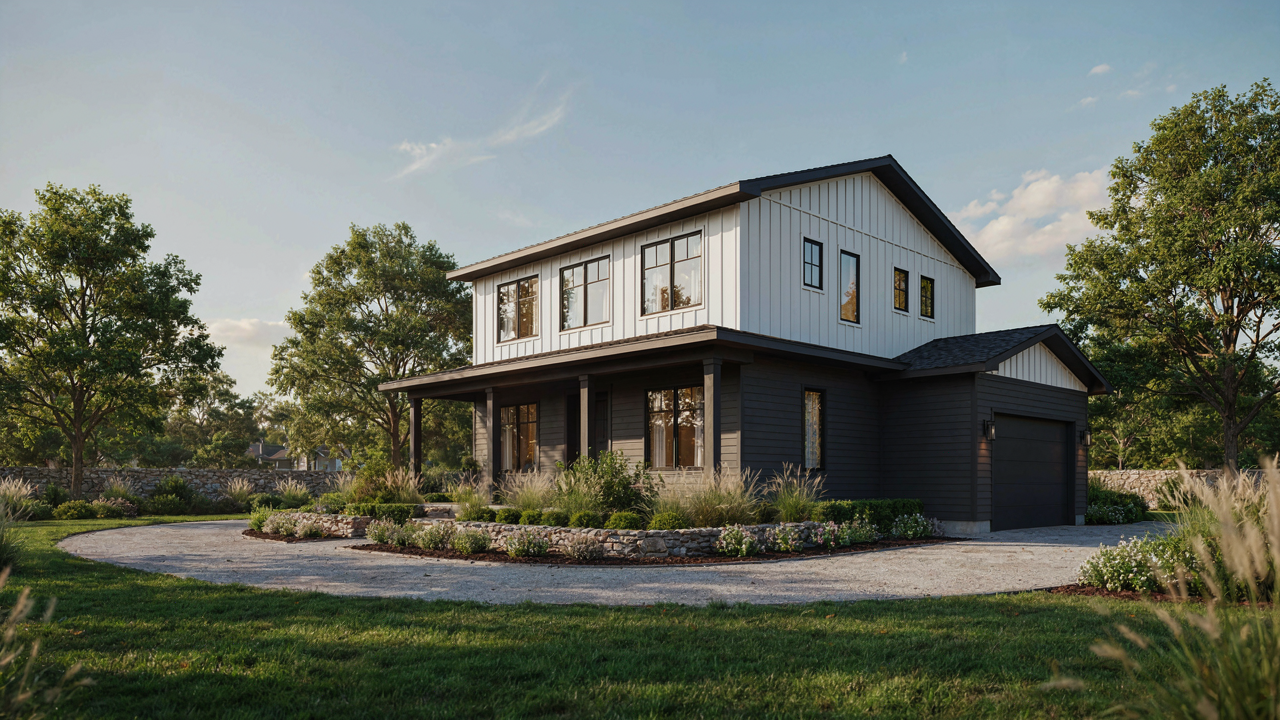
The Unseen Truth Of Garage House Plans: Beyond The Facade
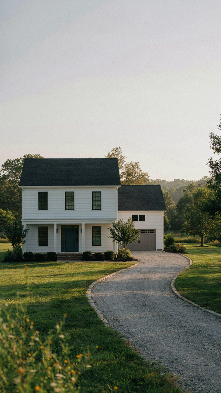
Where The Garage Actually Lives In Your Design
You want curb appeal without the garage killing it. That’s the real problem statement nobody admits. The garage isn’t a functional afterthought in farmhouse designs—it’s the primary visual obstacle that either anchors or destroys your entire front elevation. Most plans bury this truth and hope you don’t notice. The garage footprint consumes 40 to 50 percent of a typical farmhouse front facade. That’s not a detail. That’s the dominant plane.
Using spatial hierarchy from architecture—the principle that the eye organizes visual information by mass and prominence—the garage either becomes your focal point or disappears. Most farmhouse plans fail because they treat the garage as a problem to hide rather than a form to integrate. The mechanism is simple: a detached garage solves the visual problem but creates site planning complexity. An attached garage demands proportional integration into the roofline, material choices, and entry sequencing. The choice determines whether buyers see a house with a garage or a garage that happens to have a house.
The Front Facing Myth That Kills Authentic Farmhouse Plans
The assumption that everything important happens at the front is wrong. Rural farmhouse architecture evolved around side and rear access patterns because working farms never centered on front-door ceremony. Contemporary farmhouse plans copy the aesthetic but ignore the logic. This creates plans where the garage dominates the primary street view because designers followed subdivision convention instead of farmhouse vernacular.
The real move is repositioning the primary visual mass away from the drive. This doesn’t mean hiding the garage—it means offsetting it. Side-load or rear-load configurations keep the house form legible as the dominant gesture from the street. The garage becomes contextual support rather than the announcement. When you commit to this repositioning, material continuity matters less because the eye follows the dominant form first. The proportional hierarchy handles the heavy lifting.
The Barn Style House Plans Fallacy: Why Side Garages Still Fail

The Side Garage Doesn’t Save You
You want the garage hidden because you think it protects your farmhouse’s status—that rural authenticity buyers claim to want. Here’s what actually happens: a side garage doesn’t disappear. It just moves the visual problem sideways. The mechanism is simple. Garages are large, boxy volumes. Placing them to the side doesn’t reduce their visual weight; it redistributes it. Your eye still registers the structure. It still breaks the coherent massing that made traditional farmhouses feel grounded and proportional to the landscape.

The real issue planners miss: farmhouses worked because they grew incrementally. A main house, then a barn, then a silo—all separate objects with breathing room. Modern side garages attach directly to the home, creating an awkward L-shape or a bulging profile. Traditional farmsteads kept functions in distinct buildings. Side attachment is a compromise that satisfies neither aesthetic logic nor practical separation. The garage still dominates the roofline and foundation perimeter.
Visual Weight Requires Active Design Counterbalance
Think of this in terms of architectural balance, which works like physics on a horizontal plane. A side garage pulls visual mass to one edge of the composition. To restore equilibrium, you cannot simply add symmetry—that’s the lazy advice. You need mass redistribution on the opposing side. This means a covered porch, extended eaves, a secondary volume, or material differentiation on the front facade that commands equal attention to what the garage claims on the side.
Practical offset: increase the depth of the front porch by 3 to 4 feet beyond standard depth. Extend roof overhangs to 18 to 24 inches on the front elevation. Use a contrasting material—stone or board-and-batten siding—on the front gable to anchor visual focus forward. Reduce the garage door’s prominence by setting it back into shadow or breaking its rectangle with vertical paneling. Design the site plan so mature landscaping screens the garage volume before approaching the entry. These steps work because they force the viewer’s eye away from the side mass before it registers as dominance.
The “Hidden Hand” Method For Farmhouse With Garage On Side
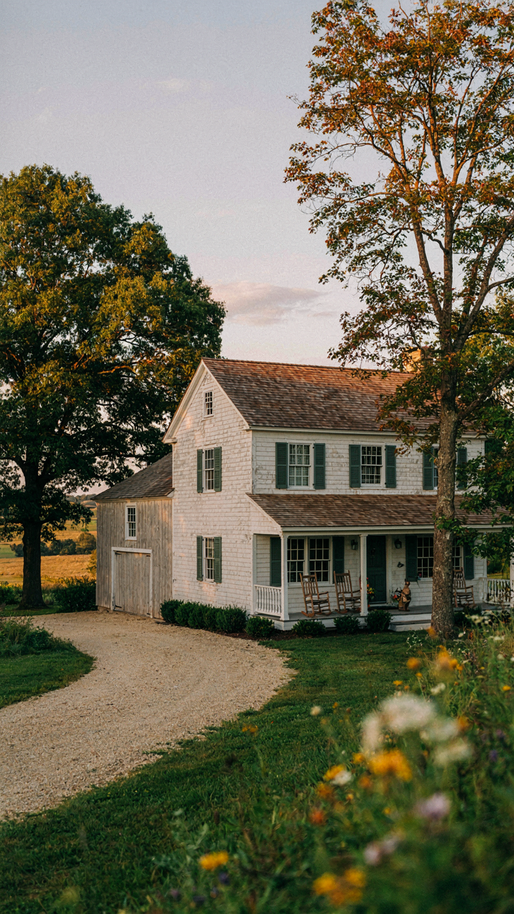
Garage As Visual Concealment
You want the garage invisible because you’re afraid it reads as suburban sprawl. Here’s the mechanism: military camouflage operates on a principle called “breaking the silhouette”—disrupting the outline so the eye doesn’t register an obvious form. Apply this to farmhouse plans with garage placement. Position the garage perpendicular to the street face, recessed behind the primary house volume. This forces the eye to process the home’s front elevation first. The garage doesn’t disappear. It surrenders visual priority.

The setback distance matters more than you think. A garage recessed twelve to eighteen feet behind the main roofline registers differently than one flush to the facade. Vegetation—fence lines, tree placement, hedge rows—becomes structural anchoring, not decoration. These elements work as sight-line blockers. The garage exists in the visual “background layer” of the composition. Curb appeal survives because the viewer’s hierarchy of attention stays on the vernacular farmhouse form, not the utilitarian box.
Viewing Angles And Street Grid Logic
Urban planners call this “pedestrian experience sequencing”—controlling what people see as they move through space. Farmhouse garage placement should mirror this. Most residential streets force a single primary viewing angle. The curb approach dictates what gets seen first. If your site plan positions the garage on the side elevation facing the street, you’ve already lost. Rotate the garage ninety degrees so side walls face neighbors, not the street. The front forty feet of your lot should show only the house form.
Corner lots demand sharper thinking. You now control two sight lines instead of one. A through-lot farmhouse plan treats the secondary street face like a flank—the garage occupies that zone, recessed or screened. Driveway geometry matters tactically. Run the drive to the side garage entrance alongside the house, not across the front. This channels traffic behind the primary facade. The garage functions. Curb appeal remains intact. The mechanism is simple: control what the street sees by controlling when and where the utilitarian elements appear.
Modern Farmhouse House Plans: Integrating, Not Attaching
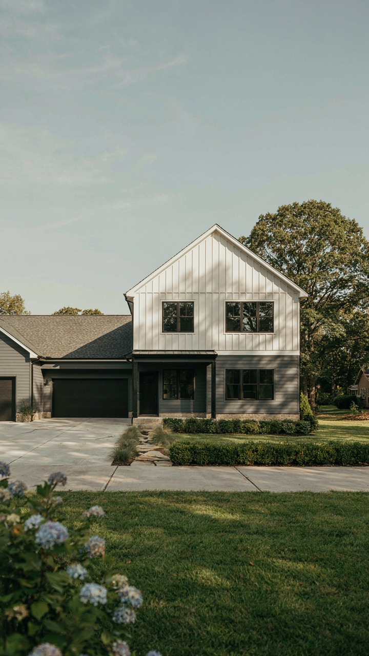
Where The Garage Actually Lives On The Facade
You care about this because a garage eats half your home’s visual real estate, and most plans waste it by bolting a box to the side like an afterthought. The mechanism is architectural hierarchy: treating the garage as a subordinate mass rather than fighting it for visual dominance. Traditional farmhouses didn’t have garages, so modern plans must absorb them into the existing language of the house, not announce them as separate structures. The difference between integration and attachment is whether the garage reads as part of the farmhouse or reads as a garage someone added.
Integration uses roofline continuity, material harmony, and setback positioning to make the garage feel like it belonged to the original plan. Attachment means the garage roof cuts at a different angle, the siding mismatches, and the entry positions it as visibly distinct. The farmhouse vocabulary has authority here: deep eaves, gable forms, and material repetition are not decorative. They’re the rules that make a structure feel coherent. When you violate those rules for a garage, the entire front elevation registers as fragmented, regardless of how much landscaping you pile against it.
Roofline Strategy Before Anything Else
Stop designing the garage as a separate box with its own roof statement, then trying to hide it. Start with the roofline of the entire footprint and work backward. When a garage occupies the front or side of a farmhouse plan, its roofline should extend from or align with the primary roof structure, not contradict it. This is a load-bearing decision in terms of visual weight, not structural engineering. A garage gable that echoes the main gable creates repetition and coherence. A garage roof that steps down or runs perpendicular fragments the eye and kills curb appeal.
Material consistency reinforces what the roofline establishes. The same shingle color, profile, and finish on garage and house read as intention. Matching exterior cladding between the main house and garage walls eliminates the visual cut that screams “addition.” The setback is the final control: positioning the garage slightly recessed from the primary street facade reduces its visual footprint without hiding it. This depth creates shadow and scale variation that makes the composition feel layered and intentional rather than flat and frontal.
The Visual Hierarchy Protocol: Guiding The Eye Away From The Garage
What Actually Competes For Attention
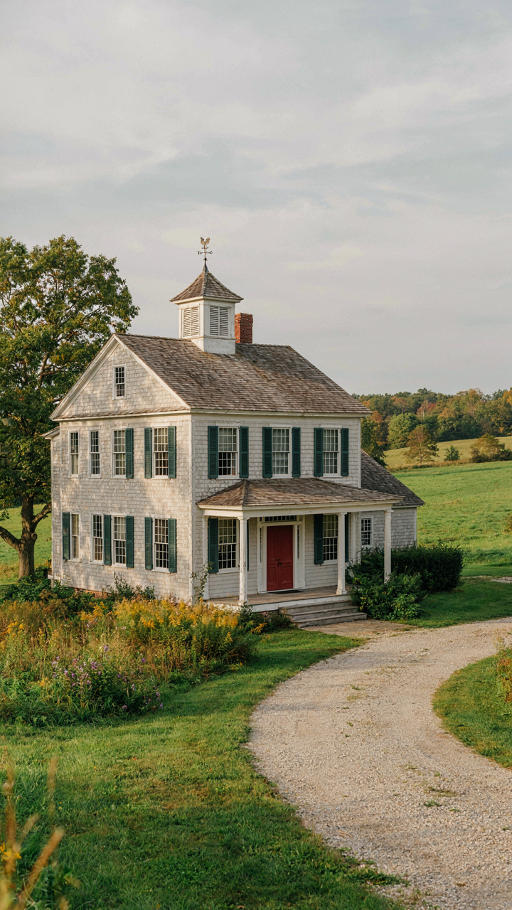
You’re worried the garage will dominate your farmhouse facade and tank resale value. Here’s the mechanism: the eye lands on the largest, most symmetrical, or most visually discordant element first. Garages fail because they’re boxy, centered, or clad in materials that contrast sharply with the house. The fix isn’t hiding the garage. It’s placing stronger visual anchors that pull attention elsewhere before anyone registers the garage exists. This is basic visual weight distribution, borrowed from graphic design composition. Your curb appeal wins when the entry, landscape, and architectural details command the focal hierarchy first.

Asymmetrical placement breaks the garage’s visual dominance. Tuck it to one side of the house, behind a secondary plane, or recessed deeper into the lot than the front facade. When the garage isn’t centered or level with the main structure, it stops reading as the primary feature. Use matching exterior materials between the garage and house body to eliminate contrast that screams “addition.” The garage door itself becomes a non-event when it’s treated as a supporting element rather than a statement. Strategic placement neutralizes the threat before design details ever come into play.
Entry, Landscape, And Material Anchors
Your primary focal point must land on the front entry. This is where the eye should stop first and linger. A strong entry means an inviting porch, distinctive door color, transom windows, or a peaked roof accent that signals importance. Without this anchor, visitors scan the entire facade and your garage becomes the default landing zone. Landscape elements amplify this effect. A specimen tree, defined planting bed, or walkway with clear sightlines to the entry pushes the garage to peripheral vision. The mechanism is simple: establish hierarchy through deliberate scale and placement, not concealment.
- Front Porch Scale: A covered porch or stoop that extends 8 to 12 feet deep creates visual weight that competes with garage mass. Exposed posts or columns reinforce this as the primary architectural gesture.
- Entry Door Treatment: Deep color contrast, arched transom, or decorative hardware on the entry door pulls focus. The garage door remains utilitarian by contrast, receding visually.
- Specimen Plantings: A single large tree positioned between the garage and entry disrupts sight lines and places a living element in the visual foreground.
- Hardscape Leading To Entry: A defined walkway, stone path, or front steps that clearly direct foot traffic to the entry reinforces hierarchy and signals where attention belongs.
- Roofline Variation: A peaked gable or higher roofline over the entry area versus a flat or lower garage roof creates vertical drama that commands attention first.
The garage occupies the same visual plane as the rest of the house, but it loses the competition for attention when these elements are stronger. Material consistency between garage and house body, combined with strategic landscaping, places the garage in supporting role rather than as a visual anchor. The eye follows hierarchy, not proximity.
Beyond The Blueprint: Landscape As The Ultimate Garage Blocker

Plants As Visual Interruption
You want the garage gone from sight because you’re afraid it makes your farmhouse look ordinary. Here’s the mechanism: a garage reads as commercial infrastructure until vegetation breaks its geometry. Plants work through layering, not concealment. A single row of shrubs fails because sight lines still reach the structure. Strategic placement means positioning trees and shrubs at angles that fragment the garage edge, forcing the eye to stop at foliage instead of tracking the building mass.
Dense evergreen species perform better than deciduous options because they maintain volume year-round. Plant spacing matters more than plant choice. Space plantings sixteen to twenty feet from the garage line, not directly against it. This distance creates visual depth. The viewer’s eye registers the vegetation layer first, then the house, then slides past the garage zone before the structure becomes the focal point. Tree canopy coverage at fifteen to twenty feet height screens the roof line entirely.
Hardscape Geometry Redirects Attention
Military strategy uses misdirection to control where an opponent looks. Hardscaping applies the same principle: pathways, walls, and paving patterns become visual anchors that pull attention away from the garage structure itself. This isn’t about hiding the garage. It’s about commanding the viewer’s gaze before it finds the problem.
A curved stone pathway from driveway to house entrance creates movement that contradicts the garage’s static presence. Raised planting beds positioned between the viewer and garage mass interrupt sightlines without requiring dense vegetation. A pergola or arbor placed perpendicular to the garage facade fragments its visual weight. Stone walls angled forty-five degrees from the house corners establish competing focal points. The mechanics are spatial division and angle disruption, not camouflage. Install hardscape elements first, then verify sightlines from the street curb before finalizing plantings.
Contemporary Craftsman: The Garage As A Design Opportunity
When The Garage Stops Looking Like An Accident
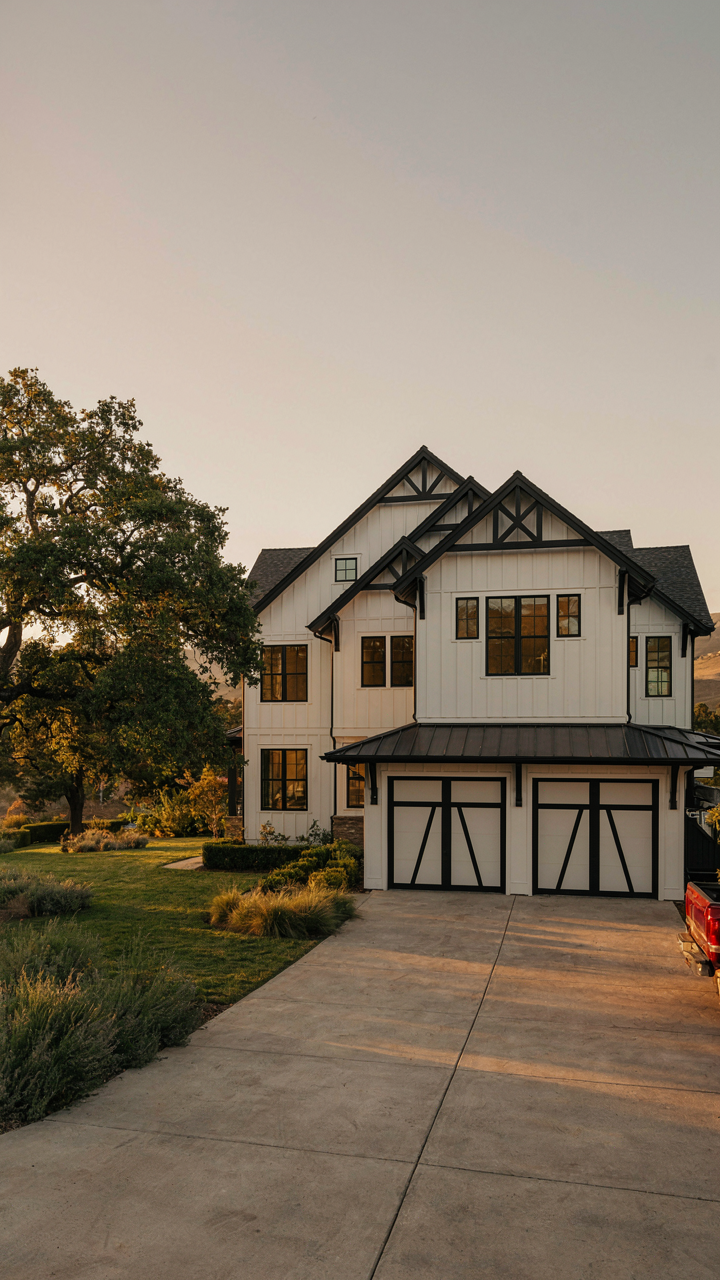
You want people to see your property and think you chose every element on purpose, not that the garage was something you tolerated. The mechanism is simple: most farmhouse plans treat the garage as a necessary intrusion, then compensate with generic cottage details elsewhere. The real move is treating it as load-bearing architecture, the same way structural engineers think about weight distribution. Your garage either carries the design or it doesn’t. If it’s a poorly proportioned box tacked to the side, no amount of shutters fixes the underlying problem.

Positioning and scale determine whether a garage reads as intentional or apologetic. A three-car garage that dominates the front elevation will always lose a fight with a traditional farmhouse aesthetic. The solution isn’t hiding it, it’s integrating it as a secondary mass. Place it perpendicular to the main house, set it back from the primary facade, or angle it to break the box form. The craftsman tradition understood that every building volume should have purpose in the composition. When your garage occupies the correct spatial hierarchy, the rest of the design breathes.
Details That Ground The Garage Into The House
Matching materials between the garage and the main structure stops the visual separation cold. Use the same siding, roof pitch, and trim profile as your primary house walls, not as accent details. This isn’t decoration, it’s consistency. The common mistake is adding gable details or board and batten to “farmhouse it up”—that signals you’re aware the garage looks wrong, so you’re overcompensating.
Functional architectural moves do the work instead. Extend the main roofline to cover a garage forecourt or entry. Use the same window rhythm and mullion pattern you established on the house. Install matching shutters on garage-facing walls if the house has them, but follow the same size and hardware spec exactly. These aren’t upgrades, they’re the baseline for coherence. When every element traces back to one design language, the garage becomes load-bearing to the entire visual story, not a competing structure demanding forgiveness.
Front Garage House Plans: The Unavoidable Truth
When Your Lot Decides For You
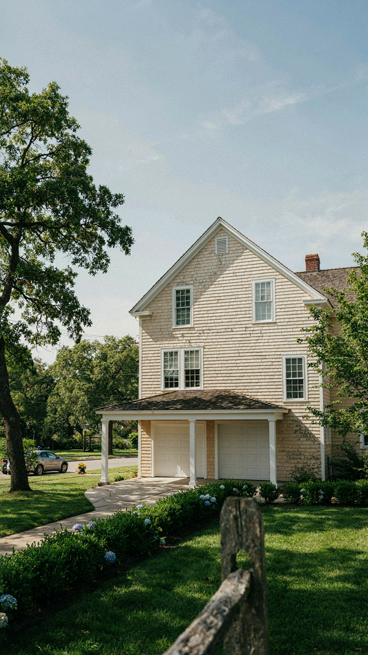
You’re worried people will judge your house as suburban instead of rural. The real mechanism is this: lot depth and setback requirements make a front garage inevitable on narrow parcels. Most residential farmland plots under two acres, especially near development zones, have municipal codes that mandate minimum front setbacks. You can’t build backward without violating code or burning budget on variance applications. Accept this constraint upfront instead of designing a plan that won’t fit your actual property.

The math is simple. A typical farmhouse footprint runs 40 to 50 feet deep. Add a front setback of 25 to 40 feet depending on local ordinance, and you’ve consumed most of your usable front acreage before the house even starts. A detached garage becomes a luxury only if you have 150+ feet of depth. Most buyers working with real budgets on real lots don’t have it. Design within your actual constraints or waste months chasing an impossible plan.
Visual Hierarchy Beats Garage Size
The common advice says “make the garage recessed” or “hide it on the side.” Wrong. You can’t hide a two-car garage anywhere meaningful without adding thousands in construction cost and losing living space. The real move is proportion and material continuity. Use the same roofline pitch, siding, and trim details between garage and house. A garage that reads as an integral part of the structure vanishes visually—not because it’s hidden, but because it doesn’t signal “afterthought.”
The front entry must visually dominate the composition. Flanking doors, a porch that projects forward of the garage mass, or a cupola above the entry shifts the visual weight away from the vehicle opening. Material contrast works against you here. Avoid siding changes, different brick colors, or detached structures that scream “this is the garage wing.” Horizontal continuity along the roofline matters more than any styling detail. When garage and house read as one mass, curb appeal survives a front-facing plan.
The Curb Appeal You Crave Isn’t About The Facade; It’s About Mastering The Shadow
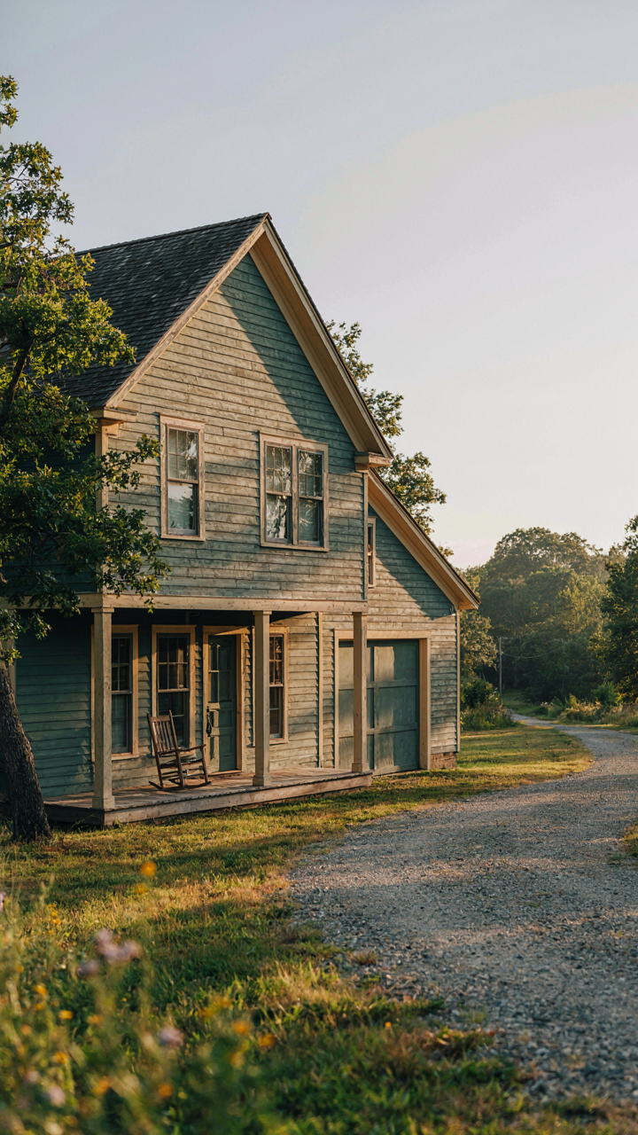
Most people obsess over the front porch and miss what actually kills farmhouse curb appeal: a garage that screams “afterthought.” Your garage isn’t a necessity hiding on the side. It’s the anchor that either grounds your entire aesthetic or tanks it. Stop treating it as separate from your home’s design. Integrate it into your floor plan from day one. Make the garage door, materials, and placement tell the same story as your front entrance. This single shift determines whether your farmhouse looks intentional or cobbled together. The best curb appeal isn’t what you add, it’s what you plan.