Introduction
Cherry red offers a unique way to bring energy and vibrancy into your space. It’s a bold color that can instantly catch the eye and make any room feel lively and inviting. Whether you want to highlight a small area or transform a whole room, cherry red accents can provide that instant impact you’re looking for.
In this article, you will discover practical and creative cherry red accent ideas. From choosing the right shades to combining them with other colors, you’ll learn how these ideas can enhance your home. You will also find easy tips to apply these accents, making your space stand out naturally.
Understanding Cherry Red and Its Impact
Cherry red is a deep, rich shade of red with subtle hints of blue and purple, often resembling the natural color of ripe cherries. It’s not just a bright red; it carries a certain warmth and depth that gives it a unique presence. You might notice that cherry red doesn’t shout as loud as fiery reds, but somehow it feels more intense, more deliberate. It’s a color that holds your attention without overwhelming your senses.
Psychologically, cherry red influences us in interesting ways. It’s often linked to energy and passion, sure, but also to a sense of comfort and richness. When you see cherry red, you may feel alert, even a bit excited—but also grounded somehow. There’s a tension in that mix, like the color wants to provoke emotion yet keep you balanced.
In design, cherry red’s impact is immediate. It naturally stands out against neutral or muted backgrounds, drawing eyes quickly. It’s not subtle, nor is it harsh. Instead, it engages you, inviting a closer look. I think part of the reason cherry red commands attention is because it’s so familiar and yet not overused. It feels both classic and slightly unexpected, which makes it perfect for adding instant character to a space.
The Meaning Behind Cherry Red
Cherry red carries a varied symbolism that changes slightly depending on culture and context. Often, it’s associated with love and passion—those emotions are probably the first to come to mind. But there’s also a sense of vitality and strength underneath. When you see cherry red, it might make you think of warmth and comfort, even sensuality.
On the other hand, cherry red can also stir feelings of urgency or alertness, which is why you might see it used in warning signs or sales promotions. That dual role—warmth versus urgency—creates a kind of complexity that makes cherry red intriguing. It’s a color that doesn’t easily simplify itself.
People might react differently to cherry red based on personal experience. Some may feel energized, while others might find it intense. I recall walking into a room painted with cherry red accents and feeling an immediate rush of liveliness. But at the same time, the color somehow grounded the space, making it feel cozy rather than chaotic.
How Cherry Red Commands Attention
Cherry red naturally grabs attention because of its deep saturation and eye-catching warmth. From a visual standpoint, it’s one of those colors that can’t be ignored—you’ll find your gaze drawn to it before you even realize it. It contrasts sharply against most other colors, especially greys, whites, or blues, which makes it a natural focal point.
The human eye is wired to notice reds quickly, partly because red shades often signal important or urgent things—think stoplights or alerts. Cherry red carries that same instinctual pull but offers a richer, softer tone that keeps it from feeling too aggressive. It’s almost magnetic.
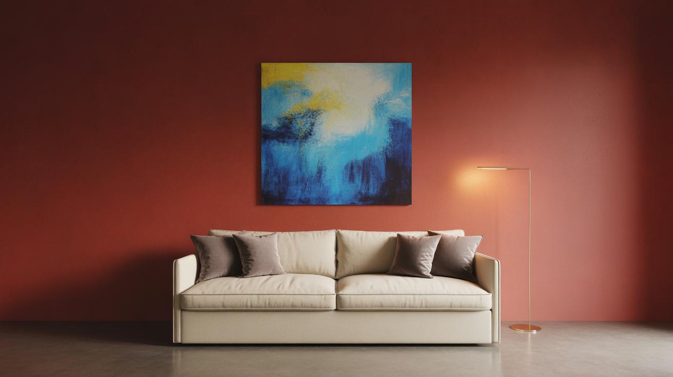
When placed strategically, cherry red gives any space an instant lift. It doesn’t need to cover a large area to make an impact; even small doses—a pillow, a lamp, or a piece of art—can disrupt the visual flow and bring energy. It makes you pause, look closer, maybe even feel something unexpectedly strong, and that’s why you’ll find it used often to spice up interiors that otherwise might feel too safe or bland.
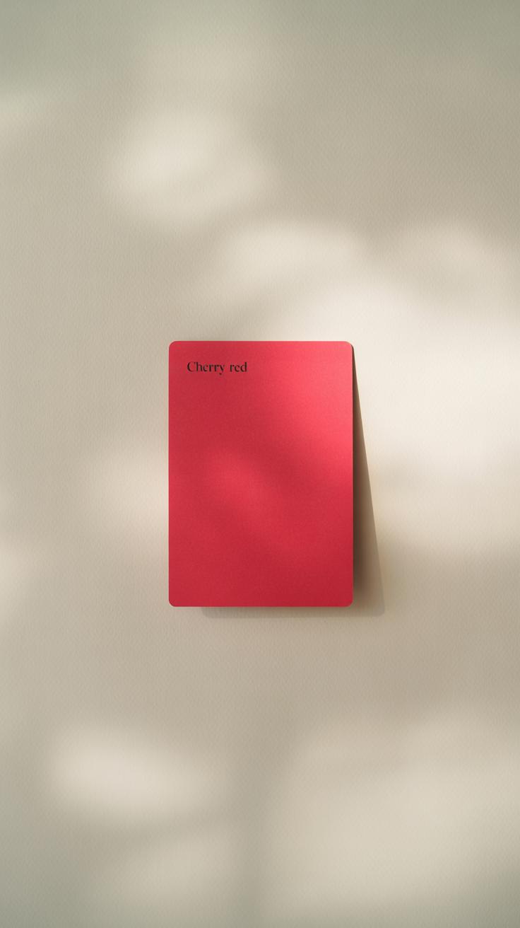
Choosing the Right Shade of Cherry Red
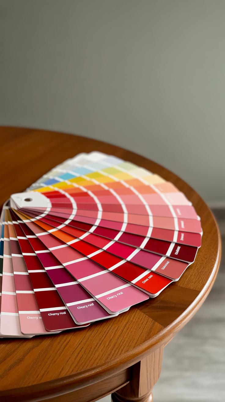
Cherry red isn’t just one simple color; it comes in so many variations that picking the right one can feel a bit tricky. Some shades lean toward bright and punchy, while others are deeper, almost bordering on burgundy. It really depends on the mood you want to set and the other colors in your room.
Here are some popular cherry red shades you might consider:
- True Cherry: A bright, classic red with a slight warmth. It’s bold without being overwhelming.
- Deep Cherry: More muted, with hints of brown or maroon. Feels cozy, almost vintage.
- Cherry Blossom Red: A lighter, somewhat pinkish red. Softer and a bit unexpected.
- Rustic Cherry: Earthier, with subtle orange undertones. Adds warmth but stays grounded.
It’s good to sample paint swatches or fabric samples in your space because cherry red can look very different under various lights.
Lighting plays a bigger role than you might expect in how cherry red appears. Natural light tends to bring out the true warmth of the color, making it feel welcoming and alive. But artificial light can either dull it down or, strangely, make it seem almost too bright, depending on the bulb’s warmth or coolness.
I once painted a cherry red chair near a north-facing window, thinking it would glow all day. Instead, it took on a cooler, slightly purplish tone in the afternoon shade. On the other hand, under warm incandescent bulbs, that same shade felt richer and a bit velvety.
Consider the time of day you spend most in that room and the types of lighting you use. If your space has limited natural light, maybe a lighter cherry red or one with subtle pink undertones is safer. But if you get plenty of daylight, go for something deeper and more robust.
Could a certain cherry red shade evoke the vibe you want, or might it mislead your expectations depending on light? It’s a subtle art—worth experimenting with before committing fully.
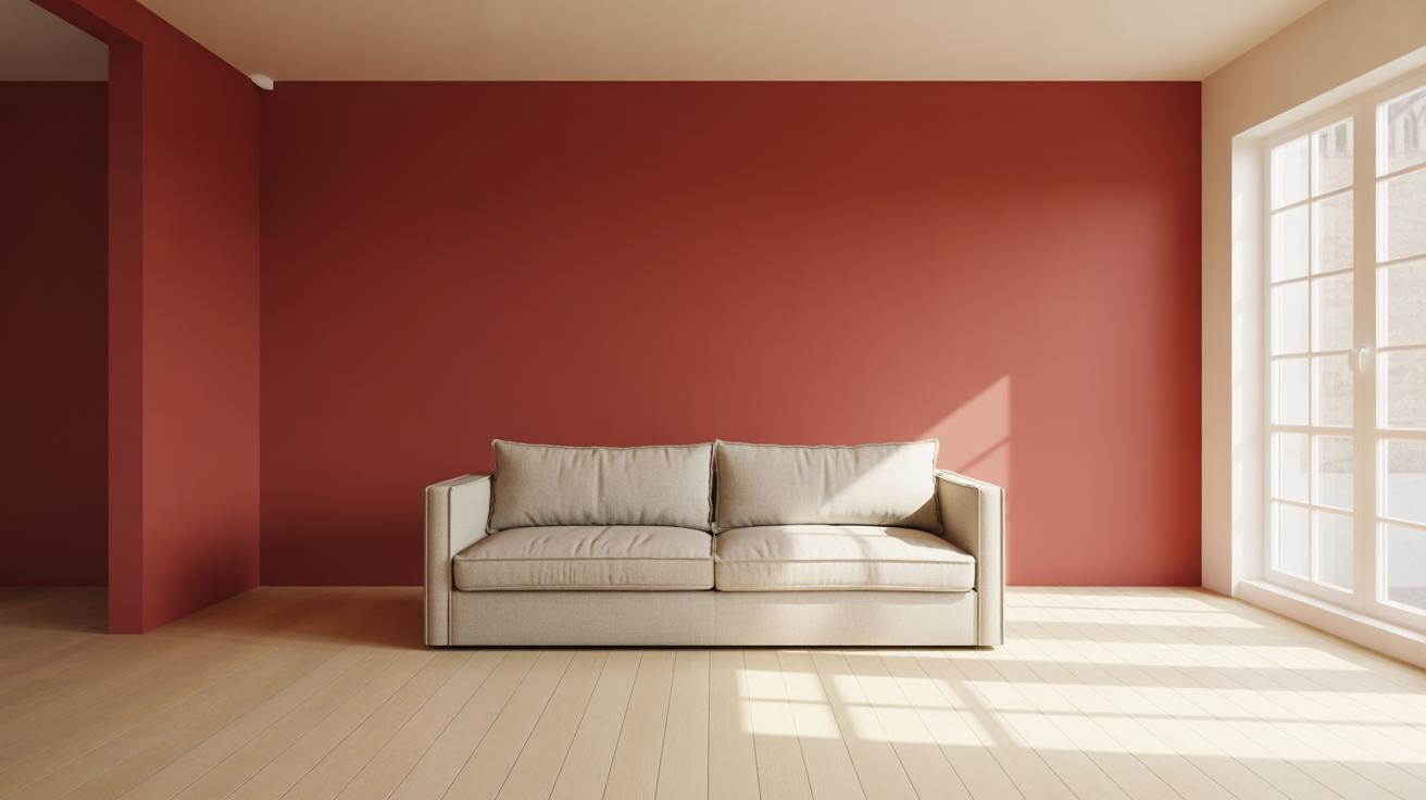
Cherry Red Accent Walls for Bold Statements
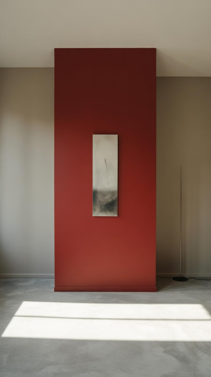
Picking the Perfect Wall
Choosing which wall to paint cherry red can make or break the impact you want to create. Usually, it’s the wall you first see when you enter the room — maybe behind the sofa in your living room or the one opposite your bed in the bedroom. But sometimes, a less obvious choice can surprise you.
Think about natural light too. A cherry red wall with direct sunlight will look different than the same wall in shadow. If the space feels dark, a cherry red wall might feel overwhelming, so pick a spot that doesn’t compete with the rest of the room for attention but still anchors the layout.
Don’t hesitate to test with painter’s tape or a large swatch before committing. It’s tricky; sometimes what works in theory feels off once you actually see it.
Balancing Cherry Red with Other Elements
Cherry red is a strong color and can easily dominate a space, so balance is key. Pair it with neutrals—think soft creams, muted greys, or even warm beiges—to help the color breathe. Too many competing colors near this wall can make everything feel scattered.
Furniture can either amplify or soothe the boldness of a cherry red wall. Lighter woods or simple black frames often tone down the intensity while keeping the statement intact. Patterns? Keep them minimal and subtle. Too busy, and the space just gets noisy.
Also, consider textures. Matte finishes on the wall pop differently next to glossy or fabric-covered furniture. Sometimes, a mix of finishes can create a more layered, thoughtful atmosphere without clashing.
Ever walked into a room and felt the color shouted at you? Cherry red walls need that delicate touch so they say what you want but don’t overwhelm the whole vibe. Balancing feels more like art than science here.
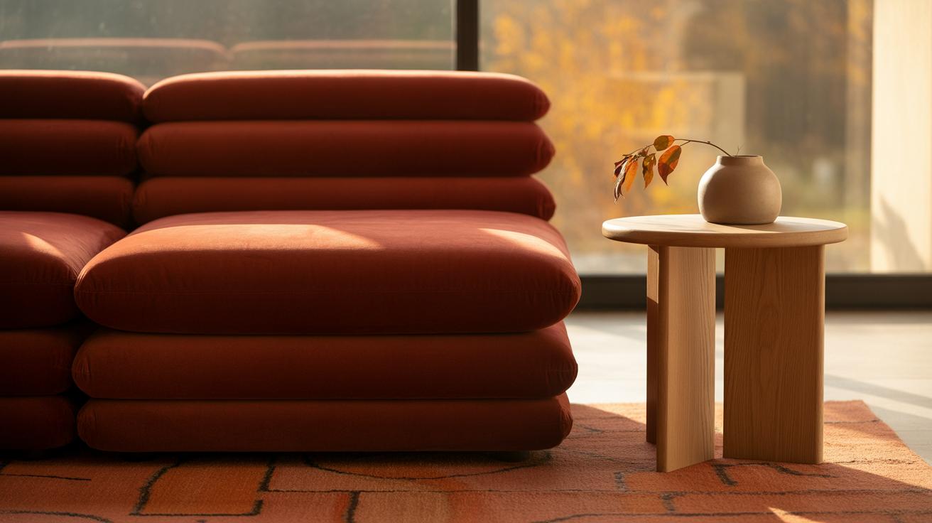
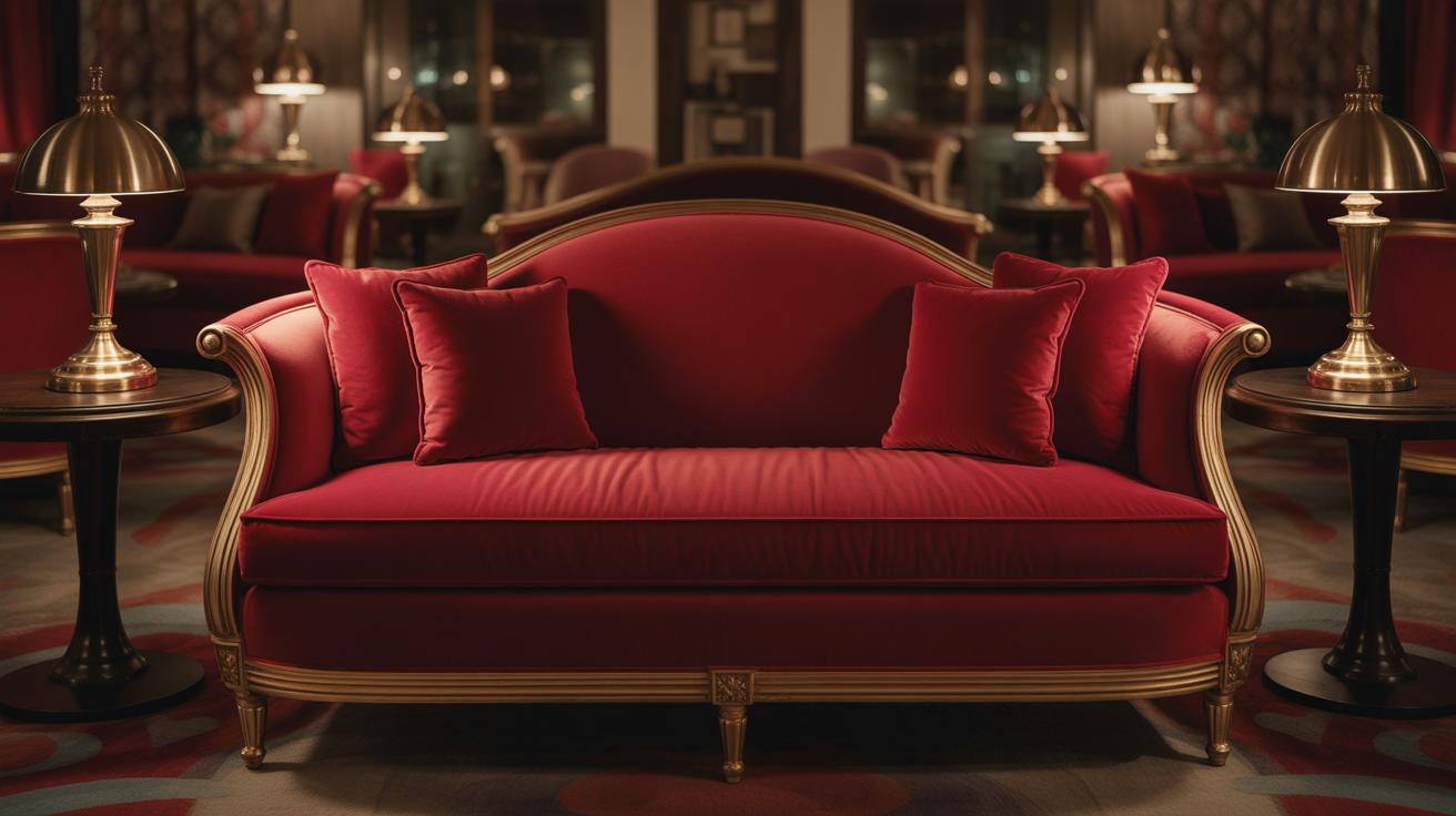
Using Cherry Red in Furniture
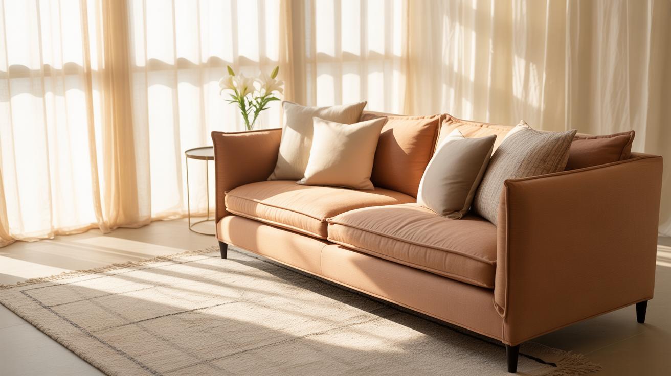
Cherry red furniture can really shift the energy of a room. It’s bold, yes, but also warm and inviting in a way that’s often overlooked. Placing a cherry red armchair or sideboard in your living room can draw the eye without overcrowding the space. You might hesitate if your room feels small, but some cherry red pieces, especially those with clean lines, can actually add depth rather than bulk.
When choosing cherry red furniture, consider the scale and function first. A large dining table or a tall bookshelf in cherry red will demand attention—and that’s exactly the effect you want—but smaller pieces like stools or ottomans offer a less intense yet still impactful splash of color. And don’t forget about texture—a glossy finish can feel sharp, while a matte or slightly distressed piece might better suit a cozy, lived-in room.
Statement Pieces in Cherry Red
Common statement items that work well in cherry red include:
- A sleek velvet armchair that becomes a cozy nook’s main feature
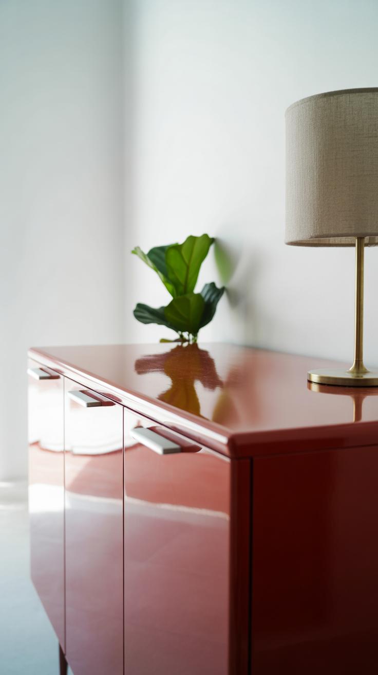
- A cherry red dresser or chest that energizes a neutral bedroom
- A polished dining chair set, perfect for breaking the monotony of a wooden table
- A striking media console that anchors the entertainment zone
In my experience, one cherry red statement piece often sets the tone for the entire room—without making the space feel like it’s shouting. Sometimes you just want that one element that anchors your design, right?
Mixing Cherry Red Furniture with Other Colors
Cherry red plays well with neutrals—think soft beige, creamy whites, or even cool grays. Pairing it with these tones often calms its intensity, letting the red shine without overwhelming. But then, you can also test contrasting colors if you feel adventurous—navy blues, forest greens, or even charcoal black can create a striking balance with cherry red furniture.
It’s a balancing act. Too much contrast can make a room feel like it’s fighting for attention, too little and the cherry red might seem less exciting. Personal taste always matters here. What do you gravitate towards—something peaceful or something daring? Choosing your pairing can change how a cherry red piece “speaks” in the room, and sometimes that’s exactly what you want: a conversation starter.
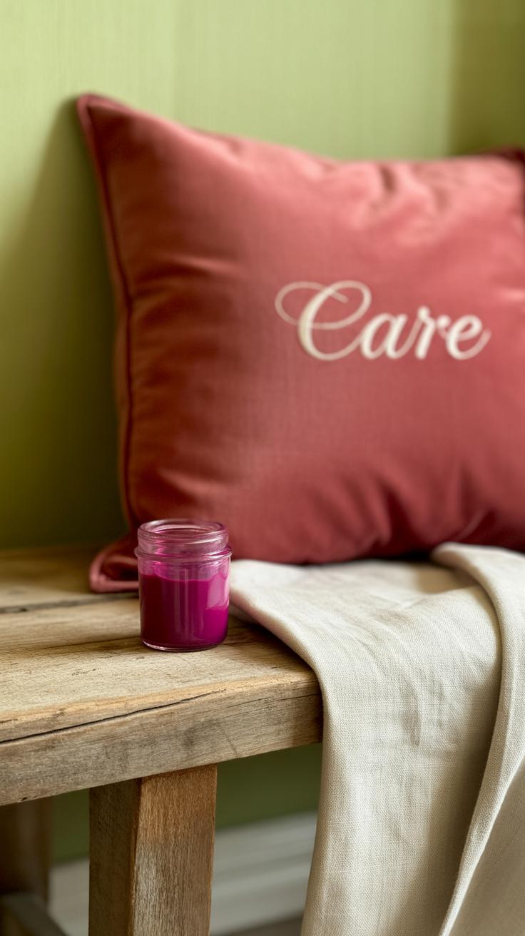
Cherry Red Accessories for Subtle Accents

Cherry red is a bold color, but when used in small doses—like accessories—it can add that spark of energy without taking over the room. If you’re hesitant about diving into a full-on cherry red wall or furniture piece, accessories offer a way to test the waters. The key is balance: a few well-placed touches brighten a space, provide visual interest, and invite warmth without overwhelming your senses.
Popular Cherry Red Accessories
Think cushions, throws, and vases. These items easily dress up any corner or surface:
- Cushions: Cherry red cushions on a neutral sofa draw the eye and make the seating area pop.
- Throws: Draping a cherry red throw over the armrest or foot of a couch adds coziness and a splash of color.
- Vases and Bowls: A cherry red ceramic vase, even empty, can stand out on a mantle or shelf.
- Lampshades: Subtle, but they cast a warm red glow that’s quite inviting.
- Candles and Candleholders: Perfect on a coffee table or dining room sideboard for understated warmth.
Using more than one type helps you spread the color thoughtfully rather than lumping it all in one spot. It’s like watering a plant—it grows better with gentle, repeated touches than a single flood.
Layering Accents for Depth
Not all reds are the same. Cherry red sits somewhere between bright scarlet and deep maroon, and you can play with those variations to create layers. For example, mixing a dark red velvet cushion with a bright cherry red silk throw adds texture and richness, making the palette feel more complex—even luxurious.
I’ve noticed that layering these tones keeps the space from feeling flat, especially when paired with neutral bases like soft grays, creams, or subtle wood finishes. Oddly, too much uniformity in red can feel either harsh or dull. So, don’t hesitate to mix matte with shiny, or bright with muted cherry hues. It’s easier than it seems and, honestly, it’s kind of fun to try.
Incorporating Cherry Red in Artwork
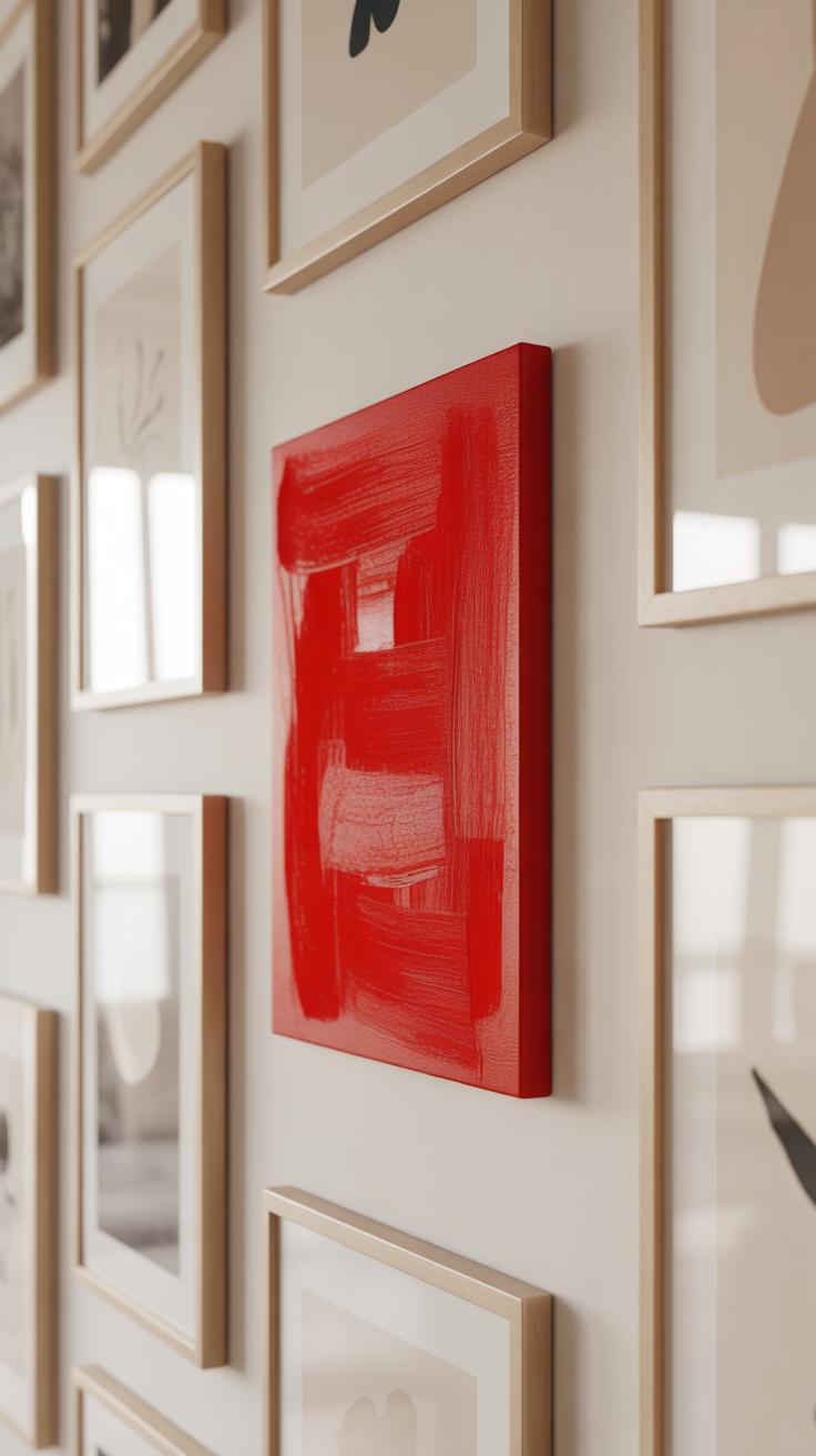
How Cherry Red in Art Can Illuminate a Space and Add Personality
Artwork with cherry red tones has a way of drawing the eye and lighting up a room without using actual light. That deep, rich red adds warmth and energy, but not so much that it feels over the top. I’ve noticed how a single cherry red splash in a painting can change the whole mood—making a neutral space suddenly feel alive or giving a dull corner a bit of boldness.
Art with cherry red often carries a sense of confidence or passion, which injects personality into any area. It’s not just about color; it can bring a statement mood—whether it’s a subtle hint or a striking feature. Sometimes, the red feels kind of unexpected, like it’s quietly commanding attention while letting the rest of the room settle comfortably.
Choosing Art with Cherry Red: What to Look For
When picking cherry red art, think about balance first. You don’t want it to clash with existing colors, but it shouldn’t vanish into the background either. Look for:
- Pieces where cherry red complements other hues in your room, like soft neutrals or dark woods.
- Artwork that uses cherry red strategically—not overdone—so the color feels intentional.
- Styles that suit your taste: bold abstract, subtle florals, or even detailed figurative art with cherry red highlights.
- Pieces that evoke an emotion or tell a story that resonates with you since that personal connection often brings a room to life.
Sometimes, less obvious uses of cherry red—like in small but key areas of the image—can have more impact than a full-on red canvas. It might depend on whether you want the art to dominate or to subtly hint at that splash of bold color.
Placement Tips for Art Featuring Cherry Red
Where you hang cherry red art changes everything. Placing these pieces:
- Above a sofa or console to create a natural focal point that anchors the space.
- In a dining room, where a cherry red element might stimulate conversation and energy.
- Near natural light sources to let the color shift subtly throughout the day. Sometimes, that’s when cherry red really surprises you.
- Grouped with smaller pieces that pick up the same red hues—it adds cohesion without feeling too matchy.
Think about sightlines too. If a piece with cherry red is on a main wall you face often, it can help keep the room feeling lively. But if it’s tucked away, it might lose some of its impact. Placement might depend on how much attention you want to draw or how much you want the color to “sneak” into the background.
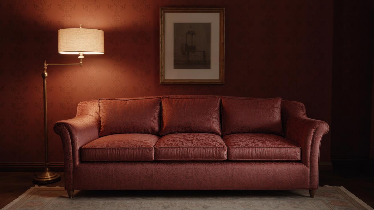
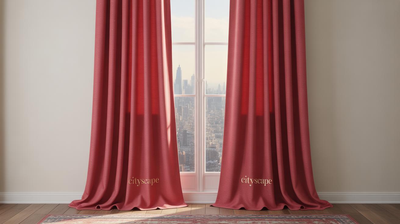
Cherry Red in Textiles and Curtains
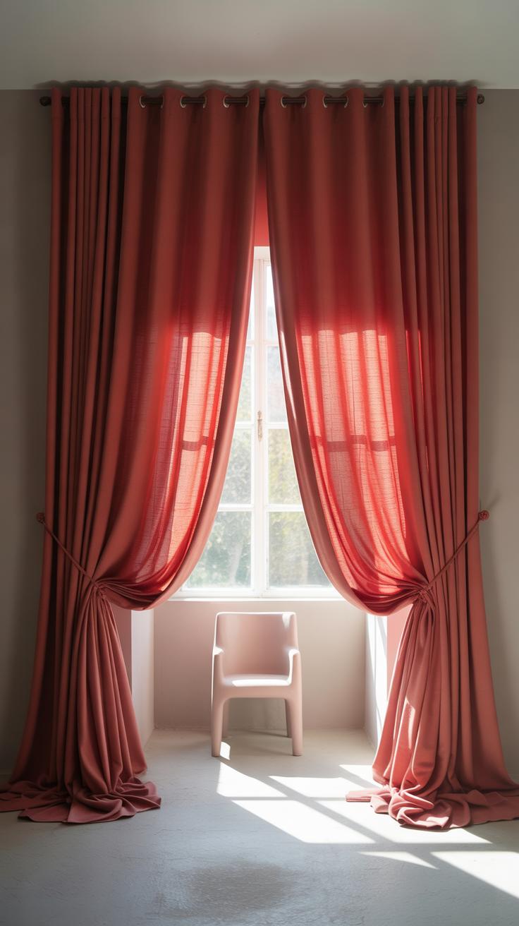
Introducing cherry red in textiles like curtains, rugs, or upholstery can change the mood of a room quite noticeably. Fabrics in cherry red bring warmth and a sense of coziness, which can make your space feel more inviting. Think about how cherry red curtains catch the light during the day, adding subtle energy without overwhelming the room.
Using cherry red rugs or upholstery injects a pop of color that anchors the space. It creates focal points that draw the eye naturally, and honestly, it can make even a neutral room feel less dull. You might hesitate to go bold with large pieces, but sometimes a single cherry red chair or cushion is enough to spark life in the decor.
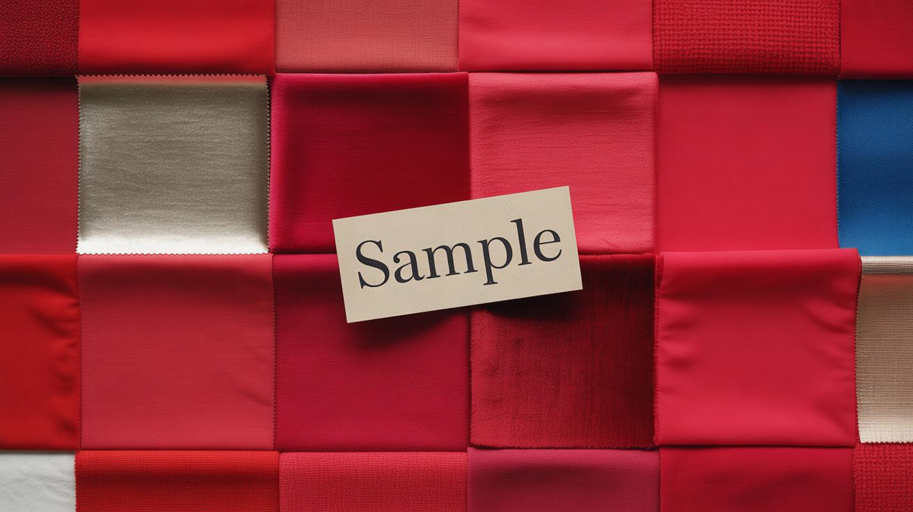
Selecting Textiles in Cherry Red
When searching for cherry red fabrics, quality really matters. Look for rich textures that reflect light well—velvet, for example, often gives cherry red that deeper, more luscious feel. Cotton or linen might feel fresher but can sometimes make the color appear flatter.
Don’t just pick the brightest shade blindly. Try several swatches in your room’s light since cherry red can lean warmer or cooler depending on the fabric and lighting. Ask yourself: does the tone feel right for your mood? Is it standing out without being harsh? Sometimes a softer, muted cherry red works better than a vivid, blaring one.
Combining Textiles for a Cohesive Look
Bringing cherry red textiles in confidently means thinking about the other colors you already have. It pairs well with neutrals—grays, beiges, and off-whites make cherry red pop without clashing. Deep blues or even certain greens can add surprise, but only if balanced carefully.
You might mix cherry red cushions with a rug that has hints of the same shade or curtains with subtle cherry red patterns rather than solid blocks. This layering helps the red feel intentional. And if you’re cautious about the intensity, start small. Combine a patterned cherry red throw over a neutral sofa with matching curtains, then see how it feels.
Cherry red in textiles isn’t just decoration—it’s about setting an atmosphere that sometimes feels bold, sometimes feels warm, and always feels thoughtfully chosen.
Using Cherry Red in Kitchen and Dining Areas
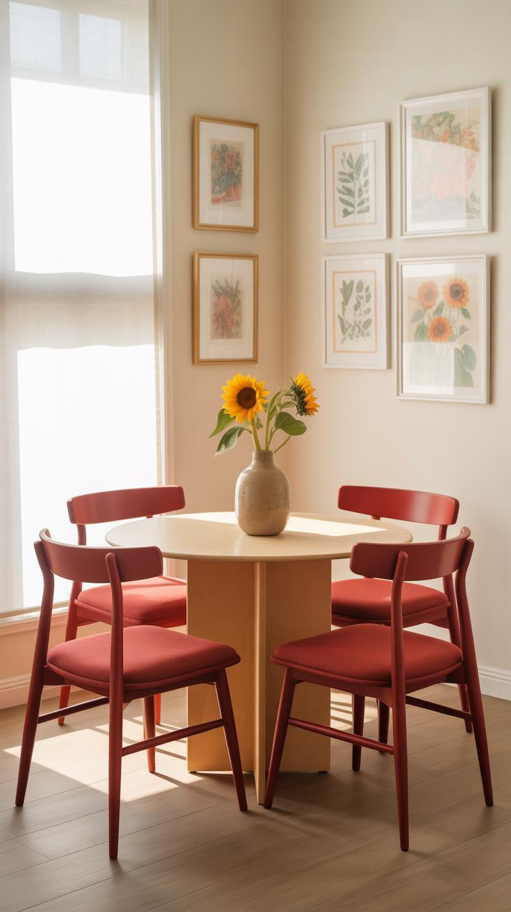
Cherry red can change the whole feel of your kitchen or dining room, often in ways you might not expect. It brings a sense of warmth that makes the space feel inviting—like it welcomes conversation and lingering meals. There’s something about cherry red that hits a cozy note without feeling dull or heavy. Maybe it’s the way it pairs with natural wood tones or stainless steel, or how it draws the eye without shouting.
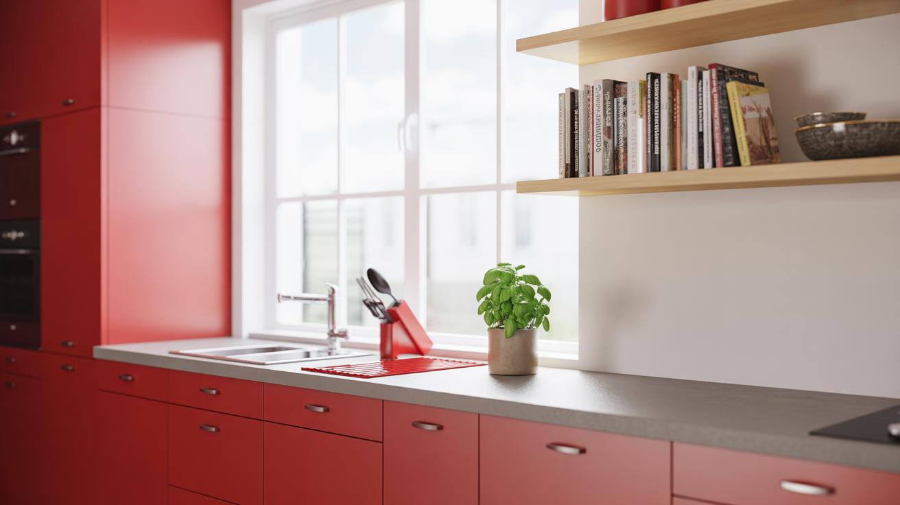
Cherry Red Cabinets and Backsplashes
If you’re thinking about cherry red for cabinets or a backsplash, here are a few ideas that might help you decide:
- Cherry red cabinets can anchor the room. They stand out but don’t overwhelm if balanced with neutral walls and countertops.
- Because it’s such a strong color, consider matte finishes to soften its impact, or gloss if you want to boost energy and light reflection.
- A cherry red backsplash works well behind simple cabinetry in whites or grays — it adds a pop without oversaturating the space.
- Don’t forget the hardware. Sometimes bronze or black handles can bring out the richness of the red even more.
One thing to keep in mind—cherry red isn’t always consistent in tone, which can be slightly tricky. It might look deep red under one light and a bit orange under another. So, testing samples in your actual space helps avoid surprises.
Dining Accessories in Cherry Red
Another way to add that red touch without a big commitment is through accessories. Small doses of cherry red plates or bowls can brighten a table and bring subtle cohesion to your décor. Tablecloths or napkins in cherry red create warmth but also can anchor the elements on the table without feeling heavy. Even candlesticks or glassware in this color spark a lively atmosphere.
Also, mix cherry red with different textures—think of a soft linen tablecloth paired with ceramic plates and glass accents. This layering keeps things from feeling flat. Honestly, I’ve found having a few cherry red accessories tucked away lets you swap them in and out, which is nice when you want a fresh look without a full redesign.
Outdoor Cherry Red Accents
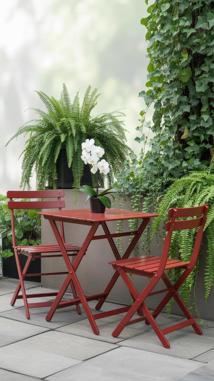
Cherry Red Garden Furniture
Cherry red garden furniture can really change the feel of your outdoor space. Imagine a set of cherry red chairs paired with a modest wooden table—that pop of color instantly wakes up the patio. You might think red outdoors could be overwhelming, but when it’s used well, it energizes without feeling too much.
If you’re not ready for full furniture in cherry red, cushions are an easy way to start. Suddenly, your outdoor seating looks less tired and more inviting. I’ve seen people mix red cushions with neutral loungers, which works surprisingly well. Bright red isn’t limited to modern styles either—you can find vintage metal chairs in cherry red or rustic wooden benches painted in the shade.
Where could you place these? Near a bloom-heavy garden path or tucked under a covered porch to draw the eye. And cherry red doesn’t fade into the background like some outdoor colors—it demands attention and invites people to sit down and stay a while, even on a gloomy day.
Using Cherry Red in Planters and Decor
Red planters make an unusual, yet effective, statement outdoors. Think about grouping several in different sizes along a deck or porch edge; the color brightens all the green and earth tones around. Some people even paint old terracotta pots cherry red, which gives garden spaces a quirky, personal touch.
Garden ornaments are another place cherry red can sneak in. A metal birdbath, a wind spinner, or even simple lanterns painted in cherry red add unexpected bursts of color. These items often get overlooked but could be the key to tying together different elements in your garden.
In my experience, cherry red stands out especially when paired with lush greens and earthy browns outdoors. It brings a contrast that feels lively rather than jarring. You might wonder if adding too much red could feel loud—it can, but that’s mostly if it’s left without balance or variety in tone. So, have a think about where your eye lands and let the red accents do the work.
Maintaining and Refreshing Cherry Red Accents
Cleaning and Upkeep
Cherry red can be tough to keep looking sharp. For painted walls, dust regularly with a soft cloth to avoid dulling the finish. If stains appear, try a gentle cleaner—something mild like diluted dish soap usually does the trick. Avoid harsh scrubbing; the color might fade or streak. I’ve learned the hard way that using abrasive sponges on cherry red furniture can leave noticeable marks. For fabric accents, like cushions or curtains, spot clean with a mild detergent or take them to a professional cleaner if the fabric is delicate. Bright reds tend to show fading sooner, so keep these in mind when placing pieces in direct sunlight.
Switching Up Cherry Red Accents
Sometimes, even with care, cherry red accents need a refresh to keep the space feeling alive. Swapping out smaller pieces is an easy fix. Think throw pillows, vases, or lampshades. It’s surprising how swapping just one or two objects can shift the mood without a full makeover. If the red feels too intense after a while, try mixing in softer or neutral tones—maybe a pale pink or beige—to balance things out. What about rotating your accent placement? Moving a cherry red chair from the living room to the breakfast nook gives a fresh vibe, without spending a dime. It’s almost like the color gets a new lease on life, which helps prevent the space from feeling predictable.
Conclusions
Cherry red accents add a dynamic feature to any room. By selecting the right shade and placement, you can transform your space without overwhelming it. Small touches like pillows or art pieces can bring that vibrant charm effortlessly.
Using cherry red thoughtfully will give your home a fresh and lively feel. Try some of the ideas shared here to create your unique look. Your space deserves an instant impact. Cherry red accents will help you achieve just that.