Introduction
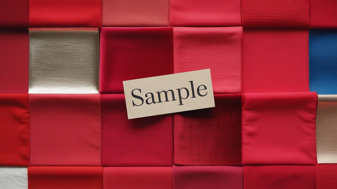
Cherry red is a vibrant shade of red that captures attention instantly. It’s a color filled with energy and warmth, making it a popular choice in fashion, design, and art. This article explores cherry red color combos that you can use with confidence. You will learn practical ways to mix cherry red with other colors, creating ensembles and designs that always look great.
Whether you want to dress with style or decorate your space, understanding cherry red’s possibilities can change your approach. We’ll look at ten chapters covering how cherry red pairs with different color families and why these combos work. You will find actionable tips and examples to apply immediately in your projects.
Understanding Cherry Red Color Basics
What Defines Cherry Red
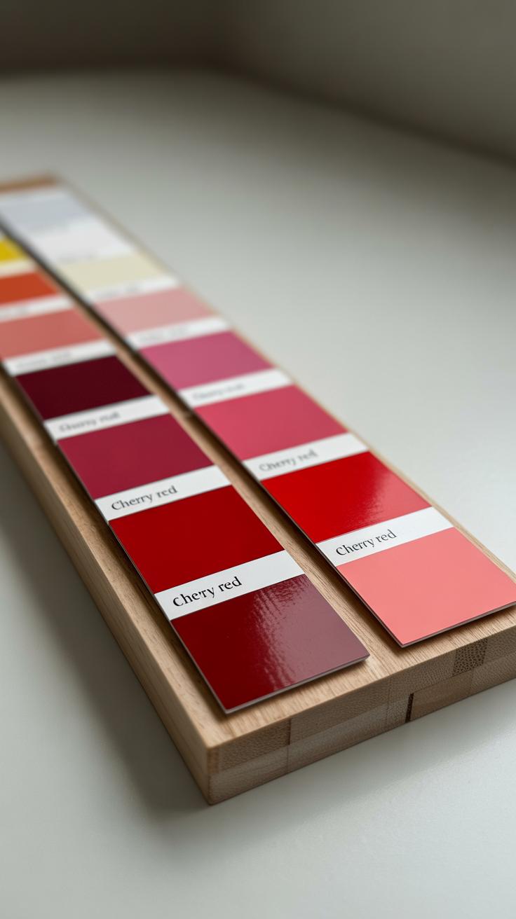
Cherry red is a shade of red that sits somewhere between bright and deep, carrying a richness that makes it stand out from more common reds. It’s often described as having a slightly cool undertone, with hints of both crimson and ruby. The color reminds me of ripe cherries—deep, juicy, and bold—but not as dark as burgundy or maroon. It’s not just any red; cherry red has a certain sweetness and intensity combined, which gives it a unique visual appeal.
What sets cherry red apart is how it manages to balance warmth and brightness without feeling either too harsh or too muted. This makes it less aggressive than bright red, yet more vibrant than darker reds. You’ll often notice cherry red having a smooth, velvety look, almost as if it’s glowing softly. This nuance helps it work well in designs or outfits where you want a pop of color that’s striking but not overwhelming.
Cherry Red in Color Models
When you look at cherry red through the lens of color models like RGB and CMYK, some interesting things pop out. In RGB, which is based on light, cherry red usually involves a high red value, moderate green, and low blue, but these can vary depending on the exact shade. For example, you might see something like (222, 49, 99), where red dominates but the subtle mix of green and blue tones softens the overall feel.
Switching to CMYK, which is more about ink, cherry red appears as mainly magenta and yellow inks, with minimal cyan and black. This means achieving the perfect cherry red in print needs a careful balance of these inks. For anyone mixing colors manually, understanding this interplay is key to reproducing that characteristic warm yet slightly cool cherry look.
You might find yourself wondering—why does this matter? Because knowing how cherry red behaves in these models helps when you’re picking paints, digital colors, or fabrics. It’s not just a red you grab off the shelf; it’s a shade that demands some attention to get it right, if you want that exact cherry feel. And honestly, that’s part of the charm with cherry red—it’s a bit distinctive, a bit tricky, but always worth it.
Pairing Cherry Red with Neutral Colors
Cherry Red and White Harmony
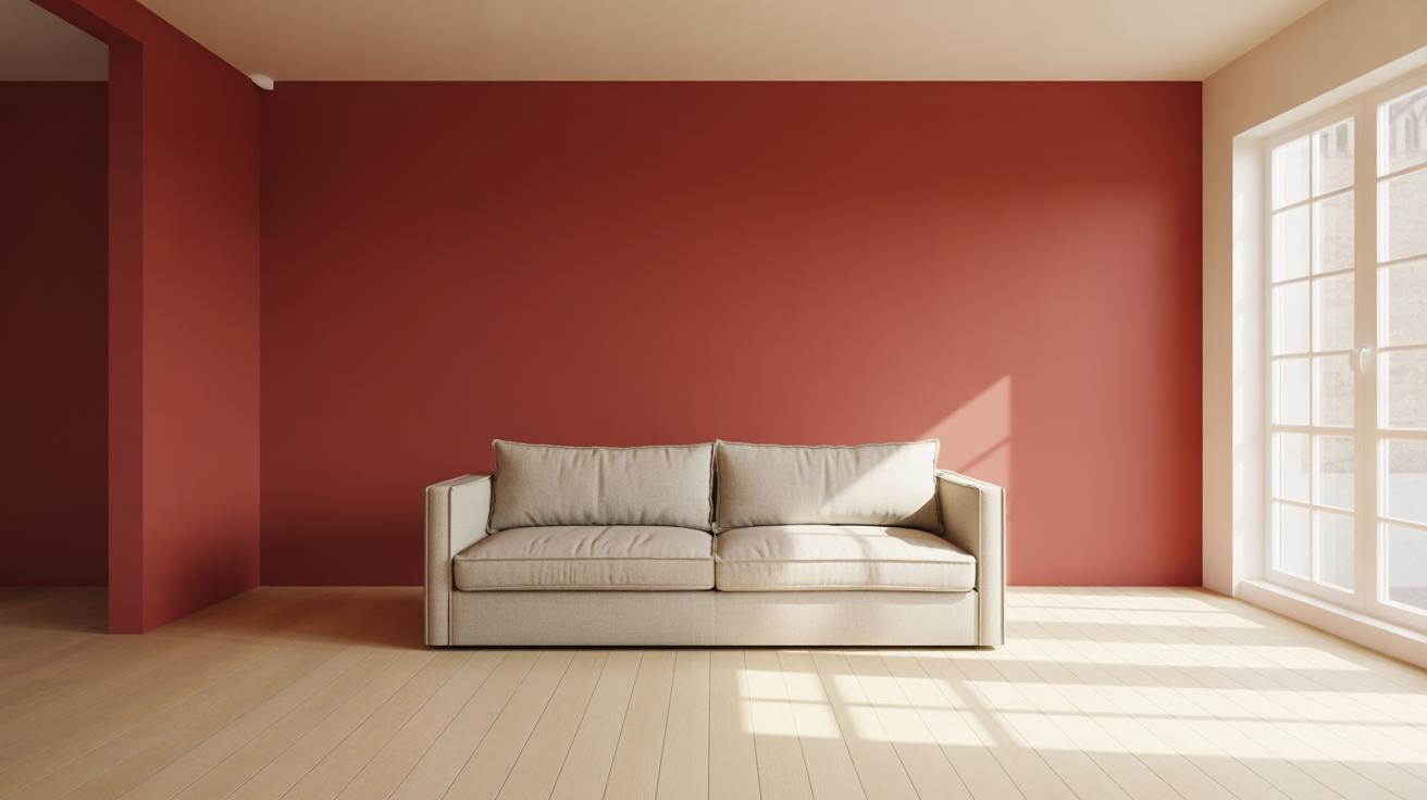
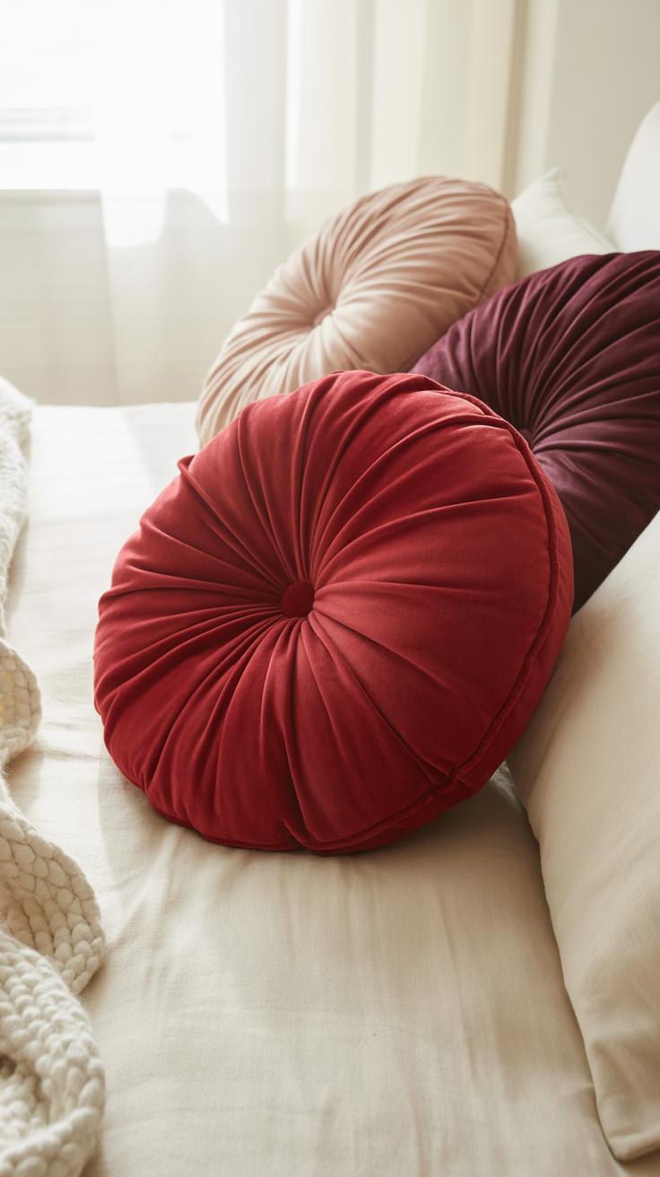
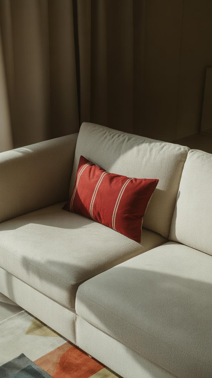
Cherry red and white often feel like a natural pair, don’t they? White acts as a kind of canvas that lets cherry red really stand out without overwhelming the eye. This combination tends to bring a fresh, bright vibe—something clean and sharp. Think of a cherry red dress against a crisp white background or red accents in a white room. The contrast keeps things lively but balanced.
What’s interesting is how white can soften cherry red’s boldness just enough to make the look approachable rather than too intense. You might imagine a cherry red pillow on a white couch or a white shirt paired with cherry red pants. It’s these everyday pairings that show the contrast works in real life, not just in theory.
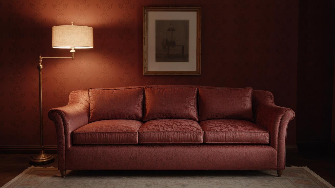
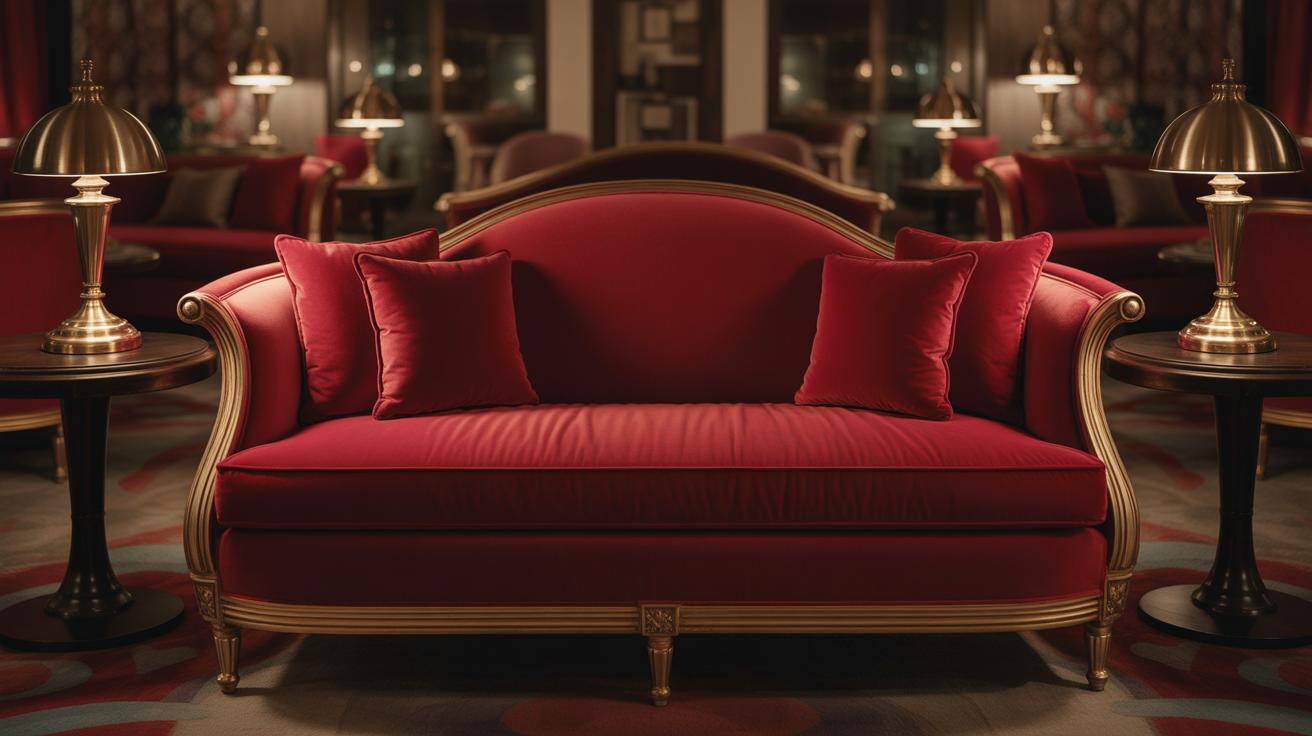
Using Black and Gray with Cherry Red
Black and gray bring a very different energy alongside cherry red. These darker neutrals give cherry red a sense of depth and even sophistication. Imagine the difference between a cherry red dress worn with black heels versus white sneakers—it shifts the entire mood. Black feels a bit more formal or edgy when combined with cherry red, while gray tones offer subtlety and versatility.
Sometimes, I wonder if gray is underestimated here. It doesn’t dominate like black but adds complexity, almost like it’s whispering rather than shouting. Trying a charcoal gray jacket over a cherry red top might surprise you with how effortlessly sleek it looks. The pairing lets cherry red stay bold but grounds it in a more nuanced palette. It’s not always about loud contrast; sometimes it’s about quiet balance.
Combining Cherry Red with Blues
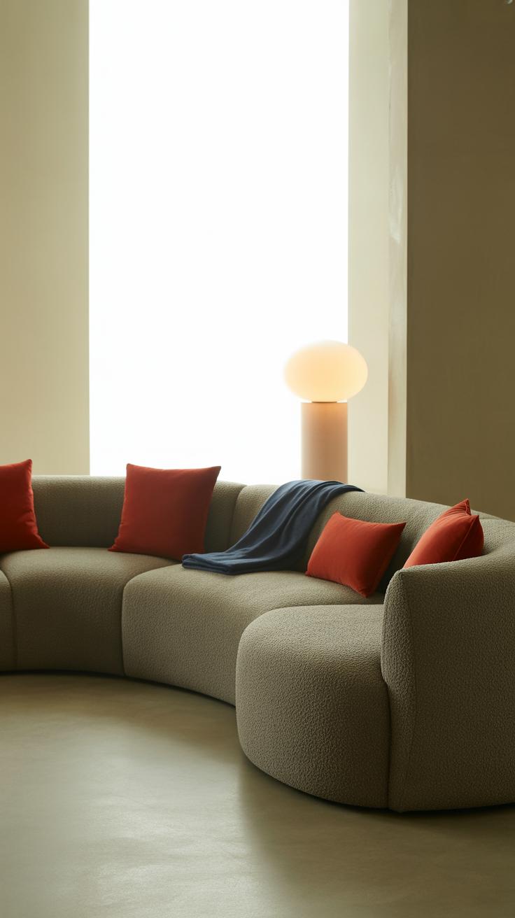
Cherry red carries an energetic warmth that pairs with blue tones in ways that can feel both striking and balanced—if handled with care. Blues tend to sit on the cooler side of the spectrum, so mixing them with cherry red means juggling temperature. If you lean too much on the cool blues, the red may seem overly bright or aggressive. But a warmer blue can mellow the intensity, creating a nice push-pull effect.
Take navy blue, for instance. It acts like an anchor when paired with cherry red, providing a depth that lets the red pop without overwhelming the senses. The two together often evoke a classic, almost timeless feel. Maybe it’s why navy blazers and cherry red accessories pop together so well. It’s reassuring, safe even, yet never dull.
On the other hand, lighter blues—think sky or powder blue—bring a casual, playful air to cherry red. These shades soften the boldness of red and can even introduce a youthful vibe. For a weekend brunch or an easy-going outfit, it works. But balancing them isn’t foolproof; sometimes the combination might veer into feeling too sweet or candy-like. Still, it often lands in a refreshing space.
When you pair cherry red with blues, ask yourself: Are you aiming for sophistication or something more relaxed? That question can guide you to the right shade. Mixing warm and cool tones isn’t always straightforward, but it’s worth experimenting with. Sometimes a little mismatch turns out to be the best match.
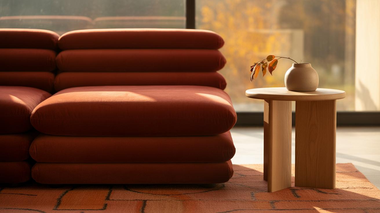
Using Cherry Red with Earthy Tones
The mix of cherry red with earthy hues like brown, olive, and terracotta often creates a mood that feels grounded yet warm. These colors somehow tame cherry red’s boldness without making it dull. It’s like cherry red becomes less “loud” and more approachable.
Brown Shades Soften Cherry Red
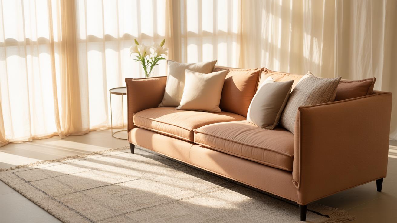
Brown tones, depending on their depth, can calm the sharpness of cherry red. Lighter browns—like taupe or camel—offer a subtle backdrop that lets cherry red stand out but in a more gentle way. Darker browns ground the color further, making it feel almost cozy. If you ever felt cherry red was too intense alone, pairing it with chocolate or chestnut shades might surprise you. This combination can feel surprisingly balanced, mostly because brown absorbs some of the energy cherry red projects.
Try thinking of cherry red with brown leather or wooden elements—it doesn’t compete but complements with a natural warmth.
Olive and Terracotta Pairings
Olive green pulls cherry red away from anything flashy and pushes it toward a rustic vibe. Olive’s muted richness adds an earthy depth, making the pairing feel both natural and unexpected at the same time. I’ve noticed olive also helps highlight cherry red’s subtle undertones—those that often get lost when paired with brighter colors.
Terracotta, on the other hand, shares some warmth with cherry red but slows down its urgency. It brings a slightly dusty, sunbaked feel to the mix. Imagine cherry red dusted with clay or wrapped in the colors of dried earth—there’s a tactile mellow quality in this combo that’s hard to describe but easy to recognize.
Both olive and terracotta can shift cherry red into something more grounded, more natural—and sometimes, that’s exactly what you want your space or outfit to feel like.
Cherry Red and Yellow Combinations
Yellow and cherry red together bring an energy that feels almost tangible. There’s a sunny warmth when these two colors meet—like the spark of a summer morning or an unexpected burst of happiness. Yellow’s naturally bright, cheerful character plays off cherry red’s bold, vivid hue, making rooms, outfits, or designs shout with life.
Bright Yellow Meets Cherry Red
When you pair a bright yellow with cherry red, it almost feels as if the colors feed off each other. Bright yellow doesn’t just sit beside cherry red; it seems to amplify it. Together, they create a palette that feels joyful, catchy, and sometimes even a little overwhelming if you’re not careful. Think of a yellow sun hat with a cherry red dress—there’s no ignoring that combo.
Yet, the intensity can be thrilling. It pulls focus, pulls smiles. If you want to express confidence or lift a mood quickly, this pairing rarely misses. You might wonder if it’s too much, but that’s part of the fun—sometimes you want a little visual adrenaline.
Muted Yellow Options
Not every yellow has to be a loud statement next to cherry red. Softer yellows—like buttercream, pale gold, or even dusty lemon—offer a calm counterpoint. These muted shades help balance cherry red’s gusto without dulling it completely.
Imagine a room with cherry red accents and walls painted in a gentle yellow. The softer yellow warms the space without screaming. It could feel cozy or nostalgic, dampening the punchy excitement of cherry red but still keeping its charm alive.
So, if you want the energy without the edge, a muted yellow might be your best friend. But maybe that edge is exactly what you want, and that’s okay too—you should trust your gut on this.
Cherry Red Matched with Pink and Purple
Cherry red, an intense and vivid shade, finds interesting dialogue with both pink and purple hues. When paired with pink, especially the softer variants, cherry red seems to soften a bit, almost like it’s lowering its volume. It’s not losing its boldness but adding a kind of tenderness that feels, well, romantic without trying too hard.
Using soft pink with cherry red can create moods that lean toward warmth and affection. Imagine a blouse in cherry red next to a pale pink cardigan—there’s a subtle balance between passion and gentleness. These combinations often evoke calm intimacy, reassuring rather than overwhelming the senses.
On the flip side, purple shifts the energy. Combining cherry red with purple usually adds a layer of drama or a touch of regal flair. This blend can feel rich and commanding, like it’s both shouting and whispering at the same time. You might notice purple lends a mysterious depth, making cherry red appear more complex, even a bit theatrical.
Whether it’s the soft side with pink or the boldness with purple, cherry red doesn’t lose its power—just changes the way it makes you feel. What moods do you find yourself drawn to with these combos? Are you leaning toward gentle or dramatic?
Metallic Colors with Cherry Red
Metallics bring a whole new level of depth when paired with cherry red. There’s something about that rich, luscious red that metallic tones just seem to lift effortlessly. Sometimes, the right metallic accent can make cherry red feel more grounded or even more glamorous, depending on the choice.
Gold Accents with Cherry Red
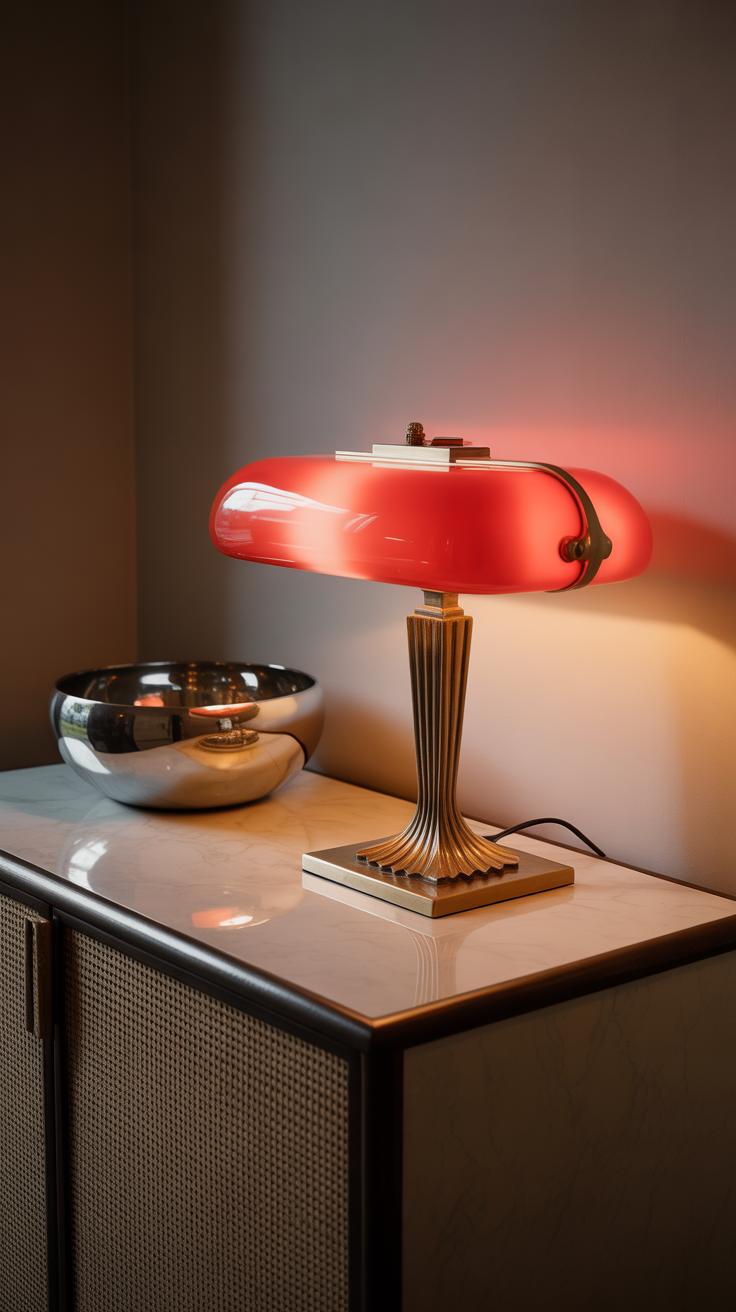
Gold and cherry red often feel like a natural duo—maybe because both carry warmth. Think of gold jewelry set against cherry red fabric; it instantly amplifies the sense of luxury without going overboard. Gold hardware or decor next to cherry red walls or furnishings does something similar, making the entire space feel more refined, brighter even. That touch of gold seems to coax out the deeper red tones without overshadowing them.
Curiously, gold can sometimes feel too much. It’s a bit like wearing a statement piece—you have to be mindful not to overwhelm. But used sparingly, it really changes the vibe, infusing elegance subtly instead of loud glamour.
Silver and Copper Variants
On the flip side, silver introduces a cooler edge when paired with cherry red. It softens the intensity in a way that’s unexpected but pleasing. Silver accessories or accents create a modern, even minimalist twist to the red, which might appeal if you want something less traditional. I guess it’s harder to predict how silver will read since it lacks the warmth gold has. It sometimes feels stark, but sometimes intriguingly fresh.
Copper, though, feels a bit like the middle ground—warmer than silver but less flashy than gold. It draws out the rustic or vintage vibes in cherry red and works well if you’re aiming for something cozy but with a distinctive twist. Copper’s a bit easier to pair with textured materials too, like leather or wood. It’s less about luxury and more about character, which is an interesting contrast to the usual expectations.
Using Patterns and Cherry Red Together
Cherry red has a way of standing out, but pairing it with patterns lets you create looks or spaces that feel lively rather than overwhelming. When you mix cherry red with stripes or checks, the geometric shapes bring an extra sense of movement and structure. Think of a cherry red blouse with thin black and white stripes. The contrast adds energy—it’s bold but keeps things orderly. That kind of pattern helps break up the intensity of cherry red, making the color more approachable without dulling it. You might find pairing it with bigger checks gives a more vintage or playful vibe, so it really depends on the scale and colors within those patterns.
Floral and playful prints offer a different effect altogether. Cherry red combined with soft floral patterns can soften its impact, making it feel warmer or more romantic. A cherry red dress with tiny white flowers, for instance, feels approachable and fitting for daytime events. On the flip side, cherry red can highlight bolder floral prints by serving as a strong backdrop. It’s like the color jumps forward when set against intricate, colorful blossoms in dresses or cushions, grabbing attention without shouting. So, patterns paired with cherry red don’t just complement—they shape how that red feels in the whole look or room.
Seasonal Cherry Red Combos
Spring and Summer Pairings
Cherry red in spring and summer feels lively and fresh. It’s like a burst of energy, but pairing it well can be a bit tricky. Think lighter, brighter colors that don’t compete but balance the boldness of cherry red.
Try combining cherry red with soft pastels—mint green, pale pink, or baby blue add a gentle contrast that feels breezy and casual. White is a classic choice here; something as simple as a white linen shirt paired with cherry red accessories instantly brightens your look.
Yellow, perhaps a softer shade like lemon or buttercup, can work surprisingly well. It’s cheerful but doesn’t overpower. Some people might shy away from this combo, but I think it can be fresh and unexpected when done sparingly—maybe in scarves or jewelry.
For accessories, think straw hats, light canvas totes, or delicate gold jewelry. These keep the look from tipping into being too heavy or overwhelming during the warm months. Cherry red paired with bright, clean colors can definitely feel like a statement without screaming for attention.
Fall and Winter Styles
Now, when the days get shorter and the air turns cooler, cherry red takes on a different role. It’s deeper, richer, and feels almost cozy. Muted tones tend to work better here. Think earthy greens like olive or forest, charcoal grays, and even navy blue. These add weight and depth without dulling cherry red’s punch.
Deep browns, especially warm chocolate shades, can ground cherry red nicely. It’s a combo I often find in plaid scarves or wool coats—there’s something quietly elegant about it.
Don’t shy away from black too; a sleek black leather jacket with a cherry red blouse or knitwear can be striking, though it might feel a bit stark for some. I personally like how the contrast between the two can elevate a winter look.
Accessory-wise, heavier materials like leather boots, chunky knits, or metal pieces with a brushed finish add the right texture and weight. Seasonal layering with these colors and materials really lets cherry red shine without overwhelming the often subdued palettes of fall and winter.
Cherry Red in Everyday Life and Style
Cherry red grabs attention, but wearing it every day can feel tricky. The key might be in pairing it with softer, more neutral tones to avoid looking too much like a walking stop sign. For example, combine cherry red with denim or muted grays for a casual look that still pops. If you want to feel bold without looking over the top, try introducing cherry red through smaller accents like a scarf, shoes, or a belt. Those little touches can be surprisingly powerful.
When you layer cherry red with tonal colors, such as blush or warm beige, you get balance and warmth without losing that confident edge. You could also try mixing cherry red with navy or even olive green, which tones down the intensity and adds unexpected depth. Wearing cherry red sometimes feels like making a statement, but it can be just as effective when used sparingly.
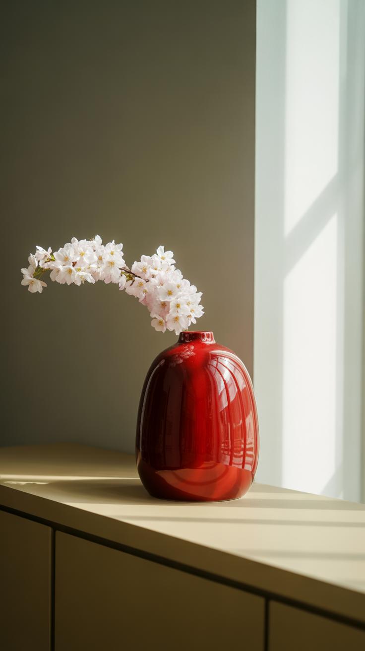
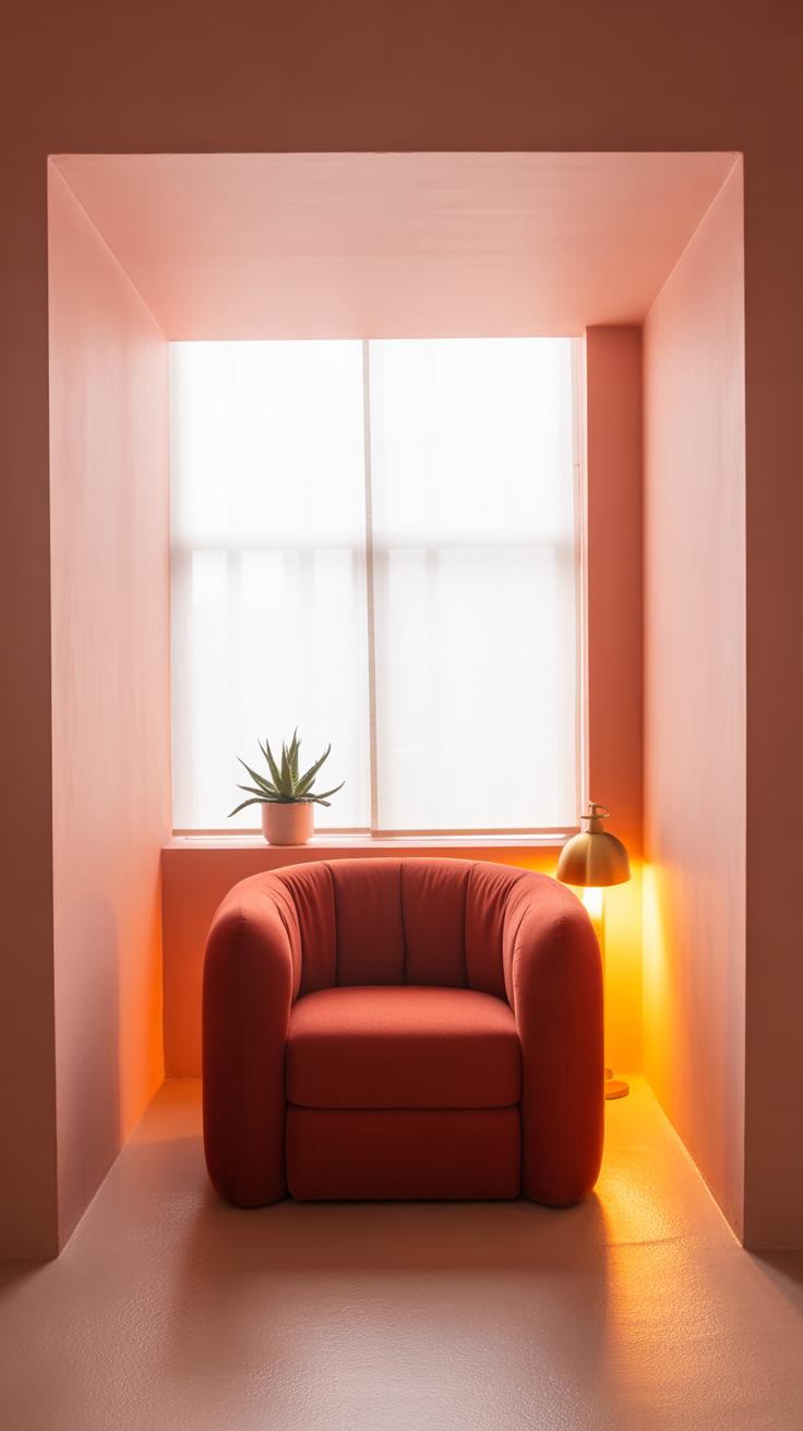
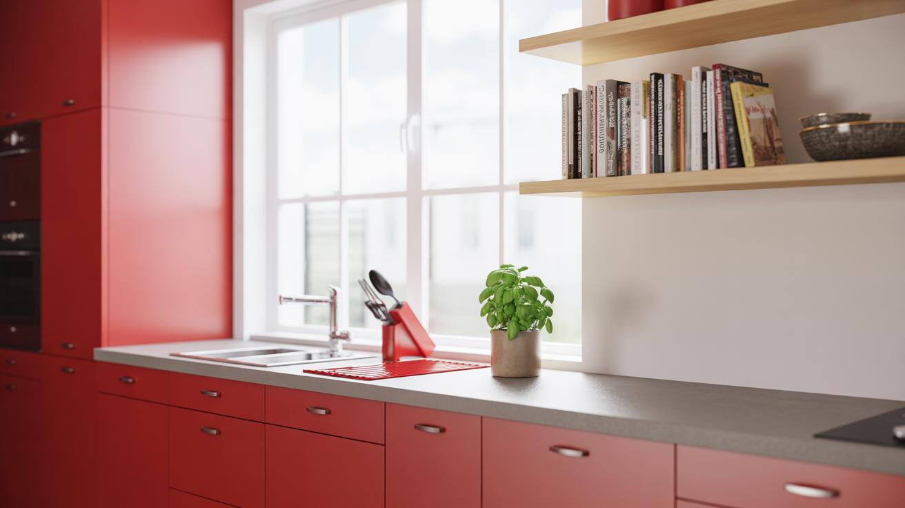
In home decor, cherry red works best as a highlight. Think cushions, vases, or framed art rather than painting whole walls. If you flood a room with cherry red, it can quickly feel cramped, even for lovers of bold colors. Add cherry red within smaller, personal spaces, like reading nooks or kitchens, where it brings energy without overwhelming the senses.
Maybe a throw blanket on a neutral couch, or cherry red kitchen utensils, can create charm without shouting too loudly. It’s a bit like seasoning food—you want enough to notice but not so much that it’s overpowering. Figuring out where and how to place those cherry red pops might take some trial and error, but when you get it right, it makes everyday life feel a little livelier.
Conclusions
Cherry red is easy to combine when you know the right color companions. From neutral shades that calm cherry red’s brightness to bold colors that enhance its energy, many options exist. Your choices can follow your mood, occasion, or style. By using the information shared about cherry red combos, you can create balanced and vibrant looks or spaces.
Remember, color harmony depends on your taste and context. Use cherry red as a starting point to experiment with color. Each combo here can inspire unique interpretations. Keep exploring and trust your eye to find combos you love. Cherry red can be a tool for endless creativity in your life and work.