Introduction
Deep red is a strong, warm color that can change the feel of any room. When used in decor, it can create a rich, cozy, and elegant space. This article explores how to use deep red in your home to make it feel both fancy and inviting. Whether through paint, furniture, or small decorations, deep red can make a big impact.
We will look at different ways to bring deep red into your home. You will find tips on mixing it with other colors, choosing the right materials, and arranging your space for both comfort and style. By the end, you will have clear ideas to transform your home with deep red decor.
Understanding Deep Red In Home Decor
Deep red in home decor isn’t just a color—it’s a feeling. It carries a weight, a presence that can quietly command attention without shouting. Visually, it’s rich and intense, often landing somewhere between crimson, burgundy, and oxblood. Emotionally, it can evoke warmth and a sense of intimacy, but also a subtle note of drama that makes a space feel more refined.
People often choose deep red because it combines luxury with comfort. It feels grounding, like it wraps the room in a soft, plush embrace. At the same time, it brings a certain boldness that keeps things from feeling dull or overly safe. I guess it’s this duality—elegant yet cozy—that makes deep red appealing to those wanting a space that feels both serious and inviting. It’s not just about looking expensive; it’s about how you want to feel when you step inside.
The Warmth And Mood Of Deep Red
Deep red has a way of shifting the entire mood of a room. It brings warmth—physically and emotionally. There’s something about it that suggests passion, richness, and even a bit of history; it’s like the color has layers, and each one adds to the overall atmosphere. In a dining room, deep red can encourage lively conversation and appetite. In living spaces, it invites relaxation and a sense of refuge from the outside world.
Rooms where you want to feel enveloped or calm often benefit from this shade: think libraries, bedrooms, or cozy reading nooks. The color’s density almost slows down time, so it can temper the energy in more active spaces like a kitchen, too. I’ve found that a deep red accent wall tends to feel less overwhelming than coating an entire room, but that’s just personal. Maybe you prefer the drama of full commitment.
Choosing The Right Deep Red Shade
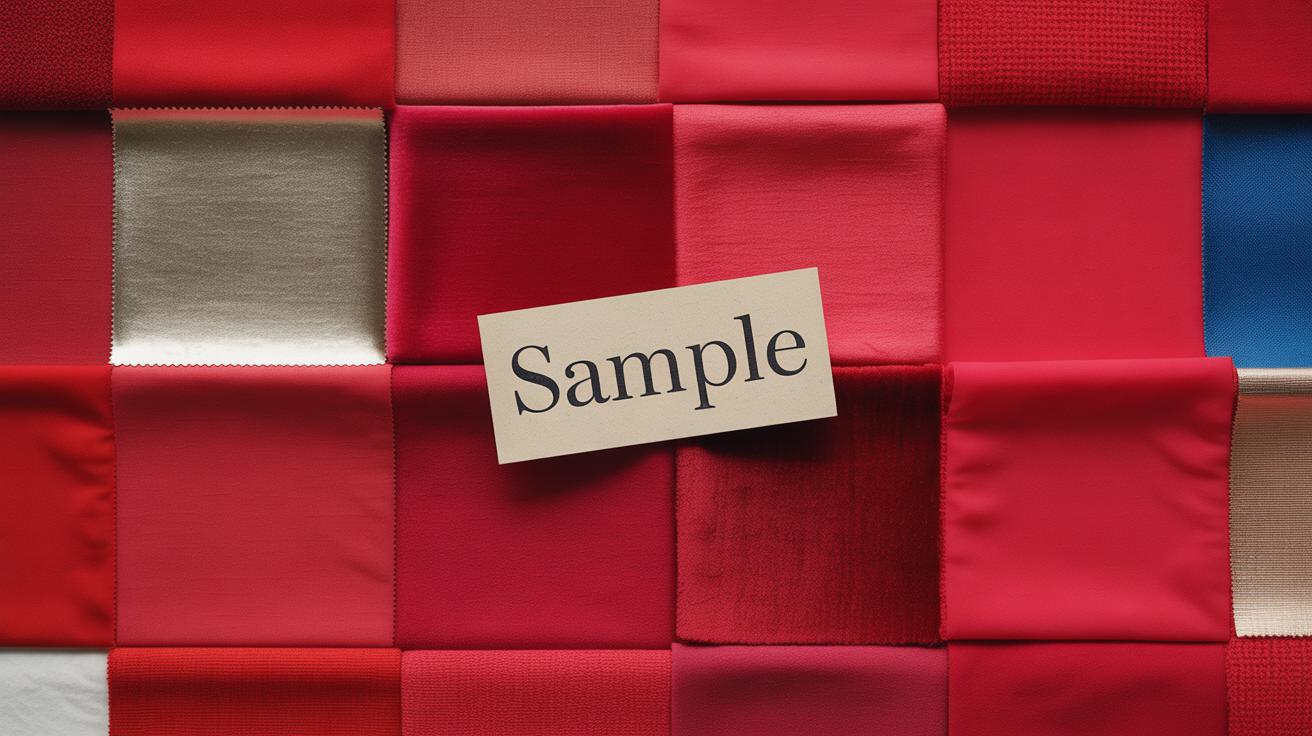
Finding the perfect deep red comes down to understanding the undertones and the way light interacts with the space. Some reds lean toward brown or even purple, others carry hints of orange or blue. The choice matters: a slightly cooler deep red can add elegance and sophistication, while one with warmer tones might feel more inviting and friendly.
Testing samples in your actual room is crucial. Paint swatches can look completely different once on the wall and when the sun moves throughout the day. The same goes for fabric: a throw pillow or curtain might seem a good match in the store but look off at home. Try placing samples next to your existing furniture and under various lights. Don’t rush it—allow time to see how the red reads both morning and night. That way, you avoid getting stuck with something that feels off after you’re already committed.
Mixing Deep Red With Complementary Colors
Bold Color Pairings With Deep Red
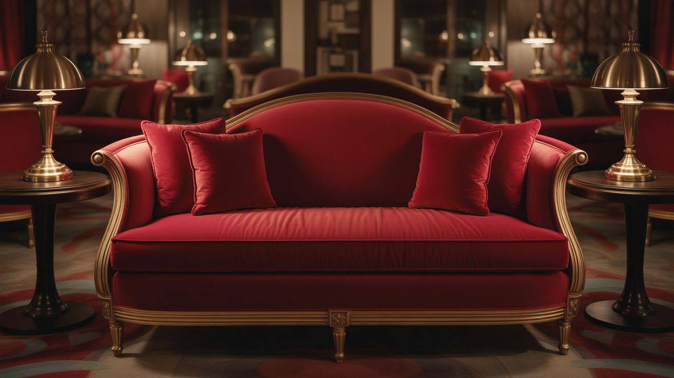
Deep red is pretty commanding on its own, but when paired with certain bold colors, it really leaps forward. Dark greens, for example, create this rich, almost vintage vibe that feels both luxurious and grounded. Think of a deep red velvet sofa with emerald green throw pillows or a forest green accent wall behind crimson decor. It’s a combo that seems to whisper elegance without shouting.
Golds amplify the warmth in deep red. A few gold accents—like picture frames, light fixtures, or side tables—can lift the overall look and add a subtle glow. It’s the kind of sparkle that makes a room feel lived-in, yet special. Sometimes I find gold leans a little too flashy, though, so a matte or brushed finish often works better.
Then there’s navy blue. It’s unexpected but works surprisingly well with deep red. The contrast here is strong but balanced, as both colors carry weight but differ in mood. In practice, a navy area rug or cushions in a deep red living room can ground the space without overwhelming it. A navy blue armchair paired with red stenciled accents is one of those pairings that might grow on you the longer you live with it.
Soft And Neutral Colors To Calm Deep Red
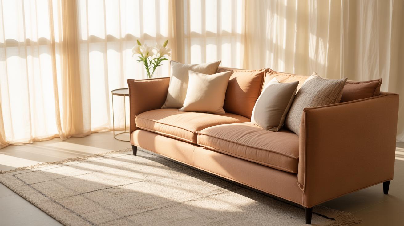
Deep red can feel intense if left unchecked. That’s why soft neutrals often provide a much-needed breather. Creams and beiges create a cozy backdrop and help balance out deep red’s vibrancy. I once saw a room where a cream-colored rug offset dark red walls—it somehow softened the whole vibe, making it warm but not heavy.
Soft grays also play an interesting role. They mute the intensity without erasing it. Gray upholstery paired with deep red cushions can tone things down, making the red feel inviting rather than overpowering. That said, if grays get too cold or bluish, they risk working against the warmth in deep red. It’s a subtle balancing act.
Using these lighter tones strategically—like on walls, drapes, or large furniture—gives the eye places to rest. You avoid the “too much” feeling, making the room feel both elegant and easy to settle into. It’s probably not the most adventurous look, but sometimes the calm contrast is exactly what a space needs.
Using Deep Red In Walls And Paint
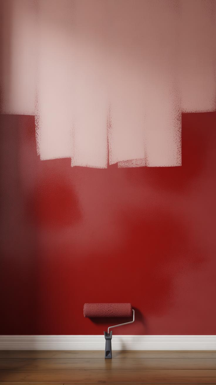
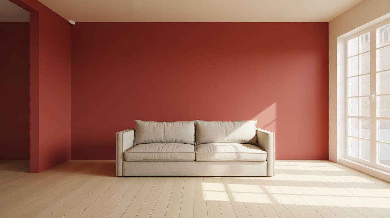
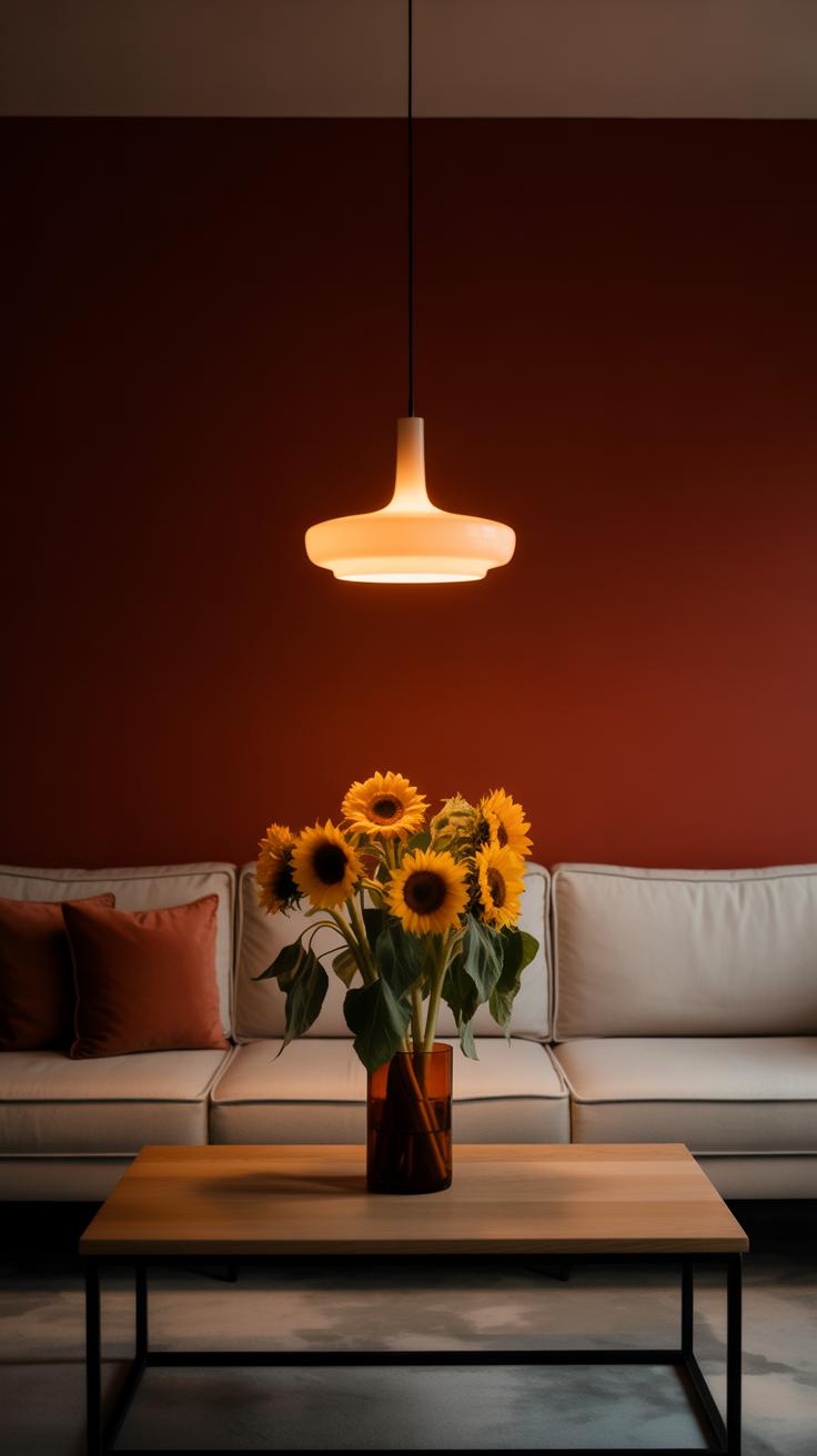
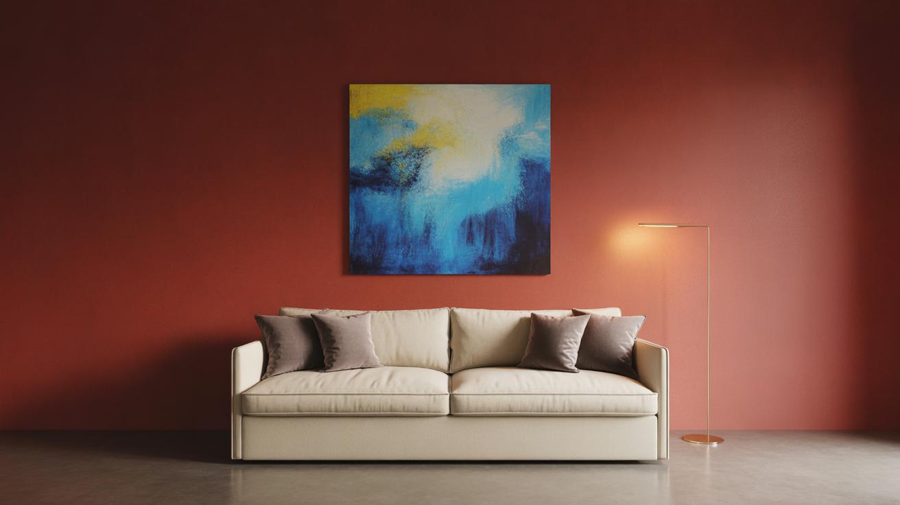
Painting walls deep red can instantly change the mood of a room, but it’s easy to let it become too much if you’re not careful. Deep red feels rich and cozy, but on all four walls, it might close in the space or feel a bit overwhelming. It works best in rooms where you want a strong, intimate atmosphere—think living rooms, bedrooms, or even dining rooms.
One strategy is to pick just one wall for deep red, creating a feature or accent wall. That way, you add warmth and focus without drowning the whole room in red. This technique works well especially in living rooms and bedrooms because those spaces welcome a bit of drama but still need balance.
Choosing the paint finish also matters a lot. Matte finishes absorb light and soften the intensity of the red, making a room feel cozy and grounded. Glossy finishes reflect light and catch attention, which can feel more luxurious but also risk spotlighting imperfections on the wall. You might pick matte for bedrooms to keep a calming vibe, and glossy in a dining room where a bit of sheen can lend elegance.
If you feel nervous about bold red walls, experiment first with smaller areas—or even large samples on the wall—before diving in. It helps you see if this intense color really meshes with your furniture, lighting, and overall style. After all, deep red is a strong choice. It’s worth taking some time to let it settle in your space.
Incorporating Deep Red Furniture
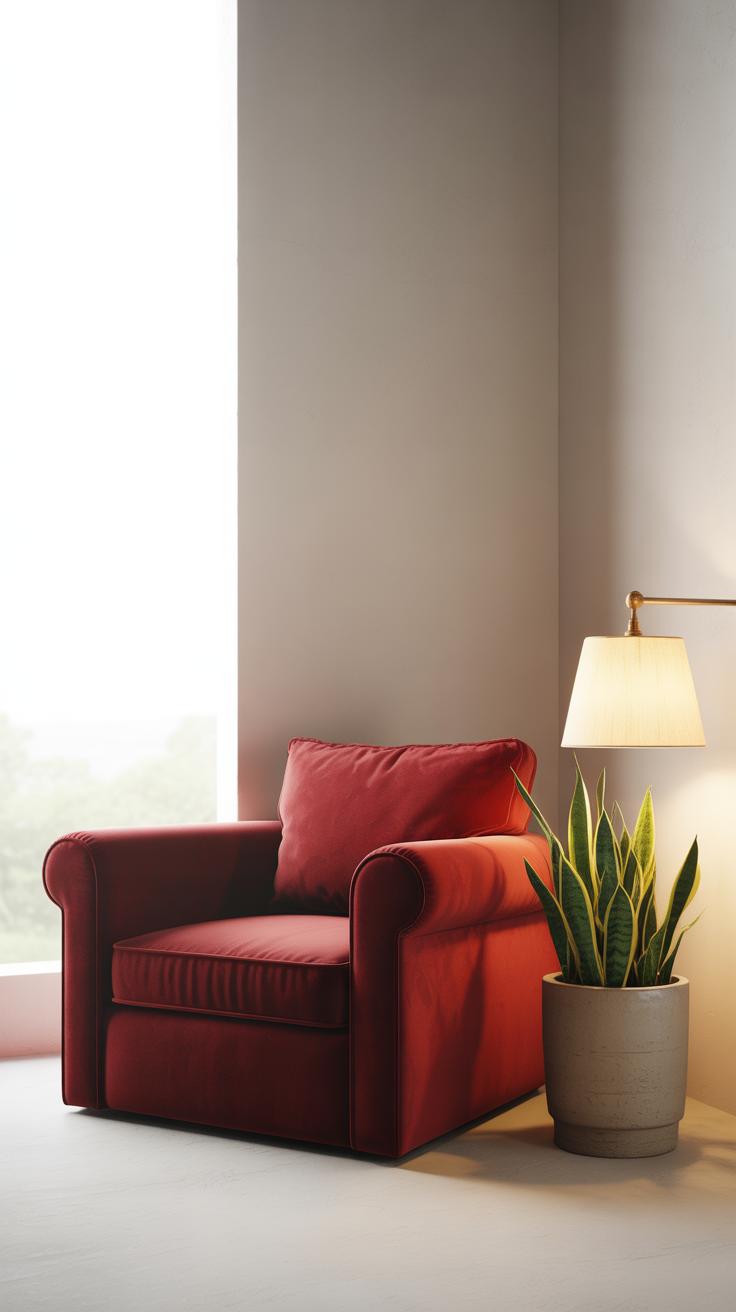
Deep red furniture carries a unique power in any room. Sofas in rich red shades, for example, instantly draw the eye and make sitting feel like a deliberate act of comfort. A deep red armchair can become a quiet retreat, inviting you to linger longer than planned. Tables and storage units in this color may be less common, but when chosen wisely, they add a warm anchor—solid, grounded, yet far from boring.
When thinking about these pieces, consider how they balance with your existing palette. A deep red sofa isn’t just bold; it’s a statement of intent. Using fewer red furniture pieces might help avoid overwhelming your space. One or two items often suffice—maybe a red velvet armchair paired with a sleek neutral coffee table. Comfort and style go hand in hand with these choices, creating a cozy yet elegant mood that feels anything but forced.
Choosing Statement Furniture In Deep Red
Picking that one or two deep red furniture items to anchor your room means answering your personal style and the room’s function. Should it be a grand, plush couch that takes center stage, or smaller pieces like a side chair or ottoman that hint at boldness without shouting? Often, less is more. You want your deep red to pop, but not dominate.
Balancing happens naturally when the rest of your furniture leans toward softer, lighter colors. Think creams, grays, or muted woods. Oddly enough, sometimes the unexpected works best—a mix of metal legs or glass elements can cool down the heat of red, making it feel more modern. You might not plan to mix those materials at first, but once you see it, it clicks. What furniture colors do you already have that could highlight a new red piece?
Mixing Textures With Deep Red Furniture
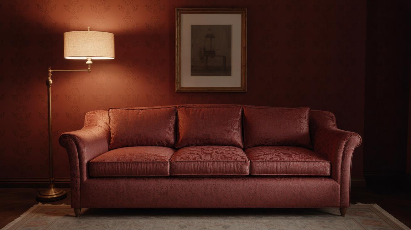
Material choice transforms how deep red furniture influences a space. A velvet sofa in deep red feels plush, warm, even a bit indulgent. The nap of velvet catches light subtly, offering shifting shades that keep things interesting. Leather, on the other hand, brings a different vibe—sleek, slightly rugged, and timeless. A leather deep red chair can soften a room that might otherwise feel too polished.
Combining these textures adds depth. For example, pair a velvet red sofa with a leather ottoman or wooden side table. This mix keeps the mood luxurious but grounded, inviting relaxation without being too cozy that it feels heavy. Simple woven rugs or tactile curtains can complement these materials, but you might find yourself craving something unexpected—a shiny brass lamp or a marble tabletop. Which textures resonate with you more when you think of comfort and style?
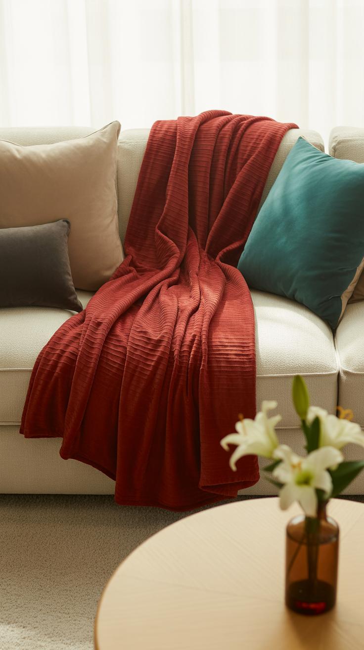
Adding Deep Red Textiles And Soft Furnishings
Soft textiles in deep red instantly change how a room feels. Cushions, throws, and curtains bring a tactile warmth that furniture alone can’t provide. You might think, “Isn’t red too bold for soft items?” But with the right layering, deep red fabrics add richness without overwhelming the senses.
Consider layering cushions in various shades of red—some with subtle patterns, others in plain velvets or linen. Mixing textures like smooth silk with nubby wool creates a depth that’s inviting. A throw casually draped over the arm of a sofa invites you to sit—almost tempting, really.
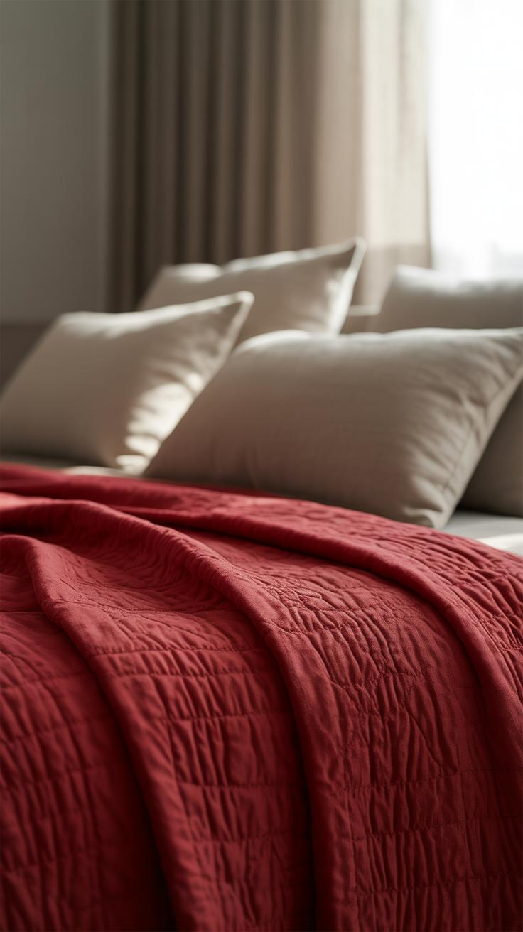
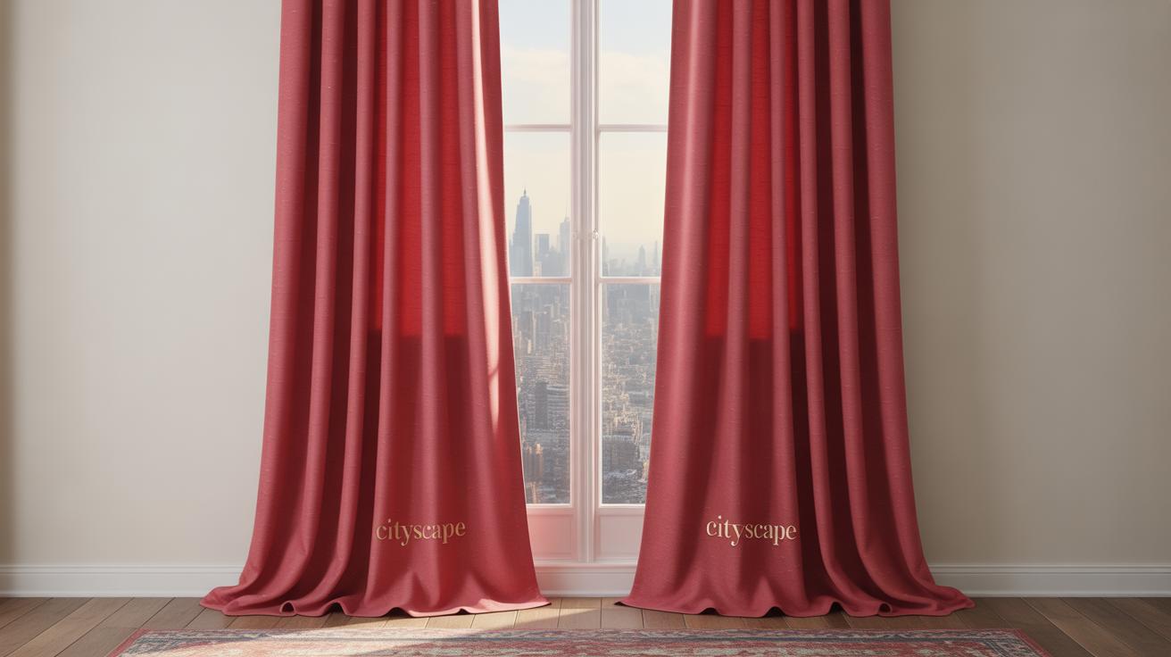
Deep red curtains and drapes can soften daylight, turning harsh sun into a cozy glow. Opt for heavier fabrics like velvet or thick cotton if you want intimacy and insulation. Sheer reds can work too, but they usually feel lighter and less private. Length matters, too: floor-length curtains feel more elegant, though shorter ones might suit a casual corner better.
Cushions and throws are small investments with big returns. You can switch them out seasonally if you want to freshen the room without repainting walls or buying new furniture. Patterns like subtle florals, delicate geometrics, or even classic brocades tweak the look without stealing focus. Textured knits or embroidered linens add visual interest and invite touch.
Ultimately, think of these textiles as flexible accents—softening edges, adding layers, and making spaces feel lived in, warm, and a bit luxe. Sometimes, it’s the little touches, like a deep red pillow by your favorite chair, that make all the difference.
Details And Accessories In Deep Red
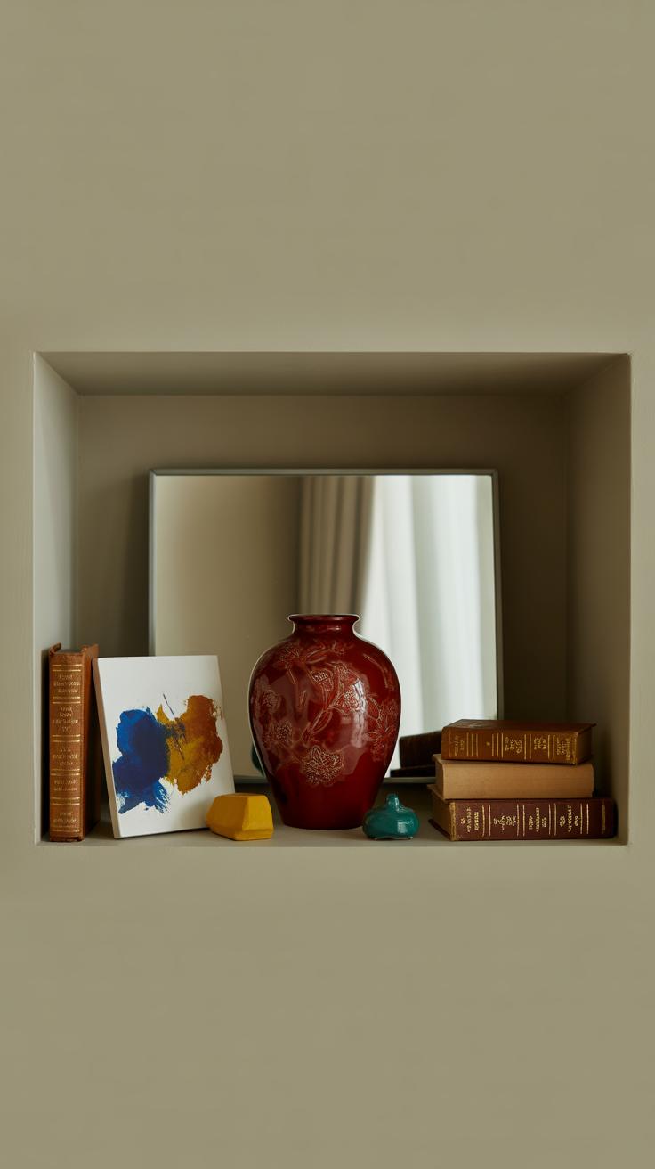
Small decor pieces in deep red can subtly shift a room’s vibe without making it feel heavy or overdone. Think about deep red vases placed on a console or coffee table. Their glossy finish can catch the light just so, injecting life into a corner that might otherwise be dull. It’s funny how such a simple object can anchor a space.
When choosing art or wall décor in deep red, don’t feel limited to one style. A modern abstract print with bold strokes of red can energize a minimalist room. Meanwhile, a vintage botanical print featuring deep red flowers offers a softer, timeless touch. Both can work well on shelves or as gallery wall pieces, creating cohesion that feels intentional, not accidental.
Lamps with deep red bases or shades add warmth at eye level. They act as both functional light sources and decorative accents. Small objects—like ceramic bowls, candle holders, or figurines—in that same rich red create visual rhythm, making the space feel thoughtfully curated rather than decorated on a whim. Have you ever noticed how these items bring a room to life without demanding too much attention?
Putting deep red details around the room encourages your eye to move freely rather than fixate. That balance is what keeps a space cozy yet polished, vibrant yet restful.
Balancing Deep Red With Lighting
Lighting changes everything when it comes to deep red. This color is so rich and intense that it can shift dramatically based on the light hitting it. I’ve noticed in some rooms with dim lighting, deep red can feel a bit heavy, almost too intense. But with the right glow, it softens and almost invites you in.
Using Warm Lighting To Enhance Deep Red
Warm light bulbs—think around 2700K to 3000K—complement deep red beautifully. They bring out the red’s natural warmth without making it look too harsh or artificial. Incandescent bulbs or LEDs that mimic candlelight tone down the color’s sharpness and add comfort.
Fixtures with shades that diffuse light gently, like fabric or frosted glass lamps, can give the room a softer feel. Position lamps at eye level or slightly above so the light falls naturally across the walls or decor. Placing a floor lamp near a deep red armchair, for example, creates a cozy yet elegant vibe that feels quite inviting.
Natural Light And Deep Red Rooms
Daylight on deep red can be tricky. Morning sun can make reds look fresher, almost brighter, while afternoon light, especially if it’s indirect, tends to deepen the hue. Rooms with lots of natural light may sometimes expose imperfections in matte deep red paint or make the color seem less cozy.
Window treatments like linen or light-filtering curtains allow daylight to soften as it enters, helping to keep the deep red balanced. Rooms facing east or southeast get a gentle light that pairs well with deep red without overwhelming it. On the other hand, north-facing rooms might feel cooler, so warm artificial lighting becomes more important there.
It’s almost as if deep red asks for a certain kind of light to reveal its best side—too much brightness and it can lose its subtlety; too little and it might feel oppressive. Finding that middle ground is key.
Creating Cozy Corners With Deep Red
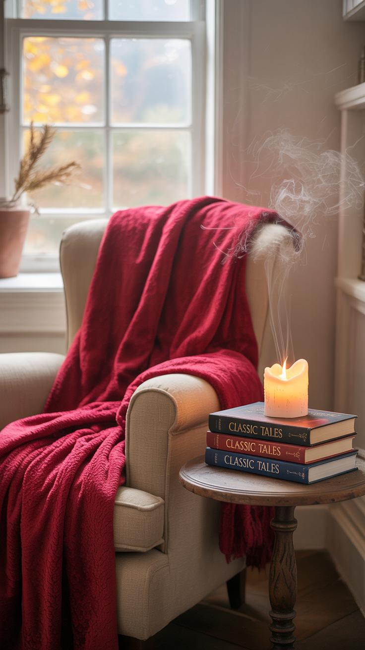
Deep red has this unique ability to pull you in. It feels like a warm hug, which makes it perfect for crafting small, inviting spaces in your home. When you’re thinking about a seating area or a reading nook, the color itself sets a tone—comfort mingled with richness. But how do you make sure your corner really feels cozy, not overwhelming?
First, choose seating that invites you to linger. A plush armchair or a velvet-upholstered bench in deep red instantly signals relaxation. If space is tight, maybe a single chair with a curved back to cradle you just right. It doesn’t have to be ornate; often, simple shapes with quality materials work best.
Think about layering textiles—perhaps a soft throw in a complementary color or a pillow with subtle patterns. These little additions break the monotony, adding depth and softness. Lighting matters, too, but not in the glaring way. A small table lamp with a warm glow helps deepen the cozy feel without competing with the red.
In my experience, balancing the red with muted neutrals nearby—like pale wood or soft taupe—prevents the space from feeling too intense. And greenery. Yes, plants actually make a huge difference. They breathe life into these intense shades, while their organic forms help soften the edges. Consider trailing vines or a compact fern on a side table.
Remember, your cozy corner is about you. Maybe you want to read, maybe just decompress after a long day. Think about what makes you feel most at ease—and let deep red be the backdrop to that.
Designing A Deep Red Reading Nook
Imagine sinking into a deep red armchair, the fabric plush against your skin. That’s the foundation of a reading nook that feels inviting and a bit indulgent. The chair’s color already sets a mood, but pairing it with the right lighting changes everything. A directional lamp, soft and adjustable, prevents harsh shadows while keeping your book’s pages bright and readable.
Textiles add another comforting layer. A thick wool throw or a velvet cushion can help regulate warmth without feeling stuffy. It’s about texture as much as color here—the tactile experience matters. And what about the walls surrounding your nook? Maybe a muted beige or soft clay tone to let the chair stand out without overwhelming. You can throw in a small side table for your tea or bookmark; function married to this quiet luxury.
Personally, I’ve found that adding something unexpected—a quirky patterned rug or a vintage clock—makes the nook feel less staged and more like your favorite spot. You might hesitate to mix patterns with deep red, but it can work if the scale is right and the colors harmonize. It’s a space to rest, so comfort trumps matchy-matchy every time.
Adding Greenery To Soften Deep Red Spaces
Deep red is powerful, yet sometimes it risks feeling a bit heavy. Bringing plants into the space can subtly lighten the mood without dulling the richness. You don’t have to go overboard. A few well-placed pots can transform the atmosphere into something that’s both lush and livable.
Look for plants with soft, rounded leaves or delicate fronds to contrast the boldness of deep red. Think of ferns, peperomia, or even a small rubber plant. Their greenery cuts through red’s potential intensity and introduces a natural calmness. If you’re into low maintenance, snake plants or pothos vines work beautifully—easy to care for and graceful.
Natural elements beyond plants also help. A woven basket for storing blankets, a wooden side table, or a stone planter can add texture and break up the saturated red. These pieces don’t compete but quietly complement, enhancing the welcoming feel.
Sometimes I wonder if the secret to using deep red well is… restraint. Just enough greenery, enough texture to keep the room breathing. Too much risk clutter. But when pulled off, those cozy corners become little retreats you want to spend hours in.
Maintaining And Refreshing Deep Red Decor
Deep red walls and furnishings have a way of commanding attention, but their rich hues need care to stay looking sharp over time. For walls, avoid harsh cleaners; a soft cloth and gentle cleanser usually do the trick. If your deep red paint starts to look dull or patchy, a fresh coat can revive the space without completely repainting. Sometimes just touching up scuffed areas makes a big difference.
When it comes to fabrics, deep red colors tend to show fading more clearly. Washing deep red textiles in cold water and air drying helps keep colors intact. I’ve learned the hard way that sunlight bleaches these fabrics faster than you’d expect, so keeping curtains or cushions out of direct sun is a good practice.
Updating your deep red decor can be as simple as swapping out accessories like throw pillows or lampshades. Even changing hardware on furniture or frames can alter the mood without sacrificing warmth. If you’re hesitant about bold changes, try layering lighter or neutral shades alongside your reds to balance the look gently.
Have you ever noticed how a slightly different texture—velvet instead of cotton, for example—can make the same shade feel fresh? Experimenting with materials might be the easiest, most subtle way to keep deep red feeling current without overwhelming the space.
Conclusions
Deep red is a versatile color that can add a feeling of warmth and luxury to any room. Using it smartly, you can create a space that feels both stylish and comfortable. Whether you choose deep red walls, furniture, or accents, there are many ways to bring this rich color into your home.
Remember to balance deep red with lighter colors and soft textures to keep your space cozy and inviting. Your home can have a deep red theme that is elegant without feeling overwhelming. Now, you have practical ideas to start decorating with deep red and enjoy a luxe, cozy environment.