Introduction
Fall brings a natural shift in ambiance, and your coffee table is the perfect spot to showcase this change. Fall coffee table decor with warm layers and texture can make your living space feel cozy and inviting. Using natural elements, soft fabrics, and warm colors, you can effortlessly reflect the essence of autumn right in your home.
In this article, we explore easy and practical ways to layer your coffee table with textures and warm tones. We’ll guide you through choosing the right decor pieces and arranging them beautifully. Whether you want a subtle touch of fall or a bold statement, this guide will help you create a welcoming and stylish coffee table for the season.
Understanding Fall Colors and Textures
When you think about fall colors, certain shades naturally come to mind. Oranges, deep reds, rich browns—these hues instantly evoke that feeling of warmth. They remind me of the last golden leaves clinging to the trees, the fading sunlight that feels softer somehow. These colors work together on a coffee table to pull the eye in and create a welcoming vibe, almost like a subtle invitation to pause.
But it’s not just about the colors themselves. The textures play a huge role in how cozy a space feels. There’s something about rough burlap mixed with soft wool that just settles the mood. Natural wood surfaces, with their little imperfections and grains, add this tactile depth that a smooth glass or metal surface can’t touch. I like to think of textures as the unsung heroes of decor—sometimes easy to overlook but so essential to that lived-in comfort.
Think about layering a wool throw folded neatly beside a stack of books on a wooden tray, or pairing a burlap coaster with a ceramic mug. Each piece adds a little warmth in a different way. These elements do more than decorate; they invite you to interact, to touch, to make the space your own.
Warm Color Palette Choices
For a fall coffee table, you’ll want to stick closely to a palette that feels earthy but alive. Here are the colors I find most fitting:
- Burnt orange—bold but comforting, it brightens without shouting.
- Deep reds and burgundy—layers that feel rich and moody.
- Various shades of brown, from light tan to chocolate—grounding and serene.
- Hints of mustard yellow or ochre—adds just a touch of surprise without breaking the autumnal theme.
Using these tones in a mix helps avoid flatness. Sometimes a splash of red can feel too intense, but softened by browns and oranges, it settles right in. When you combine these colors in something like candles, small pumpkins, or fabric accents, the overall look becomes warm and approachable. I usually try to keep the palette balanced—not too many competing colors, but enough contrast to keep it interesting.
Textures That Add Warmth
Textures might be even more important than color because they engage a different sense altogether. Here are some that have worked well for fall:
- Wool: Soft, thick, and cozy. A small wool blanket or a knitted coaster can add an instant tactile layer.
- Burlap: A bit rough but natural. It has an honesty that pairs well with almost anything else, especially wood.
- Natural wood: Whether it’s a tray, carved bowl, or simple candle holder, wood brings in warmth just by being a material your hands recognize as comforting.
Mixing these textures on a coffee table prevents things from feeling too staged or fragile. Instead, it almost encourages you to lean in, touch a surface, feel the weave of the fabric. That’s the kind of atmosphere that makes a room feel lived-in, even if you’re just assembling a centerpiece for a few weeks. What texture have you found hardest to let go of once you bring it into the room?
Selecting the Base Layer for Your Coffee Table
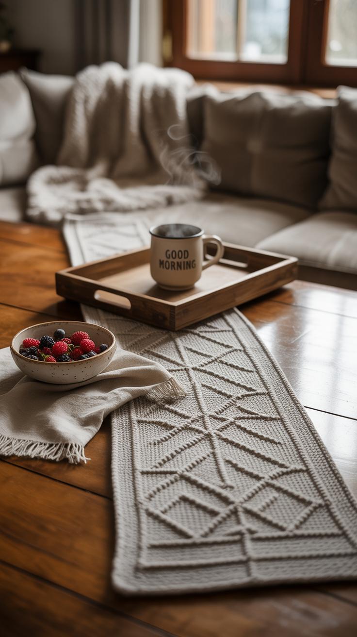
When setting the scene for fall on your coffee table, the base layer plays a quieter, but crucial role. It’s easy to overlook, yet this foundation shapes how the rest of your decor unfolds. Before piling on pumpkins or candles, think about what sits directly on the table surface. Table runners, trays, and placemats are the usual suspects here, but they each bring something different to the table—literally.
Choosing the Right Table Runner
Your runner needs to feel just right—not too wide, not too narrow. If it’s too small, it looks thrown together, and too large, it swallows your table. The texture matters more than you might suspect. A rough burlap runner feels autumnal and casual, but maybe too rustic if your style leans clean. Soft wool or knit runners invite touch and hold warmth visually, though they might be trickier to clean.
Color also pulls everything together. Deep rusts, mustard yellows, and olive greens set a cozy base without stealing spotlight from your accessories. Yet, sometimes a neutral runner—say an off-white or muted beige—can highlight vibrant fall accents better. It’s about how much you want the base to blend or stand out. I once picked a runner that was too dark, and all my decorations kind of melted into it. So, consider your room’s light and existing tones before deciding.
Using Trays to Organize Layers
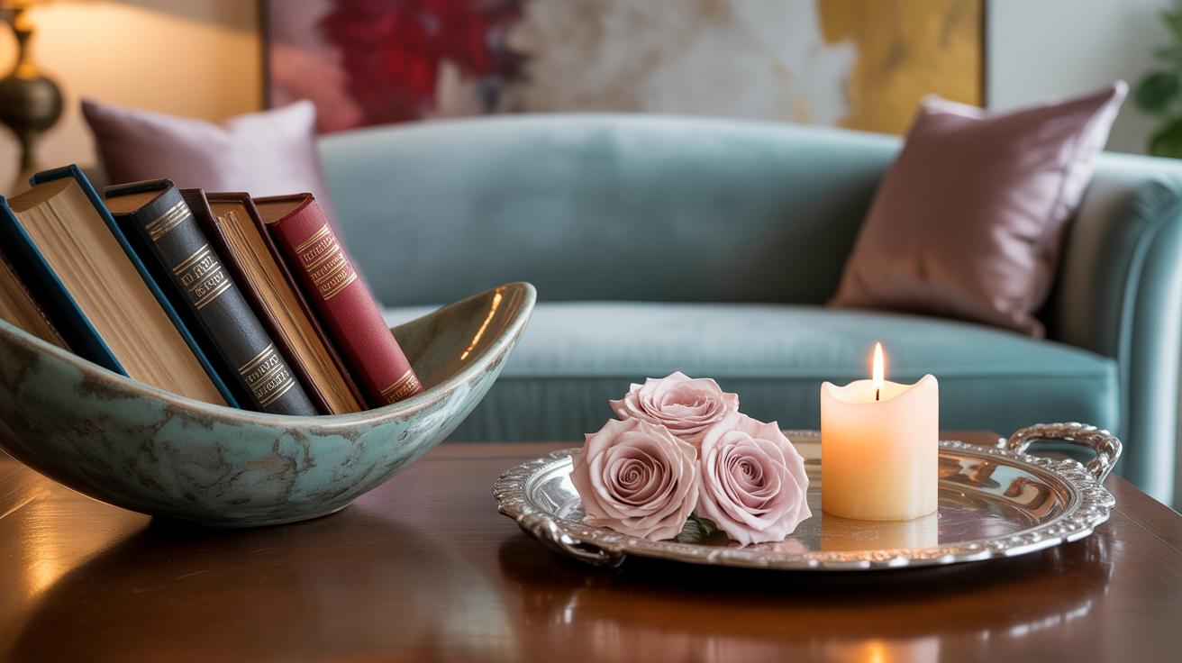
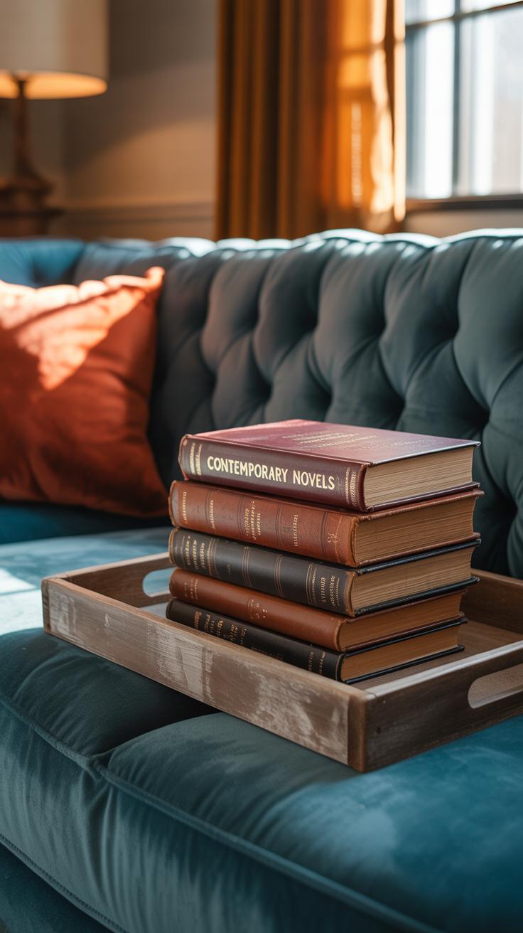
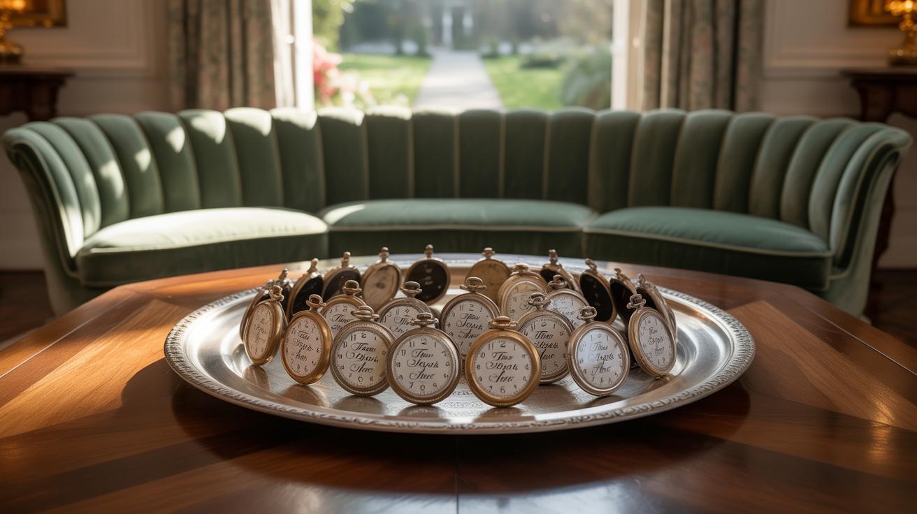
Trays are like little islands on your table. They corral items, which keeps things tidy and visually manageable. A tray can be wood, metal, or woven—you could even mix materials within a tray’s edges to add texture. They help separate objects and create natural groupings: candles on one side, a small stack of books on the other, maybe a mug or two.
Plus, trays let you switch things around easily. Want to try a different shape or size? Just swap the tray and rearrange. This flexibility often makes trays a secret weapon for layering decor without the scene turning chaotic. They add structure but also a bit of intentionality. You might start to notice how they guide your eye and help balance heavier and lighter elements. Don’t overlook trays; they’re subtle, but powerful.
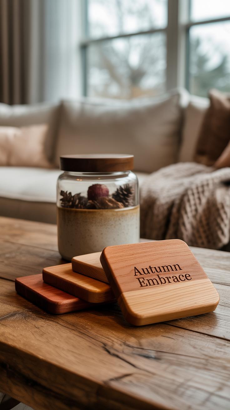
Incorporating Natural Elements
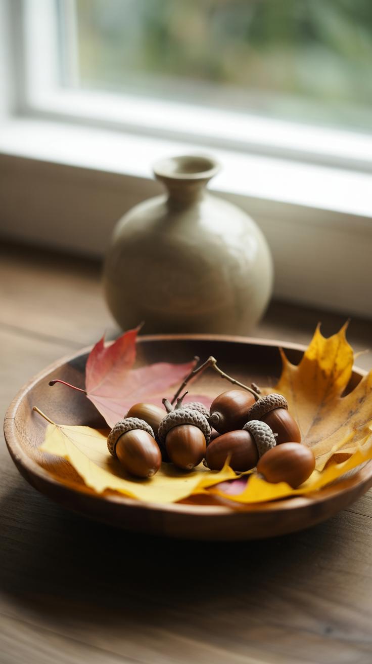
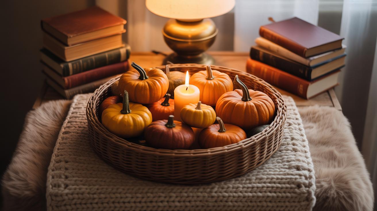
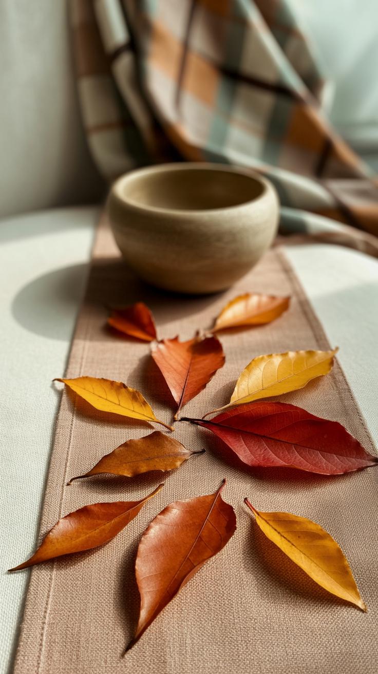
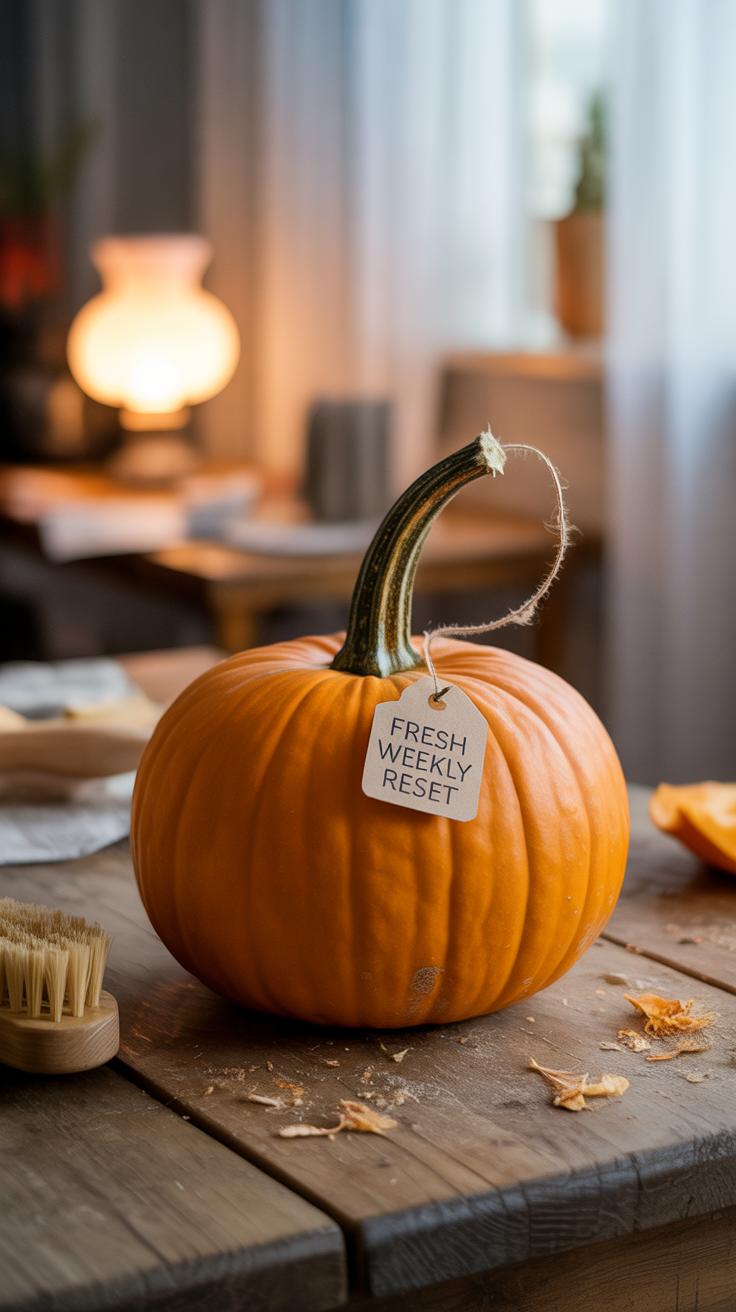
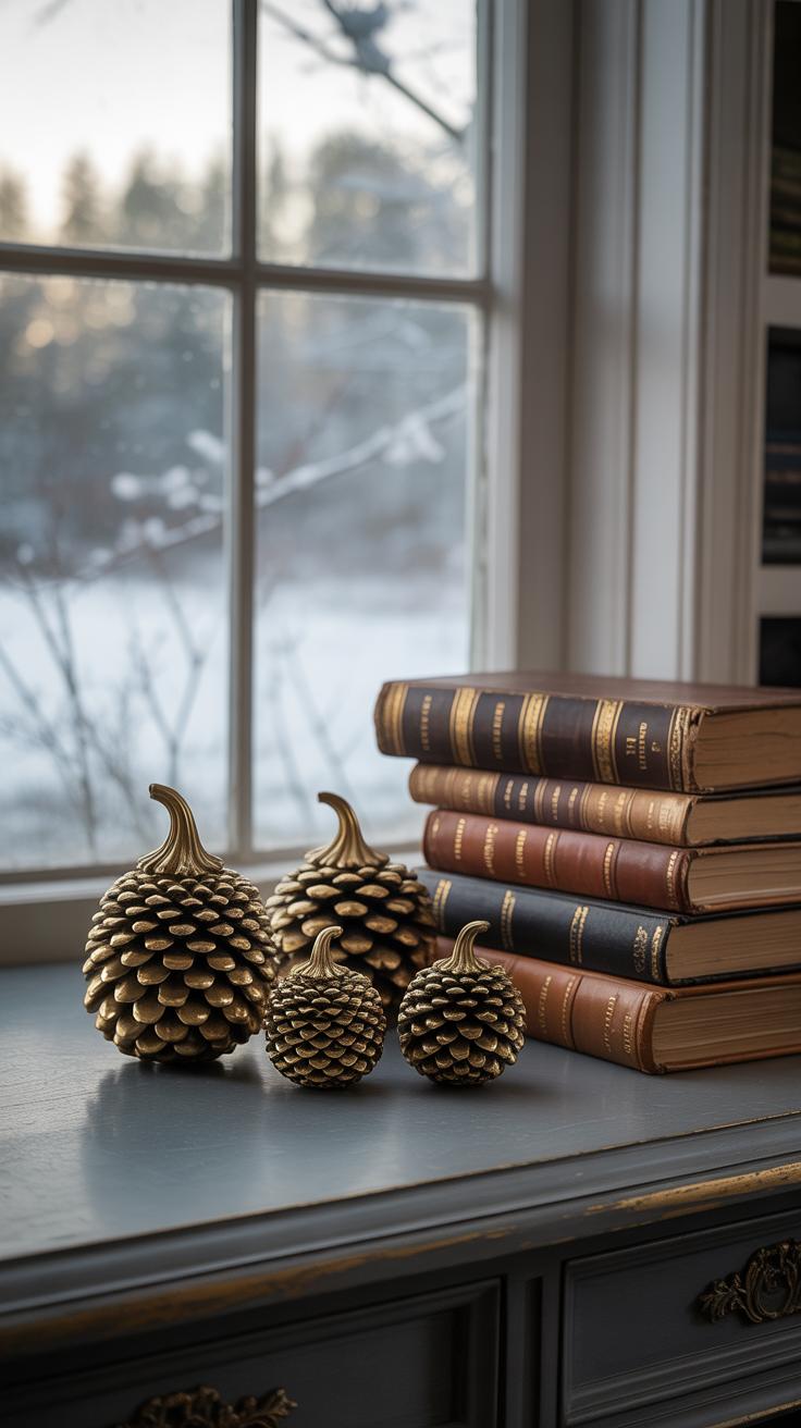
Using natural elements like pinecones, branches, leaves, and pumpkins can really pull the fall vibe together on your coffee table. These pieces add an organic feel that machines or synthetic decor can’t quite capture. There’s something grounding about a cluster of pinecones or a small pumpkin sitting right there in the center. It connects you, even briefly, to the outdoors where fall takes over. But it’s easy to overdo it or make things feel cluttered.
Popular natural items for fall coffee tables include:
- Mini pumpkins or gourds, varying in size and shape
- Acorns and pinecones, which bring texture and earth tones
- Colorful dried or fresh leaves—maples are a favorite for their shape and hue
- Thin, bare branches—twisted or straight—to add height or lines
- Seed pods or nuts, scattered lightly for detail
When placing these elements, try grouping them in odd numbers—three or five tends to look less forced. Mix tall branches with smaller objects like nuts nearby, so you get a sense of layering. Don’t just pile everything in one spot. Instead, spread the items out gently to let each piece breathe. Maybe a pumpkin anchors one corner while pinecones and leaves drift near the opposite edge.
Sometimes a random twig or leaf off to the side breaks up any stiff symmetry, making the arrangement feel more natural and lived-in. You might find that less is more with texture, while a bit of imperfection adds warmth. Does your table feel inviting or too staged? Experiment with what feels right to you, even if that means a little imbalance here and there.
Adding Soft Textiles for Comfort
Soft textiles bring a quiet kind of warmth that you can almost feel before you even touch. Around your coffee table, small pillows or knitted throws invite you to linger longer, making the space feel lived-in and comforting.
When picking fabrics for fall, think beyond just “soft.” Wool, cashmere blends, or chunky knits bring subtle texture without feeling scratchy. Cotton flannel is another option—it’s soft but has a bit of weight, perfect for cooler days. Sometimes, a velvet pillow can feel unexpectedly snug, even if it looks a bit formal at first.
Placement matters, too. Throw a knitted blanket casually over one corner of the coffee table bench or fold it neatly on a nearby chair. Small pillows work well on nearby seats or even the floor if you like to sit low. You don’t want the textiles crowding the table itself—leave space for decor and coffee cups—but around it, they create a subtle boundary of softness that pulls the room together.
Have you noticed how just a slight touch of fabric in the right spot changes the mood of a room? It’s a little detail, but often a very telling one about how cozy a space really feels.
Using Lighting to Enhance Warm Layers
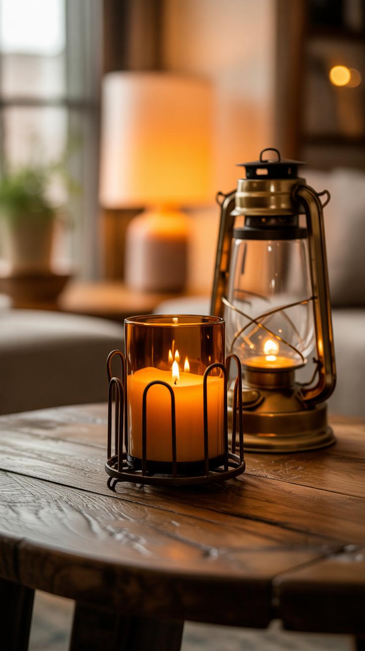
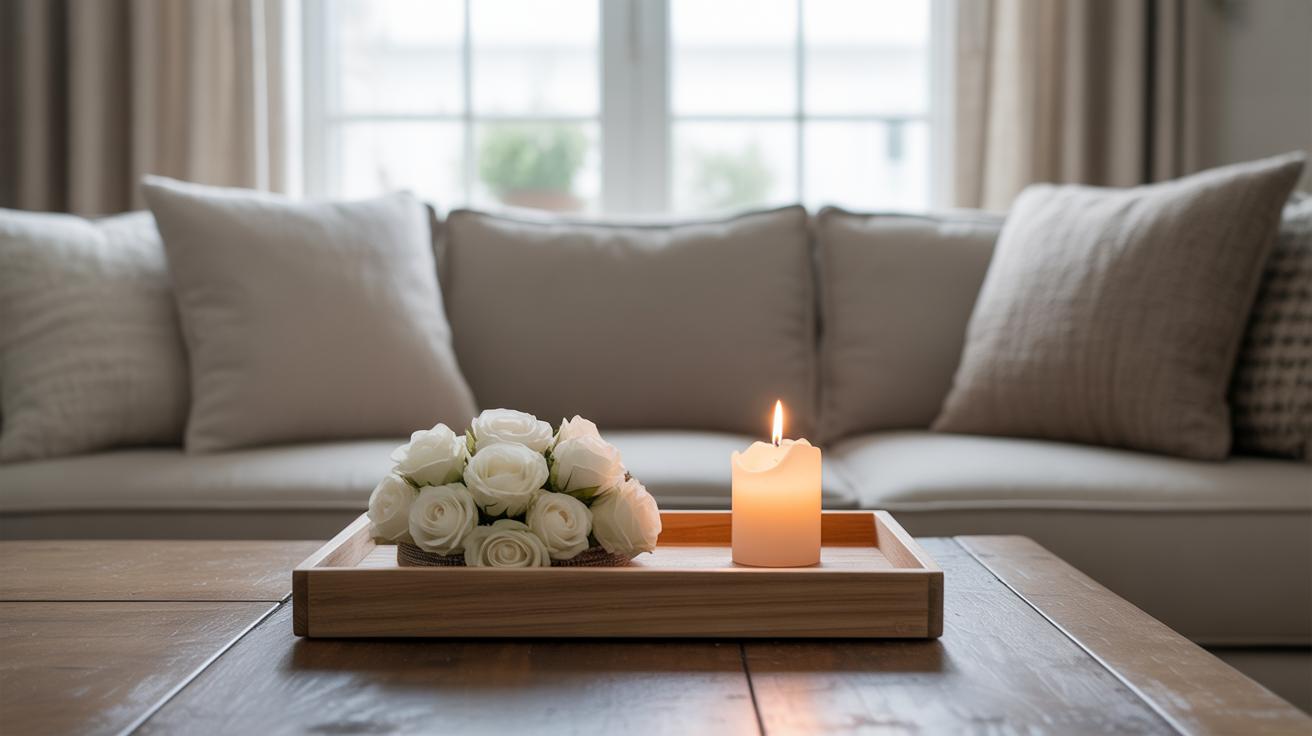
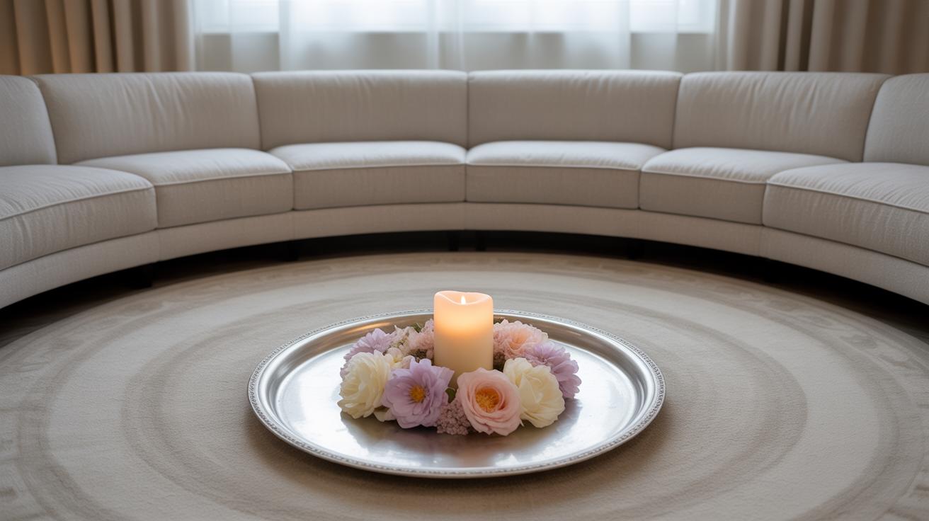
Lighting plays a surprisingly big role in setting the mood around your fall coffee table. Soft glows from candles or small lamps don’t just add light—they bring out textures you might otherwise miss. Think about the way a flickering candle makes a knitted throw seem softer, or how a warm lamp light can highlight the grain of a wooden tray. With fall decor, this subtle warmth makes everything feel—or at least look—more inviting.
Choosing Safe Candle Options
When it comes to candles, safety matters but style does too. I find that soy candles in glass jars work well—they’re cleaner burning and less messy than traditional wax pillars. Plus, there’s this calming effect from watching a real flame; it’s almost hypnotic. If you’re worried about open flames, battery-operated flameless candles are a solid choice. They still offer gentle flicker but without any of the risks. Beeswax candles also have a low drip rate and a natural scent that’s nice for fall, without overwhelming the space.
Positioning Lights for Impact
Where you put your lights influences everything. Instead of clustering candles or lamps centrally, try scattering them around the table edges or near textured items—like a woven basket or a ceramic mug—so they catch shadows and details. Placing a small lamp on a nearby side table that casts light sideways over your coffee table also reveals textures differently than overhead light. Don’t be afraid to experiment, really. Sometimes shifting a light source just a few inches can change the whole vibe, making layers pop or softening edges in a way you didn’t expect.
Incorporating Functional Decor Items
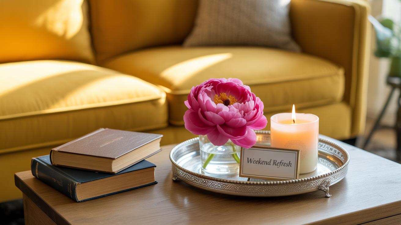
When it comes to fall coffee table decor, I think the trick is picking pieces that do more than just look nice. You want items that invite use while still adding to the cozy vibe. Functional décor like coasters, small bowls, and books can layer your table thoughtfully without overcrowding it.
Consider coasters made of natural materials—wood, stone, or leather. They protect surfaces but also bring in subtle texture and warmth. Small bowls aren’t just for holding random bits; they can contain potpourri, nuts, or even matchsticks for candles, blending utility with charm.
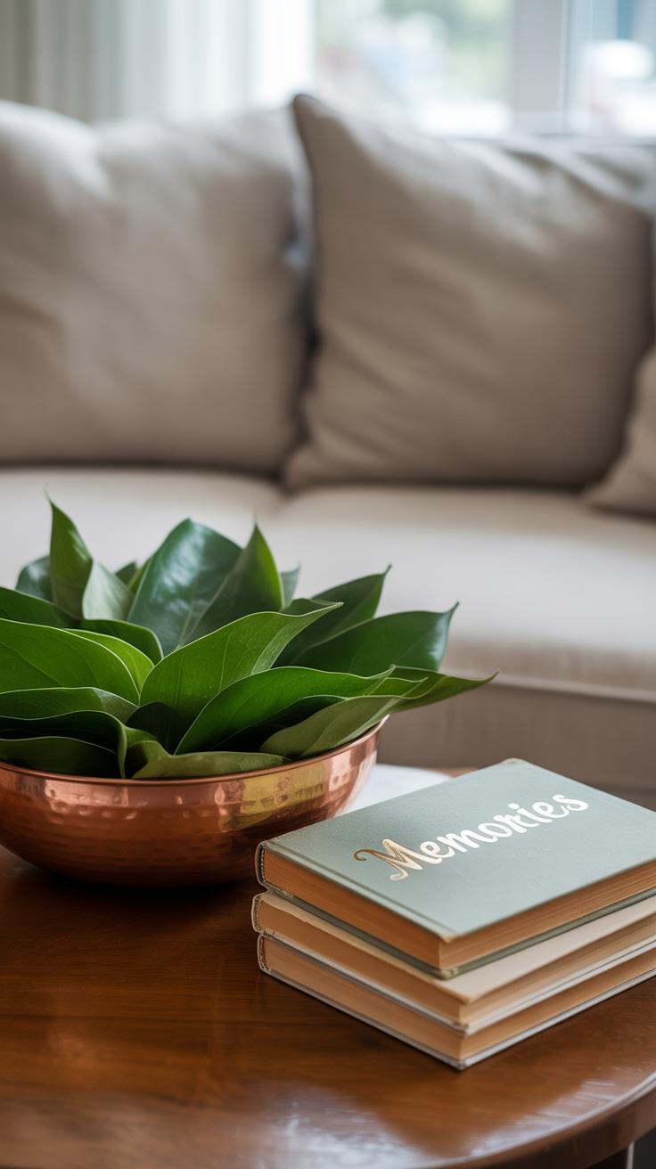
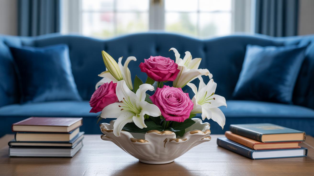
Books are great—stacked in uneven piles, they not only add height and dimension but can serve as an impromptu spot for that mug of tea on a chilly afternoon. I sometimes use vintage cookbooks or poetry collections for this.
Arranging these items can be a bit of an experiment. Placing a bowl next to a stack of books, with coasters layered nearby, can feel inviting rather than cluttered. Don’t worry about everything being perfectly centered. In fact, slightly off-kilter setups often feel more lived-in and appealing.
How many functional items are just decorative in your home, I wonder? Maybe layering with purpose makes the space feel warmer, not just visually but in how you actually experience it.
Using Color Contrast to Add Interest
When working with warm fall layers, adding color contrast can really make your coffee table pop—but it’s easy to get carried away. The trick lies in choosing colors that stand out but don’t clash harshly or overwhelm the cozy feel. It’s about finding that subtle tension between warm richness and cooler, unexpected hints.
Identifying Good Contrast Colors
Some colors naturally contrast with typical autumn shades like burnt orange, mustard yellow, and deep reds. Think about these for your accents:
- Soft blues or navy – cooler tones bring fresh depth to warm palettes. My first try with navy-blue candles on an orange runner surprised me by how much it highlighted the other colors.
- Deep greens – like hunter or emerald green; they feel both natural and striking next to fall hues.
- Muted purples or plums – they add richness without screaming for attention.
- Cool grays – subtle but effective at breaking up layers of warmth.
White or cream can also work but be careful not to lose the inviting warmth they sometimes mute.
Applying Contrast Skillfully
You don’t want to scatter contrasting colors all over your table. Instead, pick just one or two points of contrast. For example, a single blue vase or a green glass bowl can catch the eye without overpowering the entire setup. Placing these contrasting pieces close to warm elements makes the colors “talk” to each other instead of competing.
Limit the number of contrasting items so your eye has space to rest. Imagine it like a warm fire with cool shadows; too many shadows and the fire loses its glow. I usually stick to no more than two contrasting items on a coffee table—enough to add interest, not disrupt calm.
Does a bold color feel like it’s distracting? Try moving it slightly or swapping for a softer variation. It’s a quiet dance. You want the warm layers to feel enhanced, not drowned. Sometimes less color contrast actually highlights warmth better than a whole spectrum of clashing hues.
Personalizing Your Fall Coffee Table Decor
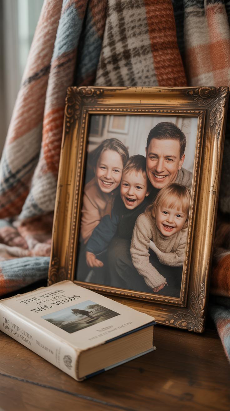
Adding personal touches to your fall coffee table can make the space feel truly yours. Photos in simple frames, perhaps from recent trips or family gatherings, bring warmth and stories to the decor. Don’t shy away from including handmade items like knitted coasters or DIY leaf garlands—it doesn’t have to be perfect to add character.
Other ideas that fit well with a cozy fall vibe include small heirlooms, carved wooden trinkets, or even a favorite autumn-scented candle you always return to. These personal decor pieces spark memories and deepen the seasonal feel beyond just colors and textures.
Balancing these elements with the rest of your decor is key. Too many personal items can clutter the table and distract from the overall look. Try mixing a few cherished pieces with simpler objects like natural elements or neutral ceramics. This keeps things cohesive but still meaningful.
Think about scale and color too. A tiny framed photo beside a larger pumpkin or a rustic bowl can create interest without overwhelming. You want your table to invite people in without feeling like an exhibit. Sometimes, less personal, more natural pieces can ground your unique items and keep the style consistent.
Maintaining Your Fall Coffee Table Look
Keeping your fall coffee table fresh doesn’t have to be complicated. A few simple daily habits can make a big difference. For example, clearing away any crumbs or spills right after use keeps things from feeling cluttered or sticky. Maybe you find it helpful to straighten pillows or fold a blanket on your couch nearby — those little touches affect how inviting the whole area feels.
It’s easy to forget that even something as small as fluffing a cushion or dusting a candle base changes the vibe. You might want to take five minutes each evening to quickly tidy the table—wipe down surfaces, rearrange any moved items, and fluff textures again. It doesn’t have to be perfect every day; just consistent enough to stop the space from feeling messy.
Over time, you might notice some decor pieces feeling stale or out of place. Swapping in new items—perhaps a fresh set of coasters or a different small vase—can keep things interesting without a full overhaul. I often change out a small element every couple of weeks, to refresh the look without stressing about it.
Also, consider the natural light or mood shifts as the season progresses. Does your arrangement still suit those softer, shorter days? If not, a slight adjustment in colors or fabric layers could bring the warmth back in. The goal isn’t to create a museum display, but a space you want to relax in.
Transitioning Your Coffee Table from Fall to Winter
Choosing Transitional Pieces
Moving from fall into winter can feel tricky when it comes to your coffee table decor. You don’t want to wipe everything away, but the heavy autumn vibe might not quite fit with the cooler months ahead. Look for pieces that blur the lines—items that work for both seasons without seeming out of place.
Think about natural materials and neutral colors. Things like wooden trays or bowls, glass vases filled with pinecones instead of just leaves, or cozy knit coasters. Candles in subtle scents—maybe shifting from pumpkin spice to fir or vanilla—can quietly hint at the change without shouting it. Even deep oranges can stay if paired with soft whites or greys.
Objects with texture that feels warm but not overly “fall” help, too. A ceramic mug in muted tones or a small brass ornament might feel wintery but don’t erase the warmth you’ve built in the previous season. Choosing items that quietly adapt saves time and keeps your table looking intentional rather than rushed.
Layering for a Smooth Transition
Layering is more than just piling stuff on—it’s about blending differing elements so nothing clashes. Start simple. If you have warm fall fabrics, place them underneath newer, lighter winter accessories. For example, a soft plaid throw could sit beneath a frosted glass candleholder.
Another way is mixing textures in stages. Pair rougher, organic pieces like a burlap runner or dried gourds with newer, sleeker items like metallic accents or faux snow-dusted branches. This contrast can feel balanced rather than jarring.
Don’t rush to remove all fall hues at once. Let your eyes adjust by nudging in cooler colors here and there. It might feel odd at first, but seeing a gradual shift helps you enjoy both seasons instead of flipping a switch. You might find yourself actually liking this overlap phase, noticing details you’d have otherwise skipped.
Conclusions
Embracing fall coffee table decor with warm layers and texture lets you bring the season indoors simply and effectively. By using a mix of natural materials, soft textiles, and warm colors, you can transform your coffee table into a cozy focal point. This creates a comforting atmosphere for you and your guests during the cooler months.
As you decorate, remember to keep pieces practical and visually balanced. Layer thoughtfully to add depth without clutter. With the ideas explored, you have the tools to update your coffee table each fall, making your living space inviting and fresh each year.