Introduction
Your front door is the first thing guests and passersby notice about your home. Choosing the right front door colors can greatly enhance the look of your house. This choice can add charm, highlight your home’s character, or give it a fresh, modern feel. Understanding how color impacts curb appeal helps you make a decision that is both beautiful and inviting.
In this article, we explore ways to pick front door colors that make your home stand out. You’ll find ideas to match various home styles, understand color meanings, and simple tips to maintain your door’s vibrant look for years. Let’s explore how to boost your curb appeal starting with your front door’s color.
Understanding the Role of Front Door Colors
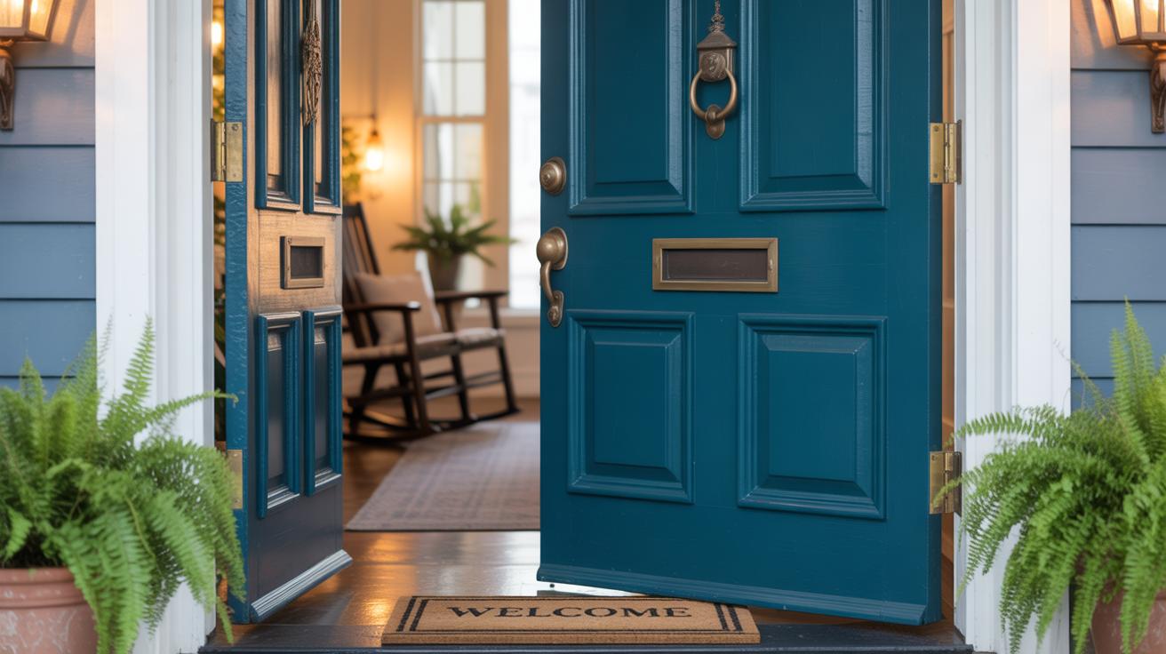
The front door is more than just an entryway; it’s the first thing people see. So, its color can change how your entire house looks—sometimes in surprising ways. Choosing the right hue can make your home feel warm and inviting or bold and modern, depending on what you want to express. The front door acts like a frame for the rest of your exterior, drawing attention and often influencing how passersby perceive the whole property.
Why does the front door grab so much attention? Well, it’s where visitors arrive, where daily comings and goings happen. It sends a message before anyone even steps inside. Since it’s usually a smaller area compared to walls or roofs, its color can pop without overwhelming.
But there’s more to it. Colors carry feelings. A classic red door might hint at a lively, welcoming home. A black door can suggest elegance or strength. Blue might calm or soothe. The choice of color can subtly shape how people feel about your place, beyond just looks. Ever noticed how some doors make you pause, curious to see what’s inside? That’s the power of color working quietly but effectively.
Matching Door Colors with Your Homes Style
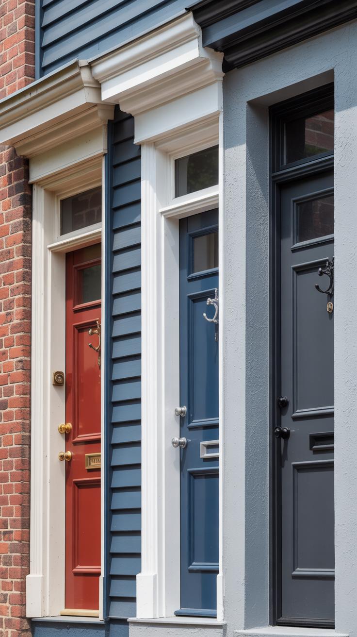
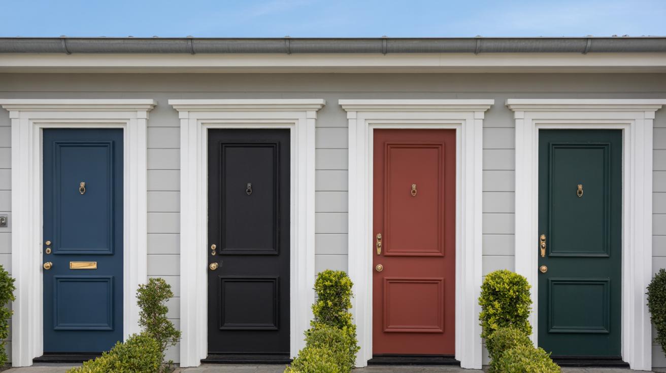
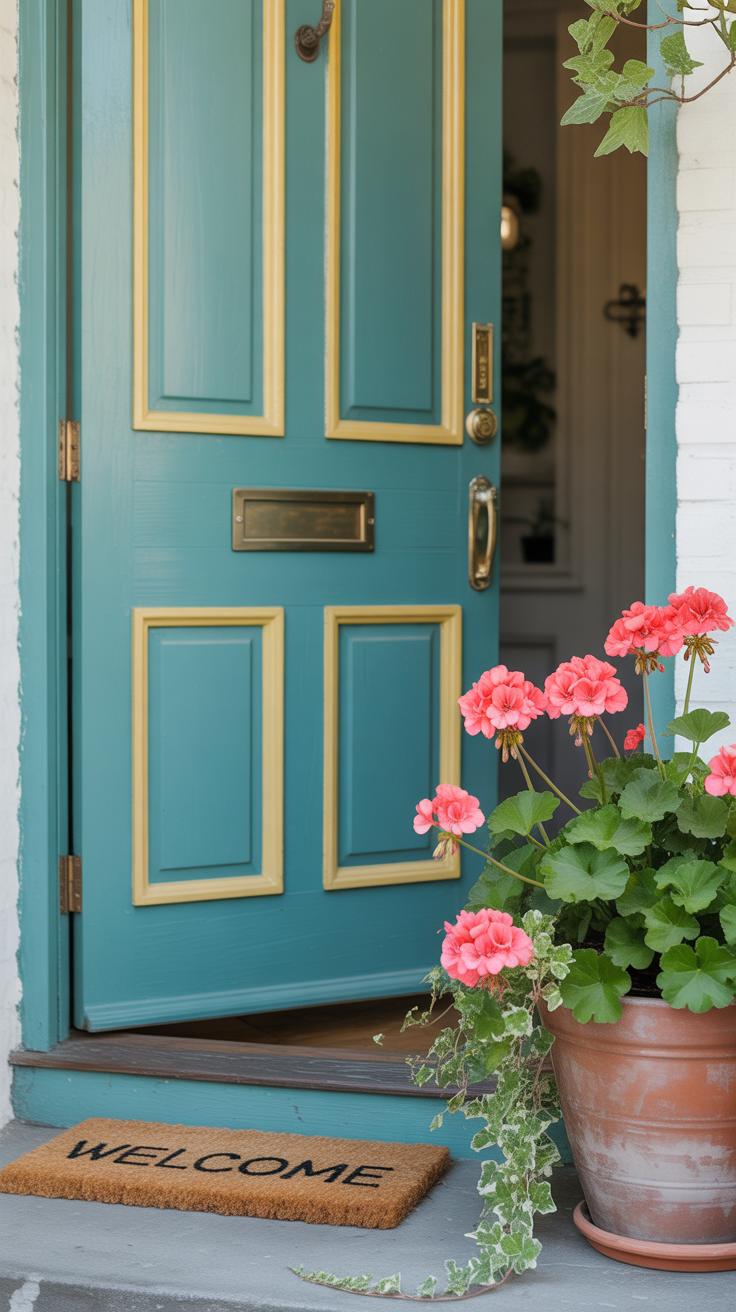
Picking a front door color that fits your home’s style isn’t always straightforward, but it can make a huge difference. Let’s start with traditional and classic homes. These houses often carry a timeless look with symmetrical shapes, brick, or wood siding. Sticking to deep, rich colors seems to work best here. Think navy blue, deep reds, hunter green, or even a muted black. These shades emphasize the elegance without shouting for attention. For example, a colonial-style home with white trim looks striking with a navy door, balancing classic charm and subtle contrast.
Modern and contemporary homes, on the other hand, give you more room to play with bold choices. If you have clean lines and minimalist features, brighter colors can actually complement the simplicity. Bright yellow or a bold orange might feel unconventional but can energize the entire facade. Or sometimes, staying with sleek neutrals like charcoal grey or matte black offers a sophisticated look that fits minimalism perfectly. You might hesitate to pick something too loud, but often, a surprising pop of color creates memorable curb appeal.
Both styles require a bit of courage and consideration. You want the door to feel inviting, yet fitting to your home’s personality. Maybe you already have a favorite color—does it blend well, or clash? Sometimes, odd choices work better than safe picks, but mostly it’s about how the color resonates with the overall vibe of your home.
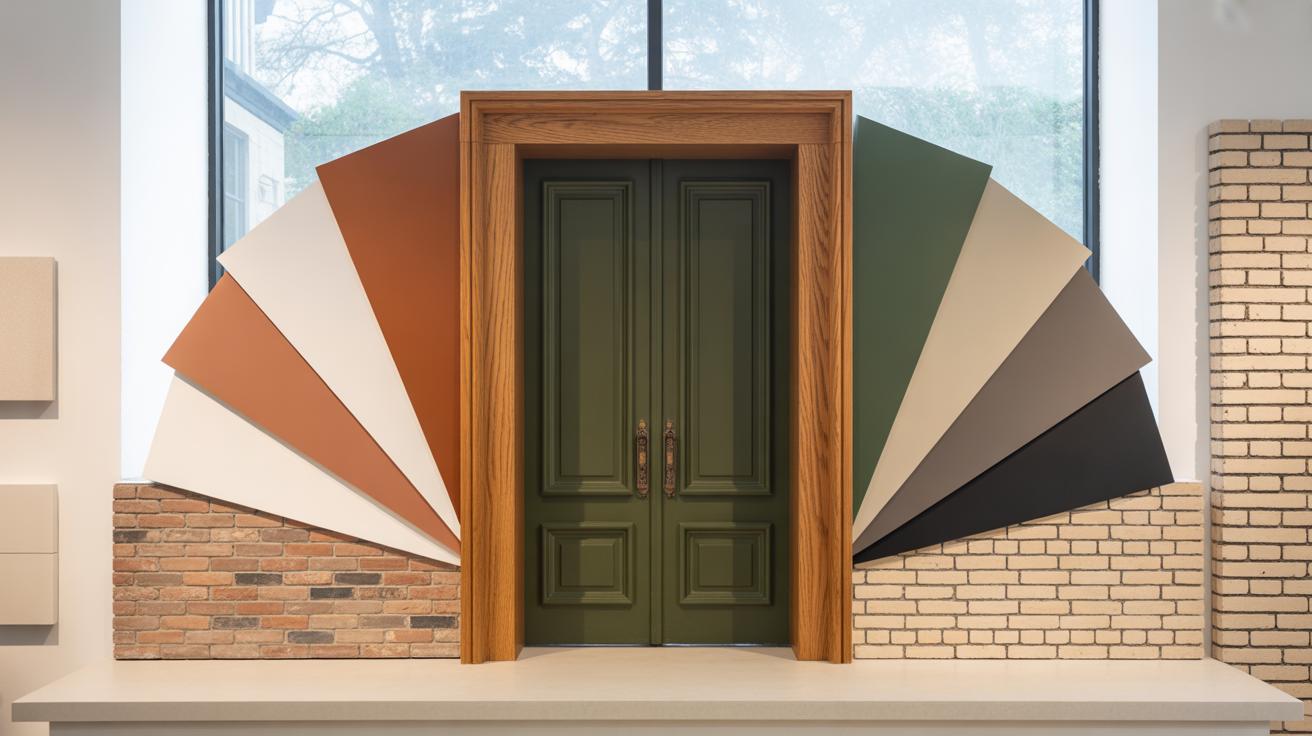
Popular Front Door Colors and Their Effects
When choosing a front door color, you might want to think beyond just what looks nice. Colors actually carry meaning and influence how your home feels at first glance.
Here are some popular choices and what they tend to convey:
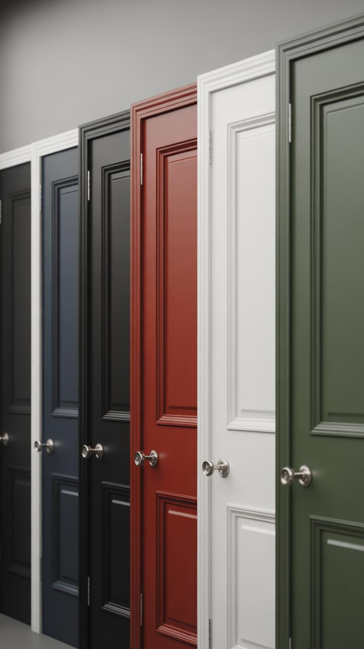
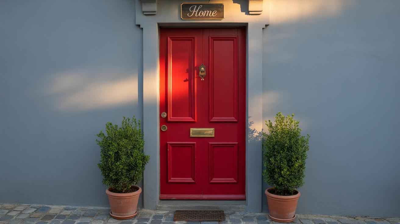
- Red: A classic pick that catches the eye instantly. It signals energy and warmth—sometimes even a bit of boldness. I’ve seen red doors make neutral homes pop without overwhelming the facade.
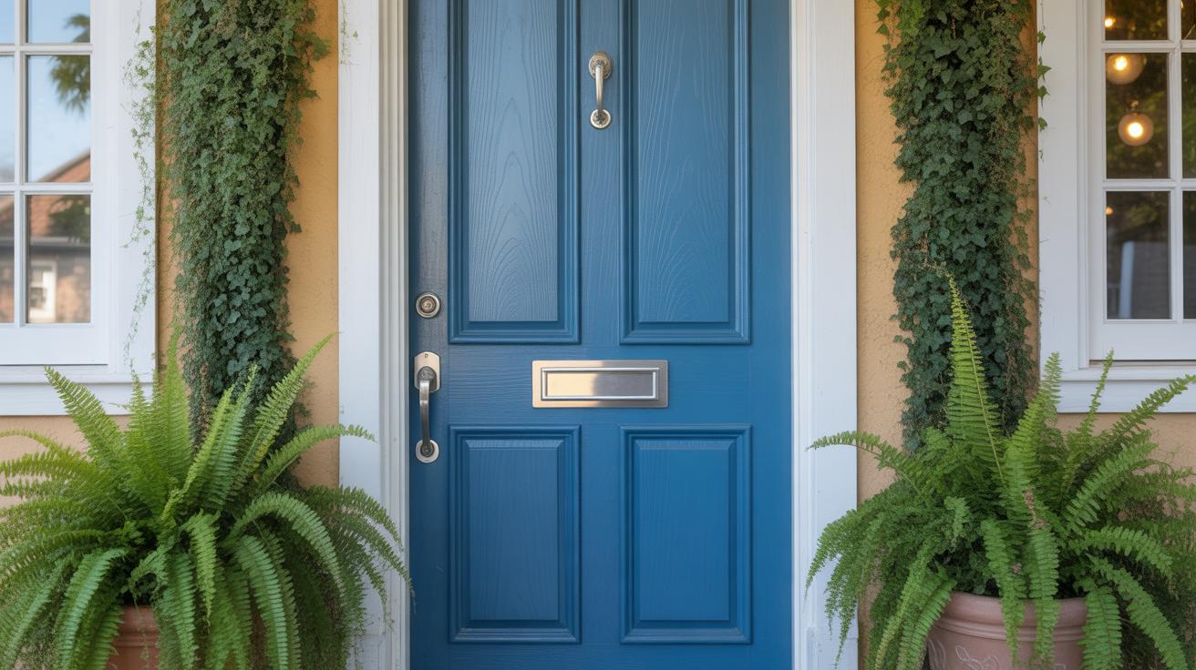
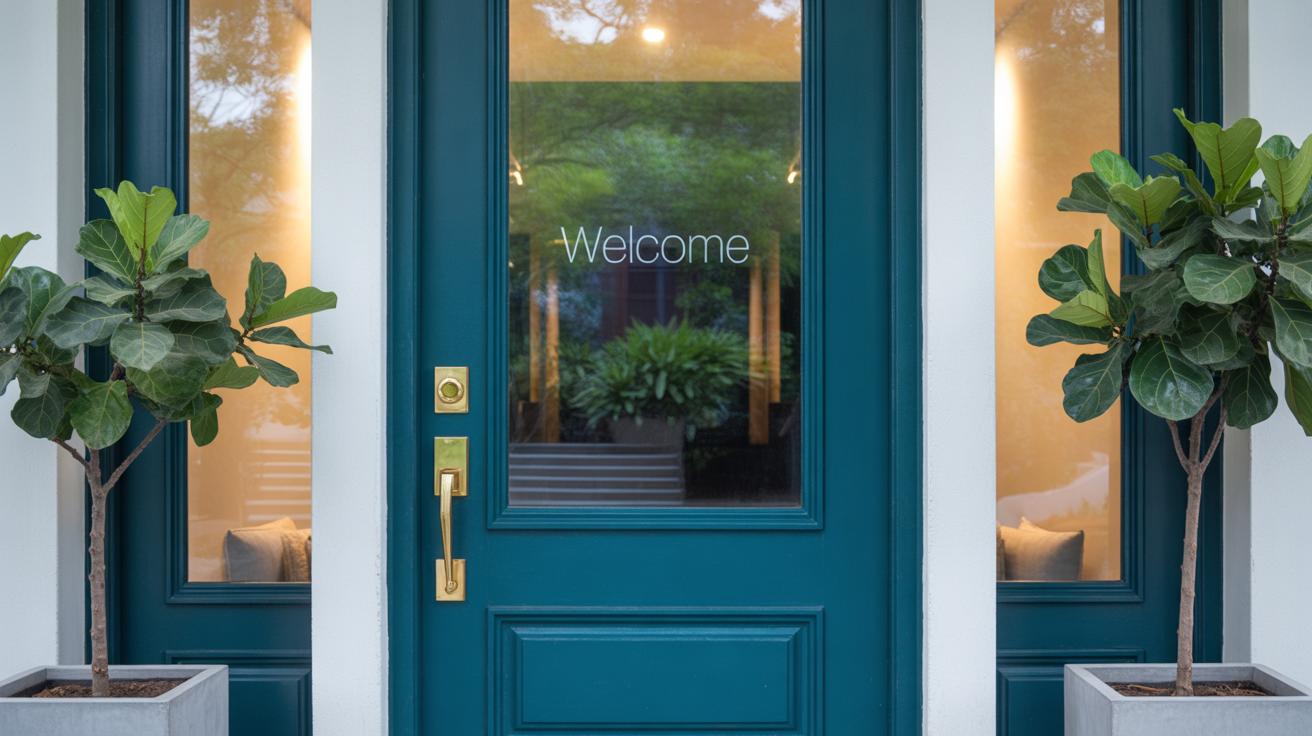
- Blue: Often linked with calm and trustworthiness. A deep navy suggests sophistication, while lighter blues add a breezy, fresh aura. Blue can feel both modern and timeless, but it depends on the shade.
- Black: Sleek and powerful. Black doors give a strong, elegant vibe but can sometimes feel cold if not balanced well with lighter elements. I think it’s a choice that suits contemporary or traditional homes alike.
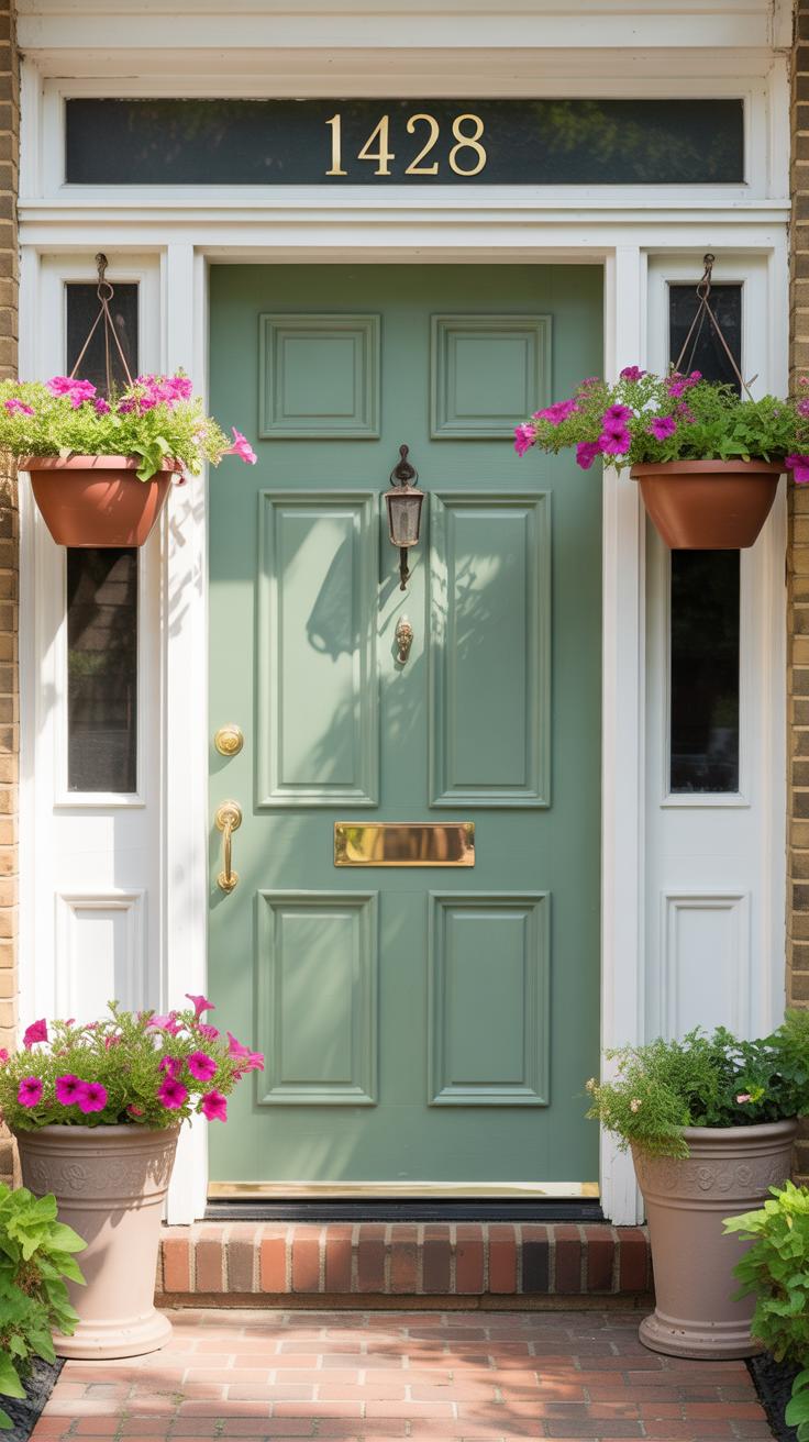
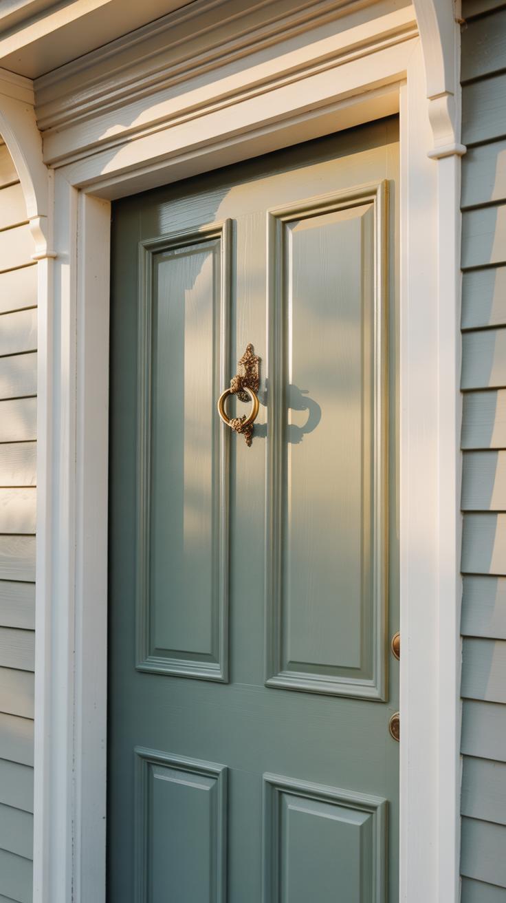
- Green: Earthy and inviting, green ranges from rich forest to soft sage. It evokes nature and tranquility, and it works surprisingly well with wood and stone exteriors.
Colors like yellow, white, or gray also come into play, but the ones above are the ones you’ll see most often. What kind of message do you want your door to send? It’s a subtle but powerful way to shape curb appeal.
Bold Colors That Make a Statement
Bright reds and deep blues don’t just sit quietly; they scream for attention. These hues tell visitors your home has personality. A bright red front door can feel like a cheerful invitation—or maybe a splash of daring in an otherwise calm neighborhood.
Deep blue, meanwhile, carries gravity but also a touch of mystery. It’s a color that insists on presence without shouting. When I first painted my own door a bold blue, neighbors stopped to ask about it—sometimes those strong colors can spark conversation.
You might ask yourself: am I ready for that kind of spotlight? Bold doors aren’t just paint; they’re statements, and they change how your home interacts with the street.
Subtle Colors for a Calm Appearance
In contrast, softer shades like muted greens, gentle grays, or pastel blues create a relaxed, welcoming vibe. These colors don’t demand attention, but they make the entrance feel soothing and approachable.
I recently noticed a home with a soft sage door nestled between white siding and beige trim. It felt unassuming yet elegant—like the door was whispering “come on in” instead of announcing itself. Sometimes, subtlety can be more inviting than boldness.
If you prefer your door to blend harmoniously with the rest of the exterior, these quieter tones might be better. They can temper the visual flow without disappearing altogether. So, is calm better for your style, or do you want your front door to take center stage?
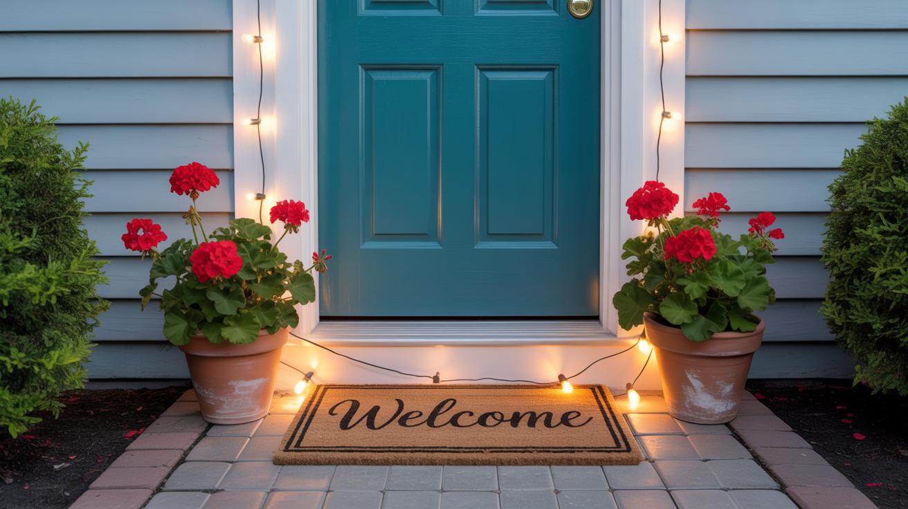
Combining Door Colors with Exterior Elements
When picking a front door color, it’s not just about the color itself but how it plays with the rest of your home. Think about the siding and trim first. If your siding is a neutral tone like beige or gray, a bold door color can create a lively punch. On the flip side, if your siding is already bright or patterned, you might want to ease up on the door’s intensity to avoid a clash.
Landscaping, surprisingly, can shift the vibe too. Dark green door shades might blend nicely with leafy plants, while bright reds or yellows can pop against flowerbeds. Hardware shouldn’t be overlooked either. The color and finish of handles, knockers, and hinges can either bring harmony or feel disconnected from the door’s hue.
Choosing Complementary Colors
Wondering whether to match or contrast the door color with your house? Both routes work, but balance is key. Matching a door color too closely to siding can sometimes cause the door to disappear, which you usually want to avoid. But matching a door to trim? Sometimes that spot-on match can add an unexpectedly cohesive flair.
If you opt for contrast, think about your home’s architectural style. A soft blue door on a warm tan house might feel relaxed and inviting, but a neon green door could throw the whole look off. Try to find colors that sit opposite each other on the color wheel but keep them muted if your home already has busy textures or multiple colors.
Coordinating with Hardware and Decoration
Hardware and decorations can make or break the door’s overall effect. If your door color is dark, a shiny brass or gold handle can add warmth and lift the mood. For lighter door colors, brushed nickel or black finishes often provide a modern yet approachable look.
Likewise, think about doorknockers, house numbers, and seasonal decorations. A large rustic knocker on a sleek, modern door might feel out of place, but on a traditional door, it looks fitting. Sometimes less is more here — you don’t want the hardware competing with your door color or vice versa. It’s about creating a small package that feels unified without trying too hard.
Testing and Selecting Your Door Color
Applying Sample Patches
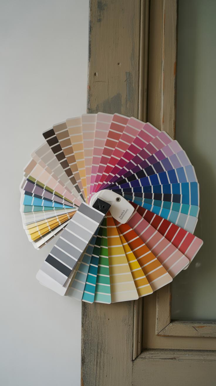
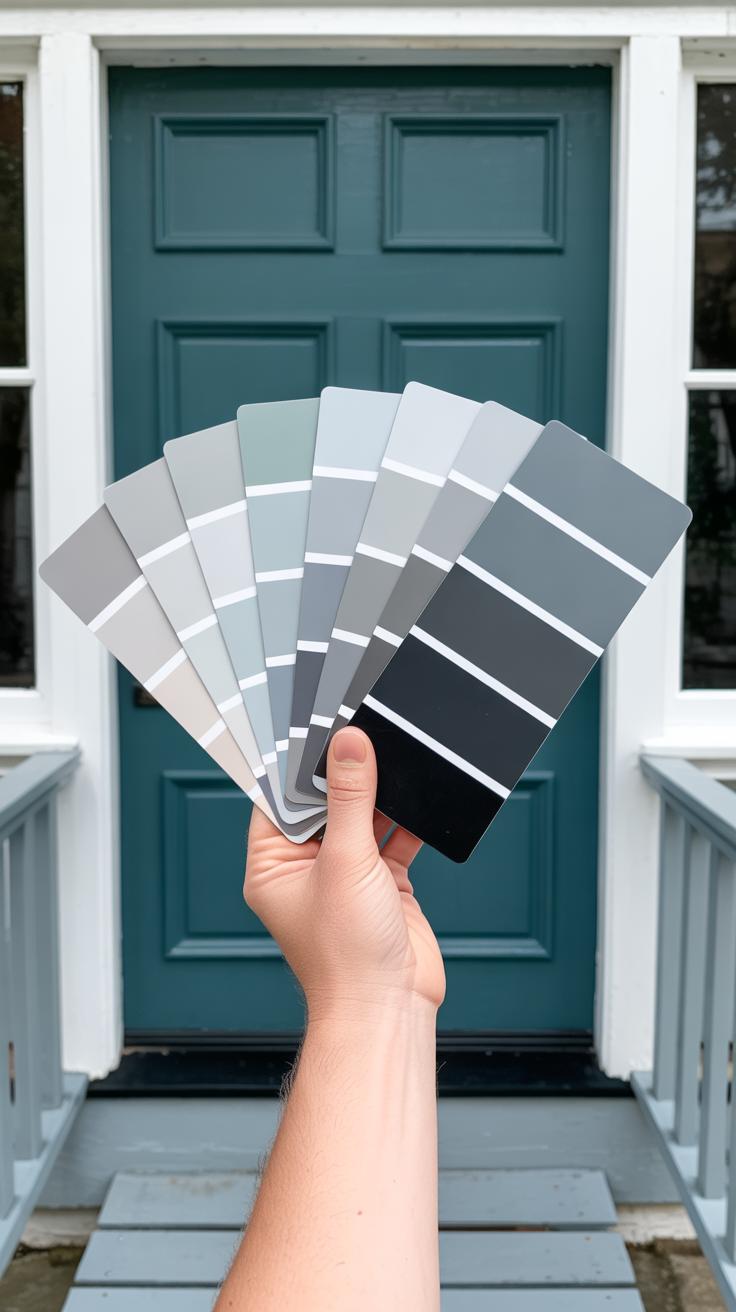
Before committing to a door color, try painting small patches directly on the door’s surface. Pick a few spots—ideally somewhere visible but not too central—and apply thin coats of your chosen samples. Wait for them to dry completely; wet paint can be misleading.
Observe these patches at different times. Morning light often feels cooler and brighter, while evening light tends to soften colors, sometimes making them look warmer or duller. A color that pops in daylight might seem flat at dusk, or vice versa. Take notes or photos over a couple of days to help decide.
Don’t overlook how shadows from nearby trees or porch lights affect the color feel. If possible, check the patches on cloudy days, too. This back-and-forth might seem excessive, but seeing the color in multiple settings saves regret later.
Evaluating Color Durability
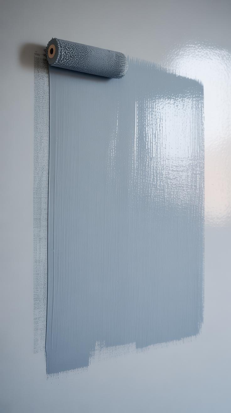
Choosing the right paint type matters as much as picking the shade. Exterior paints designed specifically for doors often resist fading and weather better than general-purpose ones. You want a finish that holds up to sun, rain, and even the occasional scuff.
Satin or semi-gloss finishes usually balance durability and subtle shine nicely. Flat paints might make colors seem richer initially but wear faster and show marks. Glossy finishes last well but can highlight imperfections.
Think about your local climate, too. If your area sees strong sunlight, a paint with UV protection can keep hues from fading quickly. Sometimes, spending a bit more on higher-quality paint prevents the frustration of repainting sooner than you’d like.
Painting Tips for a Professional Look
Preparing the Door Surface
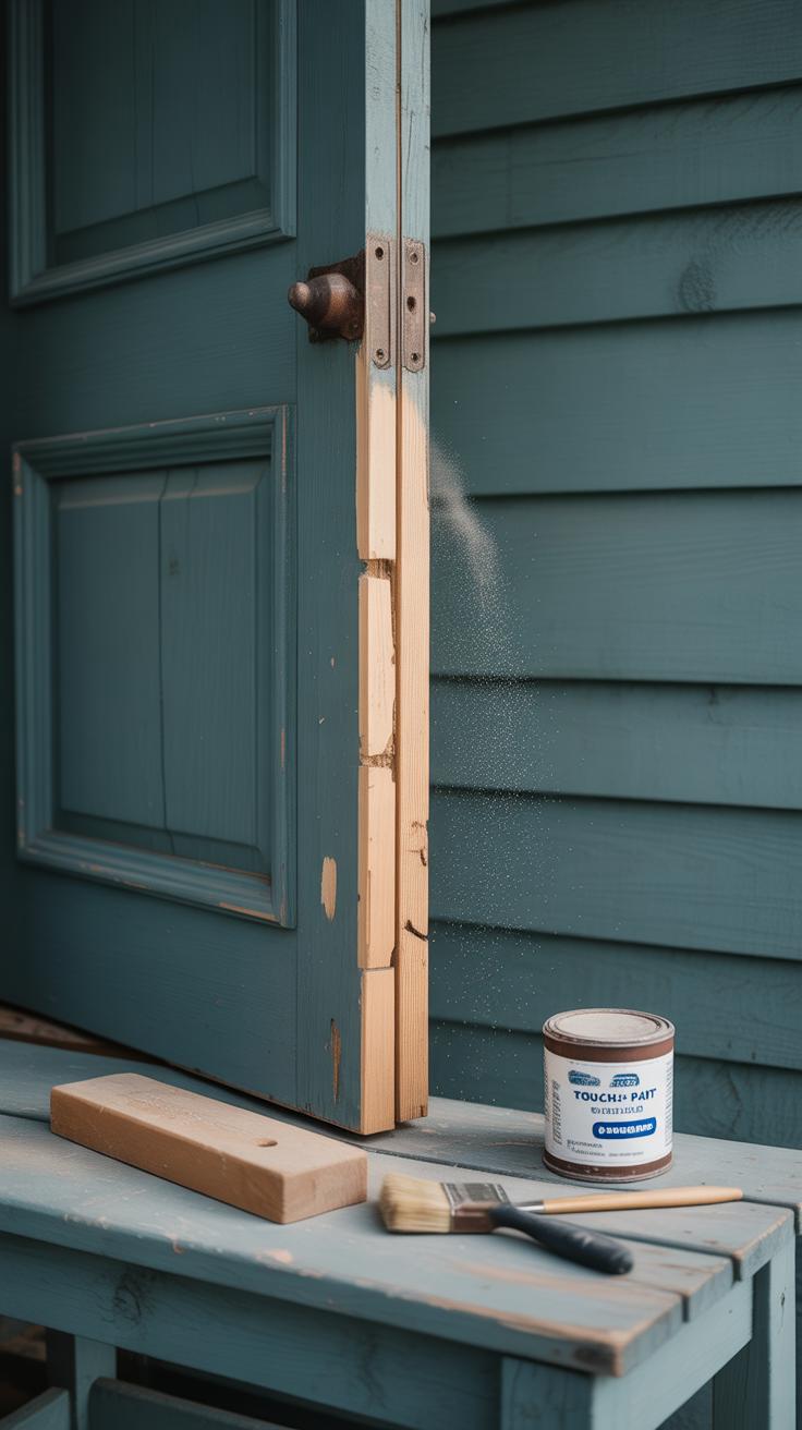
You want your front door paint to last and look good, right? Start by cleaning the door thoroughly—dirt and grease can ruin the finish. Use a mild detergent and warm water, then rinse and let it dry completely. It might seem obvious, but skipping this step often leads to peeling later on.
Next is sanding. Lightly sand the entire surface to create a smooth base. If the door has old, peeling paint, scrape that off first. Sand down rough spots or glossy finishes to help the new paint stick better. I usually prefer medium-grit sandpaper here, but sometimes fine grit works if the surface is already pretty even.
Priming the door is also key, especially if you’re switching from dark to light colors or painting raw wood. Apply a coat of primer evenly—don’t overdo it, or you’ll get drips. Primer helps paint adhere and evens out any imperfections.
Applying Paint Evenly
When it’s time to paint, don’t rush. Use a high-quality brush or foam roller depending on the door’s texture. Brushes work best for panels and edges, rollers cover flat surfaces quickly. I tend to start with a brush for detail, then switch to a roller for larger areas.
Work with thin coats; thick layers cause streaks and drying issues. Let each layer dry before adding another. This can test your patience, but skipping it leads to a sloppy finish.
Paint in consistent strokes, ideally following the wood grain or panel lines. Sometimes you’ll notice uneven spots as you go—pause and smooth them out while the paint is still wet.
Finally, avoid painting in very hot, cold, or humid weather. These conditions affect drying and texture, often leaving you with a less-than-perfect door. It’s the little things like this that make a big difference in the end.
Seasonal and Trend Considerations for Colors
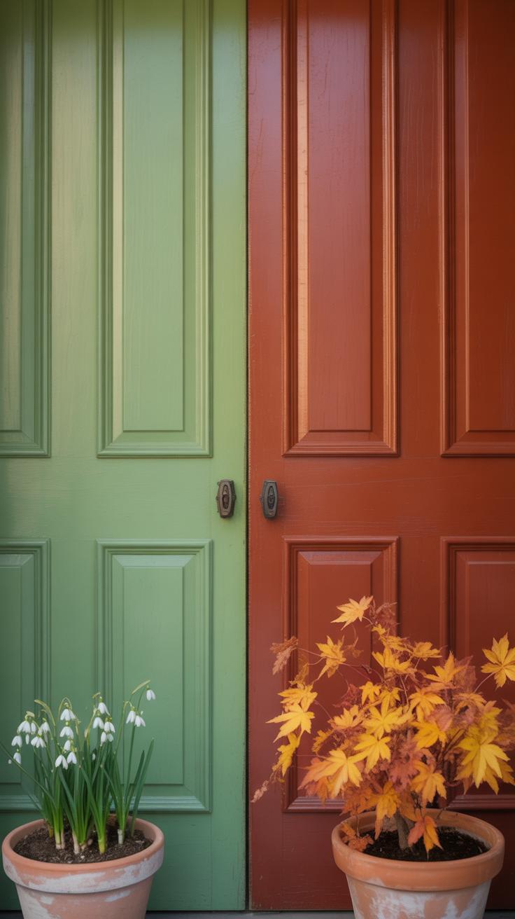
Choosing a front door color isn’t just about personal preference. The seasons can really affect how a color feels and looks on your home. Think about spring: soft pastels or fresh greens can make a door really pop without overwhelming the space. Spring colors tend to bring a sense of renewal and lightness, which can be inviting.
Summer, by contrast, often calls for bolder choices. Bright reds, deep blues, or even sunny yellows seem to fit the lively, energetic vibe. They catch the light well and stand up nicely to strong sunlight.
When fall rolls in, earthy tones like burnt orange, mustard, or deep olive sometimes feel more grounded and cozy. They complement the changing leaves and create a harmonious look.
Winter’s palette leans toward rich, dark hues—navy, charcoal, or even an emerald green. These shades bring warmth and depth but might feel a bit heavy if overused. Still, for some homes, that weight is exactly right.
Then, there’s the question of trends. Colors shift over time, and some palettes become particularly popular. Right now, muted shades—think dusty blues, soft greys, and warm taupes—are everywhere. They offer a modern touch without overwhelming your home’s original character.
You might wonder, should you chase trends or stick with timeless choices? Maybe aim somewhere in the middle. Try incorporating trending colors in accents—door hardware or a wreath—if you aren’t ready for a full commitment.
Some popular current palettes combine natural tones with pops of color for contrast. A deep navy door with brass hardware is a common example, blending classic roots with a fresh twist. It’s a reminder that your front door color can be both fashionable and lasting, if chosen thoughtfully.
Maintaining and Refreshing Your Door Color
Keeping your front door color fresh isn’t as complicated as it might seem, but it does take a bit of attention now and then. Dirt and grime can dull the finish, so regular cleaning is key. Try wiping down your door every few weeks with a mild soap and water solution—nothing too harsh, or you risk stripping the paint. I once skipped this step and noticed my vibrant red door looking a bit tired faster than expected.
Protecting the paint is just as crucial. Applying a clear, UV-protective sealant can help prevent fading from sunlight. These coatings are easy to apply, and you don’t need a pro for it—just follow the instructions carefully.
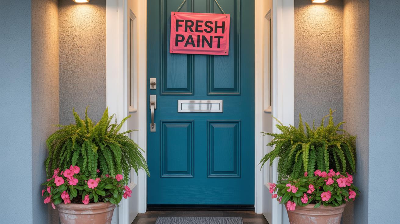
When should you repaint? Paint can last anywhere from three to five years, depending on your climate and exposure. If you spot peeling, cracking, or noticeable fading, it’s probably time. But maybe you want a change instead—refreshing your door’s look with a new color can feel like a mini makeover.
Picking a new shade is where things get interesting. You could stick with your classic favorite or pick something completely unexpected. Sometimes, a slight twist on your current color keeps the charm but adds a fresh vibe.
Don’t rush repainting in extreme temperatures. Cool, dry days are best. And before a new coat, a light sanding can do wonders for smoothness and longevity.
Using Color to Express Personality
Your front door color can say a lot about you—sometimes more than you realize. It’s one of the first things people notice, and it sets the stage for what’s inside. Choosing a color isn’t just about looks; it’s about reflecting who you are, or at least who you want your home to feel like. Think about your favorite hues, but also how they interact with your exterior and surroundings.
Sometimes, a bright yellow or fiery red door makes a statement that feels fun, inviting, or even a bit daring. Other times, a soft blue or muted green communicates calmness and steadiness. There’s no “right” choice here—what matters is how it feels to you.
Making a Bold Statement
Bold colors offer a chance to tell a story. Maybe you want your house to stand out in the neighborhood or express a part of your personality that’s energetic and unique. Some ideas that work well:
- A deep teal or navy blue that feels both modern and unexpected.
- A bright orange door that draws the eye but doesn’t overwhelm.
- A rich purple or magenta for a truly distinctive look.
Choosing these colors can be a bit risky. You might love the excitement at first but tire of it, or neighbors might have mixed opinions. But if you want to express something lively or playful, go for it. Doors like these often spark conversations and make homes feel more personal.
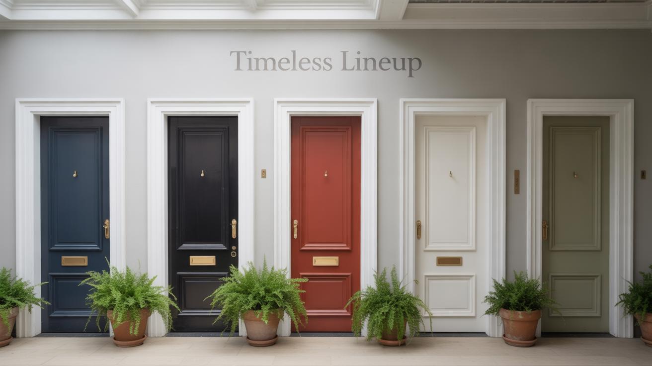
Choosing Classic and Timeless Colors
On the other hand, classic shades like red, black, or warm wood tones often appeal broadly. These colors age well and don’t feel like a fad, which is practical if you plan to sell your home someday. A black door, for instance, feels elegant and complements almost any siding or trim.
Timeless choices tend to create a welcoming atmosphere without shouting. They offer flexibility—you can change hardware, sidelight curtains, or wreaths without worrying about clashing. The plus side? You rarely regret these choices because they keep your home grounded and cohesive.
Still, sometimes I wonder if sticking with classics might miss the chance for a bit more personality. But maybe that’s the point—they’re safe bets, giving your home appeal that lasts.
Avoiding Common Front Door Color Mistakes
Ignoring Home Style and Environment
One frequent mistake is picking a front door color without thinking about the architectural style of your home. A bright, bold color might clash with a traditional Victorian facade, while something too muted could wash out a modern minimalist design. The color should feel like it belongs, subtly enhancing the home rather than competing with it.
Think also about your surroundings—the neighborhood vibe, nearby greenery, and exterior materials. A deep, forest green might blend well in wooded areas but feel out of place in a desert setting. Sometimes I’ve seen homeowners eager to follow trends, ending up with a front door that stands out—but not necessarily in a good way.
- Match door color to key exterior elements like roof, brick, or siding tones.
- Consider local climate colors; reflect natural hues nearby.
- Don’t ignore style cues: classic homes suit rich, timeless shades.
Choosing Colors Without Testing
Jumping straight to painting without testing can be a regretful shortcut. Colors often look different in natural light, on various surfaces, and as the day changes. What seems perfect in the store might turn dull or overpowering once applied. It’s a gamble that rarely pays off.
Try samples on your door or a similar surface. Look at them at morning, noon, and evening. Keep an eye out for unexpected undertones or how shadows reshape the shade. I recall a friend who picked a “cheerful” yellow, only to find it glaring under afternoon sun, clashing with her tranquil porch décor.
- Buy small paint samples and apply patches to your door area.
- Observe colors through different lighting conditions.
- Ask for opinions from others; your perception might miss nuances.
Remember, front door color is a commitment. Taking extra steps to respect your home’s style and testing options can save you from regretting a careless choice.
Conclusions
Choosing the right front door color is an easy way to increase your home’s curb appeal. By understanding your home’s style and selecting colors that complement or highlight its features, you make your house more inviting and memorable. Practical tips like considering durable paint and testing small samples help you get the best result.
Whether you prefer bold red, classic black, or a soft pastel, the right color makes a strong impression. Your front door can become a welcoming statement. Use the information here to confidently pick a color that reflects your style and invites guests warmly.