Introduction
Eco friendly color palettes for green interior design focus on using hues that promote a more natural and sustainable living environment. These palettes use greens and complementary colors that reflect nature, helping to reduce environmental impact while creating inviting spaces. Your choice of colors influences not only aesthetics but also your connection to the environment at home.
This article explores how to pick eco friendly colors, which shades work best in different rooms, and how these colors can support green living. You will learn practical tips to bring nature indoors through color, making your interior design both beautiful and responsible.
The Basics of Green Interior Design
What is Green Interior Design
Green interior design refers to creating indoor spaces with a focus on sustainability and respect for the environment. It involves carefully selecting materials and finishes that have minimal ecological footprints. Think reclaimed wood, recycled metals, and natural fibers that avoid harsh chemicals. But it’s more than just materials—it’s about how you connect your space with nature, often through color choices inspired by earth and plant life.
Colors like muted greens, soft browns, and gentle blues echo the natural world and create calm, inviting environments. Choosing these tones isn’t just an aesthetic choice but part of embracing nature’s rhythms indoors. It can make a space feel less artificial, more alive. So, green interior design is about blending environment-friendly materials and nature-inspired colors that together reduce harm and bring a sense of balance.
Why Color Matters in Green Design
Color impacts how you experience a space, from mood to lighting and even energy consumption. For example, lighter, natural tones can enhance the use of daylight—your space feels brighter, and you might rely less on artificial light. That’s a subtle but practical energy saver.
Colors rooted in nature often soothe and calm the mind, which isn’t a fringe benefit but a real consideration in sustainable homes. When you pick the right palette, you support well-being and make the space feel connected to its surroundings. It’s interesting to note—sometimes what feels “eco-friendly” isn’t just about materials but about how the space makes you feel.
Still, the choice of color can be tricky. Too dark may require more artificial light; too bright might clash with eco sensibilities or overwhelm natural materials. So, colors carry weight in green interiors not just visually but practically. Choosing them thoughtfully can enhance sustainability without sacrificing comfort or style.
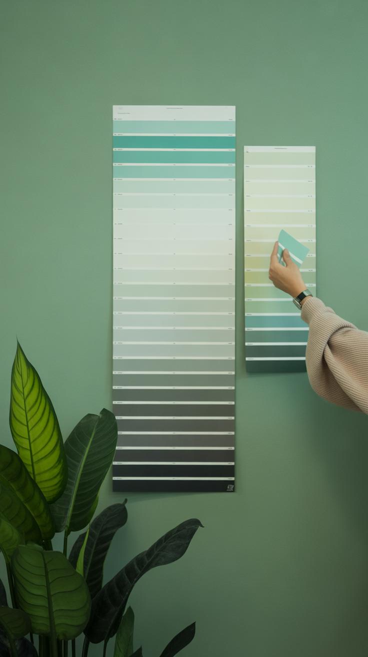
Understanding Eco Friendly Color Palettes
When we talk about eco friendly color palettes, what comes to mind might be more than just shades. It’s about what’s behind the colors—the source, the impact, and how they behave in your space over time. An eco friendly palette leans on natural pigments, like earth minerals or plant-based dyes, instead of synthetic chemicals. These origins often mean less pollution and a closer connection to the environment around us.
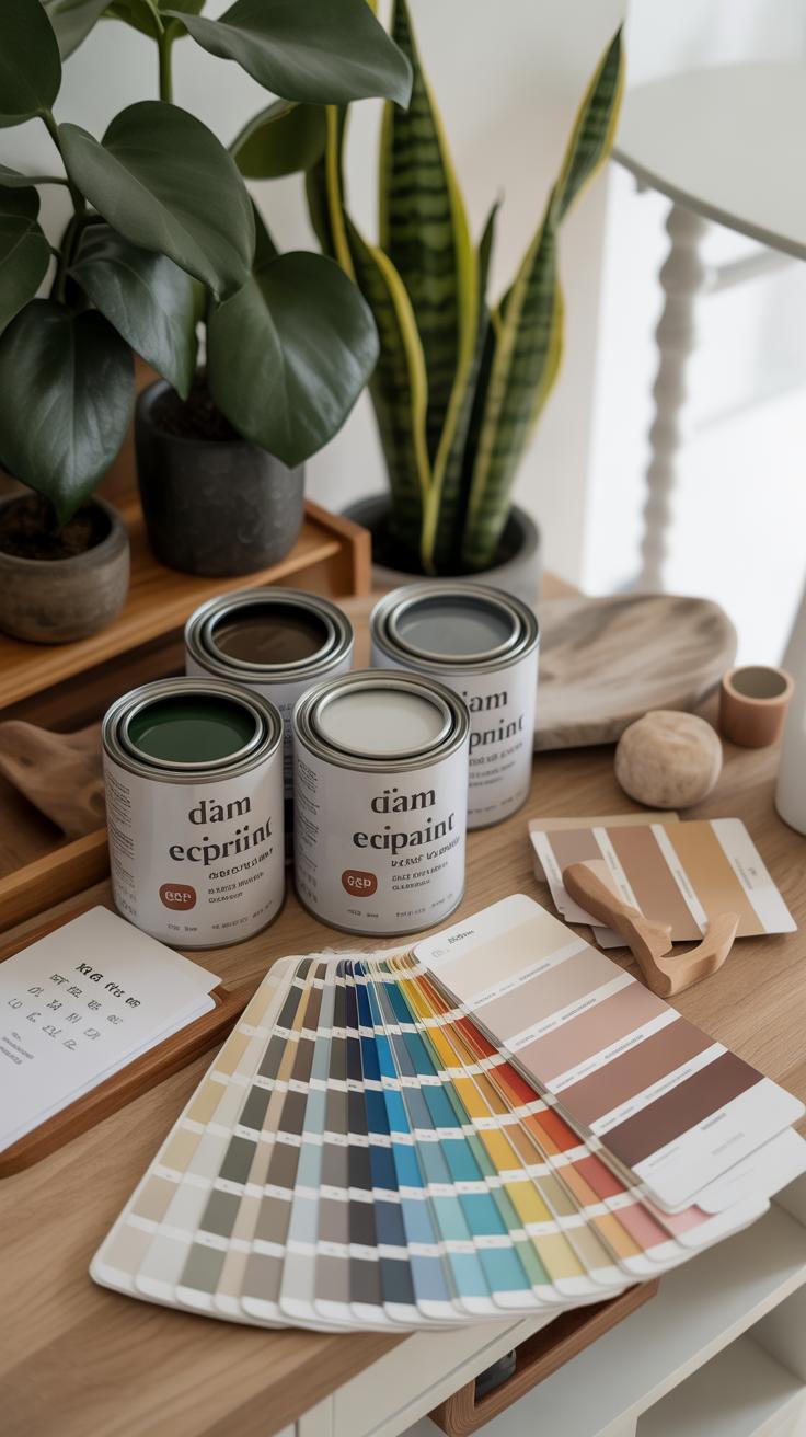
Low-impact paints play a crucial role too. Paints with low or no volatile organic compounds (VOCs) reduce indoor air pollution, making the space healthier. They often carry certifications, though not everything with a label is automatically eco friendly. It’s also about durability and how often you’ll need to repaint, which indirectly affects sustainability.
Such palettes support green interior design by enhancing the natural feel of a space without introducing harmful substances. They allow you to enjoy rich, authentic colors while being mindful of the planet and your well-being. Perhaps you’ve noticed a difference—the crispness or the calm—when using paints made from natural sources or low-impact formulas. That subtle effect is part of what makes these palettes worth exploring.
Characteristics of Eco Friendly Colors
Eco friendly colors share a few practical traits that make them stand out. They’re usually:
- Non-toxic, ensuring that neither occupants nor installers face harmful exposure during application or daily use.
- Derived from natural dyes or pigments, which can come from minerals, plants, or even recycled materials.
- Formulated as low VOC or zero VOC paints, minimizing emissions that degrade indoor air quality.
- Durable enough to avoid frequent repainting, which helps reduce waste and repeated chemical release over time.
These factors together shape how eco friendly a palette truly is. Natural dyes can sometimes mean subtler, less saturated colors, which may not suit every taste, but that’s part of their charm—a reminder that sustainability often involves accepting imperfection.
Examples of Green and Complementary Colors
Green is obviously central to green interiors, but the right greens vary widely:
- Soft sage and moss green bring calmness and a touch of earth inside.
- Deep forest green adds richness and depth but can feel heavy if overused.
- Muted olives can balance between warmth and coolness, fitting many styles.
Balancing these with complementary shades matters as well. Creamy off-whites or warm beiges can soften the green’s intensity. Shades of terracotta or soft rust add warmth without clashing. Even gentle grays, especially those with green or blue undertones, provide a subtle contrast that keeps the palette grounded and natural.
Which combinations feel right? It may depend on your space’s light and the vibe you want. But aiming for muted, earthy tones tends to keep the connection with eco-friendly principles intact while making the color scheme approachable and flexible.
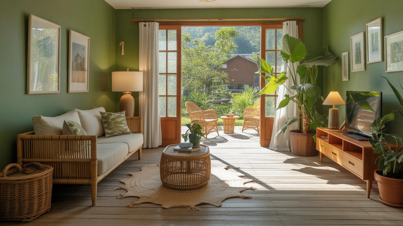
Choosing Shades of Green For Your Space
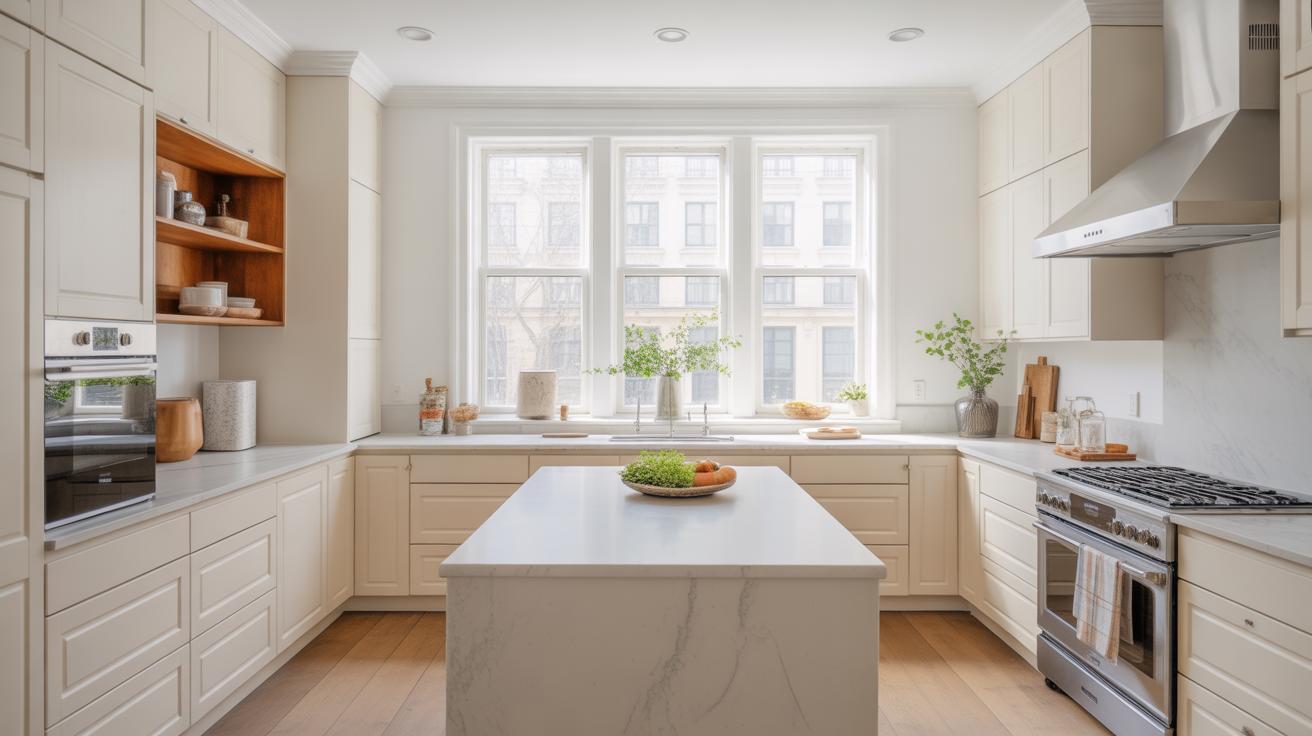
Picking the right green for your room really depends on a few things: the size of the space, how much light it gets, and what you want the room to feel like. Bright, lighter greens can make small or dim spaces feel fresher and more open. They tend to bounce light around, so they’re great for kitchens or bathrooms where you want that clean, airy vibe. Think pale sage or mint shades—soft but lively, not screaming for attention but still noticeable.
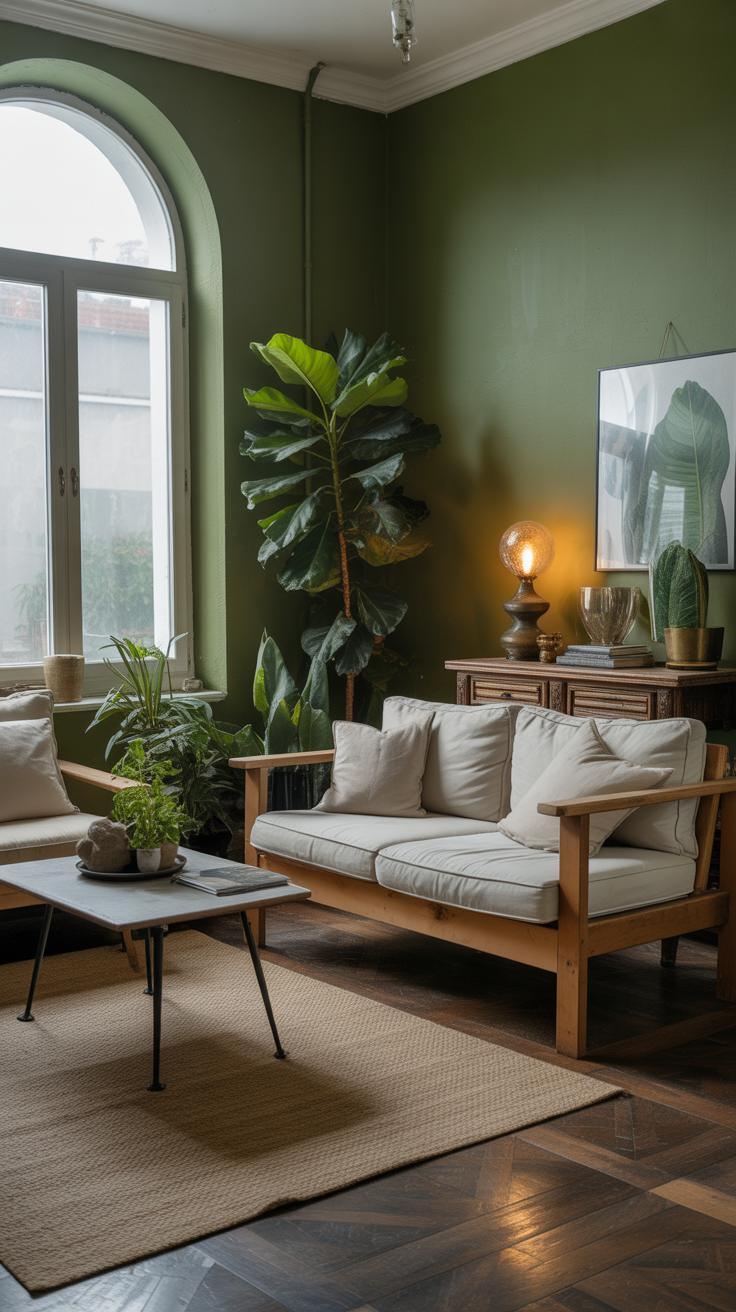
On the flip side, darker greens work well when you want a snug, comforting atmosphere. Rooms where you unwind—living areas, bedrooms, or a reading nook—can benefit from deep tones like forest or olive greens. They pull the walls in slightly, creating a cocoon-like effect. It’s a bit like the room is giving you a quiet hug.
Muted greens sit somewhere in between, often with gray undertones. These are versatile and can adapt to different lighting while keeping things calm but interesting. They don’t shout “look at me,” but they add depth and a touch of nature without overpowering other design choices.
- Use light greens to open up tight or low-lit spaces.
- Reserve deep greens for cozy corners and restful rooms.
- Try muted greens if you want subtlety and more flexibility.
Thinking about your green shade often leads back to how the space is used more than just what looks pretty. What kind of mood do you want every day? Sometimes a green that feels perfect one day might feel off another, depending on light changes or even your own mood. That’s part of the fun, isn’t it?
Pairing Green With Natural Neutrals
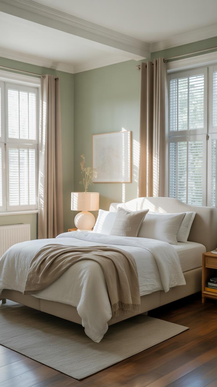
Green can feel very alive and refreshing, but pairing it with natural neutrals like beige, warm browns, or soft whites often makes eco-friendly interiors feel more grounded. When you combine green with these muted tones, the room takes on a quiet balance—green doesn’t overwhelm, and neutrals don’t feel too plain or sterile.
For example, I once tried a deep forest green wall with linens and cushions in a sandy beige; the natural fibers added a comforting softness. You might notice that even slight shifts in beige—from creamy oatmeal shades to taupe—can change green’s mood quite a bit. Soft whites bring in light and space without stealing attention.
This pairing often encourages a relaxed atmosphere while keeping the color scheme connected to nature. It’s less about bold statements, more about creating environments that feel authentic and calm.
Neutral Colors That Balance Green

Neutrals aren’t just blank backgrounds; some shades work better than others with green, especially for sustainable interiors. Common choices include:
- Warm beige tones, like sand or camel
- Earthy browns, ranging from light walnut to chocolate
- Creams and soft whites that have subtle warmth rather than stark brightness
- Greige shades—gray with a hint of beige—that ease transitions
- Soft taupe, which adds a slight depth without overwhelming
These shades tend to complement green by maintaining a natural, soothing palette. If you want your green to stand out but also want the space to feel comfortable rather than stark, these neutrals work as a kind of buffer zone.
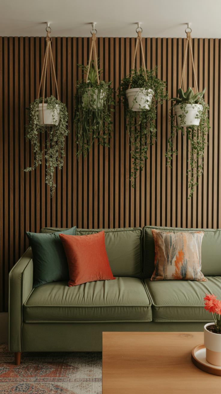
Creating Contrast and Texture
Neutral colors do more than mute green; they create space for it to breathe and offer texture that makes interiors inviting. Think of a moss green sofa paired with a wool throw in warm beige—that juxtaposition highlights the green but invites touch and warmth. Neutrals can add subtle patterns, like wood grain or woven fibers, which can completely change the way green feels in the room.
And contrast isn’t always sharp—it can be soft and layered. Pale walls can make dark greens pop, while textured neutrals like jute rugs or linen curtains keep the overall feeling tactile and real. This interplay often helps green remain the focal point without dominating the room.
Have you ever tried pairing green with too many bright neutrals? Sometimes it flattens the whole space or feels sterile. Using natural neutrals keeps the green alive, but also makes the room feel connected to the earth, even indoors.
Using Accent Colors to Support Green Palettes

When you’re working with green as a base, choosing the right accent colors can feel tricky. You want to enhance the space, not overwhelm it. But you also want to stay true to an eco-friendly approach, which means leaning towards natural vibes and avoiding overly synthetic or harsh colors.
Warm accent colors often blend nicely with green. Think about terracotta—its earthy, reddish tones bring a grounded feeling without clashing. Soft yellows, too, can brighten a room gently, like sunlight filtering through leaves. These hues add warmth and keep the space feeling natural and inviting.
On the other hand, cooler tones can offer a quiet contrast. Soft blues work particularly well, almost calming alongside green, reminiscent of sky or water. Light purples, though less obvious, introduce subtle depth and intrigue. They can soften the green’s boldness without stripping the eco-friendly atmosphere.
When picking these accents, consider materials too—perhaps a terracotta pot, a pale yellow cushion made from organic cotton, or a soft blue ceramic vase. These choices matter as much as the hues themselves. Do you want your green palette to feel energized or relaxed? Sometimes, the decision isn’t obvious, and each accent color shifts the mood in small but meaningful ways.
Selecting Eco Friendly Paints and Materials

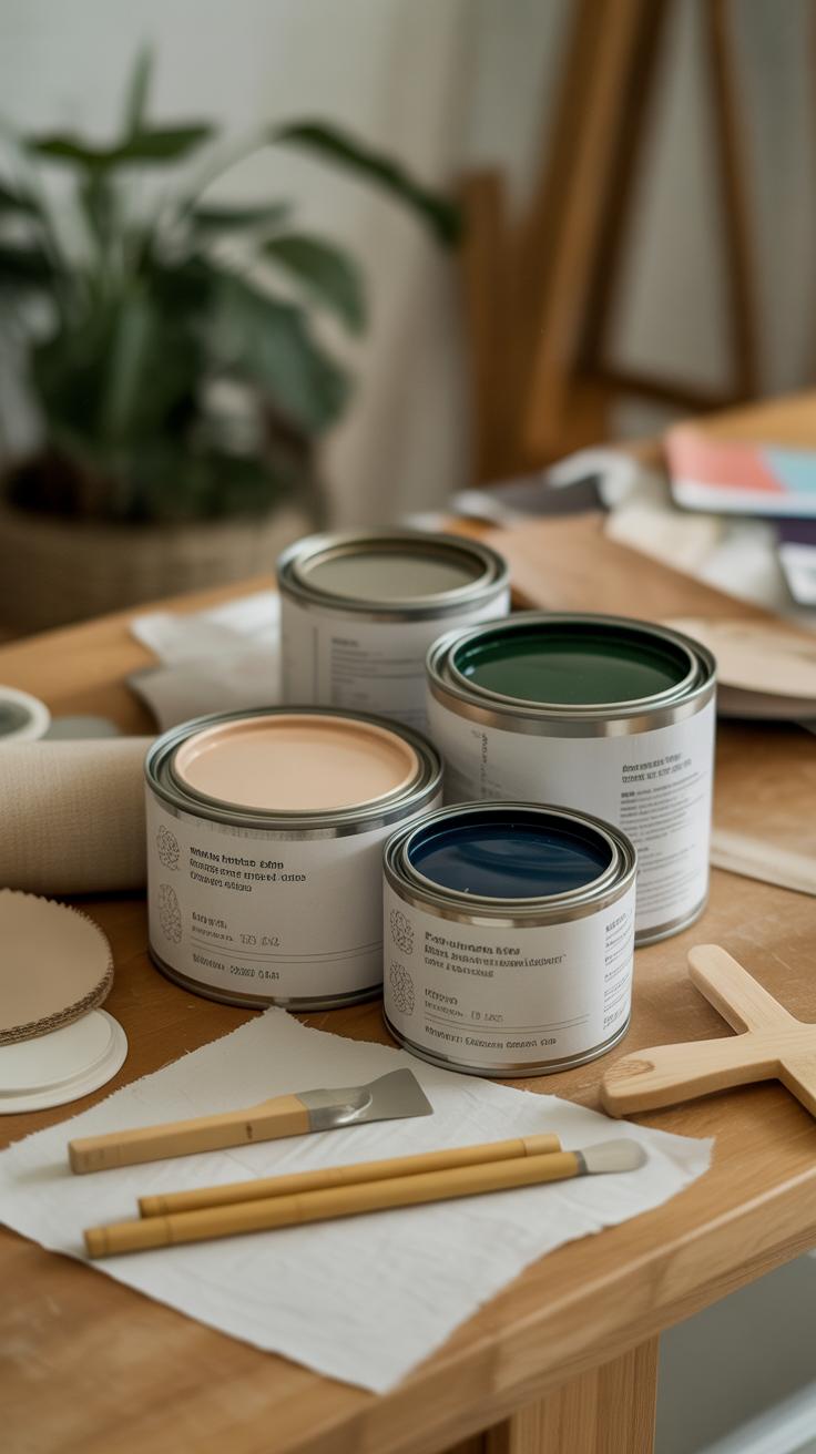
When choosing colors for green interior design, picking eco friendly paints and materials goes beyond just aesthetics. These selections affect your indoor air quality and the environment in ways that might not be obvious at first. Many conventional paints release volatile organic compounds (VOCs), which can linger in the air for months, sometimes causing headaches or irritation. It often surprises people how much impact such choices have on their wellbeing.
Exploring low VOC and natural paints can seem overwhelming, but it’s simpler when you know what to look for:
- Water-based latex paints labeled “low VOC” or “zero VOC” typically hold fewer harmful chemicals.
- Natural paints made from clay, chalk, or milk protein offer minimal off-gassing and a subtle, earthy finish.
- Some brands now mix natural pigments and essential oils for color, reducing synthetic content.
These paints might dry a bit differently or cost more, yet many find the trade-off worthwhile. When in doubt, checking product certifications like Green Seal or Ecologo can guide you toward credible options.
But paint is just one piece of the puzzle. The materials you choose for applying and complementing these colors also matter a lot. You might find that natural fibers—wools, cottons, or linens—bring warmth to your room and align with green palettes without hiding behind synthetic finishes.
Reclaimed wood has a charm that can’t be easily mimicked. It carries history and texture, often in tones that blend naturally with green-inspired palettes. Fabrics made from sustainable sources, like organic hemp or bamboo, add another layer of authenticity.
Sometimes, balancing looks and sustainability feels tricky, especially when specific hues or textures are desired. Yet, experimenting with these materials can surprise you. Perhaps a room’s color scheme evolves as you discover how these choices interact under different lighting or with your lifestyle.
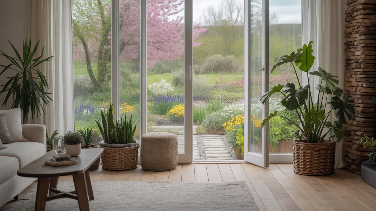
Bringing Green Color Palettes Into Different Rooms
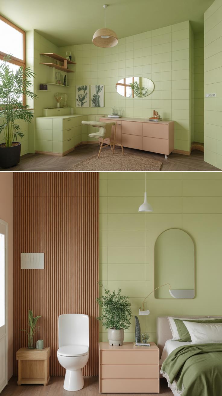
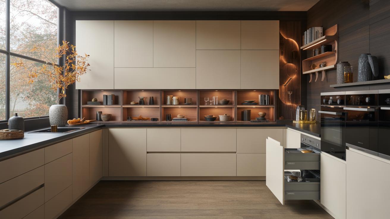
Using green tones in your home can really shift the atmosphere, but the way you apply those greens matters a lot depending on the room. Kitchens and living rooms, as social spaces, invite a livelier or fresher green. Think of grassy tones or leafy olive shades paired with natural woods. These create a grounded feel that welcomes guests and sparks conversation. You might try a deep forest green accent wall in the living room or a pale sage backsplash in the kitchen. These colors have enough character to intrigue without overwhelming.
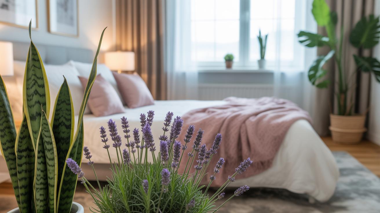
In contrast, bedrooms and bathrooms call for softer versions of green. Gentle mint or pale moss can help pose a quiet, restful vibe. These subtler shades avoid distraction and encourage calm. It’s tricky sometimes, though—too cool a green can feel sterile, too warm and it loses that peaceful quality. Maybe start small with textiles or accessories in these tones before committing to walls. Light filtering through pale green in a bathroom, for example, often looks soothing, though personal preference plays a big role here.
If you’re unsure where to start, ask yourself: do you want your green to energize or to soothe? The answer can guide your choice, room by room. Just remember, green isn’t only about the paint. Think about plants, furniture, even cookware—mixed textures and materials combined with your green palette can bring a subtle but meaningful eco-friendly presence to the whole interior.
Maintaining a Green Interior Over Time
Caring for Paint and Surfaces
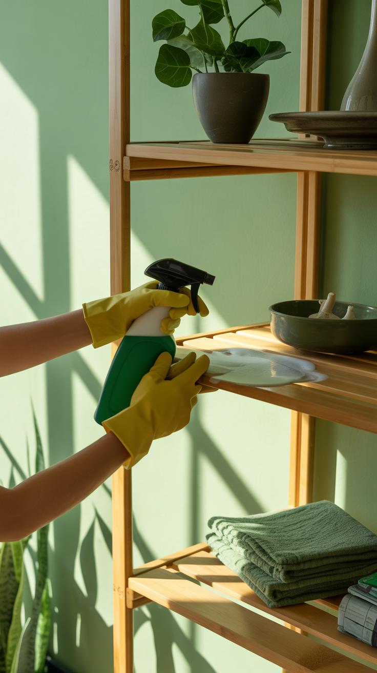
Keeping your green paint fresh doesn’t need to be complicated. Regular dusting or wiping with a soft, damp cloth can prevent dirt buildup that dulls the color. Avoid harsh chemicals—mild soap and water usually do the trick, especially with eco-friendly paints that often resist stains naturally.
Spot cleaning little smudges or marks early can save you from bigger touch-ups later. I noticed that in my own kitchen, a quick rub with a natural cleaner brought back the softness of the walls without stripping the paint. Try to use products labeled non-toxic or biodegradable to stay aligned with your sustainable goals.
For wood or matte surfaces, a gentle polish or beeswax can restore shine and protect the finish. Just remember: too much product can create buildup, so less is more. Is there any real harm in occasional over-cleaning? Perhaps, but it’s better to err on the side of caution.
Updating Your Palette Sustainably
When you want to tweak your color scheme, think small and intentional. Instead of repainting whole walls, consider eco-friendly paint pens or small sample pots for accent areas—they use less material and produce less waste.
Also, repurposing old furniture with natural stains or non-toxic paints can add new life to a room without heavy environmental costs. I’ve seen how a slight change in cushion colors or curtains can shift the vibe without touching the walls at all.
If repainting is necessary, look for paints with low or zero VOCs and those that are made with plant-based or mineral pigments. It may cost a bit more up front, but your indoor air quality and the planet might thank you in the long run.
Ask yourself: are small updates enough, or do you really need a full overhaul? Sometimes, working with what you have—not against it—maintains that eco-friendly mindset better than chasing perfection.
Conclusions
Bringing eco friendly color palettes into your green interior design means choosing tones that reflect the natural world and support sustainable habits. Greens combined with neutral and earthy colors create calm, fresh spaces that conserve energy and materials. Your palette can influence mood and environmental impact simultaneously.
Applying this knowledge helps you design interiors that are healthy for both your family and the planet. Explore different shades of green, test combinations in your rooms, and enjoy a home that feels natural and inviting all year round.