Introduction
Kitchen cabinet colors shape the look and feel of your kitchen. In 2025, fresh color trends will make your kitchen stand out. This article helps you learn the latest trends in kitchen cabinet colors, so your kitchen stays stylish and modern.
We explore popular colors, ways to choose the best one, and tips on matching colors with your kitchen style. This guide makes it easy for you to update your kitchen with the best colors for 2025.
Understanding Kitchen Cabinet Colors
Kitchen cabinet colors are the shades and tones applied to the cabinetry in your kitchen space. They’re not just about aesthetics—these colors are a crucial part of how your kitchen feels and functions. Choosing the right cabinet color can set the foundation for your kitchen’s style, whether you lean towards classic, modern, or somewhere in between.
Colors influence the mood in subtle but powerful ways. Think about it: a deep navy blue can make your kitchen feel grounded and calm, while a bright yellow cabinet might spark energy and happiness. It’s easy to overlook how much color impacts the atmosphere until you spend time in a kitchen that feels unsettling or downright cheerful based on its hues.
In practice, your cabinet color affects more than just looks—it can highlight or hide blemishes, impact how light bounces around the room, and even affect your appetite or focus. So, while it’s tempting to pick a color you like on its own, you really need to see how it interacts with other elements in your kitchen.
The Role of Color in Kitchen Design
Cabinet color sets the tone for the entire kitchen. It can make the space feel bigger or smaller, warmer or cooler. Because cabinets cover so much visual space, their color is often the primary factor driving the kitchen’s overall appearance. You might think subtle shades are safe, but sometimes bold colors create a livelier and more inviting atmosphere.
For example, white cabinets often create a clean, open feel. Meanwhile, darker tones like charcoal or forest green add depth and a sense of luxury. The choice affects how other design elements stand out—or not. A pale cabinet might highlight your countertop pattern, whereas rich, darker colors can make metallic hardware pop. Only you can decide what atmosphere suits your kitchen habits and personality.
How Colors Impact Your Mood
Colors tap into emotions in unexpected ways. Within your kitchen, they might encourage you to linger longer or keep things moving swiftly.
- Warm Colors (reds, oranges, yellows): These hues can stimulate appetite and conversation. But too much warmth might feel overwhelming, so balance is key.
- Cool Colors (blues, greens, grays): These offer calmness and focus, which can be comforting when cooking or cleaning. Though, some might find them a bit too subdued at times.
- Neutral Colors (whites, beiges, taupes): They provide a timeless backdrop, allowing flexibility with decor. Yet, they can sometimes feel bland, especially in dim lighting.
Think about how you use your kitchen daily. Do you want an energizing space for family gatherings or a peaceful nook for quiet cooking? Your cabinet color can nudge your mood without you realizing it. It’s strange, really—something as simple as paint or stain can shape your whole kitchen experience.
Top Kitchen Cabinet Colors for 2025
Neutral and Classic Colors
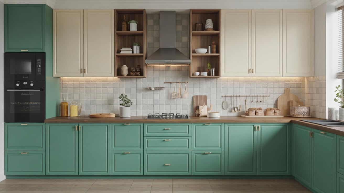
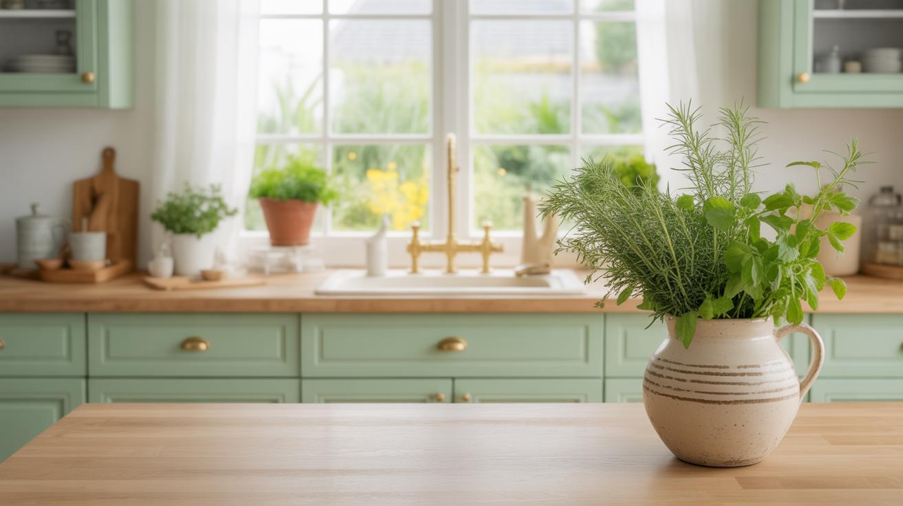
Neutral tones—white, beige, and grey—still hold strong in 2025 kitchens. White cabinets offer a clean, timeless look, making the space feel open and bright. People often choose white because it pairs well with almost any countertop or backsplash, and it tends to make smaller kitchens appear larger. Beige isn’t flashy, but it brings warmth and softness, which some find comforting in a space that’s often busy.
Grey might seem like a safe choice, but the variations from light ash to deep charcoal can add subtle depth without overwhelming the room. Grey is popular because it’s modern yet neutral enough not to tire you quickly—though, on second thought, it can feel a bit cold if not balanced with warmer elements. In any case, these colors work because they create a calm backdrop, allowing other design features to shine.
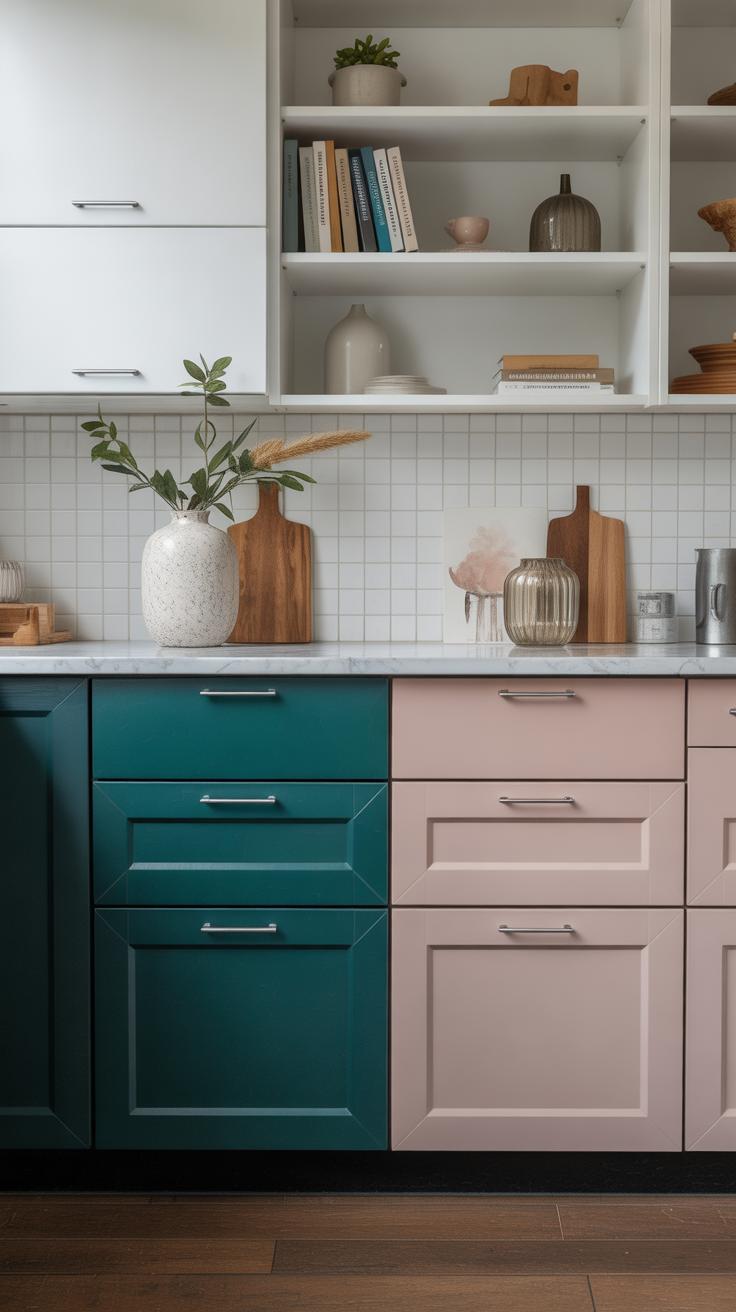
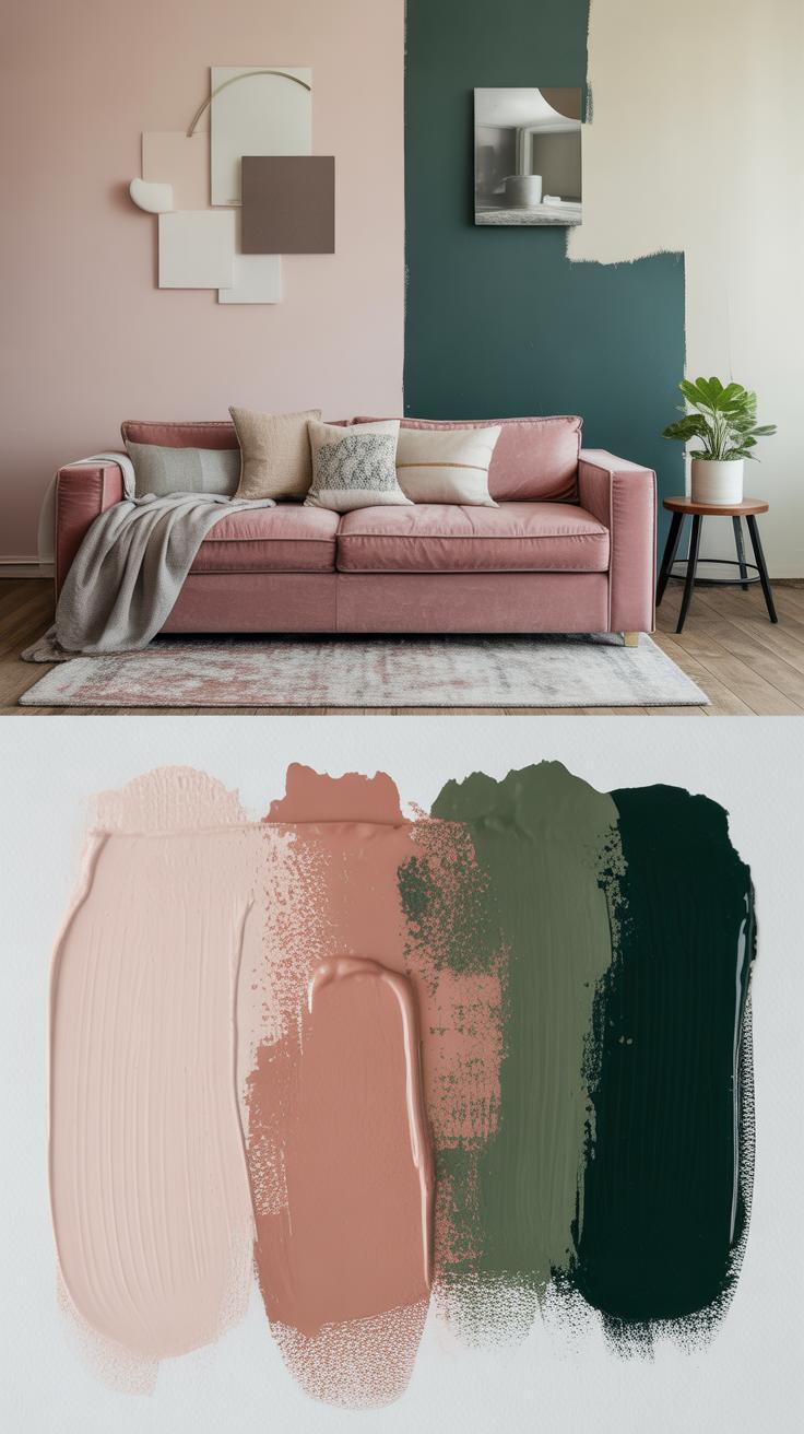
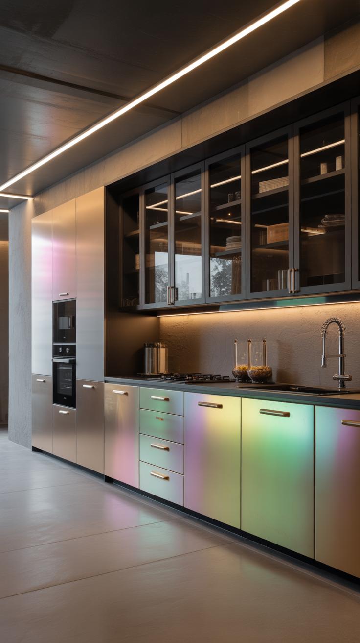
Bold and Unique Colors
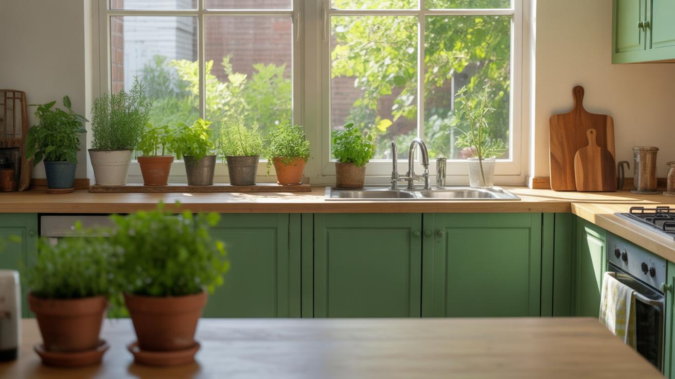
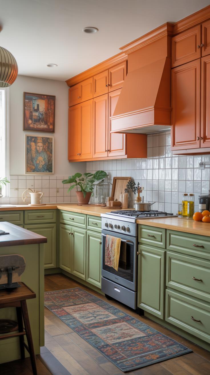
In contrast, bold colors are gaining traction among those wanting to inject personality into their kitchens. Navy blue is especially trendy. It’s strong yet surprisingly versatile, grounding a room without drowning it. Forest green follows closely, offering an earthy tone that feels both fresh and unexpected in cabinetry. This color gives a subtle nod to nature, which can be oddly soothing in indoor spaces.
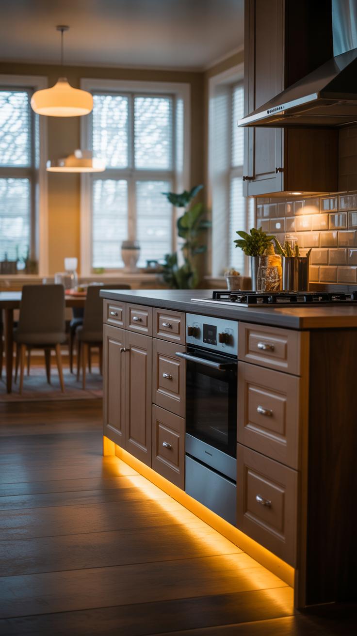
Black cabinets are making a comeback, too. They bring depth and drama, but they’re tricky—you need good lighting or the kitchen might feel too dark. Still, black can highlight hardware and countertops beautifully, giving a modern edge. Such bold colors often help express individuality, and many people seem willing to take that chance in their kitchens.
Choosing the Right Color for Your Kitchen Style
Matching Color with Traditional Kitchens
Traditional kitchens often call for warm, comforting colors that feel familiar and inviting. If your kitchen leans toward vintage or classic designs, think about shades like creamy whites, soft beiges, or even muted greens. These tones tend to complement wood details or ornate molding without overwhelming the space.
Deep navy or rich burgundy can work too, but they’re best balanced with lighter walls or countertops, or the room risks feeling heavy. I’ve seen some traditional kitchens pull off sage green cabinets beautifully—there’s a quiet charm there. Do you want something timeless? Go for earthy tones that echo nature, but avoid anything too bright or trendy; it may clash with other classic elements.
Colors for Modern and Contemporary Kitchens
Modern kitchens typically favor a clean, streamlined look, which means simpler colors that create space and light. White, black, or shades of grey still dominate here, but 2025 hints at softer tones like muted blue or subtle taupe making waves. These colors keep the room feeling fresh but less sterile.
Glossy finishes can heighten the sleekness, but matte textures are popular because they feel less clinical, more inviting. Sometimes, even a bold pop like deep teal or charcoal adds character without breaking minimalism. It’s about balancing a neat appearance with a bit of personality. If you’re unsure, pick neutral pigments and then add colorful accents elsewhere.
How Lighting Affects Kitchen Cabinet Colors
Colors in Natural Light
Natural sunlight can completely change how your cabinet colors look throughout the day. Morning light, which tends to be cooler and softer, often makes colors appear crisper, especially blues or greens. By afternoon, warmer sunlight can deepen hues, sometimes giving neutral tones a golden or even slightly reddish glow. You might think a cabinet color looks perfect when you see it in the showroom under artificial lights, but once sunlight hits it at home, it can feel quite different—maybe brighter, or somewhat muted.
Also, consider the direction your kitchen windows face. North-facing rooms get less direct sun, causing colors to look cooler and sometimes duller, while southern exposure floods the room with warm light that can lift even darker cabinet shades. If you live somewhere with strong sunlight, colors with more reflective qualities might appear almost glossy at times, which affects the mood of the space more than you expect.
Colors Under Artificial Lighting
Artificial light is trickier because it varies a lot depending on the bulbs you use. For example:
- Incandescent bulbs give a warm, yellow-orange tone, which can soften harsh colors but may make whites look creamier.
- Cool white fluorescent lights often bring out cooler undertones—meaning blues could seem stronger, but warm neutrals might look washed out.
- LED lighting comes in a range of color temperatures, but some high-CRI LEDs reveal colors more accurately, though not perfectly.
What surprised me is how a cabinet color you love can feel completely off after you change to a different light bulb. That’s why testing paint samples under your kitchen’s lighting, at night and during the day, is crucial. It’s easy to forget how worn-out or bright bulbs influence a color’s warmth or sharpness. Have you noticed this in your own space? Sometimes swapping just the bulbs reshapes the entire kitchen vibe, without changing a single cabinet door.
Combining Kitchen Cabinet Colors with Other Elements
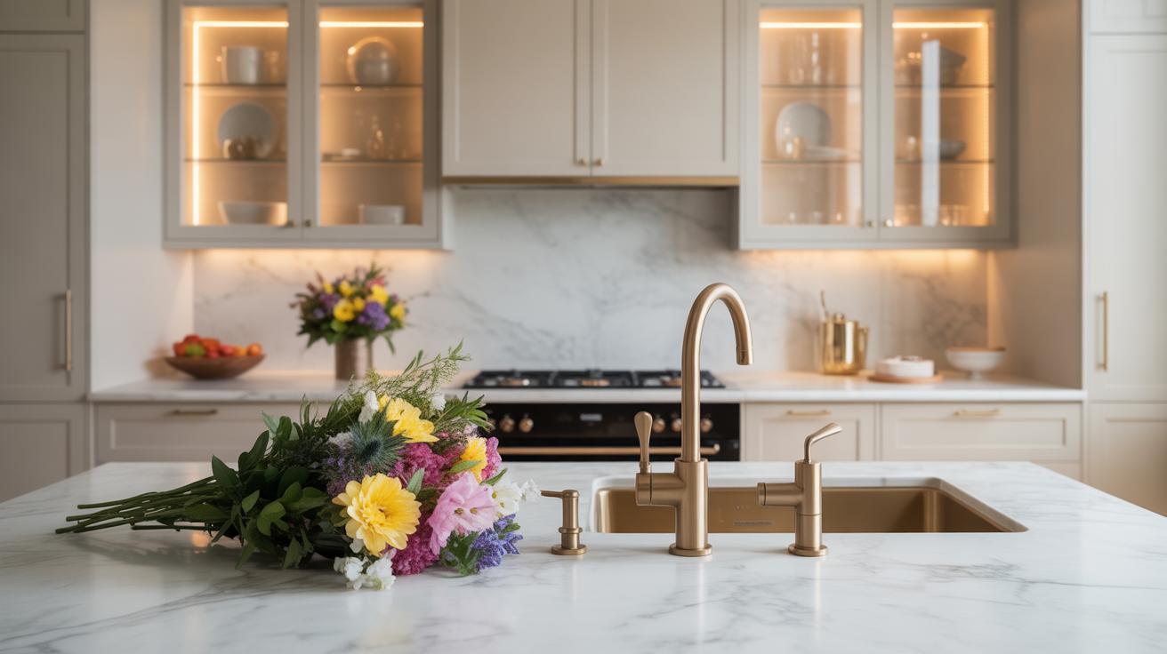
Matching Cabinets with Countertops
Picking cabinet colors isn’t just about the cabinets themselves. Think about how they play with your countertops, too. Light-colored cabinets often pair well with darker countertops—like a creamy white cabinet with a deep granite. That contrast can make both stand out, but sometimes it feels a bit stark, so maybe a softer stone with flecks of the cabinet shade works better.
On the flip side, matching tones can create a calm, even if a little safe, vibe. For example, gray cabinets with concrete or quartz countertops in similar shades can feel sleek but might lack a bit of personality. If you want to spark interest, try subtle veining or texture in the countertop that echoes your cabinet color without copying it exactly.
Sometimes pairing can be tricky. Think about how warm wood tones respond to cool marble or how bold color cabinets might clash with busy counters. Ask yourself: do you want harmony, or do you want your counters to pop? Both choices are valid.
Coordinating Cabinets with Backsplash and Flooring
Backsplashes and flooring are the silent partners to your cabinet color. A backsplash can tie everything together or make your cabinets feel disconnected. If your cabinets are colorful or dark, consider a backsplash that’s neutral, maybe textured tile or classic subway tile to balance things out.
Floors also affect the overall look. Light oak floors with white or pastel cabinets can create a fresh, airy feeling. But darker floors paired with dark cabinets might feel a bit heavy—though some people really like that coziness. And patterned or textured flooring? That adds another layer you have to consider with cabinet simplicity.
Sometimes you want your backsplash or floor to pick up a hint of the cabinet color. For instance, green cabinets paired with a backsplash that has subtle green hints can feel connected. But it can also feel confusing if the shades don’t quite match, so test samples side by side before committing.
There’s no right or wrong here. It’s about what feels balanced to you, what draws your eye, and what you can live with day after day. Mixing and matching thoughtfully can create a kitchen that’s uniquely yours. What combos are you thinking about?
Tips for Painting or Refinishing Kitchen Cabinets
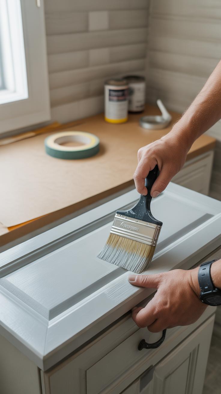
Preparing Cabinets for Painting
Before jumping into painting your kitchen cabinets, take time to prep them properly. Start with thorough cleaning — grease, dirt, and grime can prevent paint from sticking well. Use a mild detergent or a degreaser, and be sure to rinse and dry completely. Any residue left behind can cause trouble later on.
Next comes sanding. This step might feel tedious, but it’s crucial. Lightly sanding the surface breaks down the existing finish and roughens it just enough for the paint to grip. You don’t need to strip everything down to bare wood unless the cabinets are in really rough shape. Just enough to dull that glossy finish usually works. Don’t forget to wipe off dust after sanding — otherwise, you risk a bumpy result.
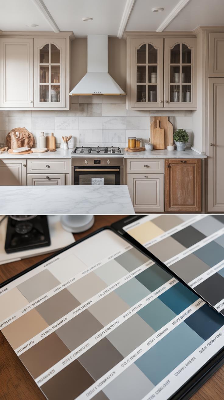
Choosing Paint Types and Finishes
Picking the right paint can be confusing. For kitchen cabinets, aim for something durable and washable. Oil-based paints offer smooth coverage and tough coatings, but they take longer to dry and have stronger odors. Water-based acrylic paints dry faster and are easier to clean up but might need more coats. Some people prefer hybrids—paints specially formulated for cabinets that balance both.
When it comes to finishes, satin and semi-gloss are popular choices because they stand up to daily wear and are easier to wipe clean. Matte finishes can hide imperfections well, but they might not resist moisture or stains as well. Glossy finishes give a modern look but often show every fingerprint or scratch.
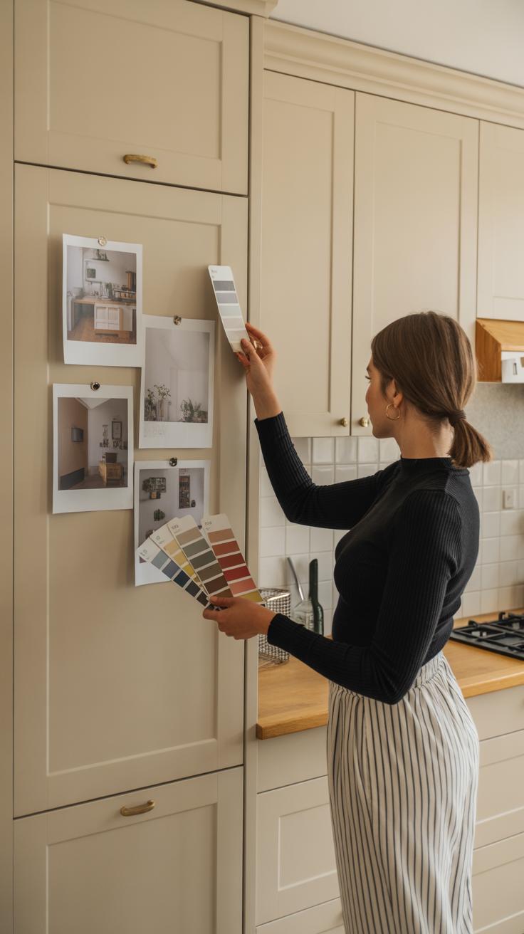
Have you noticed how sometimes the paint looks perfect in the store but changes once it’s on your cabinets? Lighting, surface texture, even temperature can affect the final look. Testing a small area before the full job is a smart move.
Common Mistakes to Avoid When Choosing Cabinet Colors
Ignoring Lighting and Space Size
Picking a cabinet color without thinking about your kitchen’s lighting or size can really backfire. Dark cabinets in a small, poorly lit kitchen might make the space feel cramped and gloomy, rather than cozy. On the other hand, very bright shades in an enormous kitchen with tons of natural light might look washed out or overwhelming.
It’s easy to get caught up in colors you like on a paint chip or online, but those samples don’t always behave the same way in your room. Have you ever picked a color that looked great in the store but felt totally wrong at home? That’s often because the light wasn’t considered properly.
Think about how much sunlight your kitchen gets and if you rely mostly on artificial lighting. For smaller kitchens, lighter and more reflective colors usually work better, while larger spaces can often handle deeper shades without feeling closed in. Sometimes, a mix or two-toned approach might solve problems too—something not everyone remembers to try.
Choosing Trends Without Personal Style
Trends move fast, and catching one can feel tempting—who doesn’t want a kitchen that looks current? But picking cabinet colors just because they’re popular might lead to regret if they don’t fit your everyday taste. Trends often fade, but your kitchen sticks around for years.
You might find yourself stuck with a color that seemed perfect when you started but now feels off, or even annoying. Maybe your personality leans traditional, but you went for a bold, ultra-modern shade because it was “in.” That clash can make the space feel less like home and more like a design experiment gone wrong.
Ask yourself: do you like this color when you imagine waking up every day, making breakfast, or hosting family dinners? If not, it might be better to pick something that speaks to your style, regardless of what’s trending at the moment. Personal comfort usually wins over trendiness in the long run, even if it’s tempting to chase the latest fad.
Future Predictions for Kitchen Cabinet Colors Beyond 2025
Thinking about kitchen cabinet colors after 2025 means looking beyond what’s popular now and imagining what might catch on as tastes shift. I suspect neutrals won’t disappear, but they’ll likely mingle with more unexpected choices. Maybe softer pastels, like dusty lilacs or muted sage, will start showing up more often—colors that feel calm but unusual enough to stand apart from classic whites or grays.
There’s also a chance that deeper, moodier shades—think charcoal blues or forest greens—will become more common, especially as people seek cozy, grounded spaces. But trends can be fickle, right? Sometimes what seems likely to grow suddenly falls out of favor.
Emerging Color Preferences
Looking ahead, you might see these trends gain traction:
- Soft earth tones that echo natural materials but with a bit of warmth, like clay or terracotta shades.
- Unexpected mixes—imagine a pale pink cabinet paired with darker wood accents.
- Monochrome looks that play with texture more than bold hues, creating subtle depth without color overload.
It’s hard to say if these will stick around or feel dated soon, but they’re worth considering if you want a kitchen that feels both fresh and personal.
Sustainable and Eco-Friendly Color Choices
One thing likely to influence cabinet colors is the rising focus on sustainability. People aren’t just picking colors for looks anymore; they want them to reflect values, especially eco-consciousness. Natural pigments and finishes made from plant-based dyes could become regular features. This might lead to more muted, earthy tones simply because they’re easier to produce sustainably.
Also, the materials themselves—reclaimed woods or bamboo—come with inherent colors that might shape design choices. Instead of painting over everything, homeowners might prefer to highlight raw, natural hues. You might find kitchens that feel a little less glossy or perfect on purpose, embracing subtle imperfections as a kind of beauty tied to eco-friendliness.
So, when you imagine your kitchen beyond 2025, think about whether the colors tell a story—not just about style, but about how your home fits bigger environmental goals. It’s an angle that feels increasingly relevant and might steer cabinet colors in directions we don’t fully expect yet.
Conclusions
Choosing the right kitchen cabinet color can change how your kitchen looks and feels. Trends for 2025 show new and classic colors that match modern home styles. You can pick colors that make your kitchen bright, calm, or stylish.
Remember to think about your kitchen’s size, light, and your home’s style. Use the tips here to pick colors that stay current and make your kitchen a place you enjoy every day.