Introduction
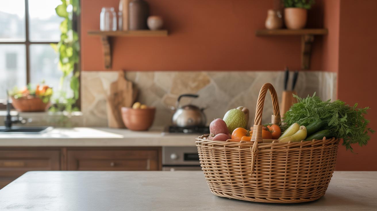
Kitchen paint color plays a big role in setting the mood and feel of your cooking space. The right choice makes your kitchen more inviting and enjoyable. Picking perfect colors can change how you feel when you cook or gather around for meals.
This article guides you through smart kitchen paint color ideas that can immediately change your kitchen. We’ll cover everything from picking the right paint type to matching colors that brighten and refresh your space. Every tip is easy to understand and apply.
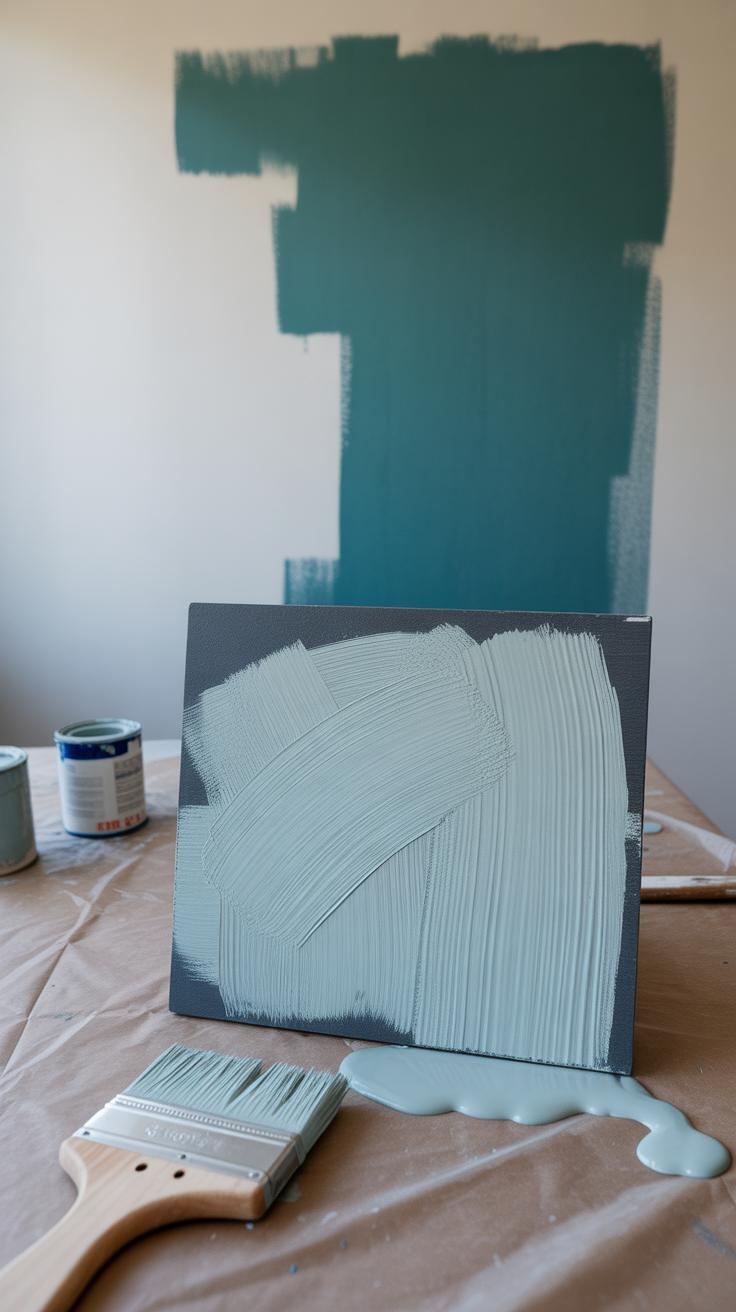
Types of Kitchen Paint Materials
When it comes to painting your kitchen, the type of paint you choose can make a noticeable difference in how your space holds up over time. Kitchens experience a lot of wear—think splashes, steam, and grease—which means durability and cleanability are key.
You basically have two broad categories to consider: water-based and oil-based paints. Water-based paints are easier to clean up and generally less smelly, which makes the painting process less stressful. They dry faster too, allowing you to get back to cooking sooner. But sometimes they don’t stand up as well to scrubbing or stains, meaning you might see marks linger if you’re not careful.
Oil-based paints, on the other hand, offer a smoother finish that’s more resistant to stains and moisture—a real perk in a kitchen. That said, they take longer to dry, have a strong odor, and require mineral spirits for cleanup, which can be off-putting for some people.
Considering finishes adds yet another layer. Satin and semi-gloss finishes usually take the lead here because they balance durability with washability. Flat paints, while great at hiding imperfections, tend to absorb stains and don’t clean well.
Imagine spending time scrubbing oil splashes only for the paint to peel or fade. That’s why, when durability matters, matching your paint material and finish with your kitchen’s activity level and how often you cook is probably a good idea.
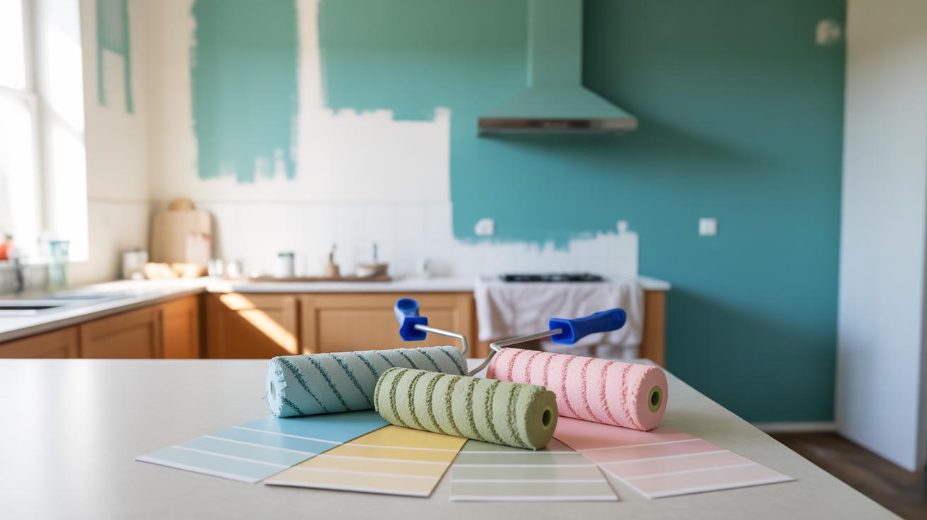
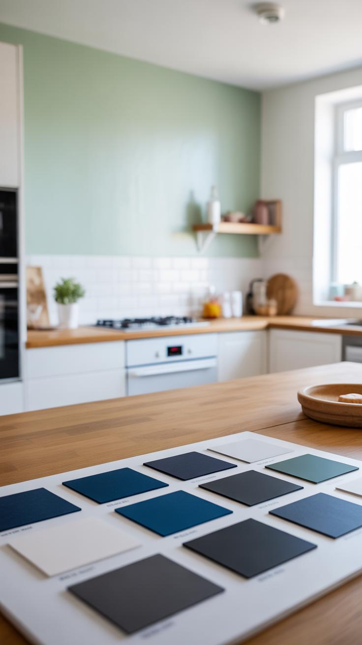
How to Pick Kitchen Paint Colors
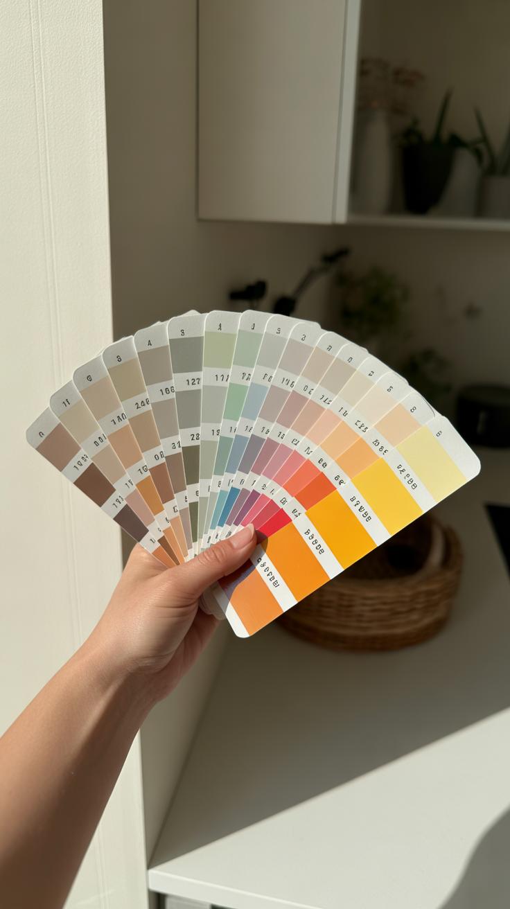
Choosing the right paint color for your kitchen depends a lot on the size of the space, the kind of light it gets, and the style you’re going for. It might feel overwhelming at first, but breaking it down makes the decision easier.
For smaller kitchens, bright colors work surprisingly well. They tend to open up the room, making it feel less cramped and more inviting. You might think a bold color could shrink the space, but lighter shades of yellow, mint, or even sky blue can actually bounce light around and create an airy atmosphere. It’s a bit like tricking the eye into seeing a bigger area.
On the other hand, neutral tones are a go-to when you want a timeless, clean look. Whites, soft grays, and beiges offer a calm backdrop. They don’t compete with other design elements but instead provide balance. Neutral colors help the kitchen feel orderly and fresh, and they age well as styles change—though, depending on your lighting, neutrals can sometimes feel a bit cold or sterile if you’re not careful.
Think about natural light. Dark kitchens with low lighting could feel gloomy with deep or muted tones. That said, it’s not impossible if you layer lighting thoughtfully. Meanwhile, bright, sunlit kitchens allow more freedom to experiment with saturated colors without overwhelming the eye.
Ultimately, the color you pick has to resonate with how you use the space daily. Are you after energy or calm? Something modern or more classic? Nothing stops you from testing samples on different walls before deciding—it often reveals what works best in real life, beyond just the paint chip.
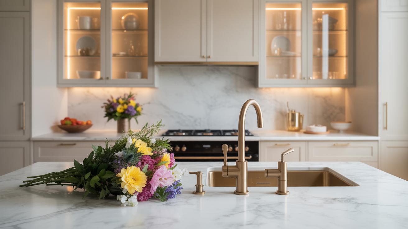
Matching Kitchen Paint with Cabinets and Countertops
Complementary Colors to Cabinets
Picking paint that pairs well with your kitchen cabinets can be tricky. You want the walls to feel connected to the cabinetry without blending in too much—or clashing outright. I’ve found that looking at the undertones in your cabinet finish helps a lot. For warm wood cabinets with reddish or yellowish undertones, soft creams, muted greens, or even gentle blues often work nicely. Cool-toned cabinets, like gray or white, can handle deeper shades such as charcoal or navy.
Your kitchen walls don’t have to match the cabinet color exactly. Sometimes a subtle contrast, like off-white walls with pale gray cabinets, creates a calm but interesting space. For painted cabinets, sometimes going a shade lighter or darker on the walls can really highlight the cabinetry’s character without overwhelming the room. Does your kitchen have natural light flooding in? If not, lighter, warmer wall colors can help balance darker cabinets so the space doesn’t feel too boxed in.
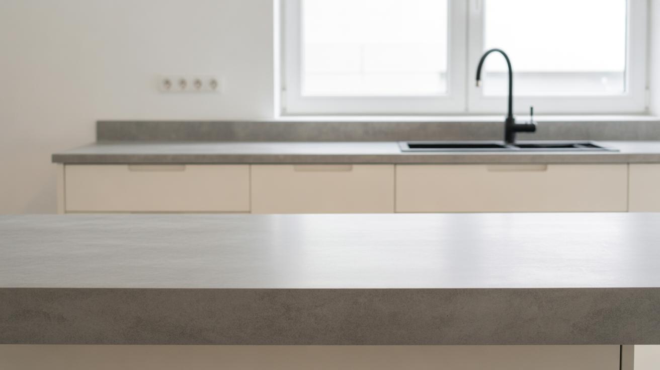
Creating Contrast with Countertops
Countertops are often the unsung heroes of kitchen design, and paint can either hide or highlight them. When your countertops are busy—like granite with lots of flecks or bold quartz—solid, soft wall colors let the counter take center stage. But if your counters are plain, say white marble or black stone, think about layering some contrast onto the walls to add dimension.
Here’s what I’ve noticed: a striking backsplash and darker walls around light countertops can make the whole kitchen feel dramatic and modern. Conversely, light walls with darker counters pull focus upwards, which can be refreshing if you want the cabinets to pop instead. If you’re aiming for a unified look, sometimes using paint that picks up a subtle hue from countertop veining or specks feels deliberate without trying too hard. Are you willing to experiment with bolder wall shades to bring attention to your counters, or do you lean toward cooler, more reserved colors? It’s worth considering how much you want your cooking space to stand out versus blend softly into the background.
Using Color Psychology in Kitchen Painting
Colors influence more than just how your kitchen looks—they shape how you feel in that space. When choosing paint, thinking about mood and even appetite can make a big difference. Ever notice how some restaurants use reds or oranges to make you hungrier? That’s no accident.
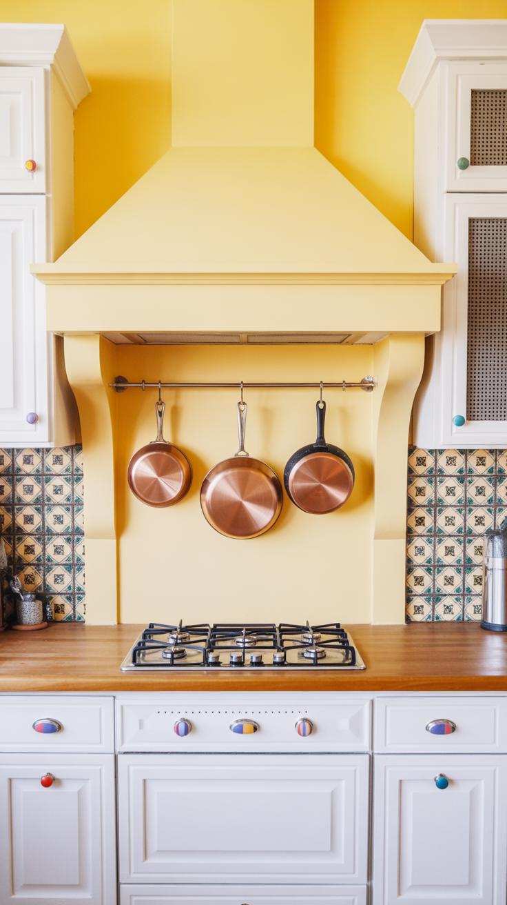
Warm Colors to Stimulate Appetite
Warm hues like red, orange, and deep yellow can lift energy levels and spark hunger. These colors seem to speed up your heart rate and make food look more appealing. Painting your kitchen walls or accent areas in these tones might actually help you enjoy mealtime more—or maybe even encourage family gatherings around the table.
That said, too much red can feel overwhelming or tense. Perhaps a burnt orange backsplash paired with softer neutrals strikes the right balance. You want appetite stimulation, not distraction.
Cool Colors to Create Calm
On the flip side, cooler shades—blues and greens—tend to lower stress and bring calmness into the room. These colors might slow down your pace, which can be great if you want your kitchen to feel like a relaxing haven amid a busy day.
Still, some people report that blues can slightly reduce appetite. So if you lean toward calm but worry about mealtime enthusiasm, try muted greens or teal rather than icy blues. These colors offer tranquility without feeling too sterile or cold.
Using color psychology doesn’t guarantee absolute results, but it gives you a guide. Think about what you want to feel most when cooking or eating—and let that guide your paint choice.
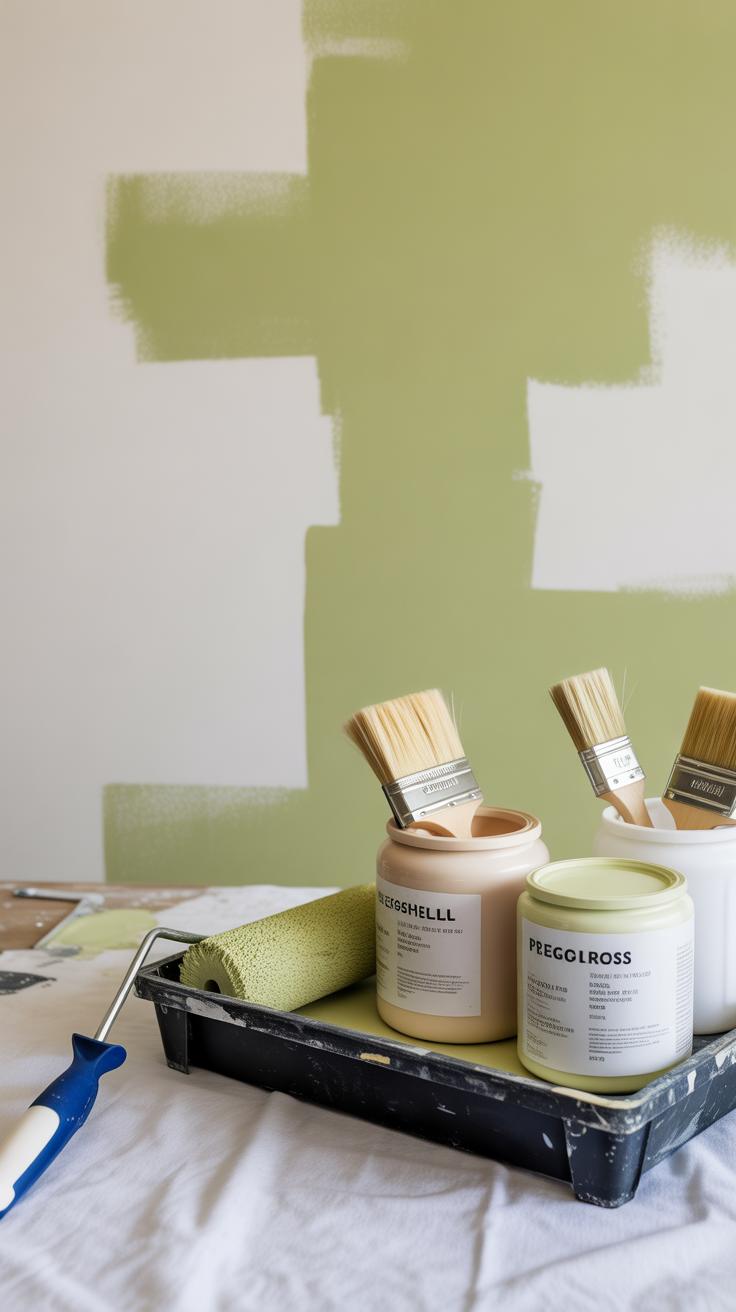
Preparing Your Kitchen Walls for Painting
Cleaning and Repairing Walls
Before you even pick up a brush, take a good, hard look at your kitchen walls. They’ll probably have grease spots, splatters, or dust—things that paint won’t stick to well. Cleaning is essential and more than just a quick wipe. Try using a mild detergent or a mix of water and vinegar to cut through the stubborn grime. It’s a bit tedious, but skipping this step often leads to peeling paint sooner than you’d like.
After cleaning, scan for any cracks, holes, or dents. Filling them with spackle or joint compound smooths out imperfections. Don’t forget to sand those patches once dry. You don’t want rough bumps ruining your fresh paint job or making the color uneven. If you overlook minor defects, they’ll stand out under light or with certain paint finishes, which can be annoying once you notice.
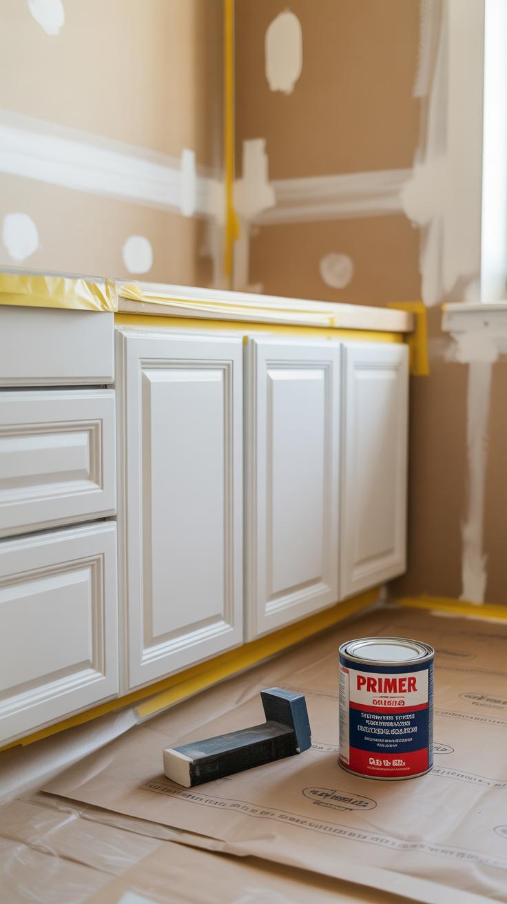
Priming for Smooth Paint Finish
Priming might feel like an extra chore, but think of it as a base layer that helps paint grip better and last longer. Walls in kitchens often have old stains or uneven surfaces. A good primer blocks stains from bleeding through and creates a more consistent surface for your new color.
Some primers even help with moisture resistance, which is handy in a cooking environment where steam and spills are common. Skipping primer can lead to patchy or uneven paint. You might save time at first, but you risk extra coats later or even early paint failure.
Choosing the right primer depends on your wall type and paint color. For example, if you’re switching from a dark color to a lighter one, a high-quality primer makes the new paint pop without needing too many layers. Your walls will thank you for the prep work, even if it feels like a lot upfront.
Popular Kitchen Color Trends
Earthy and Natural Tones
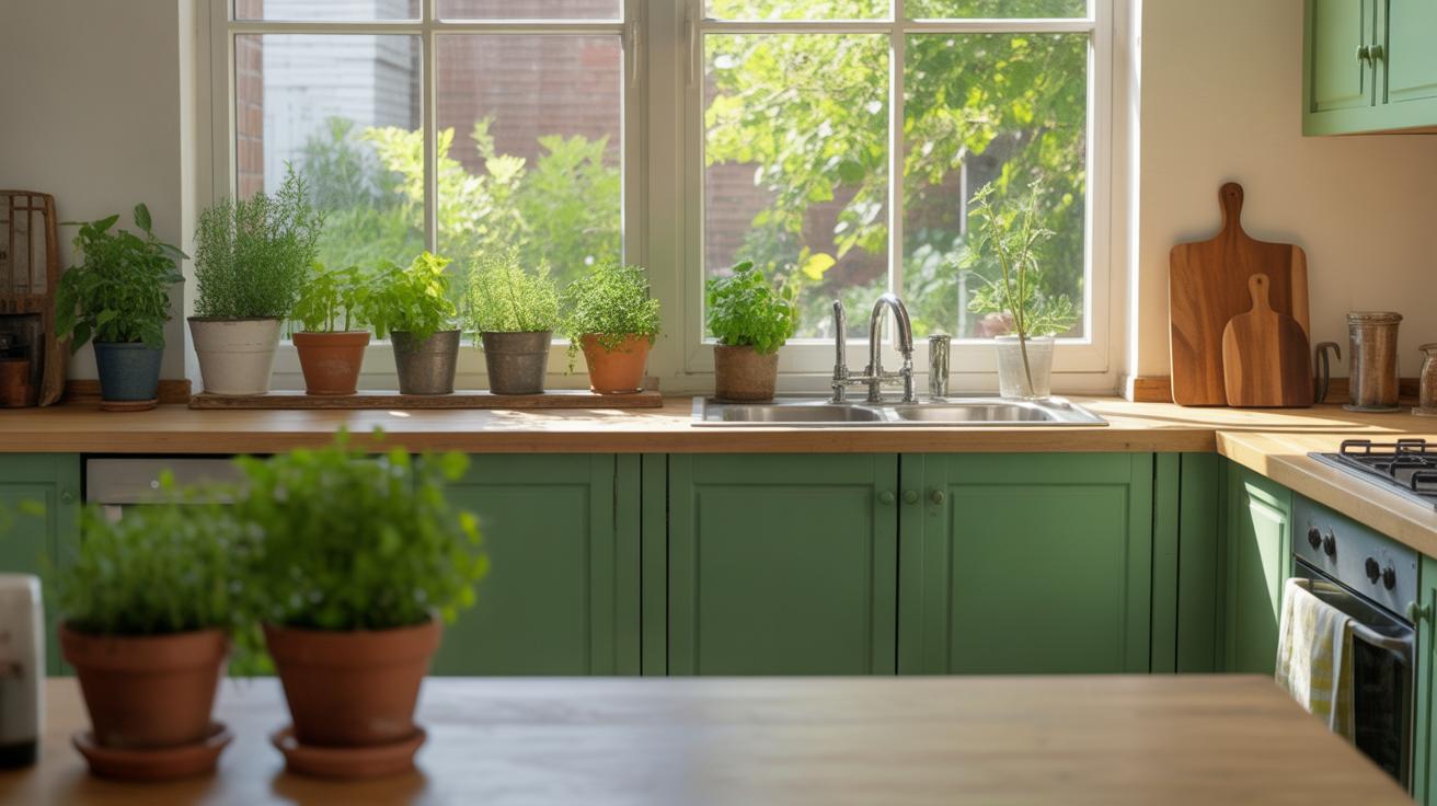
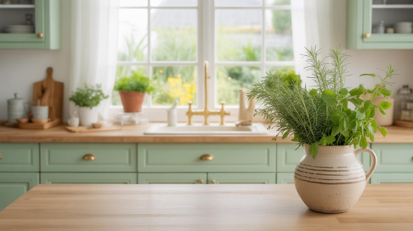
Earthy tones like warm browns, soft greens, and muted beiges have become quite popular in kitchens lately. These colors bring a sense of calm and connection to nature, which many find refreshing when spending lots of time cooking or eating. Maybe it’s because we crave something grounding in a space that’s often busy and noisy.
Such tones work well with natural materials like wooden cabinets or stone countertops. When you pair, say, olive green walls with wooden accents, the whole kitchen feels inviting, almost like an extension of the outdoors. But, there’s a catch — these shades need good lighting to prevent the room from feeling dull or cramped. I find that kitchens with plenty of natural light can really pull off earthy palettes better than those with less light.
Some popular choices include:
- Soft sage green
- Warm terracotta
- Beige or sandy hues
- Greige — that tricky mix of gray and beige
If you’re hesitant about committing fully, try these colors on an accent wall first, or in elements like backsplash or open shelves. It’s a bit easier to change or update later if you want to shift the vibe.
Bold and Dark Colors
On the other end of the spectrum, bold and dark colors are gaining traction in kitchens. Deep navy, charcoal gray, even black — they create a strong, dramatic look that stands out. Interestingly, these shades can make a kitchen feel cozier and more intimate, which may seem counterintuitive when thinking about small spaces.
It’s not just about making a statement; these colors also hide dirt and smudges better, which many find practical in a cooking space. But be mindful — if the room lacks windows or is tiny, dark walls might feel oppressive or overly heavy. Lighting becomes crucial here.
What works well with dark paint?
- Contrasting white cabinets or countertops to balance the depth
- Brushed metals or brass hardware for a subtle shimmer
- Open shelving to avoid visual clutter
Of course, choosing bold colors might push you out of your comfort zone. But sometimes, that’s what a kitchen needs — something unexpected. Even a single dark wall can add depth without overwhelming the space.
Combining Paint Colors with Kitchen Decor
Harmonizing with Furniture
When choosing paint colors to go with your kitchen furniture, it really helps to pause and look closely at your cabinets, countertops, or even stools. Do you want your walls to disappear into the background or to bring the furniture into the spotlight? I’ve noticed that softer, muted wall shades often let bold furniture stand out naturally, while darker or richer tones can add warmth by blending in with wooden cabinets.
Think about the undertones too. If your cabinets have a warm wood finish, try paint colors with similar warm undertones. Cool-toned walls, like pale gray or blue, might clash or feel cold in that setup. Yet, sometimes opposing tones can create a nice push-pull effect—think navy walls with light natural wood. It’s about what feels right to you—and what makes you smile when you step in.
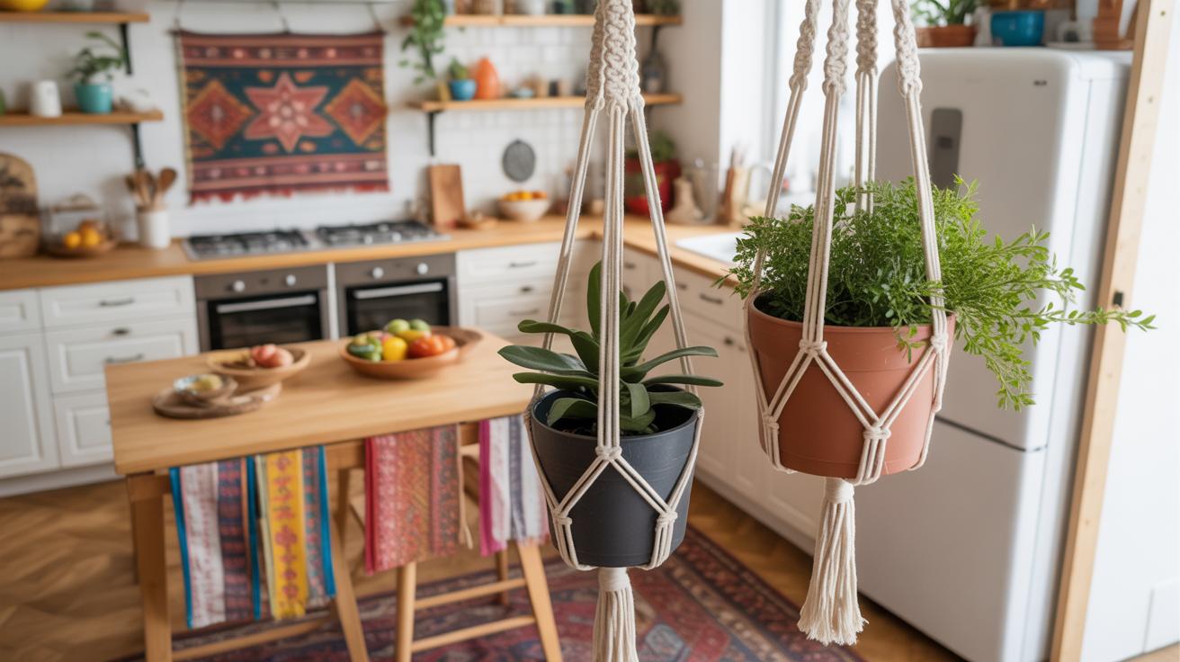
Accent Walls and Color Splashes
Accent walls offer a chance to experiment without overwhelming the entire kitchen. Maybe one wall in a vibrant green or deep terracotta breaks the monotony and adds personality. Or, a splash of saturated color behind open shelves can highlight your favorite dishes or decor pieces. You don’t always have to go bold. Sometimes just a slightly deeper shade than the rest of the room gives enough contrast to keep things interesting.
But be cautious. Sometimes accent walls can throw off the balance if lighting is limited or if the kitchen is small. What looks good in a paint sample isn’t always the same under your kitchen lights. I’ve learned to paint a small patch first and live with it for a few days before committing.
Do you want your color choice to feel like a quiet backdrop or a bit of a statement? Both have merits, but the key is how you connect paint choices with furniture, accessories, and even lighting to make everything feel intentional, not accidental.
Common Mistakes to Avoid When Painting Kitchen Walls
Wrong Paint Type Selection
Choosing the wrong type of paint for kitchen walls can really mess up your project. Kitchens need paint that stands up to moisture, grease, and frequent cleaning. If you pick a flat or matte finish, you might find yourself scrubbing endlessly with little success. These finishes soak in stains and marks rather than letting you wipe them off. Also, using interior paint designed for low-traffic rooms won’t hold up well under kitchen conditions.
For kitchens, semi-gloss or satin finishes usually work better. They repel stains and resist moisture better, making cleaning easier. Sometimes, people assume any paint labeled “wall paint” will do, but there’s more to it. If you want your walls to stay fresh and clean-looking, picking a kitchen-specific or washable paint type isn’t optional—it’s necessary.
Ignoring Light Effects on Color
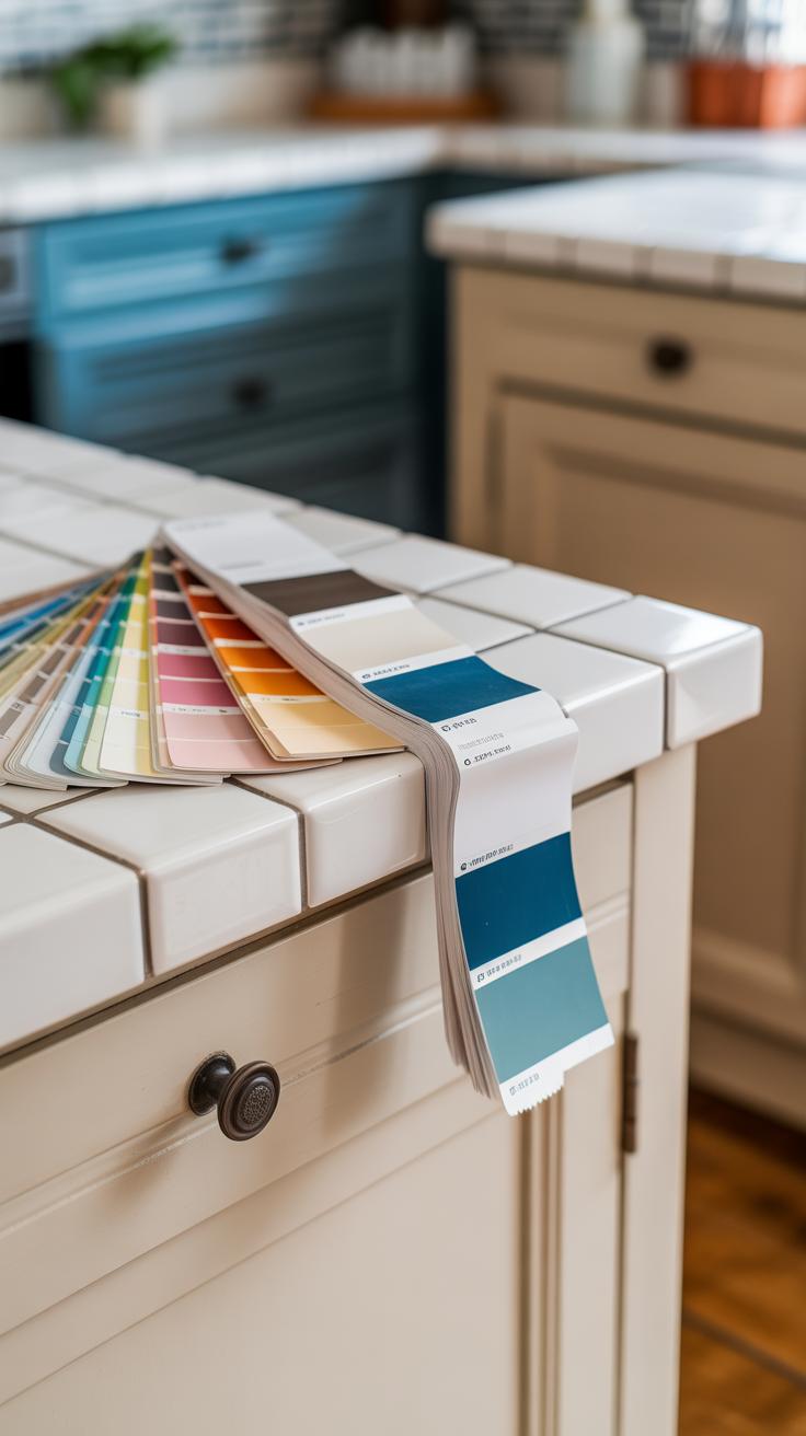
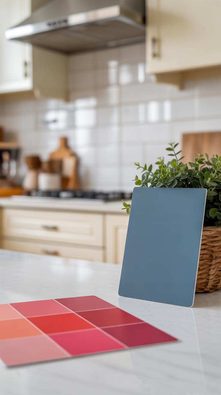
Light changes everything in your kitchen, but many don’t give it enough thought when picking paint. The same shade can look totally different depending on natural sunlight, artificial light, or shadows from cabinets. I recall painting my old kitchen in a pale yellow that looked soft and warm during the day but turned oddly dull and cool at night under LED lights. That was a surprise—and not a good one.
Before committing, test paint samples on your walls at different times of day. Notice how the color shifts. Talk yourself through questions like:
- Does the color stay true or fade into something else?
- How does it look under your kitchen’s specific lighting?
- Is it too bright or too muted when the lights are off?
Ignoring these factors can lead to disappointment. What seemed like a perfect shade might end up clashing or feeling off. If you’re not careful, lighting can completely change the mood your chosen color creates.
DIY Kitchen Painting Tips for Beginners
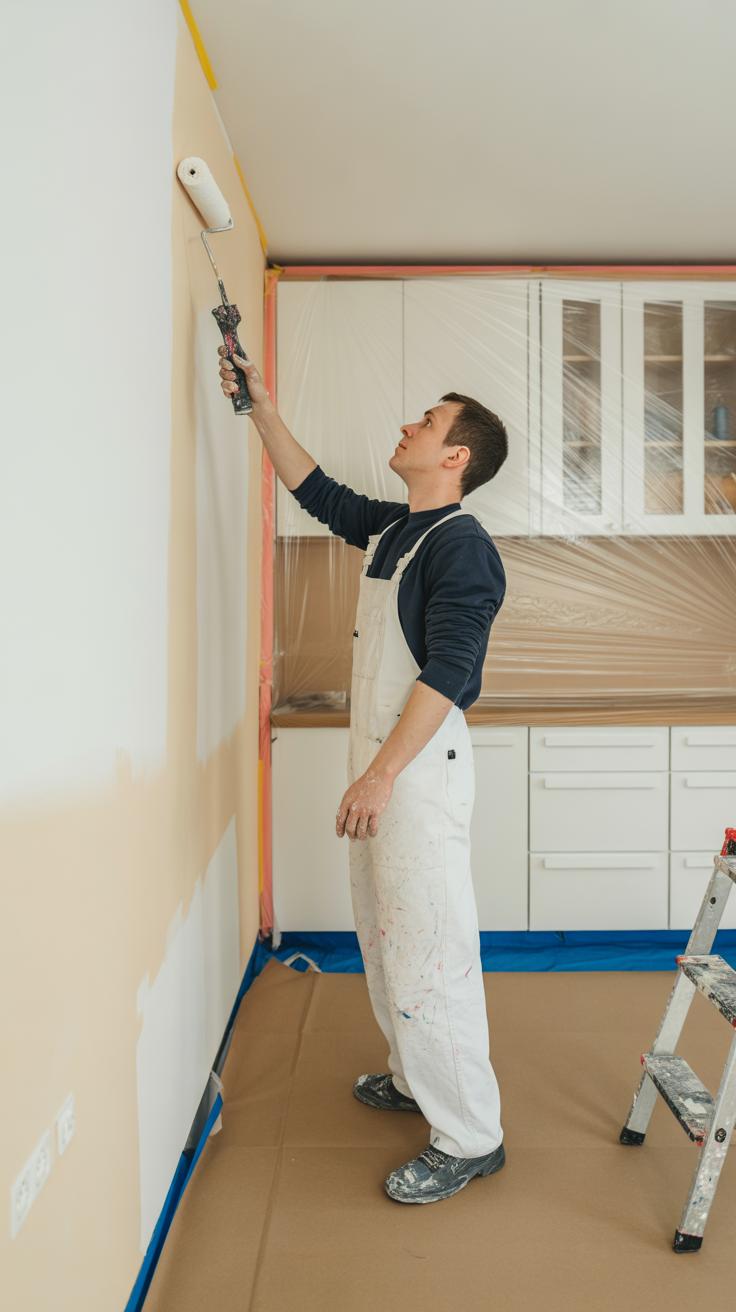
Painting your kitchen can feel a bit daunting if you’ve never tackled something like this before. But with some straightforward tips, you can get through it without too much stress—and maybe even enjoy the process. First off, prep is key. Clean those walls well, wipe off grease and any sticky spots. It might sound obvious, but skipping this step often leads to paint peeling later on.
When it comes to tools, don’t go overboard. A good angled brush is your friend for corners and edges, while a roller covers larger areas quicker. Painter’s tape helps create crisp lines around cabinets and trim, though sometimes it feels like you’re spending more time taping than painting. But trust me, it pays off.
Start painting from the top and work your way down. That way, you avoid drips ruining freshly painted areas. And don’t rush the drying times—even if you’re tempted to finish in one day. One or two thin coats work better than one thick one for a more even finish.
Ever caught yourself thinking, “Maybe I should just call a pro”? That’s normal. But with patience and these simple steps, you’ll surprise yourself. What’s the one thing you’re most worried about? Sometimes just naming that fear makes it less intimidating.
Essential Tools for Kitchen Painting
For painting your kitchen walls effectively, gather these basic tools:
- Paint rollers: Great for covering large wall areas quickly. Opt for a medium nap roller to suit most wall textures.
- Angled paintbrush: Ideal for cutting in around cabinets, trim, and corners where rollers can’t reach.
- Painter’s tape: Helps protect edges and create clean lines. Don’t skip this—even if you think you have a steady hand.
- Drop cloths or plastic sheeting: Protect your countertops, floors, and appliances from paint splatters.
- Sandpaper or sanding block: Smooths out rough spots or peeling paint for better adhesion.
- Paint tray and liner: Keeps paint contained and easy to reload your roller.
Yes, gathering these tools might seem like a lot, but trust me, they make the whole process less frustrating. You might skip something small and regret it halfway through.
Step-by-step Painting Process
Ready to roll up your sleeves? Here’s a simple way to tackle your kitchen walls:
- Prep the space: Remove or cover furniture, clean walls, and tape off trim and cabinets.
- Sand uneven patches: Lightly sand glossy or chipped areas for paint to stick well.
- Prime if needed: If your walls are heavily stained or a drastic color change, apply a primer first.
- Cut in edges: Use your angled brush to paint around cabinets, windows, and corners.
- Roll walls: Apply paint in a W-pattern to avoid streaks and get an even coat.
- Wait and assess: Let the first coat dry fully, usually a few hours, then inspect for spots that need touch-ups.
- Apply second coat: Often, two coats ensure durability and color depth.
- Remove tape carefully: Pull it off slowly while paint is still slightly tacky to avoid peeling.
If you’re like me, the hardest part might be stopping yourself from rushing the drying time. Patience really pays off if you want your newly painted kitchen to look good longer. Ever thought about which part of the process you might fuss over the most? That little insight makes it feel more manageable.
Maintaining Your Painted Kitchen Walls
Keeping your kitchen walls looking fresh over time can feel a bit tricky, especially with all the cooking activity. Grease splatters, steam, and frequent touch are bound to leave marks. But caring for painted kitchen walls doesn’t need to be complicated.
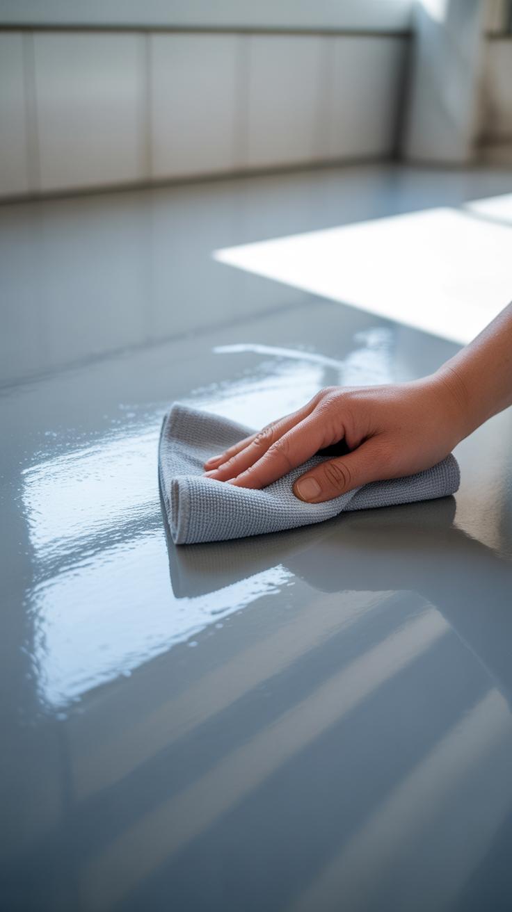
Cleaning Kitchen Walls Safely
Start with a gentle approach. Use a soft sponge or microfiber cloth dampened with warm water and a mild dish soap solution. Avoid harsh scrubbing or abrasive pads that can wear down the paint. Sometimes, even just plain water works well for daily dust.
If you spot stubborn stains, try a mix of baking soda and water applied carefully, then rinse thoroughly. Always test your cleaner on a small hidden spot first to ensure it doesn’t dull the paint’s finish. Dry the walls with a soft towel after washing to avoid water marks or streaks.
Touch-ups and Repainting
Touch-ups matter more than you might think. Keep a small container of your original paint stored away — it makes fixing chips or scrapes easier. If the damage is localized, use a small brush or roller and blend the touch-up gently with the surrounding paint. Sometimes, the repaired spots stand out just a little, so patience is key.
When it’s time for a full repaint, consider the kitchen’s wear and the paint quality. Matte finishes hide imperfections less, so frequent repainting may be needed. Satin or semi-gloss paints show less dirt and can last longer, but cleaning them carefully still helps. Repainting isn’t an everyday task. Usually, every 3 to 5 years is enough unless you’re a messy chef or have kids constantly at work near your walls.
Conclusions
Choosing the right kitchen paint color helps create a fresh and inviting space. Using suitable paint types and colors makes your kitchen look clean, large, and welcoming. You can personalize your space with colors you love and that match your style.
Start by testing colors in your kitchen light. Think how colors work with your cabinets and counters. With careful choices, you can transform your kitchen quickly and enjoy cooking in a space that feels just right for you and your family.