Introduction
Neutral paint colors provide a versatile foundation for home decor, making them a popular choice for walls. These shades include soft whites, grays, beiges, and taupes, which offer a calm and subtle backdrop. Choosing the right neutral paint color can make your rooms look bigger, brighter, and more inviting.
In this article, you will find inspiration for neutral paint colors that work well in various settings. We will examine color options, how to match them with your furniture and accessories, and tips on selecting finishes. Whether you want a modern or classic look, neutral colors offer many possibilities to enhance your home.
Paint Color Inspiration
When you start thinking about neutral paint colors, inspiration often comes from the subtle moods these shades create, more than their actual hues. Neutrals invite you to imagine how light will play on the walls throughout the day, or how different textures might complement the softness of a beige or the crispness of a white. Maybe it’s that feeling of calm a grey evokes or the welcoming warmth a taupe can bring to a living room. It’s almost like these colors set a stage, quietly waiting for your personal style to perform.
For many, browsing paint chips can feel a bit overwhelming, given the sheer variety of neutrals available. Some lean towards cool undertones — like a misty grey that feels soothing and modern — while others prefer warm undertones that exude coziness, such as creamy beiges and soft taupes. The trick is to see beyond the swatch and imagine that shade in your space, with your furniture and lighting. It’s not always easy, and sometimes colors look very different once on the wall.
The appeal of neutral paint doesn’t stop with subtlety. They can anchor bold decorating choices or quietly complement minimalist designs. For example, an off-white with slight grey undertones can create a sophisticated backdrop for vibrant art, while a warm beige might be perfect for a rustic, inviting kitchen. Inspiration comes not just from palettes but from the stories you want your home to tell — comfort, clarity, simplicity, or perhaps elegance without shouting.
It’s worth asking yourself: Are you inspired by quiet elegance or a canvas that lets your furnishings shine? And keep in mind, what feels neutral and calming to one person might seem bland or too cold to another. That’s why sampling paint in your home lighting and observing it over time is so important. Because inspiration isn’t just visual; it’s emotional, too — how a color makes you feel living with it day after day.
How Lighting Changes Paint Appearance
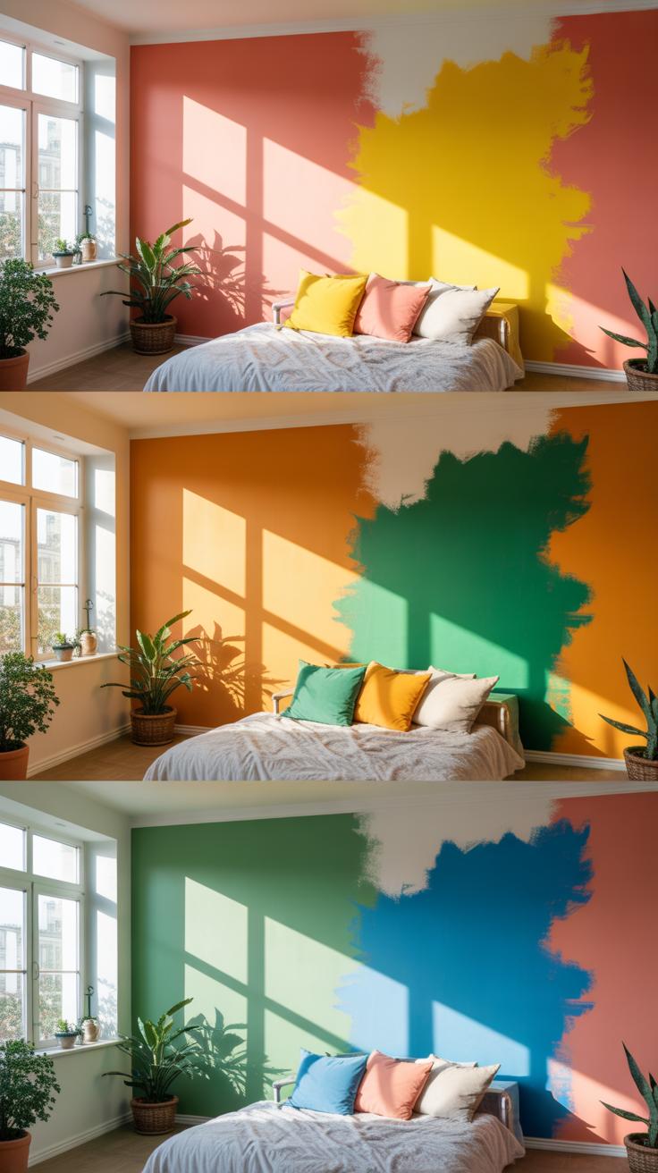
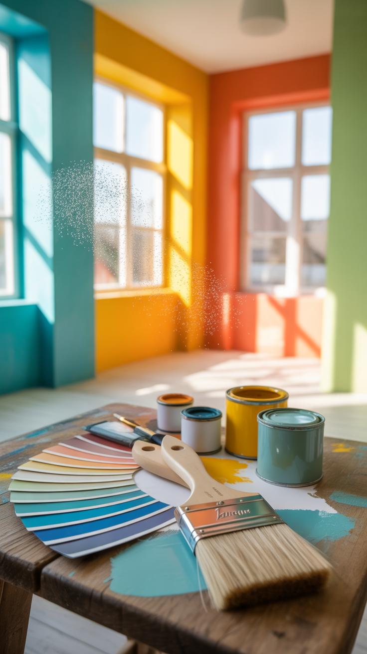
When you’re staring at those paint swatches, it’s easy to think the color you choose will look just the same on your walls. But lighting—it really plays tricks. Natural light, especially, can shift the way a neutral color appears. Morning sun can cast a cool, blue tone, while evening light might warm things up, turning a beige into something cozier or even pinkish. Artificial lights aren’t any more predictable; the wattage and type of bulb (LED, incandescent, fluorescent) influence whether a paint looks dull, bright, or off altogether.
So, what should you do? Testing paint samples in different lighting conditions is key. This means painting a few large patches on several walls, then observing them early morning, midday, and night. Try to catch every lighting condition the room will regularly see. You might find you love a shade under natural light but cringe at it under your favorite ceiling light. It’s definitely worth the extra effort before committing to a full paint job.
Natural Light Vs Artificial Light
Sunlight varies with the time of day, and it’s unevenly distributed around your home. North-facing rooms often feel cooler with softer, indirect light, while south-facing rooms get more intense warmth. This affects neutral colors: a warm cream might look perfect in the sunny south room but too yellow in a north room, which might demand cooler greige.
Artificial lighting changes things too. Warmer bulbs—like incandescent—add yellow undertones, making neutrals feel warmer. Cooler bulbs—like some LEDs—can highlight grays or blues hidden in what seemed like a simple beige. In rooms used mostly at night, pick paint that looks good under your artificial lights because, well, that’s when you’ll really see it.
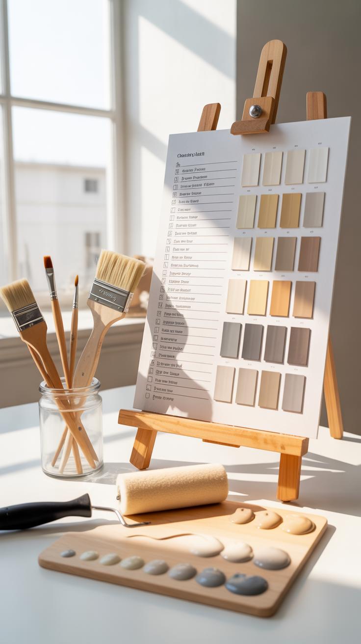
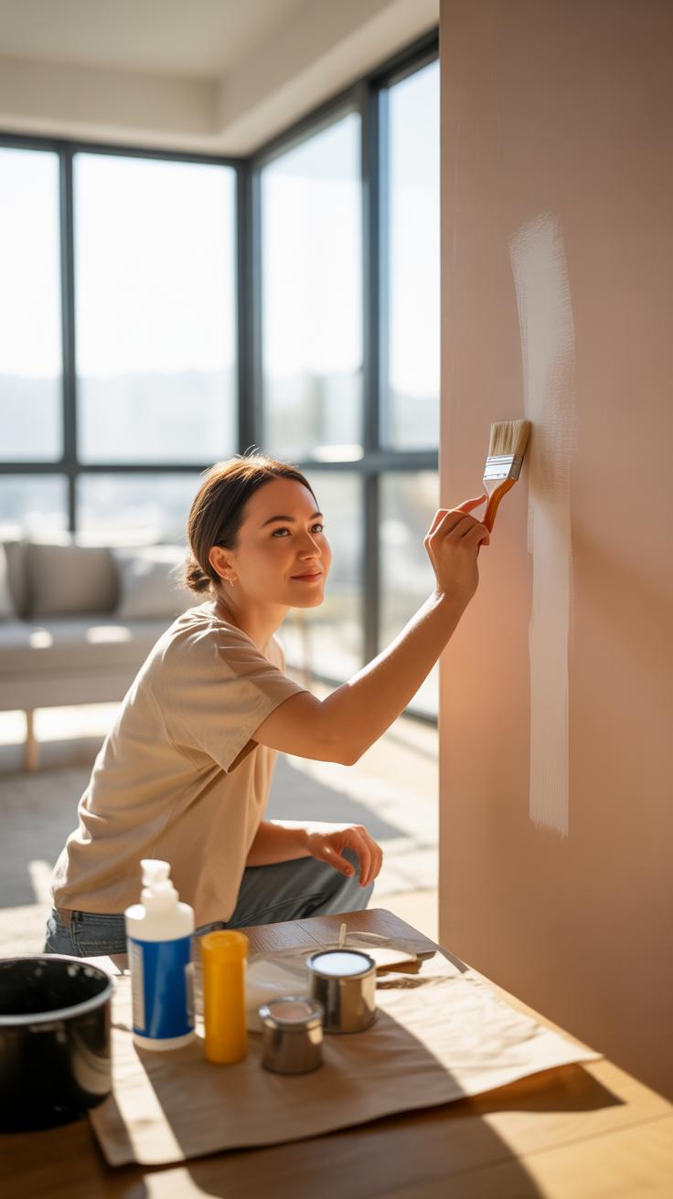
Testing Paint Samples Correctly
People often test small squares on cardboard, but this can be misleading since cardboard doesn’t reflect light the same way walls do. Instead, paint directly on your walls in a few key spots. Watch those patches at different parts of the day—the morning sun, afternoon brightness, and after dark with your usual lamps on.
Don’t rush it. Living with the samples for a few days can reveal how the color behaves with changing light and your furniture around. You’ll notice subtle differences you might have missed on first glance. Remember, the goal isn’t just to see a good color but one that feels right, shifting gently with light rather than standing out awkwardly.
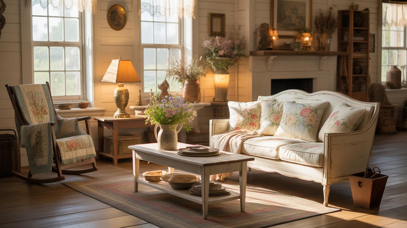
Pairing Neutrals With Home Furnishings
Neutral paint colors form an ideal backdrop for a wide range of furniture styles and hues. When combining neutrals with furnishings, think about mixing textures and materials to avoid a flat look. For instance, a smooth beige wall pairs well with a plush velvet sofa, while rough linen curtains can soften cooler gray walls. The contrast between soft fabrics and solid, sleek surfaces creates a balance that feels more inviting.
Consider the style of your furniture—traditional pieces in darker shades often look great against warm neutrals, while modern minimalist furniture benefits from cooler, almost white shades. Mixing different material types, like metal legs with wooden tabletops, can also be highlighted more effectively with neutral walls, making the space feel layered rather than one-note.
Don’t be afraid to experiment. A neutral wall isn’t a limitation; it’s a canvas that lets your furniture’s unique characteristics shine through. You’ll notice how texture plays a big role in making everything come together naturally, even if the colors are close in tone.
Matching Neutral Paint With Wood Tones
Choosing the right neutral paint for wood furniture involves understanding the undertones in both. Light woods, like maple or oak, often work well with cooler neutrals, such as soft grays or crisp whites, to create an airy feel. Dark woods, such as mahogany or walnut, tend to match beautifully with warmer neutrals — think creamy beige or gentle taupes — which enrich their depth.
A practical tip is to test paint samples next to your wood furnishings at different times of the day. Natural light can change the way colors appear. If your furniture has a reddish undertone, you might find that too-cool neutrals make the room feel off. Sometimes, going neutral doesn’t mean plain; a hint of warmth can make wood tones feel more integrated.
One more thing: consider stains or finishes on your wood. Matte finishes often blend better with soft neutrals, while glossy wood might benefit from a neutral with a bit of sheen to keep visual harmony.
Using Neutrals To Highlight Fabrics And Accessories
Neutral walls create the perfect stage for colorful fabrics and accessories by keeping the backdrop simple. When you have vibrant cushions, throws, or artwork, the neutral paint lets these pops of color stand out without competing for attention.
Simple color combos to try include pairing light gray walls with jewel-toned cushions or accessories, such as emerald greens or deep blues. Beige walls can offset burnt orange or mustard yellow fabrics charmingly, bringing warmth to the space.
Plus, neutrals don’t limit your choices—you can swap accessories seasonally for a fresh look without repainting. It’s a smart way to keep your home feeling current with a minimal commitment. So, your neutral walls not only calm the room but also encourage you to play around with vibrant accents that reflect your style.
Choosing Paint Finish For Neutrals
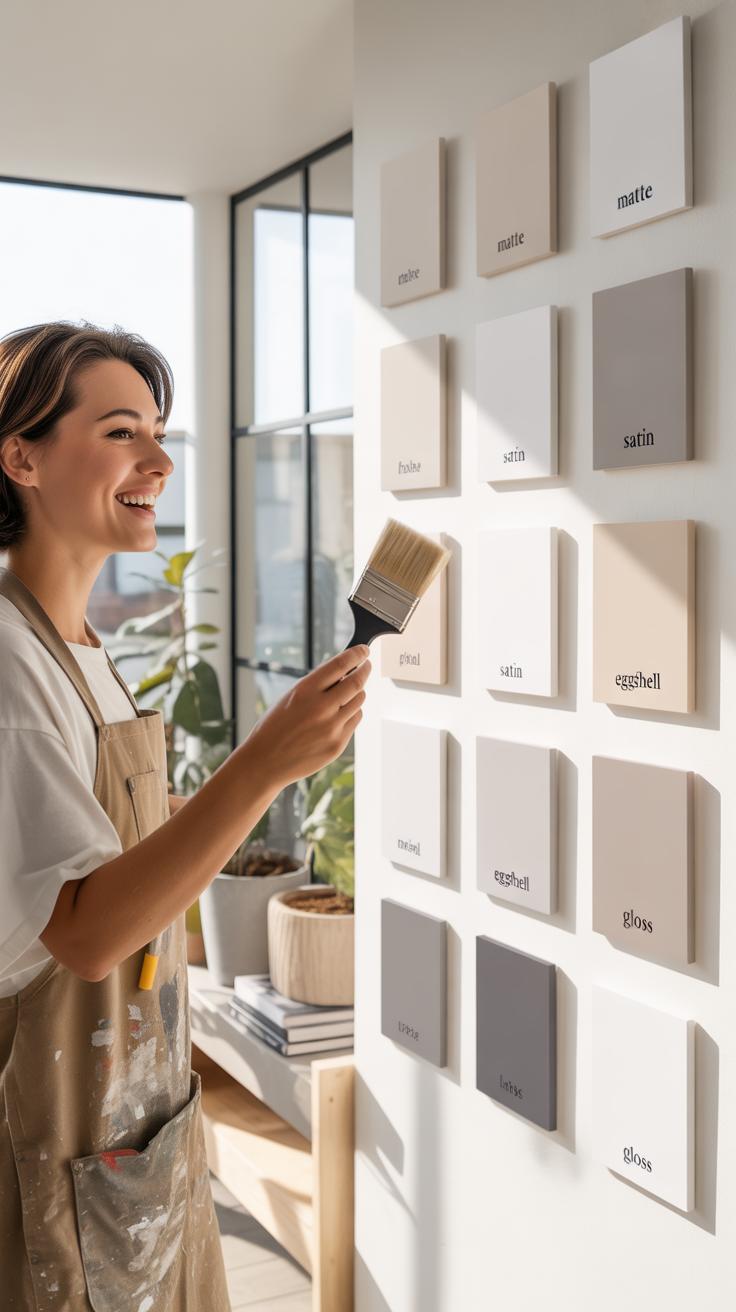
When picking a paint finish for neutral colors, the way light interacts with the surface really changes how the color looks in your space. Matte finishes, for example, absorb light, so neutrals take on a soft, muted quality. These can hide imperfections well but might feel flat in rooms with little natural light.
Satin finishes offer a gentle sheen—subtle enough to keep neutrals calm but with enough reflectivity to add a bit of life and depth. They’re often practical because they balance elegance and easy cleaning. Semi-gloss finishes, on the other hand, shine quite noticeably, making neutral tones pop. This can bring a modern edge, though it can also highlight flaws more than matte or satin.
Choosing the right finish depends on each room’s needs. In bedrooms, matte or satin might create coziness, while kitchens and bathrooms usually call for semi-gloss due to moisture and cleaning requirements. Hallways and living rooms offer more flexibility, but think about how light shifts throughout the day—does the finish feel comfortable, or too stark? It’s a bit of a personal call at the end of the day.
Advantages Of Different Paint Finishes
Each paint finish carries its own set of perks and drawbacks. Here’s a quick rundown:
- Matte: Great at hiding wall flaws; offers a velvety look. Not very durable—prone to scuffs and harder to clean.
- Satin: Strikes a balance; easier to wipe down than matte and adds a gentle glow. It can sometimes reveal uneven surfaces, but overall it’s versatile.
- Semi-gloss: Durable and washable, perfect for high-traffic or moist areas. Reflective finish can emphasize imperfections and might feel too shiny for some neutral shades.
- Glossy: Rarely used on walls, but when applied, it’s highly durable and eye-catching. May be overwhelming in neutral palettes.
Neutral colors often benefit from satin finishes—they maintain subtlety while offering practical cleaning ability. For rooms with more wear, semi-gloss is sensible, even if it risks drawing attention to wall imperfections.
Paint Color Inspiration
When diving into neutral paint colors for your home, finding inspiration can sometimes feel challenging. Neutrals, often seen as subtle or plain, actually offer a broad canvas of moods and effects depending on how you interpret them.
Look beyond the obvious beige or gray swatches in stores. Try exploring interiors of classic, modern, or even rustic homes through design magazines or online platforms. Notice how lighting changes the feel of a plain wall and how different undertones can warm or cool a space. Have you ever caught yourself dreaming about the calmness of a soft taupe or the crisp feel of an off-white? These hues can transform a cluttered room into a sanctuary or a bland corner into a statement.
It’s fascinating how changing a single color in a palette shifts the entire atmosphere. For instance, warm cream can cozy up a large, bare room, while a cool dove gray might add a touch of sleekness to a small nook. That’s the trick: neutrals aren’t just fallbacks; they are a spectrum waiting to be explored.
Don’t hesitate to mix paint samples, imagine how color layering might work or even consider using different neutrals across rooms to maintain flow yet surprise the eye. Inspiration sometimes strikes from unlikely places—a pebble on a walk, a fabric pattern, or the muted tones of a winter sky. Keep those encounters in mind when picking your next paint shade. You might realize your “neutral” is more personalized than you thought.
Paint Color Inspiration
When choosing neutral paint colors, inspiration often strikes from unexpected places. You might find yourself drawn to the subtle shades in nature—the quiet beige of sand dunes or the soft gray of a cloudy sky. These natural tones can anchor a room with a kind of calm familiarity. Yet, even within neutrals, the emotional impact can vary a lot depending on undertones. A beige with a hint of pink feels different from one leaning toward yellow.
Something I’ve noticed is that neutral paint colors don’t have to be boring; they can be the perfect canvas for bold furnishings or personal accents. Sometimes the inspiration comes from a single piece of furniture or art that sets the entire mood. Or you might stumble upon a paint chip that just feels right after hours of flipping through samples—something that makes you pause, even if you can’t fully explain why.
It’s tricky, though—neutrals can look very different under various lighting conditions. What you think is a warm gray in the store might look stark and cold at home in the evening. This inconsistency is why many people test small patches on their wall before fully committing.
For color inspiration, consider making a mood board. Compare paint swatches with fabric textures, flooring samples, and even photos from magazines or online sources. Don’t hesitate to gather a wide range of neutrals, from creamy whites to deep charcoals. Over time, you’ll feel more confident about what works in your unique space.
Examples Of Neutral Paint Use Cases
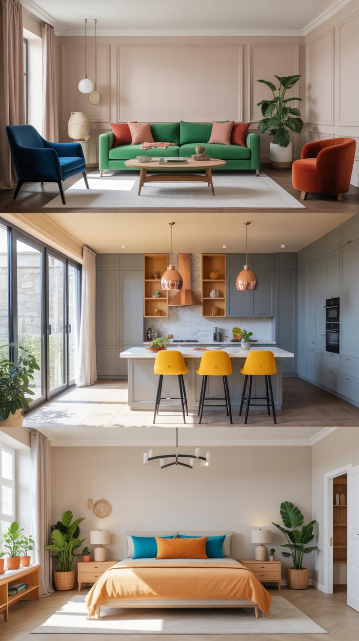
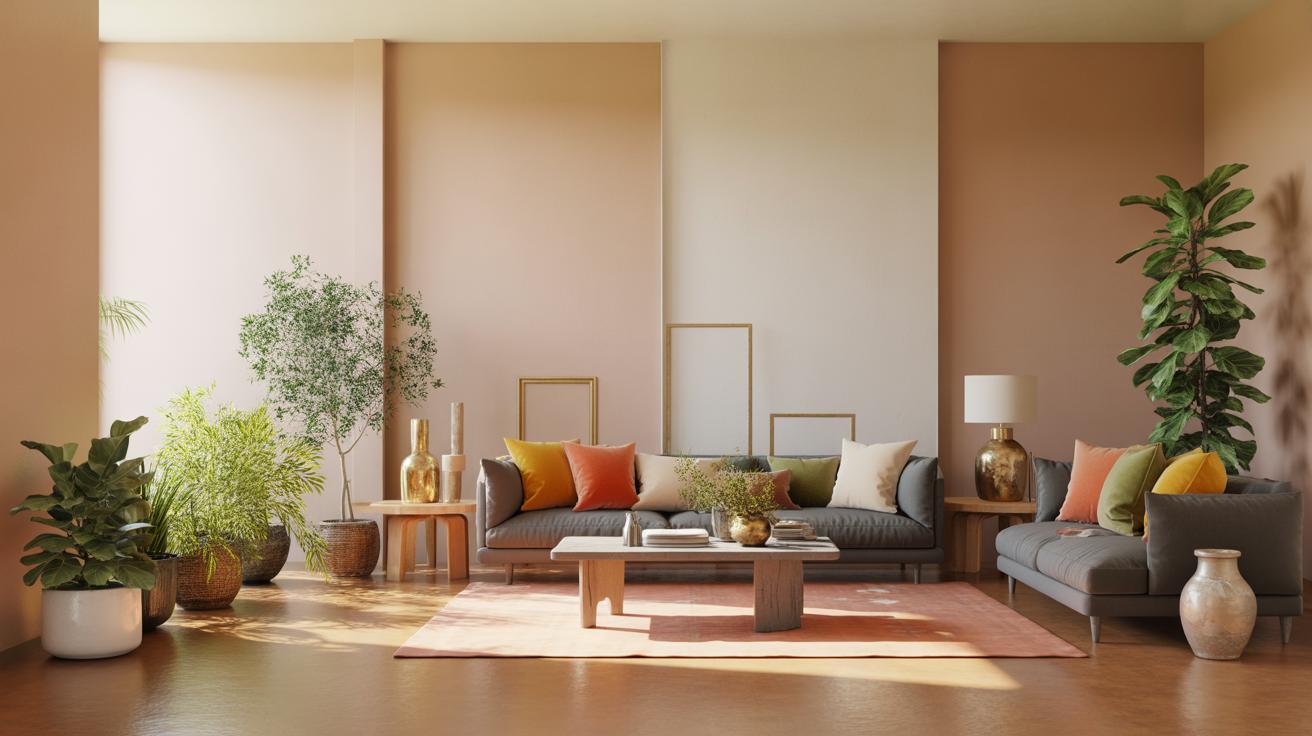
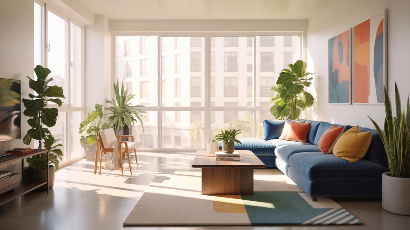
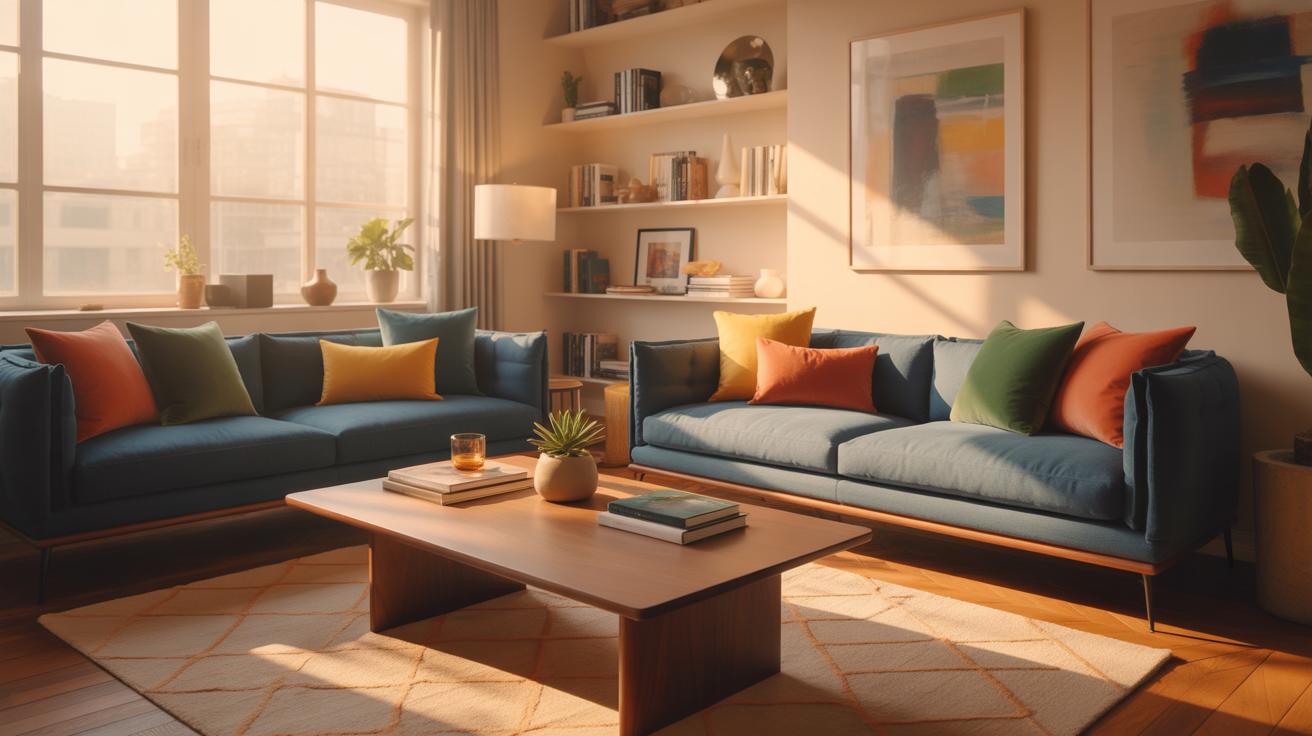
Neutral Paint In Living Rooms
Imagine a living room where soft greige walls provide an unassuming backdrop for a mix of textures and patterns. The paint isn’t shouting, yet it pulls the space together, allowing the furniture to shine without competing. In one example I remember, a pale taupe was paired with plush cream sofas and darker wood accents. It made the room feel cozy but also surprisingly modern. The neutral color seemed to soften the natural light spilling through large windows, creating a calm vibe that invited relaxation. Even subtle changes in the daytime and evening lighting brought out slightly different tones in the walls, adding depth without needing a splash of color.
Sitting there, it’s almost like the color fades into your peripheral vision, making the room feel larger than it actually is. You might think neutral paint is dull, but this example proves it offers a quiet strength — a canvas, really, for other design elements to come alive.
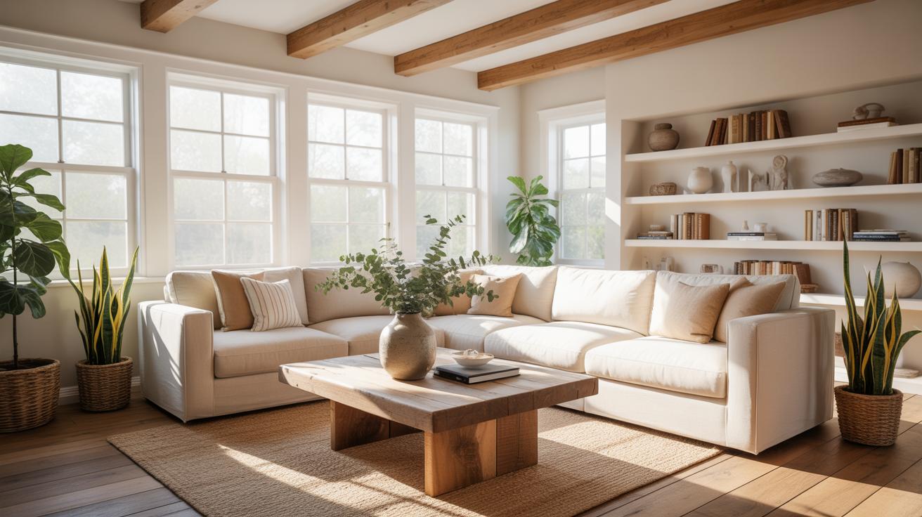
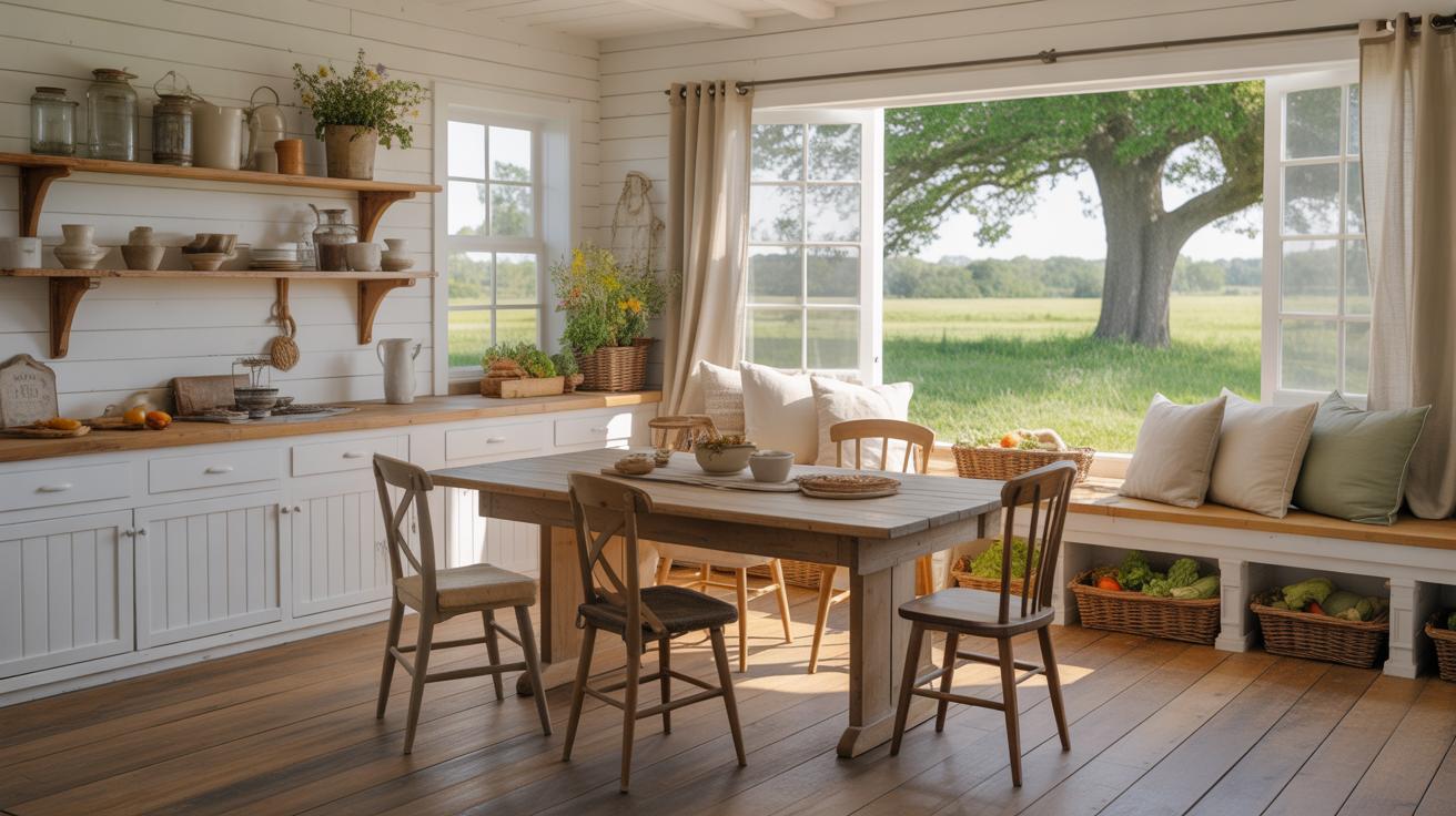
Neutral Paint In Bedrooms And Kitchens
Bedrooms often benefit from neutral paints that help wind down after a busy day. Consider a soft stone gray in a bedroom with matte finishes on the walls, paired with white linens and natural wood tones. The subdued wall color sets a restful tone yet feels far from sterile. The matte finish avoids glare, enhancing the room’s peacefulness. I’ve seen a mix of warm and cool neutrals in kitchens work wonders too, especially when combining light greys with off-white cabinets. This combo is flexible: you can swap out hardware or add colorful accessories without worrying about repainting anytime soon.
The trick that seems to matter most in these rooms is texture. Stoneware tiles, brushed metal fixtures, or sheer curtains add a layer of interest beyond color. It’s almost like the neutral base asks for those touches, inviting you to make the space your own, but without overwhelming your senses. Have you ever noticed how a gentle neutral shade just… blends with your routine? It’s subtle but somehow powerful in creating comfort.
Checklist For Painting With Neutrals
Preparing Walls And Materials
Start by examining your walls closely. You might find some spots that need patching—small holes or cracks. Clean the walls with a mild detergent and water; this removes dust and oils that can prevent paint from sticking.
Next, gather all necessary supplies. Neutral colors typically show imperfections more clearly, so quality brushes and rollers matter. Don’t forget painter’s tape, drop cloths, and a good primer. Primer is especially useful for neutral tones to ensure color consistency.
Painting Steps And Cleanup
Begin by applying primer evenly. It might feel like an extra step, but trust me, it helps with both adhesion and the final look. Once dry, start your first coat of your chosen neutral paint. Take your time—thin layers dry better and prevent drips.
After the first coat dries, assess if a second coat is needed. Often, neutrals need two for full coverage, but it depends on your wall’s color and texture. Once you’re done, clean brushes in warm soapy water, remove tape before the paint fully dries to avoid peeling, and bring back your furniture once walls feel completely dry.
Comparing Neutral Paint Brands
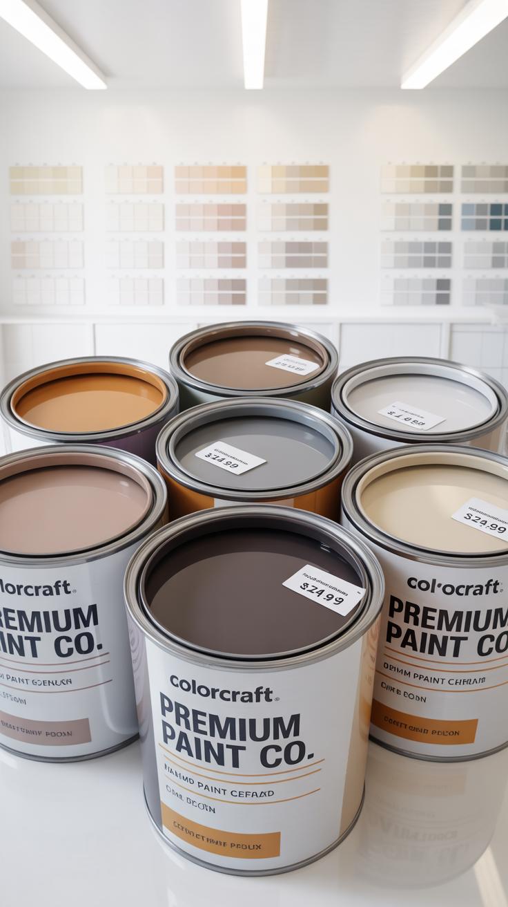
Quality Differences Among Brands
When it comes to neutral paints, not all brands deliver the same quality. Paint quality largely influences how well the color holds up over time and how the finish looks on your walls. Some brands focus on creamy textures that apply smoothly, while others might skimp on pigment concentration, making colors appear flat or washed out. Well-known companies like Benjamin Moore, Sherwin-Williams, and Behr consistently receive praise for their durable finishes and true-to-swatch colors in their neutral ranges. Yet, there’s a chance you’ll find variations even within a single brand depending on the product line, so reading reviews or testing a sample is often necessary. Just because a paint is popular doesn’t guarantee it suits every room’s lighting or surface type.
Price Vs Performance Comparison
Price sometimes reflects performance, but it’s rarely a straightforward equation. Higher-priced options such as Benjamin Moore’s Aura line often offer better coverage and longer-lasting finishes, potentially saving money in the long run since fewer coats and touch-ups are needed. On the other hand, more budget-friendly brands like Behr provide solid neutral colors and good durability at a lower initial cost—ideal if you’re painting a large space on a tighter budget. Sherwin-Williams offers a middle ground, blending reasonable prices with respectable quality. Think about your priorities: is upfront cost your biggest concern or long-term durability? Sometimes investing a bit more pays off, but in some cases, a standard interior paint suffices if you don’t expect heavy wear or want frequent refreshes.
Maintaining Neutral Painted Walls
Neutral paint colors offer a calm and adaptable backdrop in homes, but keeping them looking fresh can be a bit tricky over time. These shades, from soft beiges to cool grays, tend to show dirt and scuffs more readily than darker colors. So, regular upkeep is key to preserving their subtle charm.
First, handling everyday marks gently is crucial—you don’t want to rub harshly and damage the finish. Using a soft cloth or sponge with mild soap and water usually does the trick. Avoid abrasive cleaners that can strip the paint or leave dull spots. Sometimes, simply dusting the walls with a microfiber cloth helps prevent grime buildup before it starts.
Also, consider the room’s environment. Kitchens and corridors might need more frequent touch-ups because of grease and fingerprints. In contrast, bedrooms might stay pristine longer. Keeping furniture slightly away from walls and using protective pads can limit accidental scuffs. Small, consistent efforts can extend the life of your neutral walls significantly, which is something I’ve found handy after a few repainting cycles.
Cleaning Techniques For Neutral Walls
Cleaning neutral walls isn’t about scrubbing hard or using powerful chemicals. Instead, the goal is to gently lift dust and light stains without harming the paint. Here are some tips to keep in mind:
- Use a soft sponge or microfiber cloth—rough materials might cause scratches or dull the finish.
- Mix a mild detergent with water for sticky spots, but always test a small inconspicuous area first.
- Magic erasers can be tempting for tough stains, but use them sparingly—they can lighten or dull the paint if overused.
- Stick to gentle, non-abrasive household cleaners labeled safe for painted surfaces.
- For dust, a microfiber duster or a vacuum with a brush attachment works well.
It’s a little like handling delicate fabric—you want to clean, but with care. And hey, if you’re unsure, sometimes just a gentle wipe-down is better than a full-on scrub that might leave you needing to touch up the wall!
When To Repaint Neutral Walls
Knowing when to repaint your neutral walls can save you from endless small fixes and keep your home feeling fresh. Look for signs like fading, discoloration, or obvious damage such as scratches or peeling paint. Neutral colors can lose their appeal if they look dull or yellowed after years of exposure to sunlight.
How often you repaint depends on factors like room traffic and wall condition. Some might refresh neutral walls every 5 to 7 years, while others may stretch it longer if the paint is in good shape. When touch-ups no longer blend seamlessly or the overall effect is tired, repainting might be the best choice.
Refreshing the paint is not just about aesthetics; it also helps protect your walls from moisture and wear. It might feel like a chore, but a fresh coat of neutral can transform a space without much hassle. Have you noticed your walls slowly losing that initial crispness? Maybe it’s time to think about a little update.
Conclusions
Neutral paint colors remain a reliable choice for a wide range of home decor styles. Their ability to blend with multiple colors and textures makes them practical and timeless. By carefully choosing and combining neutral shades, you can create a welcoming and balanced atmosphere in your living spaces.
Keep in mind that lighting and room size also affect how neutral paint appears. Experiment with samples and consider the overall mood you want to create. With these insights, you can confidently select paint colors that inspire and complement your home decor.