Introduction
Red aesthetic room ideas bring a lively and warm touch to any space. Red is a bold color that can make your room feel cozy and energetic at the same time. When combined with modern design, it creates a fresh and inviting atmosphere. Knowing how to balance red with other elements is important to make the room feel both warm and modern.
In this article, you will find practical tips and easy ideas for using red in your room’s decoration. From choosing the right shades to picking furniture and accessories, you will learn how to design a room that reflects your style and feels comfortable. Whether you want a small red accent or a whole red-themed room, this guide will help you achieve the perfect look.
Understanding the Red Aesthetic
The red aesthetic revolves around using red tones to shape the feeling and mood of a space. It’s more than just a color choice—it sets a tone. Red grabs your attention, stirs emotions, and somehow makes a room feel alive, which is why many people are drawn to it, even if they don’t always realize why.
Psychologically, red is linked with energy and warmth. It’s been shown to increase heart rate and evoke passion or excitement. But there’s also a side to it that can feel overwhelming or intense, so balancing it is key.
Culturally, red carries weight in many traditions. In some places, it symbolizes luck or happiness; in others, it’s a sign of courage or warning. This mix lends red a kind of complexity. You might find yourself both comforted and a little on edge, all because of that one color.
So, when you think about adding red to your room, it’s not just about choosing a color but inviting a whole vibe that’s warm, alive, and yes—sometimes a bit bold.
Why Red Matters in Room Design
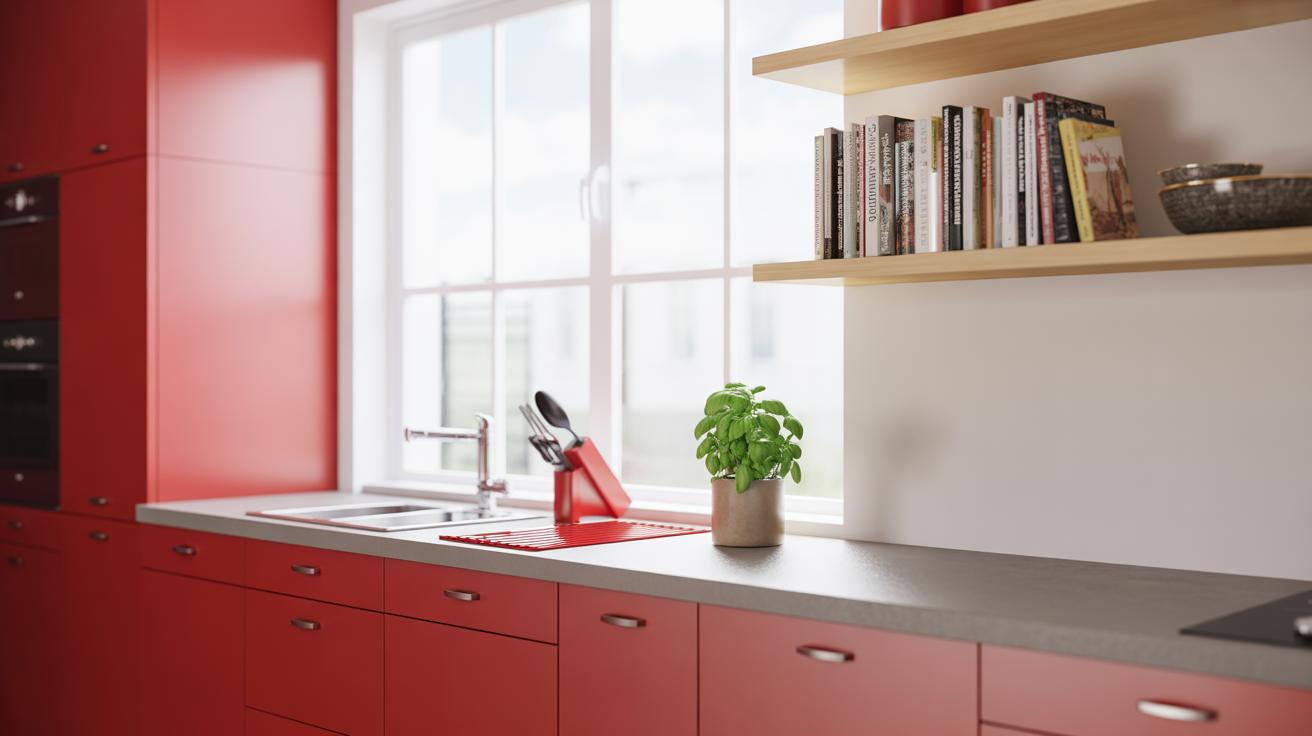
Red is used in room design primarily for its ability to bring warmth and energy. When you walk into a space with red elements, you might feel an immediate lift in mood or a surge of passion, even if it’s subtle. That’s because red naturally commands attention.
It’s tricky, though. Red can make a room feel cozy and inviting, or it can push feelings toward intensity and restlessness. That’s why designers often use it in moderation—a splash of red pillow here, a red accent wall there—to spark energy without overwhelming.
People often choose red in spaces where activity or conversation is encouraged, like living rooms or dining areas. It works less well where calm and relaxation are the goals. So, the way you use red depends on what kind of feeling you want in your space more than just liking the shade.
Different Shades of Red
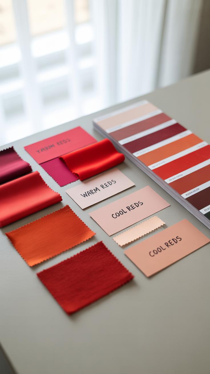
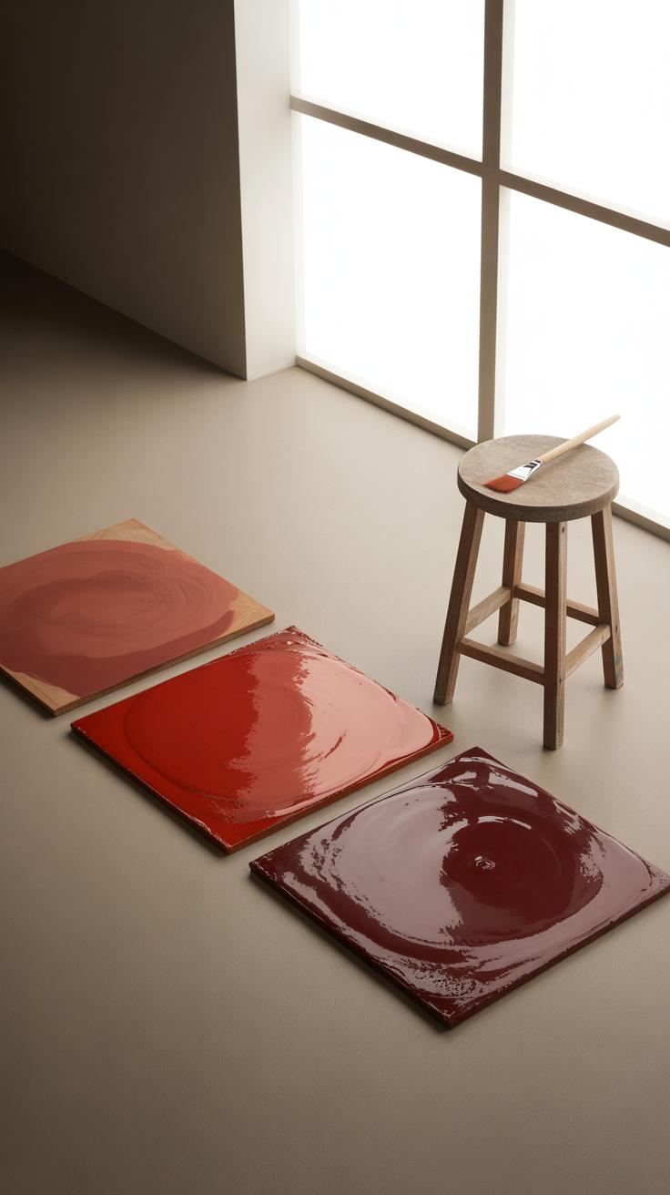
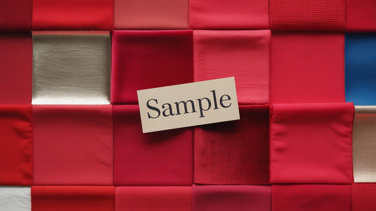
Red isn’t just one color. It stretches across a wide range from bright cherry to deep burgundy. Each shade carries its own personality and mood.
- Bright reds are bold and lively, instantly grabbing attention and often making a room feel energized or even a bit aggressive.
- Mid-tone reds like tomato or ruby offer warmth without shouting. They bring a sense of comfort and balance.
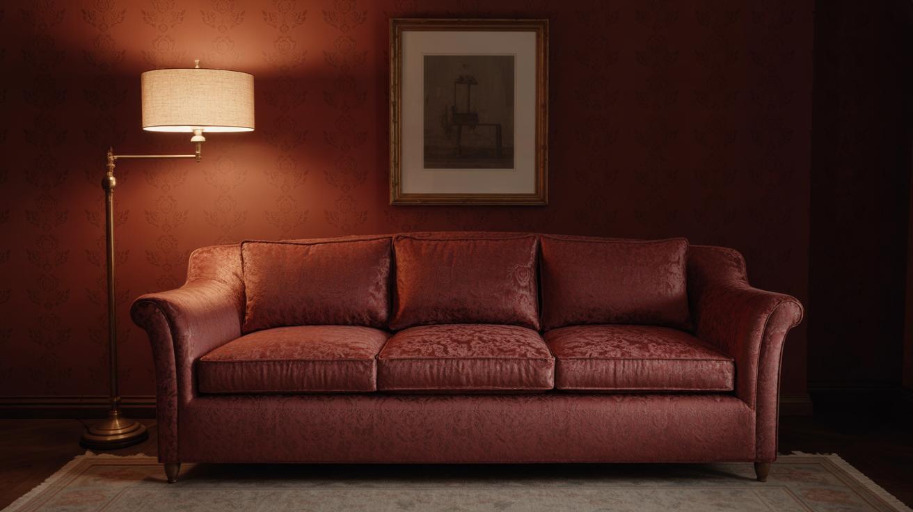
- Darker reds such as burgundy or wine tend to feel richer, more subdued, and even a bit mysterious. They can create a cozy, intimate atmosphere.
Choosing which shade to use can change how you experience the room. A lighter red might cheer you up and make the area seem larger, while a darker shade can help the space feel snug and grounded. It’s not always a simple choice and sometimes mixing shades adds depth—though that’s another topic entirely.
Choosing the Right Red Shades for Your Room
Picking the perfect red shade can feel tricky because not all reds behave the same in a room. The size of your space really matters. For smaller rooms, lighter reds tend to work better—they seem to expand the area, making it feel less cramped. Dark reds, while cozy and rich, might actually make a small room seem even smaller. But that coziness is sometimes exactly what you want, right?
Natural light affects red shades a lot too. A room with plenty of sunlight can handle deeper reds without feeling oppressive. Conversely, if your space is darker, lighter reds can keep things from feeling too gloomy, though sometimes a dark red in low light creates a nice, intimate ambiance. It’s a bit of a balancing act, and honestly, trust your gut on what feels right.
Light vs Dark Shades
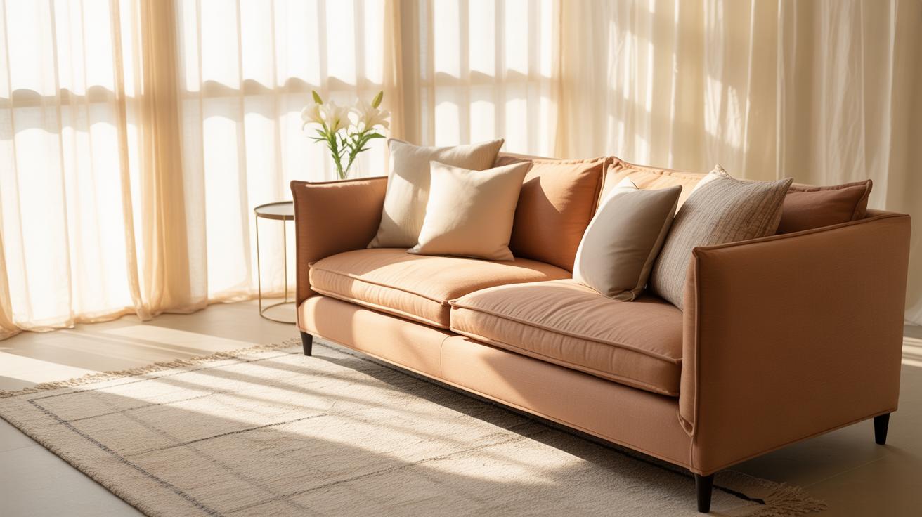
Light reds—think of soft coral or blush tones—can brighten and open up rooms. They bring warmth without heavy intensity and suit places where you want energy without overwhelming the senses. On the flip side, dark reds like burgundy or brick pull the walls inward, creating a snug, almost cocooning effect. That can be calming or even a little suffocating, depending on your mood and the room’s use.
Warm and Cool Reds
Then there’s this interesting divide between warm reds, which lean toward orange, and cool reds, tinted with blue. Warm reds feel more lively and inviting. They’re great for social areas, kitchens, or places where you want to boost conviviality. Cool reds are a touch more reserved, calming even, bringing a modern edge that can work well in bedrooms or more sophisticated settings. It’s funny how just a slight hint of blue or orange shifts your whole perception of the space, isn’t it?
When you’re choosing your red, ask yourself: does this shade make the room breathe or tighten it? Does it fit the kind of energy you want? Because picking red isn’t just about color—it’s about how the space will feel every day.
Combining Red with Other Colors
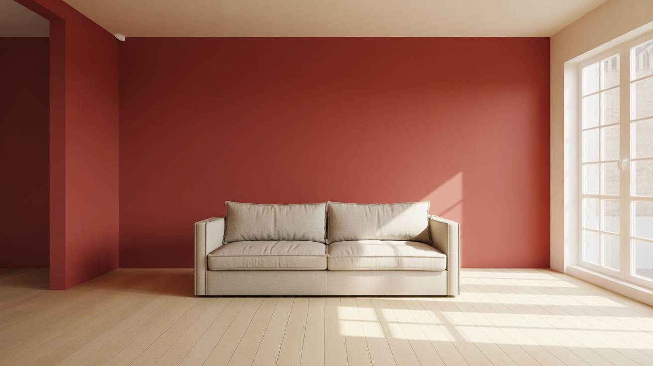
Red can easily overpower a space if not paired thoughtfully. That’s why mixing it with neutrals is often a smart move to keep things modern and balanced. Think of white, grey, beige, and black as the quiet friends that let red shine without making the room feel chaotic.
White offers crispness and airiness, especially in smaller rooms where red might otherwise feel overwhelming. Grey introduces subtle depth, and when paired with red, it creates a calming backdrop that still feels fresh. Beige softens the boldness a bit—perfect if you want warmth without too much intensity. Black can be tricky—it’s dramatic next to red but if used sparingly, say in frames or hardware, it grounds the room firmly.
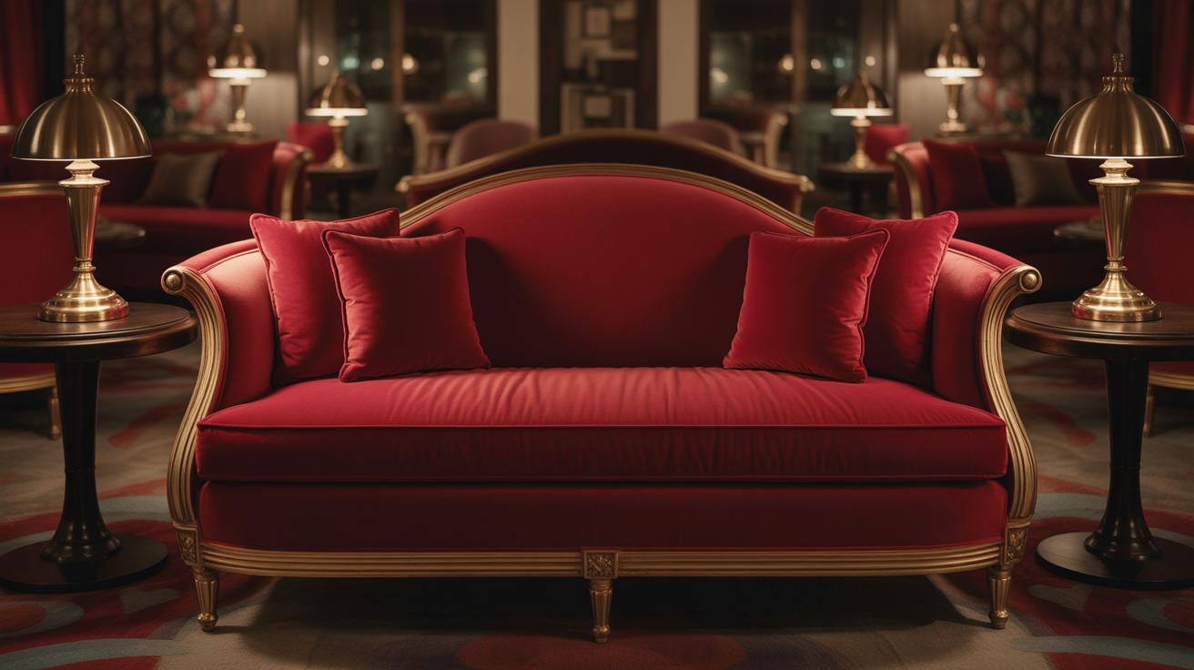
Accent colors come into play when you want to add personality beyond neutrals. Gold, for example, pairs beautifully with red, boosting a sense of luxury. Small gold accents in light fixtures or cushions can warm the vibe without competing. Green, especially richer or forest tones, creates an interesting contrast because it’s on the opposite side of the color wheel. This combination can feel lively but still cozy if you keep green accents limited to plants or throws.
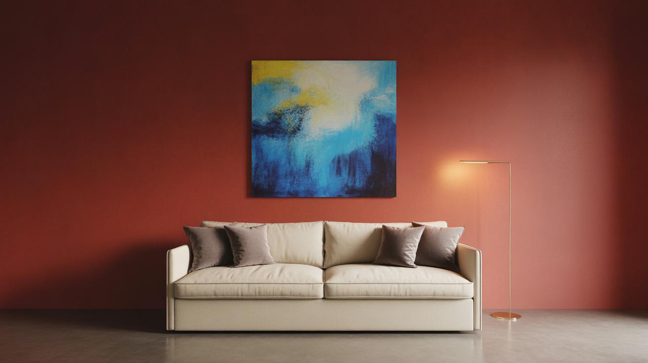
Blue might surprise you as a partner with red. Deep navy shades calm the intensity of red, giving a sophisticated edge. Lighter blues, though, might clash or feel less grounded, so test carefully. When you bring in accent colors, ask yourself: does this add warmth or tension? Sometimes a little tension isn’t bad, it can energize a room.
Furniture and Decor Choice in a Red Room
Modern Furniture Styles
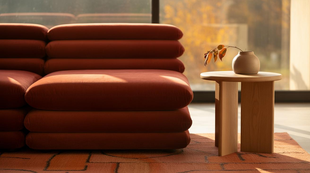
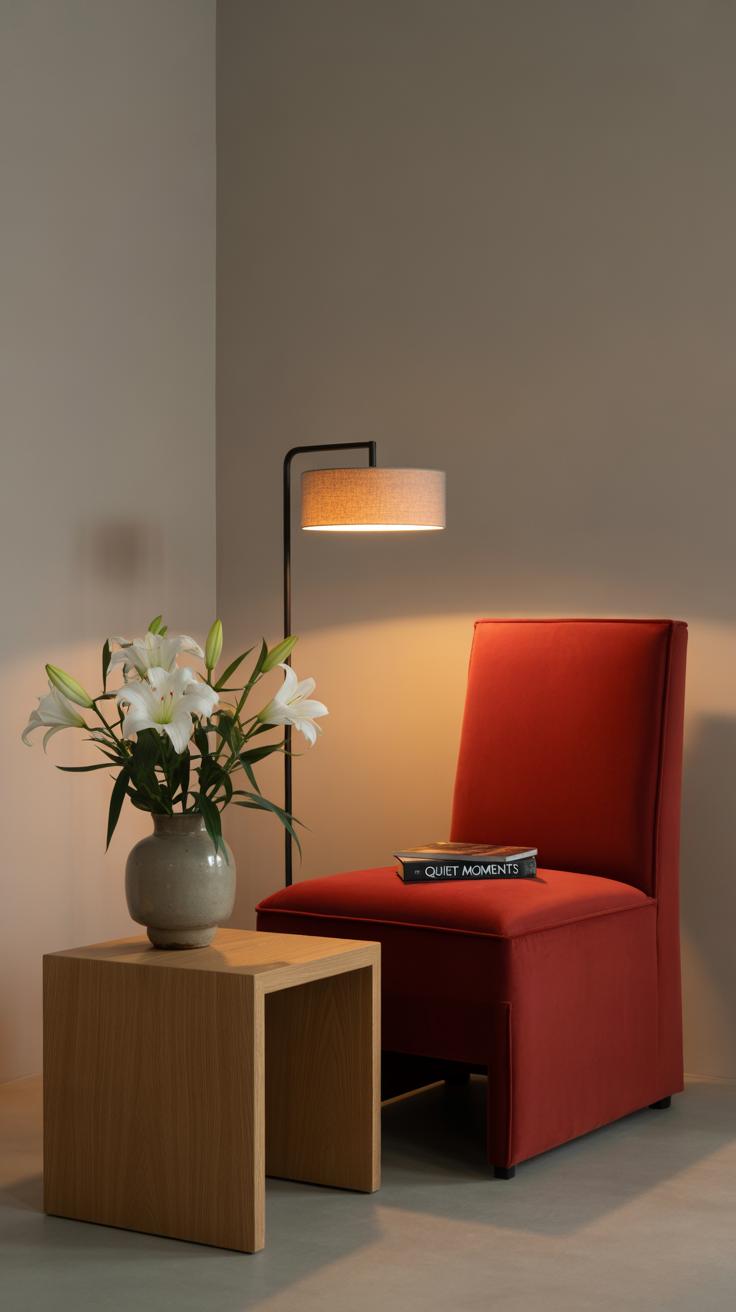
When you’re working with red walls or bold red accents, the furniture should offer a break or balance rather than compete. Simple shapes with clean lines work best. Think along the lines of mid-century modern pieces—slim legs, minimal ornamentation, and smooth surfaces. A neutral sofa, maybe in beige or muted gray, often feels less overwhelming next to red. I’ve tried pairing a red accent wall with a low-profile, light wood coffee table, and it actually made the space feel more grounded.
Sometimes black or dark metal frames add a sleek contrast that complements red without fighting it. But don’t go too dark everywhere—you risk the room feeling heavy. Just a few thoughtfully chosen pieces, like a minimalist chair or a subtle side table, can open up the space while letting red take center stage.
Decorative Elements
Now, about the decor—this is where red rooms really come to life. Rugs are a key player here. A patterned rug with hints of red mixed with softer tones can soften the intensity. Or a simple, plush rug in a neutral shade works when you want to tone down the energy but keep warmth. I once layered a cream rug over a wooden floor in a red living room, which felt cozy but not crowded.
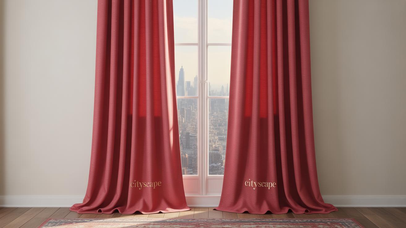
Curtains in sheer whites or light grays diffuse the stubborn brightness that red sometimes throws at you. Heavy drapes might feel too intense, unless you want a dramatic vibe. Also, artwork can be a subtle way to echo red without being obvious—abstract prints with a touch of crimson or rusty orange add dimension without shouting.
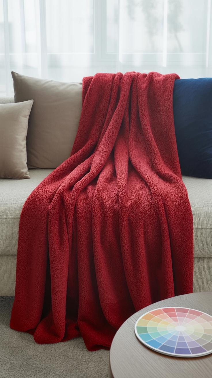
Have you thought about texture? Velvet cushions, woven throws, and even ceramic pots with matte finishes create visual interest. They break the boldness just enough, making the room feel lived in, not staged.
Lighting for Warmth and Mood
Natural Light Effects
Sunlight behaves in a surprisingly complex way when it hits red surfaces. Red tones can look deep and rich in direct sunlight, but sometimes the brightness can make them feel a bit sharp or overwhelming. That’s why window treatments matter—sheer curtains often work best, softening the sun’s intensity without dulling the warmth of red walls or accents.
Think about rooms with east-facing windows. Morning light, cooler and softer, tends to make red shades appear gentler and more inviting. In contrast, afternoon sun from west-facing windows can intensify reds, which can be energizing, or maybe too much—depending on the mood you want. Maybe blackout blinds feel too harsh here; instead, layering light-filtering curtains gives some flexibility.
Artificial Lighting Choices
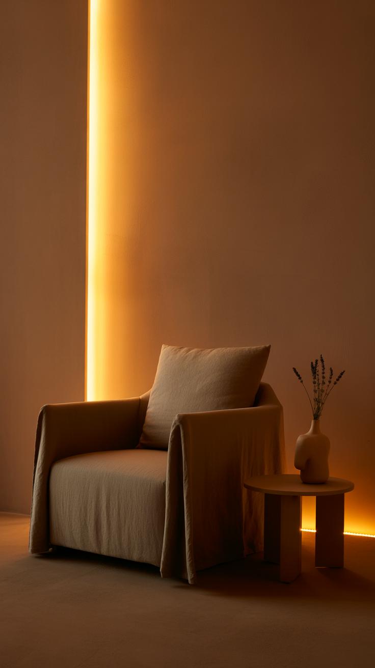
Choosing the right bulbs is key. Warm LED bulbs, around 2700K to 3000K, usually bring out the cozy side of red without washing it out. Lamps with dimmers let you shift the mood from bright and lively to intimate and calm. Floor lamps with fabric shades, or table lamps with amber or frosted glass, add subtle diffusion that helps the red tones feel more natural and less aggressive.
Don’t overlook the placement of lighting. Wall sconces or uplighting can create soft shadows that highlight red details in a gentle way. Overhead lights with harsh white tones often clash with red’s warmth. So, you might want to mix sources—maybe a central fixture paired with a few smaller lamps—to avoid a flat look.
Lighting is not just about visibility here; it sets the emotional tone. What kind of warmth do you want your red space to have? It’s almost experimental, tweaking light, seeing how it plays off your reds, to find that perfect balance where the space feels inviting without being too intense or, well, too dull.
Textiles and Materials That Work with Red
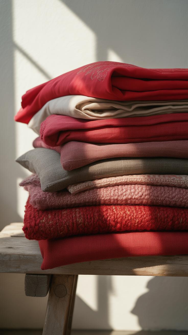
When working with red in a room, choosing the right textiles can really make a difference in how warm and inviting the space feels. Fabrics like cotton, velvet, and wool naturally complement red hues. Cotton’s breathability and softness balance out the intensity of red without competing with it. Velvet, on the other hand, brings in a certain richness and depth. I’ve found that even a small velvet cushion or throw can give the red tones a cozy, almost tactile warmth that you want to sink into. Wool is great too, especially in colder climates—its texture works well in red-accented spaces and keeps things feeling snug.
You might wonder, what about synthetic fabrics? While some blends work, natural fibers almost always feel more comfortable in a red-themed room. Maybe that’s just my bias toward natural materials, but it does seem like they soften the boldness of red without dulling it.
Materials and Surfaces
Wood is often the go-to when pairing with red. Its organic warmth complements red’s intensity while grounding the overall look. Think about a deep cherry or walnut finish; these woods echo red’s warmth but don’t overwhelm the senses. On the flip side, lighter woods can add contrast and keep the room feeling modern and less heavy. Metal surfaces, like matte black or brushed brass, introduce a sleek edge. They reflect light in interesting ways and provide a break from all the warmth, so the room doesn’t feel too enclosed.
Glass is a bit tricky, I’ll admit. It can cool down the red if overused, but used sparingly—for example, a glass coffee table or a few decorative pieces—it keeps the space from feeling claustrophobic. Glass also lets light pass through, which ties nicely to the lighting ideas discussed earlier. It keeps everything feeling open but with a modern twist that works well alongside the richness of textiles and wood.
Balancing Red for Small and Large Spaces
Using red in different room sizes can feel tricky. Red tends to demand attention, so how you place it really matters. In smaller spaces, too much red can feel overwhelming or even claustrophobic. I’ve noticed that using red as an accent works best here. Think cushions, small art pieces, or a single red rug rather than painting entire walls. Lighter reds—like a soft coral or muted brick—help keep the room feeling open while still bringing warmth.
Try pairing these with lighter walls and mirrors to bounce light around. It’s a fine line but one worth experimenting with. You might start wondering: will my space feel cozy or cramped? In my own tiny room, a dash of red on the lampshade made all the difference without crowding the room.
On the flip side, large rooms can handle bold, deep reds with more confidence. Dark crimson or burgundy on walls or big pieces of furniture create richness and depth. The key is balance—large, comfy sofas or wooden tables can anchor the color so it doesn’t become too intense. Also, lighting is crucial to avoid the room feeling like a cave. Soft, scattered light sources can soften strong reds and reveal their warmth.
Sometimes you might find a large space balanced yet slightly too formal. In that case, maybe add some playful, lighter red accessories or brighter art to break the mood. There’s no single rule. The size of the room shapes the way red behaves, but your choices in contrast and scale steer how the eye reacts.
Personalizing Your Red Aesthetic Room
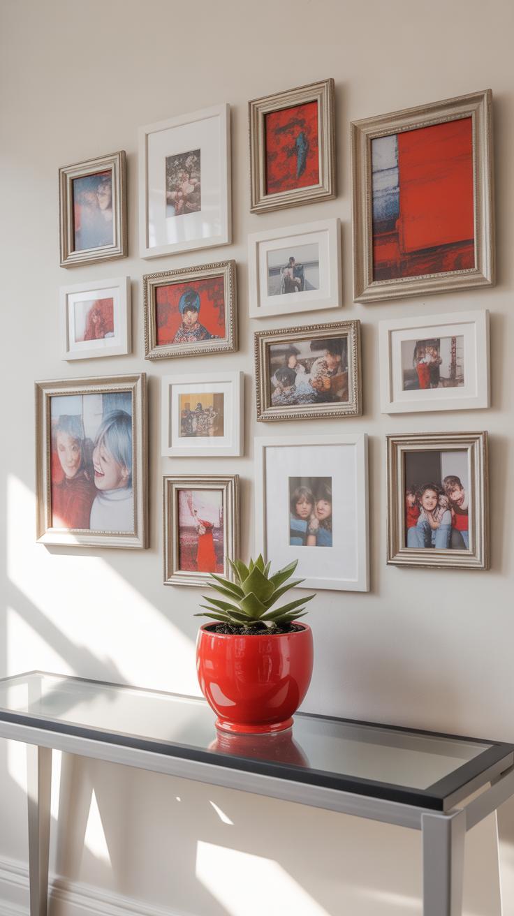
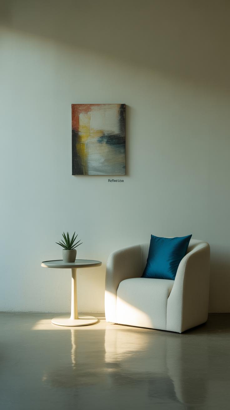
When it comes to making a red-themed room truly yours, art and personal items play a bigger role than you might expect. Red is a strong color — it can feel bold, but it also invites expression. Think about the kind of art that not only fits the color scheme but also speaks to your taste. Abstract pieces with splashes of red or even classic prints framed in black or gold can create interesting contrasts without overwhelming the space. You might prefer vintage posters or minimal line drawings that give a modern touch without clashing.
Wall hangings don’t have to be limited to paintings. Textured tapestries or metal designs in dark reds add depth, while shelves with small red accents let you display bits of your personality. This way, the walls aren’t just red—they tell your story.
Plants deserve special mention here, as their natural green tones balance out the intensity of red rooms. I’ve noticed that a few leafy ferns or a rubber plant can make a huge difference in softening the space. They bring life where red might feel heavy. Plus, the contrast between red and green is visually appealing without being harsh. Natural wood pots or woven baskets also add warmth, gently grounding the more energetic tones around you.
So, when decorating, ask yourself: what objects or plants remind you of comfort, inspiration, or nostalgia? Those are the pieces that deserve a spot in your red room. They create balance naturally, even if you’re not aiming for it—because personality can be as subtle or as bold as the red itself.
Conclusions
The red aesthetic can transform your room and fill it with warmth and modern energy. By balancing red with neutral tones, choosing the right furniture, and using lighting wisely, you can create a room that feels inviting and stylish. Red does not have to be overwhelming; it can be tastefully included in various design elements.
Remember to consider your personal style and comfort when designing your red aesthetic room. Use the tips shared here as a guide and experiment with shades and accents until you find the perfect blend. Your room will become a space that you enjoy and that feels both warm and modern every day.