Introduction
Red and brown colors evoke a strong sense of earthiness and warmth. These colors offer a natural feeling that connects you with the environment. Whether you want to decorate a room, pick an outfit, or design graphics, choosing the right shades of red and brown can create a cozy, grounded atmosphere.
This article explores many aspects of red and brown colors. You’ll learn about their history, meanings, and how to combine them effectively. You will also discover practical tips for using these colors in your daily life for a balanced, earthy look.
The Science Behind Red and Brown Colors
How Red is Seen by the Eye
Red sits at the longwave end of the visible spectrum, roughly between 620 and 740 nanometers. What’s interesting is that our eyes are particularly sensitive to this range. The cones in our retina pick up red wavelengths strongly, which usually makes red appear intense and close—almost like it demands attention. You might notice how red can feel “warmer” simply because our brain links the wavelength with heat, even though that’s not a direct physical connection.
That said, perception isn’t just about physics. Context, lighting, and even personal experience tinker with how red looks to us. For example, a deep crimson might feel cozy in one room but overwhelming in another. So, red’s wavelength alone doesn’t tell the full story, but it explains why red grabs your eye in a way other colors don’t.
What Makes Brown a Natural Color
Brown isn’t a single spectral color like red is. Instead, brown appears when certain colors mix together—usually red, yellow, and black or green, orange, and a touch of blue are involved. It’s basically a darker, desaturated orange or red, created when the brightness dims and saturation lowers. Because of this, brown often feels grounded and earthy rather than vivid or harsh.
You encounter brown everywhere in nature—tree bark, soil, autumn leaves—which might explain why it feels so familiar and “natural” to us. It doesn’t stand out sharply but blends in nicely, evoking stability and comfort. In a way, brown feels like the color of things that age or weather, possibly connecting to our deep, almost subconscious cues about the world around us.
Historical Significance of Red and Brown
Red in Ancient and Modern Culture
Red has long held a powerful place in human history. Ancient civilizations, like the Egyptians and Mesopotamians, used red pigments from natural sources such as ochre to decorate tombs, pottery, and clothing. It often represented life, vitality, and even protection against evil forces. I sometimes wonder how much these ancient uses continue to color our feelings about red today.
In many cultures, red was also linked to status and power. Think of Roman generals adorned in red cloaks or Chinese emperors favoring red for ceremonies. The color carried clear signals, but those meanings weren’t always the same everywhere. In some places, red signified danger or warning, while in others, it symbolized good luck or celebration.
Today, red still evokes strong responses. We associate it with passion and urgency, but also warmth and earthiness, especially when paired with browns or natural materials. The historical backdrop gives red a depth that few other colors hold.
Brown Through History
Brown might feel quieter compared to red, but its history is just as rich. Derived from earth pigments like umber and sienna, it was a staple in artistic palettes for centuries. Painters like Rembrandt and Van Gogh relied on brown for its natural, grounding effect, drawing from it to create shadows and texture that felt real.
On the practical side, brown dyes were readily available for clothing and household items. Before the invention of synthetic colors, browns from plant-based or mineral sources were common in everyday garments—durable and unassuming. In many cultures, brown signaled humility, simplicity, or connection to the land, though it wasn’t always considered a “fashion” color. Yet its steady presence in history feels like a quiet nod to nature’s permanence.
When you add red and brown together, you get more than colors—you get a sense of stories that span centuries. Their shared earthiness can make your space feel rooted in something ancient, even if you don’t realize it outright.
Emotional and Cultural Meanings of Red
Red carries a weight that shifts with context, culture, and even personal memory. In many Western cultures, it’s often tied to passions that run deep—love, anger, excitement. Walk into a room painted red, and you might feel alert or energized, maybe even a bit restless. It’s that push-pull between warmth and intensity that makes red so compelling but sometimes overwhelming. People often choose red to evoke strong feelings, whether in fashion or interiors, hoping to spark energy or drama.
But red isn’t just about fire and intensity. In many parts of Asia, red tones have a gentler, though no less powerful, role. It’s commonly linked to happiness, prosperity, and good fortune. Think of wedding dresses in traditional Chinese ceremonies or decorations in festivals—red is there to invite luck and ward off misfortune. That association feels more rooted in celebration and community, less about individual emotion and more about collective wellbeing.
So, what does this mean for your space? Using red might trigger excitement or warmth, but it can also bring a sense of optimism or safety, depending on which cultural lens you lean toward—or even your own personal experiences with the color. It’s not always straightforward. You might even find yourself drawn to red for reasons you can’t quite explain—perhaps it feels familiar, comforting, or simply alive.
Emotional and Cultural Meanings of Brown
Brown carries a unique kind of emotional weight, one that often feels quietly reassuring. It’s not flashy or loud, but you might find its presence strangely comforting. In many cultures, brown symbolizes reliability and connection—think of well-worn leather, sturdy wooden furniture, or the earth beneath your feet.
Across different places, brown can take on varied emotional meanings:
- Some see brown as a practical, down-to-earth shade, evoking feelings of simplicity and honesty.
- In other cultures, it might represent humility or even mourning, a reminder of impermanence.
- Others associate it with richness and warmth, perhaps because of its connection to wood and soil.
It’s interesting how these meanings overlap yet diverge, making brown a complex color emotionally. You might feel grounded in one space but slightly subdued in another, just because of how brown plays with light and shadow.
Brown and Stability
Brown often feels like a solid anchor in a room. It’s the color of stability—the kind you don’t question. When you see brown, you might think of things that last: aged furniture, earth tones that rarely fade, or the bark of a tree standing firm through storms.
It suggests dependability without fuss. You don’t often see brown trying to grab attention; it’s more about support. That’s why many people choose brown in spaces where calm and steadiness are desired—like living rooms or studies.
Yet, stability can sometimes feel a bit limiting or dull. I’ve noticed that brown’s grounding quality might make a space feel heavy if overused, so balancing it is key.
Brown’s Association with the Earth and Nature
Brown naturally connects us to the outdoors. It’s the color of soil, tree bark, and dried leaves—elements you encounter walking through a forest or a park. That link to nature gives brown an organic, wholesome feeling that can help bring the outside in.
For many, surrounding themselves with brown tones means inviting nature’s calmness into their homes. It reminds you of the earth’s cycles, growth, and renewal, even if subtly.
At the same time, brown isn’t just about pristine landscapes. It can reflect rough, weathered surfaces too—reminding us that nature isn’t always perfect or polished. This gives the color a certain authenticity that feels honest and alive.
Using Red and Brown Together in Interior Design
Combining Red and Brown for Warmth
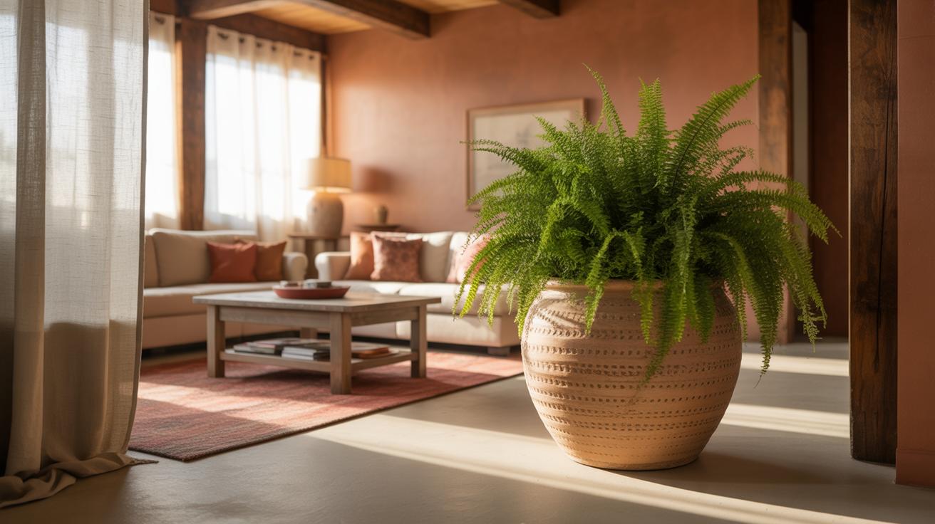
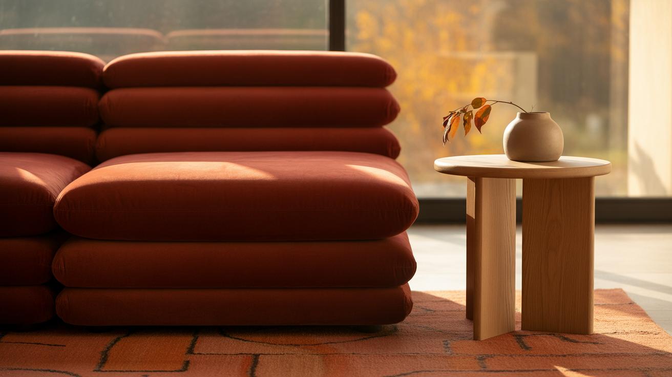
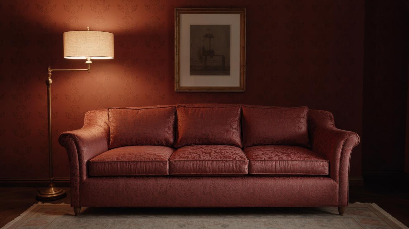
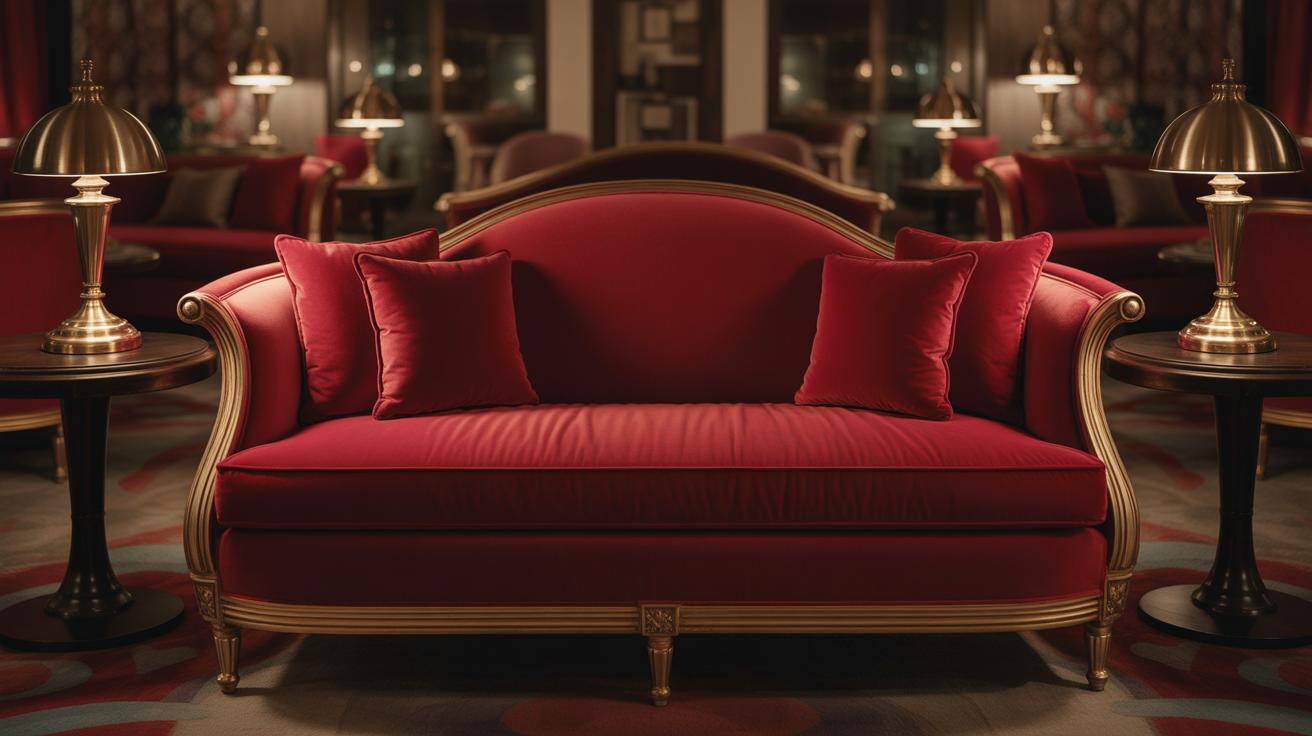
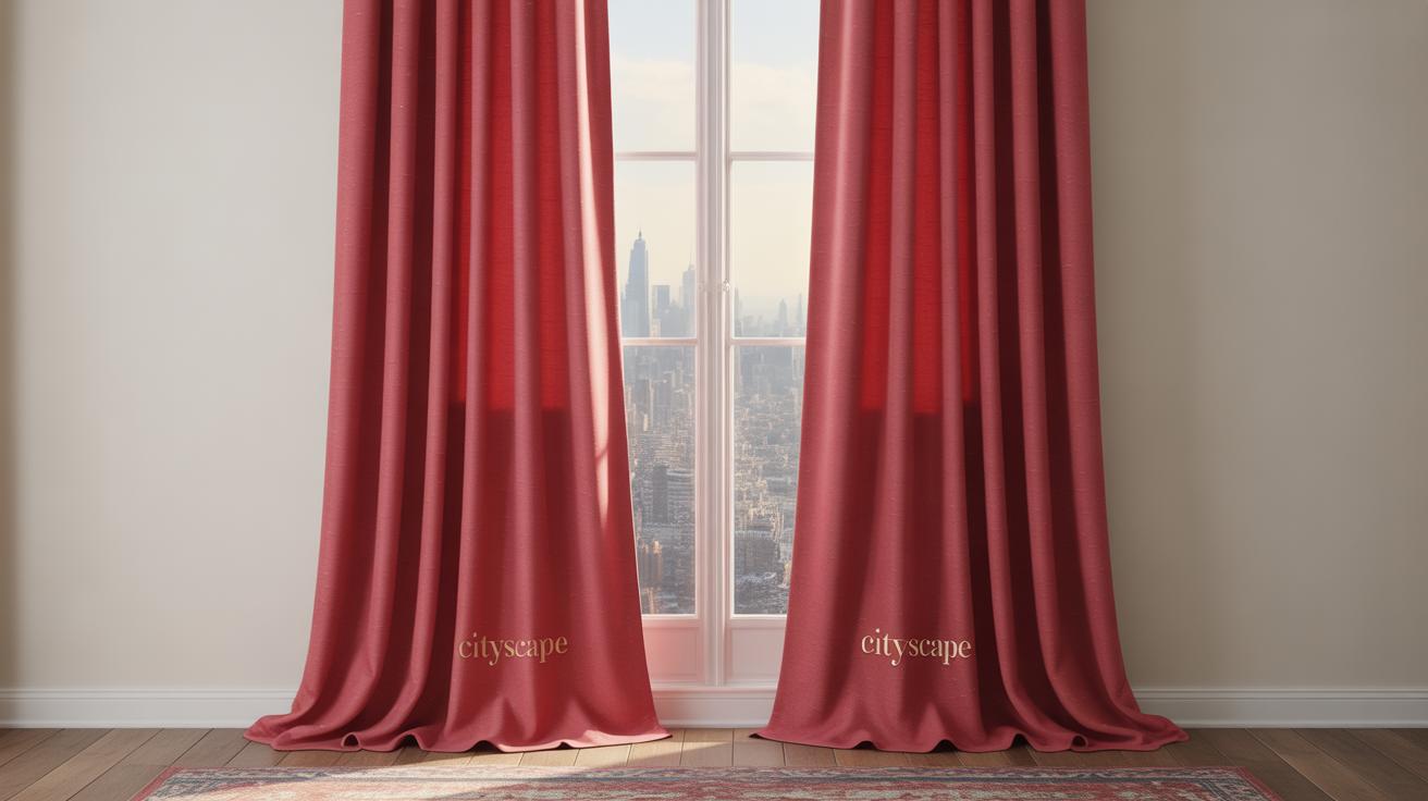
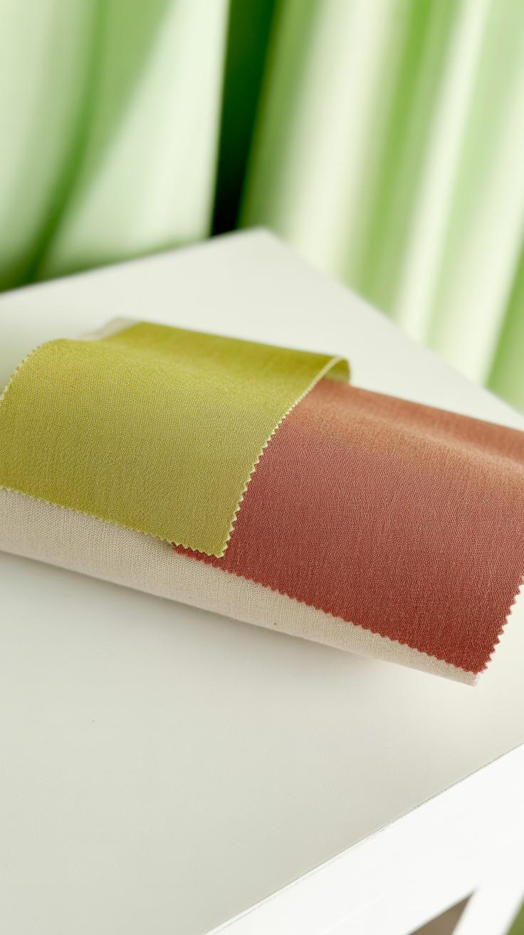
When you put red and brown side by side in a room, the feeling you get is often… inviting. The rich, grounded tones of brown help soften red’s boldness, making the space feel cozy without being overwhelming. Imagine a living room with brown leather sofas and red throw pillows—there’s an instant sense of comfort. It’s like the room warmly embraces you.
Another example might be a dining area where wooden furniture with deep brown finishes meets a red accent wall. It creates an atmosphere that encourages lingering over meals and conversation. You could also bring in red through rugs or lampshades, balancing them with brown floors or shelves. These combinations work well because they speak to natural warmth while still adding personality.
Balancing Vibrant and Earthy Tones
Red can sometimes feel intense. I’ve noticed that if too much red fills a space, it might start to tire the eyes or even make a room look smaller. Brown acts as a calming partner, grounding the energy. That said, the exact balance depends on your space and mood. Maybe a small studio can’t handle large red surfaces but can use brown cabinetry with subtle red decor instead.
Here are ways to strike that balance:
- Use brown as your base color in walls, floors, or large furniture pieces.
- Add red in smaller doses—think cushions, artwork, throws, or even a single statement chair.
- Mix deeper reds, like burgundy or brick tones, which blend more easily with rich browns.
- Consider texture—brown leather and red velvet or wool create a pleasant contrast.
It’s a bit of trial and error. Sometimes I’ve found an unexpected shade of red blends better with brown than a straightforward bright red. Try different combinations until you find a mix that feels right for you and your space.
Applying Red and Brown in Fashion
Red as a Statement Color
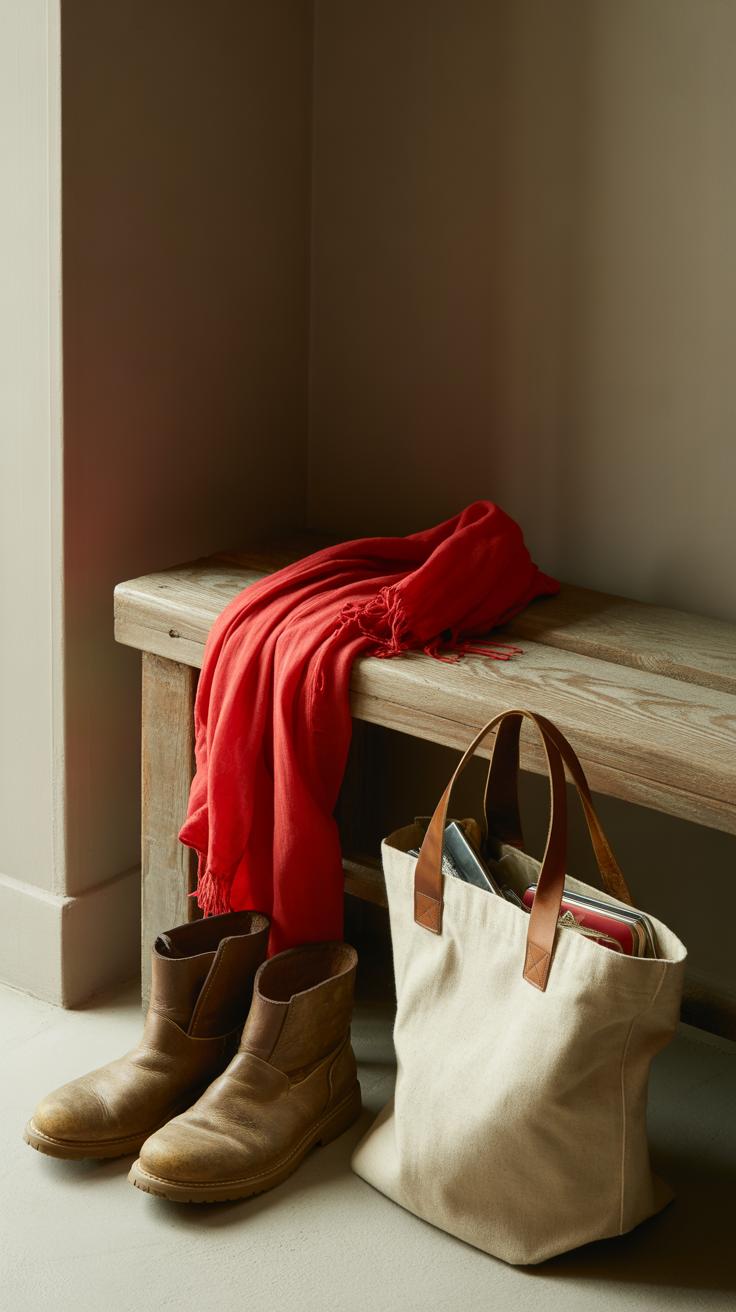
Red grabs attention, no doubt about it. When you wear red, you’re making a choice to stand out. It’s bold, sure, but it doesn’t have to feel overwhelming. A red jacket or dress can serve as the focal point of your outfit, instantly lifting everything else around it. Sometimes, just a red accessory—a scarf, a handbag, or shoes—can punch up a neutral look without going all in.
Think about pairing red with simple black or white pieces to avoid competing colors. This approach keeps the red commanding the scene but balances energy levels. You might hesitate to wear red every day, and that’s fair—it can feel intense. Yet, on days when confidence wanes, a bit of red might be exactly what you need. What if you try mixing different shades of red instead of the classic bright tone? Burgundy or brick red can feel just as bold but a little softer, more… complex.
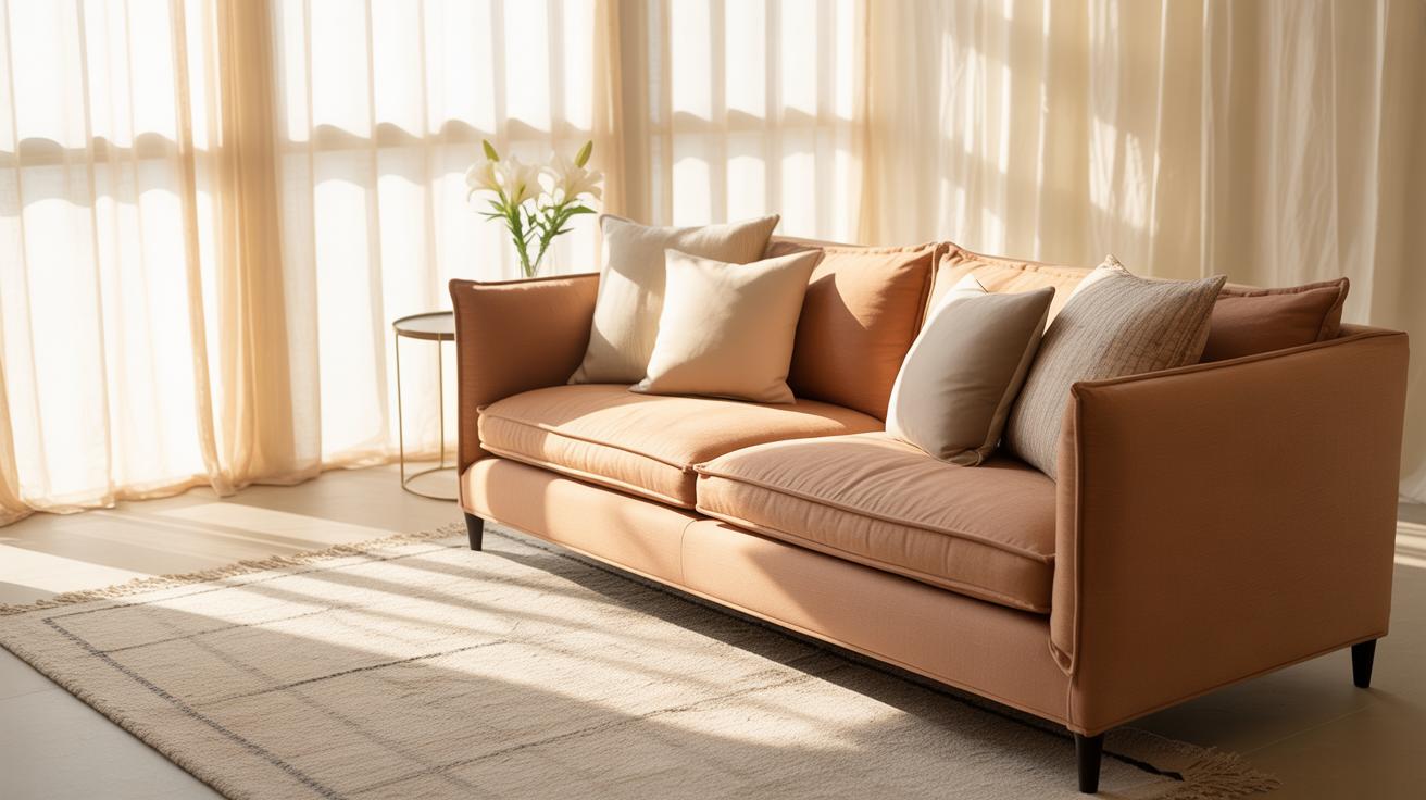
Brown for a Natural Look
Brown is underrated in fashion, perhaps because it’s so tied to earthiness and comfort. Wearing brown often means choosing pieces that feel grounded, a bit warm but never flashy. Think of soft knits or leather boots—it’s a color that invites touch, that reminds you of being outdoors or just cozy at home. And that’s what makes it appealing in everyday wear.
You don’t have to shy away from brown just because it’s neutral. Mix different tones—like tan, chocolate, or rust—to add some depth to your outfit without much effort. Brown feels approachable, but maybe a little reserved. It can also tone down flashier colors without dulling your style. If you want to feel natural and comfortable but still look put together, brown’s a solid choice. Personally, I find it’s easy to forget just how versatile it is until I experiment with layering different brown textures together.
Red and Brown in Graphic Design and Branding
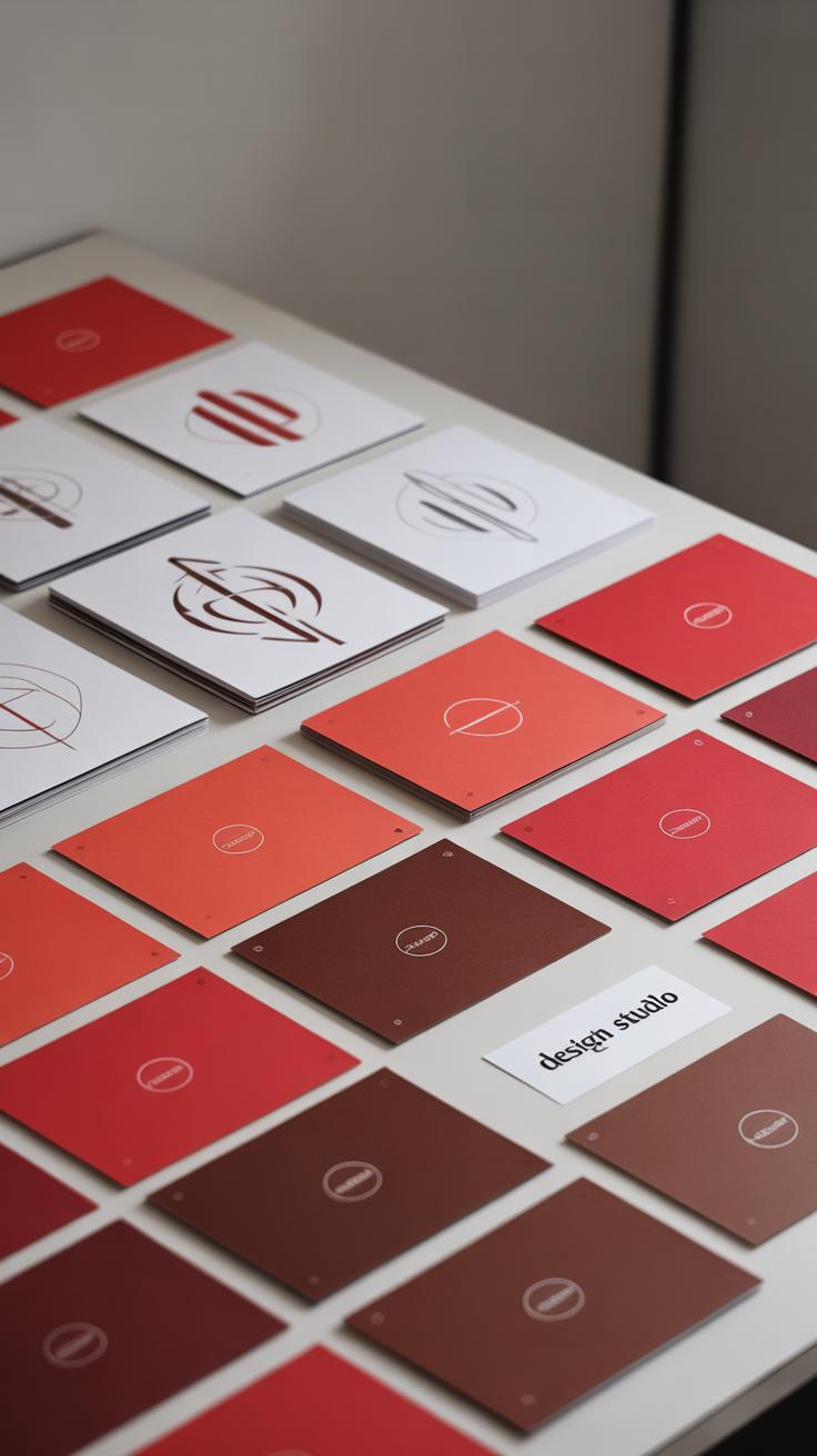
Red to Draw Attention
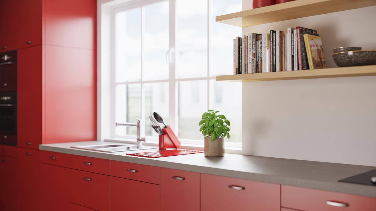
Red is a color that demands notice. When you see it, your eyes almost reflexively stop. This makes it a favorite for marketing and graphic design when grabbing quick attention is essential. It pops out from backgrounds, often signaling urgency or importance.
Think about sale signs or warning labels. Red makes you pause. But red does more than just shout—you can use it to create energy or passion in logos and ads. It stirs emotions and can push viewers to take action, which is why brands selling bold or lively products often lean on red.
Still, red’s intensity can overwhelm if used too much. It needs balance, maybe paired with neutrals or softer tones. You might try using red sparingly—like a splash that highlights key words or symbols rather than flooding the whole design.
Brown to Convey Reliability
Brown doesn’t jump out the way red does, but it quietly speaks volumes. It’s a color that suggests groundedness, seriousness, and trust. You see brown in logos for coffee shops, outdoor gear, and anything related to nature or craftsmanship. It feels solid, dependable.
Brown’s subtlety can work well when you want to appear authentic or down-to-earth. It’s less flashy, but that’s part of its charm—it says, “We’re here to stay.” It’s useful if your brand values tradition or wants to create a cozy, welcoming vibe.
On the flip side, brown can sometimes feel dull or outdated. It’s not the go-to for brands aiming to be sleek or ultra-modern, but it fits great when reliability is the message. Pairing it thoughtfully with lighter tones or textures can keep it from looking too heavy or old-fashioned.
Challenges When Combining Red and Brown
Pairing red and brown seems like a natural fit, but it often comes with unexpected challenges. One common issue is red overpowering brown, making the space feel unbalanced. Red’s intensity can quickly draw all the attention, leaving the brown tones to feel muted or even irrelevant. I’ve noticed rooms where a bold red wall makes the brown furniture seem dull or forgotten.
To avoid this, think carefully about the amount and shade of red you use. You might want to:
- Use red in smaller accents rather than large surfaces.
- Choose a deeper, earthier red that complements rather than competes with brown.
- Balance reds with plenty of natural light or lighter neutral tones to soften its impact.
On the flip side, there’s the risk of the combination feeling flat or dull. Brown, when paired with the wrong shade of red, can drag the whole palette down. The trick is to keep an element of contrast and brightness in the mix.
Try mixing in fabrics or textures that add warmth without heaviness. A reddish-orange throw or a brown leather chair can shift the vibe from dull to cozy and vibrant. You don’t want the room to feel one-note or overly safe. Don’t be afraid to experiment a bit—even if it doesn’t work perfectly at first, you’ll find little ways to inject energy into the mix.
So, the big question is: how do you find the right balance? It’s part intuition, part trial, but watching how the colors interact throughout the day helps. Sometimes, subtle changes—like switching a red pillow for a more muted shade—make all the difference.
Tips for Choosing the Right Shades of Red and Brown
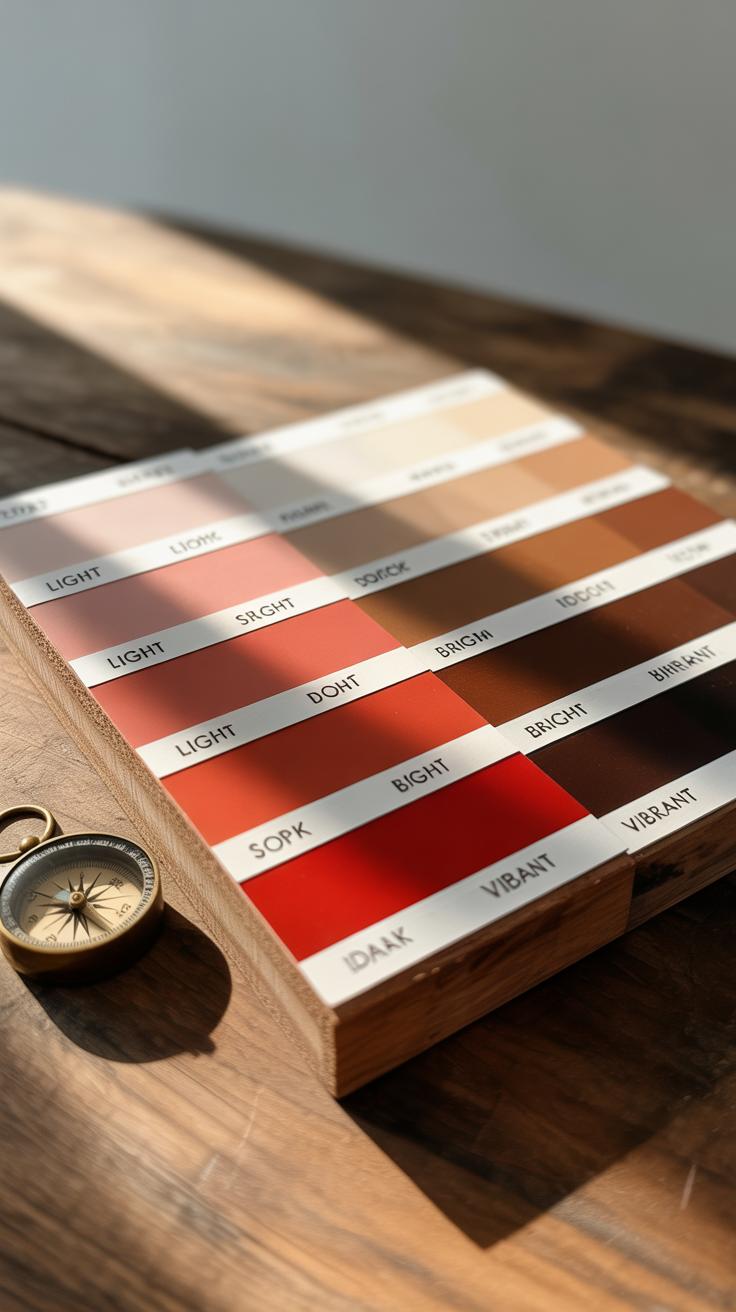
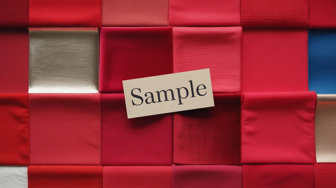
Choosing Reds for Your Needs
Picking the right shade of red can feel tricky because red carries a lot of emotional weight. Think about what you want your space to say. Do you want energy and passion? Then a bright, cherry red might work. But if you want something calmer, maybe go for a deeper, wine-inspired red. It’s interesting how the same color family can create such different moods.
Also, consider how much natural light your room gets. Reds can look intense in direct sunlight but cozier under soft lighting. If you’re decorating a lively area like a kitchen or dining room, reds with a touch of orange push warmth forward. For spaces meant to relax—bedrooms or reading nooks—reds with brown undertones soften the effect, making them feel more grounding.
So, do you want to energize or soothe? Or maybe a mix of both. Reds can be bold or subtle, but the key is matching them to how you spend time in the space, not just what looks good on the swatch.
Selecting Browns for Harmony
When it comes to browns, there’s a lot more variety than people think. Some browns lean pink, others almost golden, and some feel almost gray. Your choice can shape how your reds behave—either making them pop or fade into the background.
For example, rich chocolate browns balance well with vibrant reds, giving a grounded, cozy vibe. But lighter, caramel browns can soften sharp reds, creating a more casual and inviting atmosphere. If your red is more muted or rusty, a warm reddish brown can tie the palette together nicely, blending colors without harsh contrast.
Also, think about the room’s purpose again. Darker browns might feel heavy in small spaces with little light, while softer browns add warmth without weighing things down. Sometimes, mixing a few shades of brown with your reds creates layers that feel natural, almost like being outdoors.
Does your space scream for comfort or style? Your brown choices can tip the scale in subtle ways that you might not notice at first but will definitely feel in the long run.
Conclusions
Red and brown colors each carry unique qualities that make them feel connected to nature. Red can bring energy and passion, while brown adds stability and comfort. Together, they create a perfect blend for earthy color themes that feel inviting and warm.
By understanding these colors and how to balance them, you can use red and brown to enhance your surroundings thoughtfully. Whether in design, fashion, or art, these colors can ground your style and create a natural, welcoming vibe wherever you apply them.