Introduction
Red is a powerful color often linked to energy and passion. Many people think it might be too strong for a calm home. However, with the right approach, red can create a warm, peaceful space that feels inviting and balanced. This article explores how you can use red in interior design to make your home both calm and full of life.
You’ll learn simple ideas to bring red into your rooms without overwhelming them. From choosing the right shades to pairing red with other colors and materials, this guide shows practical ways to use red for a cozy, calm home. Let’s explore how red can bring warmth and peace to your living spaces.
Understanding the Impact of Red in Interior Design
Red is a color that rarely goes unnoticed. It grabs attention, sparks emotion, and shapes the atmosphere in profound ways. Psychologically, red tends to increase heart rate and breathing, which can make a space feel more alive—or maybe even a bit tense if overused. Some people feel energized and motivated by red, while others might find it overwhelming or agitating in certain settings.
Red’s influence isn’t straightforward—it can awaken passion or stir anxiety, depending on context and intensity. In home interiors, this means red can be both inviting and a little too stimulating if not carefully balanced. I’ve noticed that when red dominates a room, emotions rise easily, which can be great or distracting. What exact mood you get from red often depends on personal associations and how the color interacts with lighting and surrounding hues.
Red as a Color that Stimulates and Warms
There’s a warmth to red that’s hard to match. It’s the color of fire, blood, and ripe fruit—things that suggest energy and life. In interiors, red can literally make a room feel warmer, which is helpful in cooler climates or shadowed spaces. On a psychological level, red excites the senses, creating a vibe that feels immediate and intense.
Because red stimulates, it’s often used to make spaces feel more dynamic or lively—like dining rooms where conversations flow, or living rooms where social energy builds. You might notice your pulse quickens slightly when surrounded by red, or your focus sharpens. This stimulating effect can be a boon if you’re seeking space to feel active and engaged, but it might be tiring if you want to settle down.
Finding the Balance Between Energy and Calm
Striking a balance with red means combining its vigor with elements that soothe. Pairing red with neutrals—soft grays, warm beiges, or muted whites—can ground its intensity. Or, you can introduce textures and materials that absorb some energy, like plush fabrics or matte finishes, to soften the impact.
Sometimes, just a small dose of red—through accents like cushions, rugs, or art—can inject warmth without drowning the room in stimulation. But the question is, what’s your threshold? How much energy do you want your space to deliver versus how much calm you need? Balancing red feels a bit like tuning a dial: too little and it’s underwhelming; too much and it’s restless. It’s tricky, but when done with care, red creates a home that’s both alive and peaceful.
Choosing the Right Shade of Red for Your Space
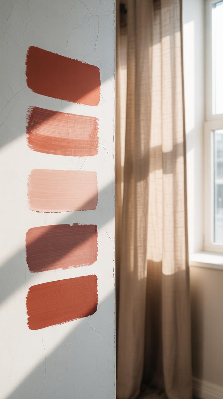
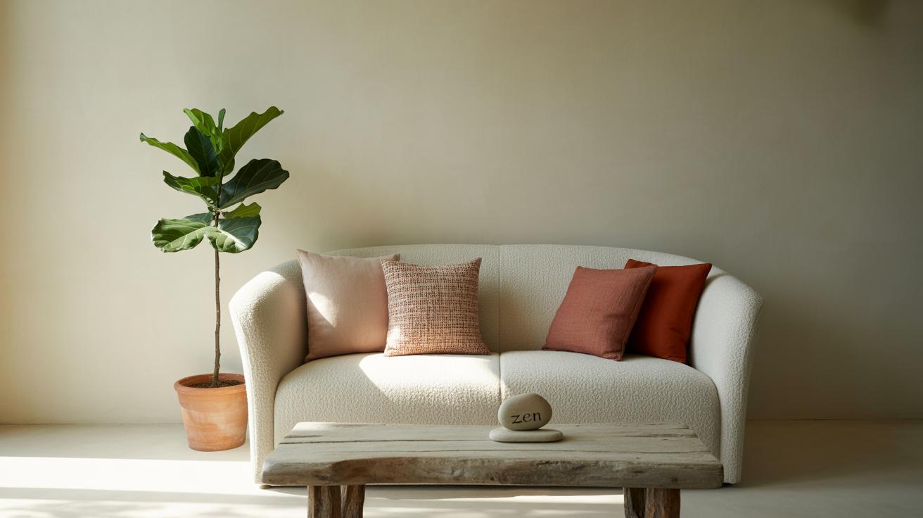
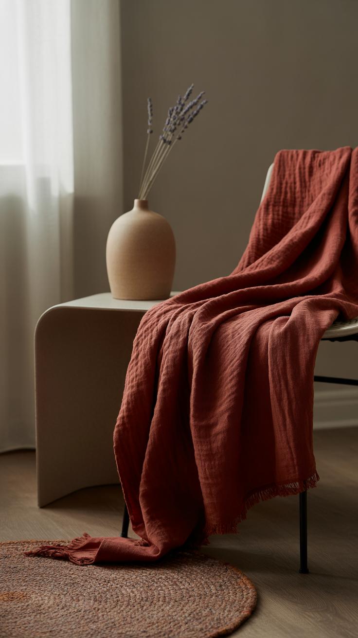
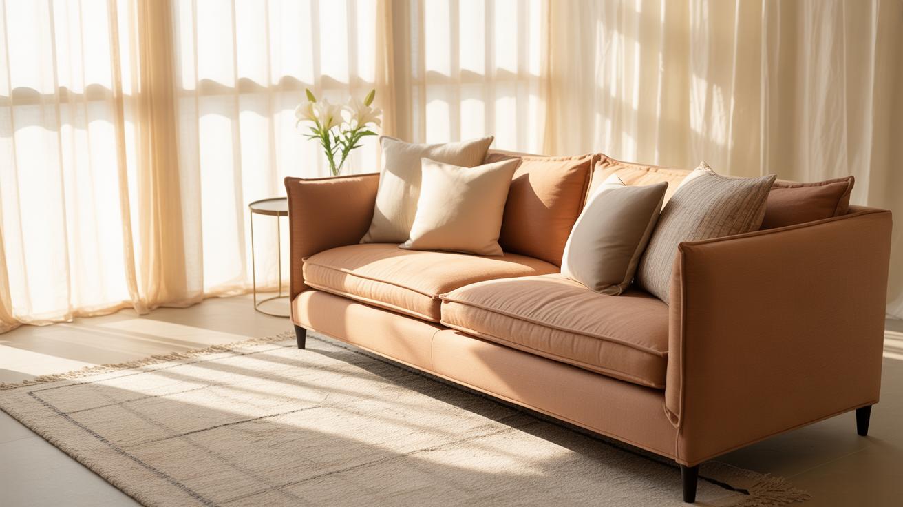
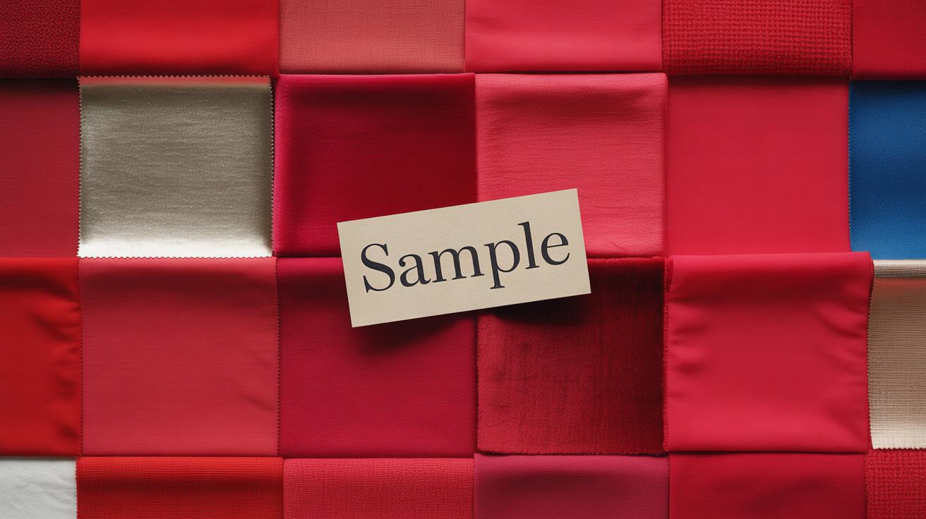
When it comes to red, not all shades create the same feeling—and that’s quite important if you want your home to feel calm rather than restless. Soft reds and muted earthy tones often work better for a relaxed atmosphere. Think of a dusty rose, a gentle terracotta, or a warm brick red. These colors don’t shout for attention but rather invite you to settle in, almost like a quiet hug. They make spaces feel cozy, grounding, and… well, less overwhelming than their bolder cousins.
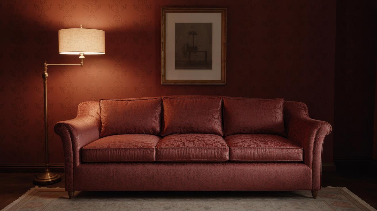
On the flip side, very bright reds or deep, dark reds have a strong energy. Bright reds—like cherry or fire engine—can make a room feel more intense, even restless after a while. They demand focus, and that’s sometimes the opposite of calm. Dark reds, like burgundy or oxblood, can feel heavy or brooding, which might add a weight to a space you don’t want if you’re aiming for peace. So, it’s really about balance: choose reds that whisper rather than yell.
When selecting, trust your instinct a little. Sample swatches in your own light. Sometimes a soft red looks quite vibrant under midday sun or artificial lighting. And remember, what feels calm to one person might feel dull to another. Red’s power is subtle but undeniable—it works best when matched carefully to the mood you want.
Pairing Red with Complementary Colors
Red can feel intense, but when paired thoughtfully, it actually calms a space rather than overwhelms. The trick is finding colors that work with red’s energy without competing with it.
Neutrals that Soften Red’s Intensity
Neutrals are a natural way to ease red’s boldness. Think of white, beige, or soft gray walls and furniture—these tones act as a quiet background. They prevent red from taking over the room, making it feel balanced, not chaotic.
For example, a deep red accent chair against pale gray walls keeps the eye engaged without fatigue. You might also try beige rugs or cream-colored curtains; they subtly mute red’s fire while maintaining warmth. When I tested this once, the room felt calmer than expected—even though red was pretty dominant.
Cool Colors to Create Contrast and Calm
Strangely enough, pairing red with cool blues or greens introduces a surprising calmness. Blue and green naturally have soothing qualities, so they can temper red’s heat. Imagine a muted blue sofa in a room with terracotta red cushions. It almost feels like the red fades into the coolness instead of clashing.
Green plants against a red backdrop bring life and freshness. Although red and green often remind us of holidays, using soft, muted greens avoids that association and just adds a restful contrast. I found that combining these colors made the space feel clearer, almost like it settled into itself more deeply.
Mixing red with neutrals or cool tones isn’t about hiding red but about crafting a place where its energy is controlled. Could your walls be a gentle gray to let red accents sparkle with ease? Or might a splash of blue cool down a red corner? The possibilities feel quietly endless once you start experimenting.
Incorporating Red Through Different Materials and Textures
Using Soft Fabrics in Red
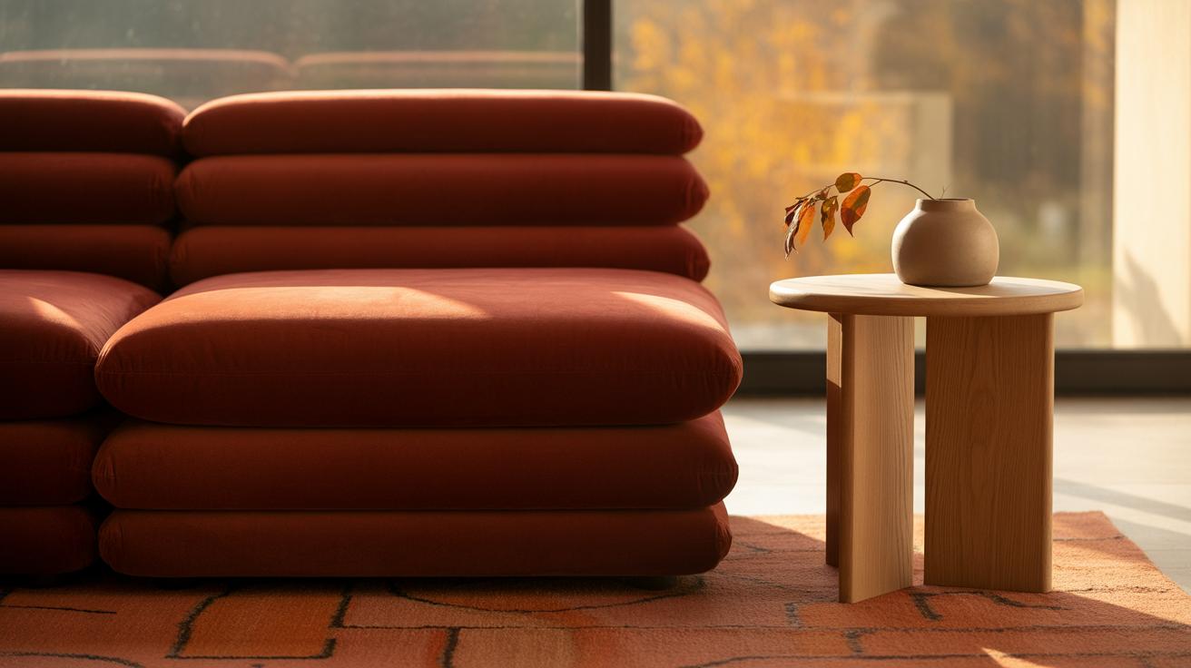
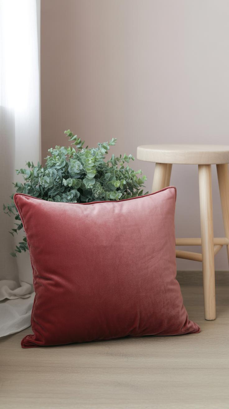
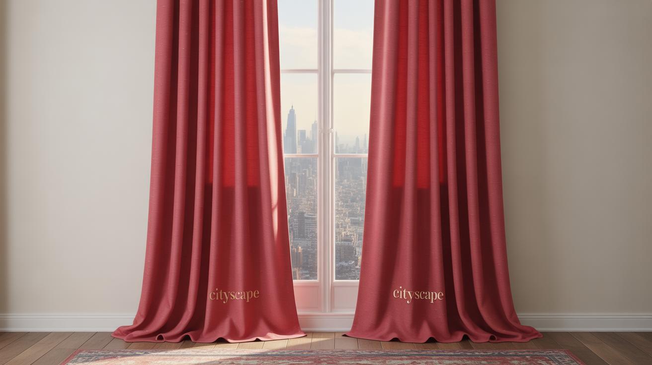
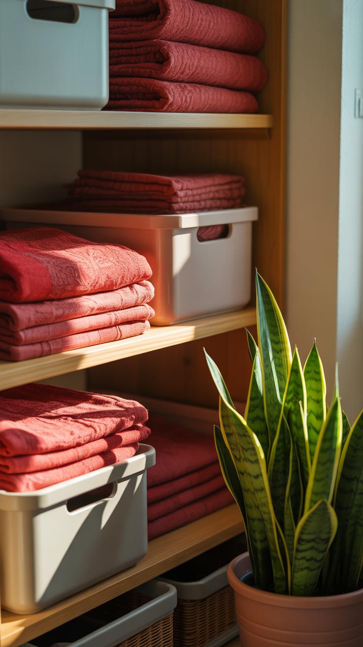
Red in soft fabrics like cushions, rugs, and curtains can create a surprisingly calming effect. When you think of red, you might imagine something loud or bold, but in plush textures, it becomes more muted, even comforting. A velvet red cushion can invite you to sit back, while a soft wool rug in a deep red shade adds warmth underfoot without shouting for attention. Curtains in a subtle red tone filter natural light in a way that feels cozy but not oppressive.
Maybe it feels a bit counterintuitive to associate red fabrics with calmness, but these elements absorb sound and soften the room’s atmosphere, which can actually reduce stimulation. I’ve found that layering different red fabrics—like a cotton throw with linen pillows—helps balance the warmth and keeps the space from feeling one-dimensional. Have you noticed how fabric texture can change how a color feels? It’s quite something.
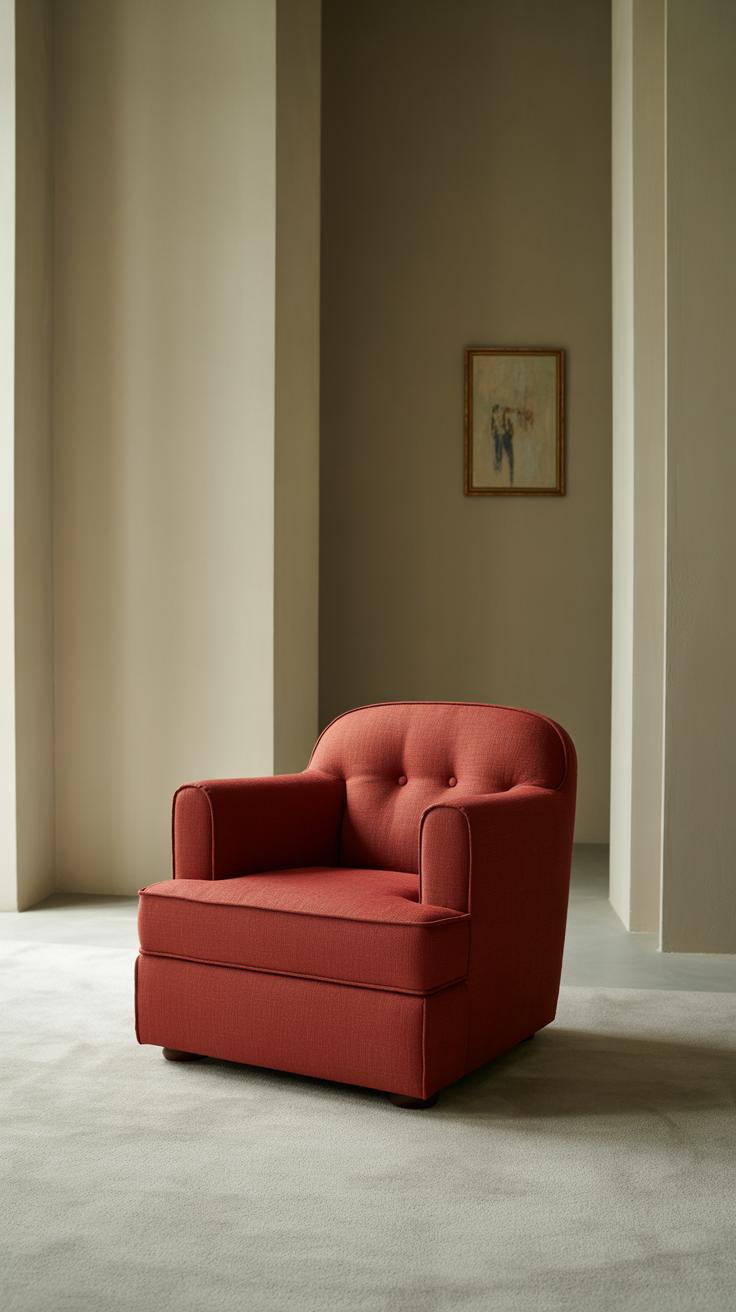
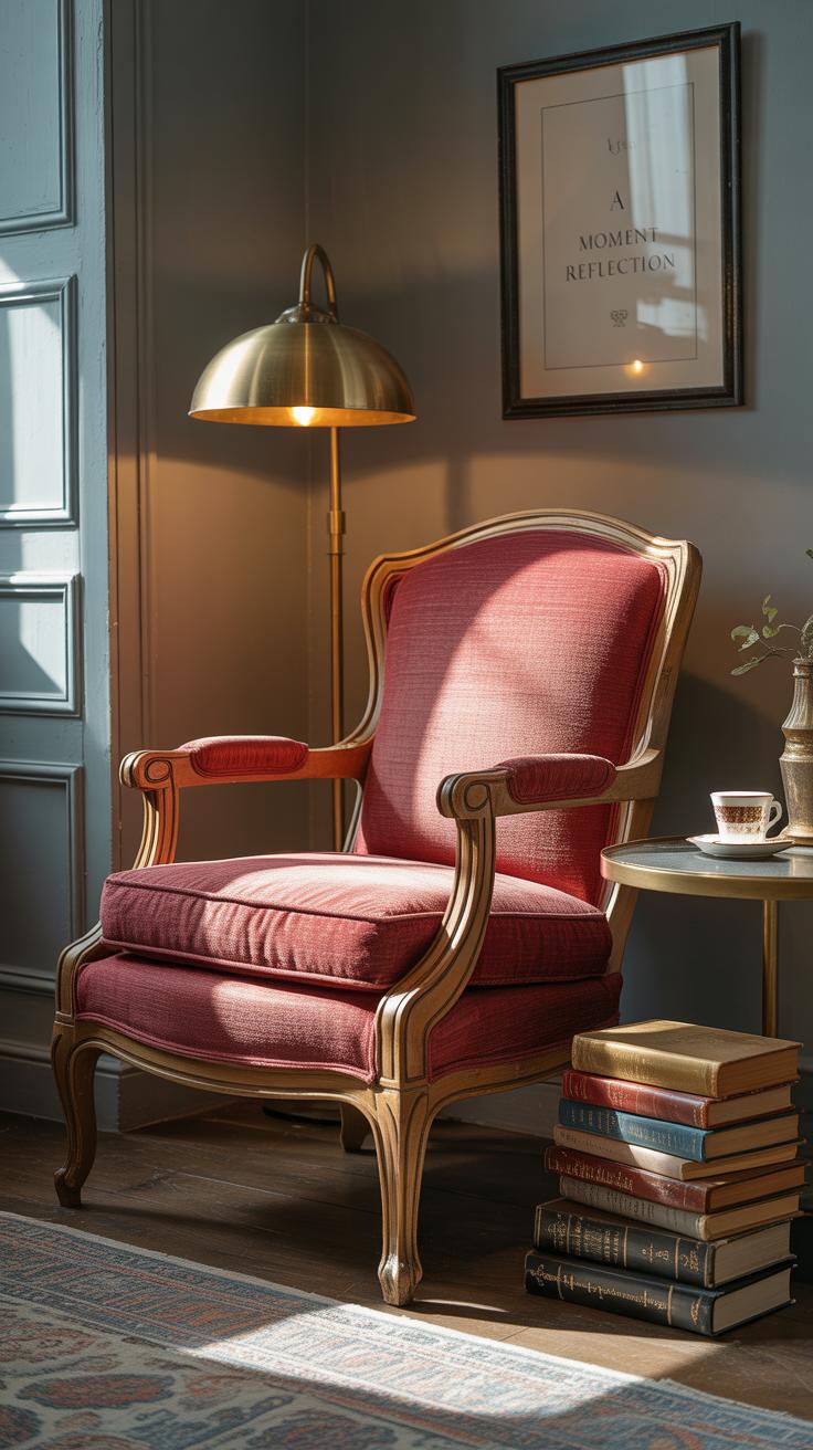
Red Accents in Furniture and Decor
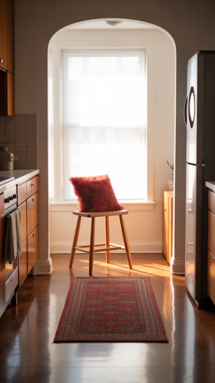
Small furniture pieces or accessories in red can energize a room without taking over. Think about a red side table tucked beside a neutral sofa, or a bright red lamp that pops but doesn’t dominate the view. These accents act like little sparks, adding personality and interest.
Even a red vase, a few books with red covers, or a modest red chair tucked away in a corner can influence the vibe. It’s about restraint. You don’t want an entire red couch—unless you’re brave—but a red ottoman or a cluster of red frames can feel lively yet controlled. It’s interesting how these smaller touches can keep the room feeling balanced yet full of life.
If used thoughtfully, red in furniture and decor doesn’t scream for attention but invites a second look. Does that subtle tension between calm and energy make the room more personal? I think it does. It’s that little bit of unexpected—and maybe a bit challenging—that makes a space feel truly yours.
Lighting Effects on Red Interiors
Natural Light and Red Tones
Natural daylight changes red in ways you might not expect. Morning light, softer with a bluish cast, often cools red, making it seem calmer, almost muted. But as the day passes and sunlight warms, red can take on a richer, more intense glow. It’s surprising how the same red wall looks different at 9 a.m. than at 3 p.m.
Rooms with large windows let red breathe, revealing subtle undertones that artificial lights might hide. When I first painted a small reading nook red, I noticed it felt deep and inviting under natural light, almost like it welcomed quiet moments. Still, too much direct sunlight can make red feel overpowering or even harsh, depending on the shade. That balance is tricky—you want red to feel alive, not aggressive.
Artificial Lighting to Soften Red
Artificial light shapes how red registers in a space, too. Warm bulbs—think soft yellows or ambers—can soften sharp reds, turning them more cozy, less startling. I once switched out harsh white LEDs for warmer bulbs in a red dining room. The change was subtle but calming; the red no longer shouted but whispered.
Soft lighting offers a way to control red’s energy. Use dimmers or lamps with fabric shades to diffuse light gently. You might wonder if cooler artificial light has a place with red. It does, but it tends to sharpen reds, sometimes making them feel restless or tense. If calm is your goal, warm, gentle light works best.
Lighting decisions affect red’s mood—sometimes dramatically. So ask: how do you want red to greet you each day? Bold and vibrant, or quiet and soothing?
Creating Focal Points with Red
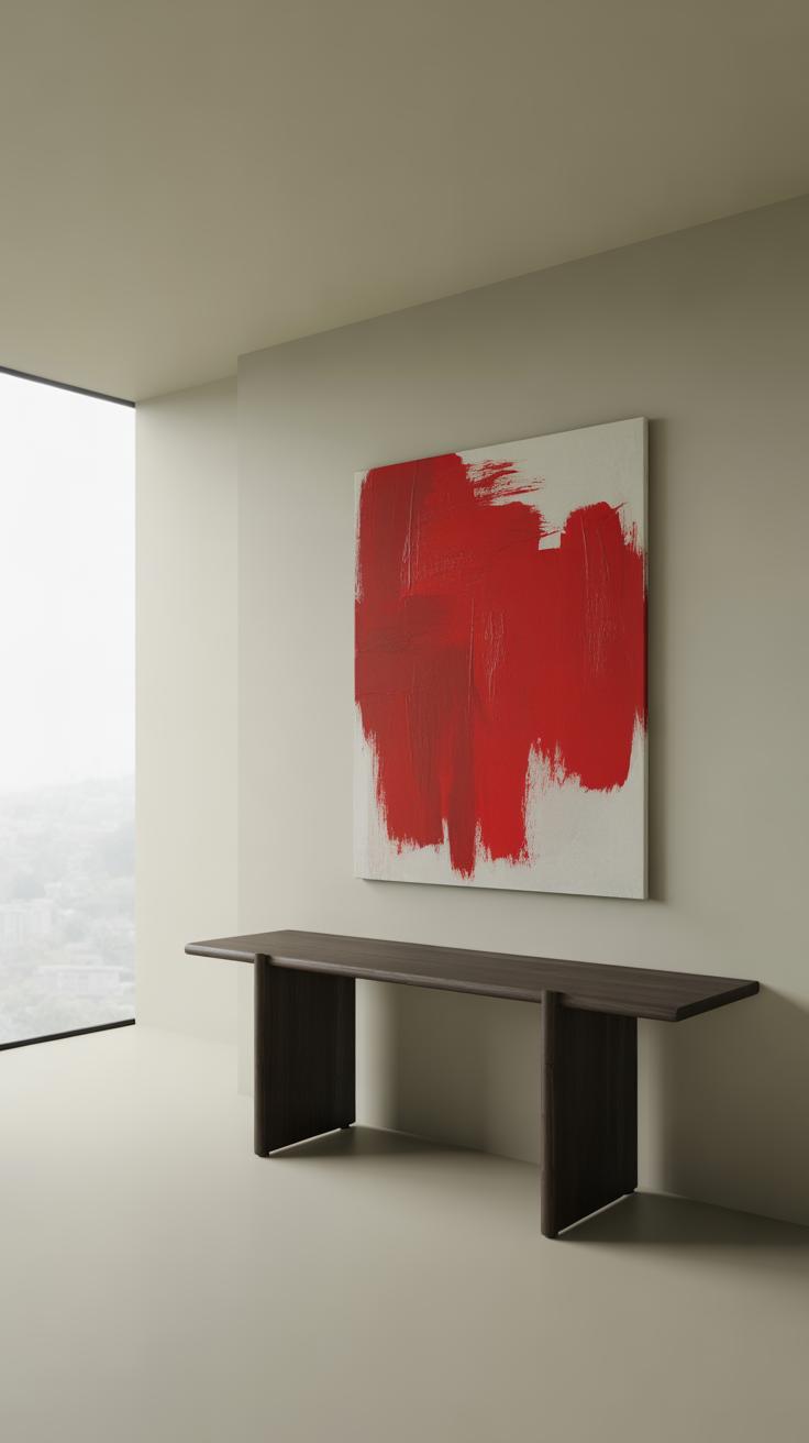
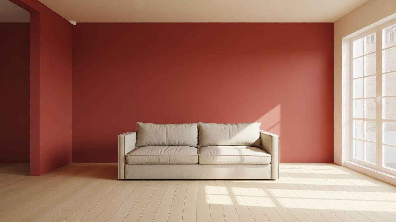
Red Walls as a Statement Feature
Using a single red wall in a room can quietly command attention without overwhelming the space. This approach anchors the room visually, guiding the eye in a subtle yet purposeful way. Choosing a deep or muted red tone helps keep the atmosphere calm rather than overly stimulating, which might surprise some who assume red is always intense.
Think about a living room where a red accent wall sits behind a simple sofa. The rest of the walls stay neutral, allowing the red to whisper rather than shout. This bold yet restrained choice can make your room feel grounded. Plus, it gives you a clear focal point to arrange furniture or art around—something that doesn’t often happen naturally with other colors.
Does that red wall become too dominant? It might, if the tone is too bright or if paired with competing colors. But if chosen with care, it can bring a relaxing energy, inviting you to linger without feeling too intense. So, maybe a red wall can be both calming and striking—just depends on the shades and context.
Red Accessories as Eye-Catching Details
Small bursts of red scattered through accessories can draw attention in a gentle way. A red vase on a neutral shelf, a lamp with a subtle red shade, or artwork featuring touches of red all work to catch your eye without demanding it all the time. These details feel intentional, like little surprises that break up monotony.
Red accessories have the power to reset the room’s visual rhythm. Imagine walking into a space where your gaze keeps returning to tiny red elements—it adds interest and layers. Yet, because they’re small, they don’t flood the senses or create tension.
Of course, you might wonder if too many red accents dilute their effect. Yes, if you pile them on without a plan, they lose impact. But a few well-placed pieces can pull a room together and make it feel both balanced and inviting. Maybe you don’t need more than a handful scattered throughout to achieve that quiet magnetism red can offer.
Red in Different Rooms of the Home
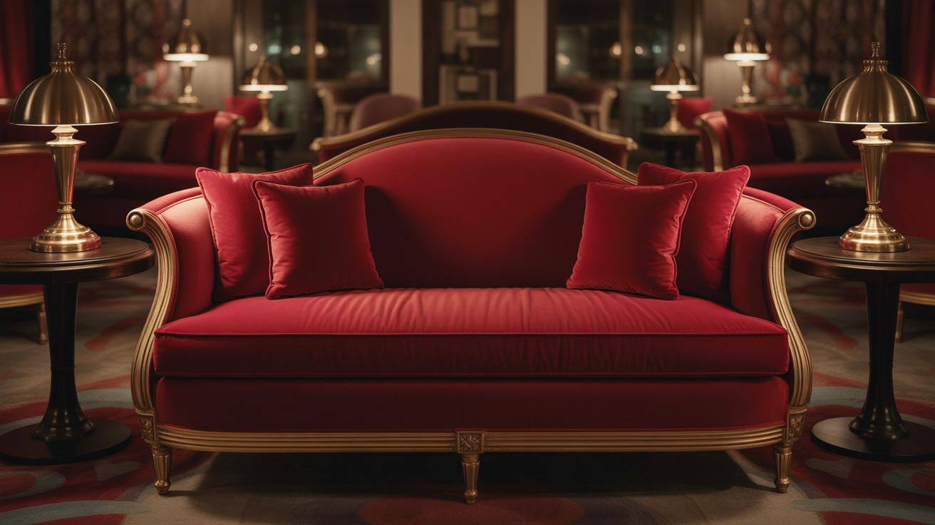
Applying red in your home calls for a bit of finesse—red isn’t an easy color to live with all day, so adapting it to each room’s function really matters. For social spaces like living and dining rooms, red can build a warm, inviting atmosphere. Think about rich, deeper reds on an accent wall or in textiles like cushions and rugs. These touches invite conversation without overwhelming. Using red alongside natural wood tones or neutral colors can soften its intensity just enough. You might want to try mixing reds with warmer neutrals—beiges, tans, or even soft greys—to keep things grounded.
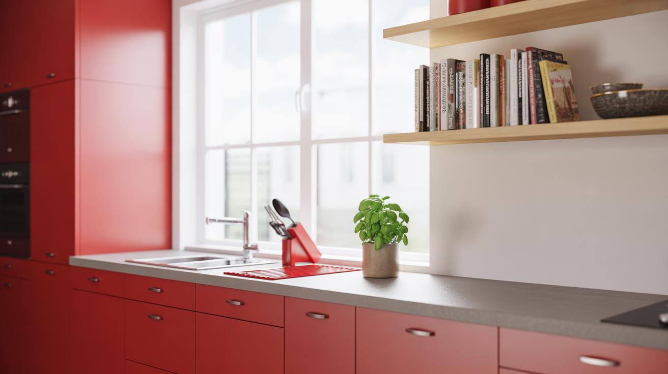
In kitchens, red often sparks energy and appetite, but it should be restrained to avoid visual clutter. Small bursts of red in accessories, like cookware or backsplash tiles, can feel lively without being jarring. If you really like red, maybe balance it with plenty of white or stainless steel surfaces to promote an open, clean feel.
When it’s about bedrooms or any quiet corners, softer reds work better. Dusty rose or muted brick shades blend nicely with soft whites or calming blues. These combinations calm the mind rather than stimulate it. You could paint a single wall or choose red through bedding and curtains, not full walls. Sometimes, it’s better to think about red’s cousin colors to hint at warmth without a too intense presence. The goal is whisper-red, not shout-red here. Finding the balance can be tricky but rewarding.
Bathrooms give you a chance to experiment in smaller doses—red towels, candles, or a small rug can uplift without stealing the peace you need. Pairing with pale stone tones or light greys often keeps red feeling fresh, rather than overpowering.
Curious how a splash of red changes your mood in these rooms? It’s worth trying and adjusting as you see how the colors settle over time. Red is potent but surprisingly adaptable when approached with care.
Maintaining a Calm Home with Red Over Time
Red is a bold choice, but keeping it calm as time passes can feel tricky. Your personal taste might shift, or the red that once felt warm could start to feel overwhelming. To stay comfortable with red, try focusing on balance rather than intensity. If your walls are saturated with deep red, consider softening the look with lighter textiles or natural wood accents. Small changes can refresh without starting over.
Updating Red Decor Without Major Changes
Sometimes, a quick swap can breathe new life into your red interiors. Think about adding or switching out pillows, throws, or curtains in different textures or red shades—maybe a rusty brick this season, a coral tint the next. Artwork featuring subtle reds can also shift the mood easily. Rugs, lampshades, or even red ceramics often go unnoticed but make a difference.
If repainting isn’t an option, layering with neutrals like beige, cream, or soft gray lets red stand out without screaming. And if you really want a change but without hassle, try adhesive wallpaper borders or peel-and-stick tiles that include red accents.
Adapting Red for Seasonal Changes
Red is quite versatile through the year, but the way you use it can change the feel a lot. During winter, richer, darker reds add warmth and coziness. In spring or summer, brighter reds mixed with white or pale pinks give a fresher, lighter atmosphere. Switching red accessories seasonally works well: a vibrant red vase in summer, a deeper red throw in autumn.
Oddly enough, sometimes less red works best as the seasons shift. You might think more red always means more warmth, but a quick change to softer tones or cutting back on red pieces can keep your space inviting without feeling too intense year-round. You might find yourself drawn to different reds depending on your mood, too. That’s okay. It’s all part of keeping your home calm and comfortable while still vibrant in its own way.
Conclusions
Red can be a wonderful addition to a calm home when used thoughtfully. It adds warmth and energy while creating a cozy atmosphere. Remember that the right shade and balance with other colors are key for making red feel relaxing instead of overpowering.
By using soft reds, matching with neutral tones, and choosing the right textures, you can enjoy a living space that feels peaceful and inviting. Try these ideas to see how red can change your home into a calm retreat that you enjoy every day.