Introduction
Red can make a big impact in your living room. It adds warmth, energy, and a sense of style that few other colors can match. If you want your living room to stand out, red living room decor ideas are worth considering. From bold walls to subtle accents, there are many ways to bring red into your space and make it your own.
In this article, you will find practical tips and inspiration for using red in your living room. We will cover how to choose the right shades, mix red with other colors, and pick accessories that highlight red’s appeal. Each chapter focuses on simple but effective ways to refresh your living room decor with red now.
Choosing the Right Shade of Red for Your Living Room
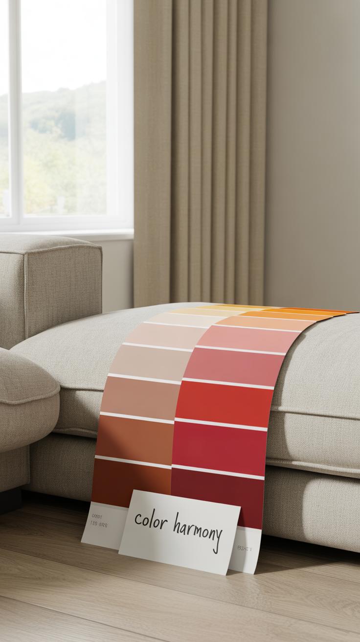
Picking the right red can feel like a tricky task. There’s more to it than just liking red. You need to think about the size of your room. Smaller spaces might feel overwhelmed by bright reds like scarlet or crimson, while larger rooms can handle them better. If your living area has plenty of natural light, bold reds bring energy without making it too heavy. But in dimly lit spaces, those same shades can feel suffocating.
Now, darker reds like burgundy often create a cozy, intimate vibe. They’re less intense but still deep and rich. So, if you prefer a calm atmosphere yet want that red punch, burgundy could work well. Crimson has a blue undertone — it’s vivid but slightly cooler. Scarlet, on the other hand, is warmer and almost fiery.
Don’t forget your personal preference. Some people love reds that demand attention, others want something more subtle. It helps to test paint swatches or look at fabric samples near your furniture and lighting before deciding. Sometimes what looks perfect online can feel completely different in your room.
Light vs Dark Reds and Their Effects
Light reds—think coral or cherry—bring brightness and liveliness. They can make a room feel cheerful, open, even youthful. But too much light red can feel a bit overwhelming or insubstantial, like it’s trying too hard. Dark reds, like mahogany or burgundy, add warmth and depth. They tend to slow the pace of a room, making it feel more grounded, sometimes a little moody or formal.
Which mood suits you more? A light red might be perfect if you want vibrancy and energy for entertaining. But if you crave a relaxing living space, darker reds might offer a comforting retreat. Still, there’s no strict rule here—it really comes down to how you respond to color emotionally.
Red Shades to Match Room Elements
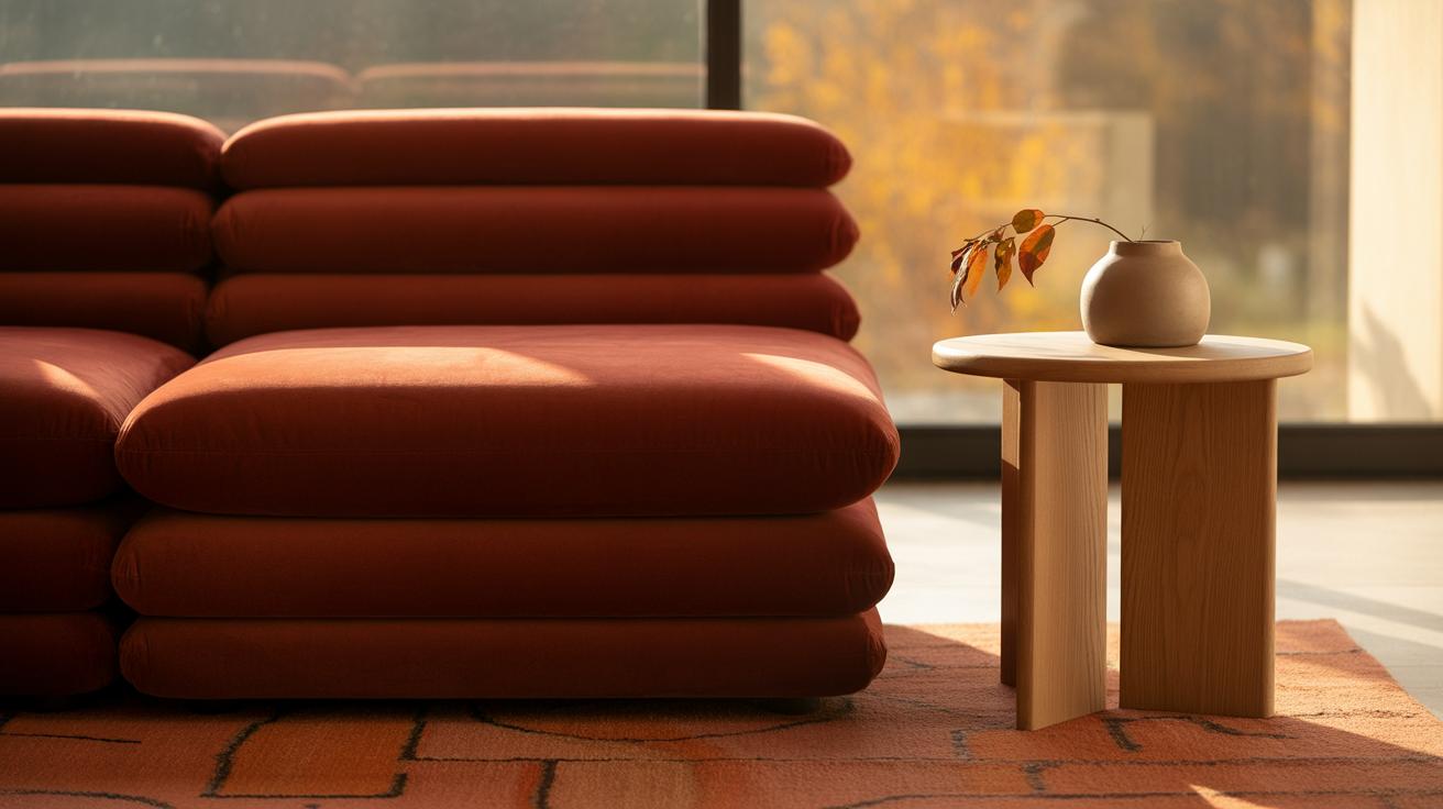
Matching red to room features requires a bit of balance. For wooden floors or furniture with warm undertones, reds with orange hints, like scarlet, harmonize well. Cooler reds, like crimson, pair nicely with greys or blues found in contemporary furniture. If you have neutral walls, almost any red can pop—but avoid clashing red shades with rugs or curtains; they should share a similar warmth or coolness.
Think about texture too. Plush fabrics in deep reds like burgundy complement classic leather sofas beautifully. On the flip side, bright reds can feel out of place with rustic or natural materials.
It’s a subtle dance. Sometimes a red throw pillow or an accent chair in just the right shade pulls the whole room together. You might surprise yourself by how much a small red detail shifts the whole vibe.
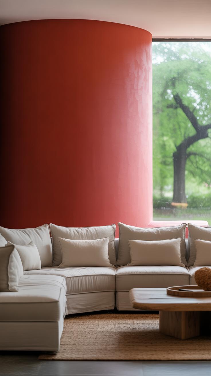
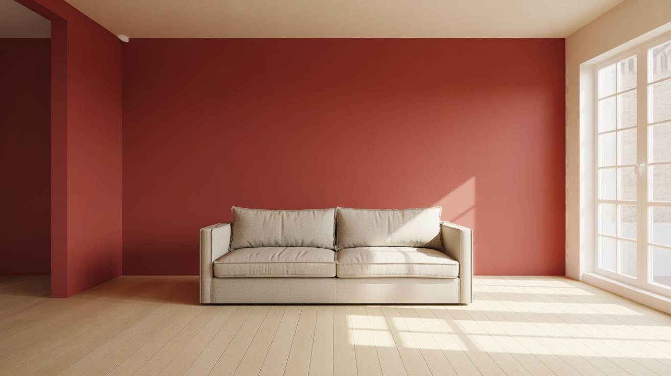
Using Red Walls to Make a Bold Statement
Choosing the Right Wall for Red Paint
Picking the wall to paint red can make or break the whole vibe of your living room. Usually, the best choice is a single accent wall—something that draws the eye but doesn’t overwhelm the space. A common pick is the wall behind a focal point, like a fireplace or a large piece of art. That way, the red highlights what you want people to notice first, without turning the whole room into a red cave.
But sometimes, painting two adjacent walls can work, especially in bigger rooms. Just be mindful that more red means a stronger, more intense atmosphere. Too much red might feel a bit… claustrophobic or tiring over time. If you’re unsure, try testing patches on different walls at different times of day. Lighting changes how red appears—a red wall near a sunny window can look less heavy, while one in a darker corner might feel deeper and moodier.
Preparing and Painting Red Walls
Getting that red wall right needs careful prep and technique. Red paint is tricky. It’s one of those colors that can end up blotchy or uneven if you rush. Start by cleaning your walls thoroughly—dust and grease can stop paint from sticking evenly. Then fill in any cracks or holes; red doesn’t forgive imperfections well, and they become noticeable once the paint dries.
Priming is key. Use a high-quality primer or one tinted close to your red shade. This helps the color pop and reduces the number of coats you’ll need. Use painter’s tape to mark edges cleanly; red paint can stain if it bleeds over to ceilings or trims.
For the actual painting, thin, even layers work best. Don’t try to cover everything in one thick coat; it’ll drip or patch up oddly. Rollers can make large areas easier, but a careful brush is better for corners and edges. Let between coats dry completely. Patience here pays off—your walls will look sharper and more professional when finished.
Final thought? Red walls get noticed and set a tone for the whole room. Make sure you’re ready to live with that intensity before you pick up the brush. But if you do, a well-painted red wall can transform your space like nothing else quite will.
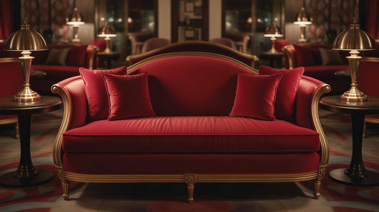
Adding Red Through Furniture and Upholstery
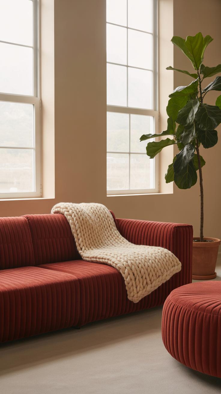
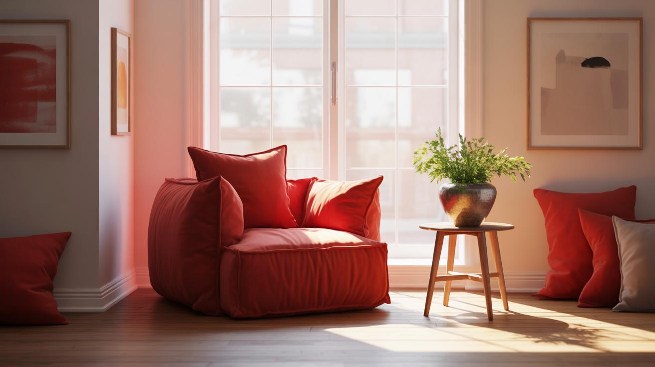
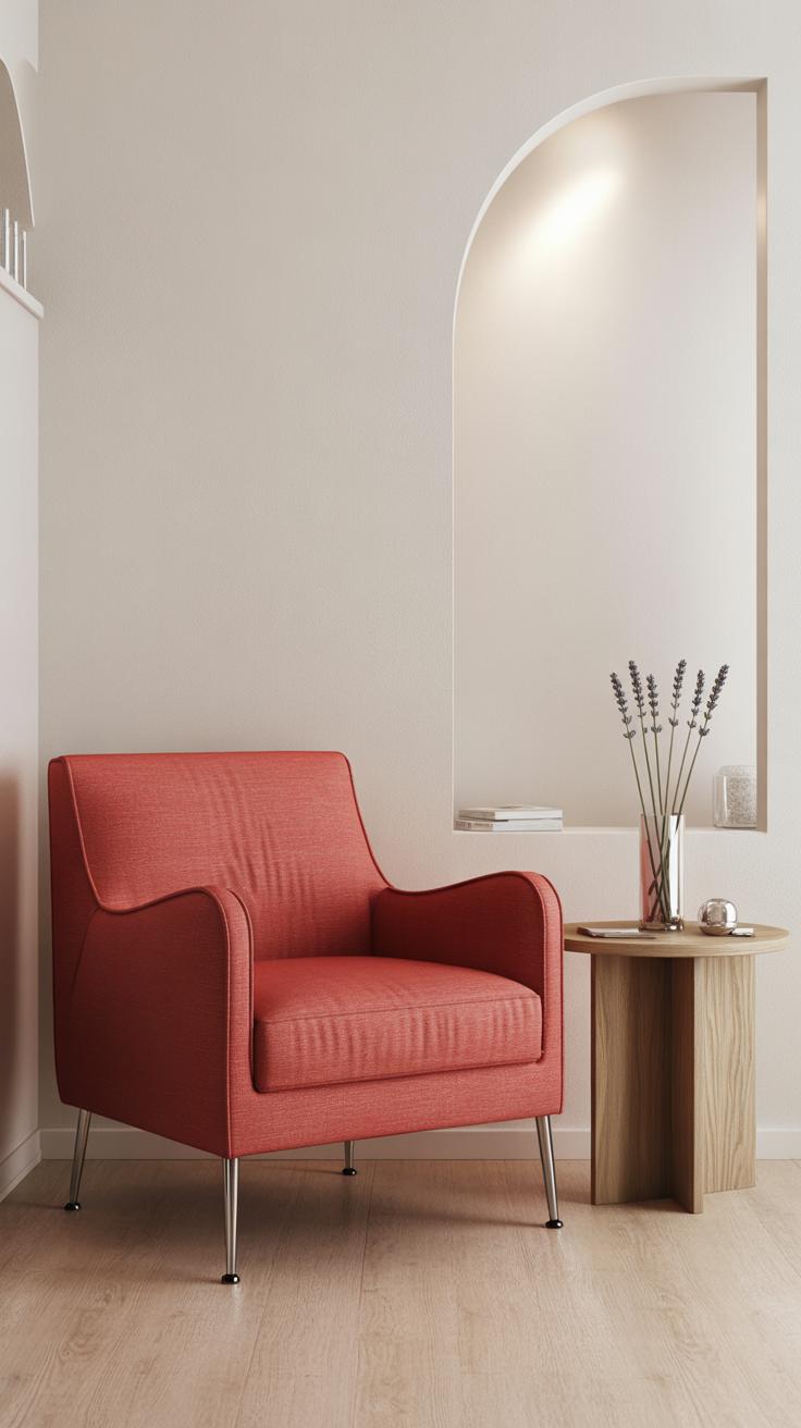
Introducing red in a living room with furniture pieces like sofas, chairs, or ottomans can quickly create a strong focal point. But it’s not just about grabbing the boldest red sofa you find. The right size and style matter a lot when choosing red furniture for your space. If your room is small, a massive red sectional might feel overpowering rather than cozy. On the other hand, a single red armchair can add just the right spark without crowding the room.
When selecting red furniture, think about how it blends with your existing style. A sleek, modern red chair might look out of place in a rustic setting. Conversely, a classic red velvet sofa can soften up a contemporary space if balanced carefully. Sometimes testing with pieces that come in different shades of red can help avoid the feeling that everything is screaming for attention.
Mixing patterned and solid red upholstery offers a lot of room for creativity. You could have a solid red ottoman paired with a chair draped in a patterned fabric featuring red accents. This breaks the monotony and lets the red tone breathe. It can also create unexpected harmony, especially if the patterns pull in complementary elements like soft grays or deep blues. And yes, don’t shy away from layering textures—like corduroy with silk—to keep your red pieces from feeling flat.
But you might wonder, how much red is too much? There’s no simple formula here. Sometimes less is more, but if you’re drawn to red furniture, trust your instincts and play with scale, pattern, and placement. I’ve noticed rooms with a bold red sofa balanced by neutral walls and wood tones often feel lively yet welcoming.
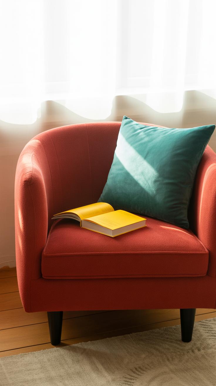
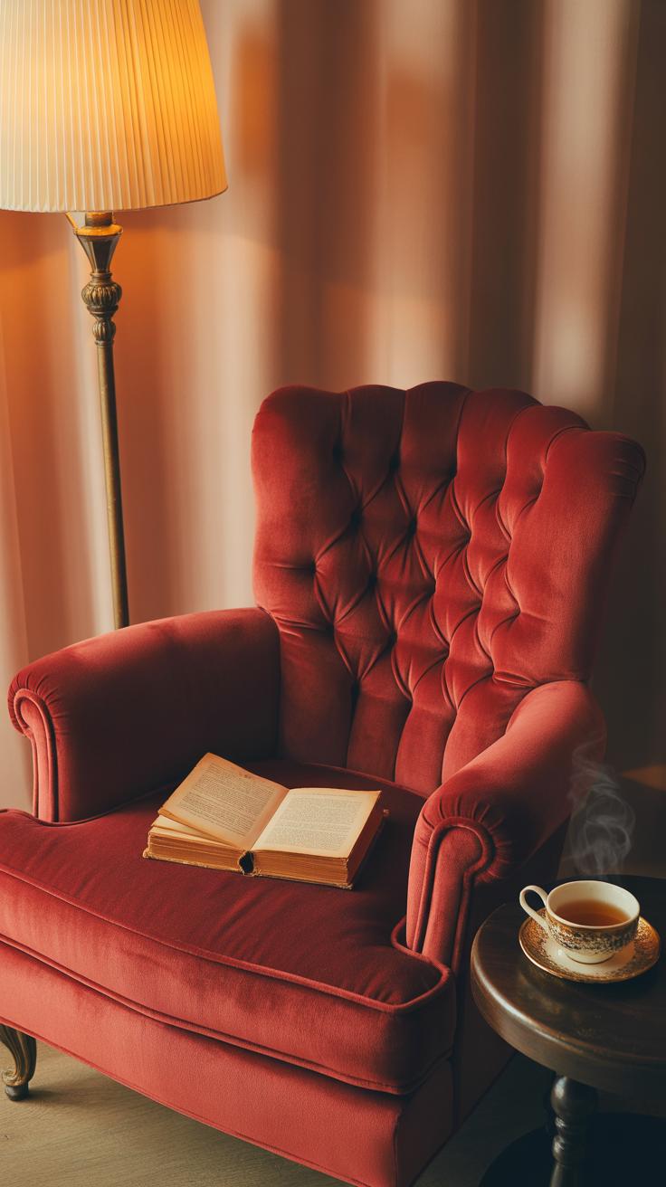
Using Red Accent Pieces for a Subtle Touch
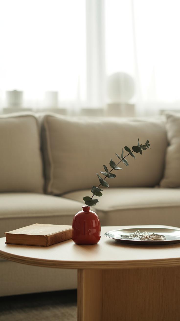
Red can be pretty bold, so if you’re not ready to commit to big pieces like sofas or armchairs, small accents are a smart route. Things like cushions, rugs, or vases offer a way to bring in that punch of red without overwhelming your living room. I remember trying red cushions for months before thinking about anything bigger—they make such a difference, especially against neutral backgrounds.
Picking the right accents means looking at the colors and style you already have. If your room features cool tones like blues or grays, a deeper or brick red works well; on the other hand, brighter, scarlet hues might suit warmer palettes. Also, consider texture—a silky red cushion feels different from a knitted one and can either stand out or blend in, depending on what you want.
When arranging red accents, scatter them thoughtfully rather than clustering. For example:
- Place a red vase on one side of the coffee table and a matching red cushion on the opposite sofa arm.
- Use a small red rug near a reading nook instead of one huge rug in the center if your space feels busy.
- Try not to crowd all red items in one spot; this keeps the look balanced and lets your eyes travel around the room.
There’s a subtle art here—too little and the red might go unnoticed; too much and it competes with other elements. Sometimes, your placements will depend on what feels right at the moment. Trust your instincts a bit. In the end, these hints of red offer a way to test the color before diving into something more permanent.
Mixing Red with Neutral Colors in Your Decor
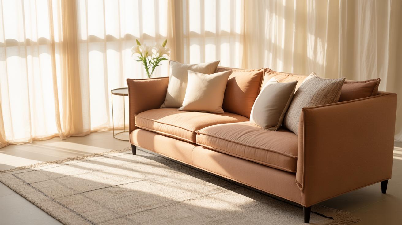
Red works surprisingly well when mixed with neutral tones like white, gray, and beige. These shades don’t compete with red; instead, they create a kind of calm backdrop that lets the red stand out without shouting. Think of a soft gray wall paired with a deep red sofa or a beige rug under a cluster of red cushions—this combination feels balanced, even if it’s a little bold.
Choosing the right neutrals can make a big difference. Cool grays tend to mute red slightly, giving the room a modern edge, while warmer beiges create a cozy feel that invites you to relax. White can make spaces feel airy but might risk making red look too harsh if overdone. You might find yourself playing around with subtle shades before hitting on the right mix.
Using red decor pieces in a neutral room adds a sense of energy and warmth. It stops the space from feeling flat or too predictable. A red lamp, throw, or art piece can inject personality without overwhelming the calm. This approach lets you experiment with red in a way that’s inviting rather than intense. Have you tried mixing red with neutrals before? Sometimes, that simple color switch is all you need to change a room’s mood.
Balancing Red with Other Bright Colors
When you think about mixing red with other bright colors, your mind might jump to a chaotic mess—but that doesn’t have to be the case. Pairing red with colors like cobalt blue, sunny yellow, or even emerald green can create a lively, friendly space that feels energetic without being overwhelming.
Which combos work well? Red and teal tend to balance each other nicely, while red and orange push the energy up a notch—sometimes maybe too much. Yellow adds warmth but can compete for attention if not used sparingly. It’s like a dance between tones. You want harmony, not a shouting match.
To keep from overloading the space, try these tips:
- Choose one dominant bright color—usually red—and use the other hues as accents.
- Space out the colors so they don’t cluster in one area, breaking up the visual impact.
- Incorporate patterns that mix the colors rather than solid blocks that fight for focus.
Sometimes, it helps to step back and ask yourself if the room feels vibrant or just busy. I’ve found that letting red take the lead while other colors play a supporting role often makes the room invite you in rather than push you away. There’s no perfect recipe here—just experimenting until it feels right.
Incorporating Natural Elements with Red Decor
Wood and Red: A Great Combination
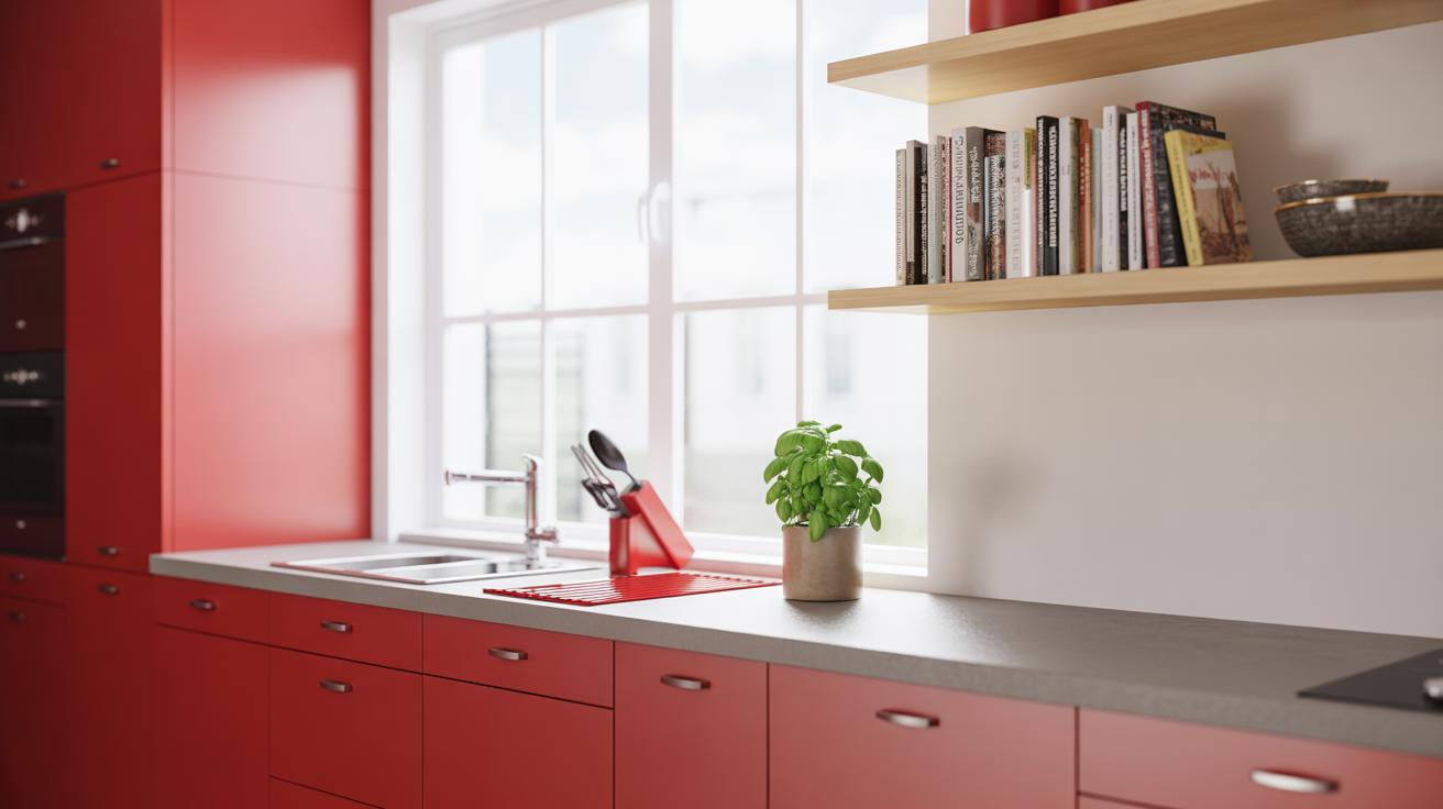
When you think of red living room decor, pairing it with wood feels natural—no pun intended. There’s something about the warmth of wood that tames red’s intensity. Whether it’s a wooden coffee table, a sideboard, or exposed beams, wood balances the boldness without dulling it. The texture of wood even adds a layer of depth, making the space feel less flat or overly staged.
Choosing wood tones matters, though. Dark woods like walnut or mahogany create a richer, cozy vibe alongside red, while lighter woods such as oak or pine give things a fresher, more casual feel. I once swapped out a glass table for a reclaimed wood piece in a red-themed room—it suddenly felt much more inviting, less sterile. Don’t be afraid to mix wooden accents with red fabrics and walls; it often feels more grounded that way.
Adding Green Plants to Complement Red
Red and green — yes, it sounds a little Christmasy, but in a living room, it works differently. Plants bring life into the space and calm red’s boldness. Their cool green tones soften the overall look and also introduce a fresh, organic vibe. You might try large leafy plants like a fiddle leaf fig or multiple smaller ones scattered around to break up the color blocks.
Plants don’t just serve as decoration. They improve air quality and make the room feel lived-in, lending a subtle sense of calm. I find that a touch of greenery also brings an element of surprise in red spaces, preventing them from feeling overwhelming. Sometimes, though, you have to be selective—too many plants might make the red lose some of its punch. It’s a bit of a balancing act to get just the right amount of green life to complement the red surroundings without clutter.
Lighting Tips to Enhance Red Living Room Decor
Using Warm Light to Enrich Red Shades
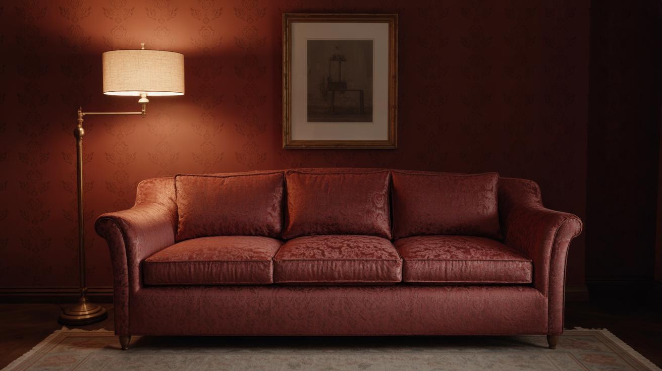
When you have red walls or bold red furniture, the type of light you choose really makes a difference. Warm-white or soft lighting tends to bring out the richness in red tones, making them feel cozy rather than overwhelming. Cooler or harsh lighting, like bright white or bluish bulbs, can sometimes make reds look dull or even a bit harsh. So, aiming for bulbs around 2700K to 3000K usually works well.
I remember once trying cool LED lights in a red-themed living room, and the whole space felt less inviting—almost cold. Switching back to soft incandescent bulbs changed everything, creating a warmth that makes you just want to stay in the room. Plus, warm light softens shadows, which can help balance the strong presence of red).
Layering Lights for Comfort and Style
A single overhead light often doesn’t cut it in a red room. That space needs depth, and layering lighting helps with that. Think about combining ceiling lights with table lamps and even candles. Each adds its own glow, allowing you to tailor the mood. Lamps on side tables or near chairs provide intimacy for reading or relaxing.
Candles are something I usually overlook but in a red living room, they do wonders. Their flickering light plays nicely on the red surfaces, creating a comfortable and almost luxurious feeling—though, of course, depending on the occasion, you might want more practical lighting.
Ceiling fixtures set the overall brightness but are rarely enough alone. Dimmers can help adjust the light level depending on time of day or activity. So layering gives you control—and comfort—in a room that might otherwise feel intense or static.
Choosing Art and Decor Items in Red
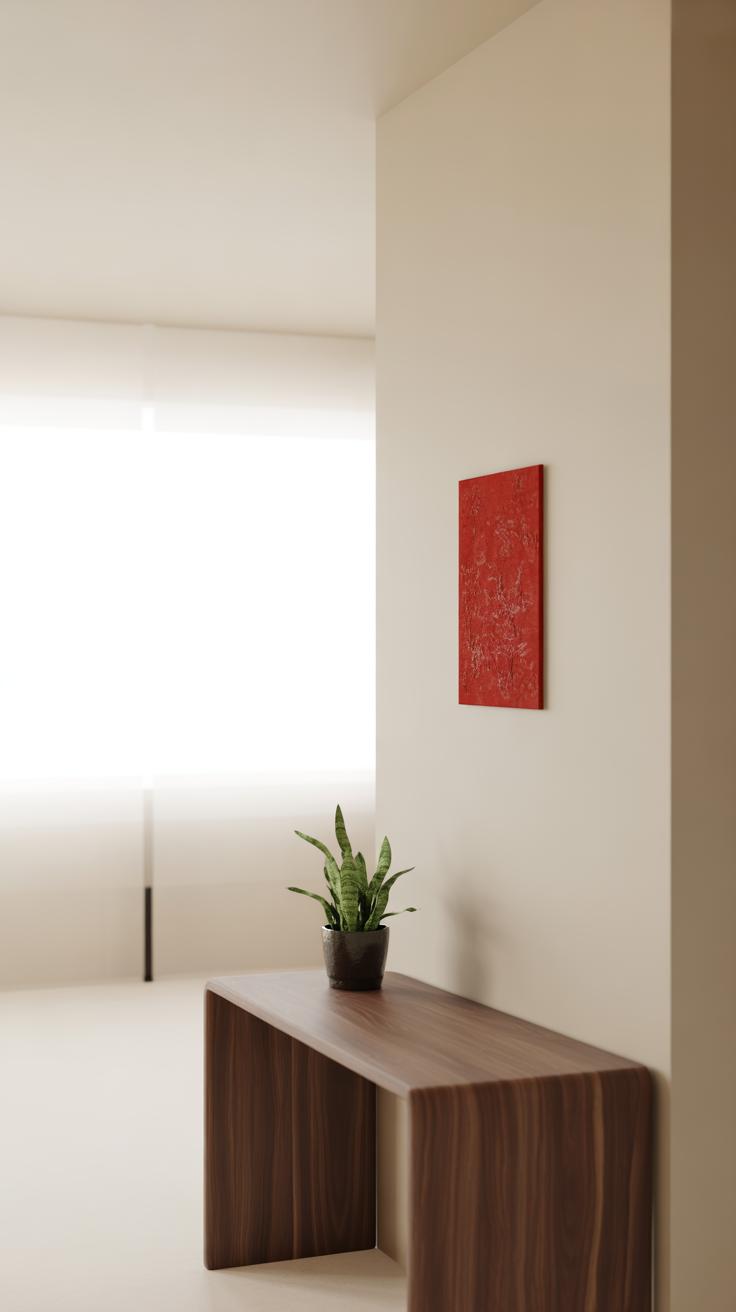
Finding artwork that features red tones can be surprisingly challenging—there’s a fine line between bold and overwhelming. When picking paintings or prints, look for pieces where red isn’t just a splash but part of the composition’s balance. This might mean a mostly neutral piece with strategic red accents or a vibrant canvas where red works alongside other complementary shades. I’ve noticed that abstract art often lends itself well to this because it plays with shapes and tones rather than literal subjects.
Try to match the intensity of red in the art to other elements in your room. For instance, if your furniture uses a deep crimson, a print with brighter reds might clash, though sometimes that contrast can work if you don’t mind a bit of visual tension. Think about size, too—a large bold red canvas can become a focal point, but small prints or framed photos with red details can tie everything together more subtly.
Besides wall art, there are plenty of other ways to weave red into your space:
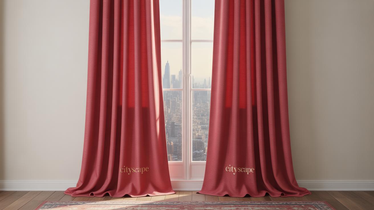
- Curtains: Choose fabrics in red or with red patterns; they soften the room while adding color. Sheer reds can filter light beautifully but heavier drapes give a more dramatic feel.
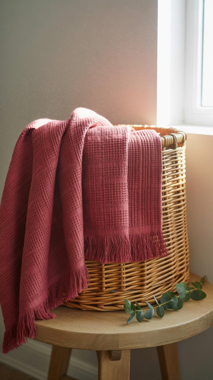
- Throws and Pillows: These offer a quick, less permanent way to add red. A red throw tossed casually can change the vibe instantly without overwhelming the whole room.
- Lampshades: Red lampshades create warm, cozy lighting. You might want to test these out first, since light passing through red can alter the room’s mood unexpectedly.
- Decorative objects: Think vases, bowls, or even books with red covers. These small touches add depth and invite curiosity without committing to large swaths of color.
Curating red accents requires some trial and error. Don’t hesitate to mix different textures and shades. Sometimes, unexpected combinations reveal new possibilities for your living room’s personality. Does this spark any ideas for your own space yet?
Maintaining and Updating Your Red Living Room
Cleaning and Care Tips for Red Decor
Red walls and fabrics tend to show dust and smudges more than you might expect. For painted walls, a soft cloth or sponge with mild soap usually does the trick. Avoid harsh cleaners—they can dull the brightness or leave streaks you don’t want. Sometimes it feels like the red fades just from sunlight, so rotating furniture or using UV-blocking window treatments can help keep colors fresh.
When it comes to red fabric, such as cushions or curtains, spot cleaning right away helps prevent stains from setting in. Vacuuming upholstery gently keeps lint and dirt from dulling the color. If your fabrics are washable, cold water is your friend to prevent bleeding or fading. Sometimes, I’ve found an occasional fabric refresher spray or steam clean works better than a full wash, especially on delicate reds.
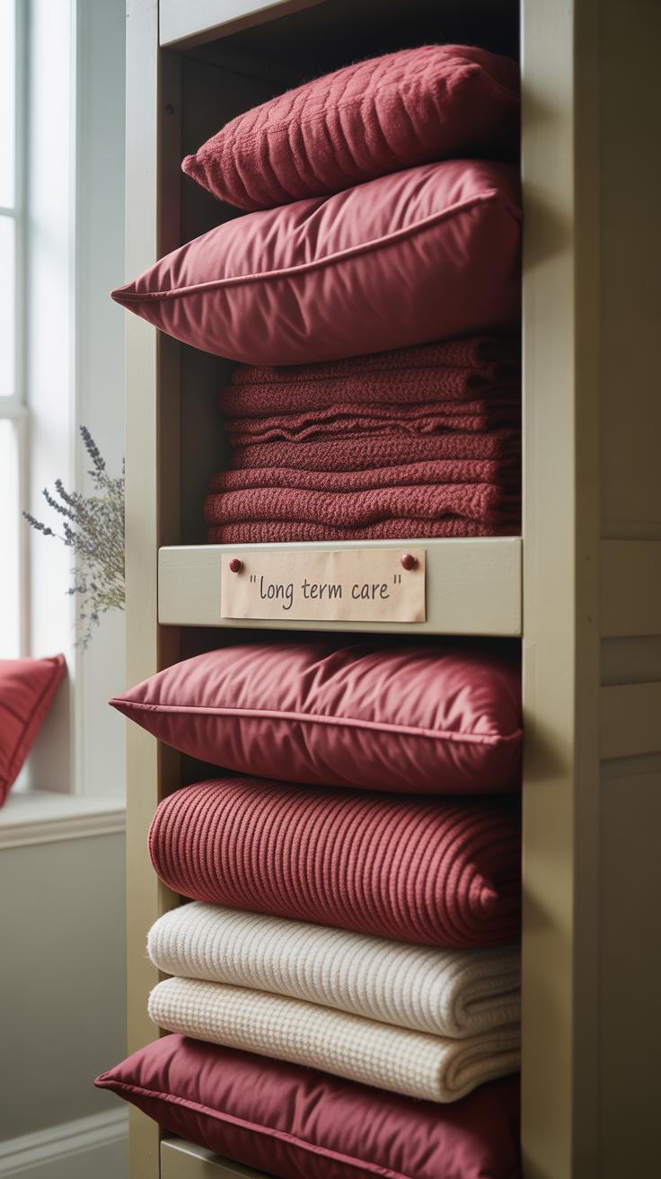
Refreshing Red Decor Over Time
Red can feel overpowering if left the same for years, so switching out smaller items can shift the mood without needing a full redo. Try swapping pillows or blankets in different textures—leather, velvet, or cotton—to subtly alter the look. Even changing your lampshades or rugs makes a surprising difference.
Consider alternating red accents with neutral or metallic tones to lighten the room periodically. Something about adding gold or soft gray elements seems to temper the intensity without losing the warmth. If you’re up for it, rearranging furniture or adding a new piece—like a coffee table or side chair with a fresh silhouette—can renew the whole vibe without touching paint or big items.
Sometimes, I wonder if the best way to keep red lively is to accept that it changes with time, and so must your approach. What small changes would make your red living room feel newer today? A different cushion here, a fresh vase there—those little tweaks can actually keep the boldness alive without wearing it out.
Conclusions
Red living room decor offers many options for refreshing your space. Whether you use red as a main color or as a touch, it brings energy and style that can make your living room feel new and inviting. Choosing the right shade and matching it with other colors will help keep the room balanced and comfortable.
By following the ideas shared here, you can start trying red decor in your living room today. Small changes like pillows or rugs can add red without overwhelming. With some planning, your red living room can become a warm and welcoming place for you and your guests to enjoy.