Introduction
Red paint is a strong color that makes a room stand out. Using red for a statement wall can give your space energy and style. A red statement wall is a smart choice when you want one wall to grab attention and add character without overwhelming the room.
In this article, you will learn how to pick the right red shade and how to use it well. We will explore different ideas for red paint on walls, from simple to creative. You will find tips that will help you bring a fresh look to your home with red paint.
Understanding Red Paint Shades
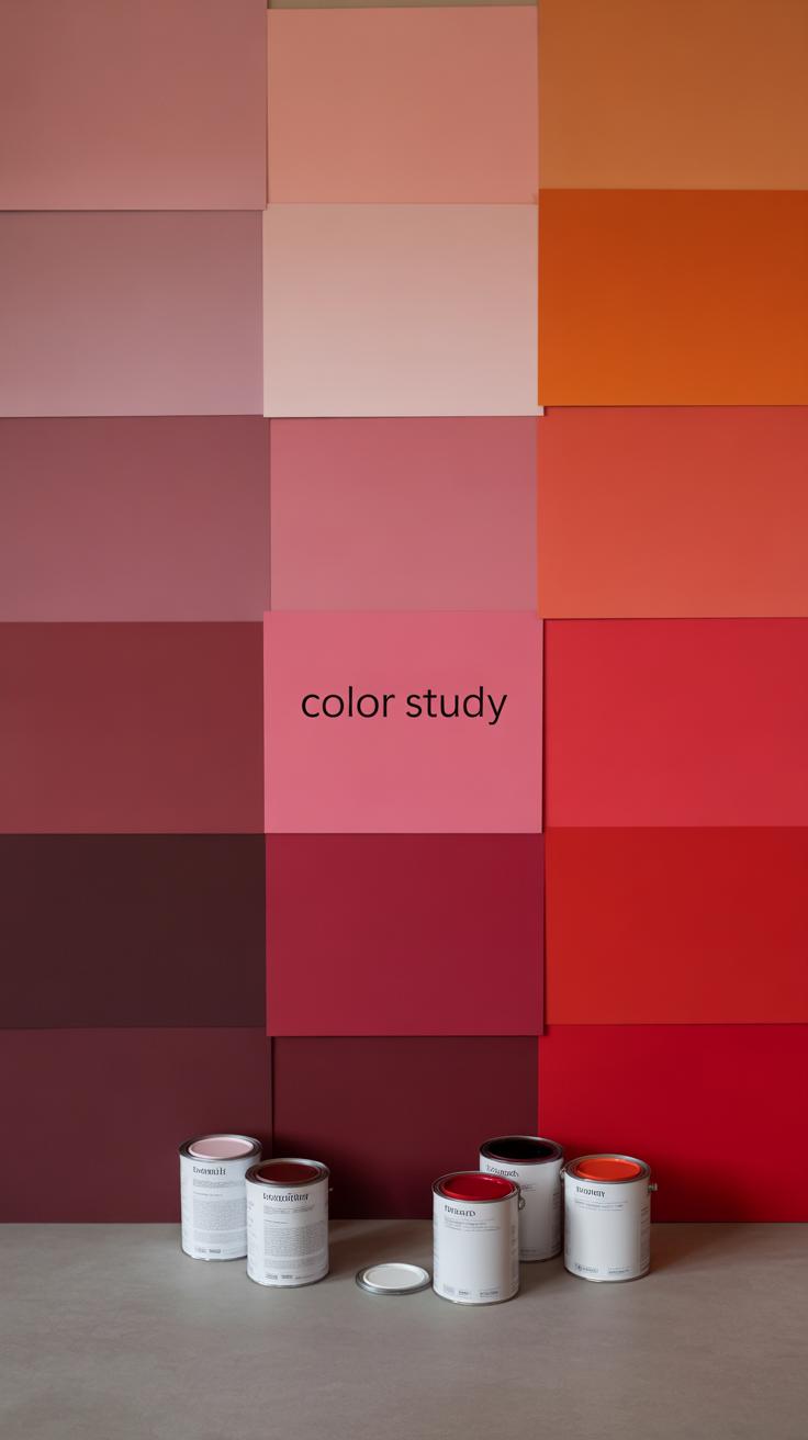
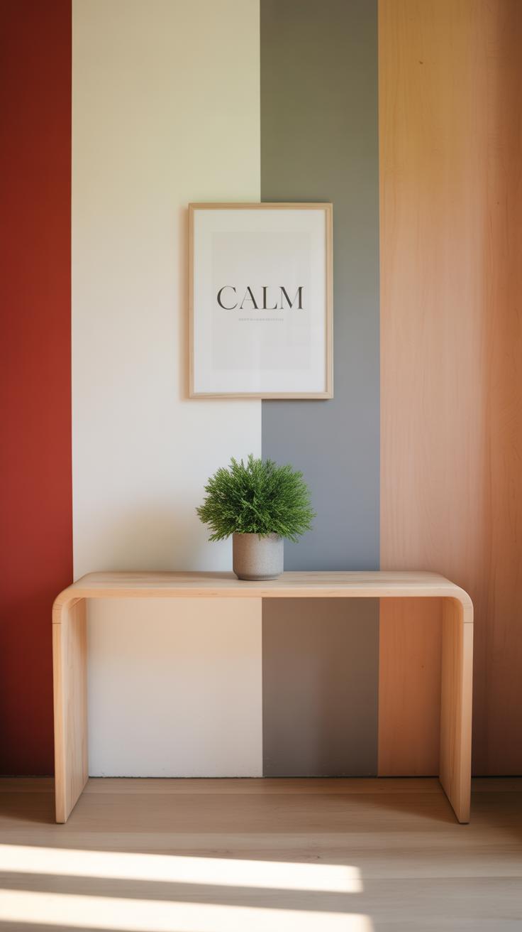
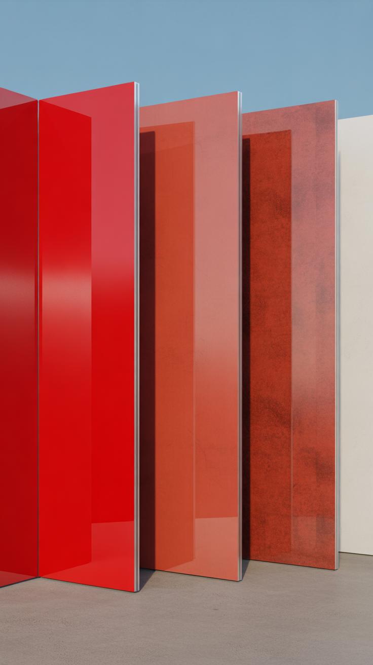
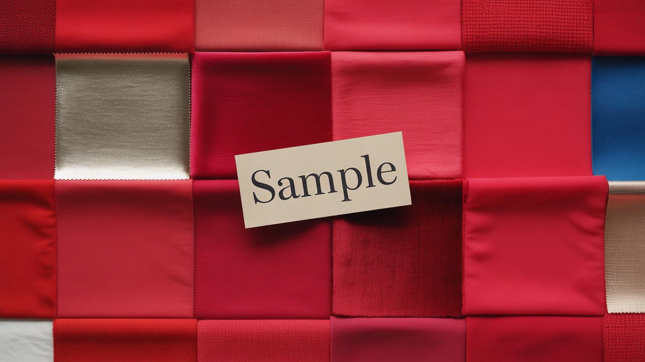
Red paint comes in a wide spectrum of shades, each stirring a slightly different feeling in a room. From deep burgundy to bright cherry, the choices can feel overwhelming. The right red depends on the mood you want and how the light interacts with your space. For instance, a darker red can create a cozy, intimate vibe, but if taken too far, it might feel heavy or gloomy. On the other hand, a lighter, more vibrant red energizes—but it might overwhelm small rooms.
Think about your lighting first. Natural light can soften reds during the day, while artificial light—especially warm bulbs—can deepen the reds to almost a burnt-orange warmth. What strikes me every time is how the same red looks different on my wall from morning to night. So, if you want a calm space, perhaps lean toward muted reds. For places where you want energy, choose reds with some brightness. But don’t rush. Sometimes the red you think you want looks totally different once on your wall.
Warm Reds and Cool Reds
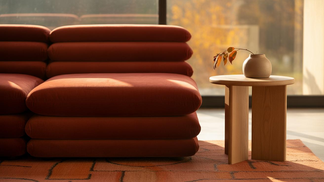
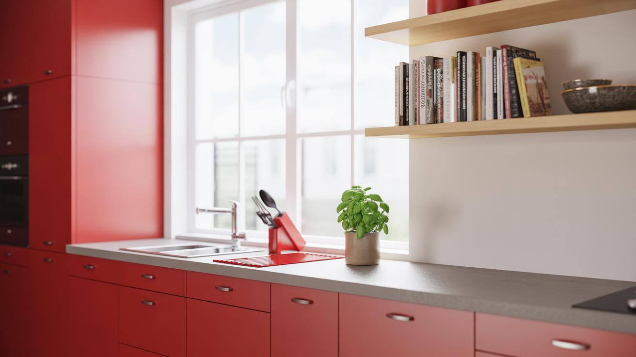
Warm reds have undertones of orange or yellow. They feel inviting and cozy, perfect for living rooms or kitchens where you want a welcoming atmosphere. Think of a tomato red or a terracotta shade. These hues tend to brighten a space without screaming for attention, although they can dominate if overused.
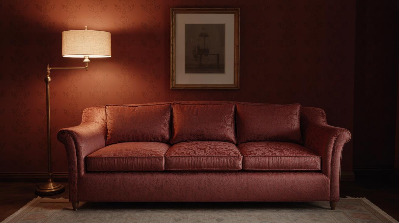
Cool reds, on the other hand, lean toward blue or purple. They offer a slightly more sophisticated and calm experience. Burgundy or crimson shades fall into this category. Cool reds often suit bedrooms or dining rooms where you might want something intense but less “in your face.” This distinction isn’t rigid, though—sometimes a cool red can feel too cold for certain rooms, especially if there’s limited natural light.
Testing Red Paint
Painting a sample patch of red on your wall is non-negotiable. I’ve learned this the hard way. Colors shift with light, and the same red can look fiery at noon but dull downright muddy by evening. Paint swatches from the store don’t tell the full story.
Paint a sizable patch—at least a foot square—in multiple areas of the room: near a window, away from light, and under artificial light. Observe it across different times of the day. You might notice a red appearing vibrant in the morning but almost bruised after sunset. This test helps avoid surprises and gives a more grounded feel for how the red will perform.
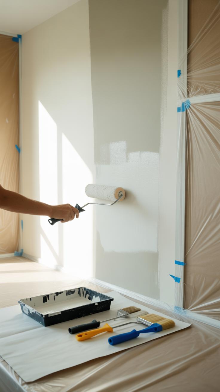
Preparing Your Wall for Red Paint
Cleaning and Repairing Walls
Before you grab that red paint, take a moment to prepare the surface properly. Start by cleaning your wall thoroughly. Dust and grime block paint from sticking well, so wipe the surface with a damp cloth or mild detergent solution. Pay special attention to greasy spots or fingerprints—these can be sneakier than you think.
Once clean, scan for any imperfections. Small holes from nails or cracks need patching. Use spackle or putty to fill these spots, then sand them smooth once dry. If you skip this, those flaws will become glaringly obvious under the bold red shade. It might seem tedious, but it really pays off. I remember rushing this step once and regretted how the paint revealed every bump.
Choosing the Right Primer
Red paint can be tricky. Bright colors often require a strong foundation—that’s where primer comes in. Primer offers a base that helps the red paint pop and prevents it from fading or peeling prematurely. Without it, you might need multiple coats or end up with uneven, blotchy patches.
Choose a primer that blocks stains and evens out the surface texture. If your wall is previously painted a dark color, a tinted primer close to your red shade helps minimize coverage issues. There’s also a debate between oil-based and water-based primers; I tend to prefer water-based for indoor walls as they dry faster and have less odor, but some swear by oil-based for stubborn stains.
Have you thought about how much the primer influences your final result? Sometimes, it’s the unsung hero behind that perfect red wall.
Techniques for Painting a Perfect Red Wall
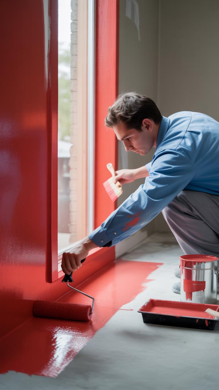
Getting that rich, even red on your wall can feel a bit tricky. Red paint tends to show streaks and uneven patches more than other colors. So, the way you apply it really matters. One thing I’ve learned is that using the right tools makes a big difference. A good synthetic brush works best around edges because it holds the paint well and leaves a smoother finish.
When it comes to rollers, a medium nap roller—around 3/8 inch—tends to work nicely, especially on walls with a slightly textured surface. It picks up enough paint without making the wall look blotchy. You might be tempted to use a thicker roller to speed things up, but that can sometimes cause a bumpy or uneven look.
For deep reds, don’t expect to nail it on the first coat. Multiple thinner coats are key here. Applying thin layers means fewer brush or roller marks and better saturation over time. Let each coat dry fully—it can take longer with red—and then go back in. You might feel impatient, but skipping this step often results in a patchy, streaky wall.
Also, watch your technique: roll in a ‘W’ pattern and don’t overwork the paint. That can cause the coverage to thin out or look inconsistent. It takes a bit of practice, I admit. Ever tried rushing it and ending up with a spotty wall? Yeah, me too. Taking it slow and steady pays off.
Combining Red Paint with Other Colors
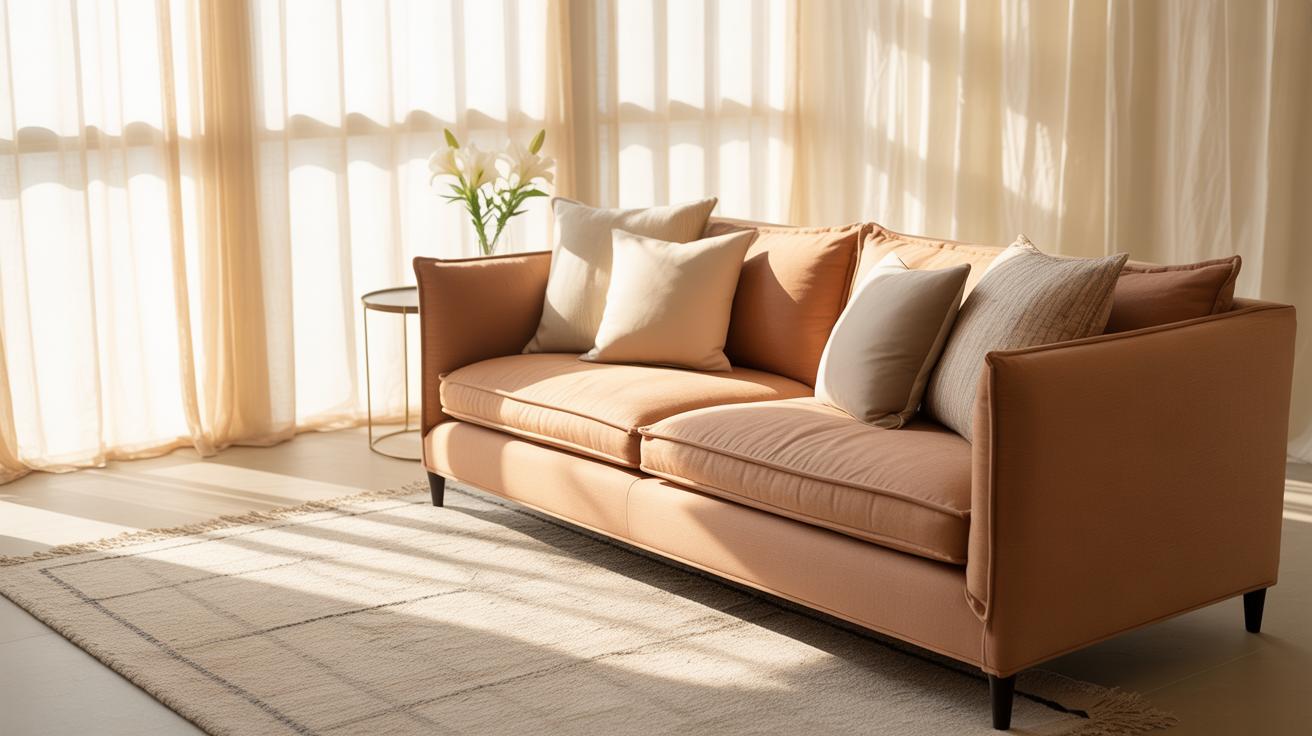
Red walls make a strong statement, but pairing them with the right colors can keep the space from feeling overwhelming. Neutrals like grey, white, and beige tend to soften the boldness of red, offering a kind of balance that’s hard to beat.
Grey, for instance, acts almost like a calming counterpoint. A cool grey can mute the intensity of red, which might feel too hot or aggressive on its own. White brings brightness and freshness. Imagine clean white trim or furniture against a red wall—it almost brings some visual breathing room. Beige is a quieter partner overall, warmer and less stark than white or grey. It feels more grounded.
Still, red can get a bit dramatic when paired with neutrals only. You might want to push things further with bolder accent colors that don’t clash.
Try these next to a red wall:
- Deep blues—navy or cobalt can create a striking contrast while keeping it elegant.
- Emerald green—this can soften red’s fire with an earthy coolness, though it might feel like a creative risk.
- Mustard yellow—unexpected, but it brings warmth and energy without fighting the red.
- Black accents—small touches in black can ground the space but should be used sparingly to avoid heaviness.
Choosing accents is a bit like picking spices—you want them to highlight the red without overpowering it. How much are you willing to experiment? Sometimes mixing too many bold colors gets busy, but a touch here and there can really lift a red wall and make the whole room sing.
Adding Texture and Patterns to Your Red Wall
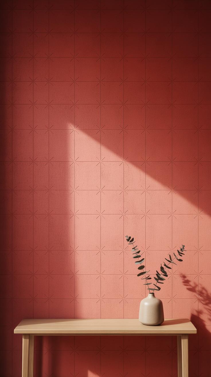
Red walls can feel intense on their own, so adding texture or patterns is a smart way to break up the color and make the space more interesting. One popular method is sponging—a paint technique where you dab a sponge lightly dipped in a slightly different red or a metallic tone on the wall. The irregular surface creates subtle depth that catches light in unexpected ways. It’s not perfect, which is part of the charm. You can choose lighter or darker reds for variation, depending on how bold you want the effect.
Then there are other texture tools like comb rollers or stippling brushes. These tools make patterns that aren’t exact but add movement and tactility. You might find that a rougher texture on red works well in rooms that feel too clinical or flat otherwise.
For patterns, stripes are an obvious choice—vertical or horizontal. Thin stripes of a muted cream or charcoal can soften the red while keeping a punchy look. Geometric shapes, like simple triangles or hexagons, painted in a gloss finish over matte red can feel modern without overwhelming the eye. Even rough hand-painted shapes offer a kind of imperfect charm that some people prefer over crisp lines.
Have you ever thought about mixing both texture and pattern? Maybe a sponge-textured red base with wide, matte stripes on top? It’s worth trying, though it might take some patience to nail the look. The key is avoiding a pattern that competes too much with the boldness of red; subtlety usually works better.
Choosing Red Paint Finishes
When picking a finish for your red accent wall, the type of paint finish can really change the whole vibe. There are a few common finishes to consider: matte, satin, and gloss, each bringing something different to the table.
Matte finishes absorb light, so red walls in this finish tend to feel softer, kind of muted even though the color itself is bold. It hides imperfections well, which is handy if your wall has minor flaws. On the flip side, matte reds can sometimes look flat, almost like the color loses some of its energy depending on the lighting.
Glossy reds, by contrast, reflect a lot of light. They make the color pop with an almost wet look, creating a striking focal point. But this shine can also highlight every bump or texture on the wall. Gloss finishes are tough to live with in larger areas because they demand a flawless surface. That said, a glossy red statement wall can feel dramatic and modern—if you’re into that.
Satin finish is a kind of middle ground. It offers a gentle sheen that isn’t overwhelming but still brings warmth and richness to red paint. Because it’s easier to clean and stands up well to wear, satin is often a good pick for rooms with lots of action like kitchens or bathrooms. It reacts well to humidity too, managing slight moisture without losing its charm.
- Matte: best if you want subtlety and texture coverage, less shine.
- Glossy: perfect for dramatic impact but requires perfect prep.
- Satin: practical for busy or damp spaces, smooth and softly reflective.
You might wonder if there’s a “best” finish for a statement wall. It really depends on your space and how much attention the wall should grab. If you want the red to shout out, gloss might work. If you prefer it to blend with a rich but calm presence, matte or satin could be better.
Inspiring Room Ideas with Red Statement Walls
Living Room Ideas
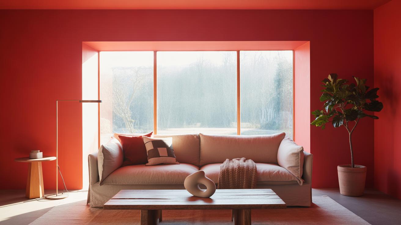
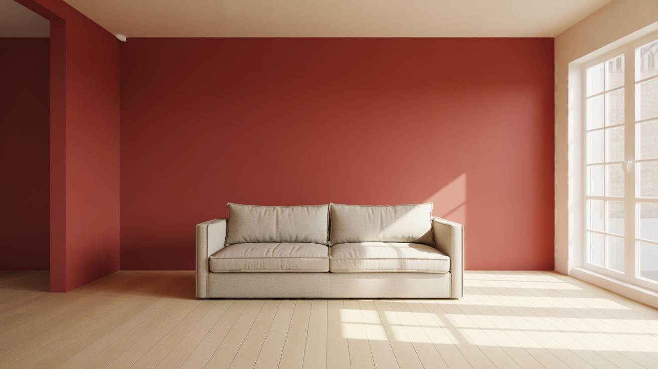
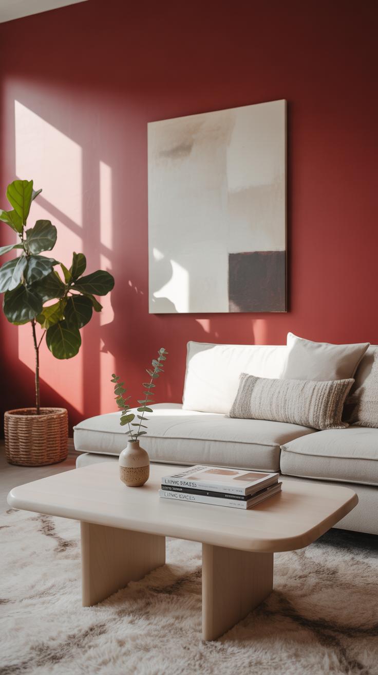
Red walls in living rooms can create a surprisingly warm atmosphere. They tend to make the space feel both inviting and energized, which is perfect if you enjoy lively gatherings or quiet evenings with a good book. I’ve noticed that pairing a deep, rich red with neutral furniture allows the walls to pop without overwhelming the senses.
Think about using a red accent wall behind your sofa or TV area. It can act as a focal point and draws attention without the room feeling cramped. Sometimes, a bold red can even highlight artwork or shelves, making them stand out in a way softer colors never quite achieve. You might find it’s easier to relax in a red room than you expected, despite the color’s intensity.
Bedroom and Kitchen Uses
Bedrooms with red statement walls invite a surprisingly complex feeling. On one hand, red energizes, which could clash with the idea of rest. But on the other, it can also create a cocoon of warmth and comfort. Maybe choose a muted red or apply red to just one wall behind the bed to keep things cozy without causing restlessness. I’ve seen bedrooms where this approach adds a subtle drama that’s hard to replicate.
In kitchens, red can stimulate appetite and conversation. It tends to inject a sense of energy and warmth that suits cook-and-dine spaces. Imagine a red backsplash wall or an accent near the dining nook. That said, too much red in the kitchen can feel overwhelming during meal prep, so balancing red with lighter cabinetry or counters generally works best. Still, a splash of red might just make your kitchen feel more alive, brightening the space where people often gather.
Maintaining Your Red Paint Wall
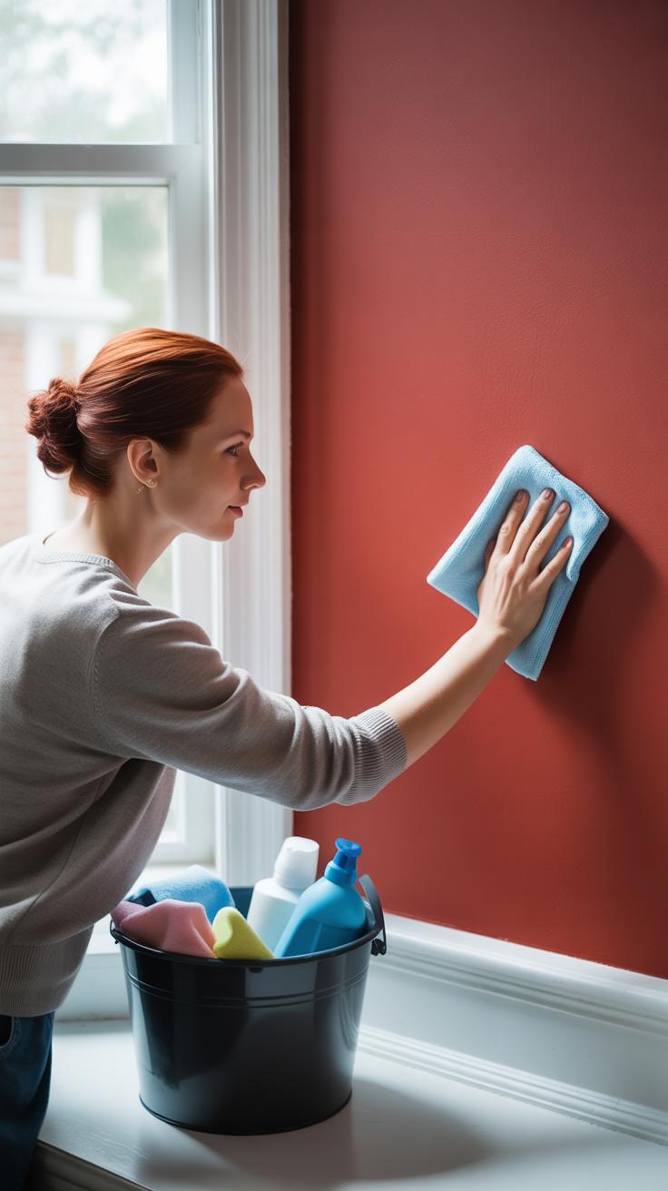
Red paint can be bold and striking, but it also tends to show dirt or smudges more easily than lighter colors. Keeping those walls looking fresh isn’t always straightforward. A simple damp cloth usually does the trick for routine cleaning. But you want to avoid harsh scrubbing or abrasive cleaners—they can dull the paint’s finish or cause subtle discoloration over time.
Try a gentle mix of warm water and mild dish soap. Lightly wipe the surface and dry it quickly with a soft towel. Spot test any cleaning solution first, maybe behind a piece of furniture, just to be safe. If you skip this, you might end up with patches that look noticeably different, which is not what you want.
When it comes to scratches or chips, repainting the entire wall isn’t always necessary. Keep a small container of your original paint. For tiny blemishes, lightly feather the touch-up paint into the damaged area using a fine brush. Matching the texture can be challenging—sometimes the new paint looks glossier or duller—but patience helps.
If you’re wondering about sanding scratches—maybe for deeper marks—go gently. A light scuff rather than aggressive sanding usually works better, preserving the paint underneath. And if you can’t get a perfect match at first, try layering thin coats instead of one thick one.
Of course, no method is foolproof. You might find some spots never quite blend, or cleaning leaves faint streaks. Still, with regular care and a bit of touch-up, your red wall can stay bold and lively for years without demanding a full repaint.
Conclusions
Red paint for statement walls is a great way to bring life to your home. It can make a room feel warm, lively, and unique. By choosing the right shade and pairing it with smart design choices, you can create a space that truly reflects your style and mood.
Think about your room’s light and furniture when you paint. Don’t be afraid to try new looks or add texture. With these ideas, you can use red paint to make a statement that is all yours.