Introduction
Creating a timeless living room involves more than just picking popular trends. It’s about choosing a design that stays beautiful and functional for years. Using a muted color palette can help you achieve this classic look, making your space feel calm, inviting, and sophisticated. This article will offer practical ideas and guidance to help you create a timeless living room with colors and furnishings that work well together.
Throughout this article, you will find advice on choosing the right muted colors, selecting the best furniture, and arranging your space in a way that remains stylish over time. From simple tips to detailed examples, you’ll learn how to make your living room a comfortable and enduring place for you and your family.
Essentials For Timeless Living Rooms
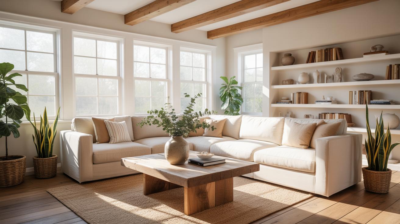
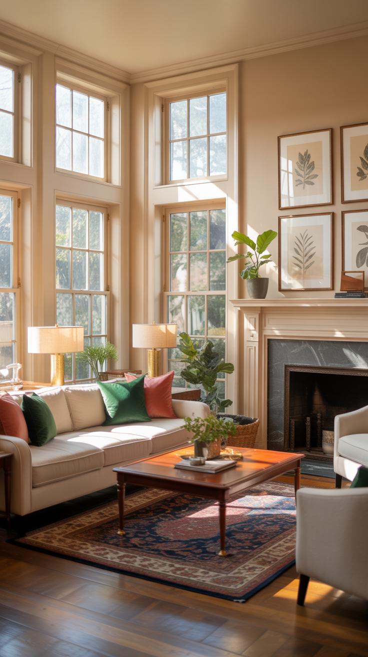
What truly makes a living room timeless? It’s not just about looking good for a season or two. A timeless living room carries a sense of comfort and familiarity that invites you in, year after year. It feels relaxed yet refined, with elements that don’t scream trends or fads. The foundation often lies in three key areas: color, furniture, and materials.
Colors tend to lean toward muted tones, not overly bright or dark. Think soft grays, gentle beiges, or warm off-whites—these shades provide a subtle backdrop that complements many styles. Furniture plays a huge role, too. Pieces should be sturdy and simple, avoiding over-ornamentation. Solid wood and natural textiles usually work well, creating a balance of durability and warmth.
Materials matter as much as style. Natural fibers like linen, cotton, and wool bring texture without overwhelming the senses. Durable hardwood floors or classic rugs add grounding elements that endure wear and time. So, a timeless living room often whispers comfort and calm, rather than shouting for attention.
Color Palette Selection For Lasting Appeal
Choosing the right color palette is surprisingly tricky, but it shapes the living room’s mood significantly. Muted colors quietly support the space, letting furniture and decor take the spotlight without clashing. You might find that soft blues evoke a sense of calm, while muted greens bring subtle freshness. Neutrals—grays, creams, and taupes—offer flexibility and won’t tire you out visually.
Many favorite choices have a hint of warmth or coolness that can shift depending on lighting throughout the day. This slight variability keeps the room feeling alive but never chaotic. When painting or picking fabrics, I find that sampling colors in different light conditions throughout the day makes a big difference. It’s worth testing before committing.
Furniture Choices That Stand The Test Of Time
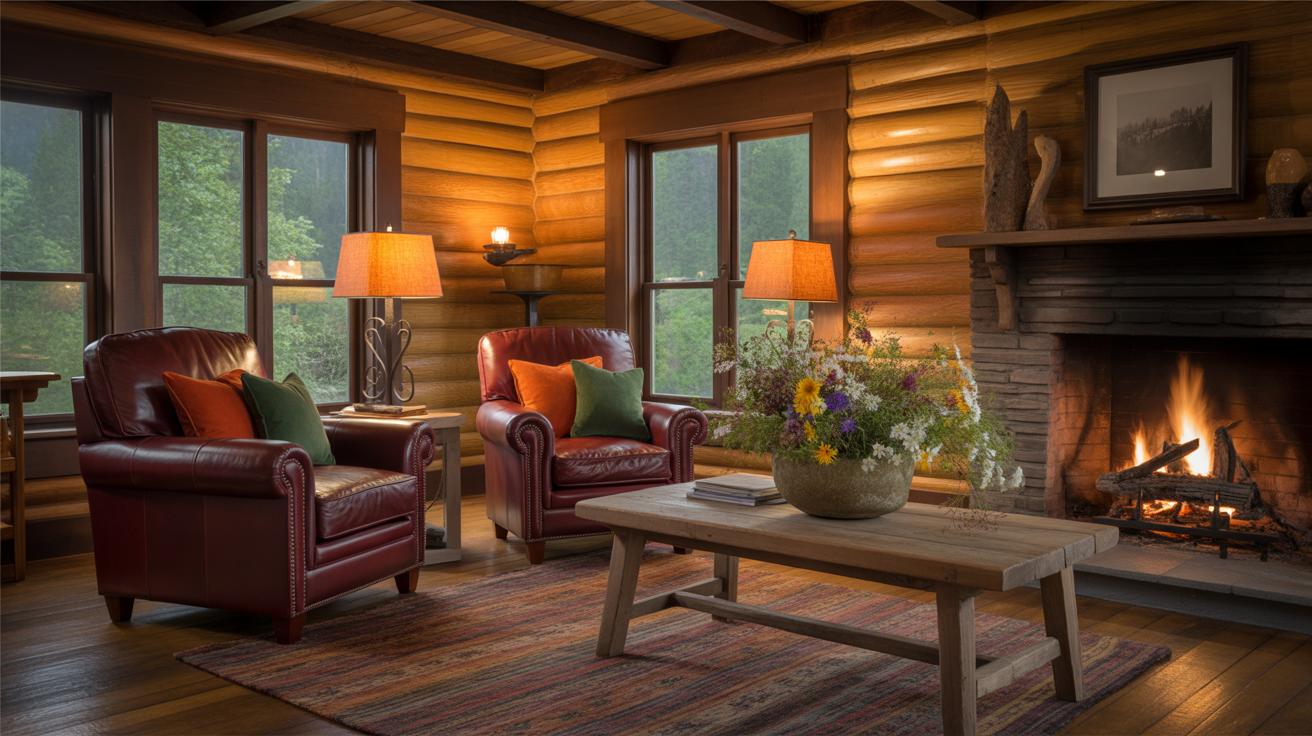
Furniture longevity goes beyond just lasting years—it’s about staying relevant and comfortable. Classic shapes like linen-upholstered sofas with clean lines or mid-century inspired wooden chairs tend to endure in appeal. And materials such as solid oak, walnut, or leather age beautifully, often gaining character rather than losing charm.
Mixing in a few modern pieces doesn’t ruin the timeless vibe; it can actually refresh the space. For example, pairing a traditional wood coffee table with a sleek metal lamp adds an unexpected edge without overwhelming the room’s core look. Buying fewer, quality items helps maintain this balance, avoiding clutter that quickly dates a space.
Creating Balance With Muted Colors
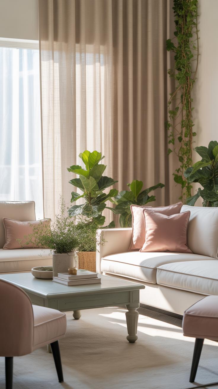
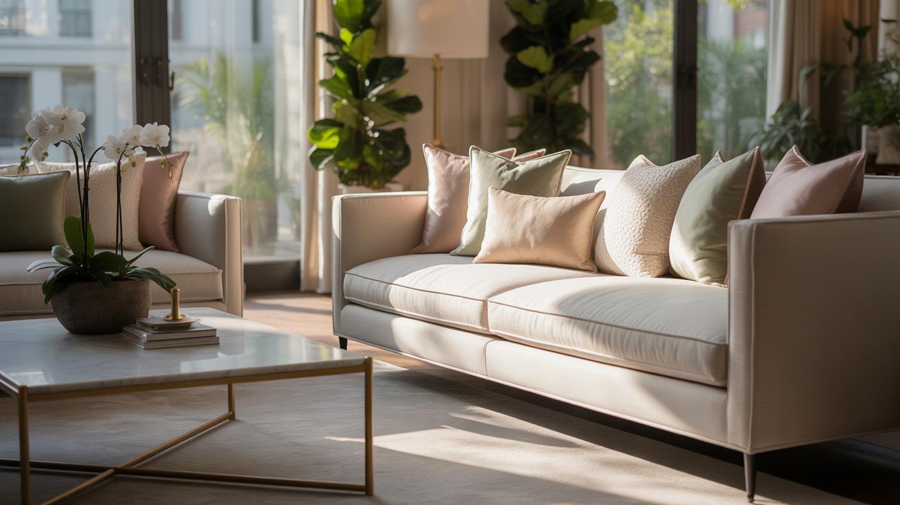
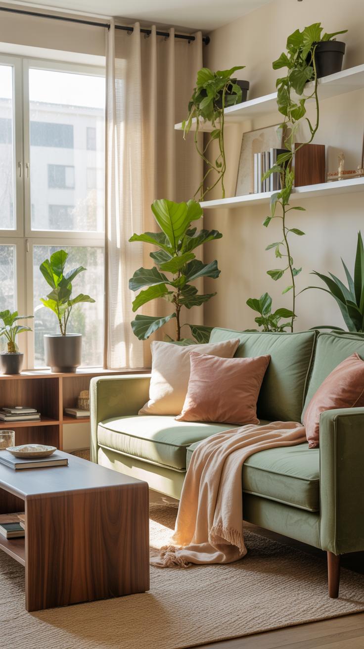
When working with muted colors in your living room, the risk you often face is monotony. Muted hues have a calm and understated presence, but using them carelessly can lead to a space that feels flat or uninspired. To avoid that, consider how you balance the colors across the room. Don’t just stick to one muted shade; blend several shades that vary slightly in tone. For example, soft greys can be paired with gentle beiges or dusty blues. These close yet distinct hues create harmony without overwhelming the viewer.
Textures and materials add another layer of interest. Think about a matte ceramic vase alongside a velvet cushion—both muted in color, but different tactile experiences. Wood, stone, and soft fabrics bring a natural contrast that prevents the room from feeling like a single washed-out color block. Mixing these elements freely invites your eye to linger and explore the room.
Personally, I find layering these subtle differences creates a quiet kind of drama. It’s almost like the room breathes—it has depth without shouting for attention. Have you ever noticed how a purely monochrome space can feel kind of dead? That’s why this balance is worth aiming for, even if it’s a bit of trial and error.
Choosing Complementary Muted Tones
Selecting muted colors that complement each other isn’t always straightforward. What helps is starting with a base color you love, then exploring its neighbors on the color wheel. Soft greens often pair well with muted pinks or warm greys, creating a soft and approachable vibe. Dusty blues can be elegantly combined with muted yellows or warm taupes.
For example, a living room painted in muted sage green can incorporate cushions in a soft blush pink and drapes in a neutral sand color. These combinations feel natural but also dynamic because the colors subtly highlight each other without clashing or feeling forced.
At times, I’ve found myself questioning if two colors are too close or too far apart—but usually, the best pairs surprise you. Sometimes, the quietest tones together do the most for a room, creating a subtle engagement your brain picks up on, even if you’re not consciously aware of it. Try swatches on your wall and observe them in different lighting; that really helps clarify what works.
Adding Texture To Avoid Flatness
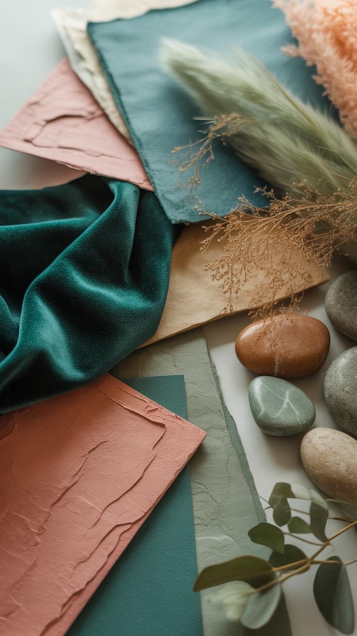
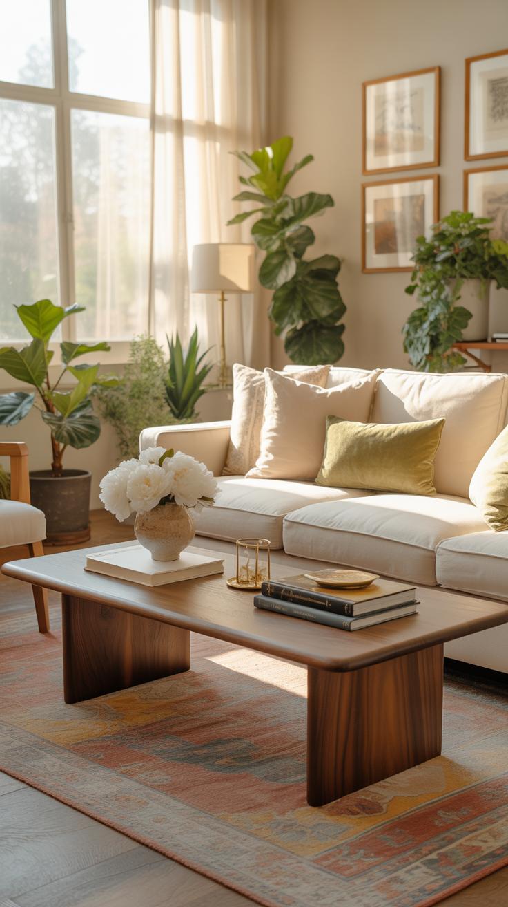
Muted color schemes can occasionally feel flat if you rely solely on color. That’s where texture comes in as a powerful tool. Fabrics with a tactile surface—like boucle, linen, or even nubby wool—can catch and play with light, adding subtle complexity. Rugs in natural fibers such as jute or sisal introduce grounding texture and warmth underfoot.
Decorative items like woven baskets, ceramic pieces with uneven glazes, or linen lampshades further enrich the space. Each texture invites a closer look and somehow prevents the muted palette from feeling one-dimensional.
In fact, one time I tried a completely smooth silk cushion on a muted pastel sofa and felt something was missing. Adding a rougher woolen throw transformed the entire feel—it was like the room suddenly had a voice. You might try mixing textures on the sofa alone, then moving outwards to furniture and decor. The key is variety without excess, so the room still stays calm and timeless but without losing interest.
Furniture Arrangement For Timeless Style
When arranging furniture for a timeless living room, it’s essential to think beyond just placing pieces where they fit. The layout should support how you live—how you move around the room and use the space daily. A good plan respects rhythm and flow, avoids clutter, and invites people to stay awhile.
Start by considering how the room functions. Is it a spot for conversation, watching TV, or both? Zone the space accordingly, creating inviting seating areas where people naturally gravitate. For example:
- Position sofas and chairs to face each other or at slight angles to encourage dialogue.
- Leave about 18 to 24 inches between seating pieces so guests can move easily without feeling cramped.
- Arrange around a focal point, like a fireplace or artwork, to anchor the space.
Don’t overcrowd the room with oversized furniture—keep scale in mind to maintain balance. A large sofa in a small room suffocates the space, while tiny pieces can feel lost in broader settings. Consider how much walking room you want, aiming for clear pathways that make the room feel open yet cozy. It’s a subtle art, and sometimes a little trial and error helps find the sweet spot between comfort and aesthetics.
Ultimately, your layout should feel natural, making the space accessible and welcoming without having everything scream for attention all at once. Sometimes less really is more, but it depends on how you actually use the room day to day.
Lighting Choices To Enhance Ambiance
Lighting plays a quiet but powerful role in a timeless living room. Natural light, for example, can subtly shift the mood throughout the day. You might think window treatments just block or reveal light, but their texture and color can soften incoming rays, enhancing muted tones rather than competing with them. Rooms facing south or east often benefit most, as their orientation allows for daylight that feels gentle rather than harsh.
Artificial lighting, on the other hand, offers more control and can be layered to suit different needs or times. Combining overhead lights with task lighting—like reading lamps—and accent lights that highlight artwork or architectural features can create depth and warmth. It doesn’t have to be complex; even simple dimmers help create a welcoming atmosphere, inviting you to linger longer.
Consider how these layers work together. Overhead lighting sets the base, task lights add function, and accent lighting brings charm. Finding the right balance might take some experimenting. You may find a particular lamp casts shadows you hadn’t noticed, or a chandelier interrupts the room’s flow. Yet, these quirks can become part of the room’s character, making it feel less staged and more lived-in.
Decor Accessories That Last
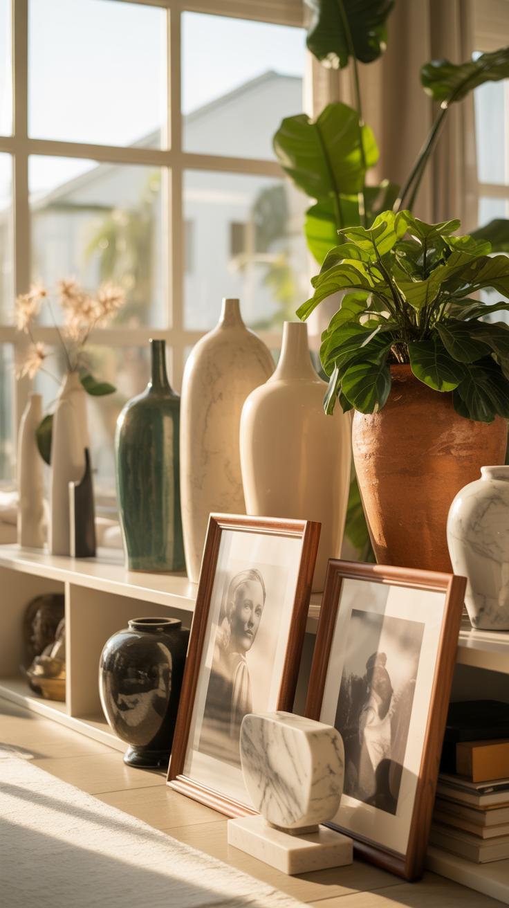
When aiming for a living room that remains stylish over years, choosing decor accessories demands some thought. The trick isn’t just picking what’s pretty now but what will age well, enduring trends and wear. Look for classic materials such as brass, wood, or ceramic. These often develop character rather than wear out.
Consider:
- Simple, elegant vases or bowls that don’t scream a specific decade
- Timeless clocks or sculptural elements in neutral tones
- Decorative trays or candle holders made from sturdy metals or glass
Durability is key but so is subtlety. Accessories shouldn’t compete for attention but support the calm, muted palette that defines timelessness. Sometimes it’s best to invest in fewer, well-made pieces than numerous fast-fashion ones. This approach prevents your space from feeling cluttered or dated.
Selecting Artwork And Wall Decor
Choosing artwork for a muted color palette requires balance. Art that’s too bold or vibrant risks disrupting the serene atmosphere. Instead, seek pieces with gentle contrasts, subtle textures, or soft gradients that echo the room’s hues.
Options might include:
- Abstract pieces in shades close to your palette
- Black-and-white photography framed simply
- Nature-inspired prints with earth tones
Don’t shy away from mixing mediums; sometimes subtle wall hangings or textile art can add depth without overwhelming the eye. Think about the scale and placement carefully—it’s better to let a single, well-chosen piece breathe than overcrowding walls with too much visual noise.
Choosing Durable Textiles And Rugs
For textiles and rugs, longevity combines both quality and style suitability. Natural fibers like wool, linen, or cotton tend to wear well and age gracefully. When paired with muted tones, they create a soft, inviting foundation for your room.
Some tips to keep in mind:
- Select rugs with subtle patterns or ones that play with texture rather than bright colors
- Opt for textiles treated for stain resistance if you have a busy household—this practical choice doesn’t spoil aesthetic appeal
- Layering different fabric textures adds interest without introducing contrasting colors
Your investment in quality rugs and upholstery pays off in both comfort and durability, ensuring that these essentials don’t just look good but endure daily use without suffering wear that screams for replacement. It’s a quiet commitment to a living room that lasts, truly timeless and welcoming.
Maintenance Tips For Longevity

Caring For Different Materials
Furniture in your living room likely combines various materials—wood, fabric, metal—and each needs a slightly different approach to care. Wood requires gentle cleaning with a soft cloth and mild soap rather than harsh chemicals that can strip protective finishes. Periodic polishing can help maintain its natural luster, but overdoing it might lead to buildup—so, balance is key. Fabric upholstery benefits from regular vacuuming to prevent dirt embedding into fibers, and treating stains quickly keeps things from looking tired. Metal pieces, like legs or lamp bases, need dusting and sometimes a gentle metal cleaner, but avoid anything abrasive that might scratch the surface.
Routine Cleaning And Replacement
Keeping your living room looking timeless implies more than occasional dusting. Establish a routine cleaning schedule for key pieces—it doesn’t have to be obsessive, just consistent. I found that wiping down surfaces weekly and deep cleaning cushions every few months really extends their life. Also, consider swapping out smaller decor items periodically. Not because they’re broken, but sometimes a fresh pillow or a new throw can lift the space and keep it from feeling stale. This kind of upkeep works a bit like preventative maintenance—you avoid the sudden exhaustion that comes with wear and tear.
Common Mistakes To Avoid

Overusing One Color Tone
Sticking too closely to a single muted color might seem safe, but it risks making your living room feel flat and uninspired. When everything blends into one hue, the space can lose its character, almost like a wash of sameness. To avoid this, try layering different shades or mixing subtle accents with complementary tones. It doesn’t have to be a strict rule—sometimes a tiny pop of a contrasting color can break the monotony just enough to keep your eyes interested. It’s about balance but not rigidity.
Ignoring Room Proportions
Scaling furniture incorrectly is a common pitfall. Large sofas in a small room can overwhelm, making the space cramped and claustrophobic. Meanwhile, tiny chairs in a grand living area create awkwardly empty spots that feel unfinished. It’s useful to measure your room and furniture before buying because guessing rarely works. I’ve heard from people who regret splurging on oversized pieces only after they see the clutter it causes. And sometimes, having a bit more breathing room is better than packing every inch with stuff.
Examples Of Timeless Living Rooms
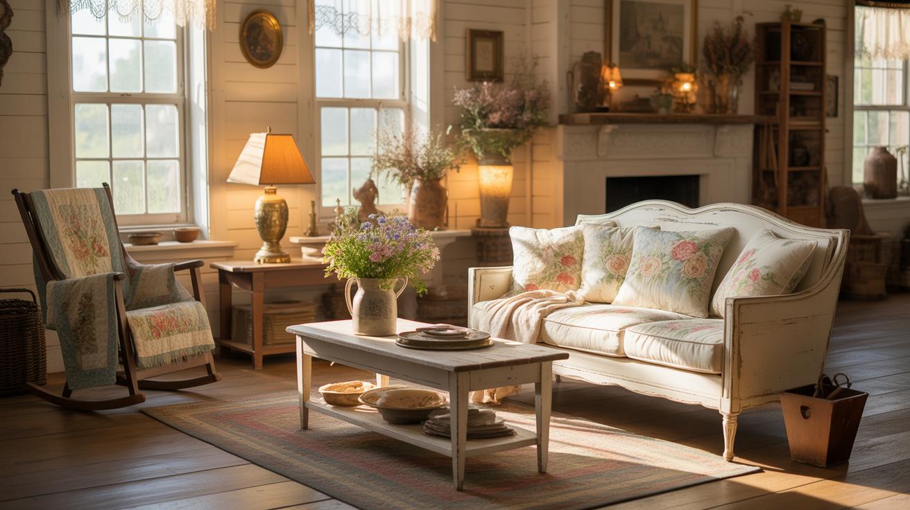
Some living rooms demonstrate the quiet strength of muted palettes that stand the test of time. These spaces don’t feel dated even years later – there’s often a calm simplicity that draws you in without overwhelming. What makes these rooms successful might surprise you: it’s less about trends and more about subtle harmony.
Consider living rooms done entirely in classic neutrals. Shades of beige, gray, and soft white dominate, paired with furniture that favors clean lines and comfort over ornamentation. Look at spaces that lean on natural fabrics like linen and cotton, and you’ll see how texture plays a big role. It’s interesting how these rooms often feature a few well-chosen pieces, such as a sturdy leather armchair or a wooden coffee table that ages with character. Such choices maintain relevance because they avoid looking too flashy or fixed to a single era.
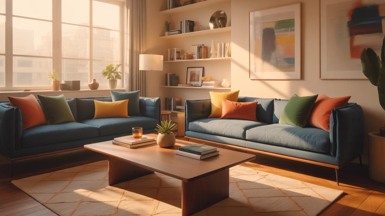
When muted pastel tones enter the picture, the mood shifts gently. Soft blues, dusty pinks, and faded greens bring a hint of color that’s delicate, not overpowering. Successful examples often use pastels as accents rather than the main theme, applying them on throw pillows, curtains, or a subtle wallpaper pattern. These touches introduce warmth and personality without sacrificing timelessness. But it’s easy to tip the balance here; too bright or too trendy a pastel can age the room quickly.
Ultimately, timeless living rooms with muted palettes succeed through restraint, focus on quality, and a sense of comfort that invites you to linger. Have you ever walked into a room and felt immediately at ease? That’s often the magic of these well-curated, subtle spaces—a quiet elegance that never really goes out of style.
Conclusions
Timeless living room decor starts with careful choices of color and furniture. Muted tones create a peaceful environment that won’t feel outdated quickly. By combining these colors with classic furniture pieces, you get a room that looks good year after year without needing constant updates.
Keep your living room balanced with practical layouts, quality materials, and personal touches. This approach helps you build a space that suits your lifestyle and grows with you. Overall, a timeless living room lets you enjoy comfort and style for a long time.