The Illusion Protocol: Forcing The Storybook Gaze
When Paint Becomes Texture
You want people to feel something they can’t name when they see your cottage. That requires understanding opacity as a design tool, not just a coverage metric. In architecture, opacity controls what the viewer’s eye stops at and what it penetrates. Paint fading and distressing work the same way: they create visual friction that reads as age and authenticity. A flat, even coat broadcasts newness. Deliberate surface variation broadcasts history.
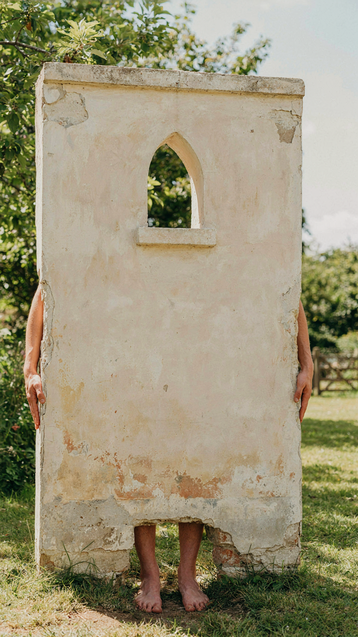
Strategic fading mimics how sunlight actually degrades exterior paint over years. South-facing walls fade faster than north-facing ones. UV exposure bleaches pigment unevenly. You replicate this by applying base coat, then dry-brushing a lighter shade of the same color across high-impact areas: trim edges, roof lines, and weathered corners. The mechanism is simple: your eye trusts what looks worn because it matches observable reality. Second coats applied selectively to recessed areas darken shadows naturally, creating depth that reads as intentional aging rather than neglect.
Distressing works through controlled surface disruption. Wire brushing, sanding, and deliberate chipping expose layers beneath, signaling that time has worked on this structure. Real cottages show this pattern. The key is restraint. Distress 15 to 20 percent of the painted surface, concentrated on corners, edges, and any areas where water would naturally weather paint. Apply distressing before final topcoat sealing so the effect locks in place. The cumulative effect trains the viewer’s brain to accept the entire color palette as period-accurate, even if you selected it last month.
Contrast Cuts Through Perception
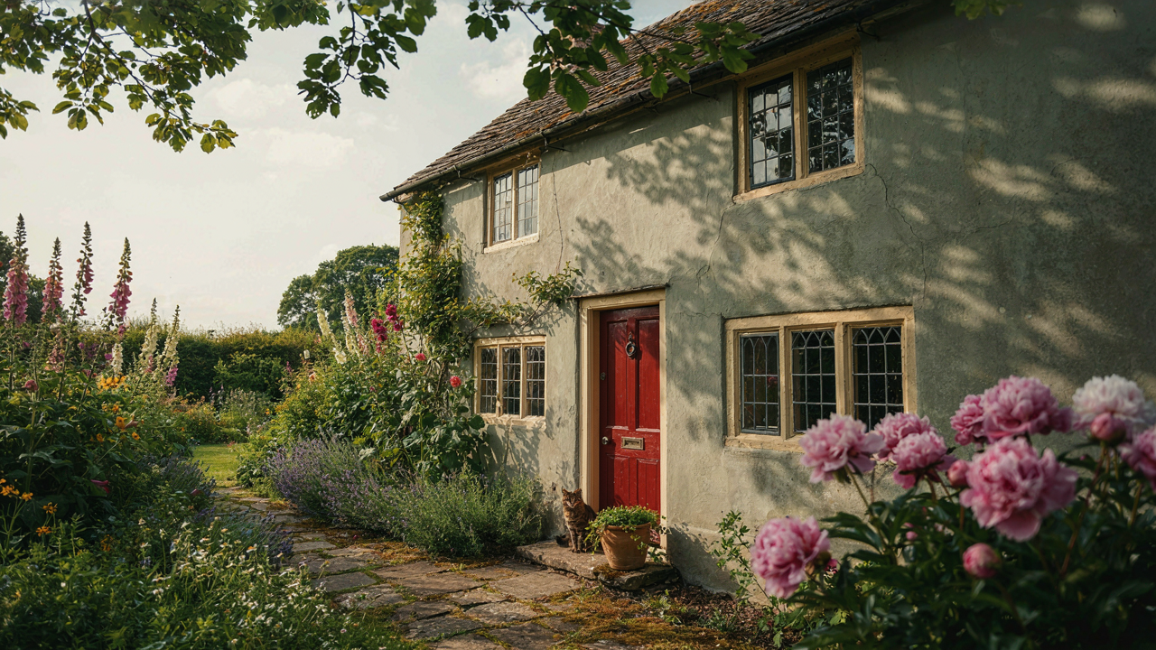
Your trim color matters more than your base color. This is what design guides miss. Architectural features define a cottage’s character, but only if the eye can isolate them from the field. Contrast is the mechanism. A cream base with forest green trim creates visual hierarchy. The green doesn’t recede; it advances because the luminance difference stops the viewer’s attention there first. Paint the body of the cottage a muted tone, then push the trim into a distinctly different value or hue. Doors, window frames, and fascia become the story’s focal points.
Complementary color pairs amplify this effect without screaming. Soft sage green on a warm greige base reads as countryside intentionality, not design-magazine artifice. Charcoal gray trim on pale cream creates cottage formality. The contrast needs to register immediately, within the first second of viewing, or it defaults to visual noise. Select your base and trim colors, then photograph them side by side in full sunlight and shade. If the trim disappears in either lighting condition, increase the contrast value until it holds. This ensures architectural features remain legible regardless of time of day.

Beyond Beige: Psychological Impact Of Cottage Exterior Colors
Warm Neutrals Trigger Ancestral Safety Signals
You care about this because you want your home to feel intentional, not like you defaulted to what the builder offered. Here’s what actually happens: warm neutrals work through the same mechanism that makes mammals seek shelter in caves and dens. Neurobiology calls it the safety response to enclosed, warm-toned environments. Cottage exteriors in cream, soft taupe, or warm gray activate this response because they read as “established shelter” rather than “exposed structure.” The brain interprets these tones as materials aged by time, not freshly built.
The mechanism isn’t aesthetic preference. It’s pattern recognition. Your nervous system processes warm neutrals as places where previous inhabitants survived winters and raised families. Cream and warm taupe don’t compete for attention like bold colors do. They recede slightly, allowing the structure’s form and the landscape around it to dominate your visual field. This is why cottages painted in these ranges feel grounded rather than staged.
Historical Pigments Anchor Authenticity Without Fakery
Most cottage color advice tells you to copy period homes, which is incomplete guidance. What actually matters is that pre-industrial pigments had narrow color ranges because they came from earth, minerals, and plant matter. Authentic cottage exteriors weren’t painted in what we now call “Historic Cottage Cream” or “Period Sage.” They were painted in whatever ochre, chalk, or limewash local suppliers provided. The consistency across regions created an accidental visual language.
If you want historical accuracy, study regional paint inventories from the 1800s and early 1900s, not Pinterest boards. In England and northern Europe, cottages wore soft greens, dull reds, and warm grays because those pigments were accessible and affordable. In Scandinavian regions, deeper reds and yellows dominated. The color palette of your cottage should reflect what was actually available in its region during the period it was built. Paint the exterior in tones that could have been mixed with pigments that existed then, not colors that modern chemistry invented.

Cottage Style Exterior Colors: Deconstructing The “Charming” Facade
The Visual Grammar Of Quaintness
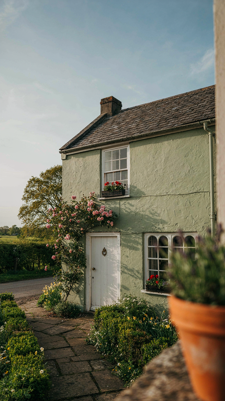
You want people to feel something when they see your house, and you’re hoping the right paint color does that work for you. It won’t. Color is a signal system, not an emotion generator. Borrowed from semiotics, the field studying how signs communicate meaning, a cottage exterior operates as a sign where hue functions like vocabulary and saturation functions like accent marks. Muted greens and creams don’t make a house charming; they signal restraint and historical continuity. The mechanism is recognition, not feeling.
Real cottage exteriors emerged from material constraint, not aesthetic choice. Lime wash and earth pigments produced specific color bands: ochres, sages, chalky whites. These weren’t precious decisions; they were what survived weathering and what local suppliers stocked. Modern cottages that mimic this palette work because the colors match the expected material story. A Benjamin Moore HC-172 (Healing Aloe) reads as authentic on a cottage because its muted saturation aligns with aged lime finish. A bright, saturated version of the same hue reads as artificial because it contradicts the material narrative. Choose colors that match the visual weight of your actual exterior materials.
Beyond Pastels: Unexpected Color Pairings
The consensus says cottage means soft and neutral. This is incomplete advice that leaves money on the table. Cottage design from the Arts and Crafts movement forward actually paired bold accents with restrained base colors. Dark charcoal trim against cream walls, deep forest green doors on white facades, black window frames on muted taupe. The pairing created visual hierarchy and broke the monotony that kills a composition. One color dominates; one color commands attention.
The practical protocol: establish your base as a true neutral (whites, greens, or grays under 50% saturation), then apply your accent color to architectural features that already exist as distinct planes. A front door, window trim, shutters, or gable end. The accent must be at least two steps darker or more saturated than your base. Skip coordinated two-tone schemes that fade into each other. Instead, create contrast that functions like punctuation. This is how real cottage exteriors achieved their visual weight without looking chaotic.

House Exterior Colors Schemes: Orchestrating Visual Dominance
The Primary Secondary Accent Framework
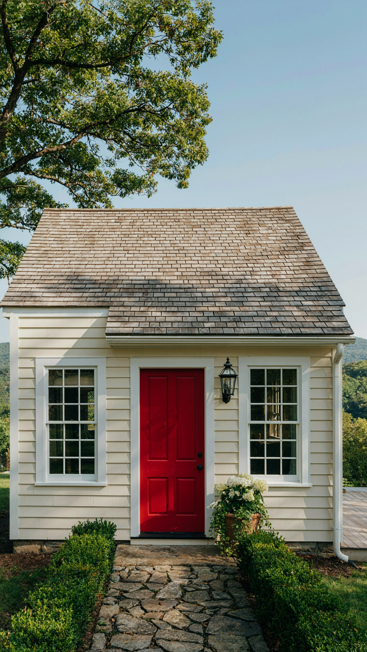
You want people to notice your house for the right reasons, not because it looks confused. Here’s the mechanism: your eye lands on whatever covers the most surface area first, then gets directed to supporting elements. The primary color dominates the main wall surfaces. The secondary color appears on trim, shutters, or architectural features. The accent color lands on doors, hardware, or small details. This hierarchy prevents visual noise.
Most cottages fail here by treating all colors equally. A cream body with white trim and a red door reads instantly. A cream body with pale yellow trim and a salmon door creates cognitive load. The primary color needs at least 60 percent of visual territory to anchor the entire composition. Secondary and accent colors occupy the remaining 40 percent combined, with the accent claiming the smallest allocation.
Directing Eye Movement With Calculated Palettes
Color contrast operates like military doctrine: concentration of force at the decisive point. A pale exterior with a dark door pulls the viewer’s attention straight to the entrance. A medium-tone body with slightly darker trim recedes into cohesion. A saturated accent color on a neutral base creates immediate focal dominance without aggression. The mechanism is simple: value difference commands attention far more than hue alone.
Cottage exteriors perform poorly when designers reverse this logic. Saturating the entire exterior kills the focal point entirely. Keeping everything the same value makes nothing visible. The protocol: choose your primary color first, then select a secondary that sits two to three steps away on the value scale, then place your accent where you want the viewer’s eye to rest. This creates intentional movement, not accident.
Painted Cladding Exterior: The Tactile Deception (Cybernetics)

How Paint Tricks Your Eye Into Seeing Texture
You want people to think your cottage has hand-laid stone or aged timber when it’s really just flat boards, and that gap between reality and perception is where this entire game lives. Cybernetics teaches us that feedback loops govern how systems self-correct, and paint operates exactly this way: the light it reflects feeds visual data back to the observer’s brain, which then constructs a false narrative about what’s underneath. Matte finishes scatter light in random directions, creating shadow variation that mimics surface depth. Glossy finishes concentrate light into highlights that read as worn edges or dimensional relief.
The mechanism is simple: micro-shadows created by paint texture compounds and application technique convince your eye that flat surfaces have relief. Cottage aesthetics depend on this illusion because authentic restoration costs five times more than painted cladding. When you choose a matte finish with fine aggregate additives, you’re not adding texture—you’re controlling how light behaves against the substrate. The observer’s brain fills in the missing dimension automatically. This is why finish choice matters more than color; the finish determines whether people see story or see paint.
Predicting What Your Cottage Will Actually Look Like
Stop trusting visualization software and mood boards. They show you the color under controlled lighting that will never match your site’s actual sun angle, shade patterns, and atmospheric conditions. Instead, map what you’re predicting against three fixed variables: the direction your walls face, the time of day your cottage receives the most viewing, and the surrounding landscape’s dominant colors. North-facing walls appear cooler and flatter under consistent indirect light, so you need higher contrast between cladding paint and trim to maintain visual dimension. South-facing walls get warmed by direct sun, which shifts warm colors toward saturation and cool colors toward gray.
The protocol is mechanical: acquire paint samples in the exact finish you’ll use (not sample cards), apply them to cardboard, mount them on your actual walls in both morning and afternoon light, and leave them for one full week. You’re watching for how the color reads against your roof, your landscaping, and neighboring structures. Most cottage owners skip this step and panic in week three of painting. The prediction works only when you’ve seen the paint under your specific conditions for enough time cycles to recognize how it behaves. Test it. Don’t imagine it.

Small House Green Exterior: Nature’s Narrative Leverage
Where Your House Sits In The Landscape
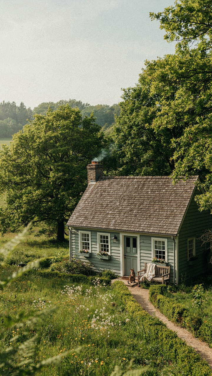
You want your cottage to look like it belongs there, not like you imposed it on the land. This is really about camouflage disguised as aesthetics. Borrow the principle from ecology: a species survives by matching its environment. Your paint color either recedes into the surrounding vegetation or it announces itself. Most people reverse this. They choose green because it sounds natural, then pick a shade so saturated or bright it fights every tree and shrub on the property.
The mechanism is tone matching, not color matching. Your cottage doesn’t need to be the exact green of nearby pines or oaks. It needs to sit on the same value scale. Surrounding trees read as medium to dark because of shadow and depth. A cottage painted in a bright, light green contradicts that visual hierarchy. Squint at your property during different times of day. Notice whether the vegetation around you reads warm, cool, or neutral. Build your paint strategy from that observation, not from trend blogs.
Greens That Actually Look Lived In
These color recommendations get worse every year because designers worship saturation. The truth: greens that feel organic carry gray or brown undertones that most people instinctively reject at first sight. They look muted. Boring, even. That’s exactly why they work. A cottage painted in a muted, slightly desaturated green appears to have weathered into its landscape instead of being dropped there yesterday.
- Sage with gray undertones: Sits between warm and cool, recedes naturally, works with stone or brick chimneys without color conflict. Common in historic farmhouses.
- Olive greens (yellow-brown undertones): Ground the house visually, pair well with tan or cream trim, don’t amplify in afternoon sunlight the way true greens do.
- Moss tones (desaturated, slightly brownish): Echo forest floor rather than canopy, appear stable and established, less common in new construction but worth testing.
- Celadon or grayish green: The recessive choice, almost invisible at distance, prevents the cottage from reading as a bright object in nature.
- Eucalyptus or muted blue-green: Splits the difference between too warm and too cool, suits coastal or mixed-vegetation settings, demands correct undertone calibration.
Sample before committing. Paint two 3×3 foot sections on different elevations of your cottage facing different directions. Observe them across a full day cycle, not just midday. A green that reads right at noon often shifts too warm or too cool in early morning or late afternoon light. The moment you stop fighting the undertones and accept them is the moment your cottage stops looking like a marketing photo.

Exterior Cottage House Colors: Art Of Deliberate Imperfection
Weathered Effects For Instant History
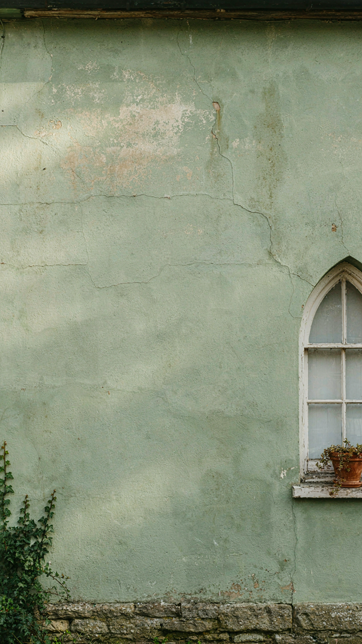
You want people to think your house has survived decades of seasons, not that you bought it last spring. The mechanism is entropy borrowed from physics: surfaces degrade predictably over time, and your paint job needs to signal that degradation without actually waiting for it to happen.
Real weathering isn’t random. UV exposure fades darker colors faster than lighter ones. Moisture collects at the base of walls and around trim, creating genuine wear patterns. You can replicate this by choosing colors that already contain the visual language of age: muted greens, soft grays, cream tones with underlying yellow undertones that suggest oxidation. Paint fades differently depending on sun exposure, so accept that your north-facing wall will hold color longer than the south side faces.
The shortcut everyone takes is adding artificial distressing or texture products. Skip it. Instead, select a base color that forgives natural fading. A soft sage green doesn’t look wrong when it lightens; it looks like it’s been there. A bright kelly green exposed to sun for five years looks like a maintenance failure. The color itself does the work.
Embracing Subtle Inconsistencies In Finish
Uniform perfection reads as corporate or new. Cottage exteriors need variation in finish application to feel honest, and most painters sand this reality to death by over-equalizing every surface.

Paint adheres differently to aged wood, new caulk, and repaired sections. A cottage that looks lived-in has subtle matte patches where wood absorbed finish unevenly, slight sheen variations from directional brushwork, and minor color depth shifts from application layers. This isn’t sloppiness; it’s specificity. When you hire a painter, explicitly reject the proposal for uniform gloss levels across all surfaces. Request matte finish on most walls with minimal sheen on trim. Accept that new wood repairs will absorb paint slightly darker than aged sections. Photograph the finished work in different light conditions before signing off. The cottage look depends on finish inconsistency working in concert with color selection, not against it.
Cottage Paint Colors Exterior: Strategic Contrast For Visual Drama
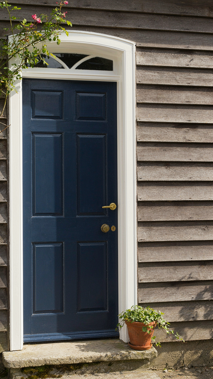
When Contrast Actually Works On Your Exterior
You want contrast because you’re terrified your cottage will look invisible. That fear is valid. Contrast is borrowed from graphic design’s concept of value separation: the distance between light and dark tones. On a cottage, value contrast forces the eye to land where you direct it, making weak architecture disappear and strong bones sing.
Most people slap a dark trim on a light body and call it done. That misses the real mechanism. Contrast works only when it separates elements that matter structurally. A gable end, a door surround, window casings, or a porch rail need opposing values to read as intentional rather than accidental. Paint the wrong elements with high contrast and you’ve created visual chaos, not drama.
The Door Frame Defines The Whole Game
Your entry door deserves the strongest contrast on the house because it’s the hierarchy anchor. A crisp white or pale cream trim around a navy or deep green door works because the difference is so stark that the eye cannot ignore the transition. The door frame becomes the compositional center, which means every other color choice must support that decision, not compete with it.

When your trim matches your body color within two or three value steps, contrast dies. You need minimum four to five steps on a ten-point value scale for the contrast to register as intentional. This is why cottages painted cream with cream trim read as flat and tired. Build the contrast by choosing a base color first, then selecting an opposing value from the opposite end of the spectrum for trim, doors, and architectural details that deserve emphasis.
Cottage Exterior: Beyond Color—The Supporting Cast
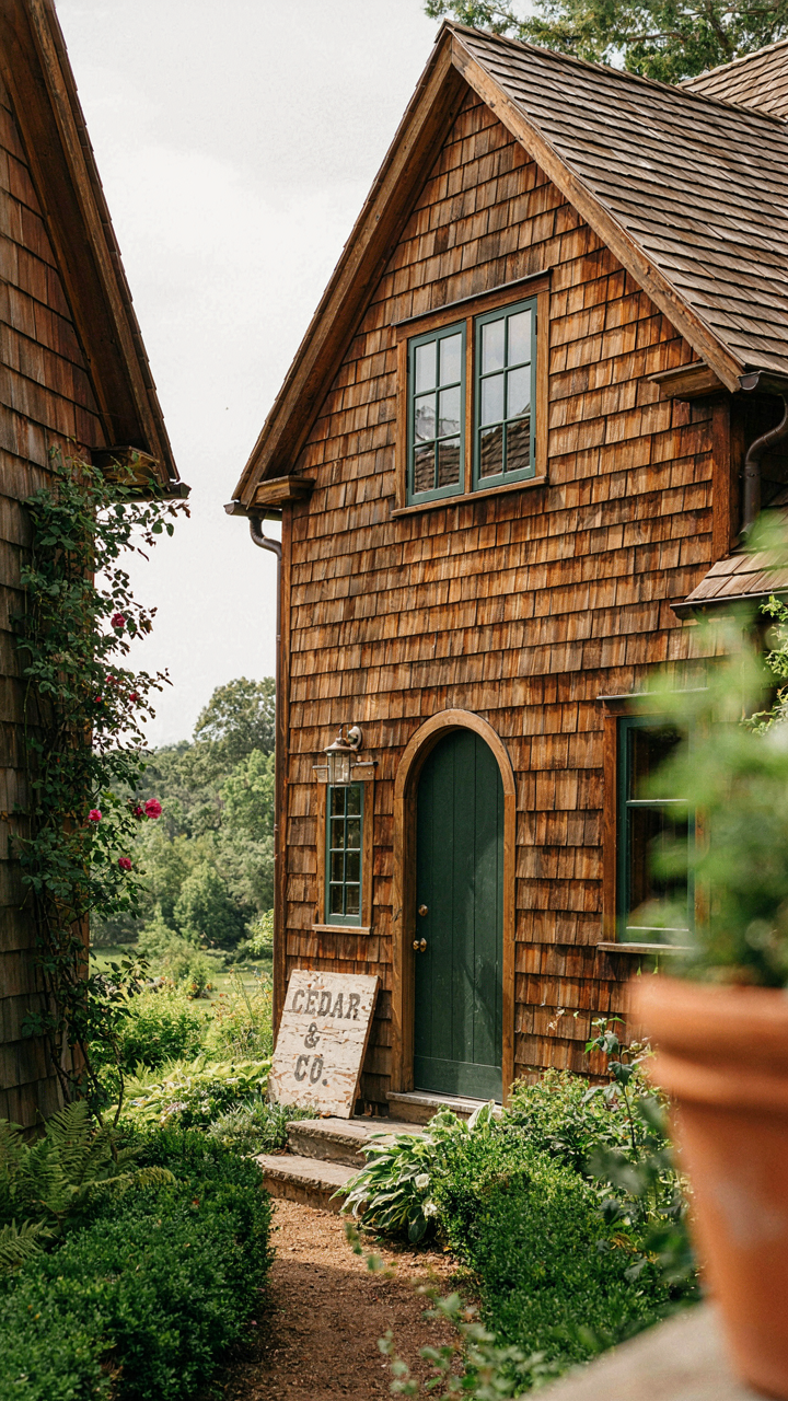
How Roofing And Trim Control Your Color Choice
You want the paint color to carry all the visual weight. It won’t. The real mechanism here is contrast—roofing and trim materials set the ceiling and floor of your palette before you ever open a paint deck. A dark asphalt shingle roof eliminates soft pastels immediately. Metal trim in bronze or copper demands warm undertones in your wall color, not cool ones.
Material reflectance is the physics principle at work. Your paint color doesn’t exist in isolation; it bounces light off surrounding surfaces. Cedar shake roofing absorbs and warms reflected light differently than slate. Cream trim reflects more light than dark wood, which shifts how any wall color reads against it. Choose roofing and trim first, then match paint to what’s already locked in.
Planting, Hardscape, And The Extended Palette
The landscaping isn’t decoration around your color choice—it’s part of your color system. Most people treat plants as afterthoughts. They’re not. A dense hedge, gravel path, or stone foundation all create a visual frame that either amplifies or deadens your paint selection.
- Native shrubs in muted greens: Dense plantings create depth and absorb visual noise, allowing wall color to read clearly without competing elements.
- Gravel and mulch tones: Warm gray gravel pairs with cooler paint; brown mulch anchors warm creams and sage tones without fighting them.
- Stone or brick hardscape: Cool gray stone demands careful paint temperature; warm brick already commits you to warmer wall palettes for cohesion.
- Climbing ivy or vines: Adds a secondary color layer that either harmonizes or creates intentional tension with your primary wall color.
- Foundation plantings at cottage scale: Low, controlled greenery frames the paint line and prevents color from feeling ungrounded or floating.
The mistake is treating landscaping as something you add after paint dries. Build your full exterior palette simultaneously—roof, trim, walls, hardscape, and plantings as one decision set. Evaluate color samples with actual samples of your roofing material, trim color, and dominant landscaping tones visible beside them. This is the only way to see what you’re actually building, not what you imagine.
The Real Obstacle Isn’t Finding The Right Color; It’s Surrendering Control To A Pre-defined Narrative
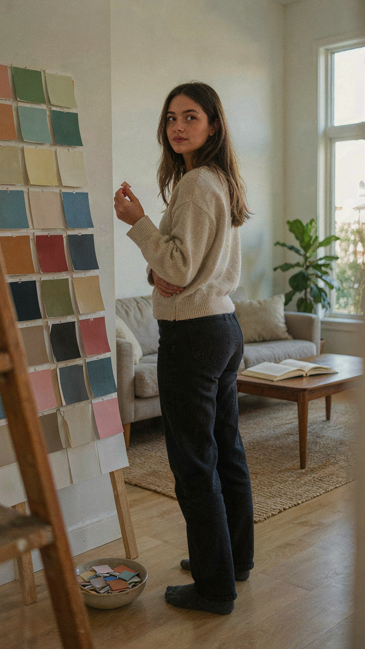
Most people pick cottage exterior paint colors the same way they pick their lives: by copying someone else’s blueprint. You scroll Pinterest, find a color you like, and think you’ve won. But that’s surrender dressed up as taste. The real work is interrogating why you want that color. Does it match your land? Your light? Your actual life? Pick one color this week. Not from a trend board. From your gut. Then defend it to yourself for five minutes without using the word “aesthetic.” That discomfort is where your actual style lives.