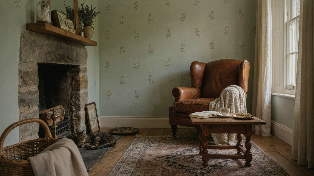
The Folly Of “Cute”: Why Most Cottagecore Wallpaper Fails
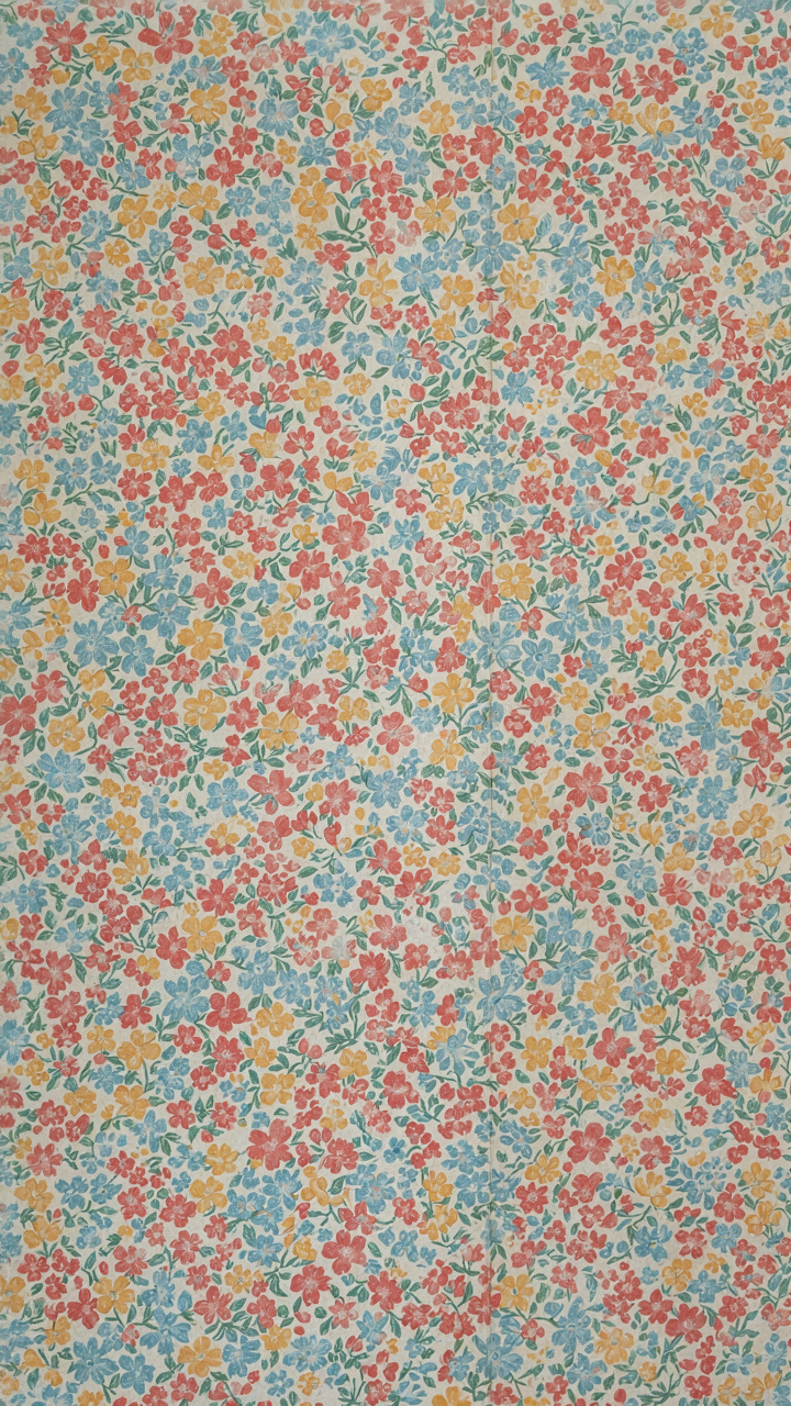
The Trend Trap That Kills Longevity
You want to feel like you’ve made a sophisticated design choice without actually studying the craft. The mechanism behind most cottage wallpaper failure is simple: manufacturers exploit the “cottagecore” trend by mass-producing patterns that check aesthetic boxes without understanding scale, proportion, or material reality. They print tiny florals and pastoral scenes at densities that overwhelm small rooms, then market them as “charming” to buyers who mistake novelty for authenticity.
What actually matters is that cottage wallpaper emerged from practical constraints, not Instagram aesthetics. Historical patterns used simpler repeat structures because hand-blocking and early printing techniques had limits. Modern reproductions ignore this. They cram detail into every millimeter because digital printing can, not because it should. The result feels busy and dated within months because it lacks the breathing room that defined actual cottage interiors from the 18th and 19th centuries.
The Difference Between Reproduction And Imitation
Reproduction wallpaper comes from documented archives, historical societies, or period-accurate pattern research. Imitation looks period without being rooted in anything real. The distinction matters because mass-market “cottagecore” patterns are pure imitation: they borrow visual language they don’t understand and apply it at the wrong scale in the wrong colorways. You can spot the fake by checking if the pattern maintains visual hierarchy. Real cottage patterns subordinate detail so one element reads first, the rest follows. Cheap imitations make everything compete for attention.
The cost difference between authentic reproduction and trend-driven imitation is smaller than most people think, which exposes the real problem: people choose imitation anyway because it’s easier to recognize at a glance. A reproduction requires you to understand what you’re looking at. An imitation just says “floral” loudly enough that no thought is required. Start by examining the repeat width of any pattern you’re considering. If it’s under 12 inches and packed with competing details, it’s designed to feel “busy,” which is design failure masked as personality.
Cottage Background Aesthetic: The Echo Chamber Effect

What Cottage Actually Means Now
You want cottage wallpaper because it signals you’re not trying too hard, which paradoxically means you’re trying harder than everyone else. The mechanism is simple: cottage aesthetic borrowed from systems theory what’s called “feedback amplification.” Each person copies the last person’s interpretation of “cozy,” and the original meaning dissolves into a visual echo. What started as functional rural housing design became an aspirational genre. Now it’s a costume worn by people in suburban homes who’ve never lived without electricity or plumbing. The patterns aren’t historically authentic—they’re consensus hallucinations about what rural comfort looked like.

The real tells are everywhere if you stop looking at Instagram. Actual cottage wallpapers from the 1800s featured dense florals because print technology was expensive and people maximized pattern per bolt. Modern cottage wallpaper copies the idea of density while using contemporary color theory that didn’t exist then. You’re not buying historical accuracy. You’re buying permission to feel nostalgic about a time you never experienced. The industry knows this gap exists and fills it by making patterns that feel old without the visual harshness of genuine period work.
Pattern Logic Isn’t What You Think
The conventional take is that traditional cottage patterns mean florals, checks, and stripes. That’s incomplete analysis. What those patterns actually share is visual repetition that obscures wall imperfections. Cottage homes had uneven plaster, moisture problems, and inconsistent surfaces. Repeating patterns masked structural reality. Modern wallpaper manufacturers have solved those problems, but they still use pattern repetition as if the problem exists. You’re paying to hide flaws that no longer appear. The pattern choice tells you nothing about authentic cottage design—it tells you about outdated functional requirements. Real pattern selection should start with your actual wall condition, not genre consensus.
Stop assuming traditional means better. Cottages used what was affordable and available, not what looked right by today’s standards. Small-scale geometric patterns were common because they required less ink and cost less to produce. Florals became associated with cottages partly through Arts and Crafts movement interpretation, not historical domination of rural homes. Your pattern choice should reverse-engineer from your room’s actual light conditions, wall dimensions, and furniture palette—not from a shared mythology about what cottage should look like. Choose patterns based on optical behavior in your specific space, then verify the pattern repeats at an interval that works with your room’s proportions.
The Arts And Crafts Background Protocol: Intentional Immersion
Where Pattern Comes From Honest Work
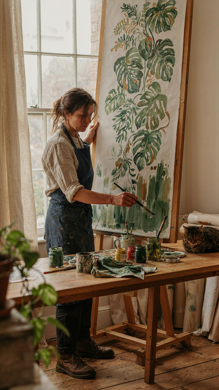
You want cottage wallpaper to feel authentic because you’re tired of mass-produced rooms that look like every other rental. The real mechanism is this: the Arts and Crafts movement rejected industrial printing shortcuts and demanded visible evidence of human decision-making in every design. Wallpaper became a protest against uniformity. Designers like William Morris refused to hide the hand that made the pattern, which is why authentic cottage wallpaper still reads as intentional rather than sterile.

The movement emerged in the 1880s as a direct reaction to Victorian excess and factory standardization. Morris and his contemporaries believed that floral and botanical patterns should reflect nature’s actual structure, not distort it for decoration’s sake. This philosophy produces wallpaper that operates differently than contemporary design. Your eye doesn’t rest on a single focal point. Instead, it tracks repeating elements that suggest organic growth, which is why these patterns don’t fatigue a room over time.
Depth Emerges When Makers Choose Constraint
Craftsmanship in wallpaper isn’t about complexity. It’s about refusing easier paths. A designer working within the Arts and Crafts protocol makes specific material choices that force pattern depth into existence. Hand block printing limited color counts, so designers layered meaning through register and spacing instead of relying on chromatic noise. This constraint produced better work.
When you select cottage wallpaper rooted in this tradition, you’re inheriting decisions that were earned through limitation, not abundance. The pattern depth comes from a maker who understood that removing options forces better thinking. Modern reproductions of Arts and Crafts designs maintain this quality only when they respect the original technical boundaries. Select patterns with clear, intentional color separation and visible print texture. The pattern should read distinctly at arm’s length and still hold coherence from across the room.
Cottage Interiors: Beyond The Feature Wall Fallacy
Wallpaper As Room Envelope, Not Accent
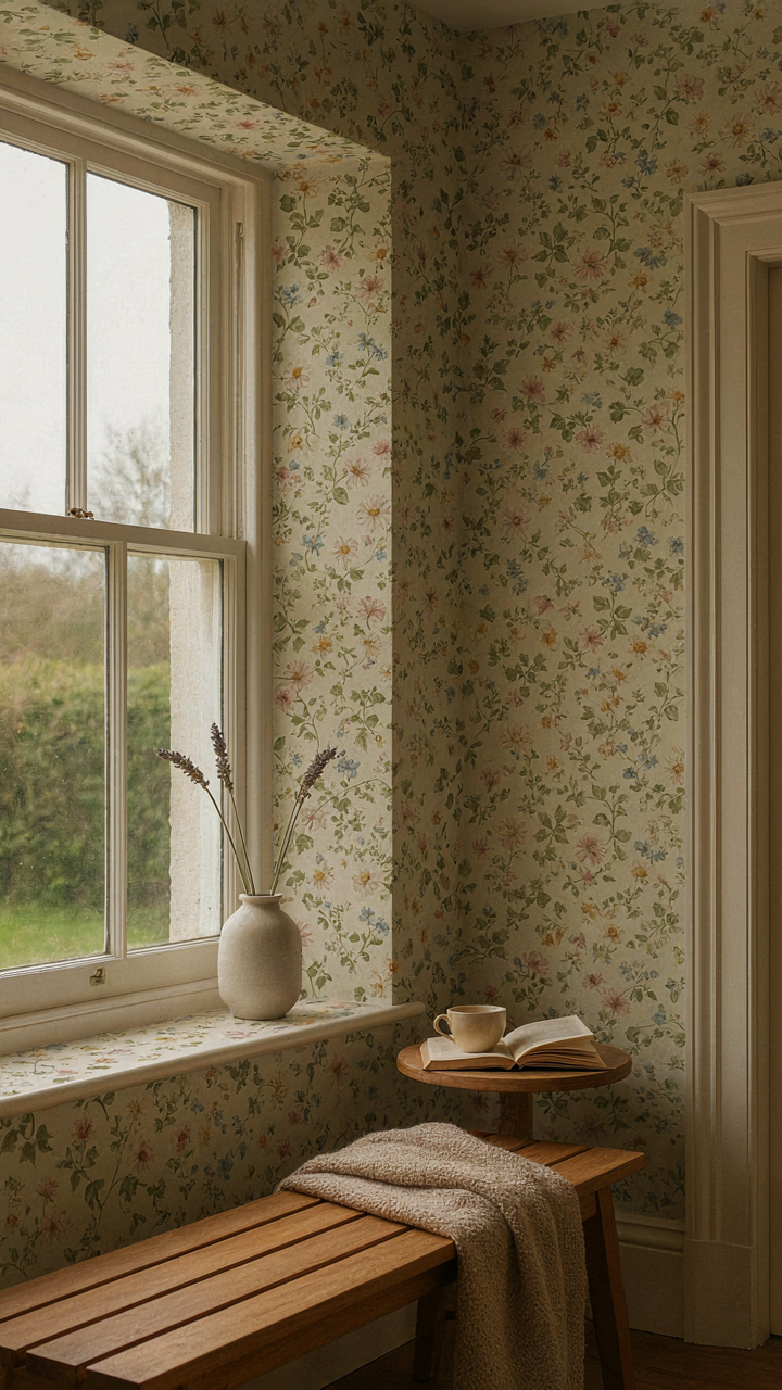
You want the feature wall because you’re afraid committing to pattern everywhere signals bad taste. The mechanism is simple: one wall creates visual noise and breaks rhythm. Wallpaper works as a system, not decoration. When you cover all walls in a cohesive pattern, your eye stops fighting the space and starts accepting it as finished.

The feature wall trend reversed actual cottage design logic. Historical cottages used consistent patterned papers throughout rooms because labor and material costs made partial coverage wasteful. Modern interior design borrowed this as an “update,” but created visual fragmentation instead. Apply wallpaper to every wall in a room to establish a genuine envelope that contains rather than punctuates the space.
Pattern Integration With Existing Architecture
Cottage wallpaper succeeds or fails based on how it responds to the room’s bones, not its current furniture. Baseboards, crown molding, window frames, and door jambs create hard stops where pattern must align cleanly. Measure ceiling height first. Low ceilings demand vertical or small-scale repeats that don’t interrupt sightlines. Higher ceilings tolerate larger motifs without making the room feel compressed. Install wallpaper so the pattern meets trim at natural breaking points, never mid-repeat at a doorway or corner.
Built-in shelving, fireplaces, and alcoves complicate application but reward precision. Wallpaper around these elements creates visual coherence only if the pattern breaks logically at architectural edges. Paper the wall behind shelving as a continuous field, then let the shelving frame become a design element within it. This transforms storage from visual clutter into intentional composition. Measure and plan seams to avoid thin strips of pattern visible between architectural features.
House Wallpaper: The Mimicry Trap Of “Soft Classic Patterns”
When Boring Masquerades As Timeless
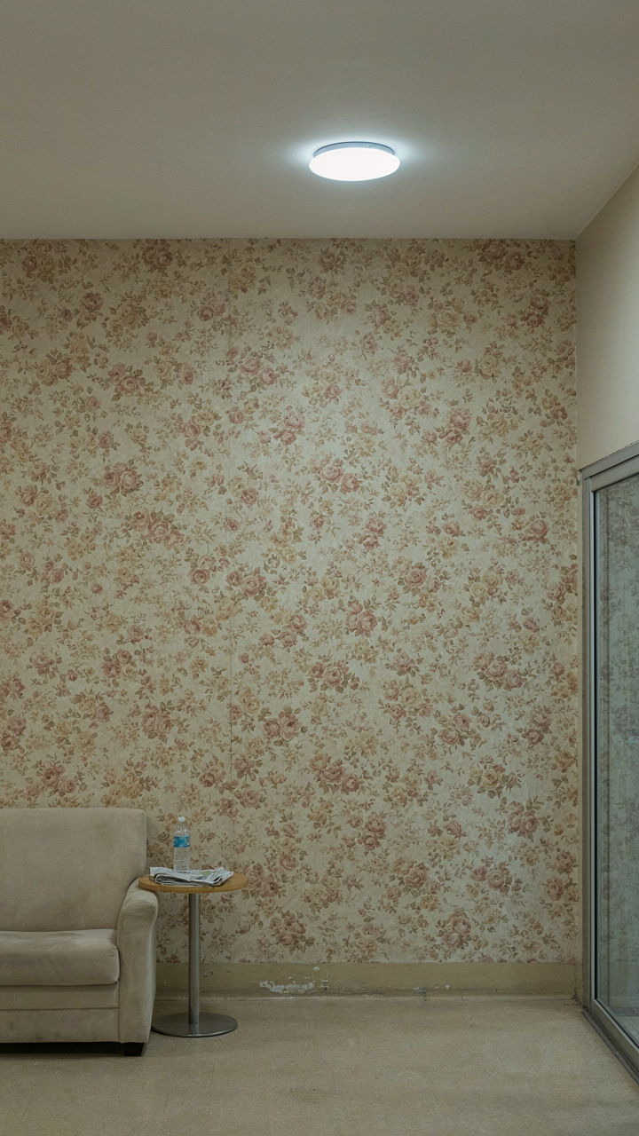
You want permission to pick something safe without admitting you’re afraid of being wrong. The real mechanism at work here is pattern dilution. Manufacturers realized that “soft” and “classic” sell to risk-averse buyers, so they flattened actual historical patterns into beige forgeries. A faded floral now means nothing. It’s generic comfort disguised as aesthetic choice, and your walls end up looking like a hotel lobby designed by committee.

True cottage wallpapers from the nineteenth and early twentieth centuries had visual weight because they served a function beyond decoration. They masked wall imperfections, absorbed sound, and signaled taste or status. Today’s mass-produced “soft classics” do none of that. They’re consumption theater. The pattern exists only to exist, carrying no narrative about craft, region, or era. Pick one and you’re not decorating. You’re buying absence.
Patterns That Carry Actual History
Pattern selection works like archaeological stratigraphy in design: each layer tells you when something was made and why. A William Morris print means something specific. A Spitalfields damask means something else. A Pennsylvania Dutch floral means yet another thing. When you select with historical weight, you stop choosing decoration and start choosing allegiance to a particular tradition. The pattern becomes legible because it points backward to actual makers, actual constraints, and actual reasons for existing.
Start by identifying which regional cottage tradition speaks to your space. English Arts and Crafts patterns differ radically from French provincial or American colonial designs. Each emerged from specific materials, printing limitations, and social contexts. Research the actual production method: roller printing changes composition versus hand-block printing. Know whether your chosen pattern replicates an archival source or invents something new under a historical name. That distinction determines whether your walls whisper truth or market fiction.
Cottagecore Pattern: The Ecological Niche Strategy

Wallpaper As A Micro Ecosystem
You want to know the secret formula so your room feels designed instead of decorated. Here it is: wallpaper doesn’t work in isolation. Borrow from ecology. In nature, an ecosystem survives through species diversity, not monoculture. Your wall patterns function the same way. One dominant pattern creates visual fatigue. Multiple pattern scales working together create resilience and depth that viewers actually settle into instead of scanning past.

The mistake most people make is treating wallpaper as a single visual element. It’s not. Your pattern interacts with light, fabric texture, furniture silhouettes, and adjacent surfaces. The pattern itself contains micro and macro scales—the overall repeat, the individual motif, the negative space between elements. Each layer either competes for attention or supports the others. This determines whether a room feels cluttered or composed.
Pattern Diversity For Visual Resilience And Depth
Soft classic cottage patterns work because they stack visual information across multiple depths. A small-scale floral repeat sits behind medium botanical elements, which sit behind larger structural shapes. Your eye moves through layers instead of stopping flat against the surface. This is active visual depth, not the passive flatness of a single-scale pattern.
The mechanism is this: asymmetrical pattern density creates perceived spatial dimension. Dense pattern areas recede; sparse areas advance. A wallpaper with varied motif spacing forces your eye to work, which makes the space feel intentional and studied rather than random. When selecting cottage wallpaper, choose patterns where the repeat includes both tight clustering and breathing room. This single choice separates a room that sustains attention from one that bores you in six months.
Cottage Background: The Illusion Of Effortless Charm
The Design Labor You Don’t See
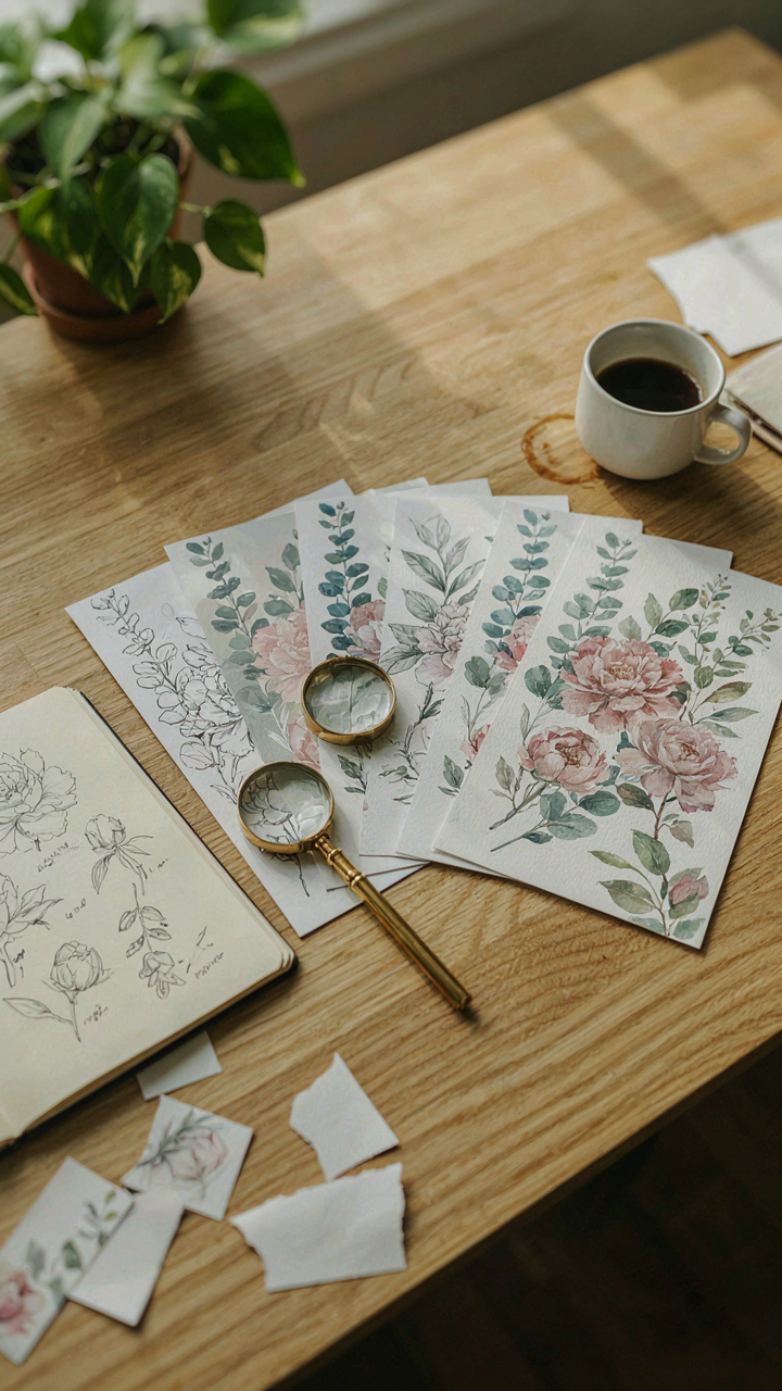
You want to believe cottage style is accident, not calculation, because that makes your home feel authentic instead of constructed. Here’s the mechanism: cottage wallpaper patterns that read as “simple” required deliberate constraint. Designers eliminated contrast, reduced color saturation, and narrowed the visual range to create restraint. A floral print that looks hand-painted took pattern iteration and selective detail removal. The fewer elements you see, the more editing happened behind it.

The historical cottage aesthetic borrowed from necessity, not aesthetic philosophy. Early rural homes used available materials and local dyes, which naturally produced muted florals and geometric repeats. Modern cottage wallpaper recreates this through intentional design choices, not by accident. Manufacturers study historical archives, test colorways for aging authenticity, and calibrate pattern density to avoid visual noise. The simplicity you perceive is the end product of multiple decision layers.
Choosing Pattern As Active Decision
Most advice tells you to pick what “feels right,” which is surrender dressed as intuition. Actual engagement means understanding what the pattern communicates about how you use the space. A small-scale botanical print in a bedroom signals different functional intent than a larger damask repeat. The pattern scale determines visual rest and mental load. Tight, dense florals create cognitive background; sparse, geometric layouts demand attention. Your choice of one over the other is not preference, it’s a statement about the psychological environment you’re building.
Commitment to a wallpaper pattern means accepting the long interaction with it. You’ll see cottage wallpaper every morning for years. Patterns that photograph well but lack visual depth fail under sustained daily exposure. Test samples on walls for at least a week under different lighting conditions. Notice which patterns recede and which demand focus. The pattern you select should support how you actually move through and rest in the room, not how the room appears in isolation.
Cottage Core Wallpaper: The Antidote To Aesthetic Anarchy
Pattern Hierarchy Stops Visual Noise
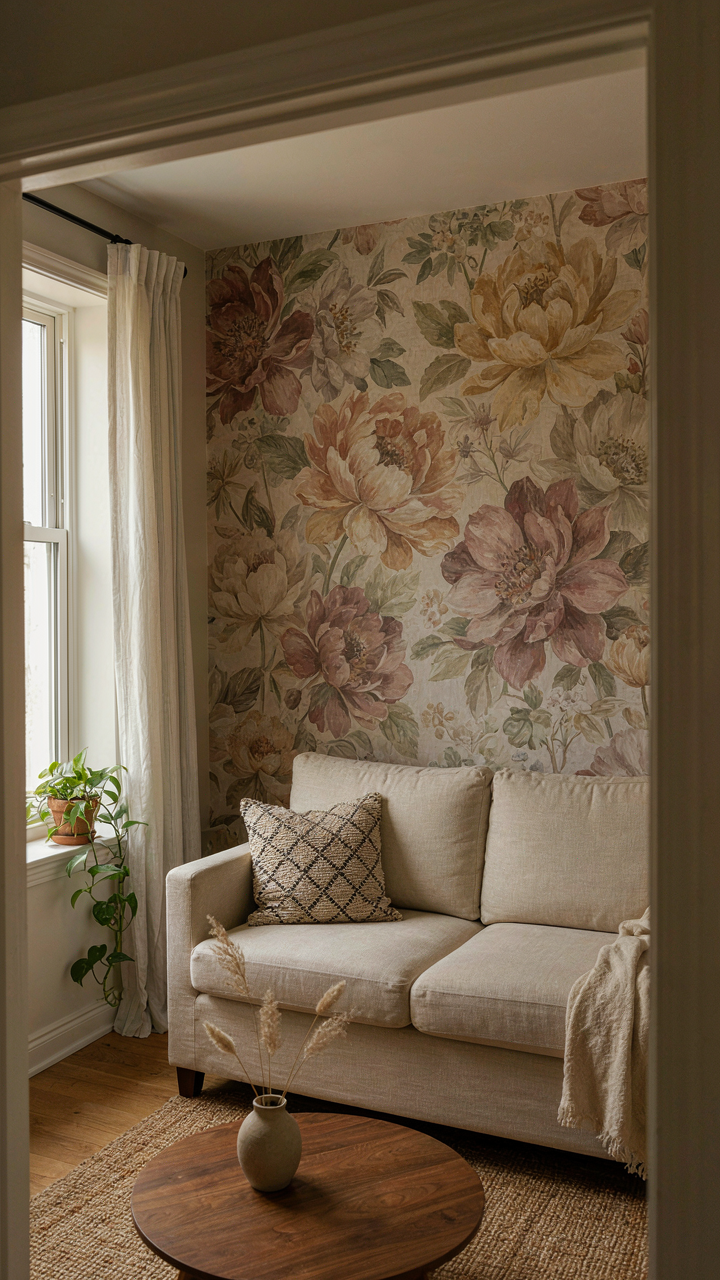
You want your space to feel intentional instead of cluttered, and that matters because chaos reads as poverty. The mechanism is pattern hierarchy, borrowed directly from information design: establish a primary pattern that commands 60-70% of wall space, then layer secondary and tertiary patterns in descending visual weight. Cottage wallpaper thrives on this structure because the aesthetic itself is built on layered florals and geometrics that need clear ranking.

Most people throw multiple patterns at a wall and hope contrast saves them. It doesn’t. The primary pattern must dominate by scale or saturation, not by competing for attention equally. A large-scale floral carries the room. Smaller geometric accents and delicate secondary patterns fill remaining surfaces without fracturing your eye’s resting point. This is why cottage rooms feel restful instead of overwhelming, even when densely patterned.
Pattern Pairing Without The Clash
Stop thinking of pattern mixing as an art problem. It’s a material problem.
- Scale separation: Pair one large-scale pattern with patterns half its size minimum. A 6-inch floral pairs with 2-3 inch geometrics, never with competing 5-inch designs that blur together.
- Tone matching across patterns: All patterns in the same room should pull from the same color family intensity. Muted florals clash with bright geometrics because the color saturation fights, not the patterns themselves.
- Positive-negative balance: One pattern should be mostly positive space (flowers on white), paired with one that’s mostly negative space (white stripes on color). This prevents visual mud.
- Border containment: Use small-scale striped or geometric borders to physically separate wallpaper sections. This eliminates the visual collision between two medium patterns trying to occupy the same zone.
- Accent walls with solid pairing: Pair patterned wallpaper with solid plaster or paint on adjacent walls. Cottage rooms require this breathing room to avoid sensory overload.
The pairing rule is simple: introduce one new pattern only when you’ve used up 70% of available wall real estate with your primary choice. If you’re adding wallpaper to a small bedroom, stick to one dominant pattern and one accent, then stop. Every additional pattern you layer demands more visual real estate to avoid collision. Measure your walls and commit to a finite pattern count before you buy.
Cottagecore Wallpaper: Reclaiming Authenticity From The Algorithm
When Feeds Replace Taste
You want to know if your cottagecore wallpaper choice is correct. That’s the real question underneath this section. Social feeds have trained you to outsource aesthetic judgment to engagement metrics, and it works until everyone’s cottage looks identical. Algorithms don’t curate taste, they amplify whatever generates clicks fastest. This means trending cottage patterns get flattened into a single visual language: the same florals, the same colorways, the same safe compositions repeating across millions of feeds.

The mechanism is simple. Pinterest and Instagram reward pattern consistency over exploration. When a floral damask performs well, the algorithm surfaces similar damasks to more users. Designers see the engagement and produce more damasks. Users see damasks everywhere and assume damasks are correct. Within months, damask becomes the default. Genuine cottage wallpaper tradition, which spans centuries and regional variations, collapses into a narrow trend cycle. You end up with walls that match the algorithm’s preferences, not yours.
Developing Taste Outside The Feed
Real taste requires friction. The uncomfortable advice here is that scrolling doesn’t build it. Building taste means spending time with actual historical cottage interiors, regional textile collections, or even visiting preserved homes from specific eras and regions. Taste develops through constraint and comparison, not consumption. You need to see what Cornish cottages from the 1800s actually used versus what a contemporary designer filtered through trend data. The gap between those two things is where your eye trains itself.
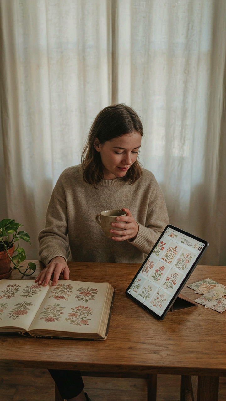
Start by collecting reference images directly from archival sources, museum collections, or period photography. Don’t use the explore page. Spend thirty minutes studying one region’s wallpaper traditions in depth rather than two hours skimming thousands of options. Notice the color limitations of the era, the repeat scales, the printing methods available then versus now. Write down what you notice. This one discipline of focused study over algorithmic browsing builds the kind of taste that produces walls worth living with for a decade, not a season.
The Wallpaper Isn’t The Problem; Your Surface-level Thinking Is
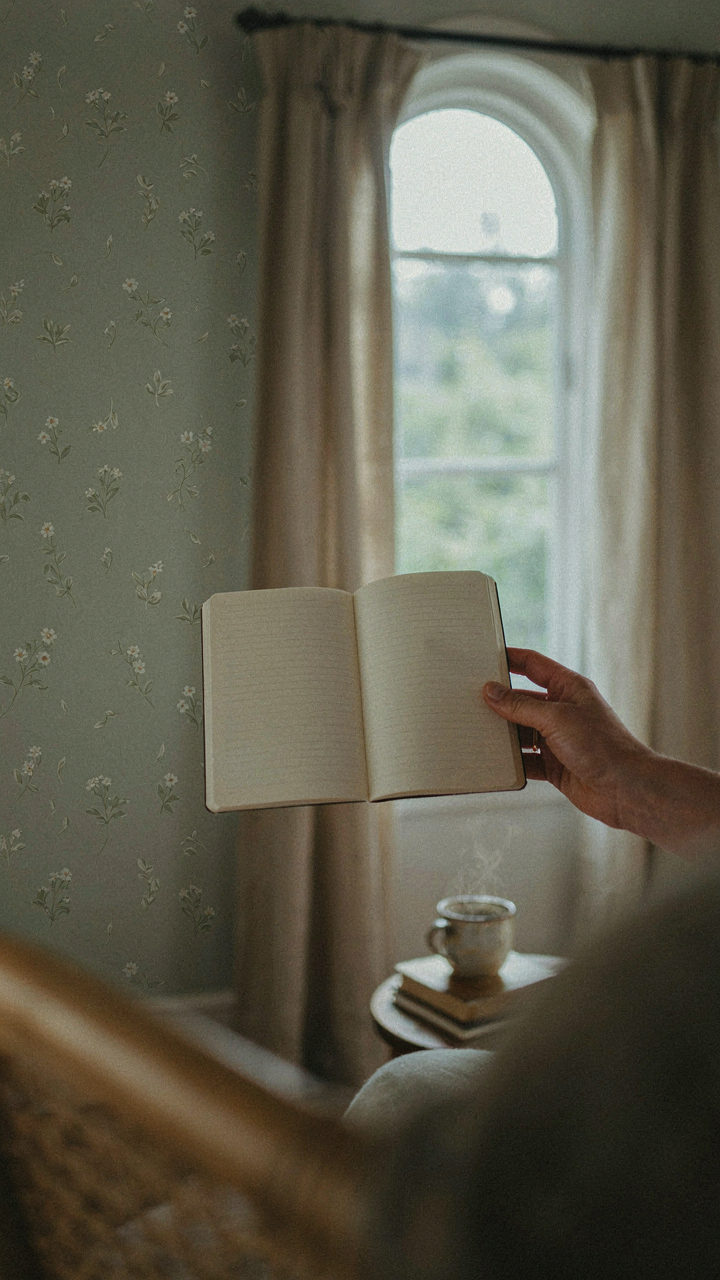
You picked cottage wallpaper because it looked good in a photo. That’s backwards. The real move is deciding what feeling you want in that room, then choosing patterns that reinforce it. Most people reverse-engineer their spaces from Pinterest instead of building from intention. Pick one room this week. Write down three words describing how you want to feel there. Now find your cottage wallpaper through that lens. Your walls won’t save a mediocre room, but the right decision-making framework will.