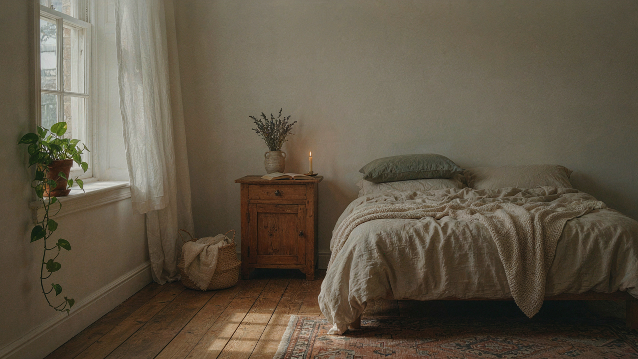
The Illusion Of Effortless Whimsy: Why Most Cottagecore Fails
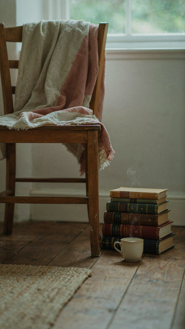
Curated Versus Clutter Without Purpose
You’re drawn to cottagecore because it promises permission to stop optimizing. You want a bedroom that feels lived-in without the guilt of mess. Here’s the mechanism: curation is about constraint, not abundance. Clutter is just stuff without a decision behind it. Most cottagecore bedrooms fail because people confuse “vintage” with “accumulation.” They pile on objects hoping the volume creates atmosphere. It doesn’t.
Real cottagecore restraint works like editorial design in print media. You include only elements that earn their visual weight. A worn linen quilt matters. A random stack of thrifted books that don’t connect to your life doesn’t. The difference is intention made visible. Start by defining what era or lifestyle you’re actually referencing, then exclude everything that contradicts it. This isn’t minimalism, but it requires active rejection of items that feel cottagecore-adjacent but break your specific narrative.
The Vintage Trap That Isn’t Actually Vintage
The common advice says “hunt for authentic vintage pieces.” That’s incomplete. Most “vintage” bedroom items sold now are reproductions designed to look aged, not objects that survived decades. Factory-distressed wood, artificially yellowed linen, and deliberately chipped paint are manufactured nostalgia. They cost more than quality new items and deliver none of the actual character of objects that lived through time. You’re paying for the aesthetic of history without the substance.
What separates authentic layering from this trap is material coherence. Real vintage textiles feel different because the fibers broke down naturally. Real wood shows wear patterns that don’t repeat identically across ten identical bedframes. Instead of chasing the “vintage look,” source functional pieces made well enough to age properly. Linen sheets from quality manufacturers will develop patina through actual use. Solid wood furniture will show genuine marks over time. This is the only mechanism that works: buy things built to last, then let time do the work you can’t manufacture.
The Authenticity Protocol: Sourcing Your Soft Vintage Layers

Where To Hunt For Real Pieces
You want people to believe your room is naturally aged, not decorated. That fear of looking like you tried too hard is what stops you from just buying everything new. The mechanism is simple: thrift stores and antique shops operate on different supply chains, and that matters for your layers.

Thrift stores stock bulk donations with no curation. You find genuine 1970s linens, worn wood furniture, and mid-century textiles because they arrived as estate liquidations. Antique shops curate inventory and price accordingly. They clean pieces and often refinish them, stripping the patina you need. Thrift stores are where soft vintage layers actually exist at scale. You’re not paying for the story the dealer invented.
Spotting Real Age Versus Manufactured Wear
The difference between genuine patina and artificial distressing is industrial. Real wear follows gravity and friction patterns. A wooden chair leg shows damage where hands grip it. Fabric fades unevenly where sunlight hit it for years. Manufactured distressing looks uniform, applied with machines or chemicals to every surface equally. Run your hand across the piece. Real aging feels organic to touch, with inconsistent texture. Fake distressing feels staged.
Check seams and hidden edges first. A genuinely old textile shows wear inside the seams before the outside shows much damage. Dye fades from exposure, not application. Look at the back of drawers and undersides of tables where manufacturers never bothered to finish. If that area looks pristine and new, the piece is recent. Authentic vintage layers require pieces that aged through actual use, not workshop treatment.
Small Cottagecore Bedroom: Maximizing Charm In Compact Spaces
The Bed Placement That Actually Works
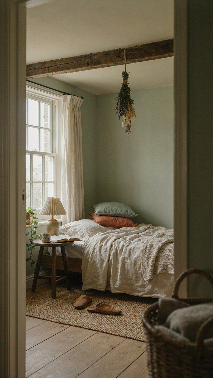
You’re worried a small room will feel cramped and ruin the whole aesthetic you’re building. Here’s the mechanism: spatial flow is about removing friction points, not adding visual weight. Place your bed against the longest wall and angle it slightly away from corners. This creates a natural pathway that makes the room feel navigable instead of cluttered. The trick isn’t decoration—it’s unobstructed sightlines.

Nightstands belong on one side only in tight quarters. A single small table with a lamp and a single shelf handles what two bulky stands would destroy. Keep pathways to windows and doors completely clear. Even a small obstacle forces your eye to work harder, which makes the room feel smaller. The real estate principle applies here: furniture placement determines perceived square footage more than actual dimensions do.
Walls And Ceilings Hold Your Layering
Most people treat vertical space like an afterthought in small rooms. Wrong. Your walls are storage real estate with zero footprint cost. Install floating wooden shelves at varying heights to break up blank wall space while storing books, pottery, or folded linens. These shelves should follow the vertical rhythm of actual cottage architecture—asymmetrical, not gridded. Mismatched heights create visual interest without clutter.
Ceiling-mounted elements matter more in compact spaces. A wooden beam (structural or decorative) draws the eye upward and changes perceived height. Hang dried herbs or floral bundles from exposed beams or hooks near the ceiling edge. This occupies the dead zone above furniture where nothing else can go. The vertical axis becomes your expansion strategy when floor space won’t cooperate.
Beyond Beige: Green And Beige Room Ideas That Aren’t Bland
The Contrast Trap In Muted Tones
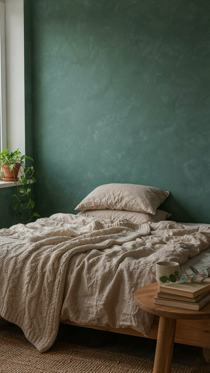
You’re worried beige and green will look flat and boring, which means you’re actually afraid of looking poor or tasteless. The mechanism you’re missing is contrast hierarchy, borrowed from visual design. Most people drop three similar tones into a room and call it layered. That fails because your eye has nowhere to land. You need one anchor tone, one complement, and one recessive tone working in calculated opposition.

The anchor is your dominant wall or large furniture piece. Make it the deepest, most saturated tone you’re using—a real sage or forest green, not wishy-washy. Your beige works as the complement, appearing on 40 percent of the visible surfaces. The recessive tone, a near-white or cream, should occupy roughly 20 percent to create visual breathing room. This ratio forces the eye to move through the space instead of getting stuck in a single value.
Texture Breaks The Monotony Rule
Cotton, linen, and wool don’t just feel different; they scatter light at different angles. This is physics at work in your bedroom. A flat painted wall next to a linen curtain next to a wool throw creates depth without adding color. Common advice says texture adds warmth. That’s incomplete. Texture adds visual information, which prevents the room from reading as one flat plane.
Layer your textures methodically. Start with one base fabric for large pieces—linen works here because it’s historically accurate to early cottage interiors and photographs well under natural light. Add a secondary texture in your bedding, like waffle weave cotton or a chunky knit throw. Introduce a third texture through window treatments or wall hangings. By the third texture layer, your eye reads the room as intentional and complex, not monochromatic.
The Whimsical Cottagecore Aesthetic: A Study In Controlled Chaos

Asymmetry That Actually Works
You want permission to break the rules without looking sloppy. That’s what asymmetry sells. But most people misunderstand it as “just throw things around randomly.” Wrong. Asymmetry in cottagecore design works because it mirrors how objects accumulate in lived spaces over decades, not how an interior designer arranges them for a photoshoot.

The mechanism comes from visual weight distribution, not symmetry. A heavy wooden dresser on the left needs counterbalance on the right, but that counterbalance doesn’t need to be identical. Stack three vintage books on a shelf. Place a ceramic pitcher on the opposite side. Both anchor the eye. The key is intentional imbalance that reads as natural, not accidental. Measure the physical space and the visual heaviness of each object independently.
Growth Patterns Over Decorating Rules
Evolutionary biology teaches one principle that applies directly here: organisms grow along paths of least resistance, filling available space according to function, not aesthetics. Your cottagecore bedroom should mimic this. Vines don’t spiral symmetrically. They climb toward light. Wildflowers cluster where seeds scattered, not in neat rows.
Translate this to layering: place items based on use frequency and natural sight lines, not on design balance. The stack of quilts lives where you actually grab them. The dried flowers occupy shelf edges where dust collects naturally. Clutter that serves a purpose looks like curation. Clutter that exists to fill space looks like neglect. The difference is whether each object has a reason to be there beyond appearing cottagecore.
Cottagecore Interior Bedroom: Textiles That Tell A Story

The Fiber Foundation
You want textiles that look intentional rather than thrifted by accident. That’s the real question underneath. The mechanism is material behavior: each fiber has actual physical properties that determine how it ages, wears, and reflects light over time. Linen softens with washing. Cotton holds dye differently than wool. Wool felts under heat and moisture. These aren’t aesthetic choices—they’re chemical realities that either work for your space or work against it.

Linen is cellulose that breaks down into softer fibers with use, which is why vintage linen bedding reads as “lived in” instead of “neglected.” Cotton has consistent fiber diameter, making it durable but also prone to pilling if low quality. Wool contains lanolin and resists wrinkles naturally, but it demands specific care to prevent shrinkage. For cottagecore bedding that actually functions across seasons, linen and cotton blends perform better than pure fiber because they balance breathability with durability. Choose materials based on laundry reality, not visual fantasy.
Texture Layering Without Chaos
The advice to “mix patterns fearlessly” is how people end up with five competing visual weights fighting for attention. Real pattern mixing is constraint-based, not expressive. Start with a scale hierarchy: one large-scale pattern anchors the space, two medium-scale patterns provide transition, one small-scale pattern breaks visual weight. A floral duvet in larger print, striped pillowcases in medium scale, and a woven throw in small texture creates depth without noise. The eye needs place to rest, not constant stimulation.
Texture works the same way. Rough linen against smooth cotton against nubby wool creates tactile interest, but only if you limit the count. Use no more than three textile types per bed arrangement. Layer them by placement: smooth base sheet, textured duvet, woven throw folded at the foot. This creates visual and physical progression without becoming cluttered. The mechanism is simple: repetition of material within constraint feels intentional. Repetition without constraint feels like indecision.
Room Position Ideas: Crafting Your Cottage Core Small Bedroom Sanctuary
Where Your Bed Actually Belongs
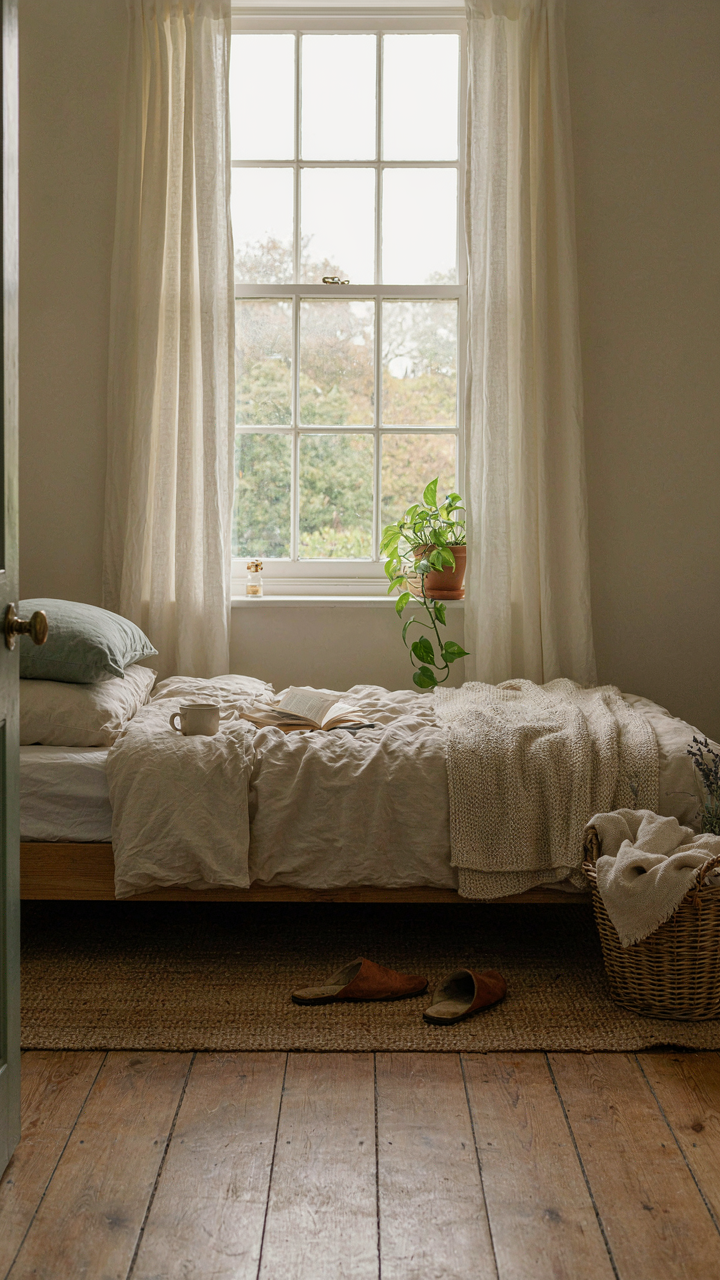
You want the bed positioned “perfectly” because you think it’ll make the room feel bigger and you’ll finally feel peaceful. That’s not how it works. The real mechanism is sightline control: your brain processes threat and calm based on what enters your visual field when you’re vulnerable. Position the bed so the door sits in your peripheral vision without requiring neck strain, and your parasympathetic nervous system stops working against you.

The wall opposite the door is the traditional placement for cottagecore bedrooms, and it works because it eliminates the startle response. Avoid placing the bed directly in line with the door opening—this creates a psychological “through passage” feeling even when the door is closed. If your room is small, the bed against the longest wall maximizes floor space and gives you genuine breathing room, not an illusion of it.
Capturing Light Without Sacrificing Privacy
Everyone says “maximize natural light,” but they don’t specify the trade off: direct sunlight fades fabrics and creates glare on surfaces you want matte. The real mechanism here is light layering, borrowed from photography. You want directional light sources at different intensities so you can control mood and exposure throughout the day.
Position the bed perpendicular to windows rather than facing them directly. This lets morning light hit the room without blasting across your sleeping surface, and it preserves the vintage textiles cottagecore relies on. Sheer linen curtains filter light without blocking it entirely, and vintage-style roller shades or wooden shutters let you dial the brightness down when needed. Window placement determines room temperature and fabric lifespan far more than most people acknowledge.
Cottagecore Bedroom Lighting: Beyond The Overhead Glow
The Physics Of Layered Light
You want this room to feel like a choice, not a default. The mechanism is simple: overhead light strips away dimension and reads as institutional. Lighting design borrows from physics the principle of light diffusion—how light scatters when it hits surfaces versus traveling in direct rays. A cottagecore bedroom needs multiple light sources at different heights and intensities so no single source dominates the space. This creates visual depth. One ceiling fixture flattens everything. Three light sources at varying distances from your eye restore the dimensional quality that makes a room feel intentional and inhabited.

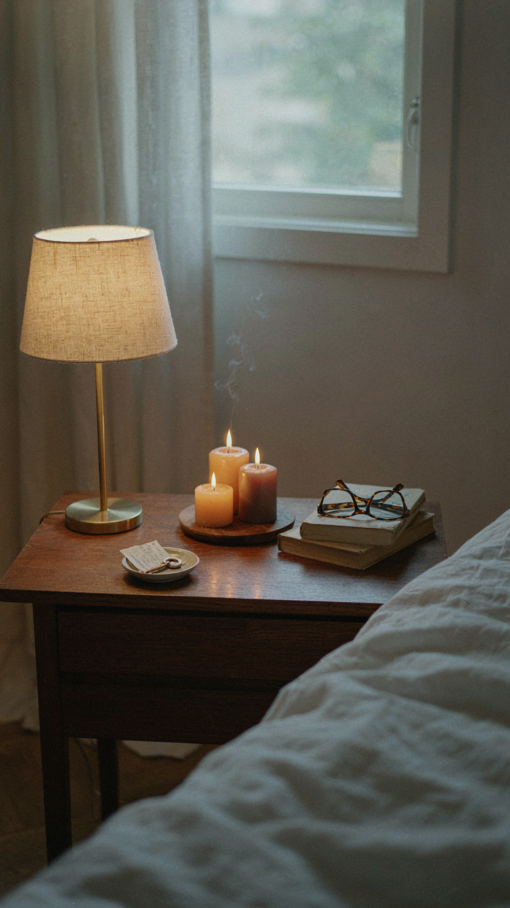
Layer your lighting in thirds: ambient (general fill), task (functional), and accent (mood). Ambient comes from sources bounced off walls or diffused through fabric. Task lighting sits where you actually need to see—bedside tables, a reading chair, a desk. Accent lighting emphasizes texture and creates visual interest. This separation means you control the room’s emotional temperature without rewiring anything. You flip different switches for different times and activities.
Candlelight And String Lights Guidelines
The practical reality: candles and string lights work because they emit warm color temperature light in the 2000 to 3000 Kelvin range, matching how humans evolved to perceive safety. They’re not decoration. They’re functional mood anchors.
- Beeswax candles over paraffin: Beeswax burns cleaner, longer, and naturally emits a higher color temperature that reads as warmer. Paraffin candles generate soot and smell chemical. The cost difference justifies itself in burn time and room quality.
- String lights with Edison bulbs or warm white LEDs: Edison bulbs (incandescent style) produce authentic warm light but generate heat and have short lifespans. Warm white LEDs (2700K color temperature) replicate the effect without heat risk. Install them loosely draped, not taut, to diffuse light rather than create spotting.
- Candle placement on stable surfaces only: Nightstands, dressers, and shelving at least 12 inches from fabric or curtains. Never hang candles or place them on unstable furniture. The cottagecore aesthetic doesn’t justify fire risk.
- Brass or copper candleholders for visual consistency: These metals age gracefully and match vintage bedroom palettes. They also conduct heat safely away from wood surfaces. Avoid plastic holders that look cheap and don’t age well.
- String light length matters for scale: A single strand across one wall looks sparse and effort-forward. Run strings along two walls or create a gentle swag effect to fill visual space without looking crowded or theme-park forced.
Positioning determines whether these elements serve the room or clutter it. String lights work best along walls or framing architectural features rather than floating aimlessly. Candles cluster in odd numbers on horizontal surfaces—three on a nightstand, five on a shelf—to create intentional groupings that read as curated rather than scattered. The goal is controlled ambiance that you can actually sit in for hours without eye strain or that nagging sense that you’re performing cottagecore instead of living in it.
Integrating The Wild: Botanical Elements In Your Space
Living Plants Versus Dried Arrangements
You want plants in your room because they signal that you have time, taste, and a functional life. The mechanism is simpler: live plants require active maintenance, which means you’re either committed to the space or you’re not. Dried florals let you perform the aesthetic without the responsibility.

Live plants demand water, light, and temperature stability. They die if you neglect them, which means your room becomes honest about your actual habits. Dried arrangements stay static indefinitely. Pick live plants only if your window placement and daily routine actually support them. Otherwise, dried flowers become the tactically correct choice because they anchor the botanical theme without the failure tax.
Foraged Elements Over Store Bought Botanicals
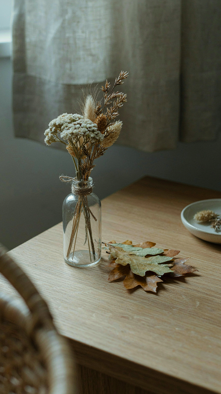
This isn’t about being precious or Instagram authentic. Foraged materials work because they carry genuine irregularity that mass-produced dried flowers can’t replicate. Pressed leaves, branches, seedpods, and grasses from your actual region cost zero dollars and look intentional rather than ordered.
The constraint of foraging forces specificity. You can’t buy a generic “wildflower mix.” You find what grows near you, which means your cottagecore bedroom reflects your actual geography instead of a template. Press specimens between book pages for two weeks before arranging. Gather in autumn for dried seed heads and branches with structural character. Store in paper, not plastic, to prevent mold. The final step: place foraged pieces in glass bottles or tie them in bundles with linen thread on your nightstand, not scattered in vases that look staged.
The Anti Cottagecore Mistake: Ignoring Function For Form
Where Your Storage Actually Lives
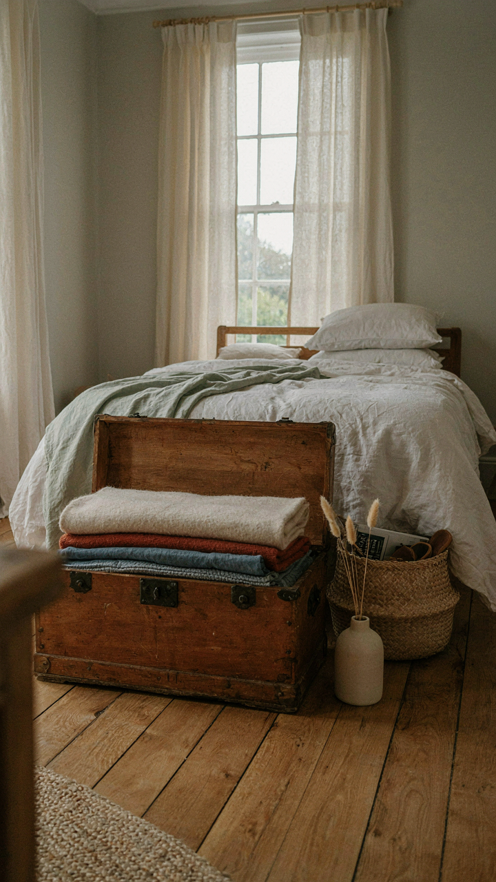
You want the room to look effortless. That’s the real reason you’re reading this section. The mechanism is simple: a cottagecore bedroom without hidden storage becomes a museum you can’t live in, and museums aren’t restful. Borrow from inventory management. Every item needs a location. Baskets under the bed, vintage trunks at the foot, wall-mounted shelves behind open doors. The aesthetic works only when the infrastructure exists first. Most people reverse this and end up with clutter masking the whole look.
Storage that matters integrates into the design, not bolted on as an afterthought. Wood shelving anchored to plaster walls, woven baskets that match the color palette, vintage dressers with deep drawers. The items you use daily should have a route to their storage spot that takes three seconds, not thirty. This prevents the slow decay where things accumulate on surfaces because finding their home requires effort.
Comfort Demands Brutality Over Instagram
Ignore the advice that says pick textiles first. That’s backwards and wastes money. Pick the mattress, pillows, and bedding weight for how you actually sleep. Temperature regulation comes before thread count. A cottagecore bedroom with a bad mattress is just a room where you sleep poorly in a nice outfit. Then add the layers. Flannel sheets in winter. Linen in summer. The visual warmth of the room serves the physical warmth you need, not the other way around.
The bed is where you spend eight hours. Everything else is decoration around that one non negotiable fact. Test the chair in the corner for back support before buying it for its vintage appeal. Ensure the lighting reaches the corners without creating glare that triggers migraines. A functional cottagecore bedroom means you can actually rest in it, which means you’ll stay in it long enough to enjoy the design at all.
You’re Not Decorating A Room; You’re Engineering An Escape. Don’t Mistake Superficial Charm For Genuine Sanctuary
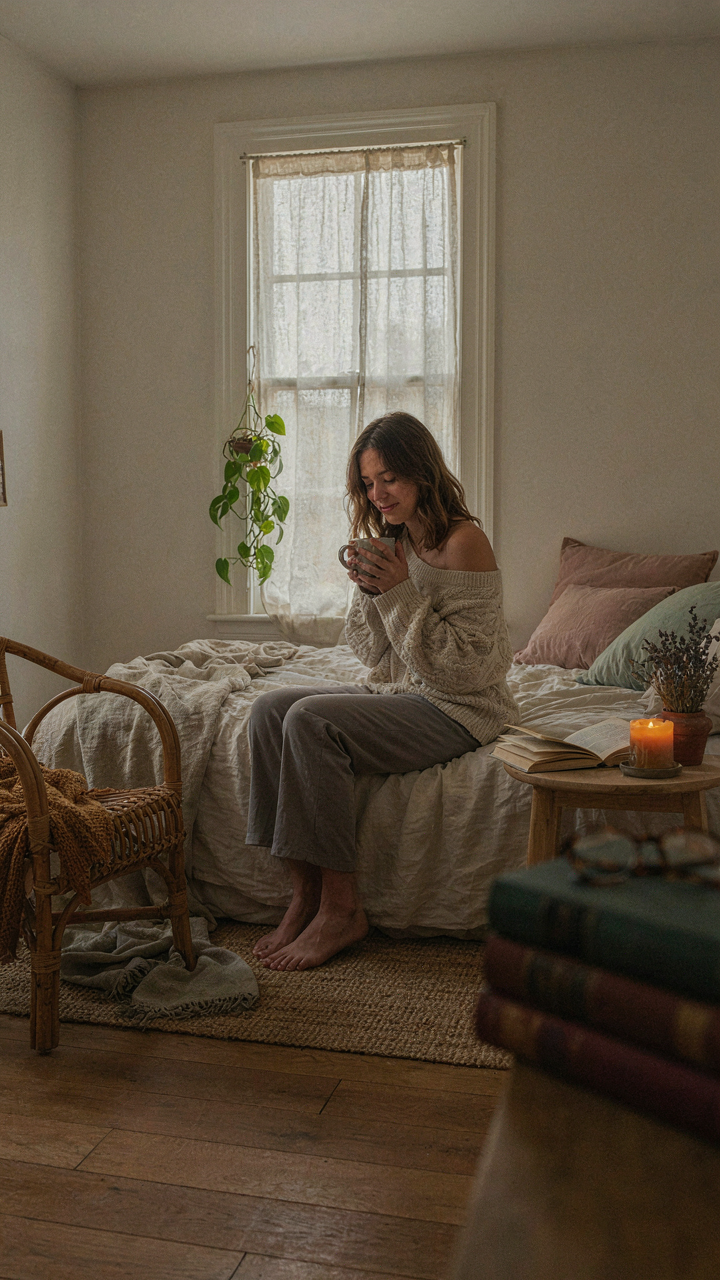
Most people buy cottagecore stuff and wonder why their bedroom still feels like a hotel. Soft layers and vintage pieces don’t matter if you haven’t removed what drains you first. Clear out the clutter, the work stress, the obligation you left on your nightstand. Then add the textures. Your bedroom works when it stops feeling like a room and starts feeling like a decision you made to protect your nervous system. Stop collecting aesthetics and start building barriers against the outside world.