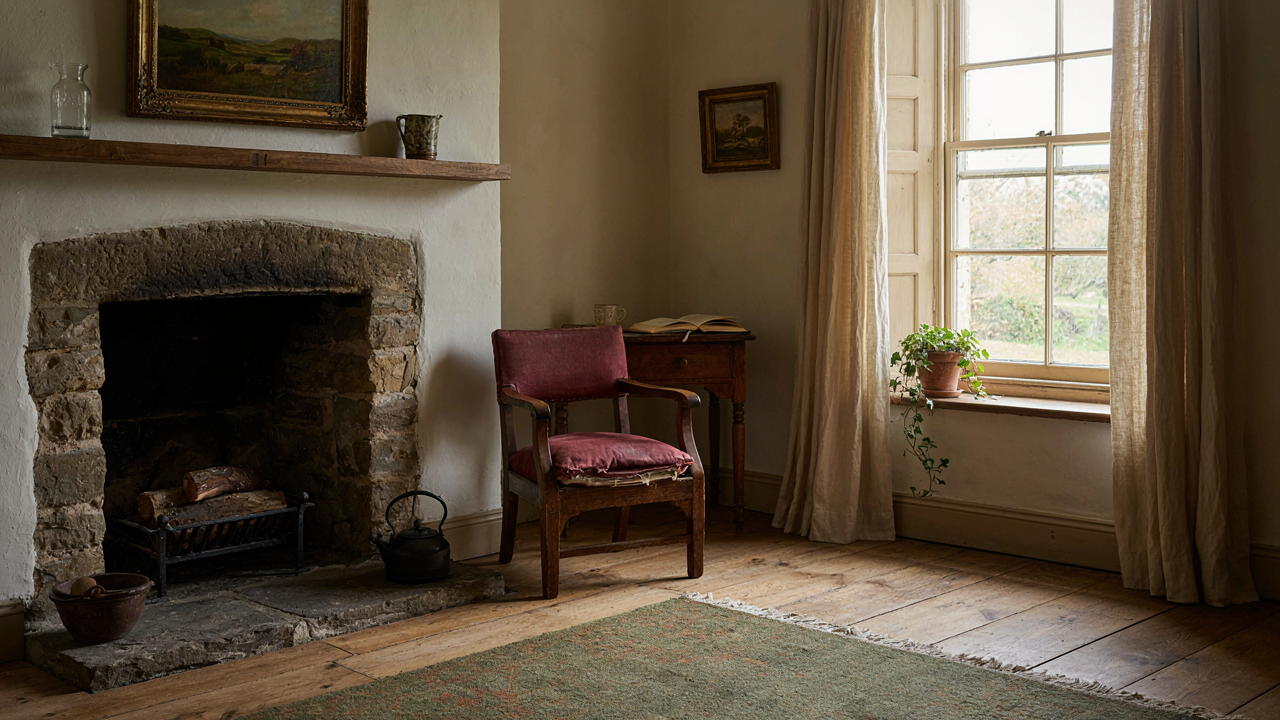
The “Cozy” Delusion: Why More Layers Equal Less Soul
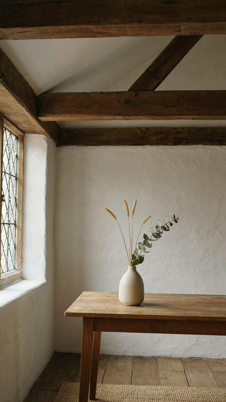
Layering As Camouflage For Weak Bones
You want people to walk into your space and feel like they’ve stepped into something intentional—not assembled from Pinterest boards. The truth: most people layer to hide bad foundational decisions, not to build warmth. Think of it like load-bearing walls in architecture. Remove the wall, no amount of decoration fixes the collapse. In English cottages, the bones are stone, timber beams, and proportioned rooms. Those don’t change. Everything else is ornament covering either strength or emptiness.
Most layering advice tells you to add texture, pattern, and objects until the room “feels lived in.” That’s backwards. A room with poor wall color, wrong furniture scale, or dead light won’t become warm by adding a throw blanket and three side tables. You notice the dysfunction first, then add layers to bury it. The mechanism works against you. Fix the structural layer—walls, large furniture, light source—before you touch a single decorative object.
When Accumulation Reads As Anxiety
Warmth is a signal your brain receives from coherence and restraint, not volume. A cottage interior with eight texture types, twelve objects on one shelf, and mismatched fabric patterns sends a different signal: whoever lives here doesn’t trust empty space. That reads as noise, not comfort. Visitors feel the anxiety underneath the abundance before they feel welcome.
English cottage interiors that endure—the ones photographed in design books, the ones people remember—operate on subtraction. A stone fireplace with one painting above it. Shelves with breathing room. One textile per surface. The warm feeling comes from what you chose to remove, not what you crammed in. Layer intention first. Everything else follows the same rule: Does this object answer a question the room already asked, or am I adding it because I’m afraid the room feels empty? Start there.
The Authenticity Protocol: Sourcing, Not Shopping

The Hierarchy Of True Patina
You want people to believe your cottage is real. That’s the hidden motive here. The truth is simple: patina works like archaeology—layers accumulate in strict order, and you can’t skip to the bottom. Real age leaves marks that follow physical law, not aesthetic preference. A floorboard darkens from foot traffic in predictable zones. Plaster cracks follow structural stress patterns. Wood grain shows honest wear only where hands and bodies actually contact it.

Most people reverse-engineer this wrong. They buy “distressed” furniture and wonder why rooms feel staged. The mechanism is detection: your eye reads surfaces for causality. When wear appears random or decorative rather than functional, the brain flags it as false. Authenticity in cottage interiors means sourcing pieces where the damage tells a coherent story about how the object was actually used.
Avoiding The Mass Produced Old
Generic advice says hunt for vintage pieces. That’s incomplete. The real problem is that 80% of online “antique” cottage goods are industrial reproductions made to look aged. Manufacturers spray stain on new pine, distress corners with hammers, then sell it as reclaimed. These pieces lack the internal logic of wear. A genuine cottage table shows uneven patina because one side faced a window. Factory-distressed versions show symmetrical scratches because machines don’t differentiate.
The protocol is straightforward. Source from working estates, deaccessioned institutional pieces, or local craftspeople who build new work using period techniques and authentic materials. Verify construction methods: hand planing marks differ from machine planing. Check wood species against what was actually available in the region and era. Avoid retailers who sell “cottage aesthetic” as a product line. The sourcing step determines whether your interior reads as genuine or as a consumer choice dressed in vintage costume.
Beyond The Beige: Unearthing Real English Cottage Colors

What Actually Lived On Those Walls
You want to know the cottage color story because you’re afraid beige will make your space forgettable. Here’s the mechanism: historical English cottages didn’t choose colors from a palette. They used what grew locally and what they could afford. Madder root made red. Woad made blue. Lime wash base meant colors shifted with light and weather. The palette wasn’t curated—it was determined by material availability and regional trade routes.

Contemporary cottage interiors copy the aesthetic of this constraint without the constraint itself. You see the same muted ochres and grays everywhere because manufacturers created a “heritage” color system that sells consistency. Real cottage colors varied wildly by county and decade. A Cotswold cottage might show deep terracotta from local clay pigment while a Kent cottage displayed pale greens from copper compounds. The difference matters because it changes how you source and apply color authentically.
The Room As A Timeline, Not A Mood Board
The common advice treats color as accent—a feature wall, a trim highlight, something added to white. Wrong. In actual English cottages, color functioned as narrative. Each room told the economic and practical story of its inhabitants. Kitchens ran warm because heat from the stove stained and yellowed plaster, and warmer pigments hid that wear. Parlors stayed cooler and more formal. Bedrooms went pale not for aesthetic reasons but because better light helped with sewing and mending work.
Your interior works the same way once you stop treating color as decoration. Pick colors that align with how you use each room and what materials dominate it. A heavily trafficked hallway with stone flags needs warm earth tones that hide dirt and scuff marks—not because it’s “cottagecore” but because that’s what performs. The color isn’t the story. The function of the color is the story. Begin by writing down what happens in each room, then let the color follow the work.
The Scarcity Principle In Cottage Decor
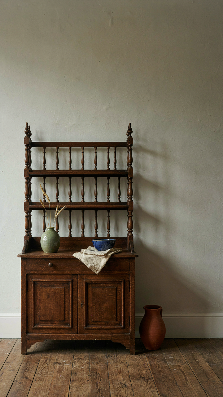
What Scarcity Actually Costs You
You want a cottage interior that signals taste without screaming for attention, and you’re hoping abundance masquerading as curation will do it. It won’t. Economics teaches us that scarcity drives value, and in cottage design, scarcity operates like price elasticity: the fewer comparable pieces in your space, the more each one demands attention and justifies its existence. Most people load rooms instead of editing them, mistaking fullness for richness.

A genuinely scarce piece in a cottage interior isn’t rare because it’s expensive. It’s rare because it’s intentionally isolated. One Welsh dresser holding specific ceramics beats twelve shelves of decorative objects. The constraint forces every item to earn visibility. When you operate from abundance, nothing stands out. When you operate from genuine scarcity, every object becomes the focal point by default, which is the opposite of what most design advice actually teaches.
When Demand Exceeds What’s Available
Unique vintage finds don’t hold their appeal because they’re old. They hold it because you can’t replace them once they’re gone. That’s demand elasticity working in reverse: as availability decreases, perceived value increases, but only if the piece actually fits the room’s logic. The common mistake is treating scarcity and uniqueness as interchangeable. They’re not. A scarce piece that contradicts your cottage’s material language is just clutter that costs more.
The mechanic is simple: source fewer items deliberately, let each one sit in empty space, and rotate seasonally if the piece can handle it. A single linen throw draped over a chair reads differently than five blankets stacked on a bench. The emptiness around the single throw makes it visible. This isn’t minimalism rhetoric. It’s signal-to-noise reduction. Commit to acquiring one statement piece per room per year instead of filling gaps constantly, and you’ll watch your cottage interior shift from decorated to designed.
English Cottage Interiors Kitchen: Function Over Fairy Tale
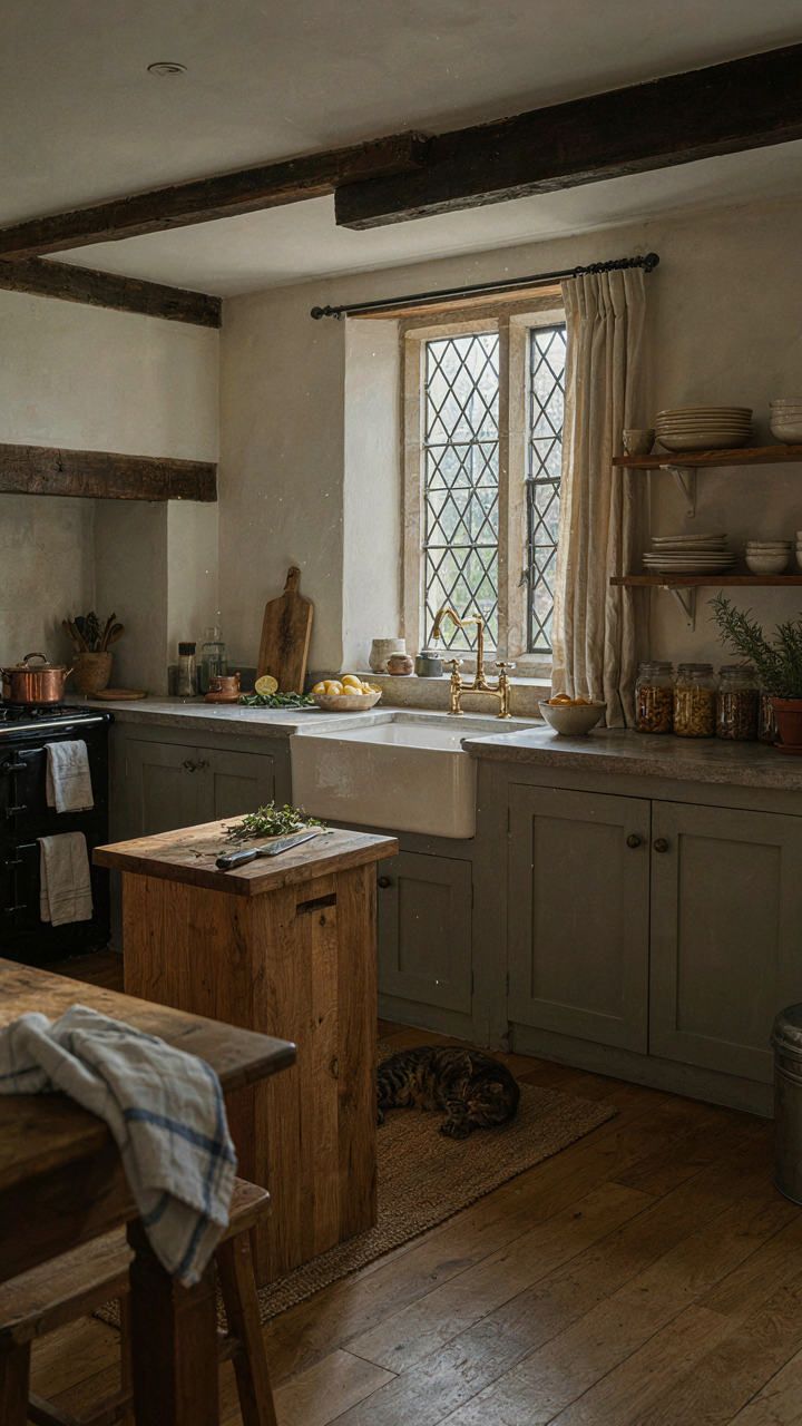
The Work Surface That Actually Works
You want the cottage kitchen to look untouched by time because you think that signals authenticity and taste. Here’s the mechanism: a kitchen that can’t handle real cooking becomes theater, and theater gets exhausting to live in. Borrow from industrial design’s principle of “form follows function”—the cottage kitchen’s layout must prioritize workflow, not nostalgia. A working surface needs depth, durability, and placement that cuts steps between stove, prep, and sink. This isn’t about replacing character; it’s about refusing dysfunction dressed up as charm.

Most cottage kitchens fail because they treat the counter as decoration rather than infrastructure. Stone or solid wood counters work because they tolerate heat, moisture, and knife marks without degrading into unusable surfaces. The depth matters—seventy centimeters gives you actual workspace, not a narrow shelf for display. Position your prep counter adjacent to the stove and sink to eliminate the pattern of walking empty-handed between zones. This single decision determines whether you cook three times a week or admit defeat and order takeout.
Practicality Dressed As Period Detail
The myth says cottage kitchens trade efficiency for looks. False. Georgian and Victorian cottages were built by people who cooked daily on limited fuel and time—they engineered tight, logical spaces. A cast iron range occupies less footprint than modern appliances while delivering superior heat distribution. The brick alcove beside the fireplace wasn’t aesthetic accident; it was the fastest route to move pots from fire to table. Recessed shelving along walls wasn’t decoration; it kept heavy equipment accessible without blocking traffic.
Modern cottage kitchens fail when they ignore this precedent and install pretty but impractical layouts. Apron sinks with shallow bowls can’t handle stockpots or sheet pans. Open shelving everywhere creates a visual mess once you’ve stored the basics. Deep drawers under counters beat cabinets because you see and reach everything without kneeling. The real constraint isn’t style—it’s whether the space lets you execute cooking tasks without friction. Start by mapping your actual cooking patterns, then place storage and surfaces where your hands naturally move.
Cottage Hallway: Transitional Spaces That Command Attention
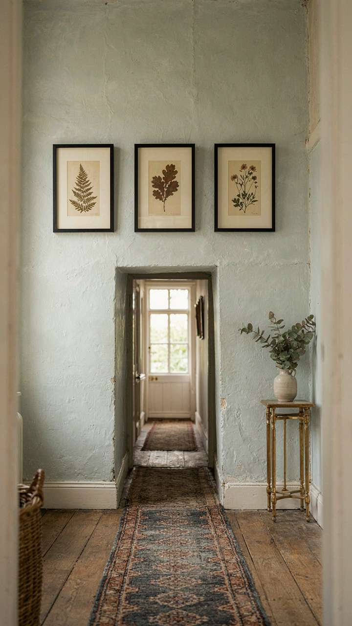
Display Wall: Treating Hallways Like Galleries
You want the hallway to justify itself because you’re tired of wasted square footage in your home. Here’s the mechanism: hallways in period cottages were never meant to be empty corridors. They functioned as display zones where owners rotated seasonal textiles, hung family portraiture, and staged collections. Think of hallway curation through the lens of retail merchandising—inventory rotation creates perceived newness without cost. English cottages exploited tight quarters by making every wall earn its place. A narrow hallway becomes a curated micro-gallery when you apply deliberate object placement rather than random decoration.

The execution is straightforward. Select three to five pieces maximum per wall section to avoid visual chaos. Mount them at eye level (57 to 60 inches center height) rather than floating them higher or lower. Use pieces that tell a single story: botanical prints with matching frames, or a sequence of copper molds in graduated sizes. The constraint of limited wall space forces better editing than sprawling rooms demand. Rotate seasonal pieces quarterly to reset visual interest without renovation costs.
Focused Light: Directing Attention And Utility
Ambient hallway lighting doesn’t solve the problem most people think it does. The real issue isn’t brightness but directional hierarchy. Historic cottages used sconces and table lamps to force attention toward specific wall features while leaving transition zones dim. This creates functional layering without the exposed utility of overhead fixtures. Use a single wall sconce at 66 inches height paired with floor-level accent lighting to establish a visual pathway rather than uniform illumination.
Install sconces with warm-toned shades (linen or parchment) that diffuse rather than project light. Add a secondary source near displayed objects—a recessed downlight or adjustable picture light—to highlight curated pieces without flattening the hallway into a lit corridor. The mechanism works because human attention follows light gradients. Your eye moves toward brightness first, then into dimmer zones. Structure this intentionally to guide movement and emphasize what matters, not to flood everything equally.
The Imperfect Aesthetic: Embracing The Worn And Mended
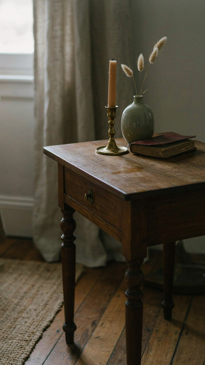
Flaws That Signal Authenticity
You want permission to stop chasing perfection because imperfection feels safer than commitment. Here’s the mechanism: flaws telegraph history. A scratch on wood, a faded patch on fabric, a visibly mended seam—these aren’t defects. They’re evidence of use. English cottage interiors leverage this. The worn appearance comes from actual wear, not artificial distressing. Surfaces accumulate patina through decades of function, not marketing. This distinction matters because tourists buy fake distressed furniture while real cottage rooms simply exist in time.

Patina operates like archaeology in architecture. Each mark answers a question about how the room lived. The water ring on a side table tells you about morning tea rituals. The worn threshold tells you about foot traffic patterns. The faded indentation in a wingback chair shows where someone sat through winters. These traces authenticate the space in ways that new materials never can. When you understand this, you stop viewing damage as a problem to hide and start viewing it as documentation you should preserve.
Mending As Decision Making
The common advice says “embrace imperfection,” which is vague nonsense that paralyzes people. Real cottage interiors don’t embrace flaws randomly. They make surgical decisions about what to repair and what to leave. This is curation dressed as casualness. A professional darned a wool blanket because blankets have functional value. A homeowner kept the darn visible because hiding repairs with new fabric would disrupt the narrative. The choice to mend visibly rather than replace silently changes what the room communicates.
Visible mending requires a protocol: identify which pieces define the room’s function, repair those first, then assess what else serves the aesthetic without serving purpose. A structural seam in an upholstered chair gets fixed properly. A minor fraying edge on a vintage linen might stay untouched. The distinction hinges on whether fixing it would erase evidence of age or restore utility. This prevents the trap of endlessly “improving” a room into sterility. Stop when the piece works and speaks clearly about its history.
Beyond Trends: Building A Timeless English Cottage Inside
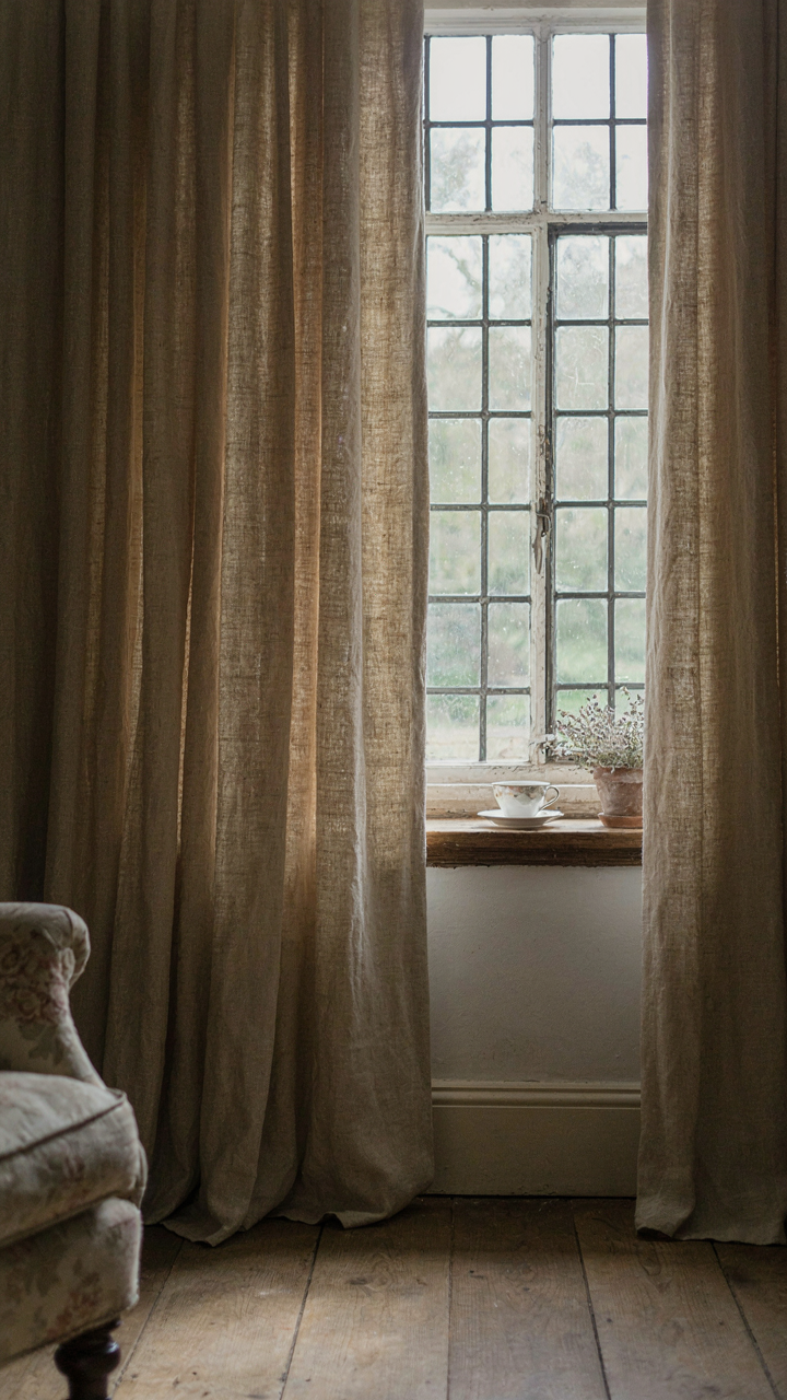
Designing For Longevity Not Trends
You want this space to matter in ten years so you don’t feel like you wasted money on something that looked good in a magazine spread. The real mechanism is material hierarchy. Most people buy decoration first, then arrange it. Timeless cottages work backward: they choose materials that age visibly and improve with use, then build around those anchors.

Stone, oak, linen, and cast iron don’t trend because they physically resist trends. They develop patina instead of obsolescence. A limestone hearth looks better at year five than year one. Pressed tin doesn’t scream “2024.” This isn’t nostalgia. It’s basic economics: buy things that appreciate in character rather than depreciate in relevance. The cost difference between a fast furniture piece and a proper wood frame is often only a few hundred pounds, but the lifespan difference is decades.
The Enduring Principles Of True Comfort
Comfort in cottage design isn’t about softness. It’s about removing friction from daily life. A chair that stops your back from hurting works. A corner that naturally collects light at 4 PM works. Storage that keeps clutter invisible works. Most advice says “layer textures” or “mix periods.” That’s incomplete. Comfort is a systems problem. Each surface, each object, each opening must solve something specific.
This means your cottage interior functions first, feels good second. Heavy curtains insulate against drafts and don’t need adjustment every season. Deep shelving holds books without visual chaos. A Rayburn or proper wood stove creates heat distribution that radiators cannot match and acts as a gathering point. Build toward elimination of daily annoyance, not accumulation of style. That’s how cottages built in the 1800s still feel better to live in than most modern homes built last year.
The Real Problem Isn’t Your Cottage; It’s Your Inability To See Beyond A Pinterest Board

Most people copy what they see. They collect images, hire a designer, and wonder why their space feels hollow. An English cottage interior works because it solves a problem: modern life is cold and disconnected. Your job isn’t to recreate someone else’s room. It’s to identify what warmth means in your life, then let that guide every choice you make. Stop collecting aesthetics. Start collecting moments that actually matter in a space.