
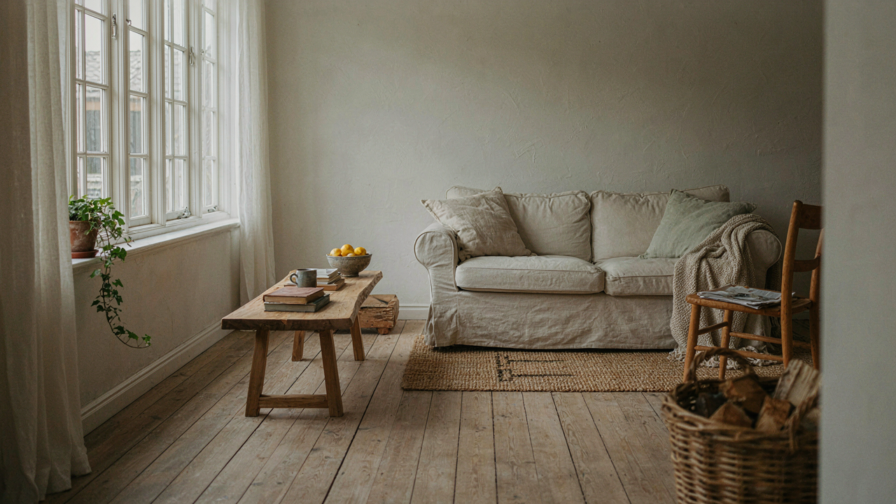
The Myth Of Light And Welcoming: Why Your Walls Betray You
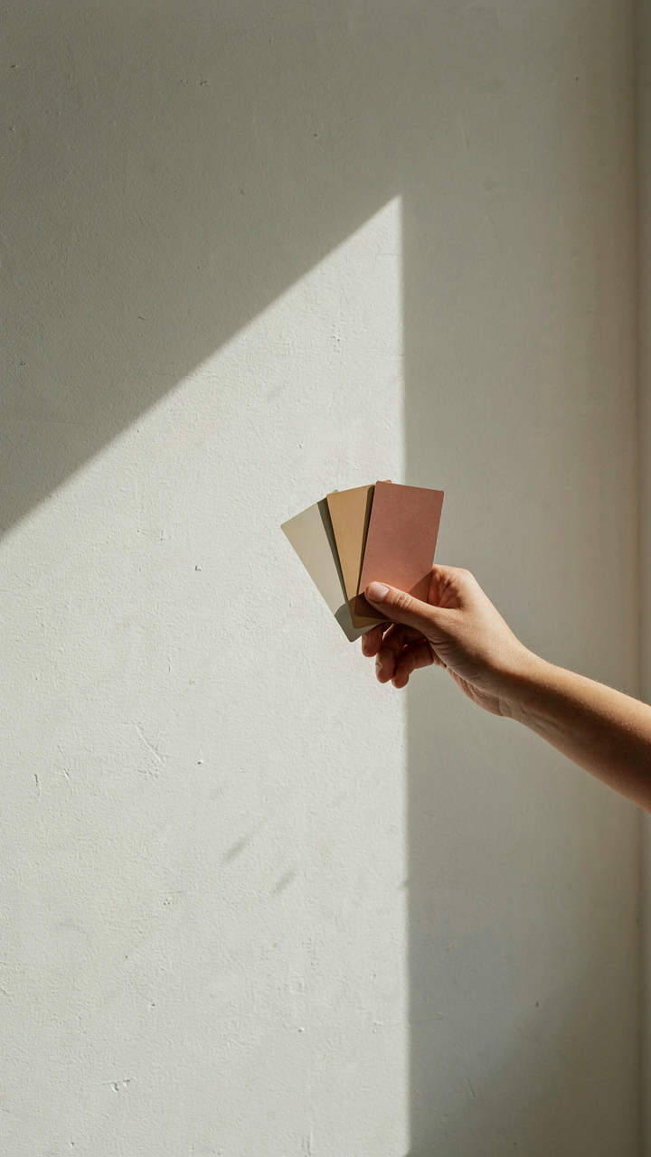
Colors That Read Pale Instead Of Bright
You want the room to feel bigger because you’re tired of feeling confined, and you think “light” paint is the shortcut. Here’s the mechanism: brightness and lightness are not the same thing in how your eye perceives them. A color can be bright, meaning high saturation and intensity, while still reading as dark. Conversely, a desaturated off white can feel flat and sterile even though it bounces maximum light. Most farmhouse palettes fail because they chase Value on the LRV scale without considering undertone sabotage.
Undertone is the hidden color cast that lives beneath the surface finish. Benjamin Moore’s Swiss Coffee looks warm and inviting in a north-facing room but turns gray and institutional in direct south light. Sherwin Williams Alabaster, the industry default for farmhouse, contains yellow undertones that shift toward cream in warm light and pull greenish under cool bulbs. The room doesn’t feel welcoming because the walls clash with your lighting conditions, not because the paint isn’t light enough. Test samples across your actual room time zones—morning, midday, evening—for three days before committing.
The Real Cost Of Chasing Brightness
Brightness addiction is an economic problem masquerading as an aesthetic one. You buy a light color, it doesn’t deliver the feeling you expected, so you repaint. Then you repaint again. Most homeowners in farmhouse restorations repaint their main living areas within two years because they’re solving the wrong variable. The mechanism is simple: you’re treating paint selection like a binary choice when it’s actually a system dependent on LRV, undertone, sheen, and light direction working together.
The unseen cost isn’t the paint itself. It’s the labor, the downtime, the decision fatigue, and the psychological toll of rooms that never quite land. Farmhouse design became popular partly because the original farmhouses used whatever materials and finishes were available and cheap, then aged naturally into cohesion. Modern interpretation skipped the coherence part and jumped straight to “slap on cream and call it rustic.” When you select a paint color based on a sample chip instead of your room’s actual light behavior, you guarantee a mismatch. Measure your room’s north south east and west exposures, identify your primary light source, then pull three undertone variants and live with them for a week.
Farmhouse Color Palette: Beyond Beige And Bleached
Where Farmhouse Colors Actually Come From
You want farmhouse colors because you think they signal taste and restraint, but the real reason you’re reading this is you’re terrified of picking the wrong shade and wasting money on paint that makes your room feel dingy instead of authentic. The mechanism is simple: farmhouse hues weren’t designed by interior designers sitting in studios. They were the byproduct of what farmers could actually afford and what pigments survived decades of sunlight and weather without fading into nothing.

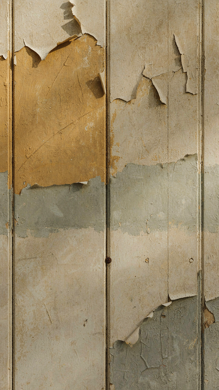
Early American and European farm interiors used earth pigments mixed into lime-based paints because those materials were locally available and cheap. Ochre, umber, and iron oxide dominated because they came from the ground. The whites weren’t pure brilliant white from chemical compounds—they were off-white, cream, or pale gray because achieving true white required expensive processing or pigments that yellowed fast. What survives as “farmhouse color” today is literally the palette of constraint and material reality, not aesthetic choice.
Colors That Worked Because They Had To
The common advice says farmhouse is just “neutral and calming,” which is incomplete and lazy. The real reason certain colors dominated farm buildings is they masked dirt, weathering, and seasonal changes better than anything else. This follows the principle of camouflage in nature, where organisms match their environment not for beauty but for survival. On a working farm, a paint color that showed every dust storm or mud splash got repainted constantly. A color that worked for five to ten years between repaints made economic sense.
Muted greens actually came from copper compounds in old barns and shutters, not from designer instinct. Dusty reds and terracottas matched the clay soil across regions, making buildings feel like natural extensions of the landscape rather than standing out as maintenance problems. Soft yellows approximated the color of aged wood and straw. The real farmhouse palette is a record of what held up under use, not what someone decided would be calming. Pick colors that match the natural materials already visible in your space—your trim, your flooring, your foundation—and you’ll get authentic farmhouse tones that feel integrated, not imposed.
The 3 Step “Depth Perception” Protocol For Farmhouse Paint
Light As A Variable, Not A Constant
You want farmhouse rooms to feel bigger without admitting your space is actually small. Here’s the mechanism: light is raw material you either leverage or waste. Borrow thinking from architecture and optics. In physics, luminosity isn’t about brightness alone—it’s about how surfaces redirect and absorb wavelengths. Farmhouse paint colors work the same way. A matte cream reflects light differently than a satin finish in the same undertone. Your walls aren’t just colored. They’re either working with your light source or working against it.

Start by mapping what light you actually have, not what you wish you had. North-facing rooms get cool, diffused light that strengthens blue undertones and can flatten warm creams if you’re not deliberate. South-facing spaces give you direct warmth and make cool neutrals read as sterile. East and west exposures shift throughout the day—morning light differs from evening glare. Before selecting a farmhouse paint color, spend three days observing the room at different times. Note where shadows fall and which walls catch the most direct sun. This observation becomes your constraint. You cannot ignore it.
Contrast Creates The Illusion Of Brightness
Most advice says keep everything light to maximize brightness. That’s incomplete reasoning. Dark farmhouse colors placed strategically make light colors read lighter by contrast—a principle from visual perception, not just design sentiment. A deep charcoal or forest green accent wall forces adjacent pale cream to recede and appear more luminous. The mechanism is real. Your eye perceives brightness relative to its surroundings, not in absolute terms.
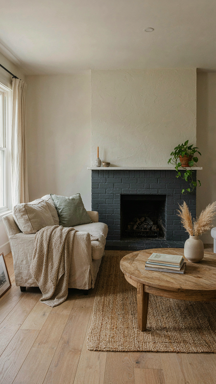
Deploy dark strategically on architectural features, not full walls. Trim work in deep grays, feature walls in muted greens or charcoal, or cabinetry in near-black forces your light paint colors to perform their job. The protocol: identify one architectural anchor—a fireplace, built-in shelving, or ceiling plane. Paint it a dark farmhouse neutral or muted earth tone. Keep walls themselves in your pale cream, off-white, or soft sage. This creates depth without consuming the room. Light rooms need shadow to exist.
Modern Farmhouse Colors: The “Undecorated” Aesthetic
Constraint Creates Direction
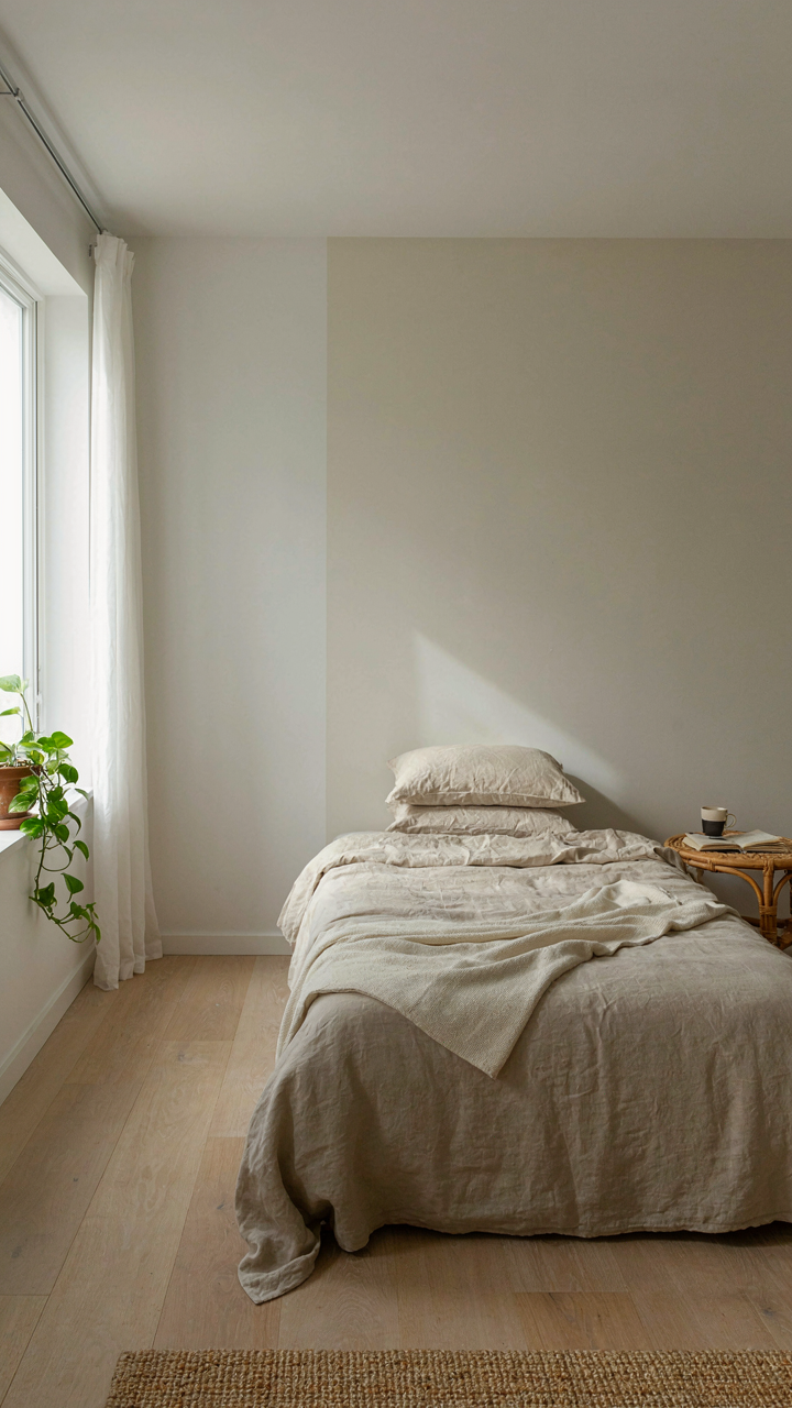
You want this section because you’re terrified of picking a color that screams “I tried too hard.” The mechanism is constraint: farmhouse minimalism works because it removes decision points. In systems thinking, constraint functions as a filter. It narrows the acceptable range so far that the remaining options feel inevitable rather than chosen. Modern farmhouse applies this by collapsing the color palette to near-neutrality. You pick from off-whites, warm grays, and muted beiges, not because they’re trendy, but because they’re the only colors that don’t compete with the room’s purpose.

The common advice says “stick to neutrals.” That’s incomplete. Neutrals fail when they’re pure. Pure white feels sterile. Pure gray feels institutional. Farmhouse neutrals work because they carry undertones that reference natural materials: cream suggests aged plaster, warm gray suggests weathered wood, soft taupe suggests linen. These aren’t decorative choices. They’re material honesty expressed through paint. Select one base neutral, then commit to it across at least two walls to establish it as the room’s anchor rather than a background.
Depth Through Restraint
Subtle variations in farmhouse palettes don’t work like decorative contrast does. They work through proximity and barely-there gradation. One wall painted in cream with undertones of yellow, an adjacent wall in cream with undertones of gray—the difference is often subliminal. The eye doesn’t register “two colors.” It registers dimension and light movement. This creates spatial depth without the visual noise that comes from actual color switching. The mechanism: your brain perceives variation as distance, even when the variation is a shift of one undertone.
Most people assume subtle variation requires multiple paint cans. Not true. One base color in matte finish on three walls, the same color in eggshell on one accent wall, shifts how light behaves across the room without changing the actual pigment. The finish variance creates the illusion of color difference. Paint the wall that receives the most indirect light in the matte finish to absorb more light. Paint the wall opposite the window in eggshell to reflect it back into the room.
Farmhouse Wall Colors: Texture As A Light Multiplier

Flat Versus Sheen: When To Break The Rules
You want flat paint because you think it looks more authentic to farmhouse style. That’s backwards reasoning. The mechanism is surface area. Flat paint absorbs light through microscopic valleys in its finish. Sheen paint reflects it. In farmhouse interiors, the consensus says use flat everywhere. That’s incomplete.

Flat paint makes sense on walls where you want color to read as pure and undistracted. Use it on feature walls or spaces with consistent natural light. But here’s what designers don’t say plainly: eggshell or satin sheen on trim, doors, and walls in rooms with uneven light creates perceived brightness without adding a window. The slight reflection doesn’t fight farmhouse aesthetic if you choose warm, muted colors like cream, soft greige, or pale sage. Test both on the actual wall before committing. Light behaves differently in your space than in a showroom.
Subtle Textures That Manipulate Light
Most farmhouse advice suggests smooth drywall only. Ignore that. Texture is physics. A textured surface scatters light instead of bouncing it back flat. This scatter reads as softness and depth, which makes rooms feel larger and less institutional. Farmhouses historically used lime wash and plaster, both naturally textured. That’s not nostalgia—that’s engineering.
Fine popcorn texture or knockdown texture applied before painting achieves this without looking dated or overmanaged. The texture must be subtle. Heavy texture reads as trendy or dated, not timeless. Apply texture to all four walls or none. Mixing textured and smooth walls creates visual conflict that reduces the light-amplifying effect. Finish with warm whites like ivory, cream, or pale warm gray over the texture. Sand the texture lightly after priming but before final paint coat to ensure even color absorption and prevent shadowing that kills the brightness you’re after.
The Visual Weight Principle In Farmhouse Paint Colors Interior

How Perception Shifts With Color Density
You want a room to feel bigger without spending money on construction. That’s the real motive. Psychology doesn’t care about your intentions—it processes color density the same way physics processes mass. A saturated color carries more visual weight than a desaturated one. Your eye perceives highly saturated farmhouse reds or deep forest greens as heavier and closer, which makes walls feel like they’re advancing. Desaturated versions of those same colors recede and create perceived distance.

Farmhouse design traditionally uses low-saturation neutrals precisely because they don’t tax perception. Off-whites, soft grays, and muted earth tones sit in the background. The mechanism is simple: your brain assigns less spatial weight to colors that contain more gray. When a paint color leans toward greige or aged cream rather than pure white or bold tan, the room gains psychological depth without any structural change. This is why farmhouse interiors read as spacious even in compact square footage.
Saturation As A Spatial Negotiation Tool
Saturation is the difference between a color’s intensity and its grayness. High saturation equals visual noise. Low saturation equals visual quiet. In farmhouse work, saturation control directly determines whether a room feels open or enclosed. A muted sage green on all four walls feels larger than a crisp, vibrant sage would feel. The reduction in chromatic intensity literally reduces the perceived boundary pressure on your spatial awareness.
Match saturation levels across your dominant surfaces to maintain consistency in perceived openness. If your walls run low-saturation, your trim and accent pieces should stay within a similar saturation band. A high-saturation red door against low-saturation walls creates jarring contrast that fragments the space. The protocol: select your base farmhouse color, then verify it reads as muted or soft by comparison to commercial color chips. If it looks sharp or punchy next to those reference standards, move toward a grayer version.
Farmhouse Paint Colors: Anticipating Obsolescence
Trends Are Signals Of Expiration
You’re drawn to trend forecasting because you want permission to buy now without looking foolish later. That’s the real mechanism at work. Farmhouse trends move because Instagram algorithms and design magazines need novelty to drive engagement, not because paint chemistry changed. A color doesn’t become “dated”—your brain does when it sees the same shade everywhere, then nowhere, then everywhere again in retrospective mockery.

The farmhouse aesthetic itself cycles because it’s aspirational fantasy, not functional design. It promises rural authenticity to urban homeowners, which means it depends on scarcity and exclusivity to work. Once every suburban house has the same shiplap and greige walls, the fantasy collapses. The color wasn’t wrong. The market simply exhausted its psychological return.
The Durability Of Restraint
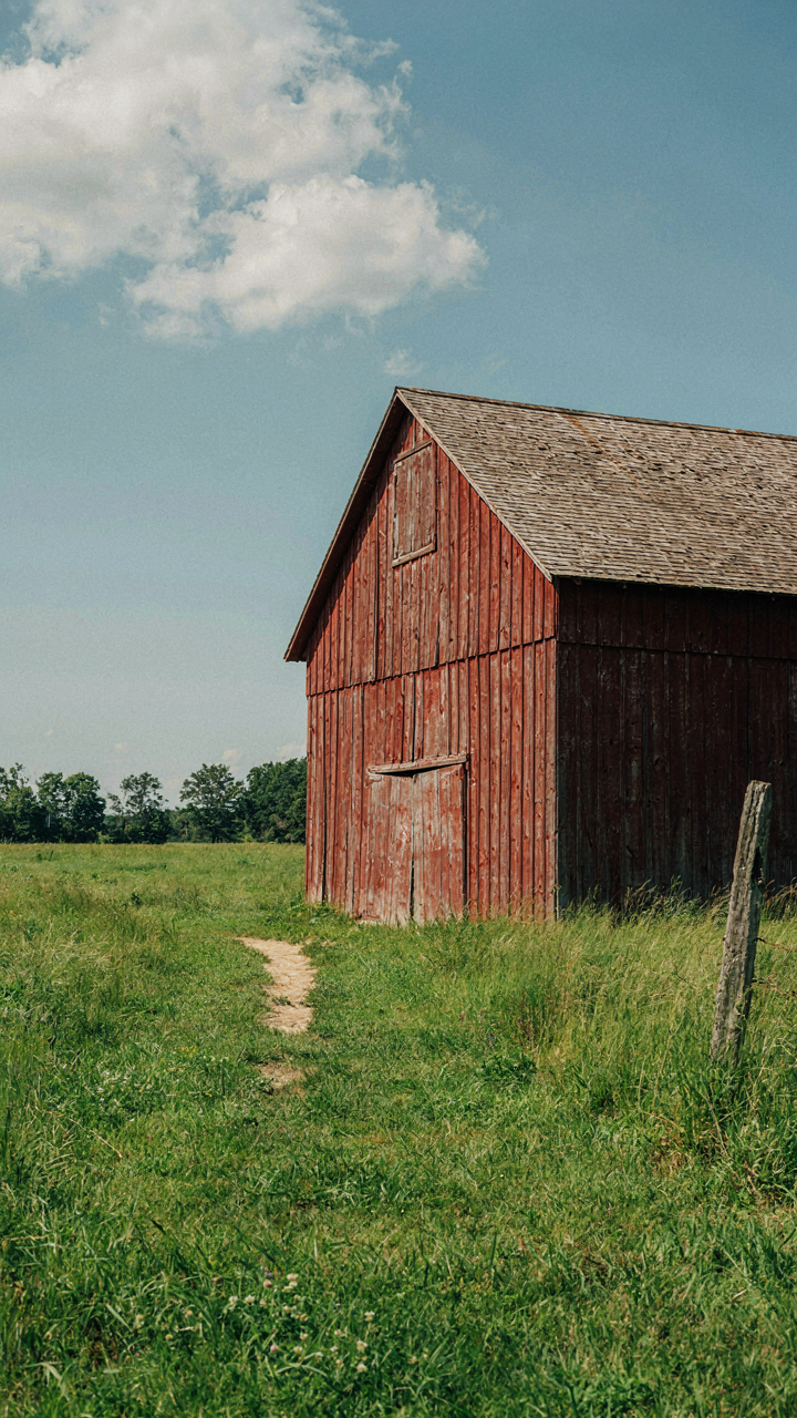
Durability in design language works like evolution: organisms that mutate too aggressively die fast. Restraint means picking colors that perform their job without demanding constant visual novelty. Off-white, warm cream, soft sage, and muted taupe don’t trend because they never left the market. They’re base frequencies in residential paint sales, which means manufacturers will always stock them and contractors will always know how to apply them.
Greige and “farmhouse white” became liabilities not because the colors faded, but because their overuse signaled conformity instead of taste. You future-proof a palette by choosing colors that work in multiple contexts and don’t rely on trend cycles for validation. Test your color against spaces ten years old and ten years into the future. If it doesn’t anchor both moments, it’s a trend masquerading as a choice.
Farmhouse Paint: The Quantum Entanglement Of Light And Color
How Light Rewrites Color Before It Hits Your Eye
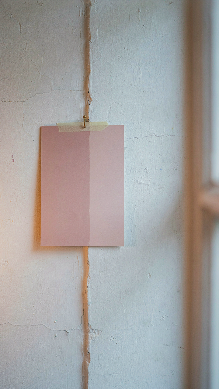
You want to know which farmhouse colors will make your room feel bigger and brighter so you don’t waste money on a paint mistake. Here’s what nobody says plainly: light doesn’t reveal color, it creates it. Physics calls this the interaction between electromagnetic wavelengths and pigment molecular structure. A paint sample viewed under noon sunlight and under incandescent bulbs aren’t the same color because the light source itself is different. Your eye sees the reflection, not the pigment. This matters because farmhouse paint colors rely on undertones that shift with light temperature. Warm whites turn yellow under tungsten. Cool creams flatten under fluorescent. The pigment doesn’t change. The light does.

Farmhouse color palettes historically emerged in agricultural regions with natural north-facing light and oil lamps at night. That context shaped which colors read as “farmhouse.” Cream and soft white dominated because they performed well under inconsistent, warm light sources. Greyed-out blues and muted earth tones followed. These weren’t aesthetic choices first, they were survival choices. Modern artificial lighting inverted that constraint. We now control light quality. But most people still choose farmhouse colors as if we’re still painting by candlelight, then wonder why their room feels off under LED. The mechanism is simple: light frequency determines which wavelengths the pigment reflects back. Different light sources have different frequency distributions. Match your paint choice to your actual light source, not to generic farmhouse tradition.
What Happens When Your Light Changes
Predicting how a farmhouse color will behave means tracking light conditions across time, not just picking a shade from a deck. Morning light differs from afternoon light. Winter light differs from summer light. Rooms with east-facing windows experience cool blue-heavy light at dawn that shifts warm and orange by evening. West-facing rooms do the opposite. The same cream paint looks different at each hour. Most people buy paint based on a 2×2 inch sample under showroom fluorescent, then apply it to a wall that gets natural light. The mismatch is inevitable. Predictability requires testing on the actual wall, at the actual times you spend the most time in that room.
The protocol is not complicated. Paint a 2-foot square of your top two color choices on the wall you’re painting. Observe the square at 9 AM, noon, 3 PM, and evening for three consecutive days including one cloudy day. Track which color shifts the least and which undertones emerge under each condition. If a farmhouse white develops a yellow cast at sunset in your kitchen, that tells you the pigment is reflecting the warm wavelengths of that light, which means it contains yellow undertone. Adjust your choice or accept the shift. Document the conditions that produce the result you want. This removes guessing from the decision and locks in behavior before you commit to four walls.
Modern Farmhouse Color Palette: The Anti Influencer Approach
What Actually Moves The Needle
You want permission to pick colors that feel right instead of looking right in photos. The real mechanism at work is signal versus noise. Farmhouse design became a mass trend because it promised authenticity on demand, but authenticity dies the moment you optimize for consensus. Your nervous system knows the difference between a color chosen for resonance and one chosen for approval. Pick the first kind, and the room settles differently. Pick the second, and you’ll repaint in three years.

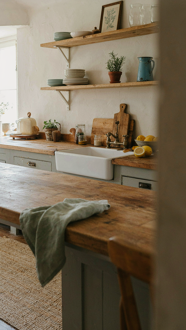
Farmhouse palettes work when they anchor to your actual environment, not Pinterest boards. The whites, creams, and muted greens that dominate farmhouse design aren’t objectively superior. They’re just forgiving enough to hide decision fatigue. The trap is believing that formula replaces judgment. Your job is stealing the permission farmhouse gives you to use soft, low contrast colors, then breaking the formula by trusting what your eyes actually prefer over what your feed rewards.
Palette Building That Bypasses Trends
Most advice tells you to start with a mood board and work backward. That’s backwards. The real process is inverted: you feel drawn to a space or material first, then extract the actual color from it. A weathered barn door teaches you more about usable neutrals than any designer’s swatch collection. The mechanism borrowed from color science is saturation. Low saturation colors recede and feel calm, but saturation exists on a spectrum, not as a binary. Your intuition picks up on these subtle differences before your conscious mind names them.
Start by spending time in spaces you genuinely prefer, not ones that photograph well. Notice what colors appear repeatedly. Aged wood. Linen. Concrete. Plaster that’s faded unevenly. These materials have taught color combinations over decades, not seasons. Write down three colors you see in those spaces without aesthetic judgment. One becomes your base. One becomes your accent. One becomes your relief. This method produces cohesion because it’s built on observation, not inspiration.
Beyond The Swatch: The Ecology Of Farmhouse Colors
When Your Walls Echo The Land Around You
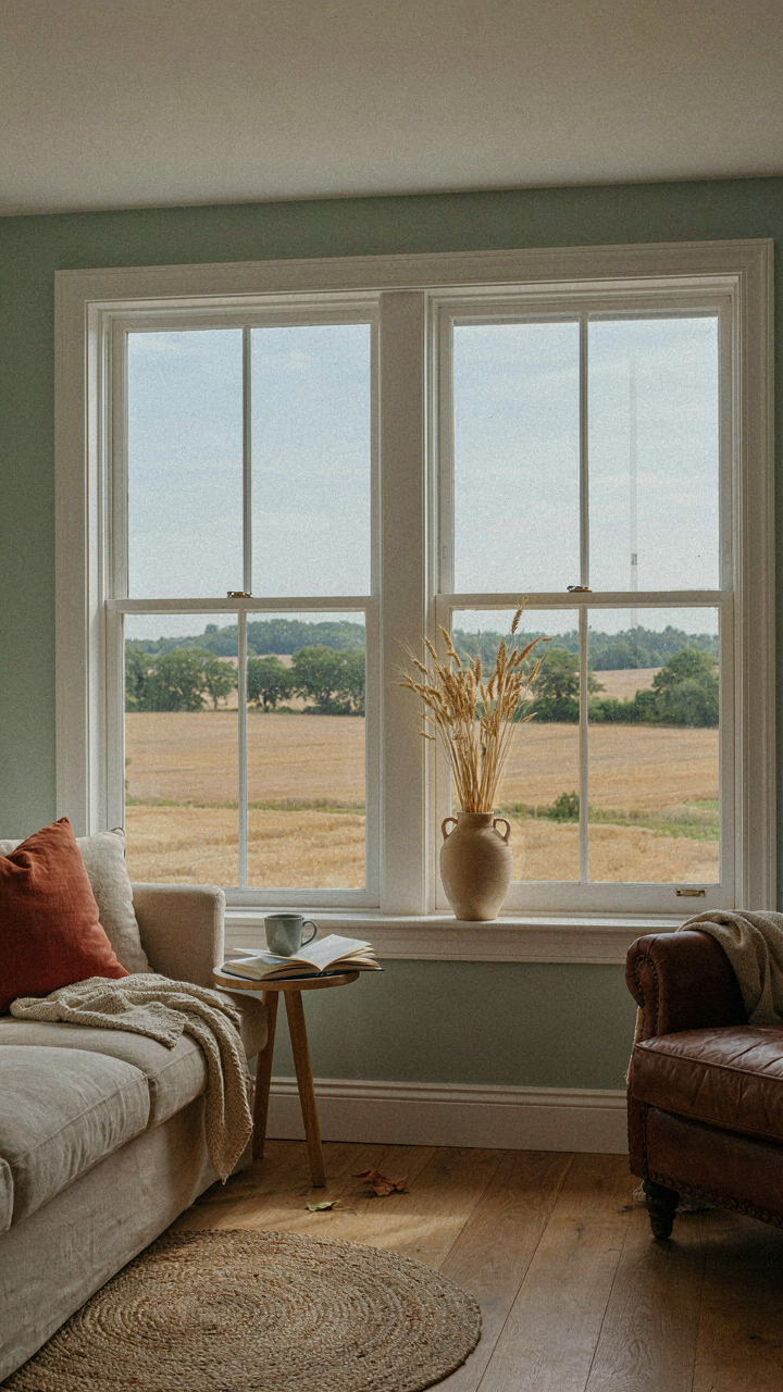
You want farmhouse colors to feel inevitable, not chosen. That’s the real motive here—the fear that your interior will look like a Pinterest board instead of a home that grew from its place. Ecology teaches us that every organism occupies a niche defined by what surrounds it. Your farmhouse paint color functions the same way: it’s a niche that either harmonizes with the ecosystem outside your windows or clashes against it. The mechanism is visual coherence. When your interior palette mirrors the soil, vegetation, and light conditions of your actual geography, the brain stops working to process the space and starts inhabiting it.
The common advice—”use whites and creams”—misses the granularity. A cream that works in limestone country looks ashen in clay regions. A warm white adjacent to red earth reads differently than the same white against granite. The specificity matters because your eye compares interior colors directly to the dominant hues visible through windows and doors. If your land holds ochre and rust tones, a pure white interior creates cognitive friction. The right farmhouse color absorbs and reflects the ambient light quality of your region, which is determined by soil composition and seasonal sun angles. This isn’t decoration. It’s alignment.
The Conversation Between Inside And Outside
Your exterior color doesn’t determine your interior color, but it establishes a visual argument that must resolve or intentionally break. Most farmhouse homes feature wood siding or stone in warm, muted tones—weathered grays, soft browns, aged reds. Your interior palette then operates as a continuation of that material language rather than a rejection of it. If your exterior reads as cool and recessive, pushing warm interior colors creates visual separation that reads as fragmentation. Conversely, interior colors that echo your exterior’s temperature and saturation level create a single visual story that moves through the threshold without shock.
The practical protocol is this: photograph your home’s exterior in natural light at three times of day. Bring those photos inside and observe how your potential paint colors interact with the actual hues you’ve documented. Hold samples against the photos for thirty seconds. Your eye will register harmony or discord instantly. Colors that create this symbiotic relationship eliminate the visual threshold—you walk from porch to living room without your brain registering a shift in the environment’s fundamental character. That seamlessness is where farmhouse color achieves its actual function: making a space feel like it belongs to the land it occupies.
The Real Problem Isn’t Your Paint; It’s Your Perception Of Timelessness
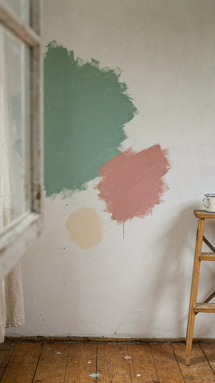
You picked farmhouse paint colors because you wanted something that wouldn’t feel dated in five years. But that fear is exactly what kills the room. Stop chasing “timeless” and start choosing colors that actually move you. Go pick up three paint samples today. Slap them on your wall in natural light and live with them for 48 hours. Your gut knows what works before your brain starts overthinking it. The only farmhouse color that fails is the one you don’t believe in.