Shiplap’s True Origin: Not Your Grandma’s Farmhouse
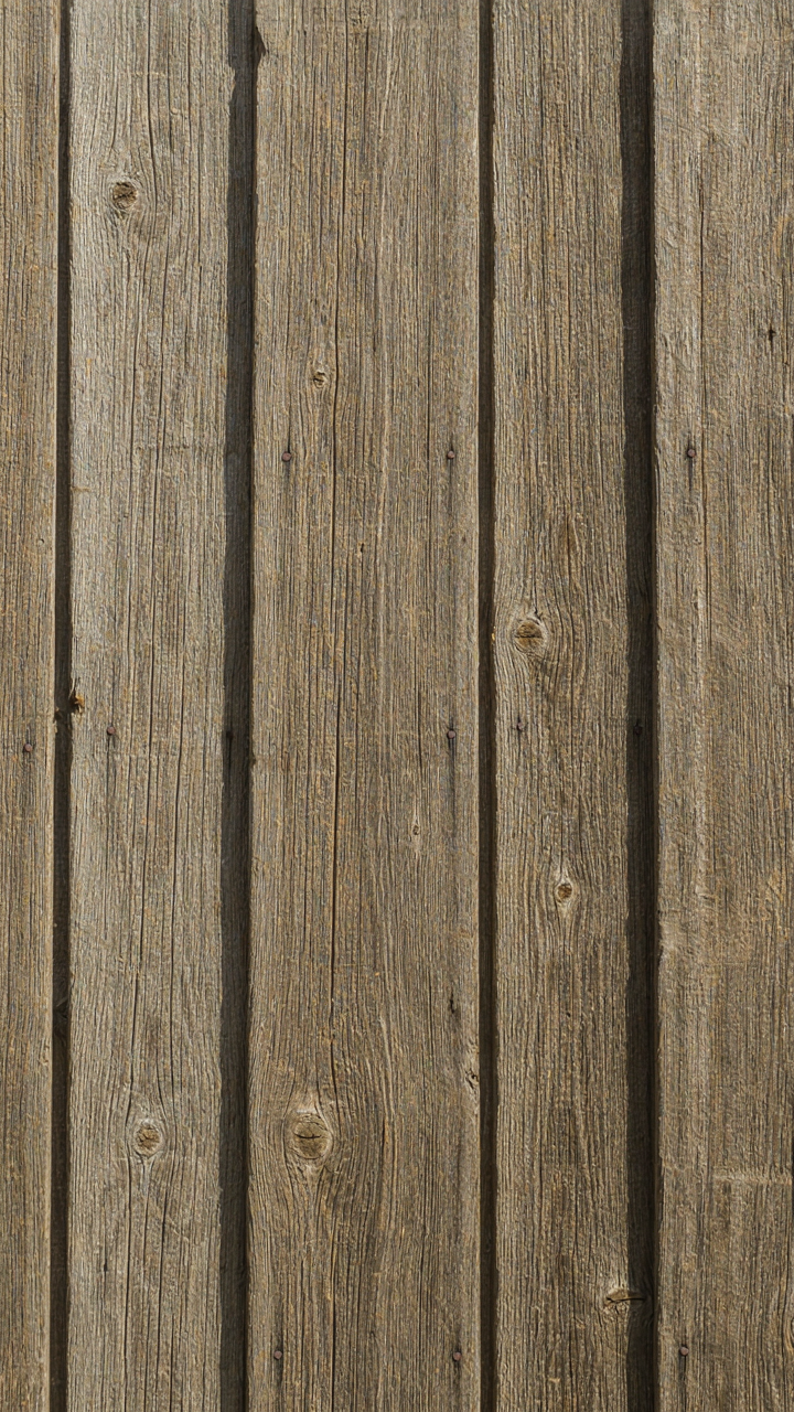
Sheathing Material, Not Decoration
You want shiplap on your walls because it signals authenticity you don’t actually possess. Here’s the mechanism: shiplap exists because of a structural problem, not an aesthetic one. Farmers and builders used overlapping boards to shed water and wind off exterior walls before modern vapor barriers existed. The rabbet joint (where each board overlaps the next) created a weather seal. Interior shiplap is pure theater—the problem it solved no longer applies indoors, which is why it’s now a choice, not a necessity.
The real distinction matters because most people install shiplap as cladding over drywall, completely divorced from its original function. Early farmhouse shiplap was load-bearing or at minimum structural. Modern interior shiplap is decoration stapled to existing wall systems. This reversal changes everything about how you should think about placement, spacing, and finish. Installing it without understanding this shift leads to wasted walls and visual noise instead of texture that actually earns its place.
Authentic Conditions Beat Manufactured Nostalgia
The common advice says shiplap works anywhere because it’s “rustic” and “charming.” That’s lazy thinking that mistakes aesthetic mood for design logic. Shiplap performs best in spaces where its original function echoes faintly—rooms with actual environmental demands or structural clarity. Bathrooms, mudrooms, and utility corridors benefit from shiplap’s water-resistant joints. Bedrooms and living rooms do not. In those spaces, you’re installing a costume, and costumes date faster than honest materials.
Manufactured shiplap sold at big-box retailers often comes prefinished and uniform, which defeats the purpose entirely. Authentic shiplap varies in width, has weathering patterns, and shows tool marks. When you choose authentic reclaimed or rough-milled boards over uniform products, the texture becomes genuine rather than applied. The mechanism is simple: environments where function and form align make materials read as intentional. Environments where they conflict make them read as trend. Select your shiplap application first based on what that room actually does, then choose materials that support that logic.
The “Texture, Not Clutter” Fallacy: Less Is Not Always More
When Adding Texture Becomes Visual Noise
You want texture because it signals authenticity and depth, and you’re afraid blank walls will expose the fact that your space lacks character. Here’s what nobody admits: the mechanism that makes texture work is the same one that makes it fail. Contrast dies when you oversaturate. Visual rhythm requires intervals of rest, and farmhouse shiplap walls break this rhythm the moment you cover every surface with competing finishes.

The real problem isn’t too much texture—it’s texture without hierarchy. Traditional farmhouse spaces didn’t plank every wall. They used shiplap strategically: accent walls, wainscoting panels, or feature areas above mantels. When you apply texture uniformly across all four walls plus ceiling, your eye has nowhere to land. The texture stops being a design element and becomes wallpaper. The space collapses into visual sameness dressed up as richness.
Strategic Voids Enhance True Texture
Graphic design teaches us about negative space—the deliberate emptiness that makes content readable. Apply this directly: shiplap walls need surrounding calm to function as texture at all. A planked accent wall reads clean and intentional against flat, painted adjacent walls. The same plank pattern repeated everywhere becomes background noise that you stop seeing after three weeks.
Install shiplap on one or two walls maximum in any given room, leaving the others smooth and painted in solid colors that complement rather than compete. The void isn’t laziness—it’s the mechanism that forces your eye to register the textured surface as a choice, not a default. This distinction matters because it determines whether visitors perceive intentional design or visual fatigue. Plan your shiplap placement before cutting boards.
The Unconventional Shiplap Living Room Ideas
Horizontal Shiplap Wall: Defying Expected Lines
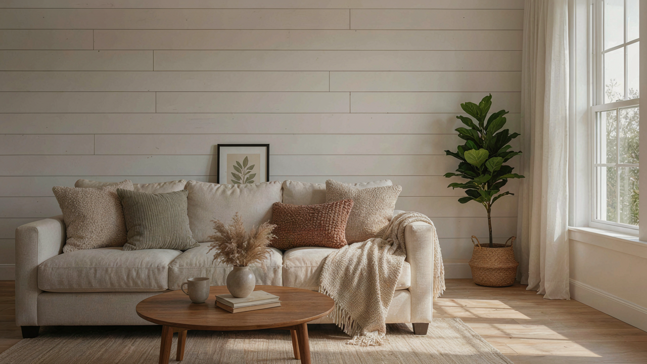
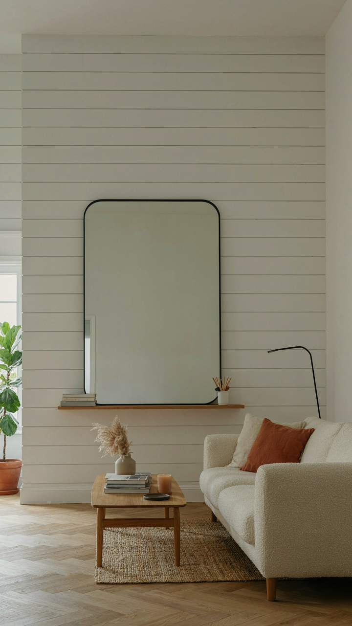
You want horizontal shiplap because it makes you feel like you’re in control of the room’s energy when you’re actually just following what everyone else did five years ago. The real mechanism: horizontal boards shrink perceived wall height and stretch the room sideways. This works because your eye tracks the lines, and horizontal lines create lateral movement. The boards themselves sit perpendicular to studs, which means load distribution favors wider wall spans without additional framing. Installers nail or screw through each board into studs 16 inches apart, and the overlapping rabbeted edges hide fasteners entirely.

Most farmhouse shiplap walls fail because people underestimate how horizontal lines flatten a room when ceilings run under nine feet. The fix is intentional placement: run horizontal shiplap on one accent wall only, ideally opposite a window or entryway where your eye naturally lands first. Paint the boards white or off-white to preserve the recessive effect. Leave at least 18 inches of drywall above the shiplap line to avoid crushing the vertical space. Measure twice, snap chalk lines for perfect alignment, and fasten every 16 inches with 2.5-inch fasteners rated for your board thickness.
Vertical Shiplap Accent Wall: Elevating Instead Of Grounding
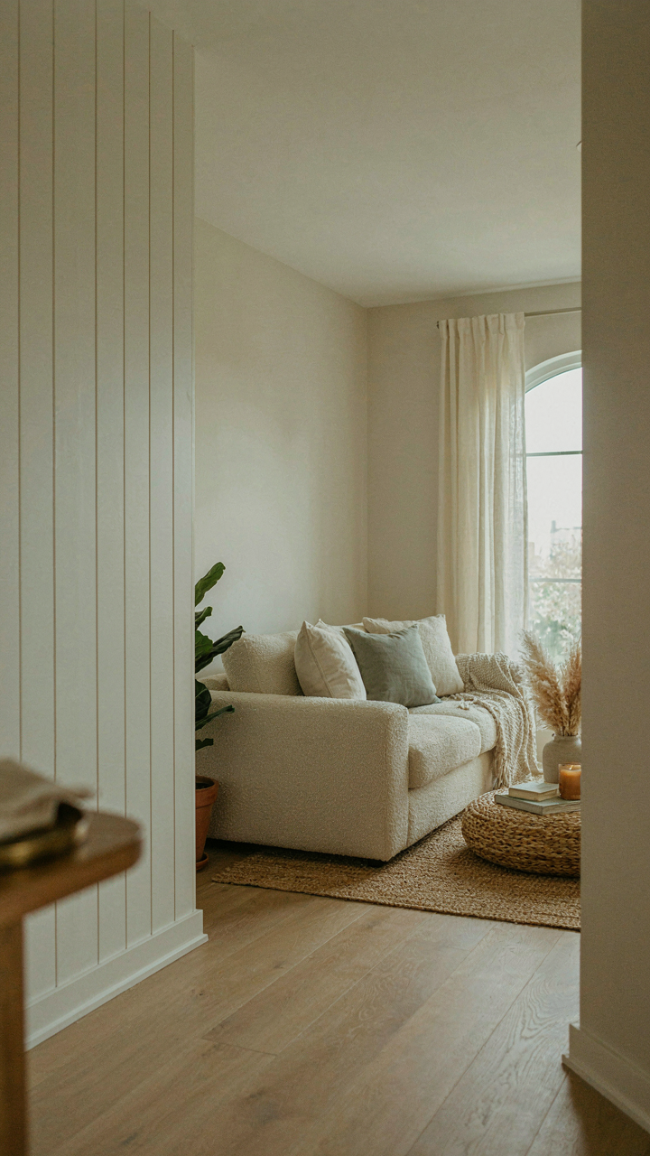
Vertical shiplap lifts rooms the way tension does in physics: opposing forces create perceived height. The boards run parallel to studs, which means you’re not fighting structure—you’re working with it. This orientation pulls the eye upward and makes 8-foot ceilings read as taller because vertical lines interrupt horizontal sight lines. Installation requires no additional framing if studs are already spaced correctly, and fasteners hit wood directly at consistent intervals. The vertical grain pattern also hides dust and casual wear better than horizontal layouts do over time.
The mistake everyone makes: using vertical shiplap on small walls or in narrow spaces where it becomes visually chaotic. Vertical works on statement walls in open living areas, not hallway nooks. Start at the corner, use a level for every third board, and pre-drill fastener holes to prevent splitting on edges. Stagger your fastener height within the rabbit joint so no single line of holes becomes visible. Install all boards before finishing so you can adjust the final board width to avoid slivers at edges.
The “Visual Weight” Protocol For Decorating Shiplap Walls
Mass And Counter Balance In Decor
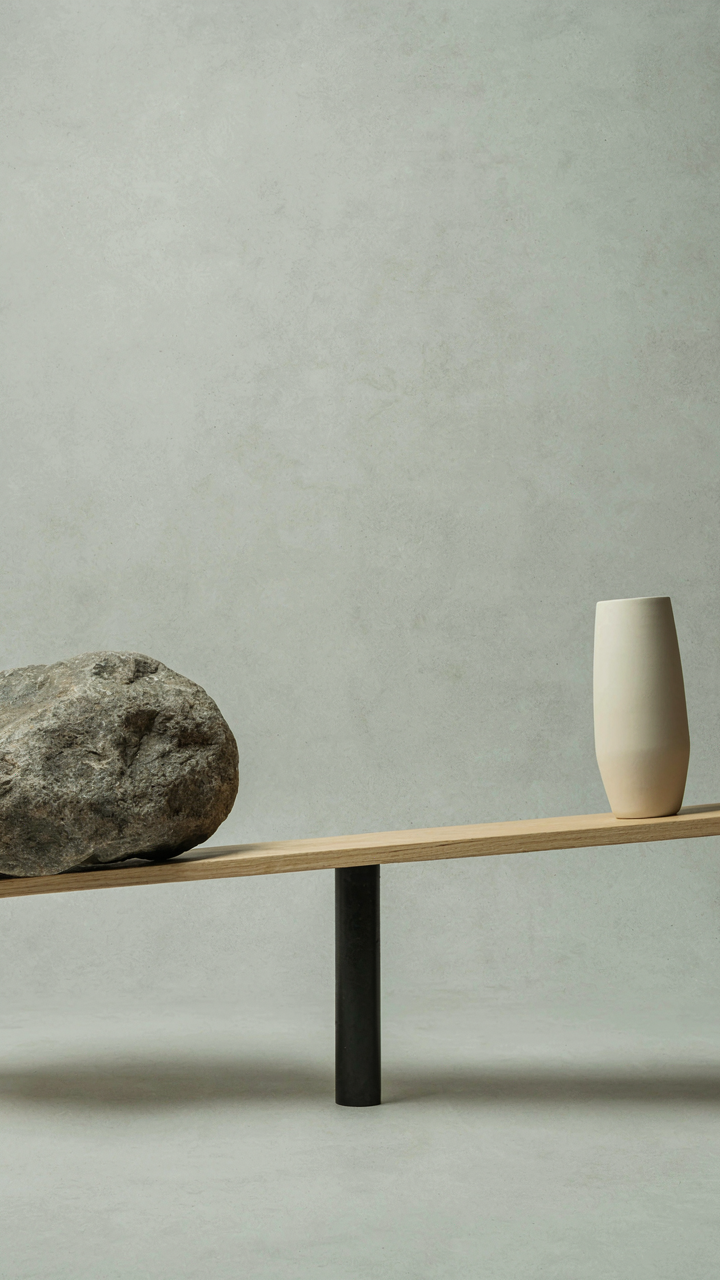
You want permission to buy more stuff without looking like a hoarder. Here’s the mechanism: decorating shiplap walls works like physics. Mass creates visual weight. A single large object anchors space the same way a 50-pound weight does on one side of a seesaw. Shiplap’s horizontal lines already generate visual momentum across walls. Add one substantial piece—a mirror, a shelf unit, a piece of artwork—and you’ve loaded that side. The wall doesn’t demand more clutter to feel intentional. It demands counter-balance.

Most advice says “scatter small items evenly.” Wrong. That multiplies visual noise without creating hierarchy. Instead, place one heavy object on the left side of your shiplap wall, then place one on the right at a different height. Your eye moves between anchors instead of scanning chaos. The negative space between them becomes active, not wasted. This is distribution through opposition, not distribution through saturation. The math works: two objects well-spaced read as deliberate. Ten objects tightly packed read as accumulation.
Negative Space As A Force Multiplier
Negative space isn’t decoration. It’s the tool that makes your actual decor work harder. Farmhouse shiplap walls have built-in rhythm from the boards themselves, which means they already compete for attention. When you add objects without accounting for the breathing room around them, you’re fighting the wall instead of using it. The shiplap pattern plus clustered items creates visual static. One object in isolation on that textured background commands focus because contrast amplifies presence.
The protocol is mechanical: measure the wall, identify its visual thirds using the rule of thirds, place one focal item in a third, then leave the other two-thirds open. That empty space forces the eye to the object you want seen. A single framed piece on shiplap wall with three feet of white space above it lands harder than five pieces crammed together. The absence becomes the statement. Hang your piece, step back, then remove one thing you think should be there. That restraint is the real design decision.
Rustic Shiplap Accent Wall: The Deliberate Imperfection
Why Worn Surfaces Stop Feeling Like Failure
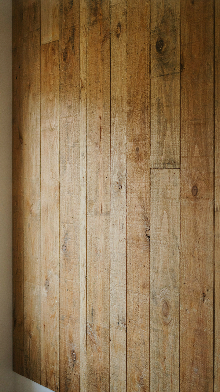
You want permission to stop refinishing everything to museum quality. The mechanism is simple: worn materials trigger a psychological anchor called “temporal depth.” Your brain reads surface irregularities as evidence of time and use, which signals authenticity in a way pristine surfaces cannot. Farmhouse shiplap works because imperfection becomes proof of realness. When a board shows grain variation, nail holes, or uneven stain, it registers as honest rather than sloppy.

This isn’t accident or laziness. Restoration ecology uses the term “patina value” to describe how degradation signals authenticity. Apply that logic to shiplap: distressing amplifies perceived age and trustworthiness. The worn edges and color inconsistencies you see on farmhouse shiplap accent walls aren’t design failures. They’re the deliberate inverse of the sanded-smooth aesthetic that dominated the previous two decades. Your room gains visual authority when surfaces look lived-in rather than showroom-ready.
Imperfection As A Practical Tool
The common advice tells you to “embrace the rustic look” as if it’s a feeling you cultivate. Wrong. Unpolished shiplap solves a specific technical problem: it hides installation imperfections and wall irregularities better than smooth walls do. Surface texture masks inconsistencies that would be obvious on flat drywall.
Unfinished or hand-distressed shiplap reduces the workload during installation and finishing. You avoid the need for perfect joints, flawless taping, or spot-free paint. Knots, grain variation, and stain unevenness become features instead of mistakes. Before selecting your boards, visit your wood supplier and request samples with natural color variation and surface texture. Apply stain in single passes rather than multiple coats for authentic variation. Mount your accent wall without attempting to hide seams or nail heads. The texture itself does that work for you.
Beyond Pinterest: Shiplap Wall Images That Inspire
The Trap Of Copying What You See
You’re looking at farmhouse shiplap walls online because you want proof that your taste is good. That’s the real reason. The mechanism at work here is social proof: you’re borrowing confidence from images instead of building it through understanding. Most people stop at collecting pretty pictures. They never ask why those walls work, so they replicate the surface and miss the structure. The gap between what looks good and what works in your actual space is where most farmhouse shiplap projects fail.

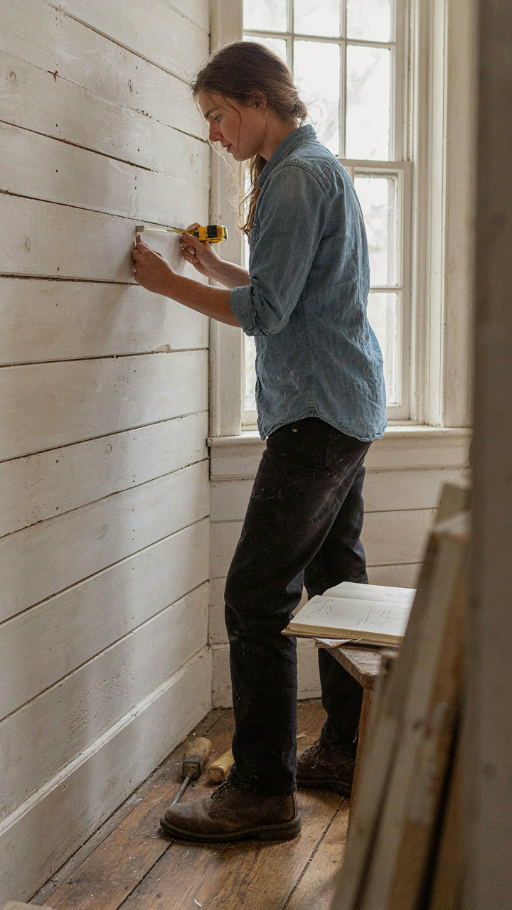
Genuine inspiration requires reverse engineering. Look at authenticated farmhouse shiplap installations and ask specific questions: What’s the board width? How tight is the spacing? What finish was applied? Is the installation horizontal, vertical, or mixed? These details matter because they determine whether shiplap reads as intentional design or as texture for its own sake. Start documenting real projects, not styled photoshoots. Real projects show wear, shadows, and how light actually moves across the surface.
Reading Design Before You Replicate It
Design analysis works like archaeology: you examine layers to understand structure. Shiplap itself is a joinery technique dating to 18th-century shipbuilding, where overlapped boards provided structural integrity and weatherproofing. In farmhouse interiors, shiplap serves a different function now—it’s visual, not structural—but understanding the original mechanism helps you see why certain applications work. Authentic farmhouse shiplap uses board proportions and finishes that complement the room’s scale and light conditions, not fight them.
Authentic farmhouse shiplap typically uses boards between 5 and 8 inches wide, installed with consistent spacing. The finish—whether painted, whitewashed, or left raw—should reflect the room’s existing materials and the home’s actual age or aesthetic direction. Analyze installations by photographing them at different times of day, noting how shadow depth changes the perceived texture. Document the paint color alongside the wood species. These variables determine whether shiplap enhances or overwhelms the space. Apply this analysis to your walls before you buy materials or hire installation.
Farmhouse Shiplap: The Anti Trendy Approach
Why Shiplap Outlasts Everything Else
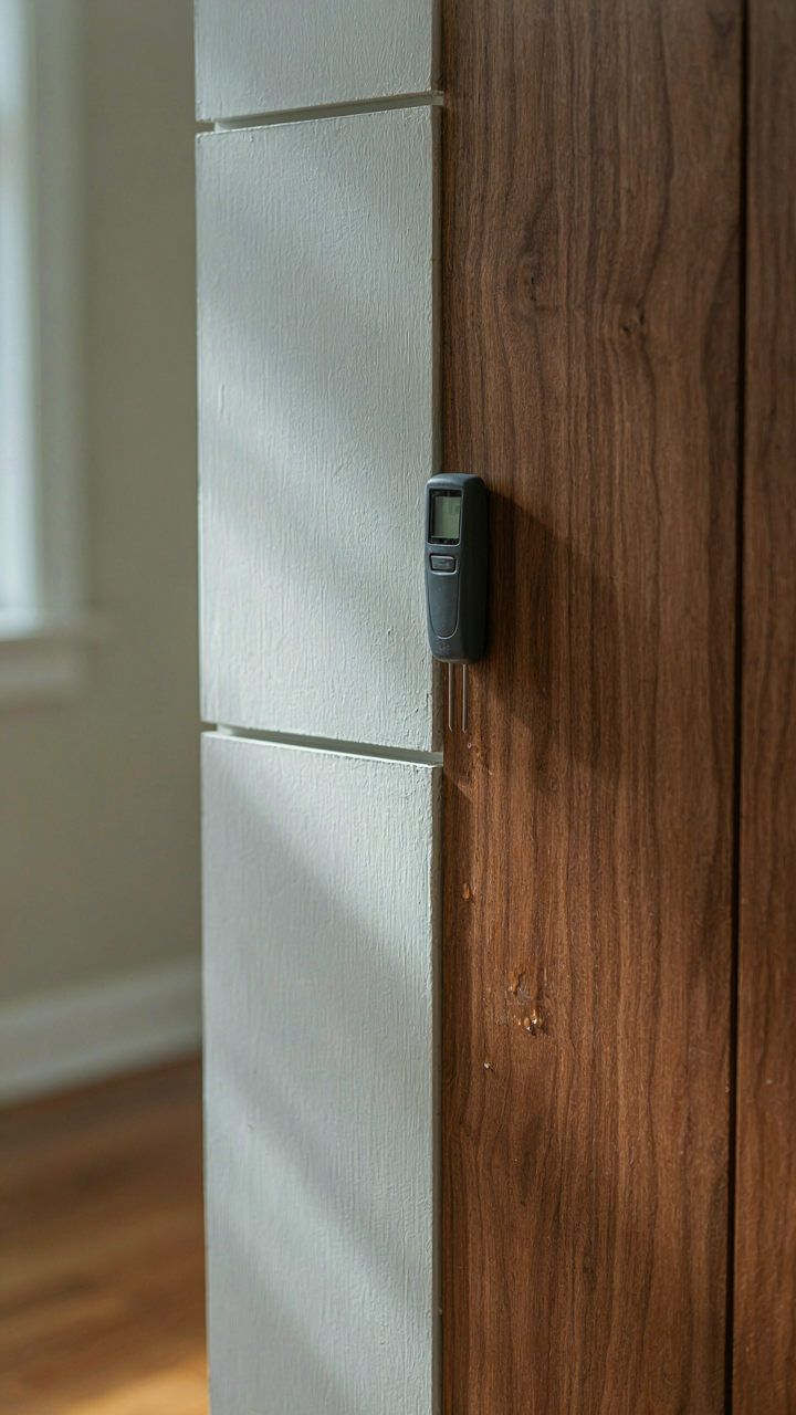
You want shiplap because it feels permanent while everything else feels disposable, and that status signal matters more than you’ll admit. Here’s the mechanism: shiplap solves a material problem first, then became an aesthetic. Farmers overlapped wooden boards to shed water on barn exteriors. The joints created intentional gaps that moved with wood expansion and contraction without cracking or separating. When shiplap moved indoors, it kept this same structural honesty. It doesn’t hide behind veneer or drywall tape. The board profiles remain visible and functional.

Trends collapse when they’re pure decoration. Shiplap persists because it’s honest carpentry that happens to photograph well. The farmhouse movement stripped it from barns and slapped it on suburban walls without understanding why the joints exist. Most homeowners install shiplap as wallpaper substitute, not as a system that responds to seasonal wood movement. The difference determines whether your walls look frozen in 2018 or genuinely built to last. Install shiplap understanding its original purpose, and it never becomes dated because it was never fashionable to begin with.
How Informed Choices Become Permanent
Permanence in design operates like evolutionary pressure: only choices that serve multiple functions survive. Shiplap works on walls because it manages moisture, provides fastening points for future changes, and creates depth without adding clutter. Generic advice tells you to choose shiplap width based on room size or “what feels right.” Wrong. Choose width based on your actual wall framing and whether you’ll need to access studs for electrical work later. Half inch gaps between boards stop wood movement without looking like gaps. Quarter inch gaps telegraph that you prioritized appearance over engineering.
Select solid wood species over engineered shiplap when budget allows. Pine and poplar hold paint and finish longer than composite boards under temperature swings. Finish selection matters more than most realize: paint seals wood but prevents it from breathing, while stains let seasonal movement happen without trapping moisture. Before installation, acclimate boards to your home’s humidity for two weeks. This single step eliminates buckling and warping that ruins shiplap installations within eighteen months. Permanent results require doing the invisible work before you see any visible results.
Shiplap Wall Decor: The Minimalist’s Manifesto
Curate With Ruthless Intention
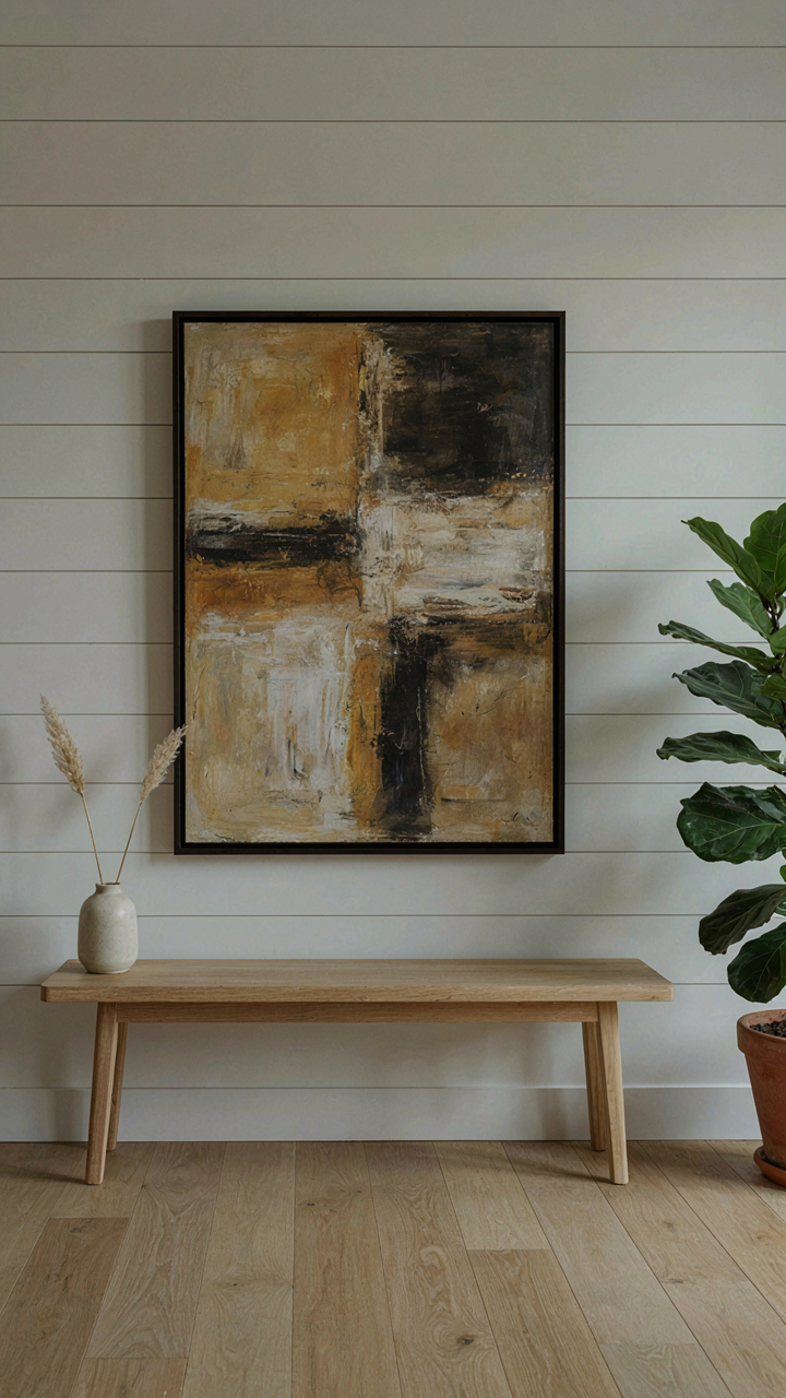
You want permission to keep things sparse because you’re afraid empty walls signal poverty or laziness. The real mechanism is this: shiplap already does textural work. Adding more stuff doesn’t enhance texture, it buries it. Every object you mount competes for visual attention and breaks the horizontal rhythm the boards establish. Strategic absence isn’t emptiness. It’s restraint with purpose.

The items you place matter more than quantity. Think of negative space as the dominant material in the room, like how sculptors treat empty air as essential as stone. Each piece you choose must either amplify the shiplap’s geometry or contrast it sharply. Vague decoration dilutes both.
- Large single artwork: One framed piece per wall section creates a focal point without fracturing attention across multiple objects.
- Functional hardware: Open shelving brackets or hooks serve as both storage and design elements, reducing clutter while maintaining utility.
- Seasonal rotation: Swap decor quarterly rather than accumulating. This forces deliberate curation and prevents visual fatigue.
- Negative wall space: Leave 40-60% of shiplap bare. The boards themselves become the primary visual element, not accessories.
- Textured textiles only: A single linen throw or woven basket adds dimension without competing with wall texture.
Restraint works because your eye settles on what remains. When everything fights for attention, nothing wins. The shiplap’s horizontal lines become background noise instead of the intentional design choice you paid for. Choose three items maximum per wall. Everything else is decoration masquerading as design.
The Power Of Absence In Design
Empty space isn’t wasted space, it’s breathing room your eye needs to process what’s there. Most people load walls because they confuse fullness with richness. Farmhouse interiors especially suffer from this. The style originated in function, not ornament. A farmhouse kitchen wall held what you used. Everything else stayed elsewhere. That principle still works.
The shiplap itself carries visual weight that most decor can’t match. The repetitive boards create rhythm. Adding more competing elements destroys that rhythm and turns the wall into a bulletin board. A single vintage scale, a mirror with clear lines, or an empty shelf says more than a gallery wall ever will. What you don’t put on the wall shapes perception as much as what you do. Stop treating empty shiplap as a problem to solve.
The Real Problem Isn’t Shiplap; It’s Your Fear Of Genuine Expression


Most people slap farmhouse shiplap walls on their homes because they saw it in a magazine, not because it speaks to them. You’re borrowing someone else’s taste. Real texture comes from commitment to what you actually like, not copying what looks safe. Stop asking if shiplap works. Ask why you want it. The difference between a home that matters and one that doesn’t lives in that answer.