The Illusion Of Opulence: Why “Authentic” Misses The Point
Stop Chasing A Museum Exhibit
You want to feel like you belong to something older and more refined than yourself. The trap is treating a French chateau living room like a historical reenactment instead of a functional space. Authenticity obsession kills usability. Real chateaux evolved constantly—owners swapped furniture, updated textiles, mixed periods. What you see in preserved estates represents one frozen moment, not a design principle. The mechanism is simple: people mistake documentation for direction.
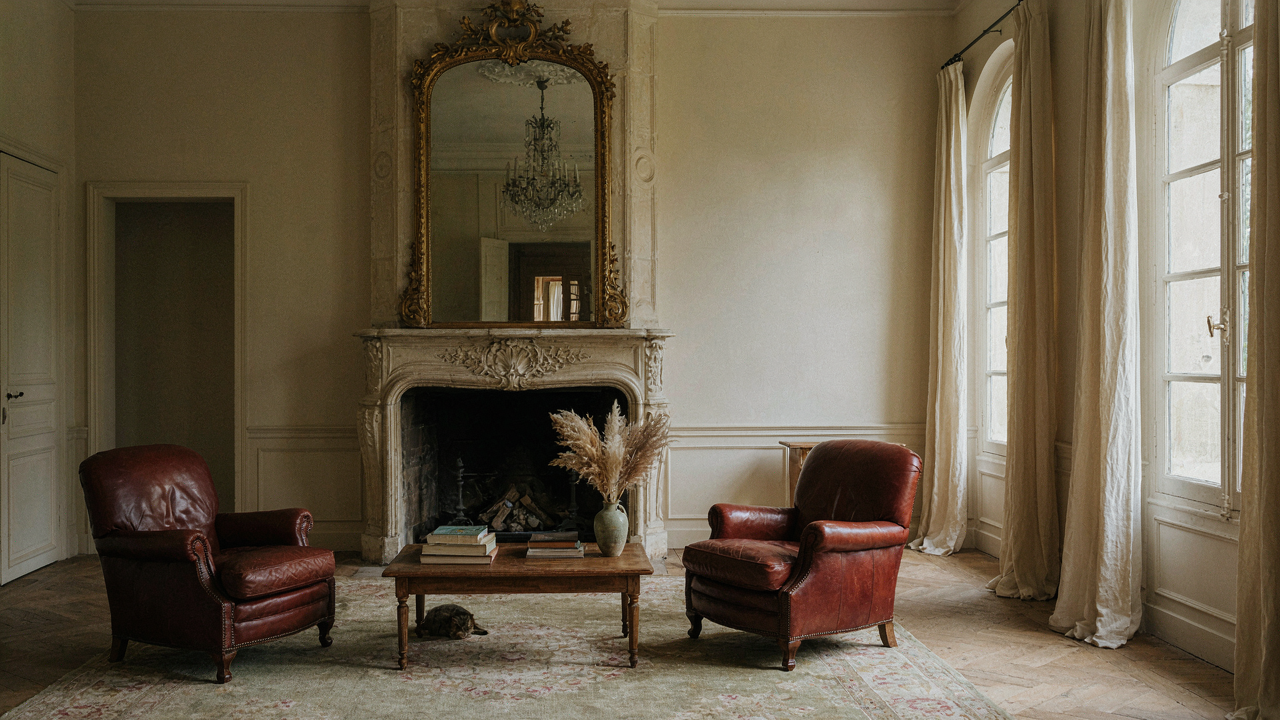
A chateau living room that actually works demands you steal the gestures, not the catalog. Heavy velvet drapes, aged mirrors, worn leather seating, stone accents—these elements solve real problems: light control, depth, durability, character. The 18th-century French weren’t preserving their rooms for Instagram. They were solving for comfort within their constraints. Your constraints are different. Your electricity works. Your heating doesn’t depend on a fireplace. Your room likely doesn’t have twelve-foot ceilings. Copy the logic, not the literal inventory.
When Replication Becomes Performance
Treating your living room like a museum piece forces everything into display mode instead of use mode. Uncomfortable chairs exist in period rooms because visitors only sat for twenty minutes during a tour. Delicate fabrics that require constant professional cleaning serve no purpose in a home where people actually live. The real leverage point is identifying which historical elements solve problems you have now, not recreating constraints you don’t.
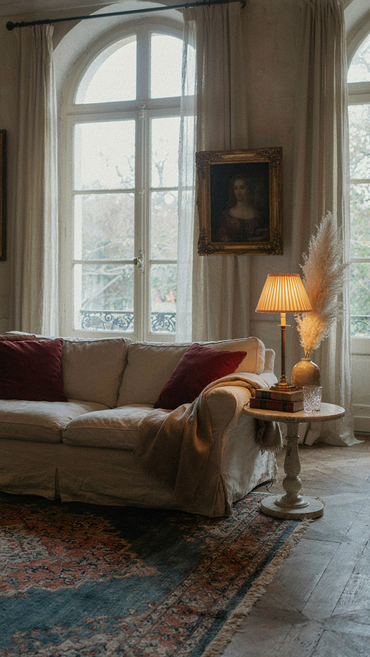
A functional chateau living room prioritizes seating that works, lighting that serves activity, and finishes that tolerate time. Choose a heavy linen sofa over precious silks. Select durable stone or aged wood surfaces over pristine veneers. Install warm lighting that flatters the room at night instead of relying solely on windows. The measure of success isn’t how accurately it photographs—it’s whether you sit in the room willingly and stay there comfortably.
The Juxtaposition Protocol: Modernizing Classic French House Interior
When Old Furniture Meets New Art
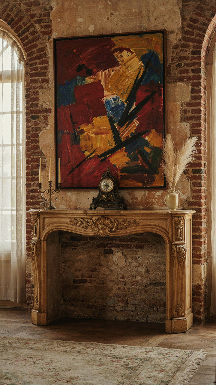
You want permission to buy expensive modern pieces without feeling like you’re erasing history. Here’s what actually works: the mechanism is contrast through scale and placement, not forced harmony. A large contemporary canvas doesn’t compete with 18th-century settees—it gives the room a focal point that belongs to the present moment. The antiques become context, not competition. This is how actual chateaux evolved over centuries: new layers added without demolishing the old.

The mistake people make is treating modern art like an intruder that needs to apologize. Position a bold abstract piece above a Louis XVI mantelpiece and the room stops feeling trapped in time. The antiques anchor credibility. The contemporary art proves you live here now. Size matters more than style compatibility. A 4-by-5-foot modern work commands attention; a small framed print reads as decoration trying too hard to fit in.
Raw Materials Against Refined Rooms
Industrial design borrows from systems thinking: load-bearing elements become visible, functional. Apply this to a chateau living room by exposing what other designers hide. Polished concrete floors, steel shelving, or blackened iron light fixtures create tension against silk damask and gilded frames. This isn’t adding roughness for authenticity—it’s creating visual relief from the relentless refinement that makes these rooms feel like museum pieces instead of places to sit.
Exposed brick, steel beams, or raw plaster walls work because they introduce human scale back into rooms built for display. A modern metal fireplace surround transforms a 400-year-old hearth into a working element instead of a static artifact. The rule: one material per room that contradicts the period language. Not two. Not scattered throughout. One statement point that forces everything else to justify its presence. That discipline is what prevents the room from becoming a costume.
The Golden Ratio Of Comfort: French Style Interior Design Principles
Balance Without Mirroring
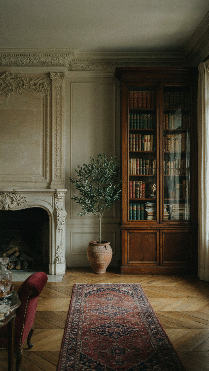
You want this space to feel effortless, which means you’re secretly afraid it’ll look staged or cold if you get it wrong. The mechanism is physics: balance doesn’t require symmetry. A French chateau living room uses asymmetrical balance, where objects of different visual weight distribute across the room to create equilibrium without matching layouts on either side of a center point.
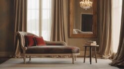
Place a substantial fireplace on one wall and counter it with a heavy bookcase or large mirror on the opposite side. These don’t need to mirror each other. A tall window with drapes can balance a low, wide sofa. The eye tracks visual mass, not matched pairs. Distribute furniture by visual density rather than position. This approach reads as intentional and lived-in, not formally arranged.
Command Position And Negative Space
Military strategy calls this territory control: you dominate through positioning, not volume. A French chateau living room achieves presence through focal points and the deliberate voids around them. Your primary anchor—usually a fireplace or large window—commands the room because it’s surrounded by breathing room, not crammed with supporting furniture.
Negative space functions as a design tool, not wasted real estate. Position seating to face the focal point with clear sightlines. Leave 40 to 50 percent of wall space uncovered in areas without architectural features. This restraint makes every piece you do place carry weight. The emptiness makes the objects meaningful. Fill gaps only when they serve function or direct attention toward your chosen focal point.
Beyond Beige: Injecting Personality Into French Chateau Interiors
Color Without Apology
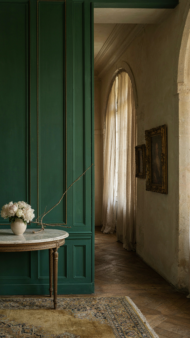
You’re worried that bold color will wreck the “authentic” chateau feel and tank resale value. That fear is the mechanism holding you back. The real constraint isn’t authenticity—it’s contrast. Chateau interiors from the 17th and 18th centuries used jewel tones, deep greens, and burgundy because pigments were expensive and rooms were lit by candlelight. Muted palettes became the myth later.
Pick one wall or architectural feature and saturate it. A deep forest green on paneling, charcoal on a ceiling, or warm terracotta in an alcove creates visual weight without chaos. The key is isolation: surround bold color with neutral surfaces so it reads as intentional, not accidental. This transforms a generic room into one with a point of view.
Layering Materials For Structure
Texture operates like load-bearing walls in architecture—it holds visual space upright. Most people throw down a rug, add a sofa, and call it finished. That’s why most chateau rooms feel hollow. You need competing materials at different scales: linen drapes, wool upholstery, stone or marble surfaces, wood with varying finishes, iron hardware, and plaster walls.
The sequence matters. Start with the largest texture first—your flooring or wall treatment. Build smaller textures on top through furniture, then micro-textures through accessories. A heavy linen curtain needs a smooth marble side table, which needs a worn leather chair arm. Each material’s finish should differ slightly from its neighbor so light catches differently and your eye stays engaged rather than sliding past.
The Curated Chaos: French Interior Living Room With Lived In Grace
Artful Disarray Beats Sterile Perfection
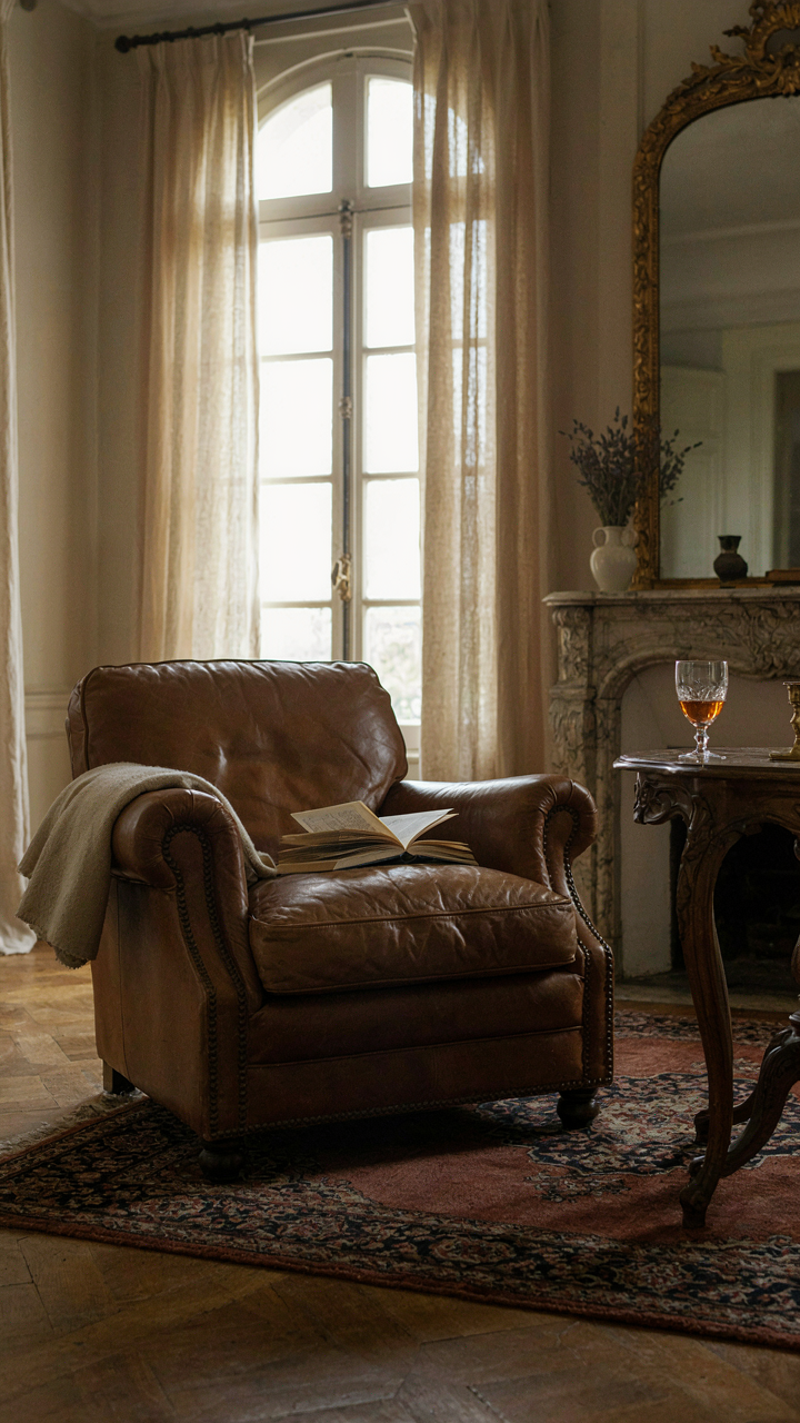
You want permission to stop performing for invisible judges. Here’s the mechanism: French chateau interiors work because they operate on entropy, not control. Think of thermodynamics—a closed system always trends toward disorder. Forcing artificial order fights the room’s natural state and exhausts you maintaining it. Lived-in spaces accumulate evidence of actual use. A book left spine-up on an armrest, a half-full glass on a side table, furniture arranged by traffic patterns rather than symmetry. This isn’t neglect. It’s the difference between a room that functions and a room that performs.
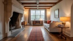
The common advice is wrong: “Everything in its place” produces museum interiors that nobody inhabits. French chateaus were occupied for centuries—rooms evolved through use, not through decorator whims applied once. Worn leather, crooked paintings, tables positioned for conversation instead of photography. The texture comes from time, not from buying “distressed” versions of new things. Your move is to stop correcting what feels natural. If furniture arrangement serves how you actually sit and read and talk, leave it that way.
Personal Objects Over Generic Decoration
The reason people fill rooms with store-bought decor is fear of emptiness. Real interiors reject that trade. A single inherited mirror, a particular chair your grandmother used, three books you’ve actually read scattered on a shelf—these objects have weight because they carry specificity. A generic “French countryside” print has none. Your room reads as chateau-adjacent only when it contains things that couldn’t exist in someone else’s space.
The mechanism here is differentiation through irreplaceability. Mass-produced items flatten a room because they flatten you—they announce you’re following a template. A collection of postcards from places you’ve been, a chess set someone gave you, mismatched plates from various sources. These create texture through biography, not through aesthetic consistency. Start by removing one category of generic decor this week. Replace nothing. Notice what the space actually needs. Then source objects based on use or memory, not on design trends.
Neoclassical Interior Reimagined: The Unstuffy Grandeur
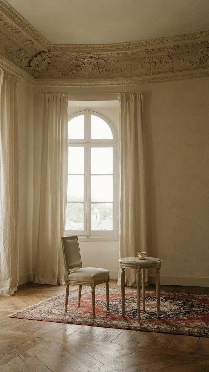
Stripping Down Without Losing Authority
You want the credibility of a chateau without looking like you’re afraid to sit on anything. The real mechanism here is constraint. Neoclassical design emerged in the 18th century as a reaction against rococo excess, and that same tension applies now: remove ornament strategically, not wholesale, and the remaining pieces gain weight instead of losing it.
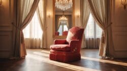
The common advice is to “embrace simplicity.” Wrong. Simplicity is lazy here. What works is calculated reduction. Keep the architectural bones—crown molding, paneling, fireplace surrounds—but strip the ornamentation from furniture and textiles. A neoclassical chair with clean lines and minimal carving reads stronger than an ornate one because there’s nowhere for the eye to hide. Fewer details force better proportions.
Layering Across Time Deliberately
Mixing periods works only when you understand the actual mechanic: visual rhythm. A room full of one era feels curated by a catalog. A room with intentional collision feels inhabited by someone with taste. Pair 18th-century neoclassical bones with 19th-century English furnishings or mid-century lighting. The rule is not “match everything”—it’s “make each piece earn its placement through material or form logic.”
Restraint between periods creates coherence. Don’t flood the room with mixed eras. Choose one dominant period for structure and seating, then introduce secondary periods through accessories, art, or a single standout piece. A contemporary abstract above a classical mantelpiece works because both demand attention through clarity, not decoration. The mechanism is repetition of intent, not historical accuracy.
Beyond The Living Room: Extending Relaxed Elegance
When The Bedroom Becomes An Extension
You want permission to blur the line between rooms because admitting they’re separate feels rigid and old. The mechanism is visual continuity: French chateaus use narrative consistency, the same principle architects employ when designing cathedral spaces that flow without walls. Your bedroom should read as the next chapter of the living room’s story, not a reset.
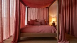
The practical move is material echo. If your living room uses natural linen on seating, your bedroom needs linen on the bed frame or upholstered headboard. If the living room features stone fireplace surrounds, the bedroom’s architectural detail should reference stone, not break it. The color palette stays within two to three tones maximum across both rooms. Texture variation matters more than color novelty here.
Where Indoor Meets The Outside
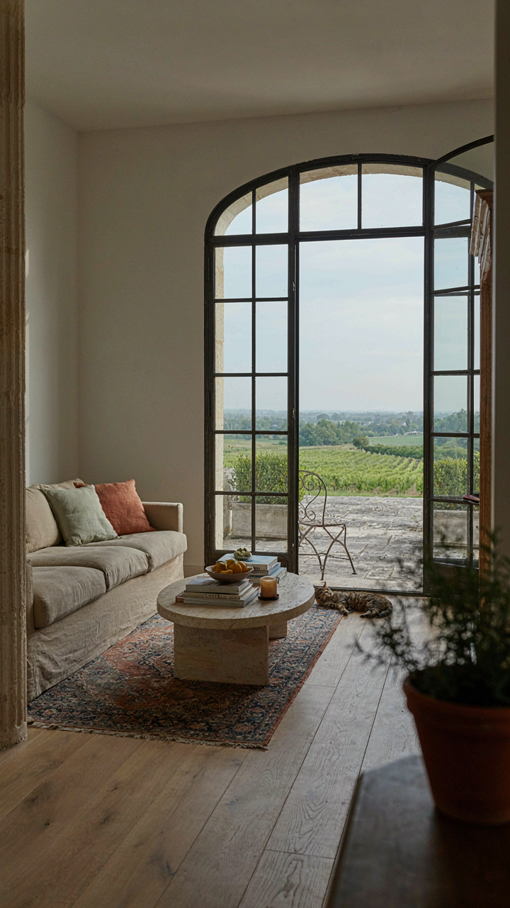
Most people think French Provincial design stops at glass doors, which explains why so many chateau-inspired interiors feel trapped. The real leverage is threshold design: your living room doesn’t end at a window or door, it ends when the material language shifts completely. A French Provincial living room extends into an exterior space when the flooring material continues or when the seating arrangement visually pulls toward the opening.
Stone tiles from the interior should match or complement exterior paving materials. Outdoor furniture should employ the same upholstery palette and frame styles as indoor pieces. The key is treating the transition as a spatial decision, not a decorative one. Position your living room seating to orient toward exterior views naturally, then repeat that visual weight outside with equivalent furniture placement.
The Effortless Entertaining Equation: Parisian Living Room Host Hacks
Furniture Placement For Movement, Not Symmetry
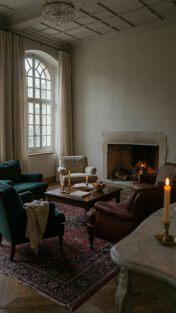
You want people to think you host effortlessly. The real mechanism is traffic flow. Most people center everything on a fireplace or mirror and wonder why conversations die in corners. Chateau living rooms borrowed the military concept of “lines of sight”—clear sightlines determine where people naturally gather, where they linger, where they leave. Break the symmetry.
- The Conversation Cluster: Position seating in angled groupings of three to four pieces around a low table, leaving one open side for entry and exit without disrupting the group.
- The Perimeter Path: Keep a clear walking route around the room’s edge so guests don’t climb over furniture or interrupt seated conversations to reach other areas.
- Secondary Zones: Place a pair of chairs or a small settee away from the main cluster—this gives people a legitimate reason to move through the room and creates natural conversation shifts.
- The Architectural Anchor: Orient seating to face a window, fireplace, or architectural feature rather than the room’s center, which makes the layout feel grounded instead of arbitrary.
- Clear Approach: Leave at least 18 inches between furniture pieces so someone can move through without squeezing or appearing awkward in front of other guests.
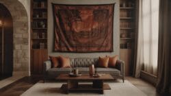
Chateau hosts knew that movement creates the illusion of flow and ease. When guests can circulate without thinking about it, they stay longer and interact with more people. The room does the work for you.
Layered Light That Shifts With The Hour
Lighting is not about brightness. It’s about controlling mood through intensity gradation—a concept from theater design that applies directly to chateau entertaining. You need multiple independent light sources at different heights and brightness levels so you can adjust the room’s emotional temperature without flipping one switch and washing everything out.
A properly lit chateau living room has no single overhead fixture doing all the work. Instead, use table lamps on side tables at seated eye level, wall sconces flanking a fireplace or mirror at mid-height, and candlelight in glass or metal holders at table level. Start the evening with sconces and candlelight only, then add one table lamp when people arrive. As the night deepens, reduce electric light and let candlelight dominate. This shift feels intentional and expensive without requiring any equipment beyond standard bulbs and timers. The mechanism is simple: you’re not trying to illuminate the room evenly—you’re creating pockets of warm light that draw people toward conversation and away from the room’s perimeter.
The Real Obstacle Isn’t Your Budget; It’s Your Fear Of Breaking The Rules
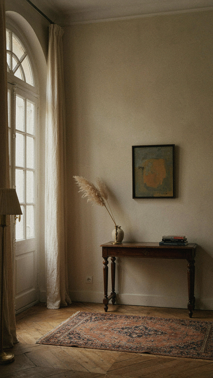
You’re paralyzed by some imaginary French chateau police. They don’t exist. The real elegance comes from breaking symmetry, mixing periods, leaving walls bare when everyone says fill them. Today, pick one rule you’ve been following blindly and violate it in your living room. Move a chair to an awkward angle. Paint one wall a color that feels slightly wrong. The masters of relaxed elegance weren’t afraid to look careless on purpose. Perfection is the enemy of rooms people actually want to live in.