
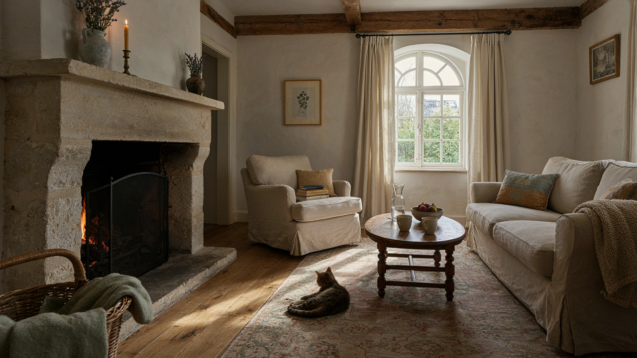
The Provincial Deception: Why Authenticity Trumps Replication
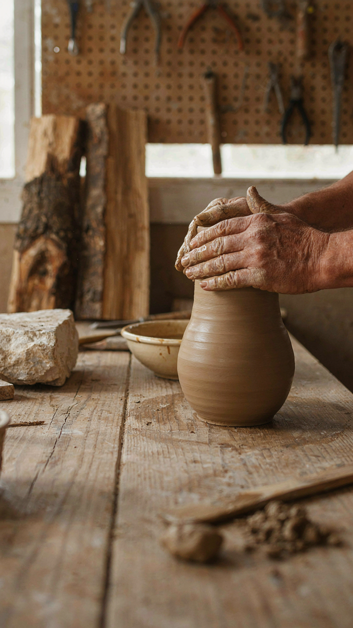
Where French Provincial Actually Comes From
You want to know the secret because it sounds expensive and rare, and you fear buying the wrong thing. Here is the mechanism: French provincial style emerged from rural practicality in 18th-century Provence, Normandy, and Brittany, not from palace decree. Peasants and minor landowners adapted available materials—limestone, oak, linen—into functional beauty. No design magazines told them what to do. Regional constraints forced the aesthetic, which is why it holds weight.
The common mistake is treating this as a historical artifact to copy. It is not. French provincial was always about solving real problems with regional resources. Furniture makers used local wood because importing was impossible. Textiles featured simple patterns because complexity required urban dye masters. The style works because every decision answered a material constraint, not a trend. When you skip this understanding and buy a “French provincial” sofa from a catalog, you buy the costume without the logic.
The Difference Between Style And Theme Park
The line between authentic adaptation and themed decoration is sharp: one solves for living, the other solves for looking. Theme park decor announces itself through decoration density. You see wallpaper borders, coordinated collections, and matching sets that scream “I bought a collection.” Authentic provincial homes accumulated pieces over decades from necessity, not coordinated intent. A table wasn’t chosen to match the chairs. The chairs survived because they worked.
Themed approaches fail because they treat French provincial as a visual formula to replicate. This inverts the actual mechanism. The style is the byproduct of material constraint and regional availability, not the goal. When you start by asking “what does French provincial look like,” you end up with surface moves. Start instead by asking “what materials do I have, what do I actually need, and what can I source locally or affordably.” Build from function outward. The style emerges when you stop trying to engineer it.
The Alchemist’s Method: Forging Patina In French Provincial Interior
Materials That Hold Time
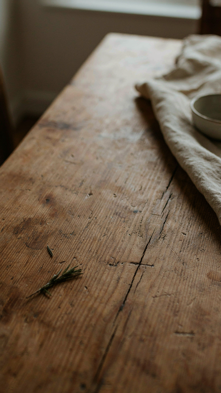
You want patina because it signals you didn’t buy everything last month. The real mechanism isn’t magic—it’s material selection. French provincial interiors work because they use substances that actually change: stone, terracotta, linen, solid wood, wrought iron. These materials oxidize, fade, absorb, and weather visibly over years. Pick them deliberately and they do the aging work for you without theater.

Stone and terracotta carry geological time. Limestone flooring, clay roof tiles, and earthenware vessels show use patterns that synthetic materials cannot replicate. Wood accepts stain and develops grain character through exposure to light cycles. Linen and wool fade asymmetrically—hems stay darker, centers go pale. This isn’t decay. It’s the material documenting its own history.
The Difference Between Faked And Found
Most design advice here is backward. It tells you to buy “distressed” furniture and call it authentic. That’s the aesthetic equivalent of wearing unwashed vintage jeans from a mall. The real split isn’t between old and new—it’s between materials that genuinely patina and finishes engineered to look damaged on day one.
Genuine patina emerges from function. A farm table develops dents because plates landed on it for forty years. French provincial pieces show wear in high-contact zones: armrest edges, table corners, stair treads. Engineered distressing scatters damage randomly—the signature of someone who’s never watched how objects actually break down. Source solid wood pieces, keep them in use, and let time do the work. That’s the only mechanism that holds.
The Un Decorated French Provincial Bedroom: Purpose Over Display
Comfort Wins Against The Ornament Reflex
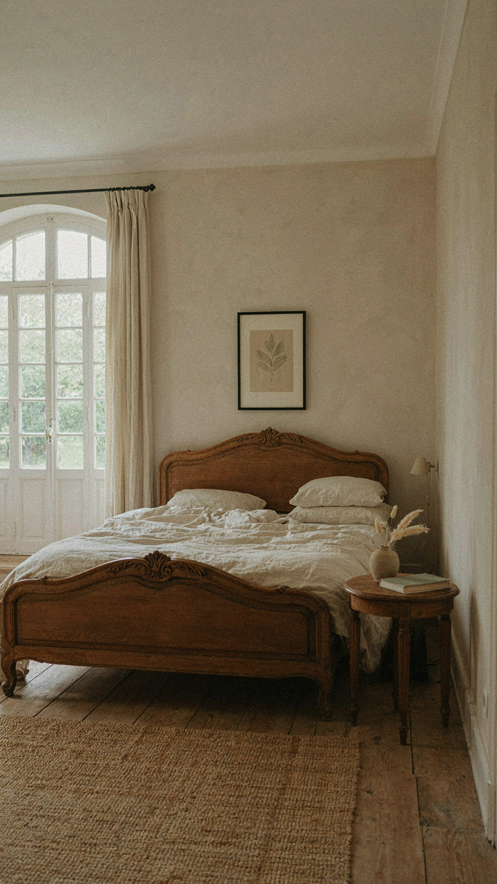
You want this room to look designed without admitting you care about looking designed. That’s the real tension here. The mechanism is simple: French provincial bedrooms reject decoration as a status signal and replace it with functional restraint. This isn’t minimalism dressed in linen. It’s the opposite of decorating. Provence and rural France never had excess. They had what worked, repeated until it became beautiful through use.
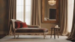
The beds themselves anchor this philosophy. Heavy oak or walnut frames, turned posts, straightforward joinery. No carved flourishes demanding attention. The mattress sits on a simple rail system or rope support, covered with linen or linen-cotton blends in cream or pale gray. Pillows number two to four, not ten. Linens change seasonally but stay neutral. This is a room built for sleep, not for Instagram validation of your sleep aesthetic.
The Weight Of Restraint In What You Don’t Buy
Most advice tells you to add “statement pieces” or “focal points” to make a room feel intentional. Wrong. French provincial bedrooms achieve intention through subtraction. Think of load-bearing walls in architecture: remove the wrong element and the structure fails, but keep only what holds weight and the design becomes obvious. A single wooden armoire for storage. One small writing table by the window. Perhaps a modest nightstand. Each piece earns its space through pure utility.
The real constraint is psychological, not spatial. You must resist the impulse to layer texture, pattern, or color for visual interest. One wool throw across the bed frame works. A rug in a natural fiber anchors the floor. Walls stay limewashed or painted in off-white. Windows have simple linen curtains on iron rods, nothing more. The mechanism that makes this work is elimination: every item you don’t bring into the room becomes part of the design. Stop buying and start editing.
The French Country House Provence: A Biology Of Growth
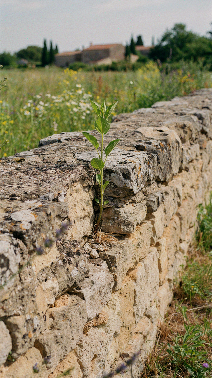
How Rooms Talk To Each Other
You want French provincial to feel effortless because you think that signals taste. It doesn’t. It signals you understand a system. Borrow from biology: in ecosystems, no element stands alone. A French provincial room works because each piece—the stone fireplace, the terracotta floor, the linen drapes—creates conditions that make the next piece necessary. The hearth pulls heat and gathering. The floor absorbs and distributes it. The textiles moderate temperature and sound. Each element serves the larger flow, not itself.
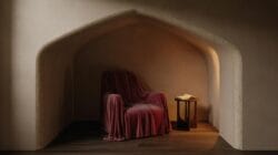
The mistake most people make is treating French provincial as a decoration problem. They buy individual pieces that look right in isolation. A rush-seated chair. A faïence plate. A wrought iron sconce. But these scatter energy. Real French provincial rooms function as living systems where materials, light paths, and traffic patterns reinforce each other. The stone walls don’t just look authentic—they regulate humidity, which changes how fabrics age and how the room feels seasonally. The shallow windows don’t just frame views—they control how afternoon light moves through the space and determines where you naturally sit. When you design this way, you’re not decorating. You’re architecting conditions.
Spaces Adapt When You Stop Planning Everything
Most design advice treats a room as a fixed state you reach, then maintain. French provincial evolved differently. Provence farmhouses grew room by room, decade by decade, as families needed them. A storage alcove became a sleeping nook. A work table migrated to catch better light. The aesthetic emerged from use, not a predetermined vision imposed downward. This is how you actually build something that breathes.
The protocol is simple but demands restraint: establish the load-bearing elements first—the hearth, the thick walls, the entry point—then leave 40 percent of the room undefined for six months. Live in it. Watch where dust settles, where you naturally move, where shadows fall at different hours. This teaches you what the space actually wants, not what your Pinterest board imagined. Only then do you commit to secondary pieces. Provence farmhouses didn’t look like Provence farmhouses because someone planned them that way. They looked inevitable because they evolved from reality instead of fighting it.
Modern French Provincial Decor: Blending Eras, Not Confusing Them
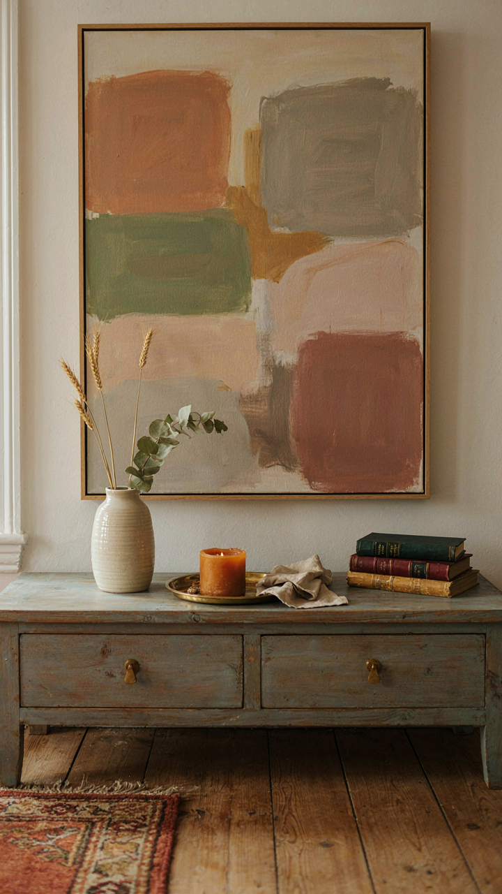
When Contemporary Art Actually Works In Provincial Rooms
You want permission to use modern pieces without feeling like you’re breaking something sacred. The real problem is that most people treat French Provincial as a sealed historical box instead of a living aesthetic system that has always absorbed what surrounded it. Think in terms of contrast, not era. Provincial style survived centuries because it adapted the materials and forms available to each generation while keeping its core DNA intact: proportion, restraint, and functional beauty.
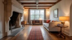
A contemporary painting or sculpture works in a Provincial room when it respects the same principle that governed the original style: it doesn’t scream for attention through novelty alone. Place a modern abstract piece above a Provençal credenza only if the colors echo the room’s natural palette, or if the scale relates to the furniture proportions beneath it. The mechanism that makes this work is visual weight, not temporal alignment. A bold geometric print in charcoal and cream lands better than a neon installation because it respects the room’s existing visual rhythm.
Straight Lines Meet Weathered Surfaces
Stop listening to advice that says mixing periods means you can ignore visual rules. Clean-lined modern furniture placed against aged stone, distressed wood, or worn plaster doesn’t create contrast by accident—it requires deliberate material pairing to read as intentional instead of accidental. French Provincial rooms historically used both smooth and rough surfaces in the same space: polished walnut tables against rough limestone walls, linen cushions on carved wooden frames.
The play works because new and old materials occupy different visual roles. Use contemporary pieces with minimal ornamentation in materials that show age gracefully: natural linen, solid wood, brass, or stone. A modern sofa in raw linen sits comfortably against Provençal-era stone flooring because both materials age honestly and share a neutral palette. The decision rule is simple: if a contemporary piece looks better when it’s new and pristine, it will create jarring discord in a room meant to celebrate texture and patina. Choose forms that improve or stay neutral as they wear.
The Provincial Palette Protocol: Undoing Color Complacency

When Muted Tones Work Better Than Bold
You want permission to play it safe with color. That’s the real fear here—that bold moves will look wrong, so you default to beige and call it French. The mechanism is this: Provençal interiors work because they use constraint as a design tool, not accident. Limiting your palette forces intentional decisions about every element that remains. The regions that shaped this style—Provence, Aquitaine, Normandy—had limited access to synthetic dyes and imported pigments, so local makers developed depth through layering muted tones instead of relying on intensity.
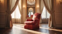
French provincial style doesn’t whisper. It commits. When you restrict yourself to ochres, terracotta, cream, soft greens, and grayed blues, each piece gains visual weight. The palette succeeds because these colors read as intentional restraint, not timidity. You’re applying constraint like a physics principle: with fewer variables in play, the remaining ones become more observable. Select your base tone from the local earth pigments that would have appeared in the region you’re drawing from—Provençal ochre differs from Norman stone gray. Once locked, build texture and depth through variations in finish and material, not by chasing new colors.
- Provençal Ochre: Warm, iron-rich yellows and burnt oranges sourced from regional clay. Use as primary wall color or accent trim that grounds the entire room.
- Grayed Greens: Muted sage and celadon tones that appear aged rather than bright. Common in shutters and woodwork, they create visual separation without harshness.
- Soft Cream: Off-white bases with slight warmth from ochre or ash undertones. Prevents the sterile feeling of pure white while maintaining brightness.
- Stone Blue: Dusty, desaturated blues inspired by weathered exterior paint. Reserve for accent walls or cabinetry where they read as sophisticated, not trendy.
- Terracotta: The clay-based reds and browns that tie to floor tiles and architectural details. Use in small doses to echo foundational materials.
The palette works because you’re not fighting the materials. Provençal design emerged from what local craftsmen could produce—clay tiles, lime wash, locally quarried stone. Your color choices succeed when they echo these constraints rather than override them. Pick three to four colors maximum for any room, then vary their saturation and finish instead of introducing new hues.
The Art Of Deliberate Restraint
The common mistake is thinking contrast means drama. It doesn’t. Contrast in French provincial design means creating visual hierarchy within a narrow band, not jarring shifts between opposites. A cream wall paired with a grayed-green shutter reads as intentional restraint. Cream paired with kelly green reads as inconsistent taste. The difference isn’t subtle—it’s whether the eye rests or snaps.
The mechanism here borrows from visual hierarchy in graphic design: dominance, emphasis, and subordination must feel earned, not forced. Your dominant color occupies 60 percent of the visual field. Your secondary color takes 30 percent. Your accent—if you use one—claims the remaining 10 percent. In a Provençal room, this means cream walls dominate, grayed-green or soft blue accents secondary, and terracotta or darker wood plays the 10 percent role. The contrast works because each color sits at a similar value and saturation level. They’re neighbors, not opposites. When you violate this principle by introducing a saturated modern accent, the room fractures because you’ve broken the inherited logic of the palette.
Test your color relationships by photographing them in actual light conditions—morning, afternoon, and evening. Provençal interiors shift throughout the day as sunlight changes the value of muted tones. What looks balanced at noon might feel flat at dusk. If your palette looks static across different light conditions, you’ve chosen colors that are too close in value. Add a single darker tone—charcoal, deep brown, or weathered black—and anchor it to woodwork, shutters, or tile. This single dark anchor point gives the entire palette permission to remain muted while still registering as intentional.
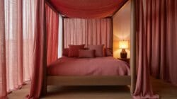
French Provincial Decor Kitchen: Function Dictates Form
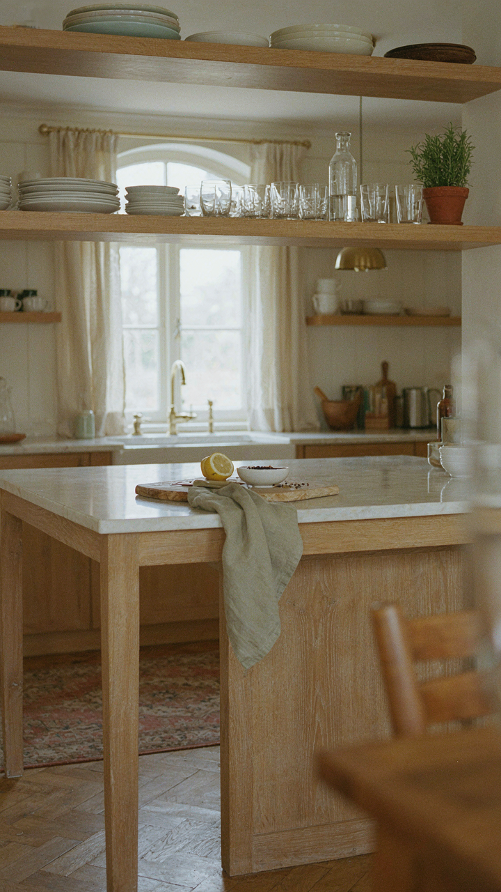
Kitchens Built For Cooking, Not Instagram
You want a kitchen that looks like it belongs in a magazine spread, but what you actually need is one where you don’t waste motion or thought. The mechanism is simple: French provincial kitchens emerged from rural farmhouses where the kitchen was the economic engine of the home. Form followed necessity, not aesthetics. A Provençal kitchen prioritizes workflow over visual spectacle. Dense storage, work surfaces at practical heights, and equipment placement that reduces steps between prep, cooking, and serving. This isn’t about charm masquerading as function. It’s the inverse. Function so efficient it becomes charming.
The kitchens that work longest are the ones designed for repetition, not admiration. French provincial kitchens survive generations because they answered a real problem: how do you cook daily meals for a large household without wasted effort? The answer lives in the layout. Countertop depth matches arm reach. Sinks position near water sources and prep zones. Storage for frequently used items stays within arm’s length of where you use them. This isn’t accident. It’s constraint-driven design. Most modern kitchen advice ignores workflow entirely and leads you toward expensive appliances and empty counter space. Build your kitchen around the five tasks you repeat daily, not the three you perform once a year.
Open Shelving For Practical Charm
Open shelving in French provincial kitchens serves a tactic: visibility creates accountability. You keep only what you use, arranged by frequency. This isn’t minimalism dressed up as rustic charm. It’s inventory control. When dishware, glasses, and cooking tools sit exposed, you stop buying duplicates. You stop stacking the same bowl six times. The constraint forces intentionality. Provençal homes historically used open shelving because closed storage was expensive and space was minimal. The aesthetic emerged from scarcity, not design philosophy.
The real mechanism isn’t decorative. It’s behavioral. Open shelves make you maintain what you own because everything is visible. You wash dishes faster when you can’t hide them behind cabinet doors. You organize daily because the arrangement affects your kitchen’s appearance every moment you’re there. Implement open shelving only for items you use at least three times per week. Everything else stays behind closed cabinetry. This creates the balanced look of French provincial design without the trap of maintaining perfect visual composition around items you rarely touch.
Beyond The Style Guide: Cultivating Your French Provincial Home Interior
The Objects That Hold Your Story
You want permission to break the rules without looking like you don’t understand them. Here’s the mechanism: French provincial homes work because they document the owner’s actual life, not a designer’s vision. Every piece exists because it solved a problem or meant something—not because it fit a mood board.
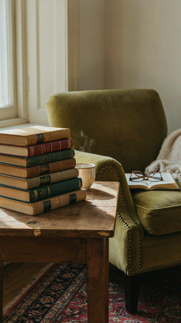
The farmhouses and manor homes of Provence and Aquitaine accumulated objects across generations. A worn table from the 1800s stayed because it functioned, not because it was “authentic.” When you furnish a space with items that have real history in your possession—inherited silver, collected ceramics, books you’ve read—the room develops legibility. It reads as lived-in because it was. This is the opposite of curated French provincial, which is just costume.
Embracing Wear Without Apology
The common advice is that French provincial tolerates imperfection. That’s incomplete. French provincial demands imperfection as proof the space is real. A pristine painted cabinet looks like reproduction. One with scratched paint and honest patina proves it survived actual use.
Evolution is the mechanism here, not static decay. Original French provincial interiors changed when needs changed. Furniture moved. Walls were repainted when the old color faded unevenly. Textiles wore and got replaced with something close but not identical. Your space should reflect this timeline. Live in it first. Then notice what actually wears. Don’t sand and refinish—let the wear pattern show where hands go, where light lands, where the room gets used. That’s the only honest design protocol.

Your Home’s True Elegance Isn’t Purchased, It’s Earned Through Thoughtful Patina And Genuine Use
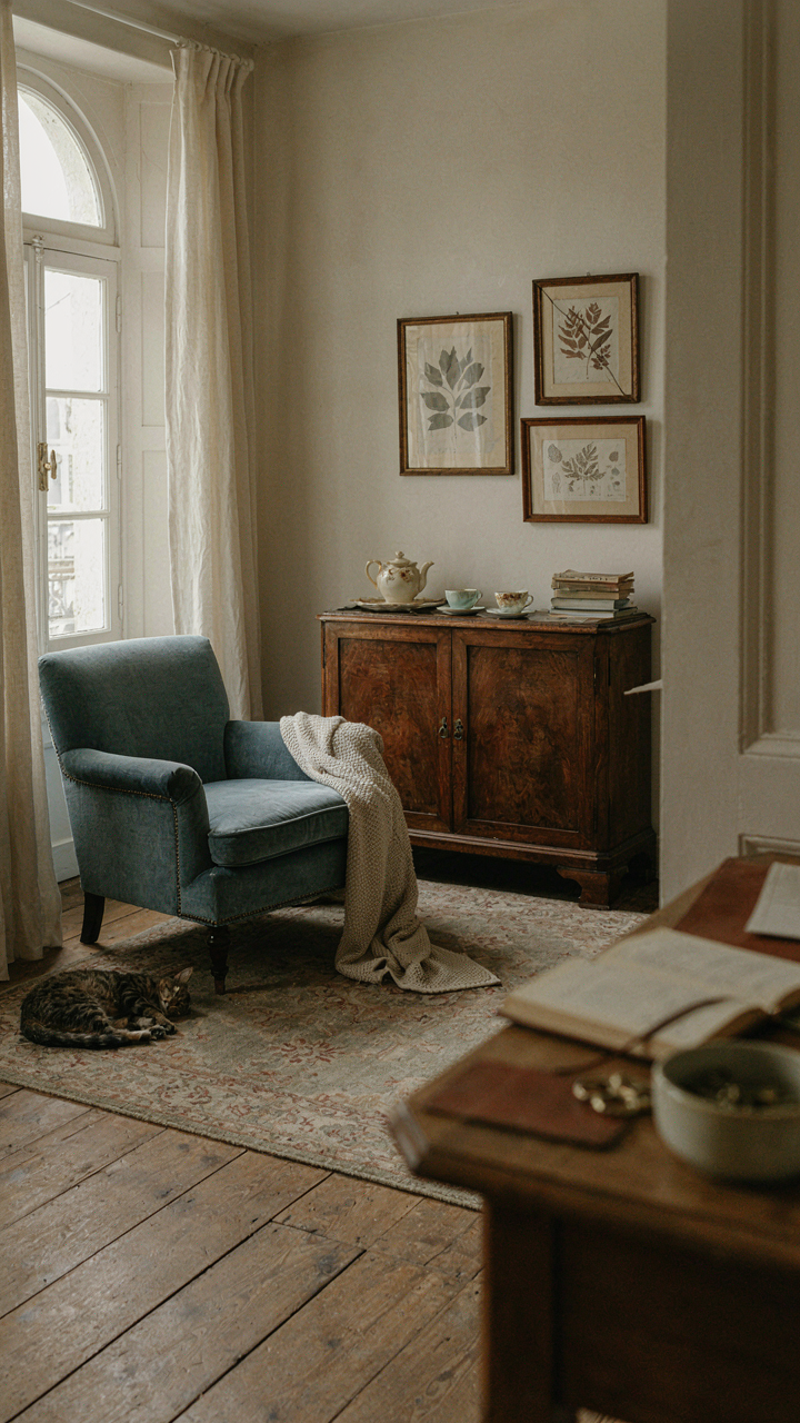
Stop buying French provincial style like it’s a checklist. The moment you treat it as decoration instead of a way to live, you’ve already lost. Real French provincial homes weren’t designed in a day. They evolved. Your move today: pick one room and commit to using it deliberately for the next month. Notice what actually works. Notice what you reach for. That friction between intention and reality builds the aesthetic that matters. Your home doesn’t need to look French. It needs to look lived in by someone who thinks.



