
The Proportional Fallacy: Why “Authentic” Is Overrated
What Authenticity Actually Costs You
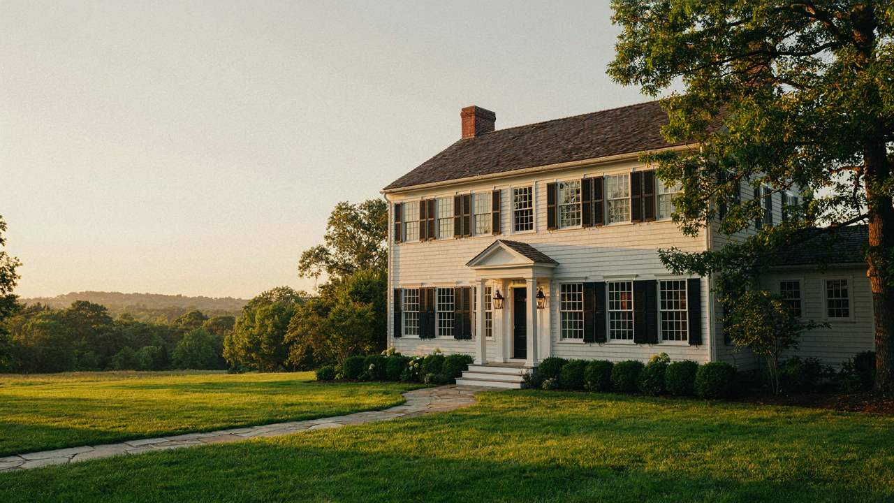
You want authenticity because it signals you know the rules well enough to follow them. Here’s the mechanism: Colonial Revival houses built between 1880 and 1950 copied proportions from homes constructed 100 to 150 years earlier, which were themselves constrained by timber availability, construction methods, and the lifestyle of their occupants. You’re copying a copy that solved problems you don’t have.
Those original proportions emerged from necessity, not aesthetic law. Ceilings sat lower because heating large volumes was expensive. Windows stayed modest because glass cost money and drafts wasted heat. Hallways narrowed because interior square footage meant tax liability in some regions. Chasing these proportions today ignores that your colonial revival house doesn’t share those constraints, making strict authenticity a performance, not a principle.
Visual Weight Moves More Than Symmetry Does
Physics governs how the eye processes mass. A colonial revival house that feels “correct” isn’t necessarily balanced—it’s loaded with optical anchors that make the brain trust the proportions. The Federalist cornice that wraps your roofline creates visual weight at the top; it counteracts the heavier mass of the ground floor. This isn’t symmetry. This is tension.
Most people get this backwards: they assume symmetry matters most because colonial revival houses appear symmetrical. The real work happens through depth, shadow, and where you place material mass. A shallow pediment over your entry signals importance through compression, not through being centered. Shift that pediment six inches off-axis and viewers won’t notice the asymmetry because the visual weight distribution stays intact. That’s where your leverage lives—in the weight, not the mathematics.
The Golden Ratio Protocol For Colonial Revival House
Applying Ancient Mathematics To Your Facade
You want this house to feel right without knowing why, and that desire sells. The mechanism is proportion, which comes from mathematics, not taste. Colonial Revival architects borrowed the golden ratio (1:1.618) from classical architecture to make facades that stopped feeling arbitrary. This ratio appears in window heights, door widths, and the relationship between wall space and openings. It’s not decoration. It’s the math that makes your eye stop scanning and settle.

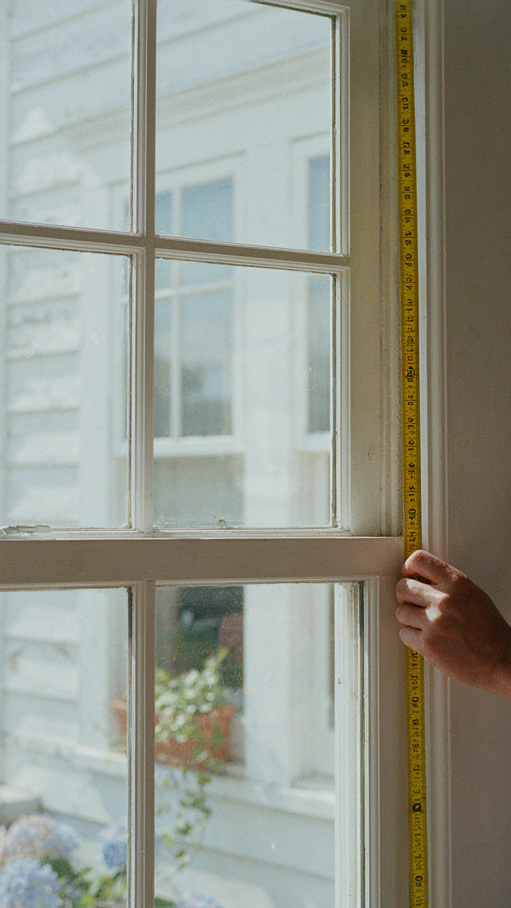
The golden ratio controls how your brain processes visual information. When proportions align to this ratio, your nervous system registers them as resolved, not confused. Colonial Revival adopted this deliberately. The width of a door frame to its height, the spacing of shutters, the relationship between the main structure and the portico all follow this pattern. You don’t consciously measure these intervals, but your body knows when they’re wrong. Apply this ratio to your facade: if a door is 36 inches wide, make it roughly 58 inches tall. Scale every secondary element proportionally from there.
Window And Door Placement Optimization
The conventional advice is symmetry, which is incomplete and lets amateurs wreck facades. Symmetry alone creates flatness. Colonial Revival achieved depth through proportion combined with strategic asymmetry in rhythm. Windows weren’t just mirrored left to right. Their placement followed rules about sight lines, wall strength, and the golden ratio applied vertically and horizontally across the entire face of the house.
Door placement determines how the eye enters the facade and where it rests. The front door should sit at the visual center, but not geometrically centered on a flat grid. It sits at a point where multiple sightlines converge when you approach the house. Upper windows align with lower windows using ratios, not random spacing. Measure the distance from the roof line to the top window, then the distance between window centers, then the distance from the bottom window to the foundation line. Each interval should bear a proportional relationship to the others. If the top interval is 48 inches, the middle intervals should follow the golden ratio downward. This creates the depth that photographs well and feels intentional.
Beyond The White Box: Modern Colonial Exterior Palette
Color As Structural Language
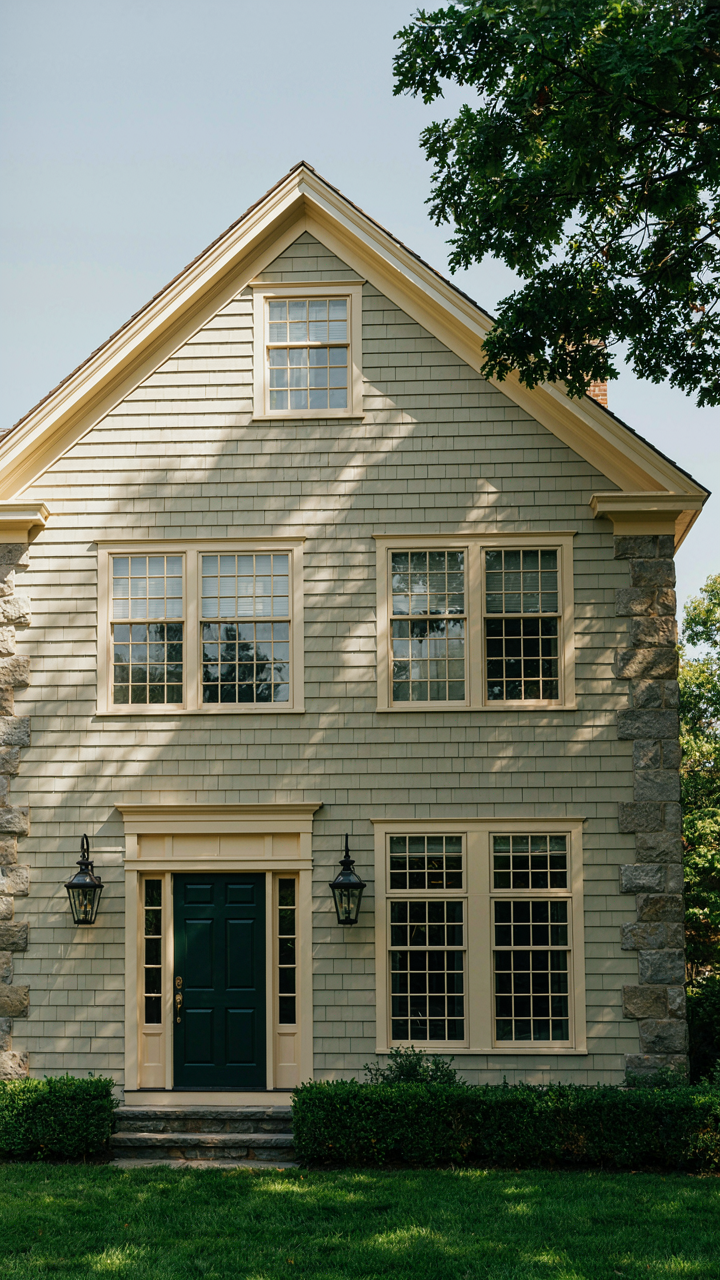
You want people to perceive your house as substantial without saying it out loud. That’s the real driver. Color functions like contrast in photography: it doesn’t decorate, it creates depth and hierarchy. Colonial Revival homes work best when exterior color articulates the building’s actual geometry instead of flattening it. Most people paint everything one shade and wonder why the house looks like a box.

The mechanism is simple. Trim, cornices, and window surrounds need separation from wall planes. A warm white or cream on trim against a muted earth tone on walls creates the illusion of structural complexity. Historical precedent backs this: eighteenth-century builders used lime wash in ochre, gray, and rust tones, never stark white. The contrast wasn’t aesthetic choice—it was visual proof of craftsmanship and material distinction.
Material Layering Breaks The Plane
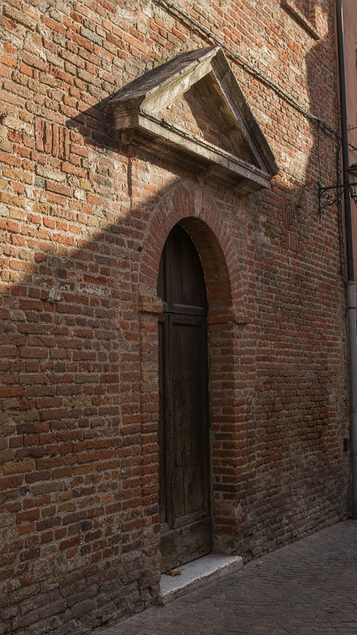
Texture hierarchy defeats monotony faster than any paint scheme. The common advice says add shutters and call it done. That misses the actual work: material change creates visual weight. Brick, clapboard, and stone each read differently under light. Colonial Revival uses this deliberately.
Start with one dominant material and interrupt it strategically. Brick as the primary wall plane with stone quoins at corners creates vertical emphasis without adding nothing. Clapboard bodies paired with shingle gables give the eye places to rest. Each material transition should align with structural logic, not random aesthetic gesture. Change materials where the building’s logic demands it—at foundation lines, between stories, or at roof transitions. This makes the exterior read as assembled rather than applied.
The Federal House Exterior: Symmetry As A System
Balanced Elements Create Visual Authority
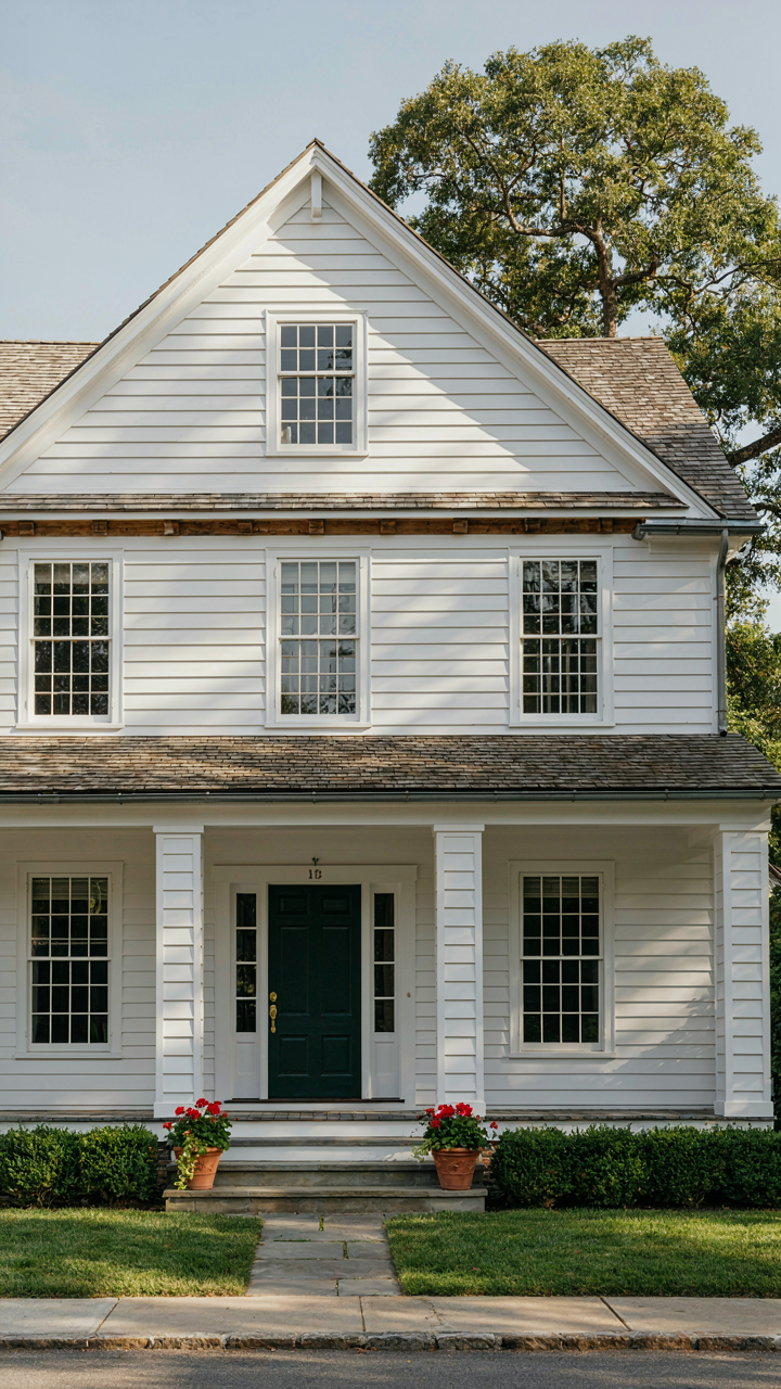
You want this because symmetry signals wealth and control to anyone who walks up to your house. The mechanism is load distribution across a facade. Think of symmetry in architecture the way structural engineers think of load paths: each element on the left must mirror the right to establish visual equilibrium and communicate intentionality.

Federal-era builders understood this wasn’t decoration. A centered doorway with matching windows on either side, equal spacing from roof to foundation, creates a visual hierarchy that reads as stability. Asymmetry reads as accident or poverty. The human eye expects balance and interprets it as competence. This is why Federal houses still command presence two centuries later.
Breaking Symmetry Without Losing Control
The common advice says stick to symmetry or go full contemporary. That’s incomplete. Federal houses broke symmetry strategically where it mattered functionally, not aesthetically. A side-entry door or an off-center chimney worked because the facade remained balanced overall. The asymmetry served a purpose: kitchen placement, site constraints, or servant circulation.
The real move is asymmetry in service of the main facade composition. Your primary front elevation stays symmetrical. Secondary facades or functional elements absorb the breaks. This prevents the house from reading as confused or poorly proportioned. When you deviate from strict symmetry, make the deviation serve the building’s operation first, not your desire to be different. That’s when it reads as intentional rather than mistaken.
Colonial House Exterior: Landscaping As An Extension
The Sightline Hierarchy
You want people to see your house first because you spent money on it. Here’s what actually matters: Colonial Revival architecture depends on proportion and symmetry being visible. Overgrown foundation plantings kill that instantly. Think of landscaping like military strategy—you’re controlling the approach vector. The enemy doesn’t get to choose where they notice your position. Neither should your shrubs.

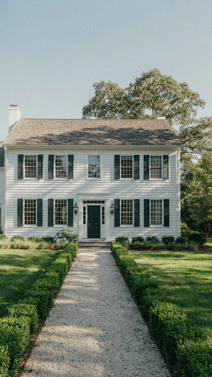
Colonial Revival homes sit on their sites with deliberate placement. The facade needs clear air around it from the street view. Heavy evergreen screening was never part of the original aesthetic. Plant placement should create a visual corridor that lands on the front door or entry portico, not obscure the roofline or window rhythm. This isn’t decoration. It’s architecture restoration through negative space.
Gravel, Stone, And Purposeful Transitions
Most people dump mulch or ground cover everywhere and call it landscaping. Wrong move. Hardscape materials in Colonial Revival contexts serve a mechanical function: they direct foot traffic and define property edges without disrupting sight lines. Gravel or crushed stone pathways mimic the original driveways and carriage approaches colonial homes actually used. Slate, bluestone, or brick edging reinforces the geometric order the architectural style demands.
Formal geometry in hardscape prevents visual chaos around the foundation. Straight or gently curved lines align with the home’s axis. Avoid island beds and scattered rock features. Instead, create one clear path from drive to entry and secondary paths to service areas or gardens. This establishes the property’s functional logic while keeping the eye on the structure. The pathway becomes the stage, not a distraction from it.
Traditional Colonial House Exterior Front Porches: Beyond The Rocking Chair
Structure Versus Ornament
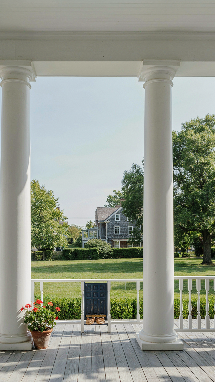
You want a porch that signals “established” without looking like you’re performing for the neighborhood. Here’s the actual mechanism: Colonial Revival porches work because they separate functional support from decorative expression. Load-bearing columns do one job. Railings, dentil molding, and balustrades do another. The colonists who built originals didn’t blur these roles because they couldn’t afford to. A column either carried weight or it didn’t. Ornament sat on top of that honest structure.

Most modern Colonial Revival porches fail here. Homeowners add decorative elements that fight against the structural logic. Too much applied detail obscures the column. Too many fussy balusters weaken the visual weight. The porch reads as cluttered rather than purposeful. Strip back to this: columns on a solid base, railings at human height, modest dentil work where the roof meets the beam. Anything beyond that needs to earn its place by enhancing what already works.
Human Scale At The Threshold
Porch depth matters more than dimension. A shallow porch is worse than no porch because it creates a dead zone. Colonial Revival precedent set a standard for a reason: porches typically extended four to six feet from the house face. That distance allows weather protection, seating, and a pause before entry. It’s not arbitrary. It’s the distance that makes a human stop naturally, not shuffle through awkwardly.
The ceiling height compounds this. Eight feet nine inches to nine feet was typical in the Colonial era because it aligned with interior ceiling height and created proportion with the column diameter. Drop that ceiling to eight feet and the porch collapses psychologically. Raise it beyond nine feet and you lose the shelter quality that makes a porch feel distinct from yard space. When you plan your porch, measure twice and check these proportions against your entry door width. The porch should frame the door, not compete with it.
The “Eco Mimicry” Principle: Optimizing Colonial Houses For Site
The House As A Living System
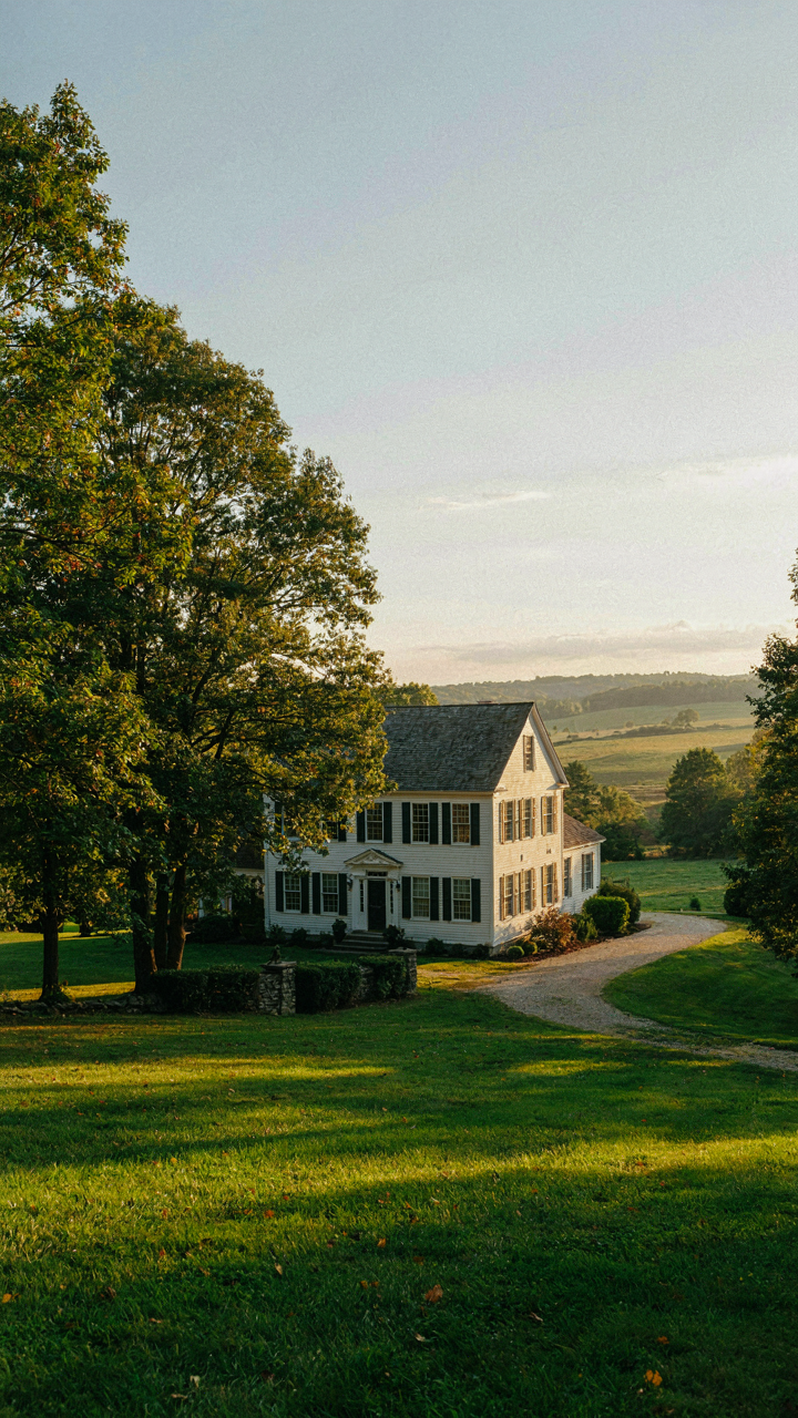
You want this section to validate that your renovation idea is “sustainable” without actually changing anything structural. Here’s the mechanism: biology teaches that organisms thrive by reading their environment and responding to it, not fighting it. Colonial revival houses do this through material selection, window placement, and mass distribution. They weren’t designed this way for environmental credit—they were designed this way because builders had no choice. Your site’s sun angle, wind patterns, and soil drainage determined your house’s survival. That same logic applies now. The difference is you can measure it instead of guessing.

Colonial builders used what grew locally: timber framing, local stone, lime mortar that breathed. Window placement followed the sun path. Wall thickness and interior mass absorbed heat in winter and released it at night. These weren’t aesthetic choices. They were responses to specific climatic demands. A colonial revival house that ignores its actual site is just aesthetic mimicry. One that reads the site’s constraints and opportunities becomes functionally coherent. The original colonials had this accuracy built in. Modern revivals usually don’t, which is why they underperform.
Tuning Design To Climate Reality
Stop treating “colonial revival” as a fixed visual formula that works everywhere. Southern colonial houses have deep porches, open-air galleries, and lighter framing because they evolved in heat and humidity. Northern colonials have compact footprints, smaller windows on the north side, and thicker walls because they faced different pressure. Your site’s actual climate zone demands a different set of moves than your neighbor’s, even if you’re building the same style. Pretending otherwise wastes money on heating and cooling that targeted design would prevent.
The practical step: map your site’s microclimate before committing to proportions or fenestration. Document the winter sun angle, summer shading from trees, prevailing wind direction, and local frost line depth. Then modify your colonial revival proportions to work with those conditions, not against them. Shift window size and placement. Adjust porch depth and orientation. Change wall mass and material thickness based on thermal lag demands. Your house should read as coherent to the site first, then coherent to the style second. That’s when a colonial revival house stops being a costume and starts being a system.
White Colonial House: The Nuance Of Simplicity
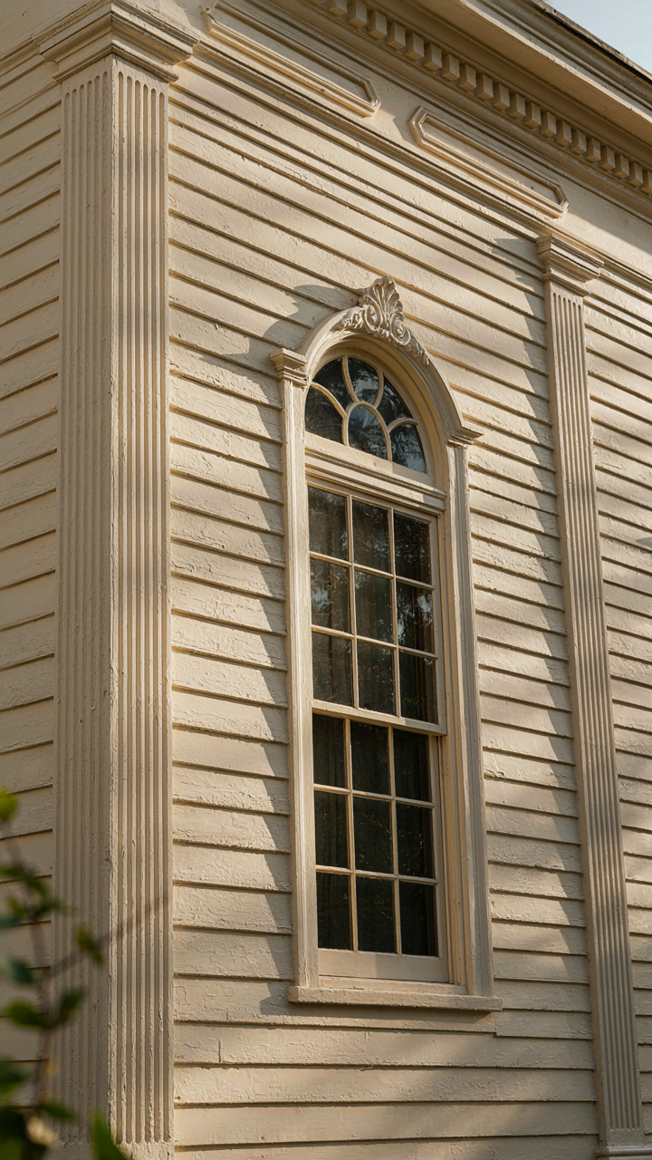
The Color Isn’t Actually White
You want white because you think it signals restraint and timelessness. That’s not restraint, that’s fear of making a real choice. Colonial Revival painters didn’t use pure white. They mixed pigments to create off-whites, warm creams, and pale yellows that absorbed light differently depending on time of day and exposure.
- Warm White (Cream Base): Contains subtle yellow or ochre undertones. Common in Colonial Revival work because it mimics aged lime wash and aged lead paint from original colonial homes.
- Cool White (Blue Undertone): Reads sterile and modern. Appeared rarely in authentic colonial work and signals new construction, not revival architecture.
- Aged Ivory (Greyed White): Includes trace amounts of raw umber or grey. This dominated exteriors in the 1920s-1950s Colonial Revival boom because it photographs well and hides dirt.
- Chalky White (Flat Finish): Pure white with heavy titanium dioxide. Reflects light aggressively. Most common mistake: painters use this thinking it’s historically accurate when it’s actually a modern latex invention.
- Weathered Cream (Yellow-Grey Blend): Imitates decades of oxidation. Appears on high-end restorations because owners understand that “white” colonial homes were never truly white after their first season.

The reason this matters is material. Lead-based paints yellowed over time. Lime wash shifted from white to cream within months of exposure. When you specify “white,” you’re fighting physics and history simultaneously. Pick the undertone that matches your trim material and site orientation, not the color chip that looks pure.
Depth Through Contrast, Not Decoration
Light and shadow aren’t decorative tools in colonial architecture, they’re structural ones. The mechanism works like camouflage: you hide proportional flaws by controlling where light lands. Symmetrical facades become readable through shadow patterns on trim, not through painted stripes or false details.
A white or near-white base coat creates a reflective surface that reveals every dimensional element. Recessed panels cast shadows. Projecting moldings catch highlights. Columns and pilasters become visible through chiaroscuro alone, not through color change. This is why Colonial Revival homes with crisp, well-maintained trim read as expensive even when the budget is moderate. You’re paying for dimensional accuracy, and light does the advertising.
The wrong move is adding visual interest through color variation on a single plane. The right move is ensuring the three-dimensional geometry is precise enough that natural light creates all the visual depth you need. Orient trim work to catch morning or afternoon sun depending on facade direction. Verify that shadow lines from dentil molding, cornerboards, and door surrounds align with window reveals. Install trim projections at consistent depths. Light finds these decisions automatically and makes them visible without any effort from you.
The Unfinished Colonial Revival House: Evolution, Not Stasis
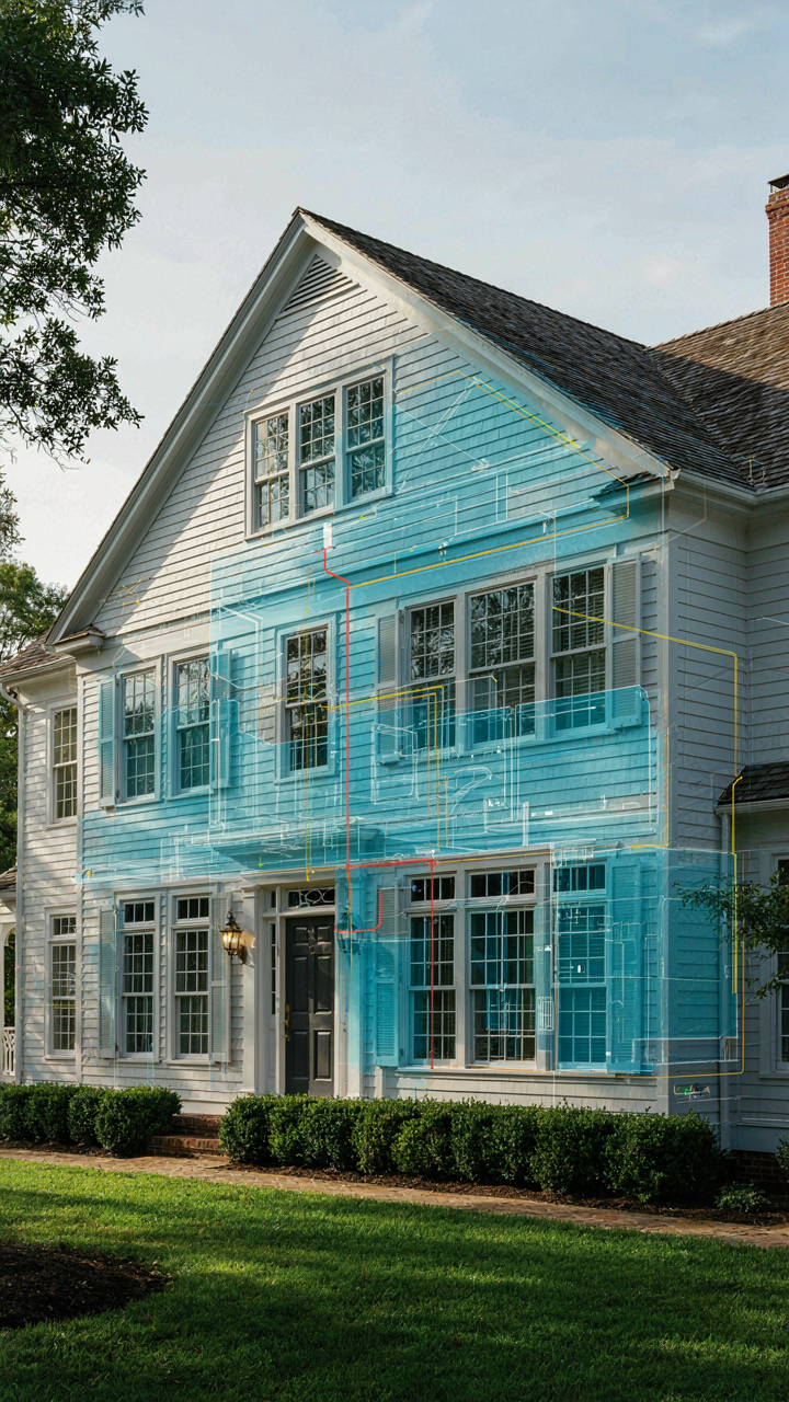
Design For Tomorrow, Not Yesterday
You want a colonial revival house to feel timeless so you never have to think about it again. That’s the real fear: obsolescence dressed up as permanence. Here’s the mechanism: colonial revival succeeds when you treat it as a platform, not a destination. The style emerged in the 1880s as a deliberate reinterpretation of colonial-era architecture, not a slavish copy. It was already adaptive by design.

Build with systems that tolerate change without announcing it. Systems thinking applies here: treat your house like a living organism with discrete, replaceable parts rather than a monolithic whole. Plumbing, electrical, HVAC, and mechanical systems should run in walls and cavities that allow future replacement without exposing original structure. Paint colors, hardware, and fixture styles shift; the bones should not care.
The Museum Piece Trap Is Real
The common advice to “preserve authenticity” misses the actual problem: it locks you into decisions made in 2024 that will feel arbitrary by 2045. Colonial revival homes from the 1920s weren’t built to be frozen. Owners modified them constantly, swapping hardware, updating kitchens, and adjusting window treatments as needs changed. Treating your colonial revival house as a museum piece isn’t historically accurate. It’s contrarian to the style’s actual DNA.
Distinguish between structure and finish. Keep the core elements that give the style its recognizable form: proportional windows, rooflines, entry details, exterior materials. Everything else should shift without friction. Your kitchen renovation shouldn’t require apology or fake historicity. Update mechanicals, insulation, and functionality openly. This preserves the house as a living thing instead of a curated artifact. The house improves through use and modification, not through resistance to it.
Your Fear Of Being Seen As Inauthentic Is The Real Limitation To Timeless Design
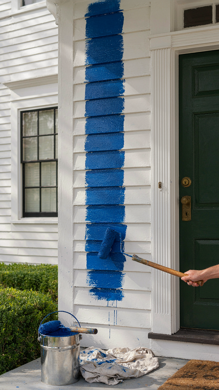
Most people kill their colonial revival house before they ever build it. They obsess over whether their choices look “authentic enough” instead of asking what actually works. Stop apologizing for mixing periods. Stop waiting for permission to trust your eye. Pull that modern fixture. Paint that wall. The only design that fails is the one you never committed to because you were too busy performing for people who will never visit your home anyway.



