Beyond Beige: The Mid Century Modern Exterior Color Deception
What The Original Architects Actually Built
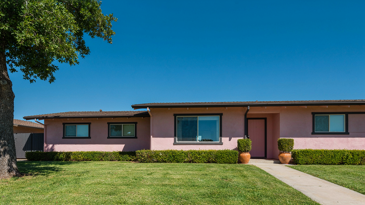
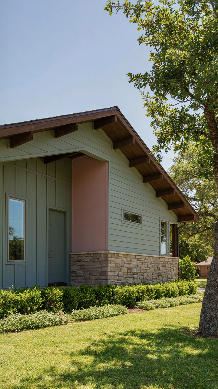
You want beige because you’re terrified of committing to something that reads as dated. That fear is the real problem here, not the color. Mid century ranch architects were not playing it safe. They used earthy tones, yes, but paired them with contrasting trim, dark rooflines, and strategic accent walls that created visual tension. The mechanism was simple: color contrast stops the eye and makes a modest structure feel intentional. Soft pink, warm tan, muted sage, and dusty rose dominated residential neighborhoods in the 1950s and 1960s, often with contrasting wood soffits or stone veneer bases that anchored the design.
The consensus story is that ranch homes were neutral boxes. That’s incomplete. Exteriors worked like composition in visual weight. A single-story footprint needed color variation to break monotony and establish depth. Builders understood this so thoroughly they standardized certain color combinations across entire developments. The original palette wasn’t boring because it avoided strong statements. It was restrained because strong statements came through form, fenestration, and material contrast, not color alone.
Contrast As The Structural Load
Think of contrast like load-bearing capacity in engineering. In architecture, load-bearing walls carry structural weight. In mid century ranch design, contrast carries visual weight. Without it, the eye has nowhere to rest or focus. The typical mistake is treating the entire exterior as one color story. Original designs broke this rule deliberately. Dark wood fascia against light stucco, stone or brick veneer at the base against painted walls above, or even a contrasting single accent wall created visual articulation that made simple geometry feel composed and complete.
Modern additions often fail because they abandon this contrast principle entirely. A seamless, monochromatic exterior reads as unfinished, even if technically accurate. The tactical move: identify the three material zones on your ranch (base, wall field, and roofline edge), then use color or material shift between them. This isn’t decoration. It’s the same structural thinking that made the original design work. Where the original design used natural material change for contrast, contemporary work can use strategic paint color shifts to achieve the same visual result.
The Mcm Ranch House Flow: Function Over Form Fallacy
Open Concept Wasn’t The Original Intent
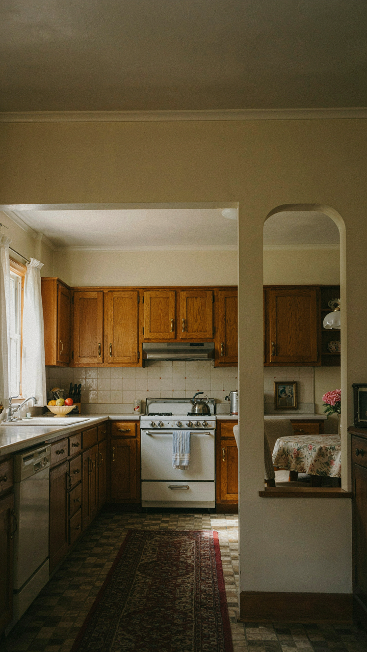
You want to knock out walls because you think open concept feels modern and more valuable. The mechanism everyone misses: the mid-century ranch was designed around separation of function, not its elimination. Zones existed by necessity, not restraint. The kitchen stayed hidden. The living room faced the street. Bedrooms clustered away from social noise.

Architects like Eichler andLevitt didn’t stumble into compartmentalized layouts by accident. They built them because postwar families needed psychological borders between work zones and rest zones. Removing walls erases the original problem the design solved. You don’t honor character by inverting the reasoning that created it.
Spatial Hierarchy Over Empty Rooms
The real play is spatial continuity without obliterating boundaries. Mid-century ranches used sightlines, material shifts, and ceiling heights to connect spaces while keeping them distinct. A lowered soffit over the kitchen creates flow without eliminating separation. A pass-through or wide opening preserves the zone concept while allowing visual connection. This is how the period actually handled modern living.
Most contractors will tell you to open it up because that’s what sells. What actually sells is the understanding that flow and function work together, not against each other. Adapt your patterns to the existing bones instead of destroying them. Use the original layout as a constraint, not a liability, and you preserve both livability and authenticity.
Midcentury Ranch Materials: Authenticity Vs. Obsession
Materials That Work Without The Museum Price Tag
You want to feel like you nailed it. That’s the real cost of this decision—not money, but the fear of getting it wrong and looking like you tried too hard. The actual mechanism is material substitution, borrowed from materials science: finding compounds with similar performance characteristics under stress. Midcentury ranches used affordable materials because they had to, not because they were precious. Vinyl composition tile (VCT) replaced ceramic. Laminate topped plywood instead of solid hardwoods. Aluminum replaced steel where budget allowed. Modern equivalents exist that deliver the same visual read without the fragility of originals.

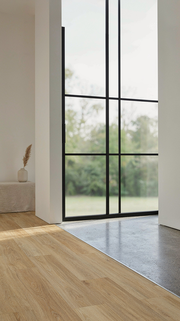
Contemporary materials match midcentury ranch aesthetics because the era rejected ornamentation anyway. Polished concrete floors replicate the plainness of original concrete slabs. Luxury vinyl plank mimics original wood grain without the cupping issues that plagued period pieces. Steel-look finishes on modern hardware capture the industrial edge without corrosion problems. The ranches that survive today kept their bones intact not because every material is original, but because the bones themselves—post and beam structure, horizontal lines, material honesty—matter more than fetishizing specifics. Substitute strategically: keep what shows, upgrade what fails.
Durability As The Real Design Constraint
The common advice says restore everything to period specifications. That’s wrong. It’s romantic and expensive and ignores why these homes worked in the first place—they were designed for maintenance that homeowners would actually do. Original materials like asbestos-laden insulation, single-pane glass, and unfinished wood framing required constant attention. A midcentury rancher bought this house because it was simple and affordable. Restoring it to original specs betrays that original intent entirely. The design goal was livability, not artifact preservation.
Modern materials durability-upgrade the ranch without breaking its character. Double-pane windows that look period-appropriate cost less to operate and last longer than single panes. Contemporary roofing materials outlast original asphalt by decades without changing the low-pitched silhouette. Quality insulation keeps the thermal envelope tight while preserving the open floor plan. Maintenance calendars shift from quarterly to annual. The mechanism is simple: choose upgrades where they’re hidden or where performance matters to daily function. Keep visible surfaces period-appropriate. This trades perfection for actually living there.
The Mid Century Exterior Light Protocol: Illumination As Integration
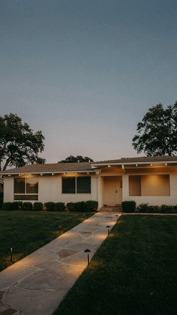
Staged Lighting For Controlled Atmosphere
You want people to notice your house looks intentional, not just lit up like everyone else’s. The mechanism is borrowed from stagecraft: lighting designers control what the eye sees and feels by layering sources at different intensities and angles, not by flooding a space with uniform brightness. Mid century ranches used this principle on exterior facades because the horizontal lines and clean geometry demanded precision. Poor lighting flattens these lines into nothing. Strategic placement amplifies them.
- Soffit and fascia uplighting: Install recessed or concealed fixtures along the roofline to graze the horizontal edges. This mimics how stage lighting defines architectural planes without creating harsh shadows.
- Path lights at grade level: Low-voltage fixtures placed along walkways and foundation lines create depth. Position them to cast light upward onto the house face, not down onto the ground.
- Column and pier emphasis: Mid century ranches often had exposed support posts or decorative piers. Target these with directional lights to separate them from the wall plane behind them.
- Integrated landscape lighting: Illuminate nearby trees and shrubs positioned near the house to create layered backdrop depth. Avoid lighting landscaping that sits detached from the structure.
- Negative space definition: Light the empty areas between architectural elements as deliberately as the elements themselves. This clarifies the ranch’s visual boundaries.

The goal is visibility through intention, not visibility through wattage. Spacing matters more than brightness. Install dimmers on every circuit so you control the intensity balance between uplighting, path lighting, and accent work depending on time of day and season.
Outdoor Rooms With Intentional Edge Definition
Extending living space outdoors only works if people know where the room begins and ends. Your patio or deck doesn’t read as an extension of the interior without light that defines its boundary. Mid century ranches excelled at blurring indoor and outdoor space on the floor plan, but the lighting has to reinforce that connection rather than contradict it.
Light the perimeter of outdoor living areas with even, moderate intensity that matches interior ambient light levels. Use the same color temperature as your indoor lighting, typically 2700K to 3000K. This tells the nervous system the outdoor area is controlled and safe, not dark or transitional. Wall-mounted or post-mounted fixtures work better than overhead strings because they create consistent coverage. Position them so they illuminate the space’s activity zone without casting glare back into the house.
Midcentury Ranch House Landscaping: Wild Vs. Manicured Myth
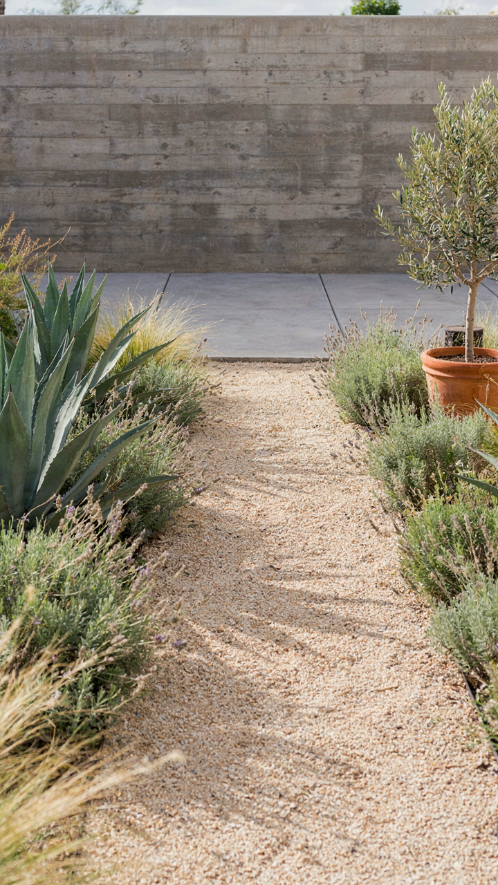
Native Flora For Low Maintenance Integration
You want the landscaping to look effortless so people think you don’t try too hard—but the real mechanism is that native plants work with your regional ecology instead of against it, which means they actually survive without constant intervention. Ecology borrowed its concept of “niche” from economics: every plant occupies a specific role in its environment. A midcentury ranch sits in a particular climate zone, and native plants are already optimized for that zone’s rainfall, soil, and temperature patterns.
The common advice to “go native for sustainability” misses the point entirely. Native plants solve a practical problem: they don’t demand irrigation systems, fertilizer schedules, or replacement every few years because they evolved where your house stands. Desert ranches in Arizona paired with desert marigold and palo verde. Ranches in the Pacific Northwest worked with Douglas fir and Oregon grape. Your maintenance burden drops because the plants are already winning against your local conditions. Stop fighting your climate and you stop working.
Strategic Hardscaping To Define Outdoor Zones
Midcentury ranch lots were often modest in square footage, so the exterior had to work like an efficient floor plan—zones instead of sprawl. Concrete pads, gravel fields, and simple wood structures didn’t exist for beauty. They existed to separate function: entertaining area from service area from view corridor. This is the real structure that made the landscape feel intentional without looking fussy.
Most people add hardscaping as decoration after the landscaping fails. That’s backwards. Lay hardscape first as the skeleton that tells plants where to go and the eye where to rest. A concrete pad near the house establishes an outdoor room. Gravel pathways create sight lines. Low walls or simple fencing mark boundaries without the clutter of dense planting. The plants fill the spaces the hardscape defines, not the other way around. This hierarchy is what gives a ranch its legible outdoor character.
The Mid Century Modern Country Home: Bridging Eras Seamlessly
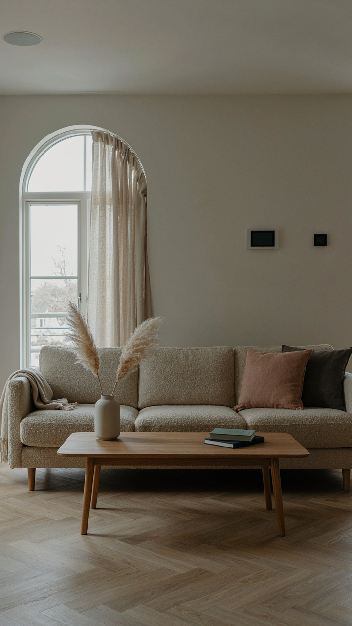
Smart Home Tech Without The Visual Noise
You want the conveniences of 2024 without looking like you betrayed the house’s original intent. That’s the real tension here, and most people solve it by doing nothing, which leaves them stuck in 1965. The mechanism is constraint thinking from industrial design: mid century architects designed for visible components. Every fixture, switch, and detail had a reason to be seen. Modern tech inverts this. Hide the infrastructure, expose the intention.

Run wiring through existing wall cavities during any structural work. Use recessed speakers in soffits rather than mounted boxes. Choose thermostats with minimal bezels in matte finishes that read as part of the wall plane, not an addition to it. The goal is functional invisibility. Your tech should serve the house’s original geometry, not interrupt it.
Furniture That Extends The Design Language
The common advice says “buy authentic pieces from the era.” Wrong. You don’t need a 1952 Eames chair to honor mid century ranch character. What you need is furniture that understands the same design principles the original architects used: clean lines, material honesty, and proportion discipline. Reproduction is a trap because it signals you’re curating a museum, not living in a home.
Look for contemporary pieces that operate under the same grammar. Solid wood construction over veneered frames. Legs that lift furniture off the floor to maintain sightlines. Neutral fabrics that don’t compete with the architecture. Avoid overstuffed silhouettes and ornament posturing. The test is simple: does the piece disappear into the space’s logic, or does it announce itself? If it announces, it doesn’t belong.
Mid Century Modern Exterior House: The Deliberate Deconstruction Method
What Actually Needs To Go
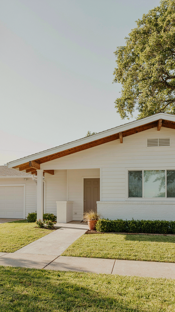
You want permission to strip things back because stripping feels like design and you’re scared of making the house look unfinished. Here’s the mechanism: mid century ranch homes were built with applied ornament—shutters, trim details, roof returns, fascia wraps—that served no structural purpose. They were decoration dressed as function. Removing them exposes what the original architects actually cared about: clean lines and honest materials.

Most people get this backward. They remove details thinking “less is more” without understanding which details contradict the home’s original language. A mid century ranch wasn’t minimalist by accident. It rejected the ornamental excess of Victorian and Colonial revival homes. The siding, the roof pitch, the window pattern—those are the real design. Everything else is noise. Start by photographing your exterior, then mark what was added after 1960 versus what shipped with the house.
Structural Elements As The Real Aesthetic
Architecture borrowed from engineering here: load paths. A mid century ranch makes its structure visible instead of hiding it behind trim work. Your beam ends, your post locations, your overhang depth—these become the visual story. Conventional wisdom says to “frame and cover.” The original design says to frame and leave it exposed where it makes sense.
Eaves aren’t decoration on a mid century ranch. They’re proportion made visible. A 24-inch overhang over a 6-foot wall section creates rhythm. The soffit, the fascia angle, the rafter tails if they’re exposed—these work together as a unit. When you simplify the exterior, expose what’s real. Paint the eave soffit to match the siding or leave it natural wood. Stop hiding the mechanics. The structure is the design.
MCM House: The Modernist’s Mandate – Evolution, Not Replication
Restoration Without The Dogma
You want to preserve it because you think perfection froze in 1965 and your job is to thaw it out unchanged. That’s not how this works. The original architects designed for living, not for museums. They used materials and techniques available then, accepted technological limits as constraints, and built with the assumption that owners would adapt the space over time. Faithful restoration often means installing period-correct elements that no longer function the way they did, while ignoring what the original design actually solved for: efficiency, openness, and flexibility.

The common advice says restore everything to original specs. That’s incomplete. Mid century ranches embodied principles, not artifacts. Those principles were about flow, light, material honesty, and integration with the landscape. A restored 1958 kitchen with period appliances is archaeology, not living. You honor the original intent by applying its logic to current needs, not by trapping it in a static moment. The difference between restoration and reverence is whether you’re serving the house or serving your idea of the house.
Contemporary Additions As Language
Think of mid century ranch design like evolutionary biology: a living system adapts to survive in new conditions, not by abandoning its DNA but by expressing it differently. The original ranches weren’t closed systems. Their vocabulary was repeatable: clean lines, minimal ornamentation, material contrast, visual connection to outdoors. A contemporary addition works when it speaks the same language, not when it mimics the original accent. You don’t add a 1955 carport in 2024. You extend the design logic using current materials and proportions.
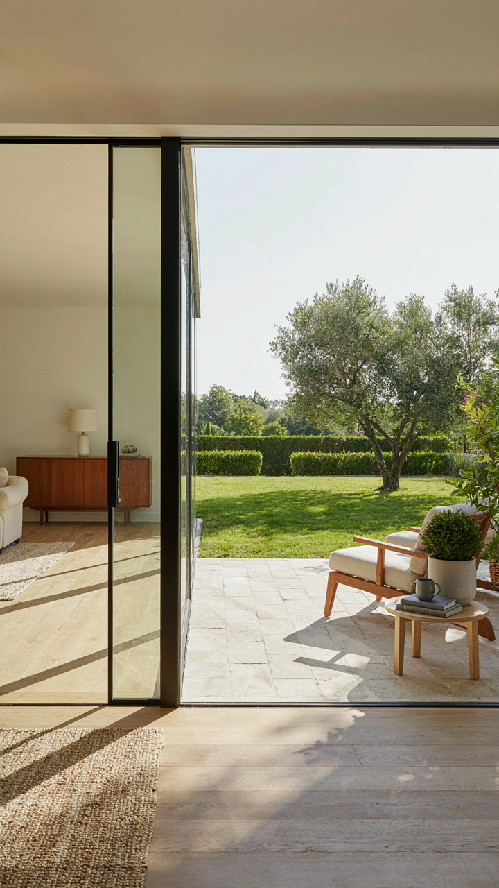
The addition succeeds when it clarifies the original’s intent rather than competing with it. A modern glass sliding wall on the rear elevation extends the opening-to-landscape principle that defines the ranch. A covered breezeway with steel posts and clean geometry continues the structural honesty. The mechanism is simple: identify the design rule the original followed, then apply that rule using materials and methods that make sense now. This approach respects the architecture while making the house functional for actual residents.
The Real Obstacle Isn’t Preserving The Past, It’s Your Fear Of Owning The Future
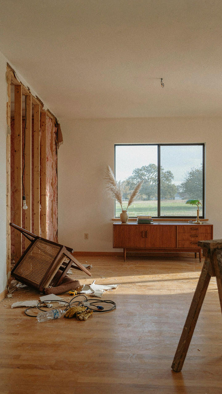
You don’t need permission to make your mid century ranch yours. The paralysis isn’t about authenticity, it’s about admitting you want something different than what the original builder left. Pull one wall down this week. Just one. Not to destroy history but to prove you’re not a museum curator in your own home. Preservation without conviction is just living in someone else’s museum.