
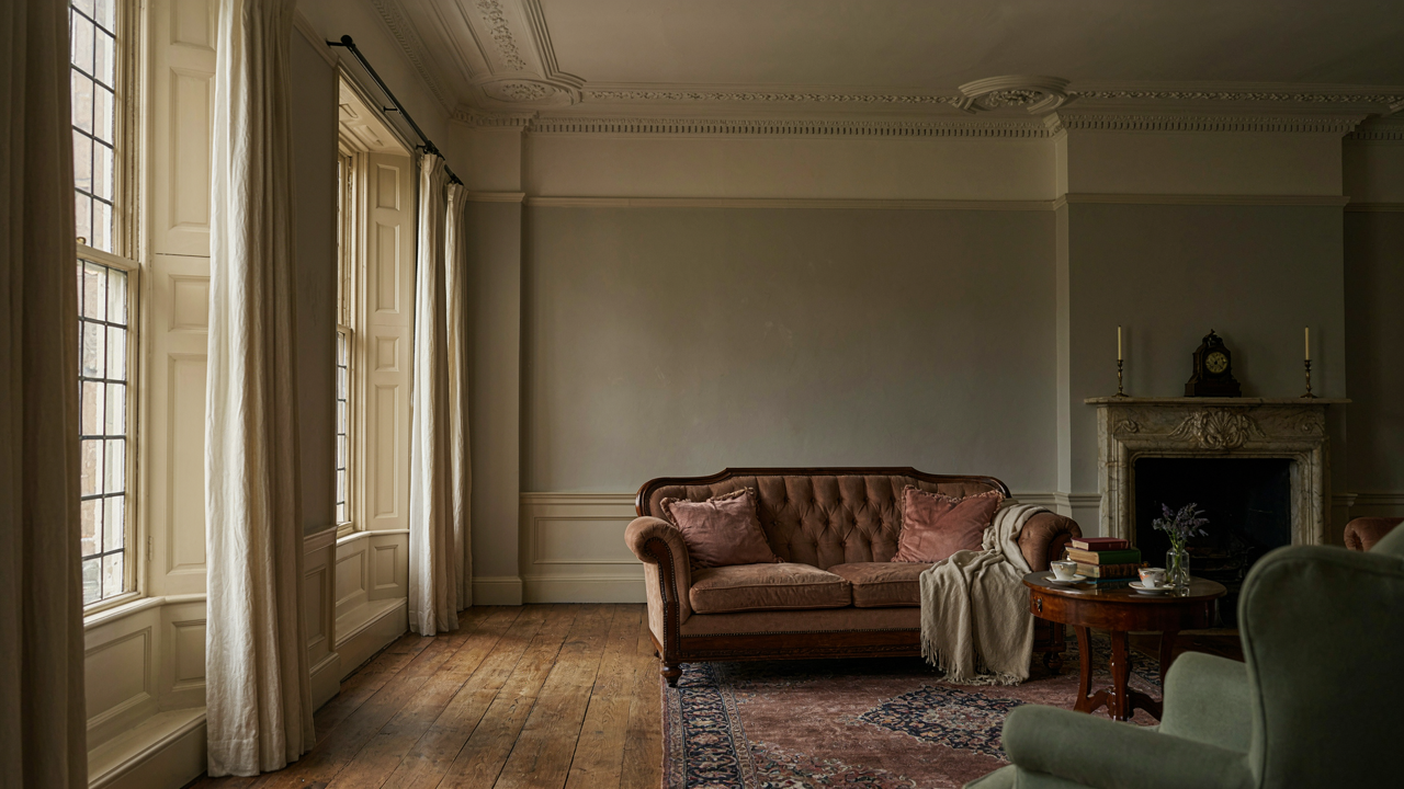
The Proportionality Paradox: Why Balance Isn’t About Symmetry
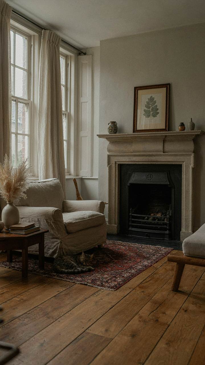
The Golden Ratio Shapes Space Before You See It
You want balance because you think it signals control. Here’s what actually happens: Georgian interiors borrowed the golden ratio from architecture itself, and this ratio governs how your eye moves through a room before your brain registers anything. Physics calls this proportion optimization. A room doesn’t feel calm because objects sit equidistant from center. It feels calm because the ratio between wall divisions, door placement, and furniture zones matches approximately 1.618 to 1.
Georgian builders understood this mechanically, not mystically. A fireplace wall in a well-proportioned room sits at the golden ratio point of the room’s length, not dead center. Doorways align to ratio-based intervals along walls. Dado rails don’t sit at halfway height by accident. They sit at the point where upper wall to total height matches 1.618. When you copy exact symmetry in a Georgian room, you break this ratio and the space feels off despite looking “balanced.”
Visual Hierarchy Beats Decorative Distribution
The common advice says scatter objects evenly to avoid clutter. This destroys Georgian spatial logic. One dominant focal point, supported by secondary elements in precise ratios, creates actual visual rest. Your eye has nowhere to land when things are evenly distributed. It exhausts itself searching.
Georgian interiors establish clear visual weight hierarchy: the fireplace holds maximum weight, a mirror above it reflects light and amplifies presence, seating arranges perpendicular to this axis, and secondary surfaces receive minimal ornamentation. Side tables, sconces, and smaller pieces occupy supporting positions determined by sight lines from the room’s entry point, not aesthetic whim. The mechanism is neurological. A single dominant focal point requires less cognitive processing than competing elements.
Beyond Beige: The Georgian Color Deception
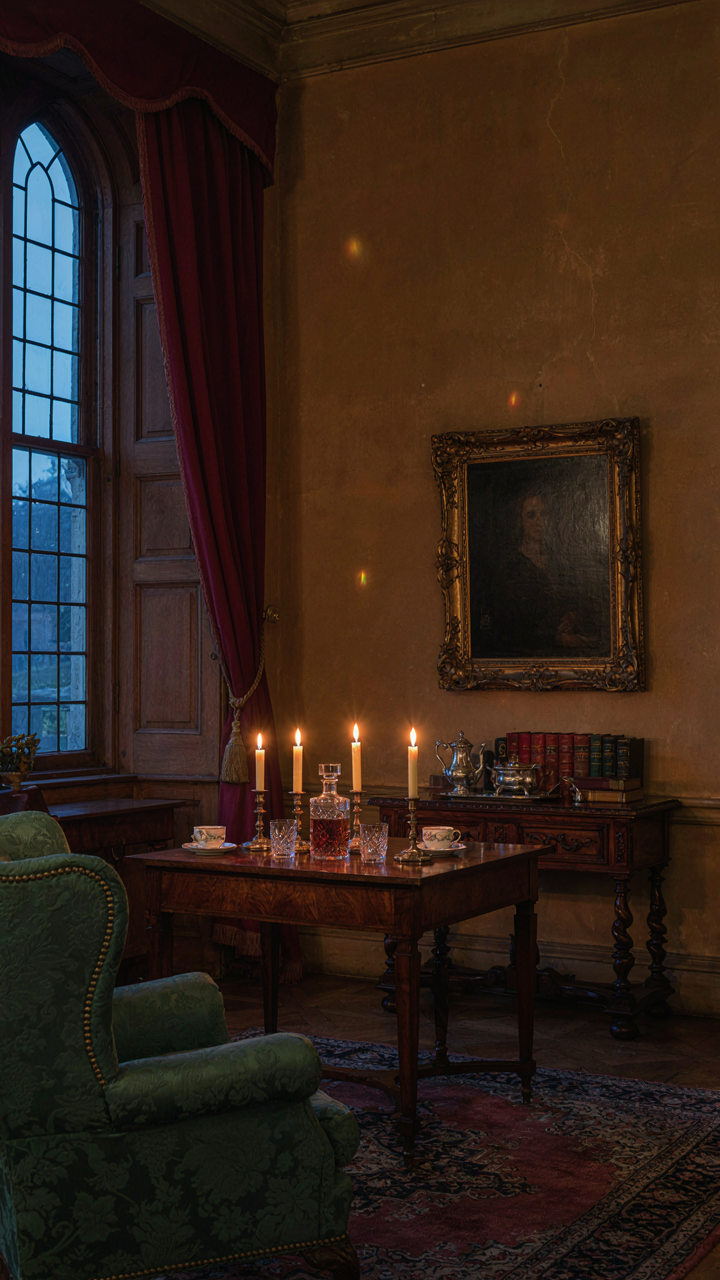
Subtle Palettes For Depth, Not Blandness
You want Georgian interiors to feel timeless and valuable, which means you’re terrified of looking cheap or trendy. The real mechanism: Georgian rooms weren’t actually pale and washed out. That’s a modern myth born from faded surviving examples and period paint manufacturers marketing “historically accurate” neutrals. Georgian owners used bold ochres, deep greens, rich blues, and warm grays deliberately. They applied these colors to create shadow and volume in rooms lit only by candlelight and windows.

The palette worked because it solved a physics problem. Dark colors on lower walls and trim absorbed light predictably in low-light conditions, while lighter ceilings reflected what little illumination existed upward. This created visual hierarchy without looking flat or wan. Painters used earth pigments mixed with linseed oil, producing colors with actual body and complexity. When you see a Georgian room photographed under modern electric lighting, the depth disappears because the light problem no longer exists. Replicate the color strategy by using muted but saturated tones on walls and woodwork, not beige derivatives.
Reflective Surfaces Shape Perceived Space
Georgian designers treated interiors like optics problems, which they were. Gilded mirrors, polished marble, glazed tiles, and varnished woodwork weren’t decoration. They were light management systems that made candlelit rooms feel larger and brighter than their actual dimensions. A pier glass between windows multiplied available light by reflecting it back into the room. Chimneypieces clad in marble or slate created focal points that caught and diffused flame light strategically.
The mechanism appears in architectural principles: surfaces with high specularity (mirror-like reflection) create apparent depth by duplicating visual information. Matte surfaces absorb light instead. Georgian rooms maximized specularity through shellac varnishes on oak and mahogany, glazed wall finishes, and polished hardware. You can’t replicate this with flat paint alone. Your woodwork needs at least semi-gloss finish to function as intended. Glass fronts on bookcases, glazed cabinet doors, and metal fixtures all serve the same optical job they did in 1780. Light gets trapped and recirculated instead of absorbed into the room.
The Un Ornate Detail: Crafting Impact With Restraint
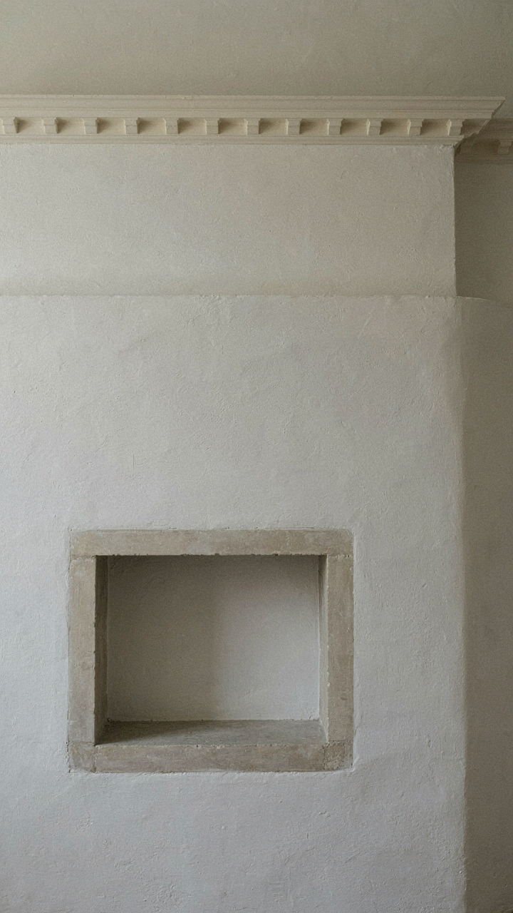
Strategic Placement Over Surface Coverage
You want to know the secret because it lets you feel sophisticated without drowning in ornament. The real mechanism is restraint as hierarchy: Georgian designers borrowed from classical architecture the principle of focal point distribution. Not every wall needs attention. Architects placed molding, paneling, and detail only where they functioned structurally or optically. Chimneypieces, door surrounds, and ceiling cornices got the investment. Plain plaster filled the rest. This created visual rest, not emptiness.

The common mistake is treating Georgian rooms like they’re supposed to dazzle constantly. They don’t. A room with ornament everywhere reads as cluttered, not refined. Georgian interiors work because negative space does the heavy lifting. When you see a dentil cornice above a fireplace in an otherwise simple room, it lands harder. The eye lands on it because there’s nowhere else demanding attention. This contrast is what reads as elegant to anyone with a functional visual cortex.
Molding And Trim As Punctuation
Moldings in Georgian houses function like punctuation in writing: they define boundaries and rhythm. A chair rail doesn’t decorate the wall arbitrarily. It marks the transition between dado and field, creates a horizontal line that stabilizes a tall room, and offers practical protection from furniture damage. A cornice frames the ceiling plane and creates a clean joint between wall and structure. These elements solve problems first, look good second as a consequence of solving them correctly.
The overlooked detail nobody states: molding profiles matter because they catch light. A complex profile with undercut sections throws shadows that give dimension even to a plain painted surface. Georgian profiles used ogees, dentils, and egg-and-dart patterns specifically because these shapes manipulate shadow and depth. You cannot achieve this with flat trim. The material—typically plaster, pine, or oak—and the profile work together to create visual weight without surface clutter. Install the wrong profile and the whole room reads as thin and cheap, even with quality materials.
Modern Georgian Interiors: Fusing Eras Without Faking It
When Old Rooms Meet New Work
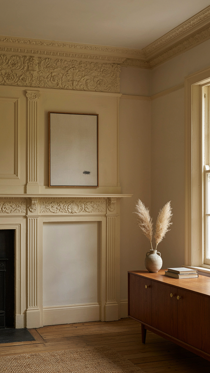
You want permission to break the rules without looking like you broke them. That’s the real reason this section matters. The mechanism is simple: Georgian interiors survived because they operate on constraint, not decoration. A Georgian room works through proportional discipline—cornicing, dado rails, window placement—all locked into mathematical ratios. Contemporary art and furniture don’t fight this structure; they exploit it.

Modern pieces land harder inside Georgian rooms because the architecture already has weight. A stark minimalist painting reads as intentional against a chimney breast with period molding. A mid-century credenza stops looking lonely next to a fireplace surround designed for visual hierarchy. The constraint becomes the amplifier. You’re not diluting Georgian rooms by adding new work; you’re using their structural clarity as proof your contemporary choices matter.
Rhythm Over Period Matching
Flow in a Georgian interior isn’t about smooth transitions between eras—that’s museum thinking and it fails. Flow comes from rhythm borrowed from music theory: a pattern of recurrence and variation. Georgian rooms establish visual rhythm through repeated elements—the spacing of windows, the horizontal line of the dado rail, the vertical emphasis of pilasters. A contemporary addition works when it respects this rhythm, not when it matches the period.
Place a modern pendant light where a Georgian chandelier would hang, but respect the focal point logic. Keep sightlines uncluttered the way the original room intended. If Georgian proportions told you the eye should travel from door to fireplace to window in sequence, don’t interrupt that travel with furniture blocking the path. The rule isn’t aesthetic harmony; it’s functional hierarchy carried across time.
The Georgian Archway Protocol: Mastering Entry & Flow
Georgian Arches As Directional Cues
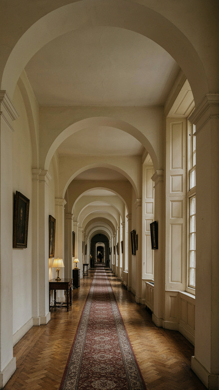
You want people to move through your rooms in a specific way without feeling herded. That’s the real goal here. Georgian architects used arches not as decoration but as traffic control devices. The arch creates a visual threshold that signals transition while maintaining sightlines. Unlike walls, which block completely, arches compress and direct movement. They funnel attention down hallways and between rooms with architectural authority, not signage.

The mechanism is simple: a rounded opening changes how the eye and body navigate space. A 9-foot barrel arch at 4 feet wide creates a natural pause point before entry. Builders used segmental arches (less than a full semicircle) to lower ceiling heights while maintaining passage width, forcing a specific body posture that slows movement intentionally. This prevented the sprawling, unfocused feeling of open-plan rooms and created rhythm through repetition.
Barrel Arch Hallways Creating Visual Corridors
The common advice says “use arches to frame views.” That’s incomplete. The real work happens in repetition and proportion, not single frames. A sequence of barrel arches down a hallway creates linear depth perception that makes narrow corridors feel purposeful rather than cramped. Each arch repeats the proportional module that the Georgian period standardized: roughly 12 to 15 feet on center, with arch depths of 2 to 3 feet. This spacing compounds the corridor’s visual authority.
Hallways with repeating arches function like a colonnade indoors. The spacing between arches should maintain visual continuity without making the perspective line vanish too quickly. Builders achieved this by keeping reveal depths consistent and springing lines level across all arches. The eye reads multiple arches as a coherent system, not isolated openings. When you enter a barrel-arch hallway in a correctly proportioned Georgian house, the repetition itself becomes the navigation tool. Stop treating hallways as passage zones and recognize them as primary design assets.
The Anti Clutter Imperative: Negative Space As Luxury
Minimalist Furniture Arrangements For Grandeur
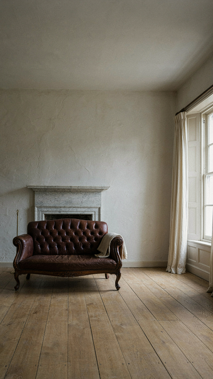
You want permission to own less and still feel rich. Here’s the mechanism: Georgian interiors worked because architects understood load capacity. A room can hold only so much visual weight before it collapses into noise. The wealthy proved this by leaving walls bare, floors exposed, and furniture placed like punctuation rather than paragraph.

Georgian rooms used negative space as a status signal. A sparse parlor with one mahogany settee and a marble fireplace announced restraint, refinement, and capital—all at once. The owner could afford more but chose restraint. This inversion flipped medieval maximalism on its head. Emptiness became the luxury good, not abundance.
What Actually Belongs On Your Walls
Most advice says “curate thoughtfully.” That’s incomplete. The real divide is between objects that earn their wall space through either historical authenticity or functional purpose, and decorative filler that signals uncertainty. Georgian homes featured oil paintings, mirrors scaled to architectural panels, and built-in shelving for books—nothing random, nothing apologetic.
- Oil paintings in gilt frames: Placed at eye level, often depicting landscapes or portraits. Size matched the wall panel, not the room’s perimeter.
- Mirrors above mantels or console tables: Reflected light and broke up wall mass. Frames complemented architectural molding, not competed with it.
- Built-in bookcases framing chimneybreasts: Integrated storage meant books were permanent, not borrowed décor. Edges aligned with architectural divisions.
- Architectural plasterwork as primary ornamentation: Cornicing, ceiling roses, and dado rails did the visual work. Walls underneath stayed quiet.
- Occasional side tables or pedestals for sculpture: Single objects placed in negative space, never clustered. Each piece commanded its own zone.
The mechanism is discipline: remove everything that doesn’t anchor to either the room’s bones or a genuine use case. What remains gains power through isolation.
The Echo Chamber Effect: Acoustics In Georgian Spaces
How Sound Moves Through High Ceilings
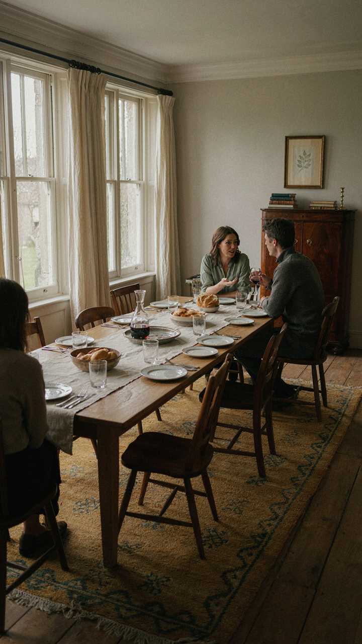
You care about this because a loud room signals poor taste, and you’re terrified your Georgian interiors will sound like a gymnasium. Here’s the actual mechanism: fluid dynamics explains sound propagation the same way it explains water flow through pipes. Sound doesn’t float randomly—it follows pressure gradients and bounces predictably off surfaces. Georgian rooms with 12 to 14 foot ceilings create a specific acoustic problem: sound travels upward, reflects off the plaster ceiling, then disperses back down across the entire room rather than dampening at the source.

The inverse relationship matters here. Lower ceilings trap sound energy in a smaller volume, making speech feel present and intimate. Georgian proportions do the opposite deliberately—the high ceiling was a status symbol, not an acoustic asset. You can’t change the ceiling height without destroying the period character. Instead, you manipulate wall surface area and placement of soft furnishings to interrupt the upward sound path before it reaches the ceiling plane. This is why Georgian rooms feel cold when empty and suddenly livable once you add curtains and upholstered pieces.
Material Selection For Controlled Acoustics
The consensus advice is wrong: heavy velvet curtains and thick carpets do not automatically fix Georgian acoustics. They absorb sound indiscriminately, which deadens the room and erases the spatial definition that makes these interiors work in the first place. The real move is selective absorption using materials period to the era and positioned to address specific reflection points.
Horsehair plaster absorbs moderate mid-range frequencies while reflecting higher frequencies naturally. This was the standard finish in Georgian homes, not modern drywall. Wool carpets provide floor absorption without the deadening effect of synthetic foam backing—period Georgian homes used wool rugs that floated over wooden floors, allowing some reflection while controlling echo. Linen and wool fabrics on sofas and chairs target frequencies that bounce between furniture pieces. Cork or leather on chair seats handles reflections at seated ear level, which is where clarity matters most for conversation.
Georgian Entryway: The First Impression Formula
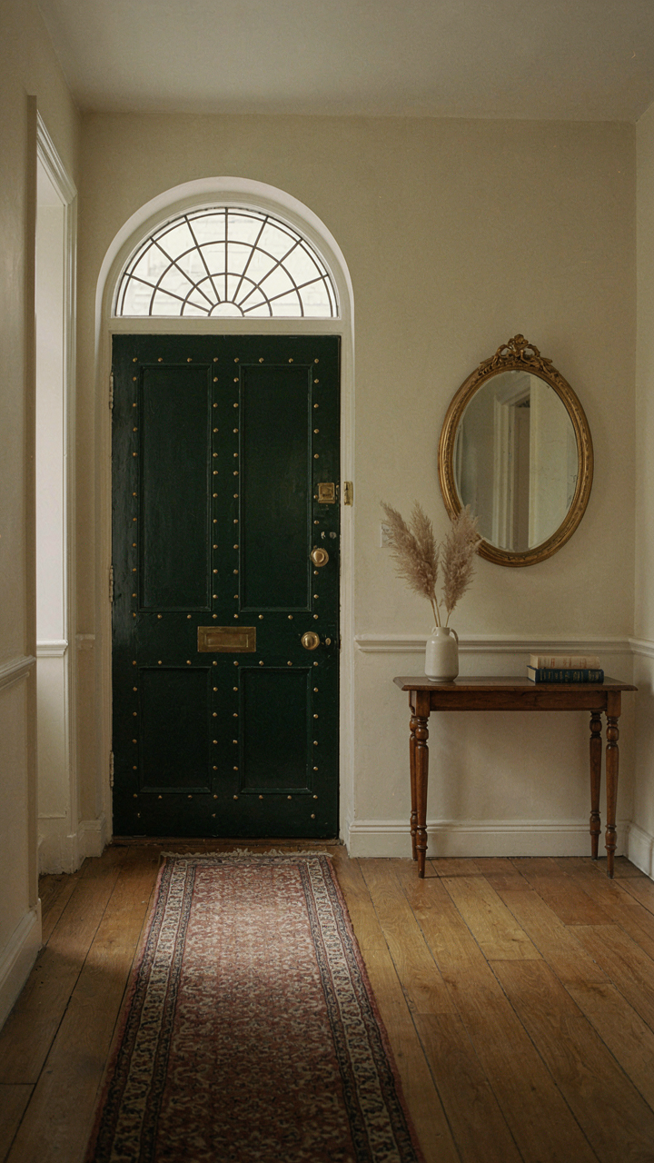
Impact Through Restraint
You want people to walk in and feel like you belong in a room like this. The real mechanism isn’t decoration—it’s proportion. Georgian entryways work because they use spatial compression the way a bank uses marble: to signal that nothing here is accidental. The entry hall shrinks the visitor’s perception of space through deliberate ceiling height ratios and wall divisions, making the rooms beyond feel grander by contrast.

Georgian builders understood that an entryway is an airlock, not a showroom. The formula relies on three loaded walls: one facing the door (usually with a dado rail), two sides that frame approach, and overhead proportions set by classical order. You don’t fill this space. You define it. A single console table, a mirror in a carved frame, and controlled light from a fanlight above the door accomplish what clutter cannot. Restraint compounds the effect.
Traditional Hallway With Architectural Frame
Most advice tells you to add a statement piece to a Georgian hallway. That’s backward. The archway itself is the statement. An archway dividing entry from deeper hall creates what architects call a threshold proportion—it’s a scaled gateway that signals transition without requiring decoration. The arch typically springs from pilasters (flattened columns) and carries a frieze or cornice that runs the hall’s length, establishing a visual rhythm.
The dado rail runs continuous through this archway without interruption. Walls below the rail stay neutral—traditionally painted or papered in soft tones. The archway’s curve and the rail’s horizontal line create two competing visual pathways that stabilize the space psychologically. Install the archway during structural work, not after. The plaster needs to set into the wall’s load path to avoid cracking later.
Georgian Interiors Contemporary: The Art Of Subversion
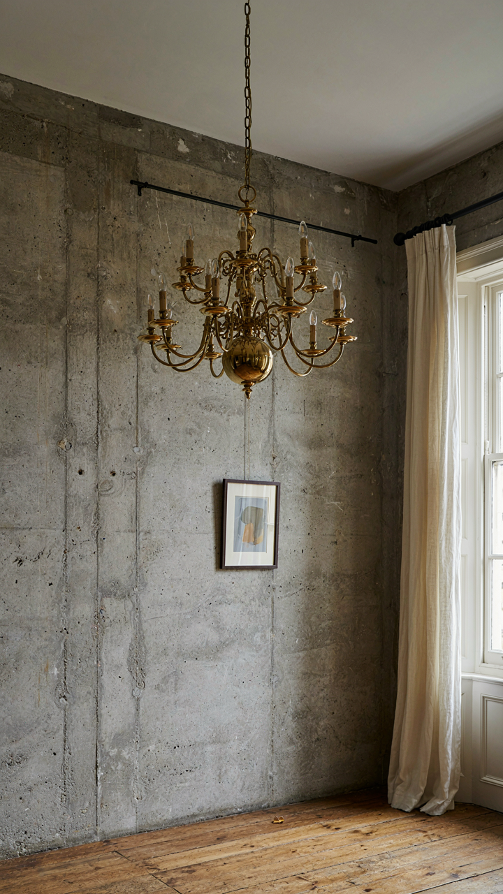
When Brass Meets Raw Concrete
You want permission to break the rules without looking like you don’t understand them. That’s the real transaction happening here. The mechanism is simple: Georgian interiors work because of proportion and restraint, not because of a frozen aesthetic. The moment you grasp that, you can subvert it without destroying it.

Pairing materials that shouldn’t coexist forces the eye to work. A polished brass chandelier hanging in a room with exposed concrete walls doesn’t fail because the materials clash. It fails only when the proportions are wrong. Georgian rooms maintained strict ratios between surfaces, ornament, and void. Keep those ratios intact and introduce raw, industrial, or unexpected materials. The classical framework holds the composition together while the material contrast creates visual tension that reads as intentional rather than confused.
Classical Motifs Stripped And Repurposed
People misunderstand what reinterpretation means. They think it means watering down the original or adding new details to an old form. It doesn’t. Real reinterpretation removes elements until only the structural logic remains, then applies that logic to something unrelated.
Georgian interiors relied on symmetry, rhythm, and hierarchical layering of detail. Take the egg-and-dart molding that runs along cornices. The logic isn’t the ornament itself but the way repetition creates visual containment. Apply that same logic to a stark white wall with negative space marked by shadow lines instead of carved profiles. The mechanism transfers: rhythm and containment still operate, but through absence rather than presence. The result reads as evolved, not diminished, because you’ve understood the principle underneath the decoration.
The Illusion Of Effort: Where Timelessness Hides
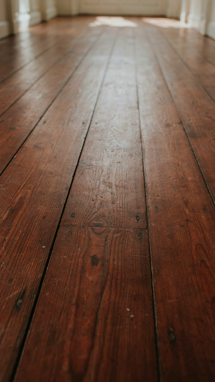
Quality Over Replacement Cycles
You want to believe Georgian interiors are timeless because buying once sounds smarter than buying twice. The real mechanism is material durability, not taste. Georgian craftsmen used dense hardwoods, plaster with lime binders, and joinery that locked pieces together without nails. These materials age visibly but don’t fail. A mahogany floor worn smooth after two centuries reads as character, not damage. Modern fast furniture splinters at year five and looks cheap at year three.
Enduring quality in Georgian rooms comes from three factors: material density, joint integrity, and finish chemistry. Solid wood paneling expands and contracts predictably. Hand-applied wax and oil patina darken rather than peel. When you specify materials that survive visible aging, you eliminate the replacement treadmill that kills contemporary interiors. The cost difference between cheap and durable is often thirty to forty percent. Stop there and compound it across decades.
The Weight Of Worn Surfaces
Perfection reads as artificial. Georgian interiors survived because imperfection became authenticity. A fireplace mantel with uneven wear patterns, floorboards with varying grain color, plasterwork with hairline cracks and subtle settlement marks all register as evidence of use, not defects. This is economics talking: scarcity and age command premium pricing only when imperfection proves legitimacy. A room that looks immaculate at forty years signals either recent replacement or artificial aging, both red flags.
The mechanism works like this: gather your materials, finishes, and furnishings first, then introduce controlled wear patterns through use and strategic placement. A rug positioned to fade unevenly. Shelving arranged so certain books spine-in, others spine-out, creating visual rhythm instead of symmetry. Paint with depth by layering matte over satin. Imperfection proves investment—it shows the room survived actual life instead of staging for a photograph.
The Only Thing Stopping Your Georgian Interior From True Elegance Is Your Fear Of Subtraction
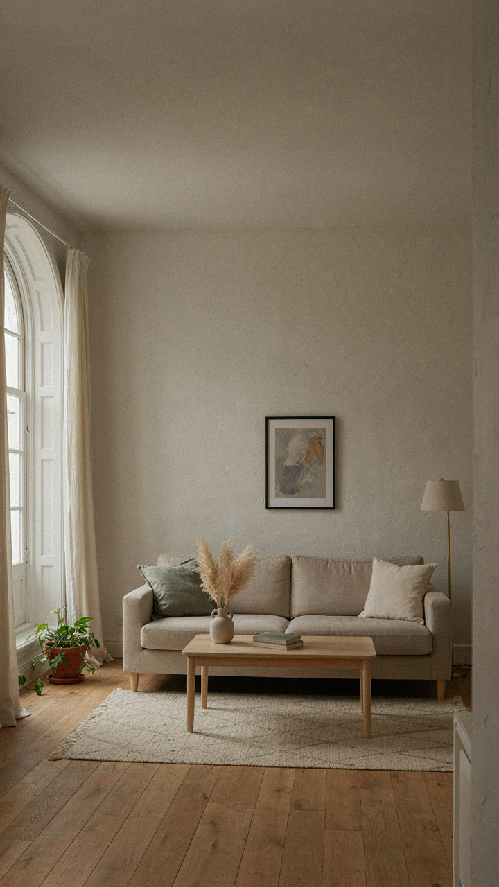
Most people furnish a Georgian room by adding. They layer in pieces until the space feels “complete.” It never does. Elegance isn’t abundance. It’s restraint. Remove one thing from your room today. Not the worst piece. Remove something good. Something you like. Watch what happens to the space around it. That empty breathing room? That’s where Georgian elegance actually lives. Most people never get there because they never try.



