
The Anachronism Algorithm: Where Old Meets Now
Clashing Elements That Actually Work
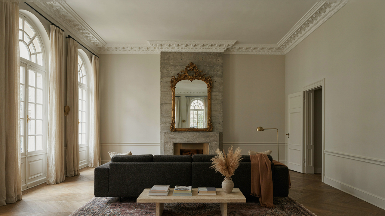
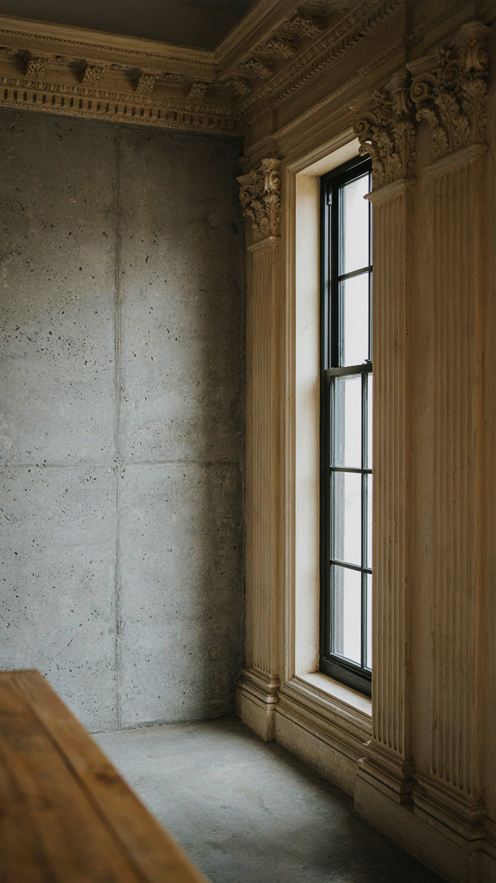
You want permission to break the rules without looking incompetent. That’s the real driver here. The mechanism is borrowed from physics: tension. Opposing forces create visual energy only when both elements stay intact and visible. Mix Victorian crown molding with raw concrete, gas lamps with steel beams, ornate mirrors with minimalist walls. The clash works because neither side surrenders. Each demands attention. Remove either element and you collapse into themed decoration.
The mistake everyone makes is softening the collision. They add a transitional color or “bridge” material and kill the whole effect. Victorian floral patterns next to Scandinavian simplicity feel disjointed only if you’re afraid of it. Commit to both. A heavily carved mahogany side table beside a stark modern sofa isn’t a design problem. It’s a statement. The tension proves both choices were intentional.
Grounding With Modern Anchors
Modern elements aren’t decoration here. They’re ballast. A Victorian room without contemporary anchors floats into historical reenactment territory. You need structural counterweights: industrial lighting fixtures, polished concrete floors, glass and metal shelving, open floor plans without excessive walls. These elements read as “present day” and prevent the space from feeling like a museum reconstruction. They hold the Victorian pieces accountable to current living standards.
Anchor selection follows one rule: visibility. Hide the modern elements and you’ve failed. Make them obvious. A sleek stainless steel fireplace insert inside a traditional brick surround. Black metal framed windows in period walls. Glass pendant lights hanging above ornate tables. The contrast declares that this space exists now, not then. This decision determines whether visitors see thoughtful curation or confused nostalgia. Place your anchors first. Build Victorian layers around them.
Victorian Living Room: More Than Just Velvet
The Restraint Problem
You want the status signal without looking like you raided a museum gift shop. That’s the real tension here. The mechanism is simple: Victorian rooms fail when they treat abundance as the goal instead of constraint. Victorians filled rooms because they lacked alternatives. You have them. A modern Victorian living room works by choosing what stays, not what arrives. Every piece must justify its presence or create visual weight that collapses the whole strategy.

The difference between curated and chaotic is decision velocity. Cluttered Victorian rooms happen when someone sees a piece and thinks “that’s Victorian, it belongs here.” Curated rooms happen when someone removes pieces until the room stops working, then adds one back. The restraint isn’t about minimalism. It’s about refusing the default impulse to layer. Your sofa doesn’t need matching side tables, a footstool, and three decorative objects on top. Pick one anchor that carries the visual load, then leave air around it.
Function Comes Before Form
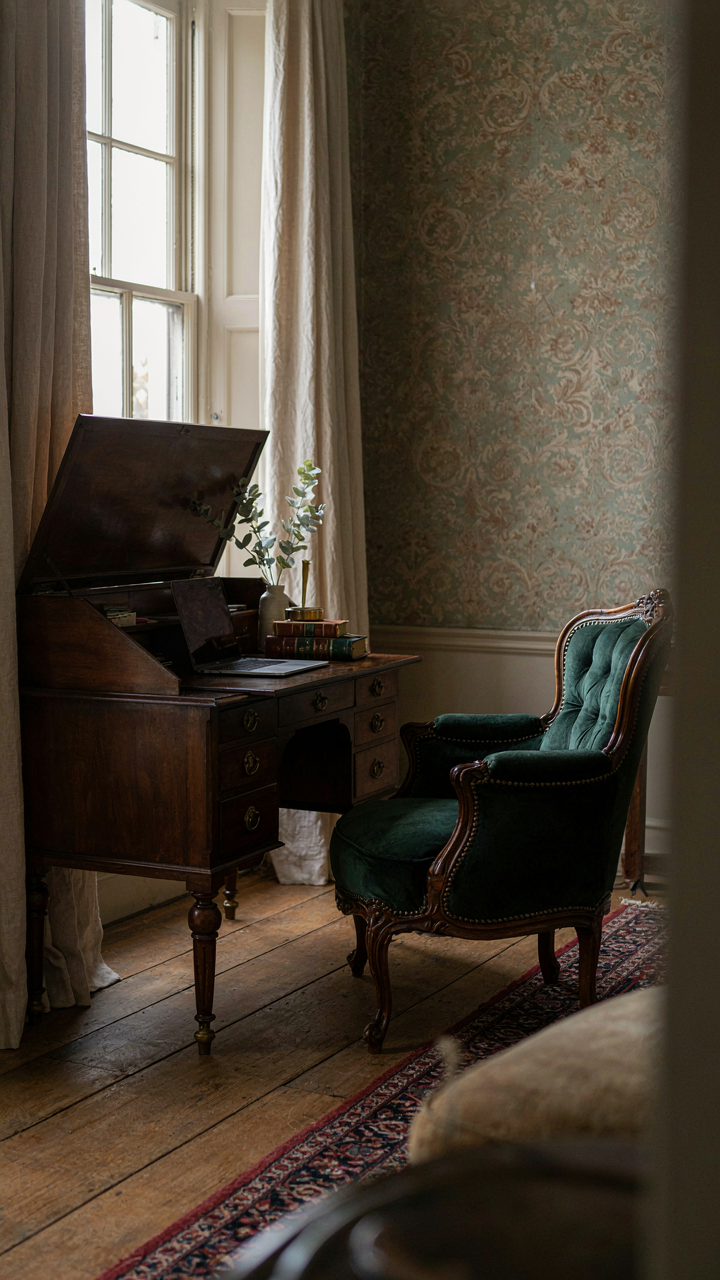
Common advice says Victorian pieces are decorative first. That’s backwards and expensive. A Victorian chair that doesn’t sit well is just sculpture you paid too much for. The real mechanism here borrows from industrial design: form follows function, which means the shape serves the behavior first. A genuine Victorian wingback chair has high arms because people sat closer to fires and needed protection from drafts and heat scatter. That function is dead now, but the form still works. The wings create acoustic containment in a room, define a zone, and solve a modern problem you might not name: open floor plans lack boundaries.
Start by identifying what the room needs to do. Reading light. Conversation seating. Somewhere to set a drink without it being visible from the hallway. Then find Victorian pieces that already solve these problems. A secretary desk isn’t decoration. It’s a workspace that looks intentional instead of like you forgot to put your laptop away. A credenza holds the things that make rooms look ransacked. Function-first thinking eliminates the pieces that just sit there, which means your budget goes to things that actually matter.
The Un Victorian Color Palette Protocol
Saturated Color Without The Period Costume
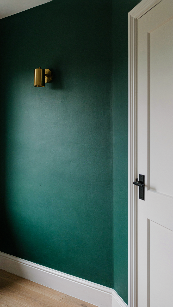
You want permission to break the rules without looking like you don’t know them. That’s the real concern here. The mechanism is borrowed from contrast theory in visual design: Victorian interiors relied on value separation—light walls against dark woodwork, pale fabrics against heavy furniture. Modern Victorian inverts this by collapsing the value range while pushing saturation. Deep jewel tones replace dusty magentas. Chartreuse walls pair with black trim instead of cream and burgundy. The bones stay Victorian. The palette signals you chose this, not inherited it.

The execution matters more than the color choice itself. A single saturated wall in emerald or navy reads as intentional restraint, not trend-chasing. Pair it with one muted accent—brass fixtures, natural wood, or concrete—to prevent the space from becoming a costume party. Paint a bedroom feature wall in deep teal and use white trim with matte black hardware. The Victorian framework supports it. The saturation proves you’re not nostalgic, you’re literate.
Neutral As Negative Space, Not Default
The common advice says neutrals ground bold color. That’s incomplete. Neutrals in modern Victorian work as deliberate omission—you’re removing what Victorian design demanded, not adding softness. Think of it like information hierarchy in typography: you remove elements to make the remaining ones louder. Greige walls or concrete gray ceilings don’t support jewel-tone furniture and fixtures. They create tension by refusing to compete.
Use a single neutral as your largest surface plane—walls, typically—then commit fully to color elsewhere. Charcoal wallpaper in a dining room with burgundy velvet chairs and brass sconces works because the walls stop arguing with the furnishings. The neutral doesn’t apologize for the color. It clarifies it. Paint trim in warm white while walls sit in cool gray. The contrast sharpens both. This is the protocol: one neutral surface, everything else declares.
Modern Victorian: The Deconstructed Aesthetic

What Actually Counts As Victorian
You want permission to keep the stuff you like without looking trapped in a museum. Here’s the mechanism: Victorian design wasn’t one thing—it was eclecticism masked as rule-following. The era borrowed from Gothic, Rococo, and Eastern traditions and mashed them together. Modern Victorian works the same way. You isolate the visual motifs that read as Victorian to most people, then strip away the historical baggage. Ornamental mirrors, jewel tones, curved furniture legs, and heavy textiles are the actual vocabulary.

The mistake most people make is treating Victorian as a monolith. It spanned roughly 1837 to 1901, and design shifted dramatically across those decades. Early Victorian favored restraint. Late Victorian exploded into maximalism. Modern Victorian borrows selectively from both periods, which means you’re not obligated to commit to either extreme. The real leverage is understanding which specific elements trigger the Victorian read in a viewer’s brain, then deploying them strategically instead of flooding every surface.
Familiar Forms, Unfamiliar Contexts
Context collapse is borrowed from anthropology, and it’s the operating system here. You take a high-Victorian form—say, a wingback chair or a marble-topped side table—and drop it into a minimalist or industrial setting. The object reads as its original self, but the surrounding space strips it of its historical meaning. A tufted velvet sofa against exposed brick and steel beams stops being fussy and becomes intentional. The form survives. The suffocation doesn’t.
This works because contrast creates meaning. A single ornate mirror hung on a bare white wall registers differently than ten mirrors clustered on a floral-papered wall. The modern Victorian approach reduces saturation but keeps texture. You’re using Victorian materials and silhouettes as design accents, not as lifestyle statements. The protocol is straightforward: pick one to three Victorian-legible pieces per room, leave the rest of the space clean, and let those pieces do the work. Restraint transforms reverence into taste.
Victorian Home Interior: The Anti Museum Approach
Comfort Over Authenticity
You want permission to break the rules without feeling like you’re doing it wrong. Here’s the mechanism: Victorian homes were designed for the people living in them, not for people visiting them 150 years later. The Victorians themselves constantly updated their spaces with new technology and comfort innovations. Treating Victorian design as a museum display is the opposite of what Victorians did.

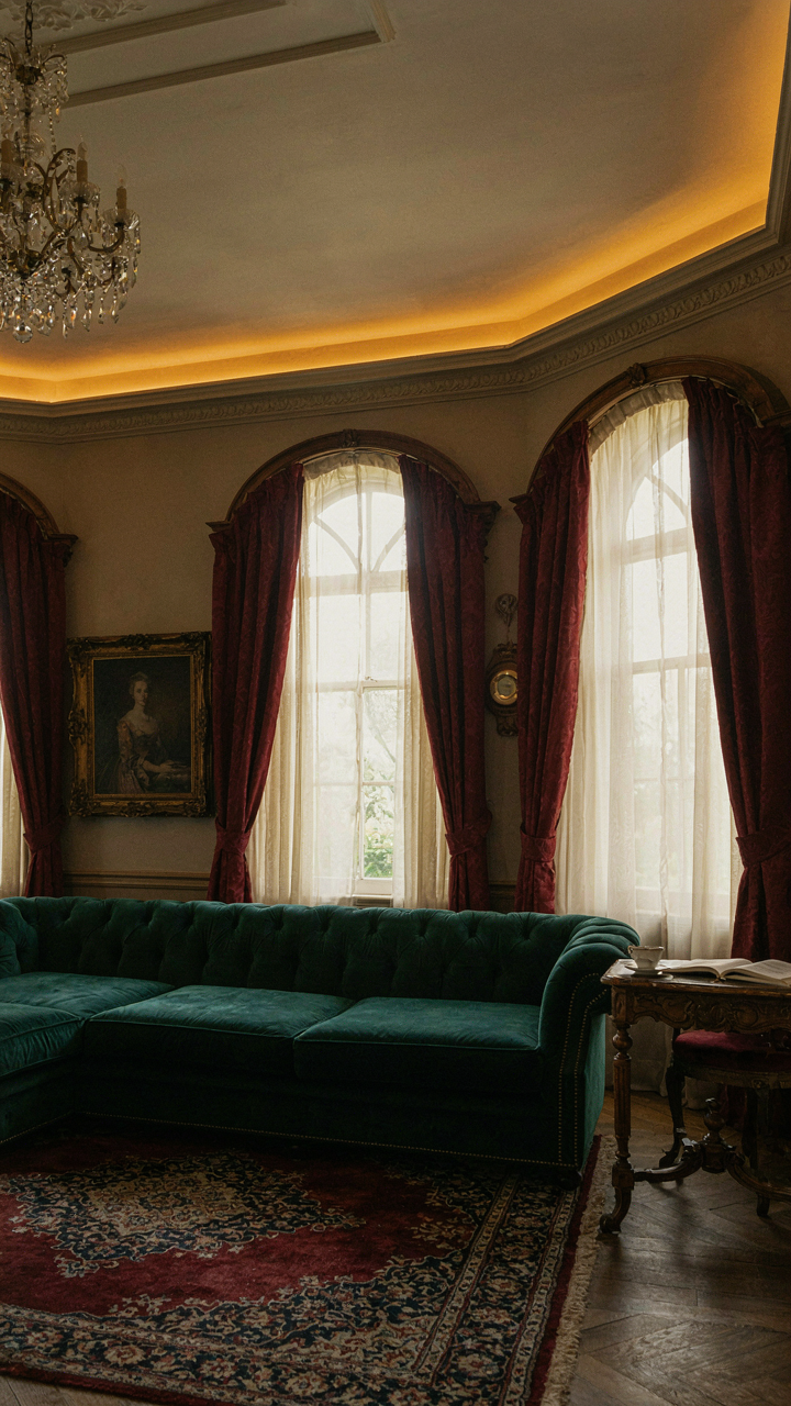
Modern Victorian interiors work when you prioritize function first. A velvet sofa with a sectional layout beats a rigid parlor arrangement. Gas lighting gives way to recessed fixtures hidden in crown molding. Heavy drapes pair with roller shades for actual temperature control. The aesthetic stays, the usability improves. This is the real rule: steal the visual language, ditch the inconvenience.
Technology Embedded Not Announced
Stealth is the operative principle here. In systems design, integration means components work together without creating friction or visibility. Modern Victorian spaces do the same: technology disappears into the architecture rather than sitting on top of it. A flat screen mounted inside a period-appropriate frame mounted on a wall becomes furniture, not an intrusion.
Hide wiring inside walls during renovation rather than running it on top. Install smart thermostats behind period trim, not on a white plastic rectangle. Mount speakers into ceiling coves or bookcases where they blend with the room’s depth. Cable management uses brass conduit that reads as deliberate detail, not failure to hide cables. The moment your tech becomes visible as “modern solutions to an old space,” you’ve already lost the effect. Integrated technology vanishes into the design language.
The “Adaptive Radiation” Principle For Victorian Hallway Decor
How Hallways Function Like Evolutionary Niches
You want your hallway to feel intentional without looking like a museum, but you’re terrified of committing to a style that’ll feel dated in three years. The real mechanism here comes from evolutionary biology: adaptive radiation describes how species diversify to fill available ecological niches. Your hallway works the same way. Victorian design elements don’t all belong together just because they’re from the same era. They survive in your space only if they solve an actual problem: light, movement, visual continuity, or spatial proportion. The hallway is the narrowest, most constrained room in most homes. This constraint forces functional specialization. A Victorian mirror doesn’t hang there because it’s pretty. It hangs there because it bounces light down a dark corridor or creates depth in a tight squeeze. Remove the function, and the element becomes clutter wearing a costume.

The common advice says to “pick a color palette and stick with it.” That’s incomplete. You’re not decorating a hallway. You’re solving a traffic pattern. Dark jewel tones work in a wide hallway with good overhead lighting. They fail catastrophically in a narrow corridor with one window at the end. Pale greens and soft grays function differently. They compress space visually but move light. Wallpaper choice becomes a tactical decision, not an aesthetic one. A small geometric print reads as texture in motion. A large floral competes with the hallway’s actual job, which is getting people from one room to another. The wallpaper you choose must recede, not announce itself.
Decor Elements That Adapt To Hallway Constraints
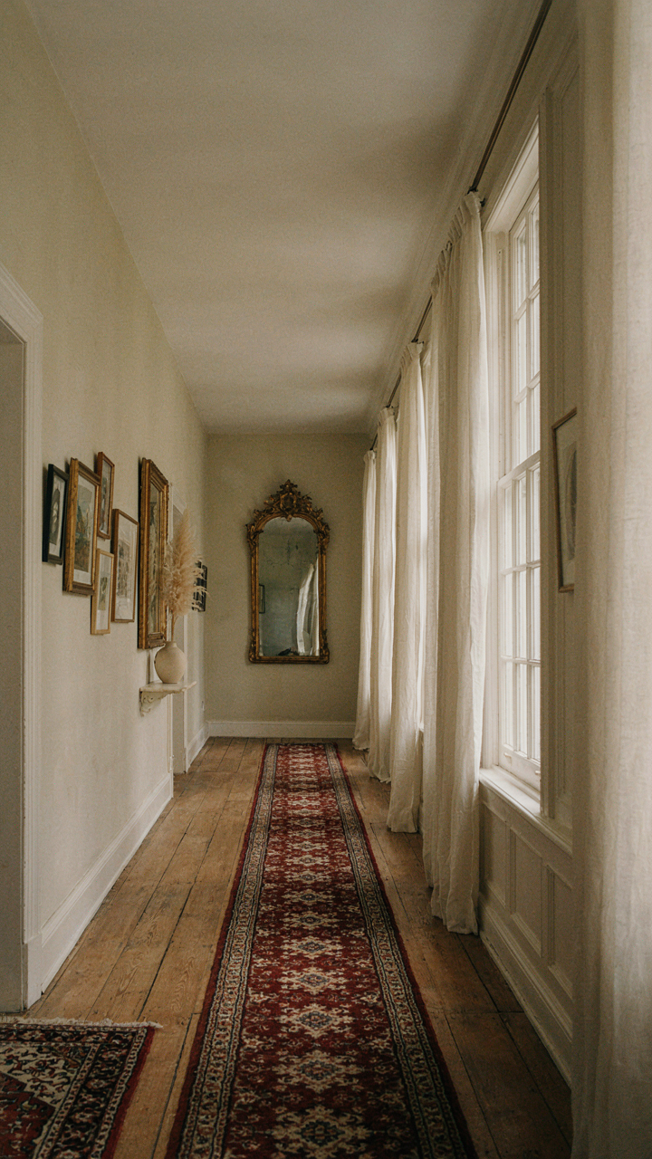
Hallway decor works when it acknowledges one hard truth: the space moves people through, so nothing here should stop them or confuse their eye. Victorian sconces mounted at forty-two inches high serve a real purpose beyond ambiance. They provide task lighting while preventing shadow zones that make narrow spaces feel ominous. A console table with a mirror above it doesn’t just look period-correct. It creates a functional landing zone for keys, mail, and mental transition. The piece works because it’s narrow enough not to obstruct foot traffic. A reproduction Victorian piece that’s too deep becomes an obstacle, not decor. Materials matter in ways most people skip over. Brass and oil-rubbed bronze don’t just look different. Brass scatters light. Dark bronze absorbs it. Your choice rewires how the hallway functions physically.
Runner rugs present the sharpest test of adaptive thinking. A Victorian-inspired runner with geometric or floral patterns can visually lengthen a short hallway or define a circulation path in an open floor plan. But the runner only works if it’s wool or wool blend with a low pile. High pile catches feet and announces itself with every step. The runner must anchor the space without interfering with its primary function. Artwork on hallway walls faces the same constraint. Large Victorian-inspired pieces demand wall space, but hallways rarely have that. Smaller framed pieces or a gallery wall of varied sizes works because viewers encounter it at a pace. They process it as they move, not as a destination. The decor succeeds when it follows the hallway’s rhythm, not when it asks the hallway to slow down and admire it.
Modern Victorian Homes: Stripping Down For Impact
Constraint Creates Better Design Decisions
You want permission to keep the ornament without looking trapped in a museum. Here’s the mechanism: Victorian interiors worked because they solved a real problem—filling large rooms with insufficient artificial light. That constraint forced density. Remove the constraint, add modern lighting, and the same density reads as clutter. Minimalist thinking applied to Victorian bones means you subtract ornament until each remaining piece justifies itself functionally or architecturally.

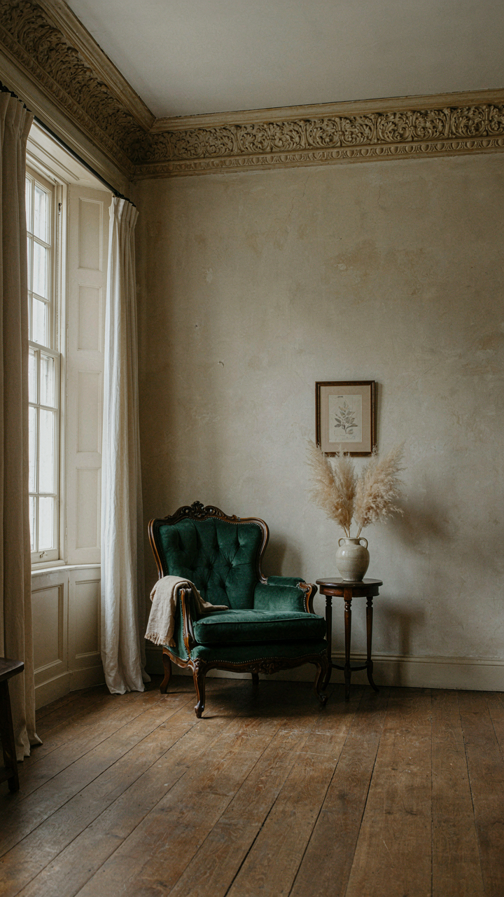
The math is simple. A Victorian parlor with gas lamps needed wallpaper, heavy drapes, and layered furniture to feel complete at night. Electric light eliminates that need. Your move: keep one or two Victorian anchors per room—a fireplace mantel, crown molding, a single statement chair—and leave the rest calm. Contrast amplifies impact. The ornate piece reads richer when surrounded by restraint.
Emptiness As A Design Tool
Negative space isn’t a luxury in modern Victorian homes. It’s structural. Think of it in architectural terms: load-bearing walls support the weight. Empty walls support the visual weight of the ornament. Victorian rooms failed modernization because designers filled them the old way, treating emptiness as failure instead of strategy.
- Bare Wall Sections: Paint solid colors between wallpapered focal points. Let the eye reset and recover before encountering detail again.
- Floor-to-Furniture Gaps: Leave floor space visible around pieces. This separates objects in space instead of creating a solid mass.
- Simplified Textiles: Use one patterned element per room. Solid upholstery on most pieces lets patterned drapes or a single rug command attention.
- Vertical Breathing Room: Mount shelves with intentional gaps between objects. Grouping everything densely erases the Victorian craftsmanship you’re highlighting.
- Single-Color Ceilings: Avoid patterned ceiling paper. Plain white or soft neutral draws the eye upward without competing with crown molding detail.
The practical protocol: measure your room in thirds. Assign ornament to one third, solid surfaces to one third, and open space to one third. This isn’t arbitrary. It forces you to edit ruthlessly before purchasing anything, which stops the accumulation cycle that killed Victorian interiors in modern homes.
Idee Arredamento Soggiorno: Beyond The Pinterest Board
The Real Reason You’re Stuck On Inspiration
You want permission to copy someone else’s room without feeling like a fraud. Here’s the mechanism: Victorian design has rules, and modern variations exploit those rules differently depending on the space’s actual function. Inspiration boards show you aesthetics, not systems. A living room in modern Victorian style works because it balances formal restraint with livable comfort, not because it looks good in a filtered photo. The constraint is the instruction.

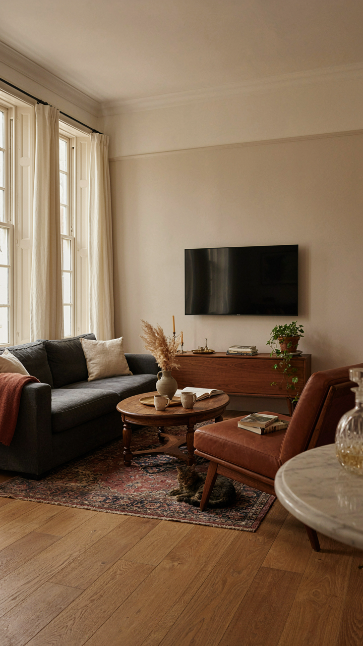
Study rooms that solve the problem you have, not rooms that look like your fantasy. If your living room needs to function for a family that watches television, find examples of modern Victorian spaces where the TV isn’t hidden behind a painting. If you entertain formally, find rooms where seating faces a conversation axis, not a wall. The pattern you’re looking for isn’t visual harmony. It’s spatial logic that matches your actual behavior.
Decoding Your Aesthetic Debt
Most people confuse personal style with taste inheritance, then blame themselves for not having either. The real work is identifying which Victorian principles align with how you live, then removing everything else. Modern Victorian decor succeeds when it strips away ornament that doesn’t serve a function and keeps structural choices that do. A crown molding works. A doily on every surface doesn’t.
Start by auditing your current space. Note which pieces you actually use versus which pieces you maintain. That friction reveals your real preference. Modern Victorian doesn’t mean adding more details. It means keeping the bones of classical proportion and period-accurate materials, then eliminating decoration that contradicts your daily routine. Apply this filter: does this object reduce visual noise or add to it? Keep what reduces. Remove what adds. This becomes your personal vocabulary.
Victorian Home Hallway: The Unsung Hero
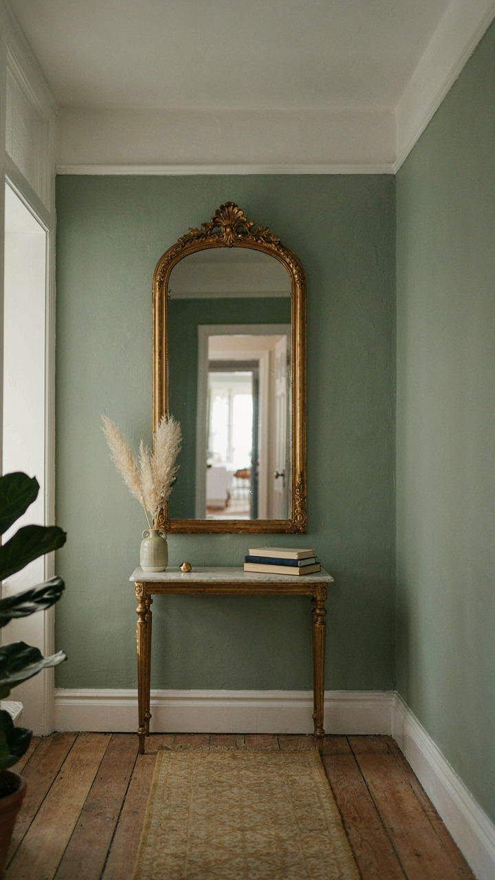
The Hallway As Control Point
You want people to think your home is curated, not decorated. That’s the real reason you care about hallways. Most people ignore them because hallways don’t serve a functional purpose beyond movement, but they’re actually the leverage point for everything else. In architecture, we call this a threshold mechanism. The hallway sets expectation architecture before anyone enters a living space. Modern Victorian hallways work the same way: they filter what the eye lands on first, priming how a visitor perceives the entire home’s design intentionality.

The hallway is where you compress the design language of your entire space into a narrow, controlled sequence. You can’t decorate a hallway like a room because it demands economy of gesture. This means every surface choice compounds. Paint a hallway sage green with crown molding, hang one properly scaled mirror with a gilt frame, position a narrow console table with brass legs, and suddenly the visitor believes you have taste. The hallway becomes the proof of concept before they see anything else.
Why First Impressions Still Matter
The consensus advice says first impressions happen in seconds, which is technically true but misses the mechanism entirely. The real constraint is that hallways have zero distraction tolerance. A poorly chosen color, a cluttered surface, or mismatched finishes immediately signal to the visitor that the rest of the home is probably improvised too. Modern Victorian decor in hallways works because it uses symmetry and focal points to create visual order at speed. Your brain processes symmetry as intentionality. The visitor doesn’t consciously think about this; they just feel it.
Install a single significant vertical element in a hallway and you’ve solved the entire space. This could be a floor-to-ceiling bookshelf with brass hardware, a statement wallpaper panel flanked by picture rails, or a large ornate mirror positioned opposite a single sconce. Modern Victorian hallways succeed because they reject clutter while keeping visual weight. The mechanism is simple: one focal point anchors the space so thoroughly that nothing else competes for attention. The visitor moves through the hallway with their eye guided, not scattered.
The Real Obstacle To Timeless Style Isn’t Budget; It’s Your Inability To Embrace Aesthetic Friction
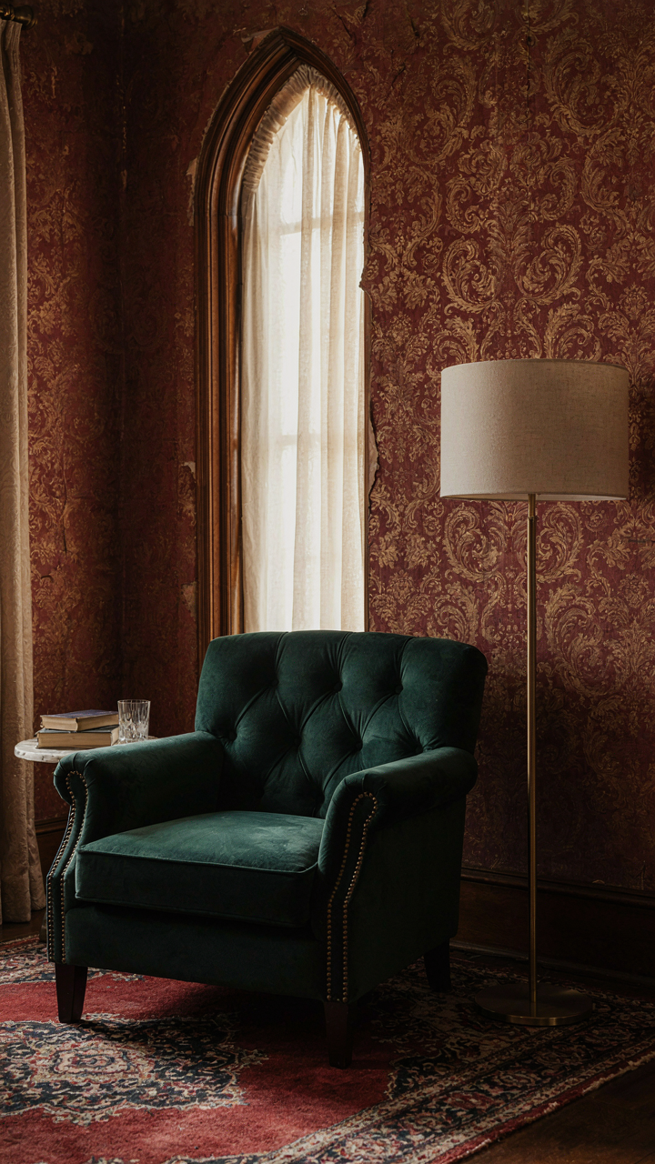
Most people fail at modern Victorian decor because they chase comfort instead of tension. They want everything to match, to feel safe, to require zero decisions. But the style lives in the clash between old and new, ornate and minimal, expected and bold. Pick one room this week and deliberately mix something that makes you slightly uncomfortable—a sleek modern lamp in a velvet chair corner, industrial shelving behind damask wallpaper. The discomfort means you’re building something real, not just decorating. Style isn’t supposed to feel obvious.



