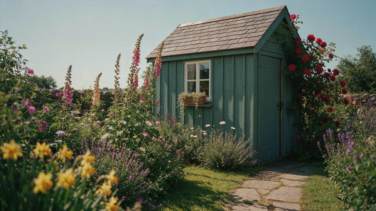
The Myth Of Seamless Shed Blending: Why You’re Doing It Wrong

The Shed That Disappears Never Actually Does
You want your shed invisible because you’re afraid it looks cheap. Here’s the mechanism: blending doesn’t work the way you think it does. Your eye doesn’t process a shed as “disappeared” when it matches trees or grass. Instead, your brain registers a color mismatch the moment light hits it differently than the surrounding landscape. A shed painted forest green at 2 PM in winter looks brown. The same paint at noon in summer looks almost black. Landscape colors shift constantly. Your shed color does not.
The common advice says “match your dominant landscape color.” This is lazy and wrong. What actually happens is your shed becomes a visual anchor that contradicts itself throughout the day. A painted surface has a fixed reflectance value. Living plants and soil do not. The shed you painted to blend in becomes more noticeable because it’s the only thing in the frame that doesn’t change tone with the sun angle. The real mechanism is contrast consistency, not color matching.
Why You Actually Want It Visible
Psychology borrowed from loss aversion explains this: you fear the shed looking out of place more than you fear it looking deliberately placed. Here’s the shift: a shed that commits to a color choice and stops trying to hide reads as intentional. Your brain finds intentional structures acceptable. Structures that pretend to be something they’re not trigger discomfort.
The landscape doesn’t need your shed to vanish. It needs your shed to belong. That’s a different operation entirely. A shed painted a distinct earth tone, dark charcoal, or warm brown signals that you made a choice, not that you’re attempting visual camouflage. Intentional placement beats failed invisibility every time. To apply this: pick a color you’d defend, not a color you hope people won’t notice.
Beyond Beige: Unlocking Purposeful Shed Paint Colours
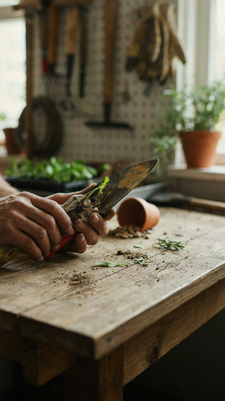
Function Determines Color, Not Aesthetics
You want your shed to disappear into the landscape because you’re afraid it looks like you don’t know what you’re doing. Here’s the mechanism: shed function dictates visibility requirements, and visibility requirements dictate color. A storage shed for tools needs different optical treatment than a garden studio or potting workspace. Storage sheds benefit from recessive colors that reduce visual weight. Studios and workspaces sometimes need slight contrast to signal intentional use. The color choice isn’t about blending for beauty—it’s about establishing the shed’s operational role in your property’s hierarchy.

Most people skip this step and grab whatever color their local hardware store recommends. That’s backwards. Start by defining what the shed does daily. Does someone work inside it regularly? Is it pure storage that gets visited monthly? Does it need to be found quickly or should it stay peripheral to your view? Paint color follows function, not the other way around. The most cohesive landscapes aren’t accident-proof—they’re function-driven.
Color As Signal, Not Decoration
Semiotics is the study of how objects communicate meaning, and your shed paint color is a signal. Common advice says to match your house or go earth-toned and neutral. That’s incomplete. A shed should signal its purpose before someone approaches it. Muted greens and grays work because they communicate “background infrastructure.” Warm earth tones like terracotta or ochre signal “active use space.” Cool grays and deep charcoals suggest “deliberate, maintained structure.” The color you choose trains the viewer’s eye about whether this building demands attention or blends into the landscape’s utility layer.
Stop treating shed color as a design afterthought. Your paint choice controls how people cognitively process your yard’s spatial hierarchy. If the shed disappears completely, visitors might trip over it mentally—they see yard but miss the building’s role. If it pops too hard, it becomes visual noise. The mechanism is simple: choose a color that signals your shed’s actual function by spending one week observing how light hits your property at different times. Then select the shade that makes the shed’s purpose obvious without demanding attention.
The Visual Hierarchy Protocol For Shed Colors Exterior
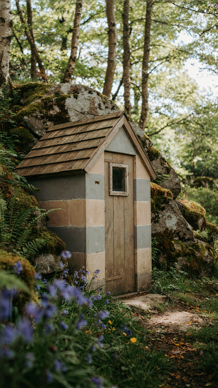
Disruption Over Disappearance
You want your shed to vanish into the landscape because you think it makes your property look larger. That’s not how perception works. Military strategists learned this decades ago: disruption patterns work better than solid concealment because human eyes track edges and uniformity, not absence. A shed painted in one flat color reads as a visual object no matter what that color is. The mechanism is contrast sensitivity, not color matching.
Disruptive patterns break the shed’s perimeter before the eye can lock onto its boundary. Use two or three colors that exist in your landscape—weathered wood tones, stone grays, moss greens—but apply them in irregular blocks or stripes across planes. The viewer’s brain processes these as separate elements rather than one unified structure. This forces spatial ambiguity: the shed stops reading as a discrete form and becomes part of the visual noise of trees, terrain, and undergrowth.
How Shadows Redefine The Shed Edge
Light doesn’t just illuminate your shed. It manufactures the visual boundary you’re trying to control. A light-colored shed in morning sun casts a sharp shadow that defines its perimeter more aggressively than the shed itself. A dark shed in the same light nearly disappears at the shadow line because no contrast exists. The real play happens at the transition zone where the shed surface meets its shadow.
Paint the shed’s upper sections lighter than lower sections. This inverts the natural shadow gradient and makes the shed appear to dissolve upward into sky rather than sit heavy on the ground. The eye reads this as the shed blending into atmosphere, not as a color choice. East and west exposures matter most: these walls catch low-angle light that creates the longest, sharpest shadows. Adjust your color strategy to work with this directional light, not against it.
Strategic Contrast: Elevating Your Garden Shed Colors
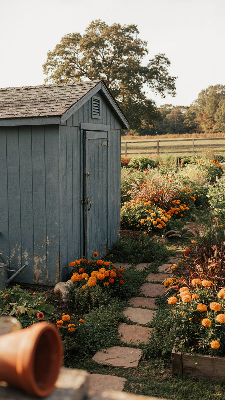
Color Theory Works Against Invisibility
You want your shed to disappear into the landscape, but you’re actually afraid it will look cheap or forgotten. That’s the real tension here. Color theory solves this by using the opponent process in human vision. Your eye perceives colors in opposing pairs: red against cyan, yellow against blue, green against magenta. When you place a shed color opposite to its surroundings on the color wheel, it gains visual weight without screaming for attention. A muted sage green shed against brown earth doesn’t clash. It activates depth through contrast while staying subordinate to the landscape.
The mechanism is simple: low saturation plus strategic hue opposition creates visual interest without dominance. If your garden beds run warm browns and ochres, a desaturated blue-gray shed reads as intentional, not accidental. The surrounding colors literally make the shed color appear more sophisticated because your brain processes them as complementary. This isn’t matching. It’s precision placement. The shed becomes a visual anchor point rather than an eyesore or a ghost structure nobody notices exists.
Know When Bold Colors Earn Their Place
Most advice tells you to play it safe with earth tones. That’s incomplete. Bold colors work in sheds when they have permission from their context. Permission means the shed occupies a defined garden zone, not open field. A bright mustard or charcoal shed makes sense as a focal point inside a hedged enclosure or near the house. It fails in an empty backyard where it reads as arbitrary.
The protocol is functional distance first. If the shed sits thirty feet from your primary viewing angles, saturation matters less. If it’s ten feet from your patio, you’re choosing a permanent daily visual element. In that case, bold works only if the color echoes something already present in your hardscape or plantings. A red shed matches red brick or red-toned pavers. A deep teal shed works if your house trim or garden structure shares that undertone. This prevents the shed from feeling grafted on. Test the color on plywood and leave it facing your viewing area for two weeks before committing to paint.
The “Shed Colors Ideas Paint” Illusion: Escaping Pinterest Paralysis
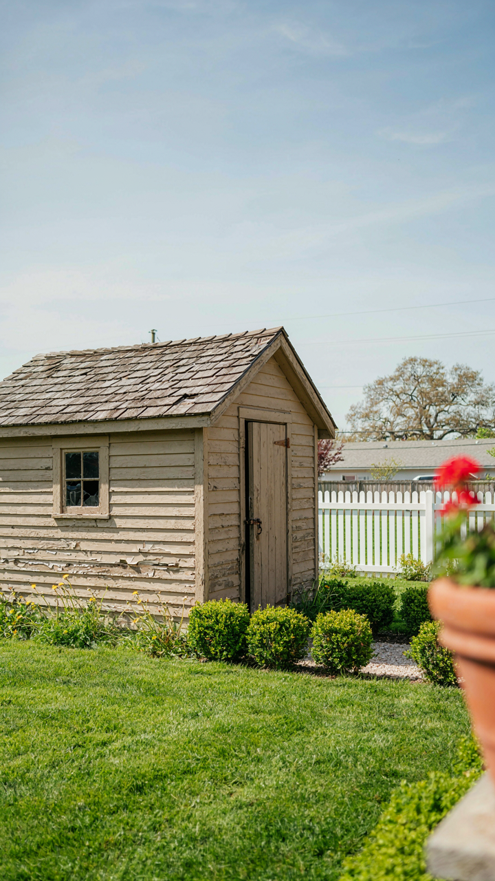
Why Popular Shed Paint Choices Fail
You’re scrolling because you want permission to pick a color without looking stupid. Here’s the mechanism: most shed color advice treats paint choice like fashion, when it’s actually a material decision. Pinterest shows you what looked good in someone else’s yard under their light, soil tone, and vegetation. You’re not seeing the context that made it work. The advice is so generic because it assumes aesthetic rules apply universally, when really your shed’s color success depends on three fixed variables: what surrounds it, how light hits it at different times, and what contrasts it needs to avoid looking abandoned.
Most recommendations skip the actual problem. They tell you to use “earthy tones” or “blend with nature” without explaining that blending and visibility are often opposing forces. A shed that disappears into the treeline might look sophisticated in a photo but becomes a navigation hazard and loses resale value. The color that works depends on whether your goal is camouflage or functional clarity on your property. You need to know which one you’re actually optimizing for before you buy a gallon.
Building Your Color Decision From Site Facts
Forget aesthetic intuition for now. Use basic landscape inventory instead. Walk your property at three times of day: morning, midday, and dusk. Note the dominant soil color, the predominant plant greens during your main usage season, the light quality where the shed sits, and what structures or vegetation create the backdrop. These are your constraints, not inspiration. Your shed’s paint color should solve a practical problem on your specific plot, not match a design trend. If you can’t describe why a color works beyond “I like it,” you haven’t done the analysis.
The mechanism is simple: contrast prevents accidents, blending prevents visual fatigue. A bright red shed in a green forest is high-contrast and functional but exhausting to look at daily. A dark green shed in the same location disappears, which solves the visual problem but creates a safety issue if people can’t locate it easily. Your color should reflect what your shed does on your land. Is it a working tool shed that needs to be found quickly, or background storage in a manicured garden where invisibility matters? That single question determines whether you choose high-contrast or low-contrast, and that choice eliminates most of the decision-making paralysis before you start.
Durability Vs. Trend: Practical Shed Paint Colors For Longevity
Paint Quality Matters More Than Color Choice
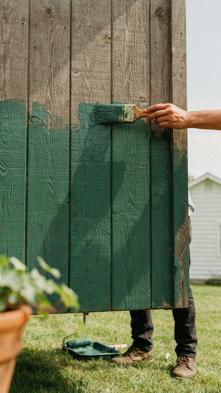
You want your shed to look intentional and coordinated, not like you abandoned it five years ago. Here’s the mechanism: paint fails because of poor adhesion and UV degradation, not because you picked the wrong shade. Most people reverse-engineer this, obsessing over color while buying cheap paint that peels within three years.
- 100% acrylic latex exterior paint: Superior flexibility and moisture resistance compared to oil-based alternatives. Expands and contracts with temperature swings without cracking or peeling on wood sheds.
- Mildew-resistant formulations: Additives prevent fungal growth in damp climates. Check the label for mildewcide. Matters in coastal or heavily shaded areas where moisture lingers.
- Two-coat minimum application: One coat leaves thin spots where UV penetration accelerates failure. Two coats create a protective barrier that extends durability five to seven years minimum.
- Primer-matched to substrate: Quality exterior primer bonds to wood grain and resists tannin bleed. Skipping primer causes discoloration and adhesion failure within months on cedar or redwood.
- Satin or semi-gloss finish: Flat paint hides dirt but fails faster. Satin and semi-gloss shed water and resist weathering 30 to 40 percent longer than flat finishes.
The color you select becomes irrelevant if the paint film itself degrades. A high-quality green lasts longer than cheap white. Buy paint rated for exterior wood, not interior repurposed as outdoor. Check the VOC rating and cure time. Poor paint dries faster but never fully hardens.
Climate And Material Dictate Real Longevity
Think of your shed paint system as a load-bearing structure in civil engineering: material properties determine failure point, not aesthetics. Wood moves with humidity. Metal rusts through salt exposure. Concrete chalks under UV. Paint must accommodate each substrate’s specific behavior or it fails predictably.
Wood sheds in high-humidity regions need paint with superior moisture-barrier properties. Latex paint allows wood to breathe slightly, preventing moisture traps that cause rot underneath. In arid climates, UV degradation dominates, so darker colors absorb more heat and expand faster, stressing the paint film. Metal sheds require paint with rust inhibitors and adhesion promoters. Salt spray near coastal areas accelerates corrosion, making paint selection tactical rather than decorative. Concrete sheds benefit from elastomeric paints that bridge small cracks as concrete micro-fractures. Your location determines which paint system will outlast others, not your color preference.
Material age matters too. New wood accepts paint differently than aged wood. Pre-weathered sheds need surface preparation that removes oxidation and opens the grain. Paint applied to a dirty or glossy surface fails within seasons. Temperature during application affects cure time and final adhesion. Apply paint when ambient temperature stays between 50 and 85 degrees Fahrenheit for optimal cross-linking. Document your substrate type, regional climate, and application date. Re-coat every four to six years based on actual inspection, not calendar guessing.
Paint Colors For Sheds Backyards: The Environmental Integration Trap
Stop Trying To Match Everything
You want your shed to disappear into the landscape because blending in feels like restraint, like you have taste. The real mechanism is contrast hierarchy, not camouflage. Most people confuse “fitting in” with “being invisible,” then paint their shed a muted taupe that looks washed out against actual dirt and vegetation. The landscape doesn’t operate on uniformity. It operates on value distribution.

Your shed exists in a space already filled with competing tones: fence wood, grass, tree bark, sky. Literal color matching fails because you’re trying to match one static reference against a dynamic system. Instead, identify which single element in your yard has visual weight, then choose a shed color that either echoes its undertone or sits one clear step away on the value scale. This creates coherence without invisibility.
How Light Actually Changes Your Paint
Physics calls this the observer effect, and it applies brutally to garden shed colors. The same paint chip looks different at dawn, noon, and dusk because light wavelengths shift and your eye recalibrates against the surrounding environment. Paint manufacturers show you swatches under controlled overhead lighting, which almost never matches your actual backyard conditions.
Test your chosen color on the shed itself for a minimum of three days, observing it at morning light, bright afternoon sun, and the angle you see it from most often. This reveals whether the paint leans warm or cool under real conditions, and whether it holds or bleeds into the landscape at different times. Don’t decide based on a swatch. Decide based on how the shed reads from your most-used vantage point when the sun is actually where it’ll be when you use your yard.
The Unspoken Rules Of Shed Painting Ideas Exterior Colors
Ignore The Consensus On “Blending”
You care about this because you want permission to break the rules without looking stupid. Here’s the mechanism: the entire “blend with landscape” doctrine comes from landscape architecture, which borrows the concept of camouflage from military strategy. Camouflage works by breaking up silhouettes and reducing contrast. But your shed isn’t trying to disappear. Most people miss this distinction entirely and paint their sheds beige or taupe because they read it somewhere, wasting the only exterior structure they actually control.

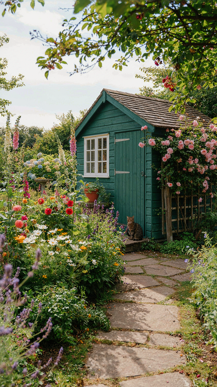
The real rule is subordination, not invisibility. Your shed should read as intentional within the landscape, not erased by it. Subordination means the structure acknowledges the environment without surrendering its identity. Soft greens, warm grays, and muted earth tones subordinate. Flat beige does nothing. Paint contractors and big-box stores push the beige narrative because it sells to people afraid of commitment. Reject it. The mechanism is simple: choose a color that reflects something already present in your yard, then commit to it without apology.
When Your Shed Becomes The Anchor
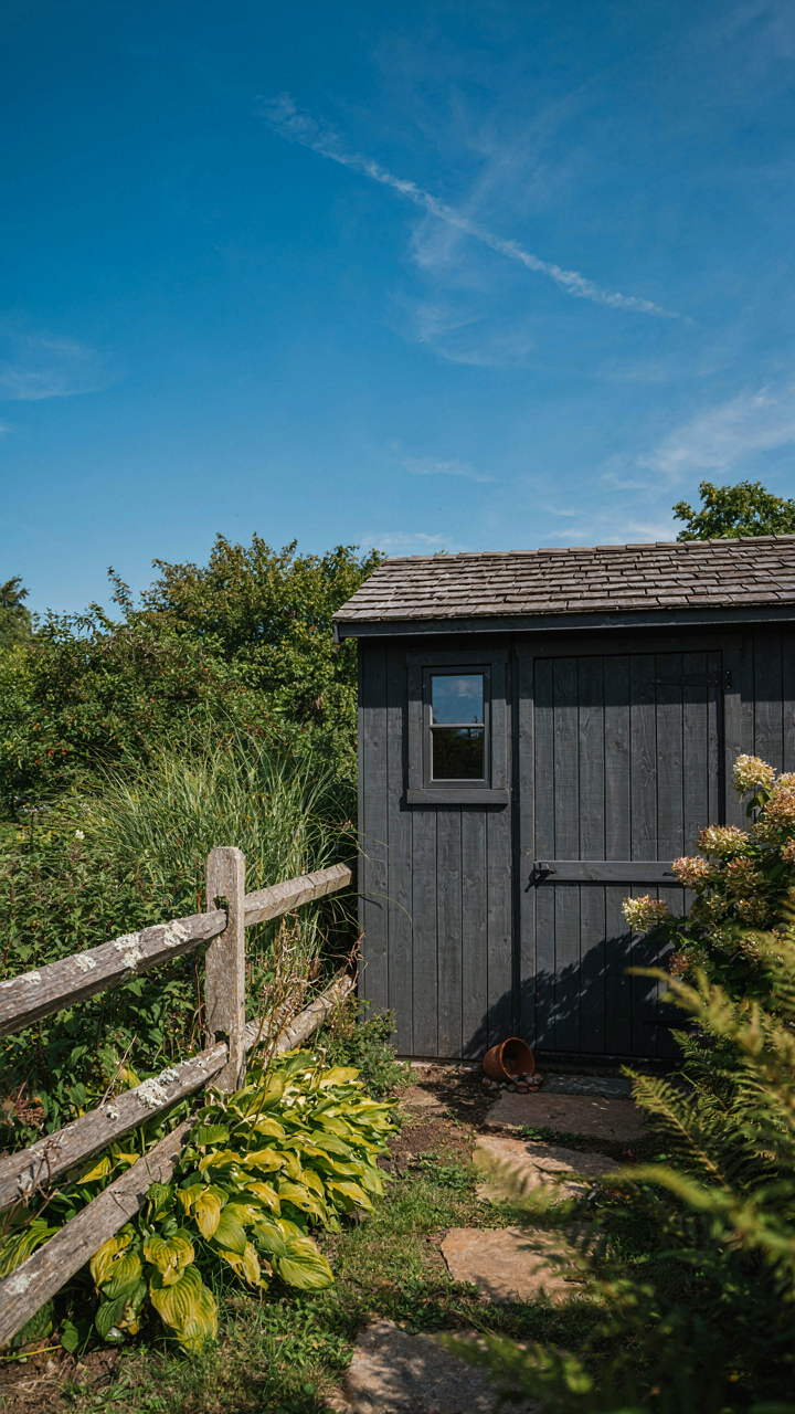
Your shed is either a decision point or forgotten infrastructure. Most people treat it as the latter and lose an opportunity. Focal point strategy requires the shed to earn visual weight through either contrast, placement, or material. A matte charcoal shed against a backdrop of pale deciduous trees becomes functional art. The same charcoal next to a dark fence disappears. Context determines whether subordination reads as sophistication or invisibility.
Build the focal point by considering sightlines from your main windows and primary outdoor gathering spaces. A shed painted in a warm terracotta or deep sage will anchor those views if positioned correctly. Paint it to support the landscape, not hide within it. This means you’re making an active choice about what you want people to see when they look across your property. That choice compounds over years. You stop seeing it as a storage box and start seeing it as part of your outdoor infrastructure. That shift in perspective changes maintenance habits and how you use the space around it.
The Real Obstacle Isn’t The Paint Color, It’s Your Fear Of Standing Out
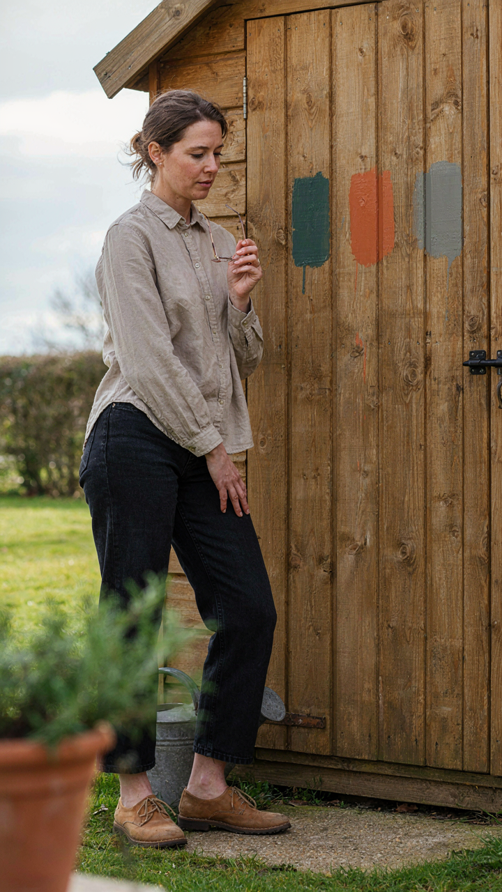
You came here wanting permission to blend in. You wanted the safe taupe, the forgettable gray, the color nobody questions. But the shed that matches the landscape perfectly is invisible, which means it fails. Pick a color that contrasts with your surroundings. Not trendy. Not chaotic. Just intentional. Go buy sample pots today and paint three swatches on your shed’s north side. Live with them for a week. The one you stop noticing is the wrong one. The one that bothers you is the right one.