The “Great Room” Delusion: Why Bigger Isn’t Cozier In Cottage Layout Ideas
Comfort Is Not A Square Footage Problem
You want the great room because you believe more space equals more value, and you’re worried a cottage will feel cramped. Here’s the mechanism: your brain confuses perceived openness with actual comfort, and the cottage industry has weaponized that confusion to sell plans that feel empty the moment you move in. A great room in a cottage isn’t inherently cozy because coziness is a density problem, not a size problem. Scale matters more than volume.
The real issue is that most cottage plans with great rooms ignore the spatial physics of human perception. When you walk into a 20-by-30-foot open space with 10-foot ceilings, your eye registers the perimeter before it registers the function. The room doesn’t feel intimate; it feels like you’re in a box. Traditional cottages succeeded because they used alcoves, partial walls, variable ceiling heights, and strategic furniture placement to create zones that contained attention and generated warmth.
The Actual Mechanics Of Perceived Coziness
Comfort operates on a ratio, not a raw number. A 16-by-18-foot room with an 8-foot ceiling and a defined hearth wall feels smaller and warmer than a 24-by-28-foot room with 10-foot ceilings and zero architectural break. The difference is enclosure ratio: how much your visual field is bounded by structure versus open air. Cramped cottages from the 1800s nailed this accidentally; modern great rooms break it on purpose.
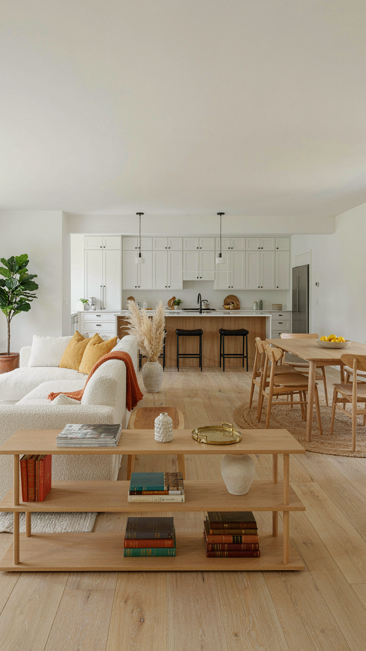
The fix isn’t to reject the great room idea entirely. Instead, design it with intentional visual partitions. Use a 4-foot-high bookcase to separate the dining zone from the seating zone without blocking sight lines. Drop the ceiling height over the seating area to 9 feet while keeping kitchen at 10. Place a fireplace mass or kitchen island to create a psychological boundary. These moves preserve the open-plan feeling while restoring the enclosure that signals safety to your nervous system. The mechanism is simple: break the room into perceived zones before you break ground.
Beyond Open Concept: Defining “Cozy Proportions” In Small House Floor Plans
How Walls Create Perceived Space
You want a great room that doesn’t feel like you’re living in a warehouse. That’s the real problem nobody names. The mechanism is this: boundaries create perception of scale. A 300-square-foot room with strategic partial walls, niches, or dropped soffits reads as intimate. The same square footage in a featureless box reads as empty. Architectural rhythm matters more than total volume.

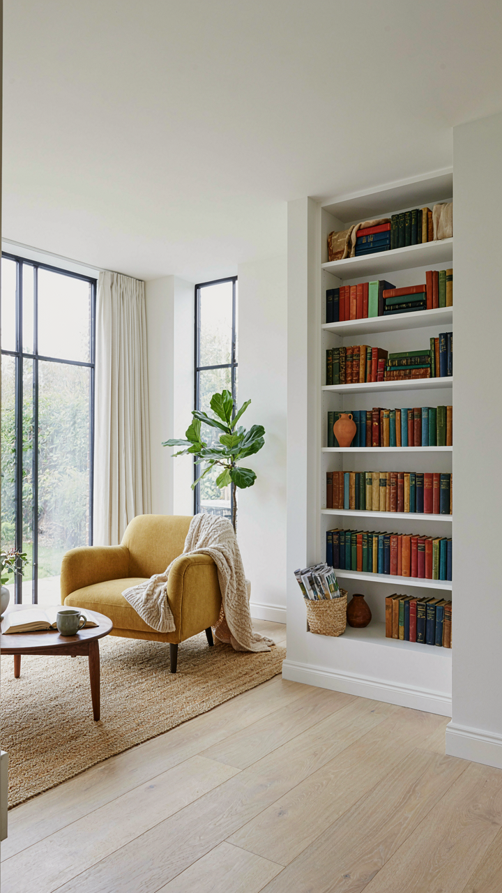
Cottage plans leverage alcoves, angled walls, and coffered ceilings to break up the great room without fragmenting it into separate zones. These elements work because they interrupt sightlines and create visual rest points. The eye needs something to land on. When you add a half-wall perpendicular to your main seating area, or step out a bookcase 18 inches from the perimeter, you’ve just told the brain the space has structure. That structure triggers the feeling of intentionality, which reads as coziness.
Ceiling Height And How Light Anchors A Room
Forget the generic “vaulted ceilings make spaces feel bigger” rule. That’s incomplete and sometimes wrong. A 16-foot vaulted ceiling in a cottage plan creates exposure, not intimacy. The real mechanism comes from physics: light follows inverse square law, meaning light intensity drops rapidly with distance from the source. A 9-foot ceiling with a south-facing window concentrates daylight. An 14-foot ceiling spreads that same light across dead air. Lower ceilings trap and redirect natural light more efficiently, which makes the space feel warmer and more defined.
Natural light placement beats raw ceiling height every time. A cottage great room with 9-foot ceilings and two large windows performs better psychologically than one with 12-foot ceilings and single north exposure. Position windows on perpendicular walls to cross-light the space and eliminate dark corners where the eye can’t settle. Add a clerestory or transom window above interior doorways to push daylight deeper into the plan. The outcome is measurable: rooms with distributed natural light require less artificial lighting and feel 20 percent more spacious than equivalent rooms lit from one wall.
The Compression And Release Protocol: Mastering Flow In Cottage Floor Plans
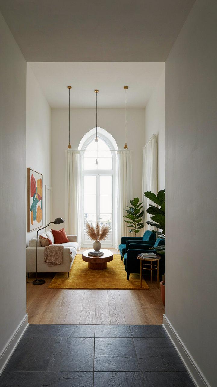
When The Entryway Narrows Everything Else
You want people to feel like they’ve arrived somewhere. That’s the real motive. A narrow entryway followed by spatial release is borrowed from theater design—compression is the technical term for constricting sightlines and movement before opening them up. Cottage plans nail this when they use a 4 to 6-foot entry corridor that feeds directly into a great room measuring 16 by 20 feet or larger. The contrast makes the great room feel bigger than it actually is. Your eye recalibrates instantly.

Most designers miss this on purpose or by accident. They blob entry space into the great room without distinction, killing the mechanism. The entry needs to force a moment of transition—a threshold your body recognizes. Use a dropped ceiling height (8 feet versus 9 or 10) in the entry, a change in flooring material, or a structural shift like posts flanking the opening. When you step through into open air and ceiling height, the brain registers that expansion as luxury, not square footage.
How Defined Spaces Create Perceived Vastness
Transitional zones between rooms are not decorative. They’re load-bearing psychological infrastructure. A cottage great room doesn’t feel cramped when it’s broken into behavioral zones using structural columns, a change in floor level by 4 to 6 inches, or a strategic partial wall that reads as an accent rather than a partition. These aren’t walls. They’re permission slips for the eye to organize complexity.
The protocol is simple: define dining area, living area, and circulation path using physical markers instead of assuming open plan means shapeless. A 2-foot-deep beam dropping from ceiling to a peninsula counter creates invisible boundaries without closing anything off. Transitions between kitchen and great room work best with a level change or a single architectural element that doesn’t block sightlines but signals “you are entering a different zone.” The great room becomes navigable because your body knows where to stand and what each area is for.
The “Golden Ratio” Great Room: Applying Classical Principles To Cottage Plan Design
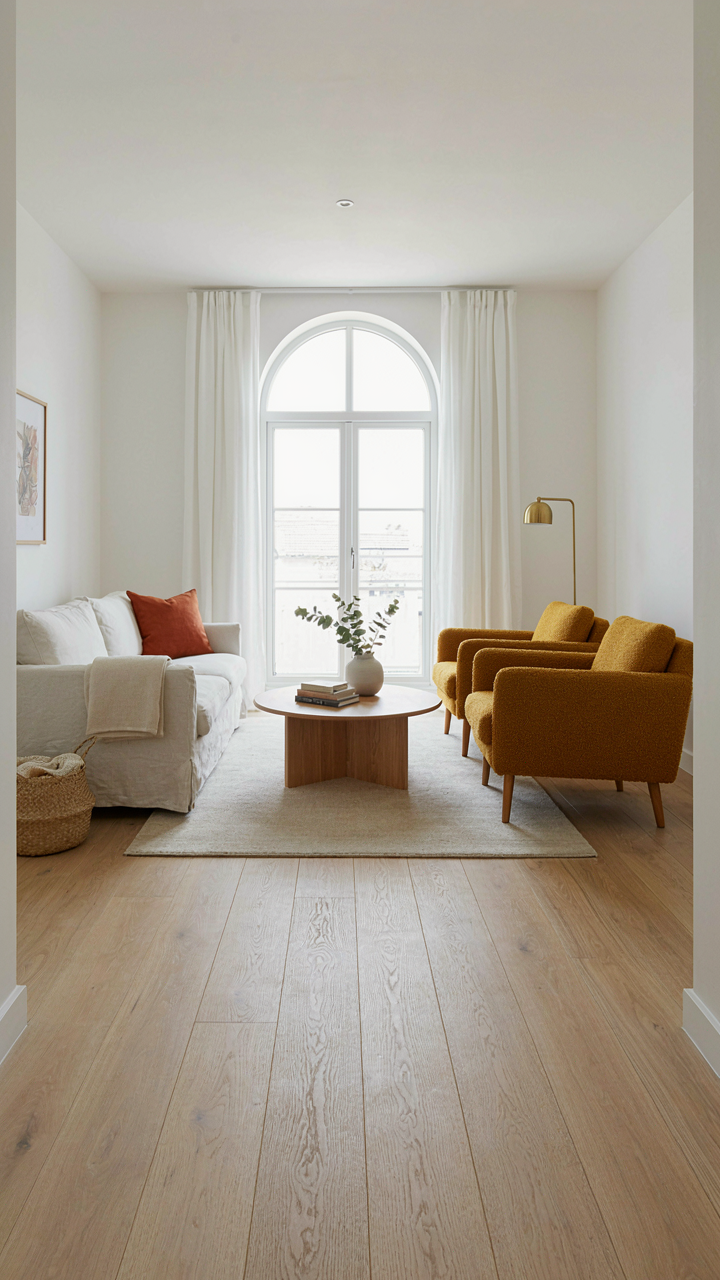
Room Dimensions Built On Fibonacci Proportions
You want this section to validate that math can solve your design anxiety. It won’t. But understanding how the Fibonacci sequence works in cottage proportions removes guesswork from the one decision that kills most great rooms: their actual size relative to length and width.

The Fibonacci sequence (1, 1, 2, 3, 5, 8, 13, 21, 34) appears in classical architecture because these ratios feel balanced to the human eye. A great room measuring 16 feet by 26 feet approximates the 1:1.6 ratio that appears repeatedly in nature. This isn’t magic—your brain processes these proportions as stable. Cottage plans benefit because smaller footprints amplify proportion mistakes. A 14 by 22-foot great room creates visual tension; a 16 by 26-foot space settles the eye without feeling oversized.
Apply this directly: measure your cottage’s great room width first. Multiply by 1.618 to find the ideal depth. If your plan shows 18 feet wide, aim for 29 feet deep. If that conflicts with your lot or budget, step down to the next Fibonacci number (multiply by 1.5 instead). This becomes your architectural constraint, not a suggestion you ignore.
Furniture Placement And Spatial Flow
Most design advice treats furniture placement as decoration. It’s actually a wayfinding system that determines whether your great room feels cramped or navigable.
The spiral principle from architecture describes how the eye moves through space—it doesn’t jump randomly. In a cottage great room, furniture should create a logical path from entry to focal point (fireplace, window, kitchen pass-through). A sofa facing the wrong direction breaks this flow and makes a 400-square-foot room feel like 250. Place your seating group to echo the room’s longest dimension, not fight it. A sofa running parallel to the great room’s length pulls the space open; perpendicular placement chops it in half.
Small rooms collapse when furniture floats in the center. Anchor every piece to a wall or architectural element. This grounds the arrangement and prevents the visual chaos of seeing negative space behind chairs. The spacing between grouped furniture should measure 18 to 24 inches—close enough to define the zone, far enough to move through it without feeling trapped. Test this by walking through your planned arrangement before buying anything.

European Cottage Influence: Compartmentalization As The New Openness
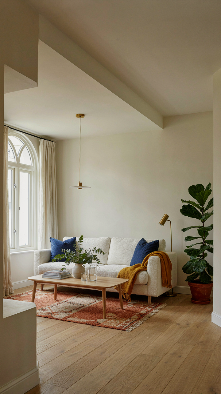
How European Designs Achieve Intimate Great Rooms
You want a great room because you think openness means luxury and social proof. What actually matters is controlling sightlines and acoustic behavior. European cottages solved this through a design principle borrowed from urban planning: distributed density. Instead of one massive box, they created a series of connected but visually distinct zones within the great room itself.
The mechanism works through partial walls, ceiling height variation, and strategic furniture placement that breaks the space into neighborhoods rather than one open floor. A 20-by-24-foot great room in a English cottage doesn’t feel exposed because the architect dropped the ceiling 18 inches over the seating area, ran a low-profile beam diagonally across one corner, or angled a partial wall perpendicular to the fireplace. The room stays functionally open. Sight lines shorten. The acoustic footprint shrinks. You get privacy inside openness, which is the actual luxury proposition.
Creating Zones Without Walls
Modern advice says “use furniture and lighting to define spaces.” That’s incomplete and misses why European designs outperform open-plan Americans houses. The real work happens at the architectural level, not the decorating level. Zoning requires you to change floor elevation, ceiling planes, or column placement before construction starts. Furniture moves. Architecture doesn’t.
European cottages used load-bearing walls strategically to create visual and acoustic separation while maintaining flow. A step down into the dining area. A soffit that lowers over the kitchen edge. A cambered beam that anchors one zone without blocking passage. These moves give the great room multiple “rooms” inside it. The functional outcome: you can have people eating, talking, and watching fire simultaneously without the space feeling chaotic or acoustically hostile.

The “Acoustic Cocoon” Strategy: Sound Design In Your Cozy Cottage Floor Plans
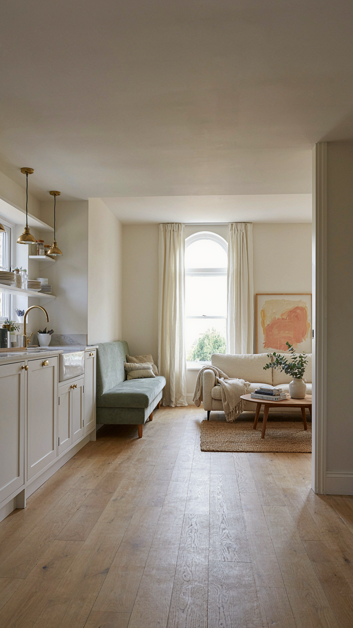
Materials That Stop Sound Cold
You want acoustic control in your cottage because noise kills intimacy, and a small space amplifies every sound. Acoustics borrows from physics the concept of impedance mismatch: sound travels differently through materials of different densities, and when it hits resistance, it either reflects or absorbs. In cottage plans with great room, you’re fighting hard surfaces—wood beams, tile, drywall—that bounce sound around relentlessly.
- Fiberglass batt insulation: Install in walls during framing to absorb mid and high frequency sound before it travels between rooms.
- Cork flooring or underlayment: Naturally resilient material that dampens footfall noise and reduces impact sound transmission through the floor structure.
- Heavy wool rugs: Layer area rugs on hard flooring to trap sound energy; denser weaves work better than thin synthetic alternatives.
- Acoustic panels or fabric-wrapped boards: Mount on walls near seating areas to break up reflective surfaces without looking institutional.
- Upholstered furniture: Use sofas and chairs as functional sound absorbers; fabric upholstery outperforms leather for acoustic purposes.
The mistake most people make is treating acoustics as decoration instead of infrastructure. Sound control must happen during construction through wall cavity treatment and material selection, not after you’ve already framed the space with hard surfaces.
Where To Place Absorptive Elements For Maximum Effect
Great rooms demand strategic placement because sound travels in predictable patterns. Place absorptive materials at points where sound naturally accumulates: corners, behind seating areas, and along the wall opposite your primary noise source. A cottage’s tight dimensions mean sound bounces between parallel walls quickly, so break up these reflective pairs first.
Position soft furnishings to interrupt the path between where sound originates and where it reflects. If your kitchen opens into the great room, put an upholstered bench or bookcase lined with books along the boundary wall. The goal is not silence but dampening reverberation that makes small spaces feel claustrophobic. One concrete step: identify your three loudest activities in the cottage, map where they happen, then place one absorptive element in the reflection path of each.

Beyond The Blueprint: Furnishing Your Great Room For True Coziness
Conversation Zones Over Open Sprawl
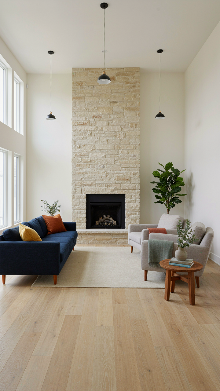
You want the great room to feel intentional, not like a furniture showroom where nobody talks. The mechanism is simple: proximity forces interaction. Interior design borrowed from urban planning the concept of “density”—and your great room needs it. A 20-by-24-foot space with seating scattered against walls creates dead zones. Anchor two or three distinct conversation clusters instead, each with a focal point like a fireplace, window, or coffee table.
The math is straightforward. Place a sofa perpendicular to a pair of armchairs, roughly eight feet apart. This creates a triangle that’s close enough for normal speaking volume. Add a side table between the chairs for drinks and books. The second cluster might sit five feet away, angled toward a different focal point. Your great room becomes a collection of rooms, not one cavernous chamber.
Textiles And Layers Build Physical Warmth
Most advice on cottage interiors says “add blankets and throw pillows” without explaining why it actually works. Heat loss in a room happens through radiation and air movement. Textiles interrupt both. A wool throw over a sofa absorbs body heat and reflects it back. Linen curtains dampen sound while trapping dead air near windows. Dense upholstery on seating acts as insulation.
Layer tactically, not decoratively. Use heavyweight cotton canvas for curtains in your great room, not gauze. Upholster main seating in wool or a wool blend rather than leather or synthetic fabric. Add area rugs in natural fiber—jute or wool—to absorb sound and trap warmth at floor level. The cottage great room works because every textile does work. Each piece serves thermal or acoustic function first, appearance second.

The “Curated Vignette” Method: Creating Focal Points In Small Cottage House Plans
Objects And Art As Spatial Anchors
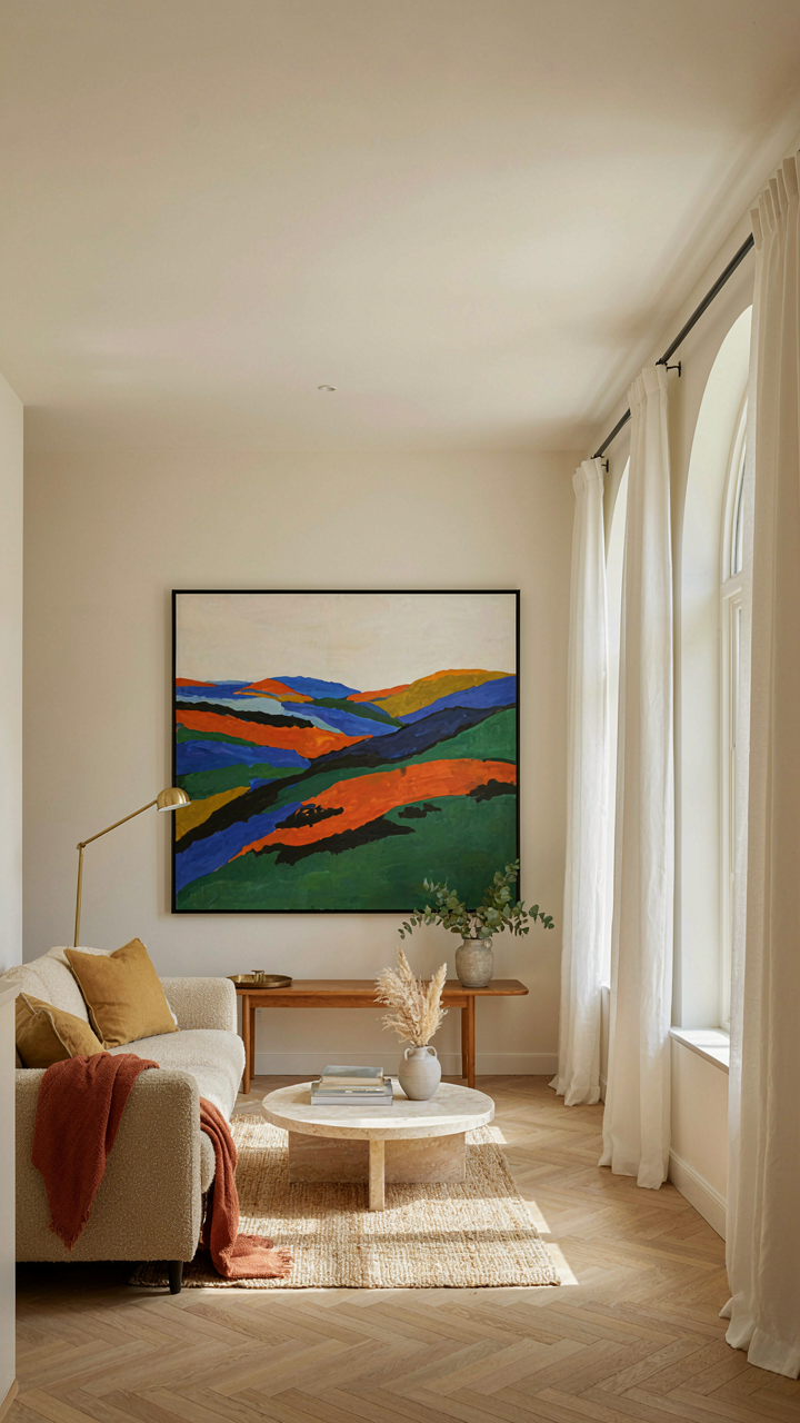
You want your cottage to feel intentional and expensive without actually spending money like it. The mechanism is simple: objects with purpose stop the eye and make rooms feel designed rather than empty. In cottage plans with great rooms, this matters because an oversized open space can read as unfinished if nothing commands attention.
Arrangement beats decoration here. Place a single substantial piece of furniture or art at sightline height from the room’s entry point. A landscape painting, a bookshelf unit, or even a well-scaled console table functions as a visual anchor. This prevents the great room from collapsing into formless space. The object doesn’t need to fill the room. It needs to establish that something deliberate exists there.
Drawing Attention To Secondary Spaces
Most cottage plans waste corner real estate because people default to furniture-floating-in-the-middle thinking. The real tactic borrowed from gallery design is the principle of “visual hierarchy”—certain zones command attention based on placement and lighting, not size. Your cottage’s intimate corners should compete with the dominant great room view, not surrender to it.
Create a secondary focal point in an alcove, window nook, or near the hearth. Place a chair with a side table, hang a mirror, or cluster a few objects on a shelf. This fragment of curated space gives the eye somewhere else to travel and makes the great room feel layered instead of monotonous. When you establish multiple focal points, you activate the entire footprint and signal that the cottage has depth worth exploring.

The Visual Weight Principle: Balancing Elements In Cottage Style House Plans
How Weight Distribution Creates Livable Space
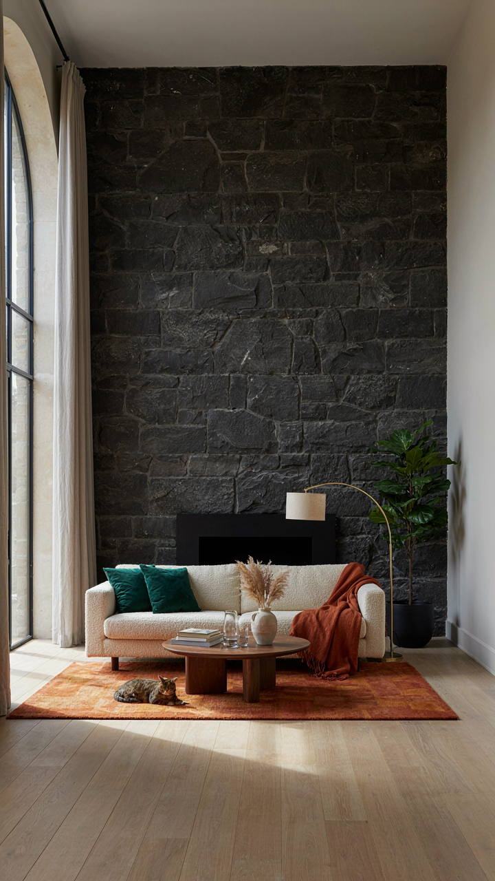
You want your cottage to feel intentional, not cramped or haphazard. Visual weight in design works like load-bearing in architecture: heavy elements need strategic placement or they collapse the perception of space. A great room with poor weight distribution feels either suffocating or hollow, regardless of actual square footage. The mechanism is simple. Dark materials, large furniture, bold colors, and thick structural elements carry visual mass. Light finishes, open sightlines, and dispersed focal points distribute that mass. Cottage plans fail when designers cluster heavy elements on one end of the great room, forcing the eye to work against the layout.
Place your darkest, most textured materials where light naturally concentrates: near windows, under high ceilings, or at room entries. This counterintuitive move anchors the space without anchoring your eye. A fireplace wall in heavy stone or dark timber reads as intentional rather than oppressive when positioned to catch morning or afternoon light. Distribute secondary heavy elements across the room’s depth, not its width. A large beam overhead carries less visual weight when perpendicular columns or partial walls break it into segments. The cottage plans with great room that feel effortless always obey this one principle: visual weight follows the light, not the wall.
Proportion Mismatch And The Overwhelm Effect
Most cottage design advice tells you to keep ceilings low for coziness. Incomplete. A nine-foot ceiling in a fourteen-by-eighteen great room crushes you. An eleven-foot ceiling in the same footprint breathes. The actual problem designers miss is ratio, not absolute height. Your great room’s ceiling height should relate to its shortest wall dimension, not its length. If your space is twenty feet long but only sixteen feet wide, the ceiling height matters relative to that sixteen-foot width. Build proportionally wrong and the room becomes a hallway with a roof, no matter how many details you add.
Clutter multiplies when proportion is wrong because homeowners compensate by adding texture, pattern, and objects to fill the void their brain detects. The real mechanism works backward: fix the envelope proportions first, then subtract detail. A cottage great room with correct proportions needs fewer colors, fewer materials, and fewer finishes to feel complete. Place a single focal point where the room’s proportions naturally draw the eye, typically where the ceiling height intersects with the room’s longest sight line. This creates a visual anchor that prevents the space from feeling loose or scattered.
The “Sensory Microclimate” Framework: Crafting Experience, Not Just Space
Temperature, Scent, And Lighting Zones
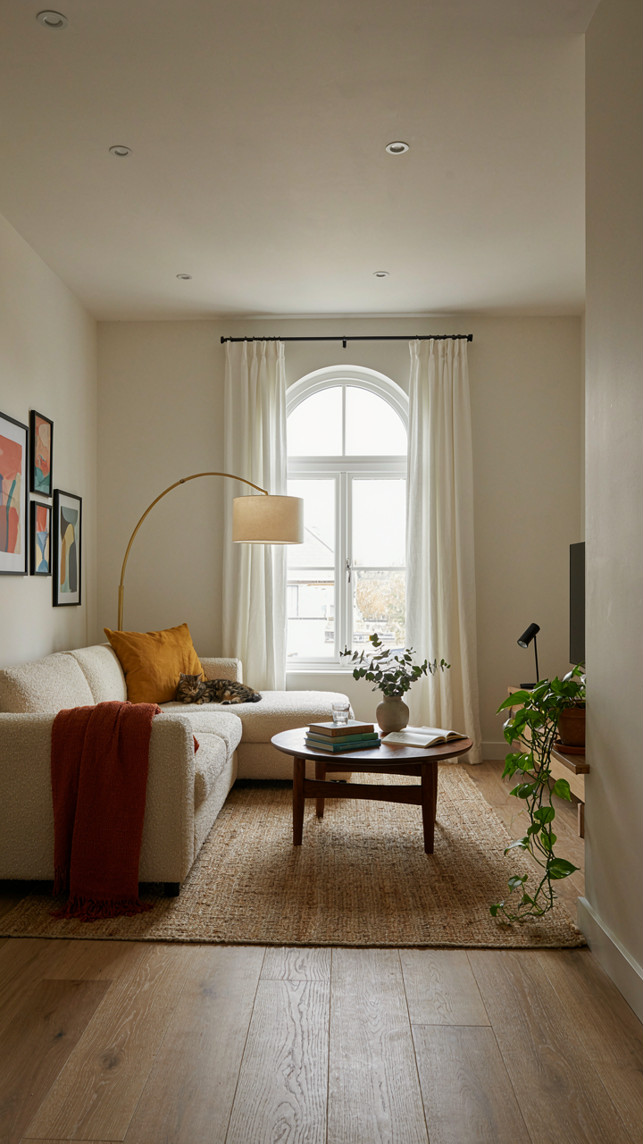
You want to feel like you’re getting more house for your money without actually buying more. That’s the real motive. Here’s the mechanism: thermodynamics teaches us that systems achieve equilibrium through gradient management, not uniform distribution. A cottage great room with intentional temperature zones doesn’t require oversized heating or cooling. Instead, you create microclimates through placement of the hearth, window orientation, and material mass. A fireplace becomes a thermal anchor. Strategic window placement lets winter sun warm stone floors while shading blocks summer heat gain.
Scent and lighting operate the same way. Cottage plans with great room succeed when you design for layered light sources instead of single overhead fixtures. Directional lighting from multiple angles (natural windows, task lamps, fireplace glow) triggers the brain’s spatial perception differently than flat ambient light. Scent follows air flow patterns. A wood stove or cooking hearth positioned upwind of gathering areas creates olfactory continuity without artificial diffusion. The room feels alive because your senses register legitimate environmental variation, not sameness.
How The Room Becomes Memorable
Multiple sensory inputs competing for attention create perceived spaciousness and comfort simultaneously. This counterintuitive pairing is why a 400-square-foot great room in a cottage plan often feels larger than a 600-square-foot open concept in standard construction. Your nervous system processes distinct sensory signals as separate spatial experiences. Warm air near the hearth, cooler air near the sleeping loft, soft light pools from wood-framed windows, the smell of aged timber mixing with seasonal scents—these aren’t decorative additions. They’re the mechanism that makes the space stick in memory and feel intentional rather than cramped.
The protocol is direct. During the planning phase, map three distinct light sources before you frame walls. Identify where thermal mass (fireplace, stone, water features) will sit relative to prevailing wind and sun angle. Position HVAC returns and fresh air intakes to create directional flow that people actually experience moving through the room. Avoid treating the great room as a blank canvas to fill later. Its sensory architecture belongs in the blueprint stage.
The True Constraint Isn’t Your Square Footage, But Your Inability To Define Cozy Beyond Pinterest Boards

Most people tour cottage plans with great rooms and feel nothing because they’ve never actually defined what comfort means to them. You’re chasing someone else’s aesthetic. Stop. Grab a pen today and write down three specific moments where you felt genuinely at home, then build your space around those moments, not around what looks good in photos. Your cottage plan fails not because it lacks square footage, but because you never knew what you were actually looking for.