The “Gabled House” Lie: When Charm Becomes Clutter
Authenticity Over Imitation
You want the Instagram version of a cottage because it signals taste without requiring actual taste. Here’s what nobody admits: the mechanism is borrowed from theater design—the difference between a set and a space. A set performs for an audience. A space functions for inhabitants. Modern cottage fails when you prioritize the visual performance over how your body actually moves through the room.
Real cottage design emerged from constraint, not choice. Thick walls existed because they insulated. Low ceilings saved heat. Small windows were expensive. Victorian and Arts and Crafts cottages didn’t choose coziness—they engineered it. Faking that aesthetic while ignoring its logic creates the uncanny valley of design: looks right, feels wrong. Strip away the false beams and ask what problem each element solves in your specific climate and daily routine.
Functionality First, Aesthetic Second
The common advice is backwards. Most design writing treats aesthetics as the engine and function as the passenger. Wrong. Function is the constraint that produces authentic aesthetics. When you force yourself to answer “what does this do?” before “how does this look?” the style emerges without effort. Modern cottage becomes coherent because every element earns its place through use, not sentiment.
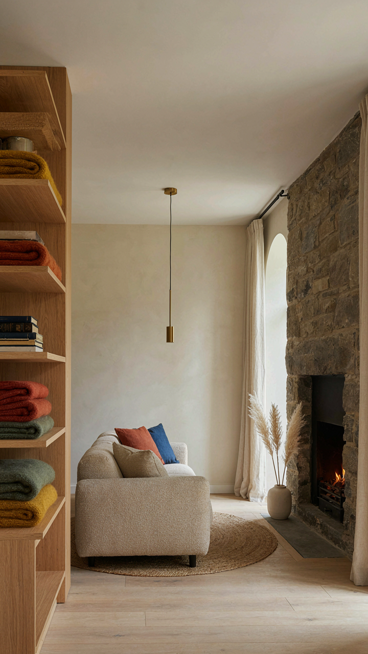
A working fireplace that heats a room looks better than a decorative one because you see it alive. Open shelving in a kitchen works if you actually use what’s visible and wipe it down weekly—otherwise it’s performance. Built-in storage that handles seasonal gear differently than daily items outperforms pretty shelving that forces everything into one aesthetic cage. Design the system first. The charm follows naturally because honesty has better aesthetics than imitation ever will.
Cottage Exterior: The Brutalism Of Simplicity
Honest Materials, Honest Answers
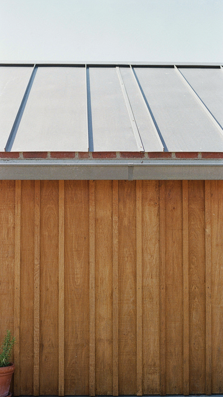
You want this to look effortless. That’s the real driver. The fear is that trying too hard will show, so you’re hunting for permission to strip things down. Here’s the mechanism: material honesty isn’t about aesthetics. It’s about refusing to disguise what something is. A board is a board. Brick is brick. Render is render. Modern cottage exteriors work because they stop pretending materials are something else.

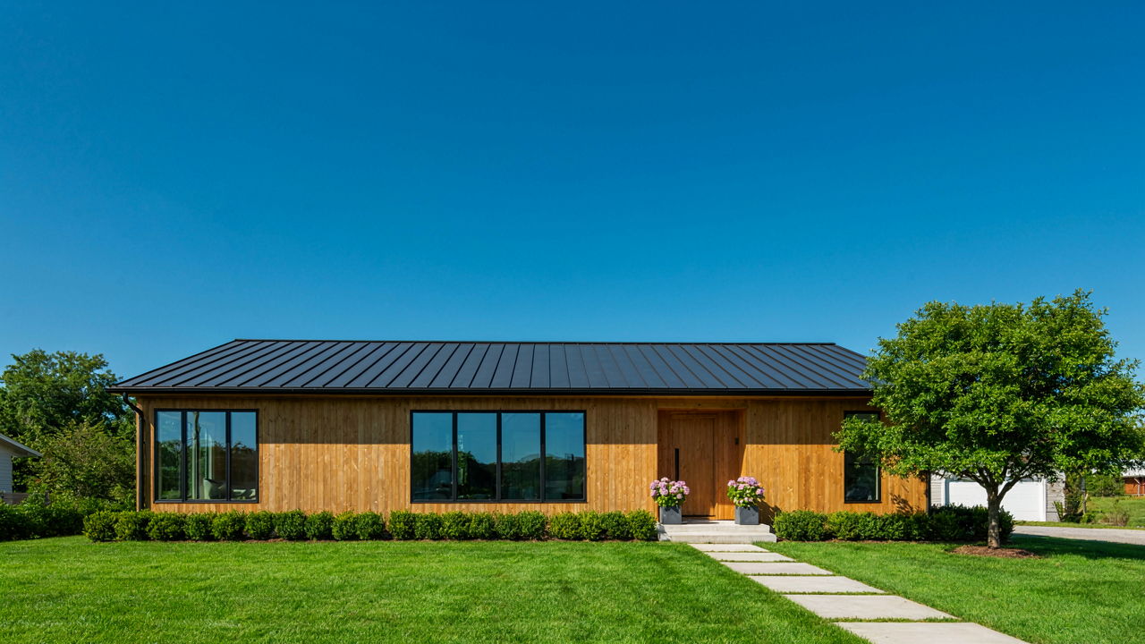
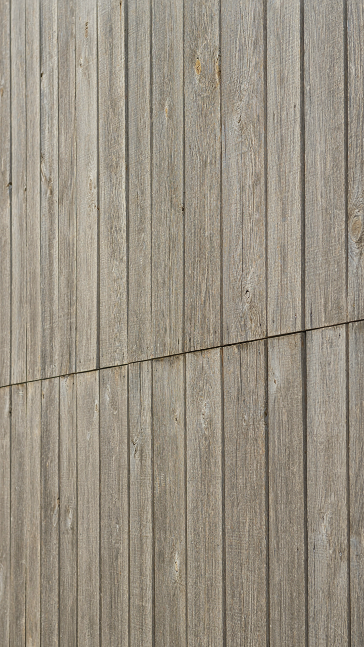
The common advice says to “mix textures for visual interest.” That’s backwards. Mix materials for structural and maintenance truth. Rough-sawn timber weathers visibly—that’s the point. You see the material doing its job. Unpainted cladding, lime mortar joints, standing seam metal roofing. These materials tell you how they’ll age, which means you’re not surprised or disappointed in five years. Material honesty defined is this: the exterior tells you exactly what will happen to it.
Clean Lines As Purposeful Constraint
Constraint forces better decisions. From engineering, this is the principle of load path—every element carries something specific, and you see that job happen. Applied to modern cottage design, clean lines aren’t decorative. They’re the visual evidence that nothing redundant is present. Every line either marks a structural joint, a material transition, or a functional boundary.
Remove the ornament and you’re left with what actually does work. Roof edges that overhang for rain protection, not decoration. Fenestration placed for light and cross-ventilation, not symmetry. Door frames that sit flush because the wall plane continues unbroken. When you stop adding trim for the sake of “character,” you discover the real character emerges from how the building actually performs. The constraint isn’t limiting. It’s clarifying.
Modern Cottage Architecture: The “Sweet Home Style” Deception
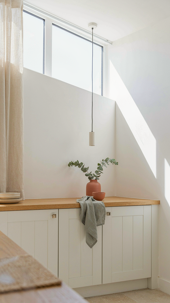
Scale And Proportion Beat Decoration
You want the Instagram version of cottage life without admitting you’re terrified of building something that looks cheap. The real mechanism isn’t what you add—it’s what you control. Modern cottage fails when architects treat it like Victorian seaside fantasy with clean lines slapped on top. The actual skill is discipline in proportion. A room doesn’t feel cottagelike because of shiplap. It feels cottagelike because ceiling height, doorway width, and window placement match how humans actually move through small, efficient spaces.

The mistake everyone makes is thinking embellishment creates character. It doesn’t. Character emerges from honest proportions. A 9-foot ceiling in a 12-by-14-foot bedroom creates coziness through mathematics, not decoration. Window placement matters more than window style. When you align openings to frame views and create rhythm across a wall, the cottage feeling arrives without trying. This is why traditional cottages worked—they followed proportion rules born from material scarcity and manual labor, not aesthetic preference.
Natural Light As Structural Bone
Architecture borrows from physics the concept of load paths—the actual routes force takes through a building. In modern cottage design, map this onto how daylight moves through rooms. The typical advice says “add more windows.” Wrong. You need windows positioned to let daylight penetrate deep into interior spaces and reset the visual hierarchy of rooms throughout the day. One strategically placed southern window creates more usable light than three random openings.
The reason matters: cottage spaces were small partly by necessity, partly because artificial light was expensive or nonexistent. Modern cottages kept these dimensions but removed the darkness problem. Position windows to eliminate dark corners where rooms feel cramped. Use clerestory windows and skylights to push light into kitchens and bathrooms where it performs work. This isn’t decoration. It’s restoring the primary design element that made the cottage format function in the first place.
Pitched Roofs & Barn House Logic: Borrowed Engineering
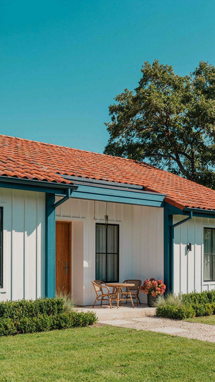
Why Your Roof Angle Actually Matters
You want a pitched roof because it looks right. That’s not the real reason to build one. Structural physics treats a roof as a load distribution problem, and a pitched roof solves it differently than flat geometry does. The angle forces water and snow downward and away from the structure instead of pooling. This isn’t aesthetic choice. It’s load management borrowed directly from barn engineering, which solved this problem centuries ago out of necessity, not taste.

The pitch angle determines how fast water sheds and how much lateral force the walls absorb. A shallow pitch (4:12 to 6:12) moves water reliably while keeping wind resistance moderate. Steeper pitches (8:12 and above) shed snow faster but increase uplift during storms. Modern cottage designs typically land at 6:12 to 7:12 because that angle splits the difference between aesthetic preference and actual physics. The framing members run smaller and the foundation takes less stress at that slope than at 12:12. Your architect isn’t choosing the pitch for Instagram. They’re choosing it because that angle makes the building cheaper to maintain and harder to damage.
Air Movement Solves The Problem Consensus Gets Wrong
Everyone says cottages should “breathe.” That language is garbage. What they mean is thermal mass and ventilation work together to regulate interior temperature without forcing mechanical systems to do all the work. Barn design teaches this directly: mass holds heat or coolness, and air movement prevents stagnation that rots wood and breeds mold.
A pitched roof creates a natural convection loop when you vent the attic properly. Hot air rises into the peak, exits through soffit vents or gable vents, and pulls cooler air from the living space below. This cycle runs free, no electricity required. Combine that with proper wall assembly—a moisture barrier that lets vapor escape but not liquid water—and you get a cottage that doesn’t require constant air conditioning in moderate climates. The mechanism is simple: ventilation channels heat away before it penetrates interior walls. Your pitched roof isn’t just shedding rain. It’s engineering a pressure differential that keeps the building dry and temperature stable.
The Spartan Illumination Protocol
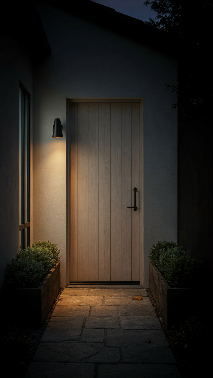
Exterior Lighting Less Is More
You want people to see your house at night because you think that proves you’ve built something worth looking at. That’s backwards. The mechanism is restraint: modern cottage exterior lighting works because it contradicts the suburban instinct to flood everything in brightness.

Cottage design inherits from periods when exterior lighting didn’t exist. When you add it now, less actually reads as intentional. A single sconce beside the entry. Path lights spaced far enough apart that darkness exists between them. This creates visual hierarchy instead of ambient soup. Modern cottage restraint signals control, not neglect.
Strategic Placement For Function Not Glow
Common advice says light up the facade to showcase architecture. Wrong. The real function of exterior lighting in modern cottage is wayfinding and safety, not display. Architectural lighting is what insecure renovations do.
Place lights where people move: entry points, steps, transitions between surfaces. Fixture placement should answer the question “where does someone need to see.” Aim light downward or sideways, never upward into trees or sky. This prevents light pollution, keeps the night visible, and makes the house read as deliberate rather than desperate. Warm color temperature (2700K or lower) maintains cottage character while functional placement keeps visitors from tripping. This is the only metric that matters.
Contemporary Architecture: The Unseen Force Of Flow
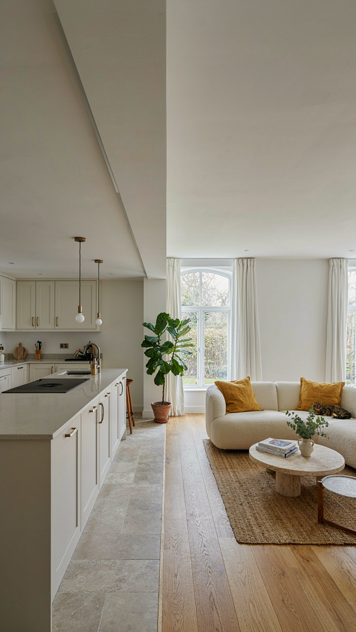
Why Open Plan Fails Without Intention
You want open plan because you believe it signals modernity and makes spaces feel bigger. That’s not actually why it works. The real mechanism comes from architecture’s control of visual hierarchy and movement patterns. Modern cottage design borrowed this from retail and hospitality: zones created through material shifts, ceiling height changes, and furniture placement beat walls every time. You get openness without sprawl.

Rooms within rooms solve the problem open plan can’t touch. A kitchen that reads as distinct from the living area through a subtle level change or beam structure maintains spatial logic. Cottage design typically uses material transitions instead of barriers. Lower ceilings over the kitchen, higher over the gathering space. Tile to wood. Stone to plaster. These shifts telegraph function without sacrificing the connected feeling buyers actually want.
- Material Thresholds: Shift flooring type at zone boundaries. Wood to stone defines the kitchen from the living area without a wall interrupting sightlines or natural light flow.
- Ceiling Height Variation: Drop ceilings 6-12 inches over functional zones like kitchens or entry halls. Raises perceived height in main gathering spaces by contrast alone.
- Structural Elements: Exposed beams, posts, or half-walls create visual breaks without blocking movement. They anchor each zone’s identity while maintaining openness.
- Furniture Anchoring: Position sofas and tables to define zones rather than float them. A dining table against a partial wall edge marks territory through placement, not partition.
- Lighting Zones: Install separate circuits and fixture types per area. Overhead in work zones, pendant or ambient elsewhere. Signals function through illumination rather than walls.
The cottage formula works because it respects human movement patterns. People naturally navigate by material cues and spatial rhythm, not walls. Modern cottage abandons the open-concept-at-all-costs mentality and uses the language of craft to organize function. This approach scales to any square footage without feeling fragmented or cluttered.
The Weight Of What You Can And Cannot See
Sightlines control whether a space feels restful or chaotic. The mechanism here is basic neurology: your visual cortex processes everything in your peripheral field as potential threat or navigation point. Unbroken sight lines to clutter, kitchen mess, or bedroom doors trigger low-level cognitive load. You relax less. Guests feel it too.
Modern cottage solves this through partial obscuring without walls. A kitchen positioned around a corner so the stove and prep zone hide from the main living sight line. A bedroom door aligned behind a structural element or partially screened by a bookcase. The space opens physically but closes visually. You can move freely while the eye finds rest points instead of overwhelming detail. This is not decoration. This is operational efficiency for the nervous system.
Sight line manipulation determines whether your cottage feels like refuge or retail display. Design sightlines first. Everything else follows from that decision. Where does someone stand in the main living zone and what do they actually need to see? Orient hidden zones accordingly. Block sight lines to function, not people. The goal is openness that doesn’t exhaust.

Luxury House Fallacy: True Value Isn’t Visible
Build For Decay, Not Display
You want people to know your cottage cost money. That’s the real reason you’re reading this. Here’s what actually matters: in material science, we call it “degradation pathway”—the predictable way something fails. Modern cottages that last don’t hide their degradation. They accelerate it predictably, then replace the part. A slate roof shows its age. A synthetic material tries to hide it, then fails catastrophically when the hiding stops. Choose materials that degrade visibly and slowly. Cedar siding grays over decades. Vinyl tries to stay white, then cracks from UV. One tells you when to act. One surprises you with a $15,000 replacement.
The cottage aesthetic rewards this logic. Exposed timber joints fail visibly at the connection, not inside the wall. Stone foundations show water damage on the surface, not in hidden cavities. This isn’t charming. It’s functional. You get ten years of notice before you need to replace something, not a surprise basement flood. Build every choice around this: can I see the failure coming? If not, you’ve picked the wrong material. That’s the entire decision framework.
Maintenance Reduction Beats Visual Impact
Everyone talks about “low-maintenance finishes” and means nothing. They mean paint that lasts five years instead of three. That’s not low-maintenance. That’s slow-maintenance. Real maintenance reduction means: stop doing the thing entirely. A modern cottage with sealed wood loses to a cottage with untreated wood that you stop treating. The sealed wood needs refinishing every seven years. The untreated wood needs nothing once the initial weathering stops. Shale gray siding needs washing. Truly weathered cedar needs inspection, not washing. One demands your attention. One demands your acceptance.
The mechanism is simple: design out the maintenance task, don’t reduce its frequency. Metal gutters need cleaning. Copper gutters develop patina and route water without intervention. A deck needs staining. Stone terracing needs nothing except occasional weed removal. Every design choice is a choice to either commit to a five-year cycle or to opt out entirely. When you’re planning your modern cottage, ask yourself per material: “In ten years, if I never touch this, what happens?” If the answer is “it looks better,” you’ve found a material worth using.

The Un Adornment Method: Stripping Back To Soul
Decluttering As Ongoing Design Principle
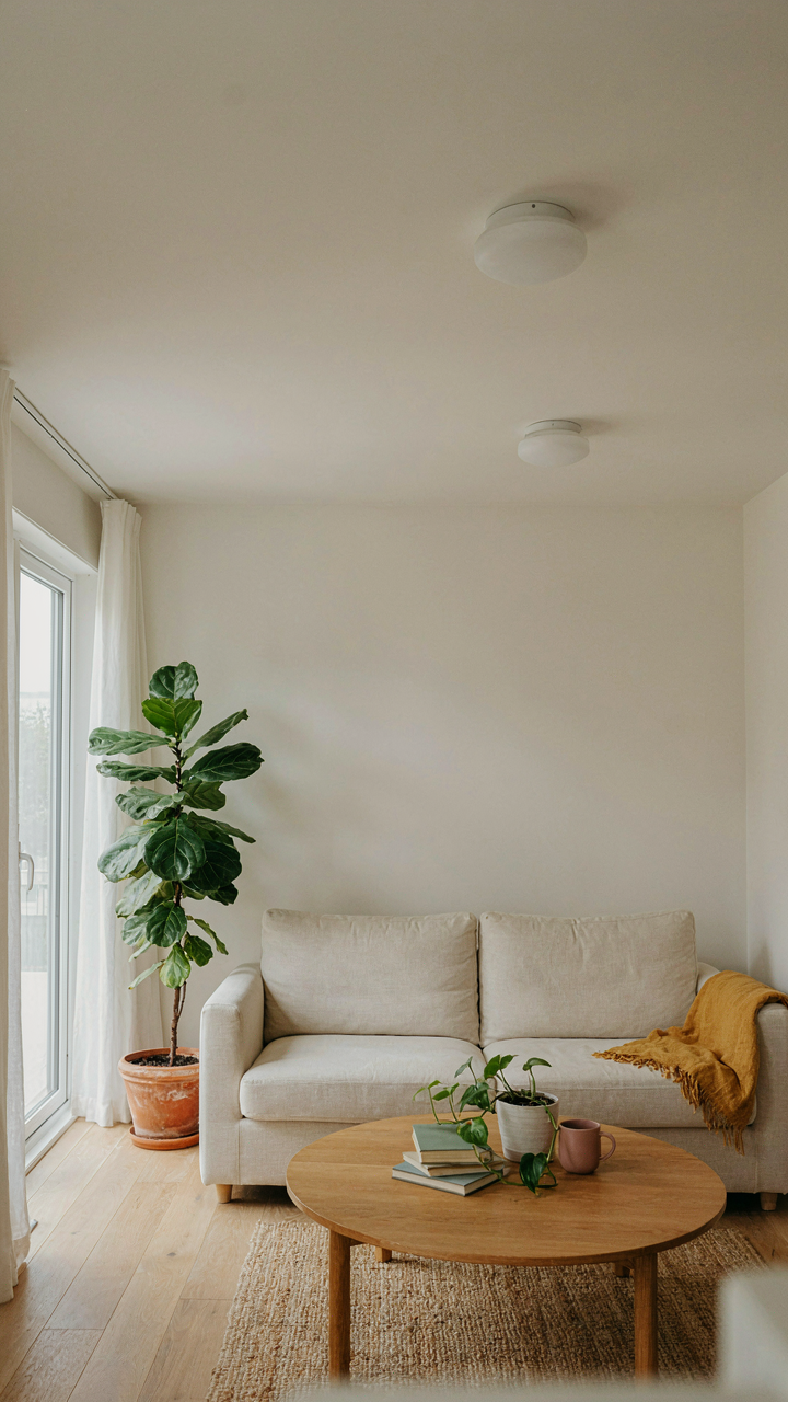
You want permission to own less and feel like you’re winning. Here’s the mechanism: decluttering isn’t a one-time event in modern cottage design—it’s the operating system. Most people treat it as spring cleaning. Wrong. In systems theory, constraint creates stability. Remove objects systematically, and you force the remaining pieces to earn their space through function or genuine visual weight.
Modern cottage design demands intentionality because the aesthetic has no visual noise to hide behind. A farmhouse can absorb clutter. Minimalism exposes it. Start by auditing what actually lives in each room, then establish a rule: if an object doesn’t serve daily life or anchor the room’s narrative, it leaves.
- Daily-use objects only: Keep items you touch or see regularly. Decorative pieces that require dusting or rearranging are friction, not design.
- Seasonal rotation: Store off-season items completely. Visible storage defeats the point. Modern cottage thrives on what’s present now, not potential future use.
- Surfaces as editing tools: Bare countertops and tables force decisions. Each new item must justify itself against the clean baseline you’ve established.
- Vertical consolidation: Group similar objects into contained zones. Open shelving in modern cottage works only when items are curated by material, color, or function—not scattered.
- The one-in-one-out rule: For every new piece entering a room, something equivalent leaves. This prevents gradual creep and keeps the design thesis intact.
The outcome isn’t sterility. It’s clarity. When you remove 60 percent of what occupies a room, the remaining 40 percent suddenly has visual authority. That’s the design win nobody mentions: constraint breeds presence.
Cultivating Negative Space
Negative space isn’t empty. It’s the working material between objects. Most designers treat it as leftover accident. In modern cottage, it’s what makes the difference between cluttered farmhouse and composed restraint.

The real move is recognizing that negative space has three jobs: it lets your eye rest, it defines scale, and it amplifies what remains. A single chair in the corner of a bare wall reads louder than five chairs arranged “cozily.” Negative space creates hierarchy. Fill every gap and nothing matters.
Modern cottage lives in the tension between texture and breath. You need enough visual material to feel warm—wood beams, stone, aged surfaces—but enough air around it to feel intentional. This balance collapses the moment you add decorative objects to “fill” space. Resist that instinct completely. Instead, position key pieces and let the room breathe around them. The moment you stop trying to populate every corner, the design starts working.
The Only Thing Holding You Back From A Truly Modern Cottage Isn’t Design, But Your Inability To Define Your Essential Needs
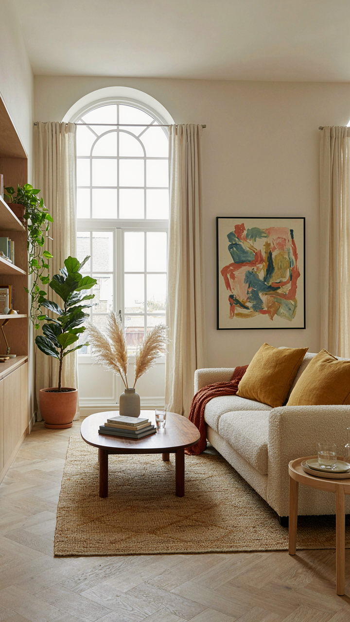
Most people chase aesthetics before asking what they actually need. They pin farmhouse kitchens and shiplap walls without knowing if they work from home, entertain constantly, or crave solitude. Your modern cottage fails because you’re designing for Instagram, not your life. Stop scrolling inspiration boards today. Instead, spend one hour writing down how you actually live in your space. Then build backward from that truth. Design follows function, not the other way around. Everything else is just expensive decoration.