The Myth Of Grandeur: Why Size Never Equaled Power

Social Climbing Built The Floor Plan, Not Function
You want to believe a big Victorian parlor meant wealth and taste. It didn’t. It meant debt and desperation to signal status to people who didn’t care. The Victorian floor plan operates on a scarcity principle borrowed from economics: the more space you devoted to rooms nobody actually lived in, the richer you appeared. Parlors, grand entry halls, and formal dining rooms existed as pure theater. Families ate elsewhere. Children played elsewhere. The parlor was a stage set for displaying furniture you couldn’t afford to anyone passing the front windows.
The mechanic is simple. Space = capital in a visual market. Victorian builders stacked unused rooms into plans not because they improved living but because they advertised spending power. A modest middle-class family would sacrifice kitchen efficiency, bedroom size, and servant quarters to maintain a showpiece parlor. The floor plan forced them into inefficiency by design. Every square foot of marble-floored entrance hall was a square foot not spent on heating, plumbing, or actual comfort. The Victorian floor plan was a financial commitment masquerading as architectural sophistication.
Hidden Inefficiencies Built Into The Bones
The common take misses this: Victorians didn’t build grand plans despite inefficiency. They built them because of inefficiency, and called it elegance. Consider servant circulation. A proper Victorian home required hallways long enough for servants to move between kitchen, bedrooms, and dining room without being seen by guests. This meant corridors that wasted 15 to 20 percent of usable floor space, all to maintain the illusion that food appeared and dirty dishes vanished through magic. Those hallways served one purpose: hiding labor.
Temperature control collapsed across these plans. Grand parlors with high ceilings and exterior walls bled heat. Fireplaces couldn’t warm 18-foot rooms efficiently, so families in cold months abandoned the parlor entirely and congregated in smaller rooms with better heat retention. The grand staircase became a wind tunnel. Architects knew this. They built it anyway. The plan’s form contradicted its function because the function was never comfort or livability. The function was the appearance of having achieved something. When you’re examining a Victorian floor plan, stop asking why it’s laid out so wastefully. Start asking what image the owner needed to project.
Victorian House Floor Plans: The Servants’ Secret Economy

Invisible Pathways Labor Dictates Layout
You want to understand Victorian floor plans because you think they’re about aesthetic taste or social display. They’re not. The layout was an operational system designed to hide work. Economics calls this “factor allocation,” and in Victorian homes, the factor wasn’t money—it was human movement. Every hallway, staircase, and pass-through existed to route servants away from sight lines while keeping them positioned to serve on command.

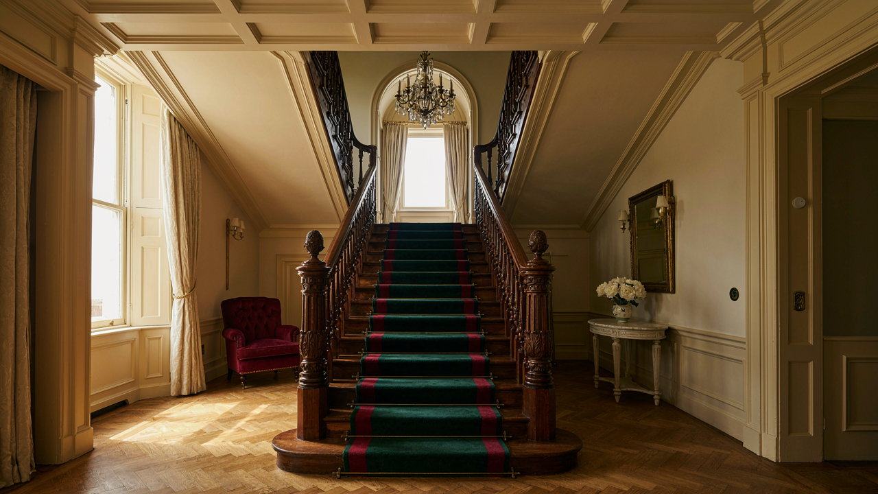
The grand staircase didn’t dominate the plan because of beauty. It dominated because it was the only staircase visible to guests. Servants used narrow back stairs, often wedged into corners or hidden behind walls. These weren’t afterthoughts. Architects calculated their placement with precision. A servant staircase positioned near the kitchen, butler’s pantry, and dining room meant food moved from preparation to table without crossing through occupied rooms. The family never saw the machinery that fed them.
Energy Flows Mapped In Forgotten Spaces
Most Victorian analysis misses the real efficiency metric: steps eliminated, not added. The floor plan wasn’t wasteful because it had many rooms. It was efficient because rooms clustered by function. The kitchen sat distant from family living areas to isolate heat and smell, but servant corridors connected kitchen to dining room to pantry to serving areas in tight sequence. A housemaid needed fewer steps to complete her route, meaning more time for other tasks, meaning lower labor costs.
The second-floor layout reinforced this. Family bedrooms occupied prime space with natural light and views. Servants’ quarters crowded into attic spaces or narrow upper-floor rooms with minimal windows. This wasn’t cruelty encoded in architecture—it was cost control. Servants didn’t need view access. They needed proximity to service stairs and storage for linens and chamber pots. The floor plan routed their daily labor as the primary design driver, with family comfort layered on top as a secondary concern. Architects who ignored labor flow produced homes that were expensive to run.
The Parlor’s Paradox: Social Theatre, Not Sanctuary
The Friction Between Performance And Privacy
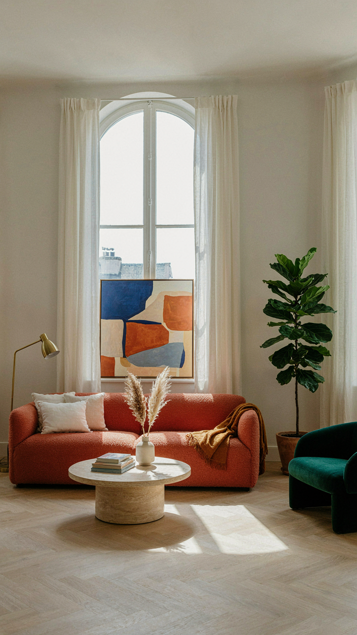
You want to believe a Victorian parlor was a retreat. It wasn’t. The parlor operated on theatrical economics: guest perception determined its design, not the comfort of people who actually lived there. This is pure signaling architecture. The family’s real life happened elsewhere, in spaces visitors never entered. The parlor was a stage set built to broadcast status, and every inch of it was calculated for that single purpose.

The parlor sat at the front of the house for one reason: maximum visibility. Passersby could see through the windows. Guests entered directly from the street into these rooms. Nothing here was accidental. Wallpaper, furnishings, and spatial arrangement all coded wealth and taste to an audience. The actual inhabitants spent minimal time there. When they did, they performed. The parlor demanded a version of yourself that was controlled, formal, and profitable to your reputation.
Design That Serves The Audience
This mirrors the economic concept of principal agent problems: the room’s designer prioritized the guest’s perception over the inhabitant’s utility. The parlor’s layout trapped function. Conversation seating faced inward in rigid formations. Windows were dressed in heavy textiles and layers that blocked light and air. Fireplaces provided minimal heat. Furniture was ornamental first, functional second. A Victorian parlor was hostile to sustained use by the people paying for it.
Performance architecture demands specific sacrifices. Doorways remained narrow to create controlled entry points. Ceilings rose high to signal expense and space. Mirrors multiplied the visual impression of crowding without adding actual room. Every detail whispered to guests, not inhabitants. The inhabitant learned to endure the space as a cost of maintaining the signal. Those who stayed comfortable did so elsewhere, in breakfast rooms, studies, and bedrooms the public never saw.
Grand Stairs: The Vertical Status Symbol Trap
When Height Becomes Hierarchy
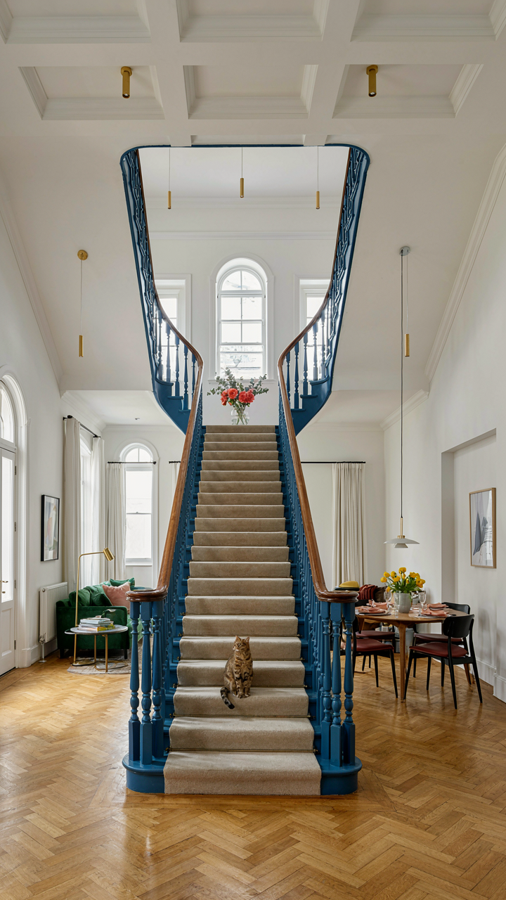
You want the grand stair because it signals arrival. Everyone sees it. Everyone moves through it. But here’s what actually happens: Victorian architects borrowed from military strategy—the principle of vertical dominance. A commanding position controls the room. The stair accomplishes this through pure visual real estate. It consumes floor space at every level, fragments room adjacency, and forces traffic patterns around a central monument to itself. The parlor’s spatial efficiency dies the moment the stair becomes the design centerpiece instead of the circulation.

What you’re not told: most Victorian homes with grand stairs feel smaller than modest homes without them. The stair occupies dead volume. Rooms shrink. Hallways tighten. You gain symbolic power and lose practical living space. The trade-off was acceptable for the wealthy who had rooms to spare. For everyone else, it was pure visual theater masking spatial poverty.
The Hidden Cost Of Vertical Movement
Most design writing skips the energy economics here. Victorian households without mechanical systems relied on servants and family members moving goods, water, and bodies up and down multiple stories constantly. The grand stair looked impressive during formal visits. It destroyed daily workflow. A person living in the house moved across it dozens of times per day, often carrying things. Each trip burned time and effort.
The mechanism is simple: ornamental grand stairs add nothing to function. A narrow, efficient stair tucked to the side saves square footage, shortens walking paths, and reduces steps per trip. Victorian homeowners accepted grand stairs as non-negotiable status markers. The constraint was psychological, not technical. Modern floor plans that copy this choice inherit the inefficiency without the social payoff that justified it.
Victorian Mansion Layout: The Queen Anne’s Gambit Protocol
The Parlor As Information Control
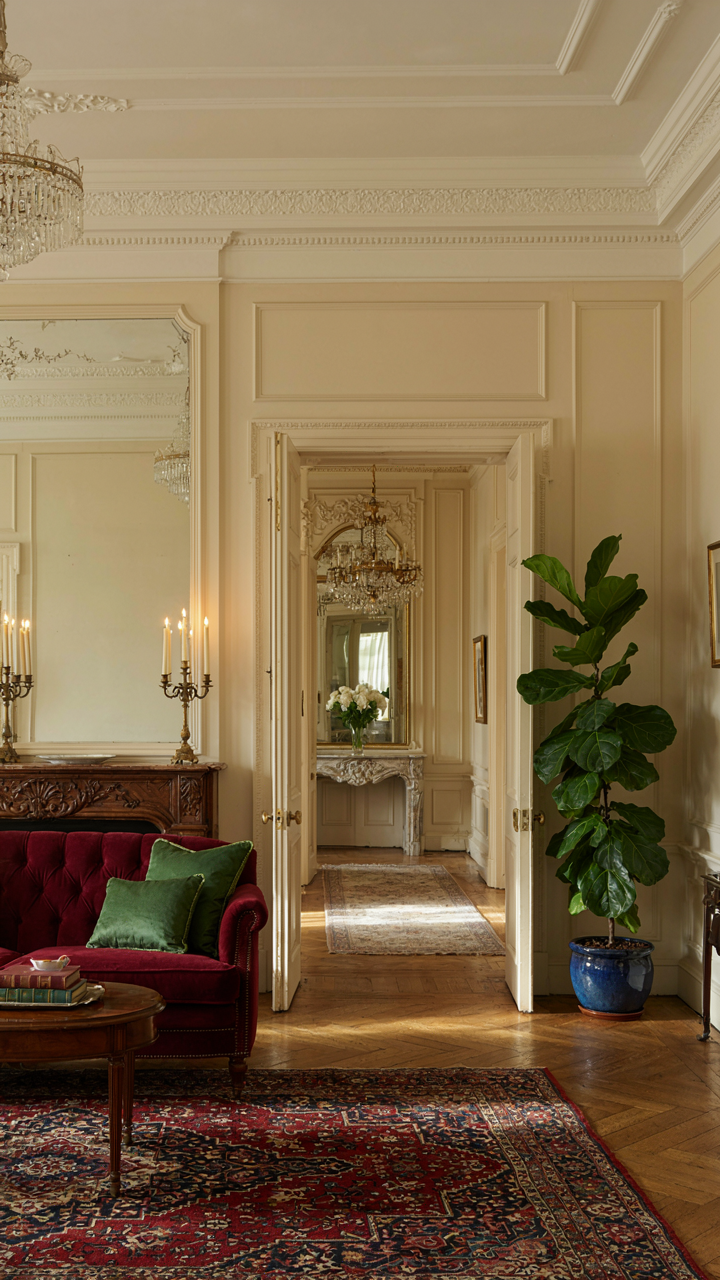
You want to know this because you’re trying to understand how spatial design signals power. Here’s the mechanism: military strategy uses chokepoints and sightlines to control enemy movement. Victorian architects weaponized the same principle through room sequencing. The parlor wasn’t just a sitting room—it was an intelligence checkpoint. Visitors moved through it first, meaning the family controlled what they saw, heard, and learned about the household before accessing inner rooms.

The Queen Anne style (1880-1910) formalized this by placing parlors adjacent to entry halls. This forced a mandatory social filtering step. You couldn’t reach the dining room, library, or bedrooms without passing through the parlor where family members stationed themselves. The layout enforced a ritual of observation before penetration into private space. Every transition required implicit permission, signaled through conversation or gesture, not locked doors.
Strategic Choke Points And Movement Restriction
The real trap everyone misses: they think hallways were just connectors. They weren’t. Victorian floor plans used narrow hallways and single-door transitions as movement controllers. In military terms, this mirrors the principle of funneling—forcing the enemy into predictable, observable paths. Queen Anne mansions did this deliberately. The main staircase sat in a central hall visible from the parlor. Anyone ascending was under surveillance.
Servants had separate staircases, narrow and hidden, running parallel to main circulation routes. This wasn’t just class separation—it was operational architecture. The family could move through public space and monitor all entry and exit points simultaneously. Chokepoint design meant fewer doors between rooms, forcing specific traffic patterns. A visitor couldn’t drift unobserved through a side passage. The spatial grid itself enforced a hierarchy of access, making social rank visible through where you were allowed to move.
Beyond Victorian Style Homes Map: The Modern Efficiency Blueprint
When Walls Disappear, Intention Appears
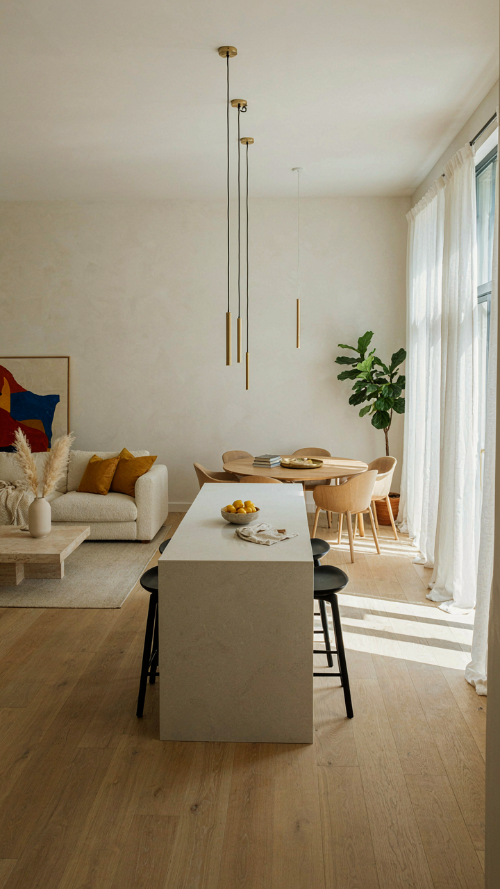
You want to gut the walls because you think openness equals progress. The real mechanism is constraint removal masking poor layout decisions. Victorian parlors were separate for a reason: they allowed different social functions without acoustic or visual collision. The open concept doesn’t create connection—it forces proximity and demands constant negotiation of noise, sight lines, and activity overlap. You’re trading one problem for another without understanding what the original design solved.

The Victorian floor plan separated zones by function and formality. The parlor stayed formal. The dining room stayed ceremonial. The library stayed quiet. Remove those walls and you’ve removed the architecture’s ability to buffer incompatible activities. Modern efficiency demands you rebuild those boundaries through placement and materials, not demolish them through ideology. Study Victorian entries: they used vestibules and transition spaces to manage temperature, noise, and social ritual. That’s not waste. That’s compression engineering.
Rooms That Refuse Single Purpose
Victorian design had a flaw everyone misses: it locked spaces into rigid roles. A parlor was a parlor. A morning room was a morning room. Modern efficiency means the opposite of Victorian specialization, but the opposite of bad specialization isn’t no specialization. It’s flexible specialization. The difference matters because it changes how you occupy space.
A Victorian morning room received eastern light and held modest seating for correspondence and needlework. That specificity was waste when the room sat empty twelve hours a day. Modern adaptive design borrows the Victorian insight about light and adjacency but strips the rigid purpose. A space adjacent to the kitchen with eastern exposure becomes morning work station, informal dining, or overflow hospitality depending on the hour. You’re not erasing function. You’re letting one room absorb multiple functions without structural conflict. The mechanism: overlapping activity timelines in a single footprint, not simultaneous activities crashing into each other.
The Sims Victorian House Layout Fallacy: Digital Dreams, Real World Nightmares
When Aesthetics Override Function
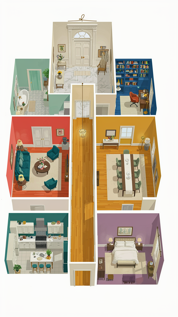
You’re drawn to this section because you’ve built a beautiful Victorian layout in The Sims and now you’re wondering if it actually works in reality. Here’s the mechanism: games reward visual composition over inhabitant flow. The Sims doesn’t penalize you for a parlor requiring a fifteen-second walk through three rooms. Real Victorian homes punish this instantly through wasted time, heat loss, and daily friction that compounds over decades.

Victorian floor plans prioritized ceremony over efficiency because labor was cheap and servants managed circulation. A game engine has no concept of servant routes, fuel costs, or the psychic drain of inefficient movement. When you admire a Sims Victorian layout, you’re admiring a fantasy that worked only when household staff handled the inefficiency tax for you.
The Scale Trap And What Gets Erased
The Sims 4 displays rooms at roughly 10 by 10 feet when the engine actually treats them as abstract containers. Real Victorian parlors ranged from 18 to 30 feet long. Your digital Victorian bedroom looks proportional until you realize that staircase in the corner would occupy 40 square feet of floor space in reality, not the four grid squares it occupies on screen.
The game hides operating costs entirely. Heating a Victorian home with separate rooms and high ceilings required constant fuel and labor. A parlor used only in evenings sat cold all day. A Sims house costs nothing to heat and render empty hallways generate zero regret. When translating a layout to real construction, you inherit these economic realities that the game simply removes from the equation.
Queen Anne Victorian House Plans: Optimizing For True Value
When Preservation Costs More Than Replacement
You want to preserve the original because it feels authentic and you fear losing character. Here’s what nobody tells you: Victorian homes use economics from a labor-surplus era. A grand staircase required skilled carpentry that cost nothing relative to today. Preservation locks you into reproducing those same labor costs with modern wages, but the functional output stays identical.

The real choice isn’t preservation versus renovation. It’s deciding which original features generate actual utility versus which ones consume capital for nostalgia. Load-bearing walls, floor joists, and plumbing runs demand preservation because replacing them is structurally catastrophic. Ornamental ceiling medallions, hand-carved newels, and elaborate dado rails produce zero functional return and cost thousands to restore or replicate. Strip the second category without guilt.
The Grand Feature Trap
Economics teaches us about sunk costs. Victorian floor plans embed “cost sunk in prestige rather than performance” into every parlor and vestibule. You see a showpiece staircase and calculate renovation as restoration. The mechanism is different. That staircase consumed 12 percent of the original builder’s budget for visual dominance in a 1890 home where entertaining in the entry was core business. Your home’s core business is different.
The parlor solved a specific problem: separating entertaining space from family living when servants managed the boundary. You don’t have servants. You have one kitchen, one family, and no need for ceremonial zones. Practical ROI means measuring whether a 400-square-foot parlor sitting empty most days justifies its maintenance, heating, and renovation cost against converting it to a functional home office or auxiliary kitchen. Run the calculation on square footage cost per hour of actual use, not on how the room photographs for resale.
Victorian Style House: Dissecting The Architectural Ego
Surface Drama Masking Dead Space
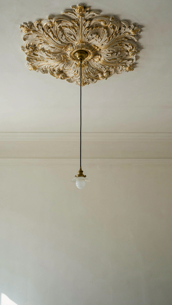
You want to believe a Victorian floor plan proves your taste. Here’s what actually matters: ornamentation in these homes served zero functional purpose. The parlor existed to signal wealth. The grand staircase consumed square footage that could heat, sleep, or feed a family. Wallpaper, crown molding, and plaster cornices were pure display. They demanded maintenance, harbored dust, and created visual noise that distracted from the real problem: inefficient room layouts.

The mechanism runs like economics. You pay a cost for every decorative element. In Victorian design, owners paid in maintenance labor and material expense while gaining nothing but visual ranking against neighbors. The ornament was the entire point. Function followed aesthetics, not the other way around. A simpler ceiling would cost less to plaster, less to clean, and less to repair. Victorians chose ornament anyway because ornament broadcast purchasing power. That choice embedded itself into the structure itself.
The Cost Of Frozen Image
Maintaining a Victorian home now means inheriting someone else’s status performance. You cannot strip the crown molding without feeling like you’re desecrating history. You cannot remove the parlor without admitting it was always wasted footage. The floor plan locks you into a narrative: “This is a Victorian home, and Victorian homes have these features.” Reality is different. That narrative protects nobody. It traps you.
The real trap is treating original features as non-negotiable. Many Victorian homeowners today remove walls, modernize kitchens, and eliminate formal rooms because they conflict with how people actually live. This signals something crucial: the original occupants were also constrained by style, not freed by it. The floor plan was a status cage then and remains one now unless you treat it as raw material instead of scripture. Your renovation decision is not about authenticity. It is about whether you prioritize function or image.
The Minimalist Victorian: Reclaiming Space And Sanity
What Actually Matters In A Room
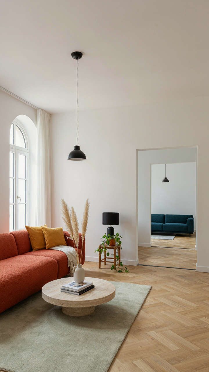
You want permission to throw things away without feeling like you’re betraying history. The mechanism is this: Victorian floor plans weren’t designed around objects. They were designed around movement and function. The parlor held conversation. The dining room held eating. The hall held arrival. Everything else was decoration that served the room’s purpose, not the reverse.
The consensus advice says “keep period-appropriate items.” Wrong. What matters is the spatial logic underneath. A Victorian floor plan works because rooms have clear thresholds, distinct purposes, and furniture scaled to human movement. Strip away the decorative excess and you keep the structure that actually functions. Here’s what stays:
- Doorways and thresholds: The architectural bones that define room boundaries and sight lines. These create the psychological separation Victorians understood instinctively.
- Fireplace placement: Victorian hearths anchored rooms spatially and thermally. Keep the focal point even if you remove the ornamental surround.
- Ceiling height and proportions: The vertical relationships that make a room feel coherent. These proportions shaped how Victorians arranged furniture and movement.
- Window placement and depth: Victorians sited windows for light distribution and social positioning. The bay or sash placement determines furniture arrangement, not vice versa.
- Molding at key transitions: Base moldings and cornices define zones without adding clutter. They’re the structure, not ornament, when kept minimal.
- Staircase geometry: Grand stairs weren’t decorative status symbols first. They were circulation paths that organized multi-story living. The geometry dictates traffic flow.
What you remove is the furniture multiplication that happened later. Victorians layered objects into rooms until they suffocated the original logic. A parlor needed seating, a table, a lamp. Everything else compressed the space. Modern minimalist Victorian design means: restore the room’s actual function by removing what obscured it.
Living With Less Drama
Victorian rooms were designed to compress multiple functions into one space without chaos. That’s the opposite of what most people think minimalism means. Minimalism isn’t emptiness here. It’s ruthless prioritization of what the floor plan actually demands.
The grand staircase in a Victorian entrance hall isn’t minimal because it’s restrained. It’s minimal because it does one thing brilliantly: it marks arrival and organizes the upper floors visually from the ground level. Every other element in that hall serves that geometry or gets cut. Apply this logic room by room. A dining room needs a table scaled to the room’s proportions, chairs, light above. A sideboard only if the wall depth can handle it without blocking movement. Movement paths matter more than decoration abundance.
The practical step is this: stand in each room and trace the actual traffic pattern from door to functional zone. Furniture should create barriers only where Victorian spatial logic requires separation, like a parlor from a hall. Everything else should keep sightlines clear and movement fluid. That’s when a Victorian floor plan feels intentional instead of cramped.
The Grand Facade Obscures A Simple Truth: True Command Isn’t Built, It’s Earned
Victorian floor plans didn’t create power. They displayed it. The parlor wasn’t a room. It was a statement. Today you’re obsessed with the wrong architecture entirely. Stop studying how the wealthy arranged their spaces and start studying why they arranged them that way. Walk through your own home right now. Every room you’ve chosen, every corner you’ve designed, reveals what you actually value. Your space doesn’t lie about who you are. Your choices do.