The Deceptive Power Of “Open Concept” For Your Tiny Cottage Living Room
Why Walls Matter More Than You Think
You want open concept because you think it signals sophistication and solves the problem of feeling cramped. It doesn’t. Open concept actually compounds the problem in tiny cottage living rooms because there’s no visual rest. Every piece of furniture, clutter, and activity bleeds into every other piece. The eye has nowhere to land. In visual hierarchy terms borrowed from graphic design, you’ve eliminated all contrast. Without walls or architectural breaks, a tiny cottage becomes a single undifferentiated zone where chaos spreads faster and feels more chaotic.
The real mechanism is this: small spaces need strategic enclosure, not removal of it. Partial walls, sliding panels, or even bookcases create psychological boundaries that make the room feel larger, not smaller. This works because your brain processes defined zones as separate territories, each with room to breathe. A cottage living room with three distinct visual sections registers as more spacious than one open barn where everything competes for attention at once.
When Everything Becomes Nothing
The common advice says remove walls to expand space. This is incomplete and misses what actually happens in cottage living rooms when you strip away structure. Open layouts work in large homes because square footage absorbs activity. In 150 square feet, an open plan turns your living room into a dumping ground where cooking smells sit on furniture, work materials migrate into relaxation zones, and visual noise overwhelms the senses. You end up with less functional space, not more.
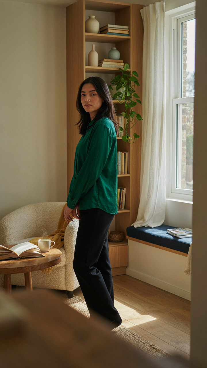
The solution isn’t more openness. It’s strategic opacity. Use tall bookcases, half-walls, or sliding barn doors to create zones without demolition. Each zone then operates under its own visual rules. Your seating area stays a seating area. Your reading nook stays contained. This separation paradoxically makes the cottage feel more spacious because your brain doesn’t process the entire footprint as one failing attempt at openness. Instead, you get multiple rooms that each feel intentional and complete.
The Void Protocol: Creating Space Through Radical Deletion In Your Small Cottage Living Room

Stop Treating Your Room Like A Storage Unit
You want your cottage living room to feel open because you’re afraid of looking poor or cluttered, and that fear keeps you buying furniture to fill silence. But here’s the mechanism: in information design, signal-to-noise ratio determines clarity. Your living room works the same way. Too many objects create visual noise that contracts the space psychologically, even if the square footage stays identical. The room doesn’t need more square feet. It needs fewer competing claims on your attention.

Most people approach this backward. They add storage solutions, organizational systems, and decorative objects to “make the space work.” Wrong move. The space works by having less in it. Deletion is the only tool that reliably makes a small cottage living room feel larger because you’re not fighting your brain’s processing limits anymore. Start by identifying what actually serves a function or genuinely brings utility. Everything else is clutter pretending to have a job.
The Math Of One In, Two Out
Cottage living tends toward accumulation because older homes reward people who think they might need something someday. The real purge methodology isn’t aspirational. It’s mechanical: for every new object you bring in, two objects leave the room permanently. Not stored elsewhere. Gone. This forces a brutal honesty about what stays because you can’t maintain the room’s openness while hoarding.
The friction this creates is intentional. When you know bringing in one throw pillow means surrendering two existing items, you stop impulse buying. You stop collecting. You get selective. Your cottage living room stops being a repository for “maybe” and becomes intentional. Pick the objects that earn their weight in daily use or genuine aesthetic purpose. When those two items leave, they leave to donation or disposal, not to a closet upstairs. This prevents the psychological trick where you think you’ve decluttered while actually just hiding the problem.
The Physics Of Perception: Manipulating Volume, Not Just Area For Cozy Cottage Interiors Small Houses
Empty Space Works Harder Than Stuff
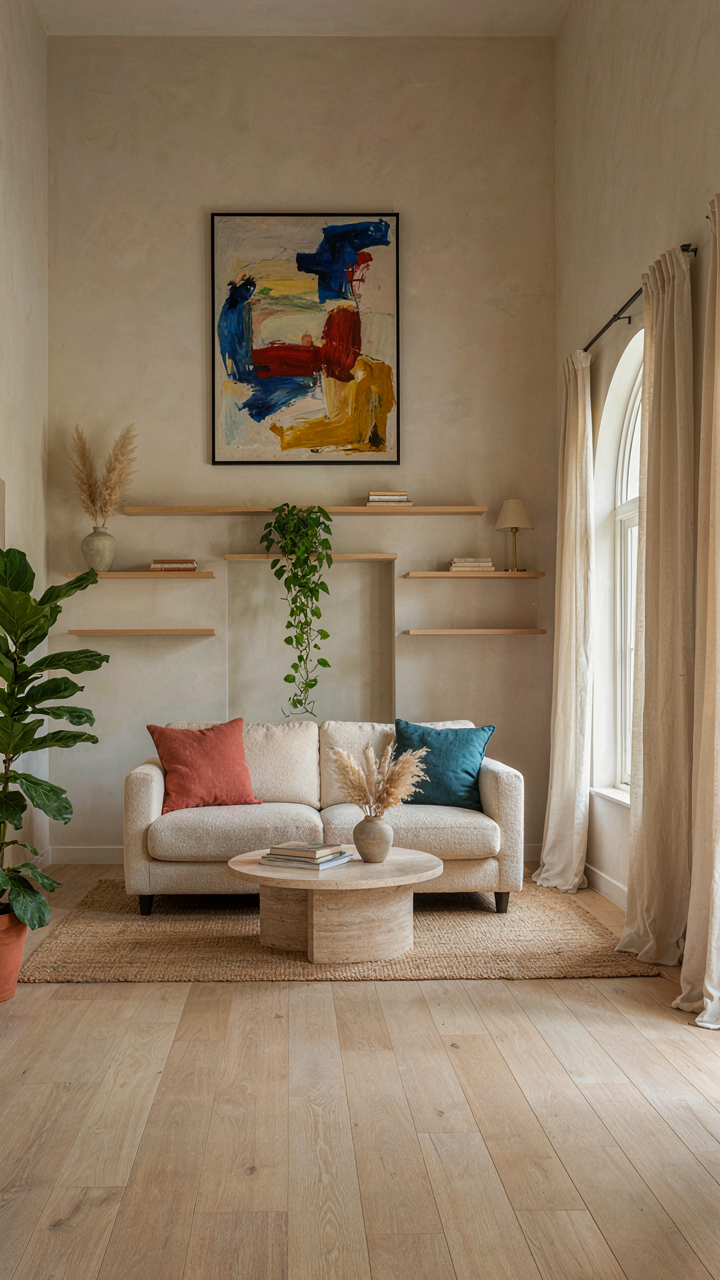
You want the room to feel bigger without admitting you live small. That’s the real tension here. The mechanism is simple: negative space functions as a visual anchor that tells your brain the room extends beyond its walls. In physics, vacuum creates pressure differentials. In cottage design, emptiness creates perceived expansion. A room packed with furniture feels claustrophobic because your eye has nowhere to rest. Strategic emptiness does the opposite.

Most advice tells you to “declutter” or “go minimal.” That’s incomplete. You need to position empty space where it does work. Clear floor area near windows creates sightlines that extend perception outward. Empty wall segments between furniture clusters reset your visual measuring stick. The goal isn’t sterile. It’s about placing voids deliberately so they function as design elements, not as afterthoughts. Leave a two-foot gap between your sofa and the adjacent wall. That gap makes the room feel three feet wider because your eye recalibrates distance based on unobstructed surface.
Ceilings Determine Perceived Volume
Height sells the illusion of space faster than square footage ever will. A cottage living room with a nine-foot ceiling feels trapped. The same room with a ten-foot ceiling, or visual tricks that suggest it, feels breathable. Draw your eye upward and you’ve reframed the entire volume. Paint ceilings a lighter color than walls or match them to white trim. This erases the boundary between walls and ceiling, which tricks depth perception into reading the space as taller than it measures.
Vertical storage, tall narrow shelving, and artwork hung near the ceiling force your gaze up consistently. This isn’t decoration. It’s directional architecture. Wall-mounted shelves that rise toward corners pull attention vertically. A single piece of art positioned high resets spatial awareness every time you glance at it. The mechanism: your visual center of gravity shifts upward, and the room’s perceived volume expands proportionally. Install floating shelves that start at six feet and climb toward nine. This pulls the room’s visual mass upward where it reads as abundance rather than confinement.
The Monochromatic Myth: Why White Isn’t Always Right For Tiny Cottage Living Room Ideas
Deep Color Creates Spatial Anchor
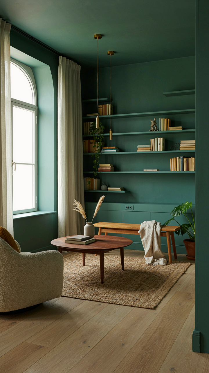
You want white because you’ve been told it makes rooms feel bigger. That’s incomplete advice masking a real fear: that your cottage will feel cramped no matter what. Here’s the mechanism: color functions like a spatial anchor in design psychology. A single deep, unifying color—charcoal, warm gray, or muted sage—compresses visual distance the same way a forest’s canopy does. Your eye doesn’t travel frantically searching for boundaries. It stops at the color itself.
Small rooms with uniform deep color actually feel intentional instead of tight. The walls recede into context rather than pressing forward as obstacles. White does the opposite in tiny spaces: it amplifies every imperfection and creates visual noise because contrast demands constant attention. Pick one deep color for walls, trim, and built-ins. Let the color settle the room before you add furniture or texture. The result isn’t a cave. It’s a defined space that breathes on its terms, not on some internet rule about lightness.
Layering Surfaces Over Variety
The common advice says vary your colors to add visual interest. That fails in tiny cottage living rooms because each new color fights for dominance and fragments the space. Texture does the work instead. A wool rug, linen curtains, plaster walls, a wood shelf, and a brushed metal lamp in the same color story create depth without chaos. Your eye moves across surfaces, not between competing hues.
Start with one matte wall color. Add a slightly lighter or darker version of that color in fabric. Introduce raw materials—wood, unfinished plaster, woven fibers—all within the same family. This approach uses surface variation to generate visual complexity while maintaining spatial cohesion. The tiny cottage living room becomes layered, not congested. Tactile interest replaces chromatic noise.
Furniture As Architecture: Defining Zones In Your Cosy Cottage Living Room
When One Piece Becomes The Whole Room
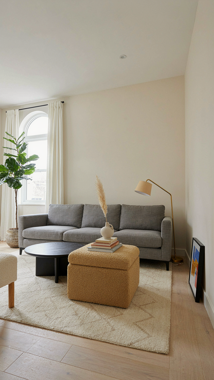
You want your cottage living room to feel bigger without admitting you’re anxious about cramped space. The real mechanism is this: a single well-placed piece of furniture stops the eye from racing to the walls. In architecture, this is called anchoring, and it works because humans perceive rooms through visual stopping points, not square footage. A substantial sofa, low bookcase, or storage bench becomes the structural element that makes everything else feel intentional instead of desperate.
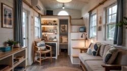
Multi-functional pieces work because they collapse the ratio of visual weight to actual utility. A wooden chest serves as seating, storage, and a visual anchor without eating extra floor space. The piece justifies its presence through pure function, not decoration. This is why a cottage living room with one honest, dual-purpose anchor reads larger than one cluttered with single-purpose side tables. You’re not filling the room, you’re architecting it.
Revealing The Floor As The Fifth Wall
The common advice says to push furniture against walls in small spaces. That’s backwards and makes rooms feel smaller. Floor visibility creates apparent depth, which is the optical trick that actually works. When furniture floats, your eye travels underneath and beyond it, extending the perceived boundary of the room. This is basic spatial psychology applied to layout.
Floating a sofa six inches from the wall or placing a chair away from the perimeter forces the room to define itself through negative space rather than boundary contact. The floor becomes an active design element, not just the thing you walk on. Leave at least eighteen inches of visible flooring around key pieces. This single protocol shift makes a 120-square-foot living room feel genuinely open instead of defended.
The Illusion Of Depth: Borrowing External Views For Your Small Cottage Homes Interior
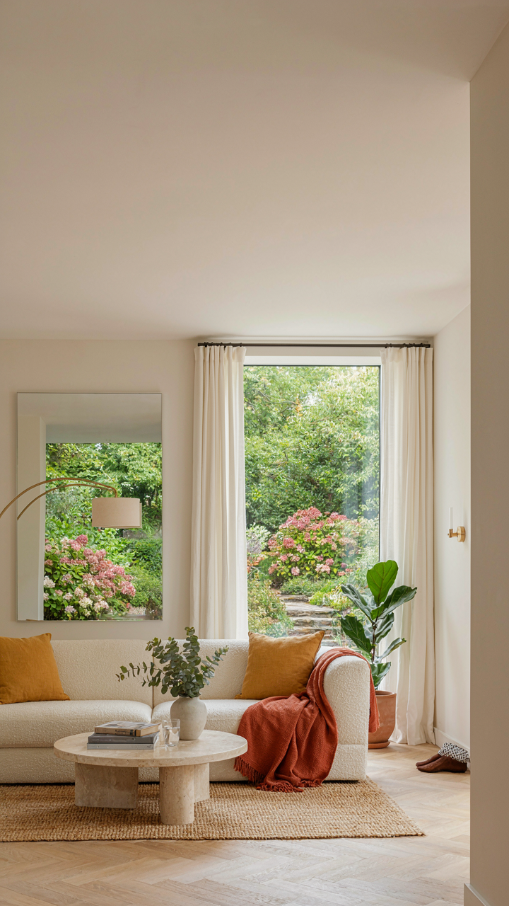
Windows As Framed Architecture
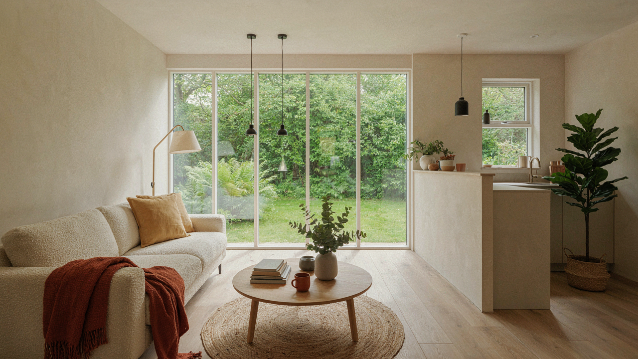
You want people to think your cottage is bigger than it is. That’s the real reason you’re reading this. Here’s what actually works: borrow the exterior. In architecture, the concept of “borrowed scenery” treats the landscape beyond your walls as part of your interior composition. Your tiny cottage living room stops at your window frame but visually continues into the yard, tree line, or street beyond. The window becomes a permanent piece of wall art you don’t have to buy or maintain.
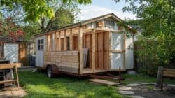
Placement matters more than size. A cottage window positioned at eye level from your primary seating point pulls the outdoor depth straight into your sightline. Position your sofa or chair to face the window, not parallel to it. Avoid blocking windows with tall furniture or clutter. The mechanism is simple: unobstructed sight lines to the exterior extend perceived interior volume. Your brain doesn’t calculate square footage. It tracks how far it can see.
Strategic Reflection And Spatial Multiplication
Everyone says mirrors make rooms look bigger. That’s true but useless without the mechanism. Mirrors don’t expand space through magic. They multiply the visual field by reflecting light and depth from the direction they face. Place a mirror perpendicular to your primary window, not parallel to it. This reflects the borrowed exterior view back into the room, creating two viewing angles of the same depth. Your eyes process this as expanded territory.
- Perpendicular placement to windows: Reflects external depth back into the room, creating layered sight lines rather than direct reflection.
- Corner mirror positioning: Doubles the corner’s visual mass by reflecting two walls simultaneously, breaking the perception of a tight box.
- Opposite wall placement: Multiplies the longest visible line in your room by reflecting it back, stretching perceived length.
- Low mirror positioning: Reflects floor and lower furniture, expanding vertical perception upward without forcing the eye toward the ceiling.
- Frameless or thin-frame mirrors: Removes visual weight that frames add, keeping the reflected space feeling open rather than contained.
Don’t clutter the mirror’s reflection. Keep the area it reflects clean and simple. A mirror reflecting a pile of magazines reflects a pile of magazines. A mirror reflecting your window and wall reflects openness. The protocol: identify your longest sight line, position a mirror to reflect it, remove obstacles in both the mirror’s path and its reflection field.
Lighting As A Sculptor: Carving Space In Your Cozy Cottage House Interior
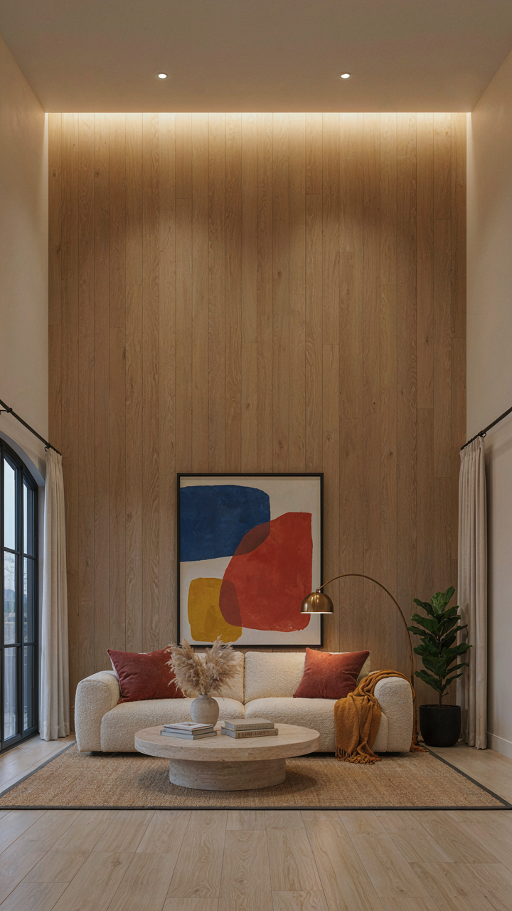
Uplighting And Wall Washing To Expand Boundaries
You want your cottage to feel bigger because you’re afraid tiny means cramped, and cramped means failure. Here’s the mechanism: light sources positioned at floor level or low on walls use the physics of reflection to push perceived boundaries outward. Uplighting bounces illumination off ceilings and upper walls, forcing your eye upward and outward instead of inward at the compressed floor plan. This isn’t decoration. It’s optical expansion.

Wall washing is the specific application. Position light fixtures 12 to 18 inches from a wall and angle them to graze the surface with even coverage. This erases the wall as a hard boundary and transforms it into a light-emitting surface that reads as farther away than it actually sits. Combine uplighting in corners with wall washing on the longest wall in your cottage living room. The room stops feeling like a box and starts feeling like space you’re standing inside, not trapped within.
Dark Corners Destroy The Illusion Of Space
The common advice is to “brighten every corner,” which is lazy and wrong. Dark corners don’t just look bad. They signal compression to your brain because they create visual stops and boundaries your eye can’t penetrate. Your eye hits the darkness and registers an ending, which collapses perceived square footage.
Deploy accent lighting specifically into corners: recessed fixtures angled into the junction, or small uplights positioned on shelving. The goal is elimination of shadow pools, not theatrical brightness. A single 40-watt warm bulb in a corner fixture erases the visual dead zone. Install corner uplighting on a dimmer circuit so you control when the space feels open versus intimate. Start at 40 percent brightness and increase only if pooling shadows remain visible at night. This is the protocol.
The Eisenhower Matrix For Decorating Small Houses
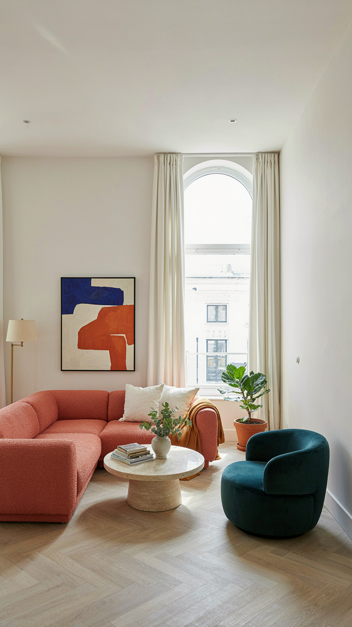
Separate Signal From Clutter
You want to feel like you’ve made smart choices without admitting you’re afraid of wasting money on stuff that won’t matter. The real mechanism is this: the Eisenhower Matrix comes from military strategy and forces you to plot every object on two axes—urgency versus importance. In a tiny cottage, a coffee table is urgent only if guests arrive weekly; a lamp is important only if it solves a lighting problem you actually have. Most decoration fails because people treat everything as equally urgent when nothing is.

Start by listing every item currently in your cottage living room. Then ask: Does this solve a functional problem right now? Will I use it in six months? If both answers are no, it leaves. If one is yes, it stays. If you’re hesitant, you’ve already answered—hesitation means it doesn’t belong in a space where every square foot counts. This isn’t decoration; it’s triage.
High Impact, Low Volume Wins
The common advice says “choose statement pieces.” Wrong. Statement pieces are expensive armor for indecision. What works is the opposite: one functional object that serves multiple roles and doesn’t apologize for existing. A window seat with built-in storage is high impact because it handles seating, storage, and visual depth in one footprint. A single large mirror opposite a window changes perceived square footage without adding volume.
Real high-impact decor obeys this rule: it solves a problem you named out loud. If you named “I need more seating,” a bench works. If you named “the room feels cramped,” vertical shelving works. If you haven’t named the problem, you’re decorating blind. Measure twice, name the problem once, buy the object that solves it, then stop.
Beyond Decluttering: The Minimalist Mindset For Tiny Cottage Interiors
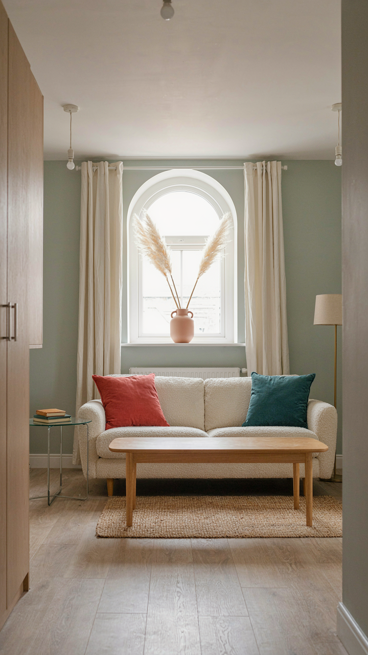
Austerity As Design Philosophy
You want permission to own less because you’re afraid emptiness means poverty instead of control. Here’s the mechanism: austerity in design is constraint economics applied to space. In economics, scarcity drives value. In tiny cottages, removing options increases perceived space. Every object you don’t own is square footage you don’t have to visually process. The brain treats each item as a decision point. More items mean more cognitive load, which makes rooms feel smaller regardless of actual dimensions.

Austerity isn’t deprivation. It’s the deliberate choice to own objects that earn their place through function or structural necessity. A cottage with four chairs feels cramped. A cottage with one quality chair and open floor feels intentional. This mindset separates minimalism from deprivation. You’re not sacrificing comfort. You’re eliminating the tax that surplus objects levy on perception. Start by identifying which pieces in your cottage actually serve a purpose beyond filling space, then remove everything else.
Empty Surfaces Hold Real Estate Value
Most design advice tells you to style surfaces with small objects and plants to make spaces feel “lived in.” That’s wrong. Empty surfaces are the highest-value real estate in a tiny cottage. A bare tabletop is usable space. A tabletop crowded with decorative items is visual noise that shrinks the room. Surfaces operate like conversation space in a meeting. The more people talk over each other, the harder it is to follow. Empty surfaces let the eye rest and move freely through the room.
The mechanism is simple: visual pathways. Your eye needs uninterrupted routes across the room to perceive openness. When surfaces are full, your eye stops repeatedly. It catalogs each object. This fragmented perception makes rooms feel smaller and more cluttered even when total furniture is minimal. Keep surfaces empty except for one active item at a time. A coffee table with nothing on it reads as larger than a coffee table with four decorative objects. Apply this rule consistently across all horizontal planes, and your cottage suddenly breathes.
The Unseen Constraint: How Your Habits Define Your Tiny Cottage Living Room
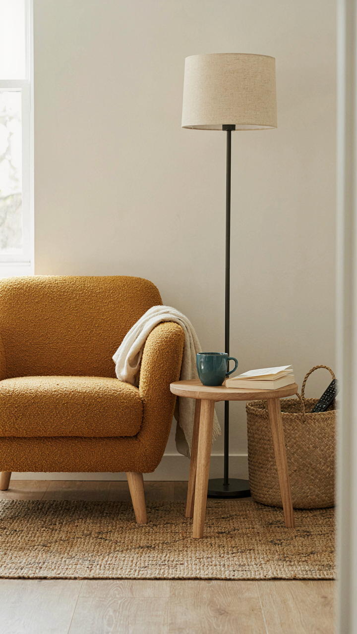
Friction Points In Your Daily Routine
You want to believe the room itself is the problem, but it’s not. Behavioral economics teaches us that friction cost determines behavior. In your tiny cottage living room, friction is the distance between where you sit and where clutter lands. Every extra step between the couch and a storage spot is a friction point you’ll lose to eventually. You won’t fight physics. You’ll just let things pile up.
The real mechanism: people don’t choose chaos. They choose the path of least resistance. If your storage requires you to walk eight feet and open three cabinet doors, you will leave the remote on the armrest. If a basket sits within arm’s reach of your seat, you’ll use it. Design removes the willpower requirement entirely. Your tiny cottage living room doesn’t need you to be disciplined. It needs you to be lazy in the right direction.
Systems That Make Messiness Impossible
The common advice says get organized. That’s backwards. You don’t organize a tiny cottage living room by willpower, you organize it by making the wrong choice difficult. Neatness systems work because they eliminate decisions, not because they inspire better behavior. A throw blanket draped over a chair gets used once then abandoned. A blanket stored in a closed ottoman that takes two seconds to access will actually get folded back inside it.
Every surface in a tiny cottage living room should have a single, assigned purpose and a container that makes returning items automatic. The lamp table holds only the lamp and a small tray for remotes. The side table holds a single stack of books with a defined height limit. When the stack exceeds the limit, you remove one before adding another. The system enforces itself. You stop thinking about it after two weeks.
The Real Obstacle To An Open Tiny Cottage Living Room Is Your Mental Clutter, Not The Square Footage
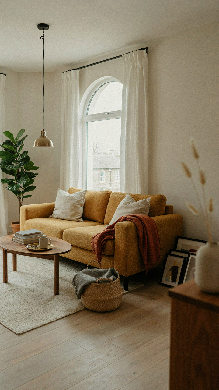
You keep every object because you might need it someday. You arrange furniture to hide problems instead of solve them. You treat your tiny cottage living room like a storage unit with a couch. The space doesn’t expand until your mind does. Pick three items today and remove them permanently. Not donate. Remove. Watch how the room actually breathes once you stop treating it like a museum of your past decisions.
Your cottage doesn’t need more space. It needs you to stop filling it.