The Cognitive Load Fallacy: Why Your “Calm” Decor Creates Stress
Sensory Overload: Identifying Hidden Stressors
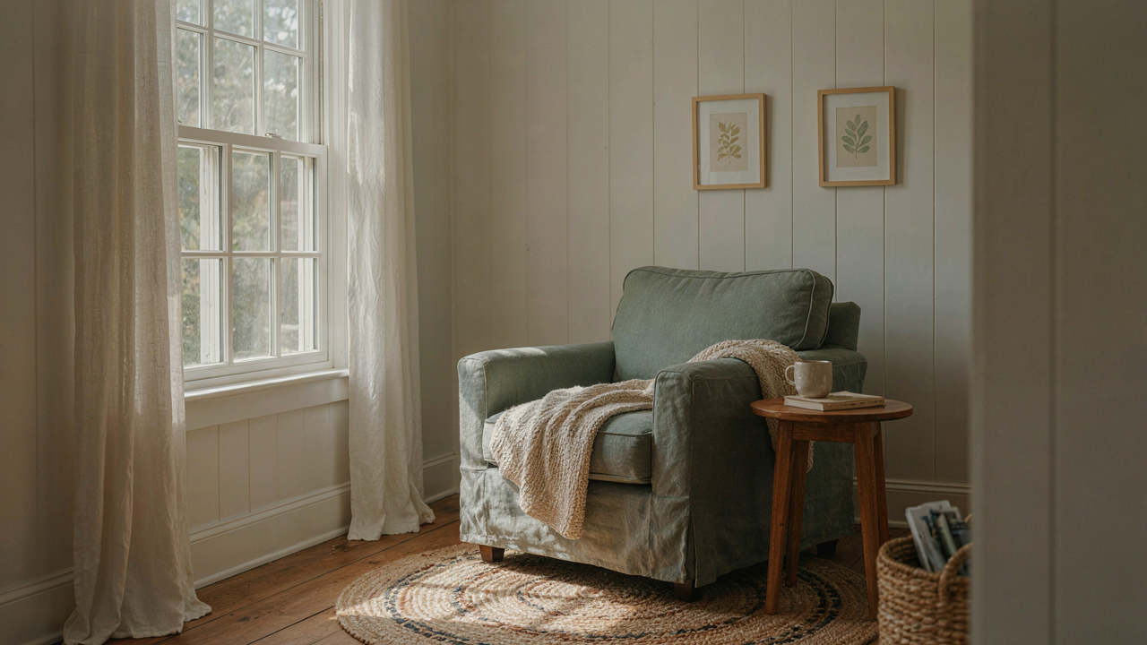
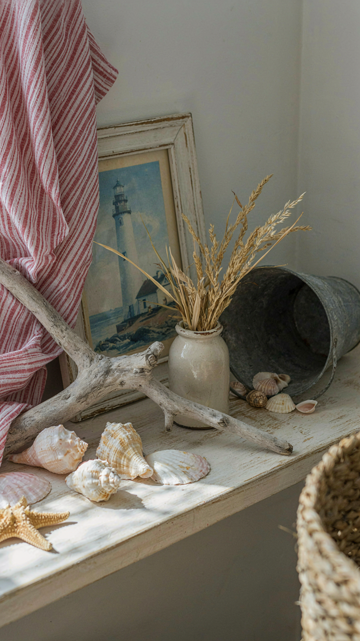
You want to feel peaceful in your space because you’re afraid you’re wasting money on decor that makes you feel worse. Here’s the mechanism: your nervous system doesn’t care about design intent. It responds to input. Cape Cod cottage interiors rely on layered textures, pattern mixing, and collected objects—each one a sensory signal your brain must process. Whitewashed wood, striped fabrics, driftwood accessories, lighthouse artwork, and weathered metals occupy the same visual field simultaneously. Your eyes work harder. Your cortisol rises.
The common advice says “less is more” or “edit ruthlessly.” That’s incomplete. The real problem is stimulus density, not quantity alone. A room with three perfectly curated items can stress you out if those items compete for attention. A Cape Cod cottage with fifteen items arranged by visual weight creates calm. The difference isn’t the count. It’s whether your brain recognizes a hierarchy. Every object must answer: Does this support focus or fragment it?
The Real Cost Of Clutter
Clutter drains mental energy through decision friction, not through moral judgment. Economics teaches us opportunity cost: every decision made is energy spent elsewhere. In your Cape Cod cottage interior, this shows up as unmade choices. A shelf with mixed vintage glassware, stacked books, and framed photos forces your brain to categorize, prioritize, and sort visually every single time you enter the room. That’s work. Repeated work compounds.
Stop treating this as a tidiness problem. It’s an attention allocation problem. Your brain has a finite daily budget for decisions. Clutter doesn’t make you lazy—it makes you depleted by afternoon. In a Cape Cod cottage, the antidote isn’t minimalism. It’s intentional grouping. Consolidate similar objects into defined zones. Store seasonal items out of view. Display only pieces that create visual momentum without requiring interpretation. Your space should make decisions for you, not demand them from you constantly.
The Tide In, Tide Out Protocol For Cape Cod Cottage Interior
Start With What Actually Functions
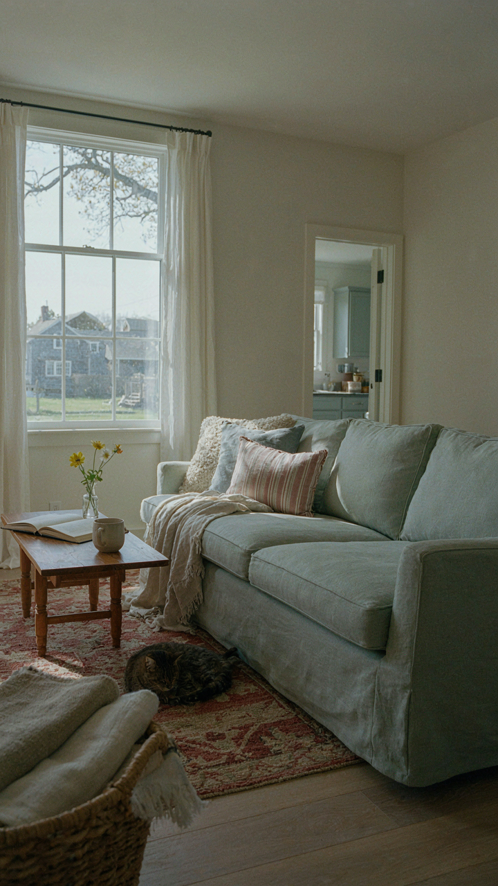
You want a Cape Cod interior that feels effortless, which means you’re really afraid of it looking contrived or requiring constant maintenance. The mechanism is simple: function precedes aesthetics in coastal homes. Salt air corrodes. Humidity rots. Foot traffic from beach sand accelerates wear. Build your interior around what survives these conditions first, then layer style on top.

Cape Cod cottage design emerged in the 1600s-1700s from practical constraint, not design theory. These homes used materials and layouts that resisted coastal degradation. Wooden shiplap interiors, low ceilings, compact rooms, and minimal ornamentation weren’t aesthetic choices initially—they were survival choices. Start there. Identify the functional demands of your space before committing to paint color or furniture placement.
Rotate, Don’t Commit Permanently
The common advice says pick a color palette and stick with it. That’s lazy thinking for a Cape Cod cottage. These homes operate on seasonal logic, not permanent fixtures. Winter demands heavier textiles and lower light. Summer demands breathability and reflection. Furnishings, layering pieces, and even wall treatments should shift with the seasons, not remain static year-round.
Think of your cottage interior like ecological succession in biology, where environments shift and species adapt accordingly. Your cottage adapts through seasonal swapping. Heavy wool throws come down in June. Lightweight linens rotate in. Darker accent pillows swap for lighter neutrals. Window treatments change from thermal blocking to light diffusion. This isn’t redecorating—it’s maintenance that aligns your space with actual climate demands. Execute the rotation in early June and early November.
Deconstructing The Light: How New England Home Interior Maximizes Natural Flow

Light As Architecture, Not Decoration
You want this section because you think better light makes a space feel bigger and more expensive without spending money. That’s half true. The real mechanism: light behaves like a structural load. In physics, incident angle determines how energy transfers through a system. In Cape Cod cottages, window placement and wall color act as load-bearing elements that either diffuse or concentrate that energy. Small rooms with the wrong angles feel cramped. The same room with corrected angles feels twice the size.

Cape Cod cottages sit on the Atlantic coast. East and south-facing windows catch morning and afternoon light at specific angles determined by latitude and season. Colonial builders knew this. They sized windows small to retain heat but positioned them to maximize winter sun penetration. Modern additions often ignore this pattern, placing windows for view instead of angle. The fix: prioritize southern exposure for living areas, eastern exposure for bedrooms. Angle matters more than quantity.
Shadow As Structural Element
The common advice says to eliminate shadows and brighten everything. Wrong. Shadows create visual contrast. Without contrast, the eye stops reading depth. In Cape Cod interiors, flat white walls with diffuse light feel institutional, not restful. Controlled shadow reveals architectural bones and makes surfaces recede or advance.
Cape Cod cottages use simple trim: narrow baseboards, flat casings around doors and windows. These elements exist to catch shadow. When northern light enters a room, shadow pools in the recess of a door frame. That shadow line reads as a frame within a frame, adding perceived depth to a two-hundred-square-foot bedroom. Place one light source off-axis to the trim work, not centered overhead. Shadow play costs nothing but removes the need for visual clutter and unnecessary furniture.
The Biomimicry Blueprint For Cape Cod Cottage Interiors
Fractal Geometry In Textiles And Walls
You want permission to break the rules without looking chaotic. That’s the real draw here. Nature doesn’t follow a grid, yet it feels ordered. Fractals—self-similar patterns that repeat at different scales—are the mechanism that makes this work. In biology, fractals appear in branching trees, coastlines, and fern leaves. Apply this to Cape Cod interiors through textiles and wall treatments that echo natural recursion rather than symmetrical repetition. A linen throw with irregular diamond nesting, or shiplap arranged in staggered widths, triggers the same visual recognition your brain uses to parse natural order.

The common advice tells you to “mix patterns for visual interest.” That’s lazy. What actually works is choosing textiles and paint treatments where smaller patterns nest inside larger ones, mimicking how nature builds complexity. A wool rug with striping that varies in width at intervals, paired with a linen curtain whose weave shifts subtly, creates coherence through repetition at scale rather than through matching. The eye reads it as intentional rather than random. This is why Cape Cod rooms with layered, seemingly mismatched textures often feel more restful than those with coordinated pattern schemes.
Organic Textures Build Spatial Depth Without Clutter
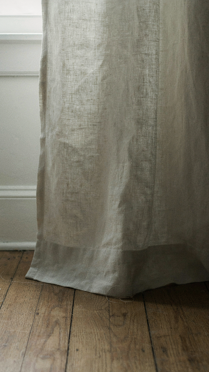
Raw materials don’t need arrangement strategy to work. Wood, linen, and stone perform depth through surface variation alone. This isn’t aesthetic preference—it’s optical physics. A white linen sofa reads flat. The same sofa in undyed linen with visible slubs and weave irregularity creates shadow and light variance across its face, which your visual cortex reads as spatial dimension. Similarly, aged timber flooring or exposed ceiling beams generate depth through grain variation and patina. Stone surfaces like soapstone or granite countertops do the same through mottling and natural color shift.
Cape Cod interiors historically used these materials by necessity, not design trend. Linen curtains existed because cotton didn’t. Wide pine boards filled rooms because milling limitations prevented narrow planks. This constraint forced texture to become the primary design element. Modern Cape Cod interiors that feel authentic replicate this by prioritizing material quality over decorative layering. Choose unfinished or lightly finished wood flooring. Use raw linen where you might add patterned fabric. Let stone speak through its natural surface rather than polishing it into uniformity. The spatial depth this creates reduces the psychological need for furniture density, allowing rooms to breathe.
Cape Cod House Interior: The Illusion Of Space Through Strategic Minimalism
How The Eye Moves Through A Room
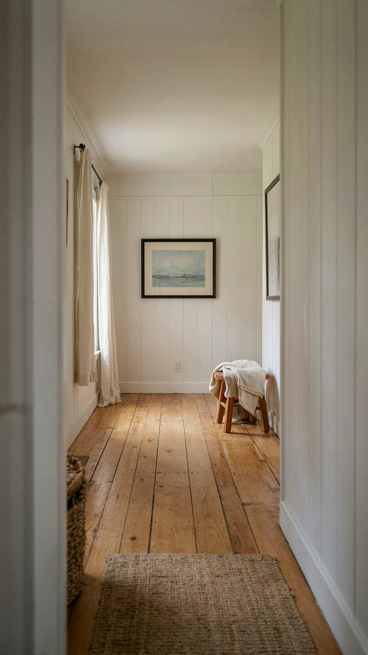
You want your cottage to feel bigger without renovation. That’s the real driver here. The mechanism comes from visual hierarchy, borrowed from graphic design: you control where attention lands, and you compress perceived distance. In Cape Cod cottages, low ceilings and compact footprints force this choice. Most people fight the space. Smart designers use it.

Sight lines are the skeleton. Place your strongest visual anchor at the farthest point the eye can naturally reach. In a living room, this means a single artwork, window view, or architectural detail opposite the entry. Remove obstacles between you and that anchor. Every object in that pathway competes for attention and breaks the line. Clear sight lines double apparent depth without moving a wall.
Where Things Disappear By Design
The common advice says “declutter and use neutral colors.” That’s incomplete. Hidden storage is not about minimalism as lifestyle. It’s about optical compression: you remove visual noise so the architectural bones dominate instead. Cape Cod cottages have built-in advantages here. Walls are thick. Under-stair cavities exist. Window seats sit hollow.
Install storage that matches wall color exactly. Paint cabinet doors the same shade as surrounding wall surface. This erases the furniture edge and extends the visual plane. Built-in shelving reads as part of the architecture, not as an object occupying space. The storage vanishes. The room breathes. Execute this through exact color matching during installation, not after the fact.
Beyond Beige: The Real Cape Cod Cottage Interior Palette
Borrowed Landscapes, Nature’s Color Cues
You want permission to skip the sterile decorator templates. Here’s the mechanism: ecology uses spectral distribution to signal habitat stability. Cape Cod interiors do the same thing. The palette works because it mirrors the specific light and materials of coastal Massachusetts, not because beige is “timeless.” You’re borrowing credibility from the actual environment.

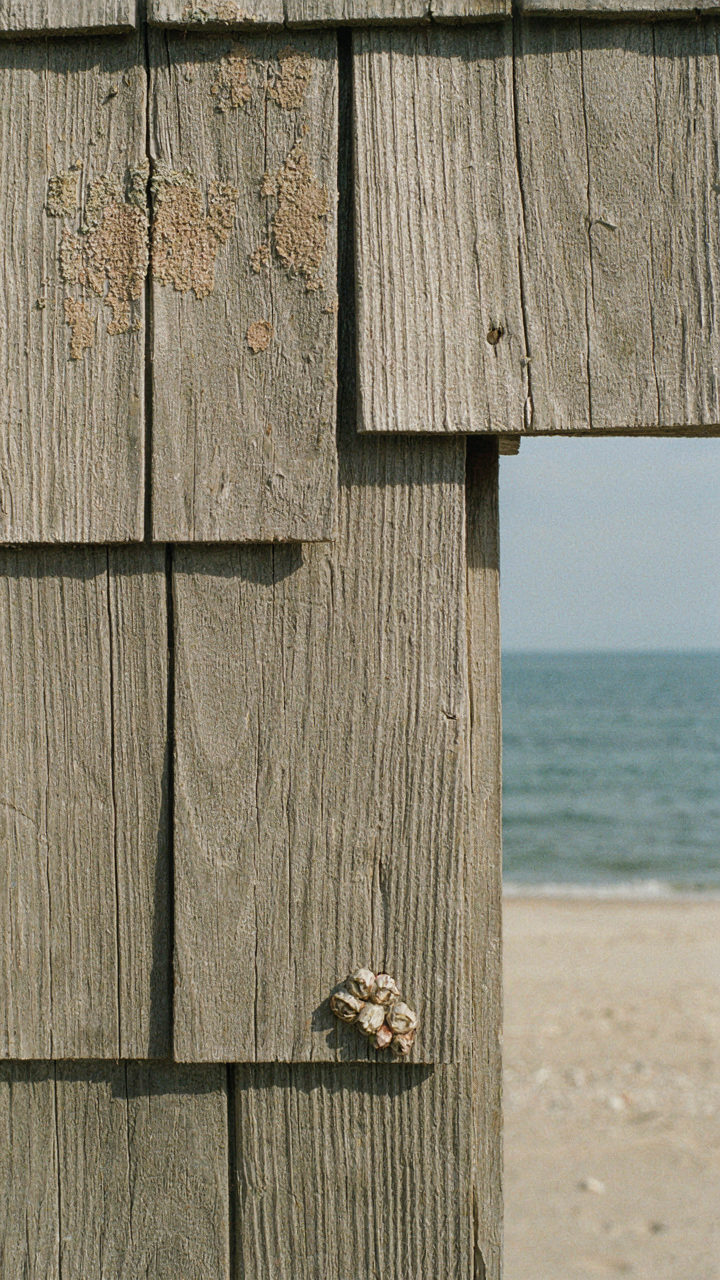
The dominant colors emerge from water, sand, and weathered wood—but not as you’d expect. The water isn’t a bright blue; it’s the gray-green of the Atlantic on most days. Sand reads as warm taupe, not cream. Weathered shingles run through brown, silver, and charcoal. These aren’t arbitrary. They’re the actual chromatic output of the region’s dominant materials and light conditions in their most common state, not their best-light version.
Intentional Contrast: Subtle Depth, Not Stark
The advice to keep everything “light and airy” is incomplete and causes flat, lifeless rooms. Contrast creates visual depth without drama. A darker wall trim against lighter plaster, a deep navy cabinet against whitewashed paneling, or charcoal flooring under cream trim—these pairings work because they replicate the shadow play of real coastal architecture under natural light.
The strategy isn’t about mixing bright colors or creating visual tension. It’s about replicating how actual Cape Cod buildings looked before developers sanitized them. Implement contrast through material and value shifts, not hue shifts. Select one wall for deeper tone, anchor it with wood trim, then measure the tonal distance—it should land between one and two stops darker on a standard value scale. Anything beyond that reads as intentional design rather than passive decoration.
The “Echo Chamber” Effect: Curating Authentic Cape Cod Home Interior Elements
Provenance Over Novelty: Objects With History
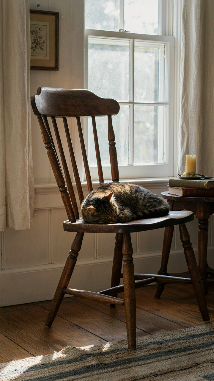
You want people to think you inherited taste instead of bought it. That’s the real mechanism at work here, and it’s why provenance matters more than design magazines admit. In archaeology, stratigraphy establishes value through layering and context, not individual artifacts. Your Cape Cod cottage interior works the same way: a scratched Windsor chair from 1840 signals authenticity through accumulated wear and documented origin, while a reproduction signals budget constraints and uncertainty.

The difference isn’t snobbery. It’s signal clarity. A piece with verifiable history carries embedded information—it survived because it functioned. It weathered actual Cape Cod salt air, actual use, actual time. Reproductions replicate the aesthetic but skip the proof. Source pieces from estate sales, antique dealers on Route 6A, and regional auctions where Cape Cod provenance is documented. Ask sellers for history. The object’s story becomes part of your interior’s credibility.
Local Artisans And Craft Integrity
Mass production optimizes for margin, not material. Local artisans optimize for reputation in a town of five hundred people. That’s the economic constraint that creates quality in a Cape Cod cottage interior. When a furniture maker or potter works within earshot of their customers, corners get expensive. They can’t hide behind supply chain abstraction.
- Falmouth woodworkers: Produce built-ins and cabinetry using salvaged local pine, matching historical grain patterns and joinery techniques specific to 1920s-1950s construction.
- Dennis and Yarmouth ceramicists: Create handthrown tile work and custom hardware that references Portuguese and English cottage traditions common to Cape Cod settlements.
- Chatham textile artisans: Weave linen and cotton fabrics with patterns derived from actual historical documents held at regional historical societies.
- Provincetown metalworkers: Fabricate custom hinges, latches, and lighting fixtures using forge techniques that match period-appropriate hardware from original cottages.
- Orleans upholsterers: Restuff and recover existing furniture with period-correct batting and fabric, maintaining original construction methods rather than modern shortcuts.
Direct commission or purchase from makers who can explain their material choices and techniques. This eliminates the design markup that generic retail adds. The maker’s constraints become your guarantees. When you know the weaver personally and understand why she chose that flax weight, the piece stops being decoration and becomes honest material labor.
Functional Aesthetics: The Unsung Hero Of New England Cottage Interior
Furniture That Earns Its Space
You want your cottage to feel effortless. That requires buying things twice as hard so you never have to think about them again. Cape Cod cottages demand furniture that performs multiple jobs because square footage is the enemy. This isn’t about clever storage hacks. It’s about load capacity: each piece must deliver on looks and utility simultaneously, or it’s dead weight.

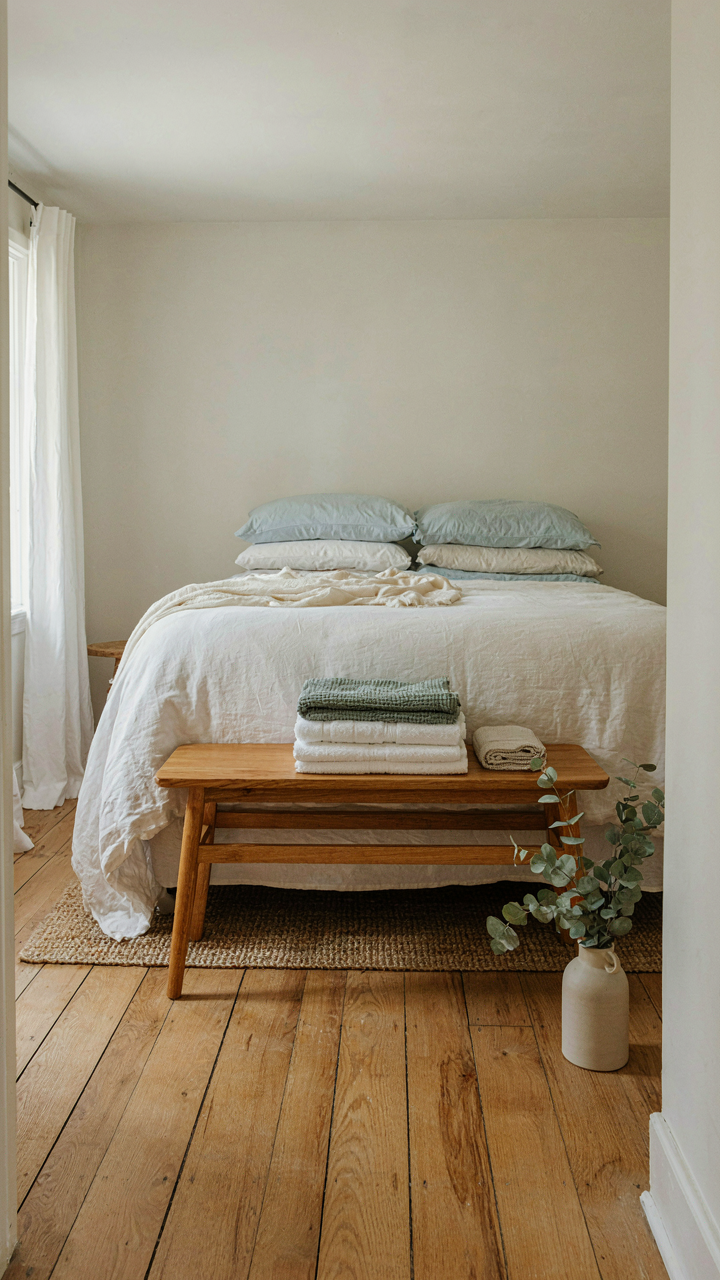
A low-slung bench at the foot of a bed becomes extra seating, storage for linens, and visual weight that grounds a room. A console table behind a sofa holds lamps and books while breaking up wall space. A round table in the corner works as dining, game surface, and workspace depending on the hour. The mechanism is simple: items that solve two problems cost the same as items solving one, so only buy the former.
Materials Built For Salt Air And Wear
The common advice tells you to pick durable materials. That’s not wrong, but it misses why it matters. Coastal New England humidity and salt spray don’t just age wood and metal—they accelerate decay. Your material selection is an engineering problem, not a design preference. Teak, white oak, and properly sealed pine endure because their grain structure resists moisture penetration better than softer woods.
Wrought iron and stainless steel fixtures resist oxidation where regular steel fails within seasons. Ceramic tile, stone, and sealed concrete beat out painted surfaces that chip and peel. Cotton and linen fabrics withstand salt air better than synthetics that off-gas and degrade. The action step is straightforward: source materials by asking your supplier what works in humid coastal climates, not by picking what matches your mood board.
Cape Cod Style House Interior Design: The Imperfect Imperfection Principle
Wabi Sabi Embracing Natural Wear
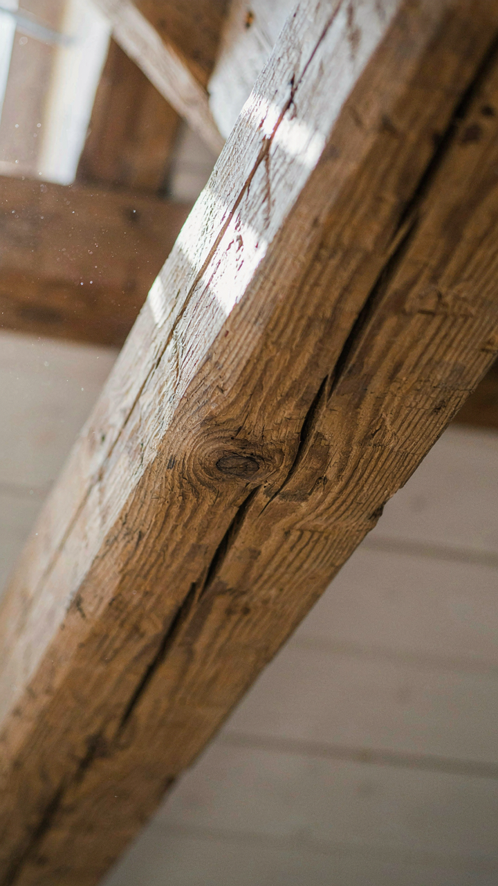
You want permission to stop fighting the decay. Here’s the mechanism: wabi-sabi, the Japanese aesthetic principle, treats aging as gain, not loss. Cape Cod interiors borrowed this without naming it. Weathered wood beams, faded paint, worn floorboards—these aren’t failures. They’re evidence. The cottage interior works because time made it, not because a designer controlled every variable.

Original Cape Cod homes from the 1600s and 1700s were built by necessity, not trend. Owners didn’t refinish beams quarterly. Salt air corroded metal. Sun bleached fabrics. Wood settled and cracked. Modern interpretations that sand everything smooth miss the actual appeal: you’re living in a space that proves it survived. This principle applies directly—stop treating visible age as a problem to solve.
Hand Hewn Details Character Over Polish
The common advice is wrong: rustic doesn’t mean rough or poorly made. Hand-hewn details mean deliberate irregularity created by human labor, not machines. A hand-planed beam shows variation because the craftsperson’s hand moved slightly differently each stroke. Factory-milled beams look identical, which reads as fake the moment you see actual hand work next to it.
Cape Cod interiors use hand-hewn elements as anchors: exposed ceiling beams, door frames, mantel pieces. The irregularity is the credential. You’re paying for the trace of human work, not uniformity. Source reclaimed wood or commission reproduction pieces from craftspeople who use hand tools, not CNC machines. The visual difference costs more because it requires skill time. Apply this rule: if the detail looks perfect, it’s not actually characteristic of the style.
The “Sensory Budget” Framework For True Coastal Calm
What Your Eyes Actually Process
You want calm but you’re actually afraid of boredom, so you load the room with visual noise and call it collected. Neuroscience shows that your brain allocates finite attention resources to visual input. In a Cape Cod cottage, this means every object competes for cognitive load. Surfaces, colors, and patterns all demand processing power. The mechanism isn’t about minimalism or maximalism. It’s about signal-to-noise ratio in visual information density.
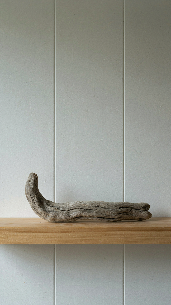
Traditional Cape Cod interiors worked because they operated under constraint, not philosophy. White walls, wood trim, and soft linens created visual rest. The few decorative objects present held genuine weight. Modern versions fail because they treat the framework as aesthetic rather than neurological. You reduce cortisol and decision fatigue by lowering the number of competing visual stimuli, not by adding more “coastal” objects. One quality piece of driftwood beats twelve cheaper ones on the shelf.
Material Texture As Deliberate Input
Touch works backward from sight. While your eyes passively receive input all day, your hands choose engagement. Tactile experiences in a Cape Cod cottage should feel like decisions you’re making, not accidents of design. Linen, wool, weathered wood, and natural stone create friction and resistance that your nervous system recognizes as real. Synthetic materials feel smooth and uniform, which reads as false to your sensory cortex.
The old advice says “mix textures for interest.” That’s lazy. You’re not decorating for visual variety. You’re creating a tactile hierarchy that rewards touch. Rough linen curtains slow your hand. Oiled wood railings age and darken under repeated contact. Salt-worn rope handles become personalized through use. Intentional material choices mean you’re designing for interaction, not just appearance. Your hand should know what room you’re in before your eyes open.
Your True Obstacle Isn’t Design, It’s The Unexamined Belief That Authenticity Can Be Bought, Not Built
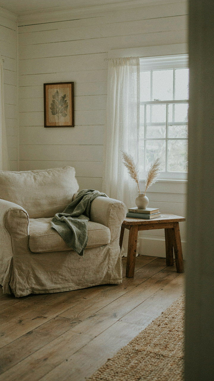
You don’t need another Pinterest board. You need to stop treating your Cape Cod cottage interior like a catalog to assemble. Authenticity lives in constraint, in choosing three colors and living with them until they feel like home. Pick one room today. Strip it down. Keep only what serves light, function, or memory. Everything else leaves. The spaces that move people aren’t designed. They’re lived in first.