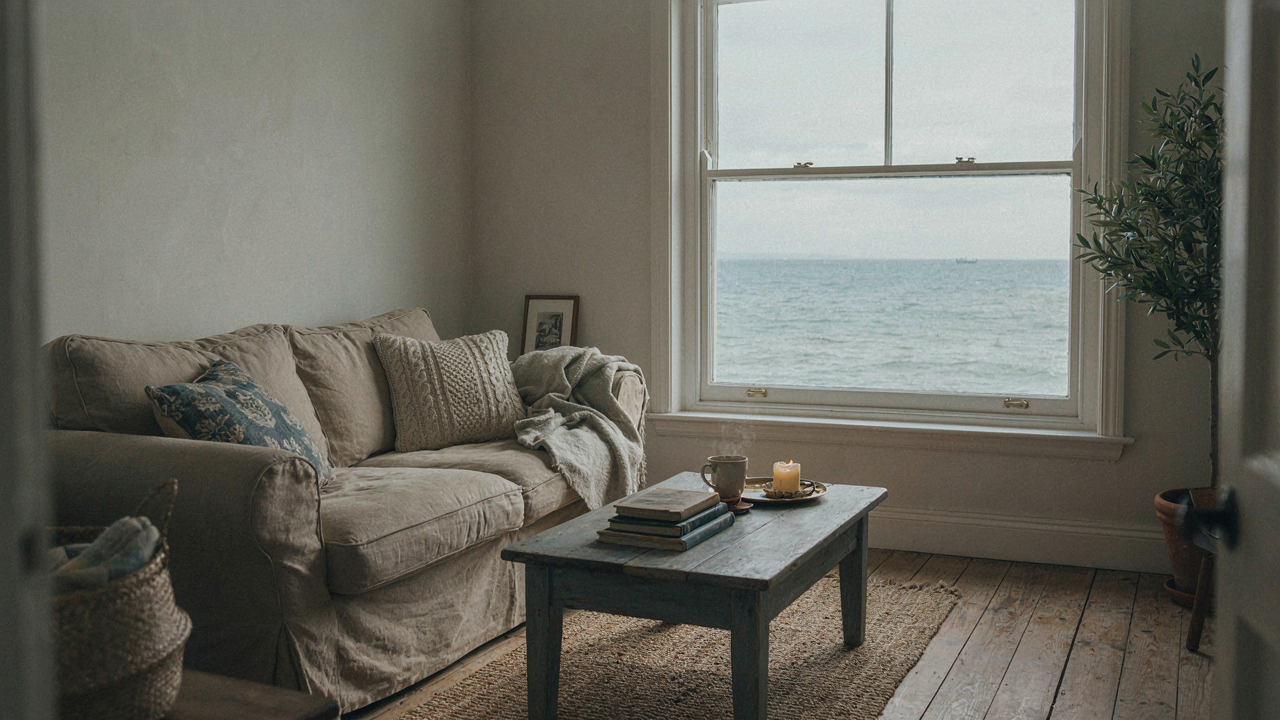
The Authenticity Algorithm: Escaping Generic Coastal Traps
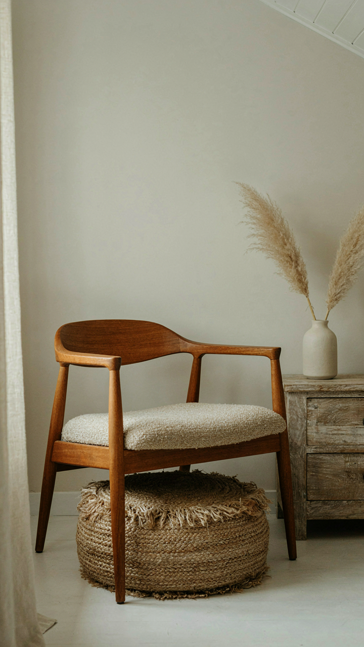
Curated Wins Over Themed Every Time
You want people to think you have taste, not that you bought a catalog. The real mechanism here comes from economics: themed spaces signal scarcity of judgment, while curated spaces signal abundance of it. A themed room announces its constraints. A curated room hides them.
Theming means you outsourced your decisions to a brand’s narrative. You picked the “coastal cottage” filter and filled in the gaps. Curation means you made choices based on friction, history, and what actually works in your space. The difference is ownership. One requires you to think. The other requires you to shop.
What Actually Qualifies As Coastal Cliche
The common advice is wrong here. People say avoid lighthouse decor or anchor prints and call it done. That’s surface level. The real problem is aggregation without reason. You’re not looking for what to remove. You’re looking for what you kept because it matched a mood board, not because it solved a problem.
Coastal cliche lives in density. Five woven textures stacked together. Drift wood that has no function. A color palette so literal it reads like stage design. The tell is when every object whispers the same thing. Real collected coastal homes have friction: a mid century chair next to a woven pouf next to a weathered table. The objects don’t perform unity. They coexist because they earned their place through use, not through theme alignment.
Coastal Decor Inspiration: Beyond Pinterest Boards

The Thrift Store Hunt Versus Intentional Sourcing
You want to feel like you discovered your décor rather than bought it. That’s the real driver here. The mechanism is simple: mass-produced coastal décor lacks friction. You see it, click it, it arrives. Your brain registers it as purchased, not found. Intentional sourcing flips this by forcing you into a search process that creates genuine attachment before you own the object.

The difference between a thrift store haul and real sourcing is discernment. Thrifting is reactive—you find what’s there and rationalize it into your space. Intentional sourcing means you know what gap exists in your room, then hunt for it across specific channels. Estate sales, local craftspeople, salvage yards, and regional makers become your supply chain instead of a retail website. This approach takes longer and costs more sometimes, but the object arrives with a story already embedded in it.
Sourcing From Makers In Your Region
Think of coastal cottage décor like a supply chain problem in manufacturing. You need to shorten the distance between maker and your home. Local artisans produce pieces that carry regional specificity—the light they work in, the materials available to them, the climate they’ve witnessed. A woodworker in Maine creates differently than one in California, even when both claim “coastal” work.
Regional makers embed place into their work automatically. A potter near the coast uses local clay that absorbs humidity differently. A metalworker sources reclaimed dock hardware instead of new reproduction pieces. You find these makers through craft fairs, local galleries, community Facebook groups, and direct outreach. When you commission or buy from them, the piece reflects actual geography, not a Pinterest algorithm’s interpretation of coastal style. Visit their studio if possible. See how they work and what materials surround them. The information you gather becomes part of why you chose the piece.
Coastal Style Interiors: The Layering Principle
How Ecosystems Build Visual Depth
You want your space to look like you inherited it, not decorated it. That requires understanding how nature actually builds complexity instead of just stacking objects on surfaces. Ecology teaches us that ecosystems don’t achieve depth through uniformity—they stack distinct zones that interact without competing. Your coastal cottage works the same way. Each layer must occupy a different visual frequency so the eye reads them as separate elements rather than visual noise.

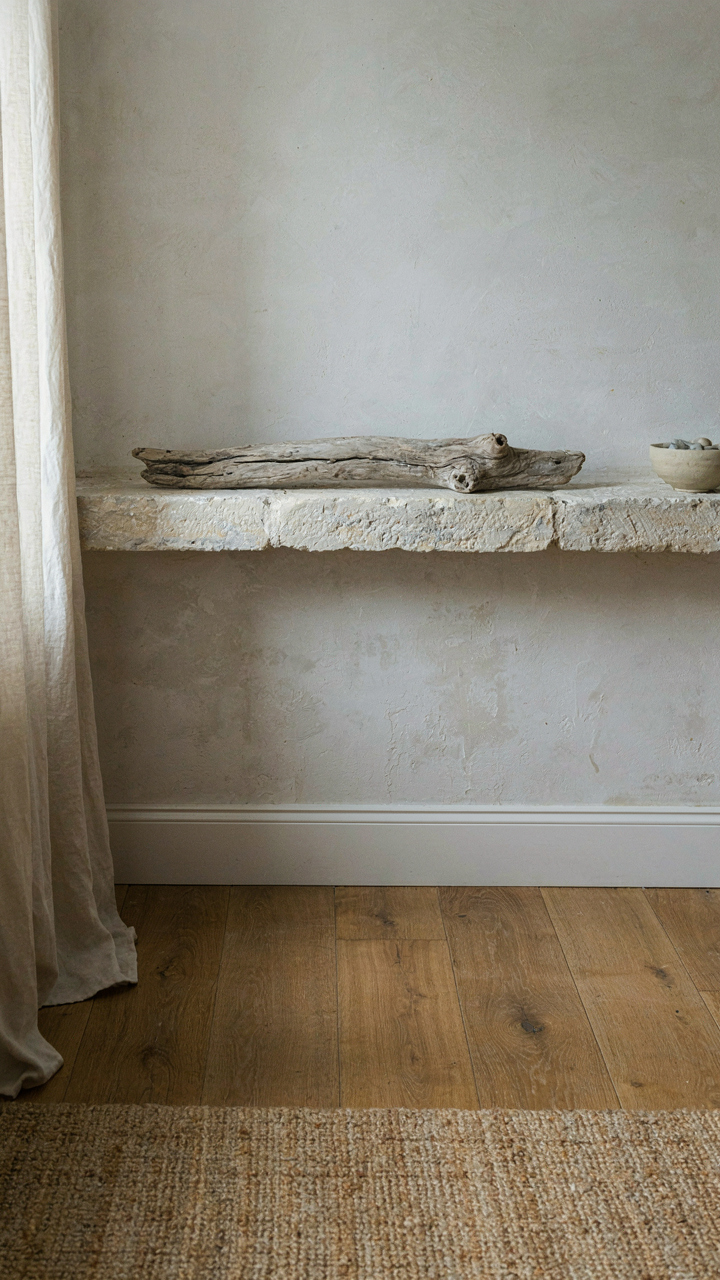
Most people layer by color or theme, which creates flatness. Actual depth comes from varying material density, texture scale, and light absorption across horizontal planes. A jute rug sits on wood flooring. Linen drapes hang in front of plaster. Driftwood sits atop a stone shelf. Each layer has its own material logic and doesn’t try to blend seamlessly with the one behind it. The gaps and transitions between them are what create perceived depth, not the layers themselves.
Weathering As A Texture Strategy
Erosion doesn’t make surfaces ugly—it creates legibility through wear patterns. Coastal cottage texture works when you apply this principle directly: surfaces should show evidence of how they’ve aged, not attempt to maintain uniformity. Paint shouldn’t be pristine. Wood shouldn’t be perfectly sealed. Linens shouldn’t be wrinkle-free. These imperfections aren’t oversights. They’re the mechanism that makes a space feel inhabited rather than staged.
The difference between collected and themed is whether textures tell a story of use. Weathered wood beams, salt-worn metal hardware, and faded textiles communicate time spent in place. Start with one rough material—reclaimed wood, aged brass, or linen with visible weave—and let it set the texture temperature for surrounding elements. From there, introduce complementary worn finishes in measured intervals. This prevents the space from reading as either too polished or too deliberately distressed.
The Subtlety Protocol: When Less Is More

Light As Architectural Restraint
You want people to feel like your space happened naturally, not that you engineered it. The mechanism is this: light and shadow create perceived depth without furniture or objects doing the work. Borrow from photography’s exposure triangle—in coastal cottages, you’re controlling how much of the room reads as “intentional” versus “found.” Unfiltered northern light softens edges. Southern exposures demand diffusion through linen or sheer curtains to prevent glare that flattens the room. The shadow line from a single window becomes more valuable than a decorative object.

Strategic window dressing rewires how people interpret a space. Avoid heavy curtains or blackout shades in coastal cottages—they announce control. Instead, layer a simple rod with linen panels that filter light without blocking it. Let natural shadows move across walls throughout the day. This forces the eye to notice architectural bones instead of searching for “decor.” The collected feeling emerges because time and light—not purchases—shaped the room’s character.
Restraint In The Color Story
Most coastal cottage advice says use whites, grays, and blues, then sprinkle in “pops of color.” That’s lazy and it fails. The real mechanism is contrast through value, not hue saturation. A room with ten muted tones reads as confused. A room with three core values—one light, one mid, one dark—reads as intentional and lived-in. Coastal cottages borrowed their palettes from what surrounded them: bleached driftwood, weathered siding, sea glass, and salt-stained textiles. You’re not creating a theme; you’re translating an environment into walls and furnishings.
Restraint in color means deciding your three values, then never breaking that rule. Paint walls in the lightest value. Choose upholstery in the middle value. Anchor with a single darker accent—weathered wood beams, a vintage iron fixture, or stone. Textiles shift the game: linen, canvas, and undyed wool introduce texture that makes limited color feel rich instead of sparse. The collected aesthetic survives because nothing contradicts the core palette. Stop adding colors and start subtracting them.
Nautical Homes & Beach Decor Aesthetic: The Functional Imperative
Durability Over Aesthetics First
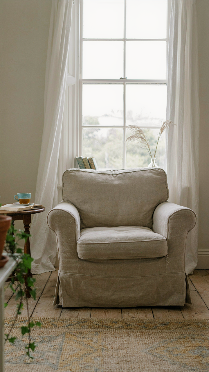
You want this to look effortless because you’re afraid anything deliberate looks like you tried too hard. The real mechanism is this: coastal cottage decor that survives salt air, humidity, and actual use requires you to reverse the typical design priority. Stop choosing what looks good and start choosing what performs. Durability becomes your design constraint, and constraints force genuine aesthetics. A faded linen slipcover isn’t charming by accident—it’s the result of choosing a fabric that degrades beautifully under UV exposure instead of cracking or discoloring into ugliness.

The materials you select dictate what your home will look like in five years. Untreated wood will silver. Powder-coated metal will chip near salt water. Raw linen will soften and pale. These aren’t flaws to prevent—they’re the mechanism that makes collected decor read as lived-in rather than purchased. Your job is choosing materials whose failure mode aligns with the aesthetic you want. Select them for their decline trajectory, not their debut state.
Materials That Earn Their Patina
Patina isn’t a nice bonus in coastal homes—it’s the only honest outcome of this environment. Use materials that age into their best version, not worse versions. Reclaimed wood already carries its history. Brass and copper oxidize intentionally. Linen becomes softer and more textured with time. Stone holds salt weathering without degrading structurally. These materials don’t require refinishing or replacement. They require acceptance of change.
The practical choice is materials with high time value. Galvanized steel rusts slowly and develops a protective layer. Wool resists moisture and hides stains naturally. Unfinished clay absorbs and releases humidity without warping. Stainless steel costs more upfront but eliminates corrosion worry in salt-spray zones. Your selection process becomes: what will this material look like after two seasons of coastal exposure, and do I want to live with that version of it?
House By The Sea Interior: Connecting Indoors And Out
Views As Focal Points, Not Afterthoughts
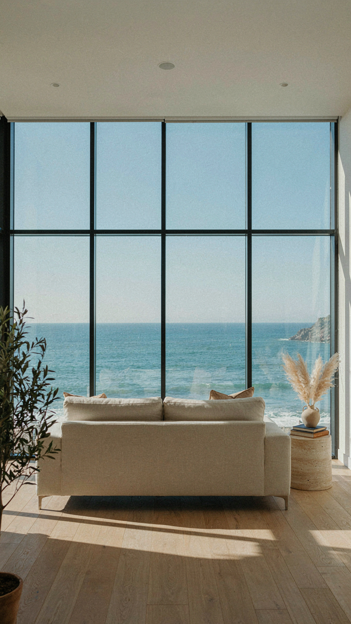
You want the ocean view to do the decorating work for you so you feel less responsible for the choices you make. The real mechanism: architecture controls what the eye lands on first. In coastal cottages, the window becomes the room’s primary focal point, not the furniture. This means you build the interior around sight lines, not around what looks good on its own. The view’s scale and movement demand that everything else recede.

Stop arranging rooms like the ocean view is just scenery. Large windows need zero treatment or transparent glass only. Paint walls pale or neutral so they don’t compete with what’s outside. Position seating to face water, not inward. The cottage succeeds when someone enters and the view hits them before noticing any single piece of furniture. Everything indoors serves the external landscape as supporting actor.
Natural Elements Belong Inside Through Material, Not Decoration
The common advice says bring shells, driftwood, and sand into the house as accents. Wrong. Authentic coastal interiors work because of structural materials and their honest aging, not because of decorative objects that reference the beach. Wood beams, exposed stone, salt-worn metal, and weathered plaster speak to the seaside environment through actual material properties, not through thematic staging.
Use materials that genuinely exist in coastal climates and show their deterioration. Reclaimed timber with actual salt damage carries more weight than a new driftwood sculpture. Whitewashed plaster that erodes unevenly reads as collected, not curated. Metal fixtures that oxidize naturally from salt air belong in a seaside cottage; the patina is the point. The mechanism is material integrity, not objects chosen for their Instagram association with beach life.
Charleston & New England Beach House Interior: Regional Nuance
Why Two Coasts Look Different
You want this section because you’re afraid your room will look generic, like every other Instagram coastal cottage. The real mechanism is simple: Charleston and New England developed different building constraints, material availability, and economic pressures over two centuries. Those constraints created visual languages you can’t fake by mixing aesthetics. One coast used what it had. The other did the same thing differently. The collected feel comes from respecting those boundaries instead of treating them as a mood board.

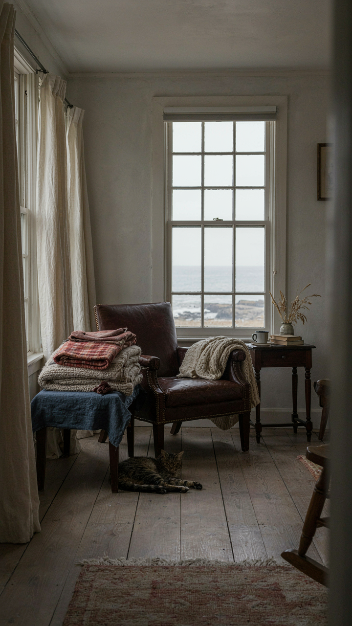
Charleston’s palette emerged from heat, humidity, and port access to Caribbean trade. Interiors favored lighter woods, open floor plans for air movement, and indigo or ochre accents from available dyes. New England cottages responded to cold winters and shipbuilding economies with dense wood, smaller windows, and darker finishes that hid soot. These weren’t design choices. They were survival solutions that became aesthetic.
The Four Regional Anchors
- Charleston color story: Soft greens, muted blues, and pale yellows derived from natural pigments and fading from coastal sun exposure. These weren’t trendy; they lasted because they reflected heat and masked salt residue on walls.
- New England timber palette: Exposed beams in dark wood, wide plank floors weathered gray or stained deep. Shipbuilding surplus meant abundant heavy timber, making it economical to leave structural elements visible.
- Window placement strategy: Charleston uses tall windows and transoms for cross-ventilation. New England positions smaller, strategic windows to retain warmth and minimize draft points during winter months.
- Hardware and fixtures: Charleston favors brass and wrought iron with thinner profiles. New England employs cast iron and chunky hardware designed to withstand temperature swings and salt air without degradation.
- Flooring approaches: Charleston uses tabby, oyster shell concrete, and heart pine to manage moisture. New England relies on sealed wide plank pine or oak that can be refinished without warping.
Mixing these systems kills the collected effect. Your room becomes a costume instead of a place that makes sense. The key is choosing one regional language and committing to its logic, not its Instagram aesthetic.
Architectural Bones Determine Everything Else
New England cottages carry load-bearing walls, low ceilings, and small rooms designed to trap heat. You can’t pretend these spaces are open and airy without fighting the building. Charleston homes sit elevated on pilings, feature wraparound porches, and open to breezes. The architecture itself dictates what belongs. If your cottage has small windows and thick walls, you’re working with New England logic regardless of what color you paint. Honor that, or the space feels forced.
The collected look emerges when your furnishings reinforce what the bones already say. In a New England cottage, dark wood furniture, grouped textiles, and close-spaced arrangements echo the architecture’s density. In a Charleston space, lighter pieces, breathing room between furniture, and tall focal points amplify the height and openness already built in. One specific protocol: photograph your room’s structural elements first, identify whether they read as heat-retention or heat-rejection, then curate every piece to support that original intention.
Coastal Kitchen: Function First, Form Follows
Work Surface Over Statement Piece
You want your kitchen to signal taste without screaming for attention. That’s the real reason you care about this section. The mechanism is simple: coastal kitchens that last abandon the idea that a kitchen proves your design credentials. They prioritize what your hands actually do there.

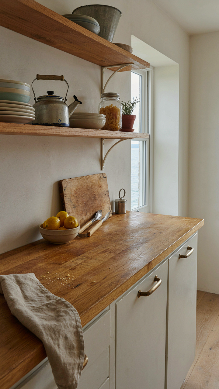
A work surface that functions teaches you more about coastal restraint than any aesthetic choice. Wood countertops age into character. Marble stains and requires maintenance, yet coastal homes use it anyway because it performs in humid, salt-heavy air. The counter isn’t decor. It’s infrastructure that happens to look collected instead of curated.
Materials That Earn Their Place
Trend-driven kitchen design dies fast because it confuses visual novelty with longevity. Most design advice tells you to chase aesthetics first. This is backwards. Coastal kitchens survive salt spray, humidity, and temperature swings that destroy cheaper materials. Your material choice isn’t a style decision. It’s a structural one.
Open shelving in coastal kitchens works not because it looks airy but because it forces you to store only items worth seeing daily. Stainless steel pulls and fixtures resist corrosion. Reclaimed wood cabinetry doesn’t need stain perfection because weathering is the point. When materials prove themselves through exposure rather than marketing, the kitchen looks collected by accident, not by Instagram mood boards.
The Only Thing Worse Than Bad Taste Is Borrowed Taste

Stop curating Instagram boards and start ransacking your own life. Your coastal cottage doesn’t need a designer’s permission slip. It needs the lamp you actually bought, the driftwood your kid found, the mirror from your grandmother’s garage. The difference between a showroom and a home is friction. Imperfection is the only proof it’s real. Go buy one thing today that has nothing to do with trend forecasts or mood boards. Your space will thank you by finally feeling like it belongs to someone.