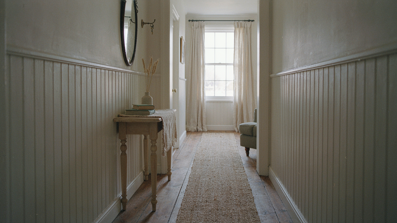
The “Compression & Release” Protocol: Engineering Perceived Space
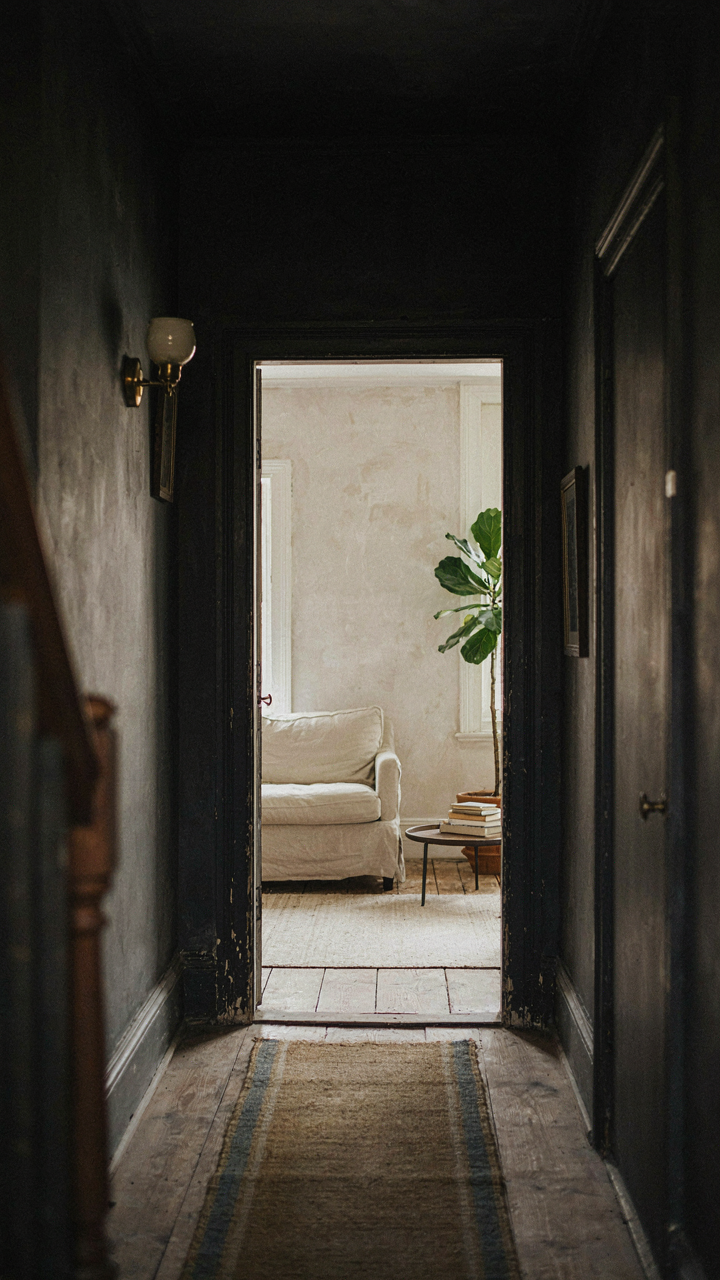
How Light Contracts, Then Expands
You want to feel like your hallway doesn’t trap you. That’s the real thing here. Physics gives us the mechanism: visual perception of space depends on how light behaves in sequence, not on square footage alone. A narrow cottage hallway feels suffocating or intimate based entirely on what happens to your sight line as you move through it.
Darkness compresses perception. Light releases it. The technical term is atmospheric perspective—objects fade as distance increases because of light scatter. In a cottage hallway, you weaponize this by darkening the entry zone with rich wall color or shadow, then flooding the far end with unobstructed light. Your eye travels toward brightness and reads the destination as farther away than it measures in reality. The hallway suddenly breathes.
The Deliberate Bottleneck Payoff
Common advice says widen hallways and remove obstacles. That’s incomplete. Strategic constriction works because contrast makes scale legible. Military strategists use chokepoints to control movement and create psychological advantage. A cottage hallway uses the same principle: a narrow entrance intensifies the impact of what opens beyond it.
Install a door frame, archway, or even just a change in ceiling height at the hallway mouth. This creates threshold psychology. The compression zone announces “something shifts ahead.” When visitors move through, the release into a wider space or brighter area registers as relief and expansion, even if the actual dimensions don’t change. The reveal is the mechanism that rewires how people perceive the entire sequence.
The Hallway As A Curated Gallery: Your Personal Aisle Of Art
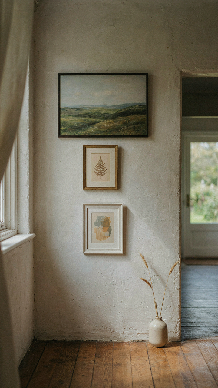
Restrain Your Instinct To Fill Every Inch
You want the hallway to feel intentional, not like you’re compensating for emptiness with decoration. That’s the real fear underneath. Here’s the mechanism: a narrow hallway functions like editorial space in typography. White space isn’t wasted space—it’s the variable that makes the objects you do hang land harder. Overcrowding destroys hierarchy. One strong piece stops the eye. Three mediocre pieces fight each other.

The cottage hallway works best as a progression, not a grid. Hang work at consistent intervals with genuine breathing room between pieces. This creates rhythm without noise. Your brain tracks the pattern and rests between moments of visual interest. That rest period is what makes you notice each piece when you encounter it again.
Where Linear Impact Beats Symmetry
Most hallway advice prescribes centered symmetry or matched pairs. Wrong approach. Architecture and interior design principles borrowed from retail design show that linear spaces perform better with asymmetric rhythm and varying heights. A cottage hallway is a shop window you walk through daily. The progression matters more than balance.
Mix frame sizes, matting styles, and piece scales deliberately. A small framed print followed by a larger textile, then a medium canvas creates movement without chaos. Uneven spacing reinforces that movement—tighter clusters near the entry, looser spacing deeper in. This pulls eyes forward and makes the hallway feel longer than it is. Anchor with one anchor piece at the end of the hallway, or at a natural stopping point like a staircase or doorway.
Strategic Illumination For Depth: Beyond Mere Brightness
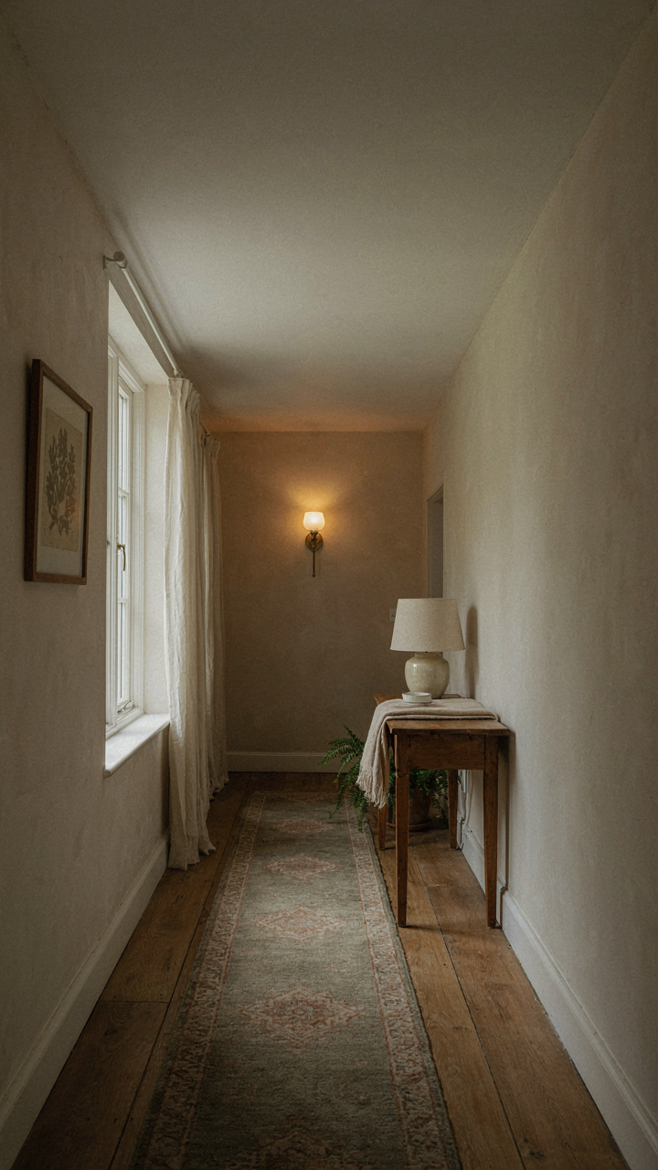
Layered Lighting For Visual Trickery
You want the hallway to feel bigger because a cramped cottage entrance makes guests feel your whole place is smaller. Lighting works like perspective in painting: it controls where the eye travels and how far back the space appears to extend. Most people flood narrow hallways with overhead fixtures. That’s wrong. Overhead light flattens depth and makes tight spaces feel tighter.

The mechanism is contrast and shadow depth. Place a fixture near the far end of the hallway—a wall sconce, recessed light, or standing lamp—and keep overhead brightness moderate or off entirely. This pulls the eye forward and makes the hallway read as longer than it actually is. The brain interprets light sources at the end of a tunnel as distance. Add a second light source at mid-hallway on the opposite wall. The interplay between them creates perceived depth that a single centered light destroys.
Accent Lighting, Not Floodlighting
Forget the design maxim that says “use more light to make small spaces feel bigger.” That advice comes from commercial real estate, not residential cottages. Bright, even illumination in a narrow hallway creates visual monotony. Your eye has nowhere to rest and no reason to move deeper into the space.
Install accent lighting on architectural features: a bookshelf alcove, a framed print, or textured wall paneling. Use warm-toned bulbs (2700K or lower) on these accents. Keep ambient hallway light dimmer and cooler. This creates rhythm and visual interest, which makes brains perceive space as more intentional and, paradoxically, larger. The technical term from lighting design is “sparkle and shadow.” Apply it by placing one bright accent every six to eight feet, leaving the space between them slightly darker.
The Un Hallway: Zones, Not Passages, For Cottage Entryway Ideas
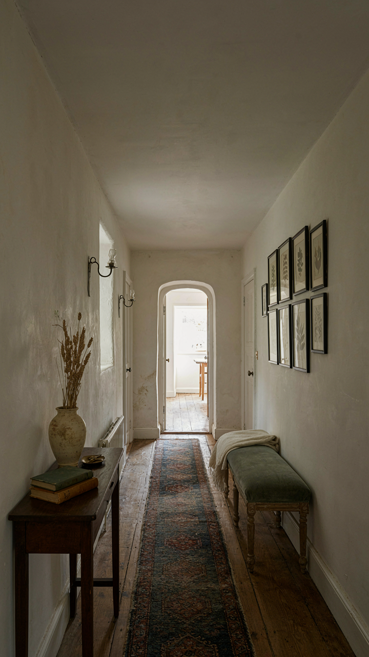
Defining Purpose Within Constraint
You want people to think your hallway is intentional, not just a leftover space. The real mechanism here borrowed from urban planning is called “functional zoning.” Architects use it to turn dead corridors into destinations. A cottage hallway stops being wasted square footage the moment you assign each section a job. Most people leave hallways blank because they think movement is the only function. Wrong. A hallway can hold a coat station, a reading nook, a display wall, or a transition buffer. The space works better when it does something.

Zoning a narrow cottage hallway means dividing it into three to four distinct areas along its length, each with its own visual weight and purpose. A console table with a mirror becomes the entry zone. Wall shelving five feet down creates a display zone. A narrow bench at the midpoint becomes the pause zone. This isn’t decoration. This is structural clarity that makes narrow feel intentional instead of cramped. Your brain registers each zone as a separate room, which expands the perception of space without changing the dimensions.
Furniture As Spatial Anchor
Furniture stops a hallway from feeling like you’re walking through a pipe. The common advice says keep hallways clear and minimal. That’s lazy thinking designed for generic hallways, not cottages. A well-placed piece anchors the space and tells the hallway what it is. In architecture, an anchor is a load-bearing element that stabilizes the whole structure. A console table, a narrow bench, or a tall bookcase functions the same way in a hallway by breaking sightlines and creating psychological stopping points.
The anchor must be proportional to the hallway width. A console table 30 to 36 inches deep works in a hallway that’s 40 inches or wider. A bench seat 14 to 18 inches deep fits tighter spaces. Place your anchor at the entry or at a natural midpoint where the hallway transitions direction or light quality shifts. The piece should have legs or visual clearance at the base so it doesn’t block floor sightlines. Your anchor furniture stops the hallway from being a dead sprint to somewhere else.
Tactile Walls, Not Just Walls: Bead Board Walls For Depth
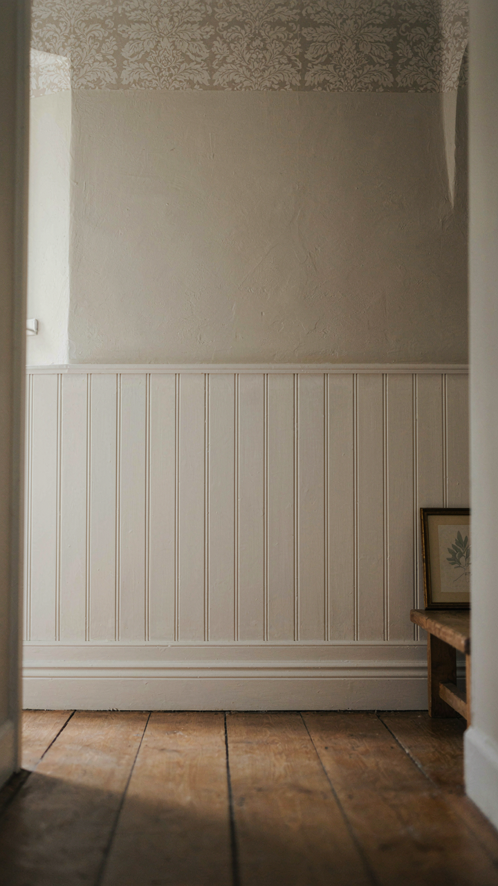
Why Texture Stops The Shrink Effect
You want beadboard because narrow hallways feel like tunnels, and you’re hoping surface detail will trick your brain into perceiving more space. That’s not entirely wrong, but the mechanism is different than you think. Beadboard works through visual interruption, not illusion. The vertical grooves break up wall plane monotony and create shadow lines that give your eye multiple focal points instead of one compressed perspective.

Beadboard’s real strength sits in scale theory borrowed from architecture: it introduces rhythm. The grooves establish a repeating vertical interval that your brain reads as intentional proportion rather than constraint. A smooth cottage hallway feels like a shipping container. Grooved walls feel like they belong to something with history and purpose.
- Vertical Grooves: Create shadow lines that interrupt sightlines, preventing the wall from reading as a single flat plane pressing inward on the space.
- Beadboard Height: Stopping at chair rail (around 36 inches) anchors the visual weight low, making ceilings feel higher relative to the compressed width.
- Paint Contrast: Light beadboard with darker wall above it forces the eye upward, redirecting attention away from lateral compression.
- Groove Spacing: Tighter grooves (1 to 2 inches on center) read as formal; wider spacing feels casual. Match your cottage’s existing woodwork interval.
- Installation Angle: Vertical installation reinforces height. Horizontal or diagonal runs emphasize width, useful only if your hallway is extremely tall and narrow.
The mistake most people make is treating beadboard as decoration. It’s structural visual language. Install it at the same height as other trim in your home—baseboards, door frames, window sills—so it reads as intentional architecture, not an afterthought. Mismatched heights betray the edit.
Material Layering Beyond The Standard
Everyone defaults to beadboard and stops there. The real play is material sequence. Combine beadboard with shiplap sections, textured plaster, or salvaged brick to prevent visual monotony from flattening the space into sameness. One material throughout a narrow hallway amplifies the tunnel effect by removing contrast points.
Your hallway should read as a sequence of surfaces with different tactile and visual weights, not a uniform tube. Install beadboard on the lower section, shift to smooth plaster above the chair rail, then consider a textured paper or paint technique near the ceiling. This three-layer approach mirrors how historic cottages evolved—additions and repairs layered over time. It feels authentic because it reflects actual building practice, not contrived design aesthetics.
The “Beadboard Blueprint” For Flow: Country House Hallway Ideas
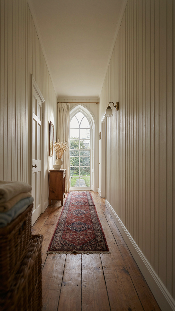
Vertical Lines For Perceived Height
You want the hallway to feel bigger because a cramped passage makes you feel poor, even if you’re not. This is basic optics: vertical lines create lift by forcing the eye upward, which psychology calls the “elevation effect.” Beadboard—those narrow vertical planks running floor to ceiling—weaponizes this. The planks act as visual guides that pull attention up the wall rather than across it, making an eight-foot ceiling read taller than it measures.

Install beadboard to chair rail height (typically 32 to 36 inches) or run it full wall. The repetition of vertical grain creates rhythm, not clutter. Paint the beadboard a light shade—white, soft cream, pale grey—and leave the upper wall a complementary tone. The contrast point creates a visual break that emphasizes height. Measure twice, cut once, and nail studs at 16-inch intervals for structural integrity before you panel.
Color Integration With Beadboard Hallway
Most advice says “paint beadboard white and call it done.” That’s lazy. The real mechanism is contrast hierarchy: your eye lands first on the lightest object, second on the darkest, and fills the middle with texture. Beadboard reads as bright and neutral only when the surrounding wall creates enough tonal separation.
If walls are pale grey, paint beadboard off-white or ivory to maintain lift without washing everything out. If walls are warmer (sage, muted taupe), beadboard should be brighter to preserve the height effect. The door frame, trim, and baseboard should all tie to one color family to avoid visual fragmentation. This keeps the hallway reading as a single contained space rather than a collection of competing elements. Paint walls first, let them cure three days, then paint beadboard to see true color relationships before committing.
Intentional Entryways: Your First Act, Not An Afterthought
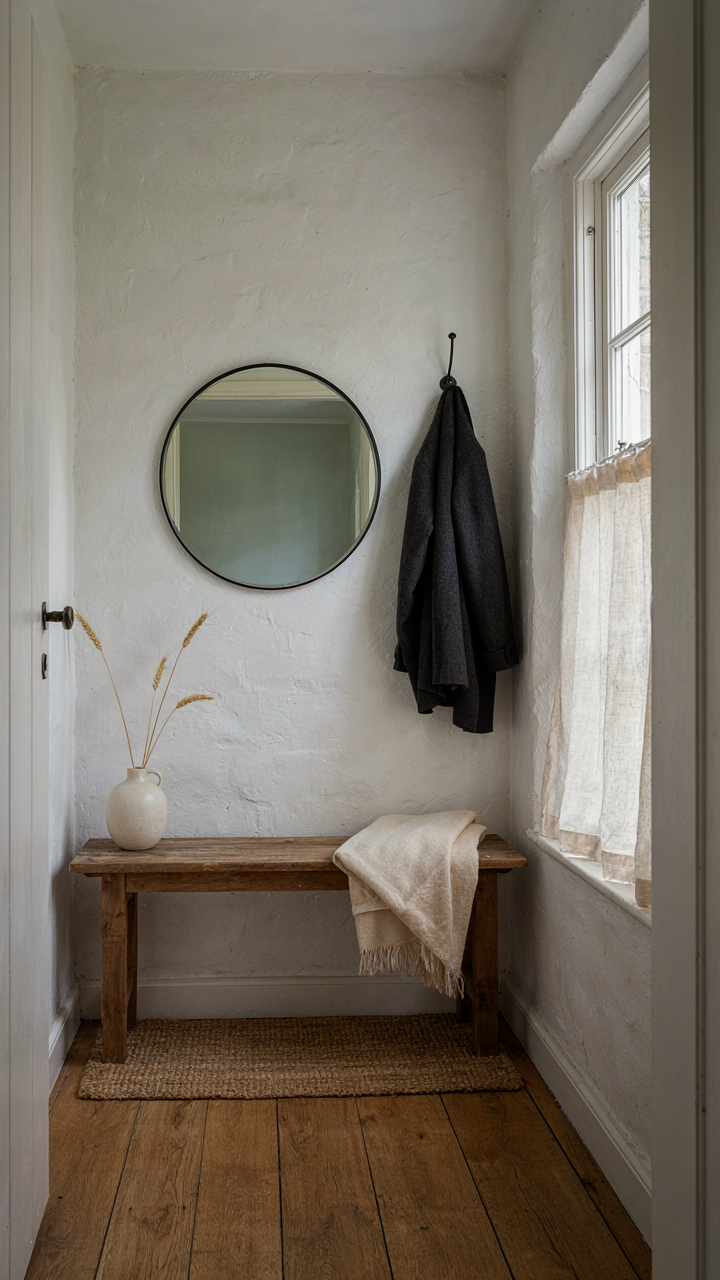
Make Your Entry Do Work
You want people to think your cottage hallway is effortlessly charming, which is why you’re reading this instead of just moving boxes around. The real mechanism is triage: an entryway that forces decisions the moment someone enters stops chaos from spreading into the rest of the space. Borrow from airport terminal design, which uses bottleneck architecture to move people through specific zones. Your hallway entrance needs the same logic—a defined landing zone where coats, boots, and clutter stop before they infiltrate living areas.

Narrow cottage hallways fail because they try to be routes instead of rooms. Give your entry a single job: capture what enters. Install a narrow bench or low shelf within arm’s reach of the door. Position a coat hook at eye level, not somewhere guests forget exists. The tighter your space, the more ruthlessly functional each element must be. No decoration survives if it blocks the primary task.
Strip Everything Unnecessary First
Most advice tells you to add storage solutions before you eliminate what doesn’t belong. That’s backward. Entryways fail because people treat them as overflow zones for items that haven’t found permanent homes elsewhere. Walk through your cottage hallway and identify everything that entered in the past month but doesn’t actually live there. Shoes waiting for repair, coats from three seasons ago, packages opened last Tuesday—move them out before you plan a single design intervention.
Once your entry is actually empty, you see what the space actually needs. The visual impact shifts immediately when your eye isn’t competing with visual noise. This is when you add a single statement piece: a specific mirror, a narrow table with a single lamp, or a patterned rug that anchors the zone. The constraint isn’t the space itself—it’s the discipline to keep only what serves entry and nothing more.
The UK Home Aesthetic: Understated Utility In Cottagecore Hallway Ideas
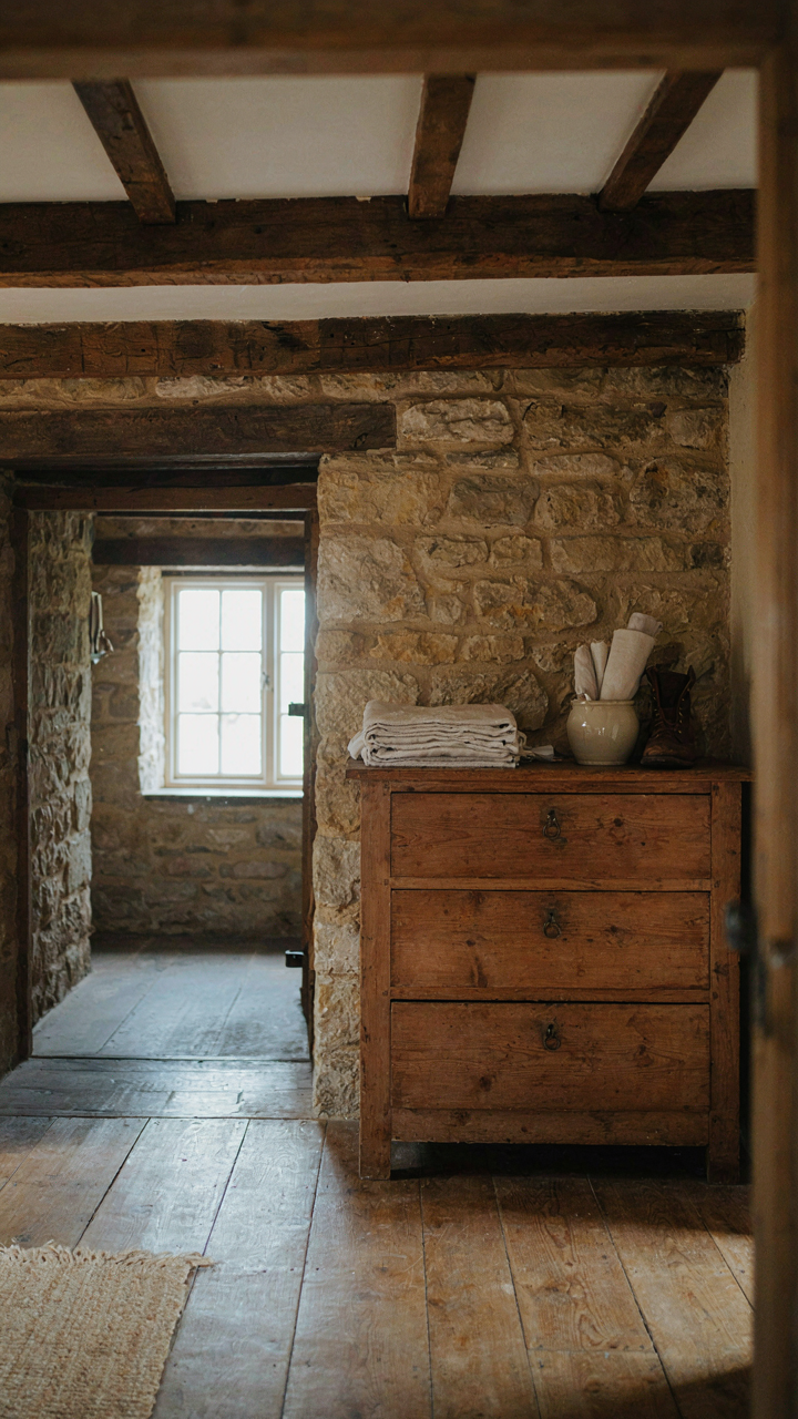
Beauty That Solves A Problem First
You want your cottage hallway to signal taste without effort. That’s the real ask. Here’s what actually works: the UK aesthetic treats decoration as a consequence of function, not the goal. A coat hook isn’t decorative because it hangs coats well. A narrow shelf isn’t charming because it holds things. This inverts how most people design hallways. They pick pretty first, usefulness second. That approach fails in tight spaces.

Real cottage hallways evolved from necessity. Rural homes had minimal square footage. Every surface earned its place by doing work. A wooden dresser held linens and boots. Exposed beams supported the roof and provided visual structure. Stone walls regulated temperature. This wasn’t curated nostalgia. It was economics. When you design backward from function, the space stops fighting you and becomes genuinely livable. Your hallway stops feeling cramped and starts feeling intentional.
Materials That Age Rather Than Fade
The trend advice is wrong here. Most people assume cottage style means shabby, distressed finishes. That’s Instagram cottagecore, not actual cottage building. Real materials in working cottages were chosen because they survive. Stone, timber, lime plaster, and iron don’t need constant replacement. They improve with time. A whitewashed lime wall develops character through weathering. An oak bannister darkens and hardens. Cast iron fixtures outlast three generations of trends.
Choose materials rated for the specific job your hallway does. Flagstone or slate floors handle foot traffic better than painted wood. Limewash works on cottage walls because it breathes, preventing moisture damage in older structures. If your hallway gets wet from an external door, reclaimed timber wainscoting creates a water-resistant base that visually grounds the space without blocking light. Material choice is load bearing architecture, not decoration. It determines whether your hallway feels permanent or temporary. The selection you make now determines whether you redesign in five years or thirty.
Hallway Remodel Ideas: Dispelling The Grand Renovation Myth
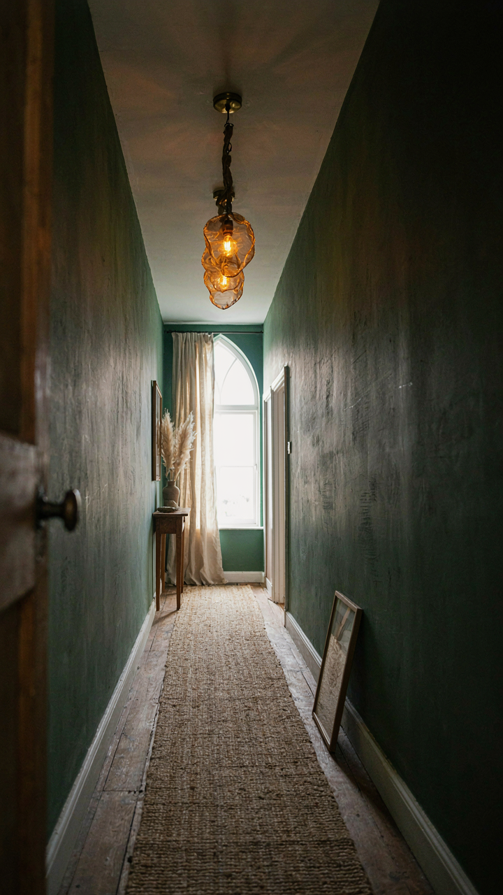
Small Changes Deliver Disproportionate Returns
You’re hoping a full gut renovation will solve the problem, but that’s denial dressed as ambition. The mechanism at work here is constraint forcing clarity. Cottage hallways are narrow by design, which means you can’t hide mediocrity behind square footage. One deliberate choice lands harder than ten timid ones. Paint color, lighting fixture, or flooring material—each decision compounds because there’s nowhere for the eye to escape. This is why cottage hallways often outperform their actual dimensions.

The math is simple: limited surface area multiplied by intentional selection equals visible impact. Most people default to beige and recessed lights because they fear commitment in a small space. That’s backwards. A narrow hallway rewards bold moves because the stakes feel lower and the visual payoff is immediate. Replace a standard pendant with a sculptural brass fixture or commit to deep forest green on the walls. The hallway either works or it doesn’t, and you’ll know in weeks, not years.
Function Before Aesthetics Wins Every Time
The common advice gets this wrong: “Make it feel bigger.” That’s the trap. Stop treating a cottage hallway like a problem to solve and start treating it like a constraint to leverage. Think in terms of industrial engineering’s concept of bottleneck optimization. Your hallway isn’t a bottleneck to eliminate—it’s a transition space with specific traffic patterns, lighting needs, and storage demands. Fix those first, then layer in what looks good.
Start with movement and utility. Does foot traffic flow without obstacle? Can you grab what you need without fumbling? Is the lighting adequate for the actual tasks that happen there? These are mechanical questions, not aesthetic ones. Only after those work does color or material choice matter. A hallway that functions poorly but photographs well is a hallway you’ll resent. The reverse—functional, honestly finished—becomes a space people actually value. Make the functional choice first, always.
The Real Problem Isn’t Your Hallway’s Size; It’s Your Timid Approach To Its Inherent Constraints
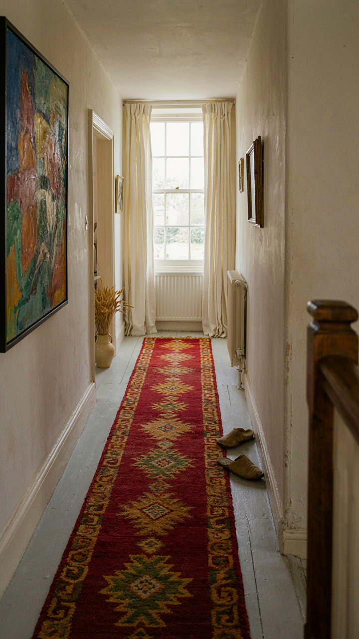
Most people treat their cottage hallway like a problem to hide. Stop. Constraints force creativity. A narrow hallway demands you make every detail count, which means your space will feel intentional instead of accidental. Pick one bold element this week—a color, a fixture, a material—and commit to it fully. Timidity makes small spaces feel smaller. Conviction makes them feel curated.