The Illusion Of Choice: Why Generic Craftsman Colors Fail
When Beige Becomes Invisible
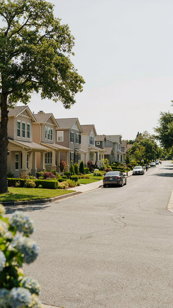
You want to stand out without looking like you’re trying. That’s the real fear underneath all this. The mechanism at work here is saturation, borrowed from information theory: when every signal broadcasts the same frequency, none of them register. Craftsman exteriors have become a visual template. Taupe, sage, cream, and muted olive dominate because they’re safe. They’re also noise. Your eye stops processing them the moment you see the third house painted the same way down the street.
The problem isn’t the colors themselves. It’s that homeowners treat Craftsman palettes like a solved equation instead of a decision framework. Generic craftsman colors work against you precisely because they worked for someone else first. You inherit their lack of distinction. The formula teaches you to fear contrast and saturation, so you copy what “worked” and end up with the same visual result as ten neighbors you’ve never met.
Breaking The Pattern Without Breaking Period Accuracy
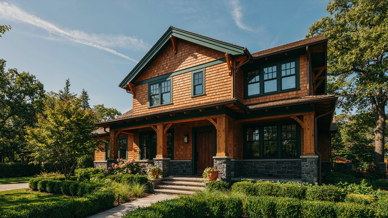
The common advice says stay muted and stay safe. That’s incomplete, and here’s why: the actual Craftsman movement valued honest material expression, not bland uniformity. Architects like Greene and Greene used darker trim, bolder greens, and deep reds because those colors made the wood and stone read as intentional. Muting everything erases the movement’s core principle.
Stop treating your exterior like a neutral backdrop. The mechanism that kills most craftsman recolors is hesitation disguised as restraint. You need to pick a color that creates contrast with your existing materials, not harmony. If your stone is warm and tan, don’t pick warm and tan trim. Go deeper. If your siding reads as light, let the trim work against it. This single protocol shift transforms a forgettable house into one people actually notice and remember.
Beyond The Swatch: Understanding Light’s Tyranny On Craftsman House Exterior
How Ambient Light Rewrites Your Color Choice
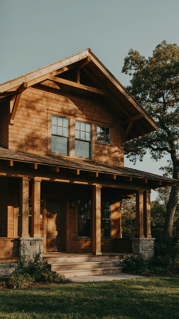
You want the color to look right in the photo you’ll show people, not in the actual light that hits your house every single day. Here’s the mechanism: light carries wavelengths, and those wavelengths shift based on their source. Physics calls this color temperature. For craftsman exteriors, the ambient light source—whether morning sun, afternoon glare, or the sodium vapor from a streetlight—literally changes which wavelengths reflect off your siding or stone. A color that reads warm and earthy at noon becomes muddy under overcast skies or cold under evening light. The swatch in the paint store uses controlled fluorescent lighting that matches neither your house’s actual conditions.

The craftsman palette thrived because the style emerged when natural light was the only ambient source, and materials were selected to harmonize with that consistency. Modern exterior colors fail because homeowners choose them under conditions that won’t exist on their house. Test paint samples for a full week across all daylight hours and at night under your actual exterior lighting. Don’t just look; photograph the samples at different times. Document the specific light conditions where the color will live, then make your choice only after seeing it shift through a real day cycle.
The Depth Game: Shadows As Your Layout Tool
Shadow creates perception of form, and form creates hierarchy on a facade. A single color applied uniformly reads flat. Strategic color placement in shadow zones and high-light zones makes the craftsman aesthetic work because it replicates the depth that materials themselves provide. When you place a darker shade in shadow recesses of trim, eaves, or architectural details, you’re not fighting the shadow—you’re amplifying it. This compounds the visual depth the building already has from its geometry. The lighter color on the main wall face reflects more light and appears to push forward while the dark recesses recede. This isn’t decoration. This is spatial illusion based on how eyes process contrast and depth cues.
Craftsman houses used this principle with material shifts: darker wood trim against lighter stone, or stained shingles against painted siding. The color scheme mimicked material contrast. Study where shadows fall on your specific house at different times of day, then assign your darker craftsman colors to those permanent shadow zones. Place mid-tones and lighter shades where direct light hits most consistently. This protocol forces you to think like the original designers—not as someone choosing a pretty color, but as someone using color to sculpt the building’s apparent form.
The Contrast Cadence: A System For Craftsman Colors Exterior
When Trim Demands Separation
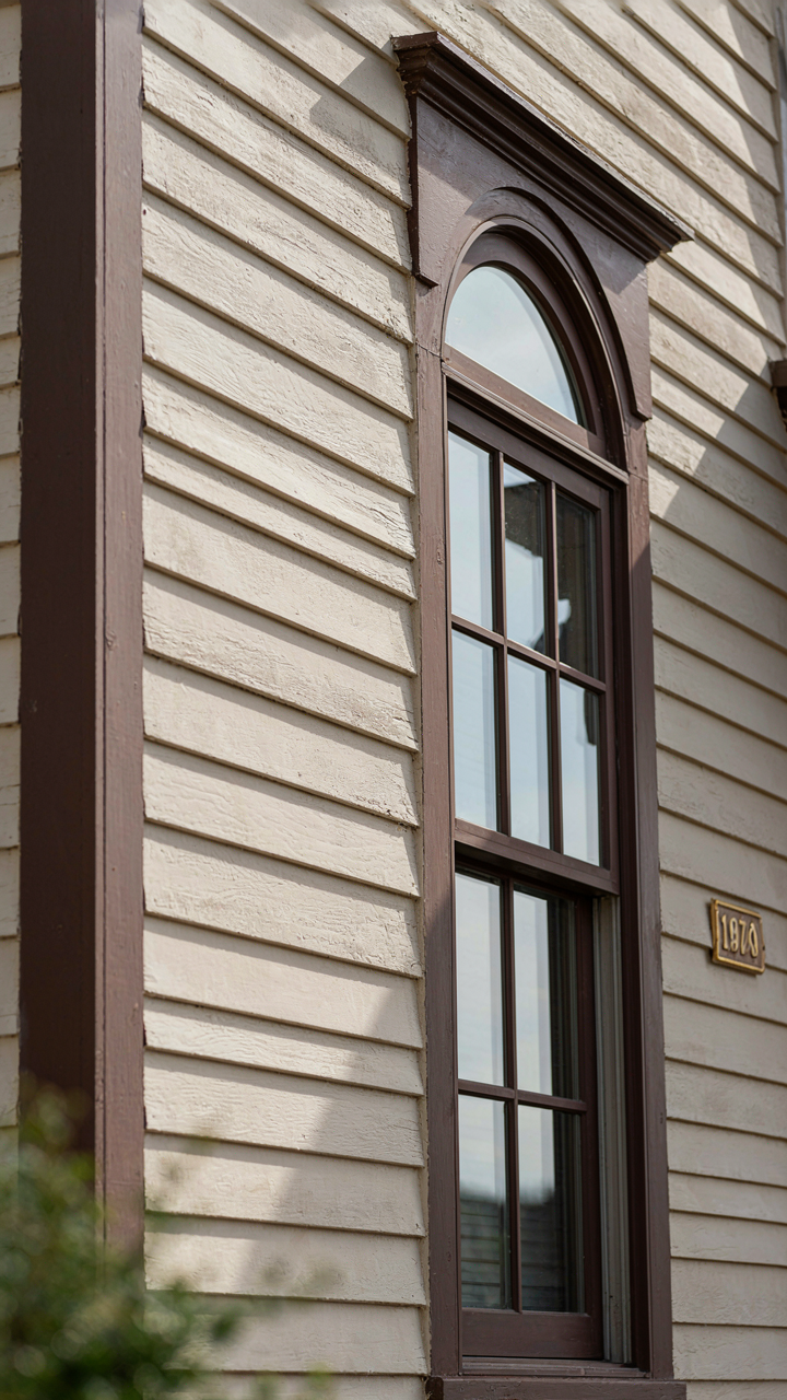
You want people to notice your details. That’s the real reason contrast matters. Most advice says “use contrast” without explaining the mechanism. Here’s what actually happens: contrast works like signal-to-noise in information design. Your eye locks onto the boundary where two colors meet. The larger the gap between them, the harder the boundary reads. Craftsman homes use this deliberately at trim, soffits, and transitions between materials.
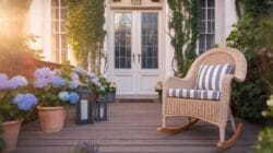
Dark trim against light siding isn’t just prettier. It creates visual hierarchy. Your gaze lands on the architectural work first because the color shift announces it. This is why Craftsman exteriors from the early 1900s paired dark wood trim with light shingle siding or stucco. The contrast enforced the structure. Without it, the trim dissolves into the field color and your $8,000 detail work becomes invisible.
Holding Color Relationships Steady
The real mistake isn’t making transitions too subtle. It’s making them random. Every color shift between materials should solve a specific visual problem, not fill a gap. Subtle contrast maintains material distinction without creating visual screaming. This happens at the junction between siding and foundation, or where trim meets siding at a recessed detail.
Pick a contrast ratio and defend it. If your trim sits five shades darker than siding, your foundation should sit five shades lighter than siding. This creates a rhythm. The eye recognizes the pattern and accepts the transitions as intentional rather than accidental. This consistency is what separates deliberate Craftsman color work from paint-by-committee results. Measure your colors against one reference and shift them proportionally across all material boundaries on the exterior.
Harnessing Materiality: Wood And Stone As Primary Pigments
Let The Materials Choose Your Paint
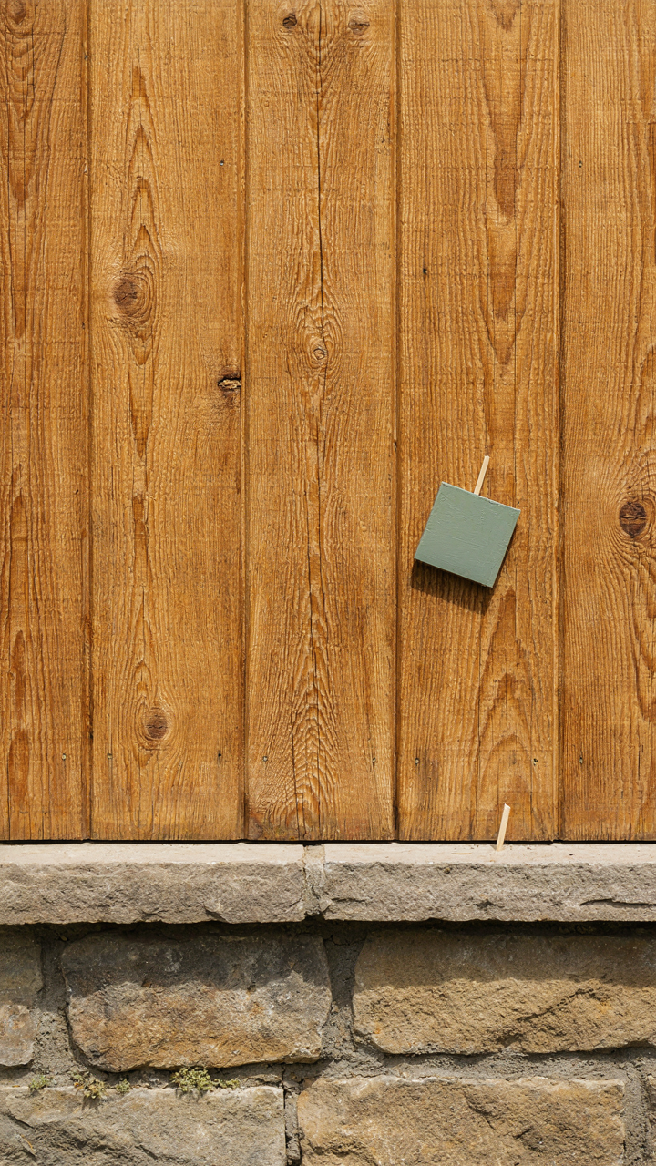
You want permission to skip the paint decision. You think if you just pick something “neutral” the house will look fine. The mechanism is this: your wood and stone are already pigmented. They have undertones. Paint doesn’t sit on top of them neutrally. Paint competes with them or amplifies them. Most people paint over wood and stone without acknowledging they’re working against existing color, not starting from blank canvas.

Craftsman homes use wood and stone as visual anchors. The exterior color palette emerges from what’s already there, not imposed on top of it. Douglas fir trim has warm red undertones. Granite has gray-to-purple depth. Cedar siding shifts between golden and silvery tones depending on weathering. Your paint color either echoes these wavelengths or clashes with them. The common advice says pick a color you love. That’s incomplete. You pick a color that doesn’t fight the materials your house is already made from.
Stopping The Undertone Mismatch
Undertone conflict is real, and nobody names it directly. You paint a house sage green that looked perfect on a swatch, then it looks dingy against warm-toned brick. That’s not the paint’s fault. That’s undertone rejection. Think of it through color theory’s principle of harmony: colors from the same temperature family amplify each other. Colors from opposing families cancel each other out, creating visual mud.
Warm wood demands warm paint undertones. If your siding is Douglas fir or redwood, you’re working with reds, oranges, and yellows in the undertone spectrum. Cool grays and blue-based whites will make that wood look sickly. Stone adds complexity because granite and limestone often contain both warm and cool notes. Survey your stone in direct sun and shadow. If it reads gray-to-purple, your paint undertone must lean cool. If it reads warm gold or tan, shift your paint toward warm neutrals. The mechanism: paint your test board on the actual wall in morning and afternoon light. Mismatch surfaces immediately as visual tension. Harmony reads as intentional restraint.
The “A/B Testing” Protocol For Craftsman Home Colors
Test Samples Across Different Light Conditions
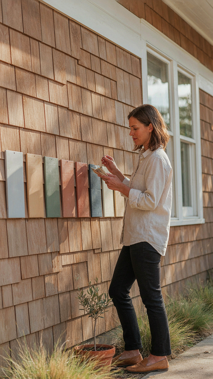
You want certainty before committing thousands to paint. The real mechanism here borrows from experimental design: you need control variables. Light changes everything about how a color reads on wood and stone, and most people skip this step entirely because it feels tedious. Buy sample pints. Paint two-foot sections on different elevations of your home, then observe them at dawn, midday, and dusk for a full week. North-facing walls kill warm undertones. South-facing walls amplify them. East and west exposures shift color temperature across the day. Document what you see, not what you think you should see.

The craftsman palette relies on earth tones and muted greens that shift dramatically under different sun angles. A color that reads rich and grounded at sunrise can flatten or lean too yellow by afternoon. Paint samples on the actual material your home uses, not on primed drywall or cardboard. Stone and wood have their own undertones that interact with paint color. Spend the time watching. This is not decoration advice. This is data collection.
Photograph Under Consistent Conditions
Document each sample with identical camera settings, time of day, and weather. Cloudy days are best because they eliminate harsh shadows that distort perception. Take photos straight-on from the same distance every time. Your phone camera will lie to you through automatic white balance adjustment, so disable that feature or use a dedicated camera app that locks exposure. Compare prints side-by-side indoors under neutral lighting. Digital screens introduce color casts that change your decision in the field. The craftsman homes that hold color well over decades use samples photographed this way before selection happens. This eliminates memory bias and the false confidence that comes from looking at color chips.
Print your photos at actual size if possible, or at minimum four by six inches. Tape them to a neutral gray or white board and review them in the same interior lighting where you’ll make the final call. The color that photographs best under consistent conditions is the color that will perform across real weather and real time. This protocol takes discipline. Most people skip it and repaint within three years.
Psychology Of Perception: How Color Directs The Eye On A Craftsman Bungalow Exterior
Where Your Eye Lands First
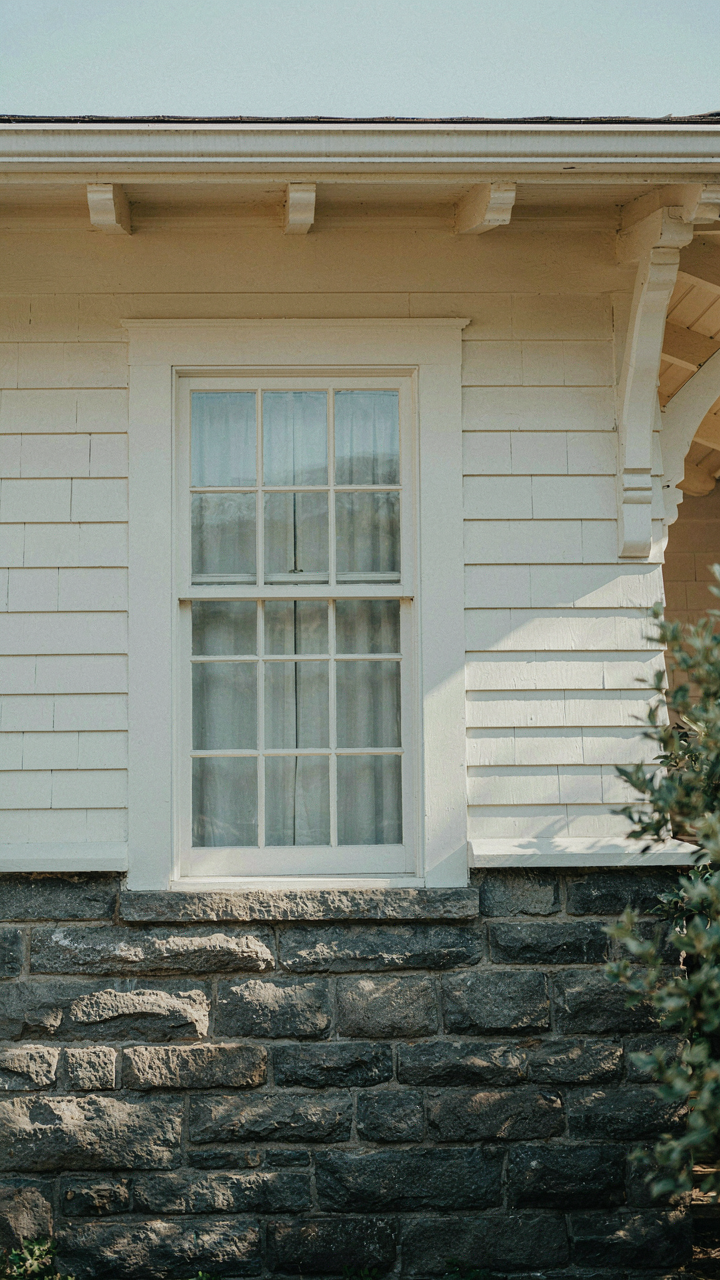
You want people to notice the expensive stone or timber you paid for, not waste their attention on trim. Here’s the biology: your eyes don’t see the whole facade at once. Ocular dominance means one eye leads the visual scan, and saccadic movement means your gaze jumps to high-contrast areas in rapid, involuntary jerks. A craftsman exterior with competing colors creates visual noise that fragments attention. Darker trim against lighter stone, or vice versa, anchors the eye exactly where you choose. The mechanism is neurological, not aesthetic.

Craftsman design doesn’t fight human perception. It leverages it. When you pair warm stone tones with deep brown or charcoal trim, the contrast creates a visual hierarchy. Your eyes move to the trim first, then settle on the material behind it. This isn’t coincidence. Early craftsman architects understood that color contrast governs where attention flows, even if they lacked the neuroscience language. The goal was always functional: make the honest materials unmissable.
What Your Periphery Misses
Most advice on craftsman colors ignores foveal focus entirely, focusing instead on vague ideas about “cohesion.” Wrong approach. Your fovea, the central part of your retina, processes fine detail and color nuance. Your peripheral vision catches broad tones and edges. On a craftsman bungalow, this distinction matters tactically. Paint the body in a neutral tone that reads consistently from the street, then use deliberate color saturation on the focal point: the front door, stone chimney, or timber brackets. The periphery holds the composition steady. The fovea directs judgment.
Stone and wood demand specific chromatic conditions to appear valuable instead of dull. When peripheral vision dominates your color choice, materials flatten. The eye must move toward the detail to perceive depth and craft. This is why warm grays and muted earth tones work on craftsman exteriors: they don’t compete for foveal attention. They support it. Place darker, more saturated colors where the viewer’s central gaze will actually land, typically at eye level on architectural features. The outer frame stays quiet. The center reveals texture.
Beyond Trends: Timeless Palettes For Craftsman Bungalow Exterior Colors
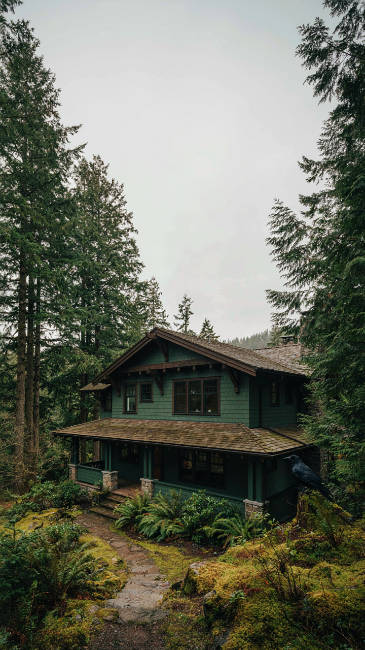
What Regional Builders Actually Used
You want timeless colors because you’re afraid of dating your house. The real mechanism is simpler: regional material availability determined color palettes, not aesthetic choice. Builders used what local suppliers stocked. In the Pacific Northwest, deep greens and warm grays dominated because they matched the clay and stone quarried nearby. The Midwest favored burgundies and earth tones tied to brick production. The mechanism is supply chain, not design theory.
- Pacific Northwest: Deep forest greens, warm grays, and dark earth tones that echo local stone and timber. These colors emerged from what was cheaply available, not invented by architects.
- Midwest and Great Plains: Warm brick reds, burnt siennas, and ochre yellows reflecting abundant clay deposits and local manufacturing capacity.
- California Craftsman: Warm taupes, sage greens, and terracotta influenced by Spanish Colonial architecture and local adobe traditions already established in the region.
- Northeast: Deep forest greens, charcoal grays, and warm browns tied to slate quarries and the region’s forest ecosystem visibility in the built environment.
- Upper South: Warm olive greens, muted mustards, and soft grays reflecting both plantation-era traditions and the limestone prevalent in Tennessee and Kentucky.

Replicating regional accuracy matters because those colors work with local light, local materials, and local resale expectation. A deep green that looks correct in Seattle fails in Phoenix not because of taste but because the surrounding landscape context is gone. Match your region’s original palette and you avoid the visual discord that screams “wrong.”
The Paint Chemistry Problem Everyone Ignores
The worst advice about craftsman colors is to just pick “timeless” shades and assume they’ll last. Paint fails not because you chose poorly but because craftsman exterior colors sit on materials that move constantly. Stone expands and contracts. Wood absorbs moisture then sheds it. Modern acrylic latex paints flex with the substrate, but they weren’t what original craftsman homes used. Early homes got oil-based and casein paints that bonded differently to aged wood and stone.
You cannot replicate 1910 paint performance with 2024 products. What you can do is stop fighting the material underneath and choose colors that hide the inevitable cracking and weathering. Darker colors mask this better than lighter ones because the visual noise of texture degradation reads as shadow, not damage. Deep greens, warm browns, and charcoal grays hide fifty years of normal wear. Soft creams and pale yellows show every flaw. The concrete action: if you want a light craftsman color, accept that repainting happens every seven to ten years instead of fifteen. Budget accordingly and choose the darker option if maintenance matters more than variety.
The Understated Power Of Trim: Defining Edges On Your Craftsman Home Exterior Color Schemes
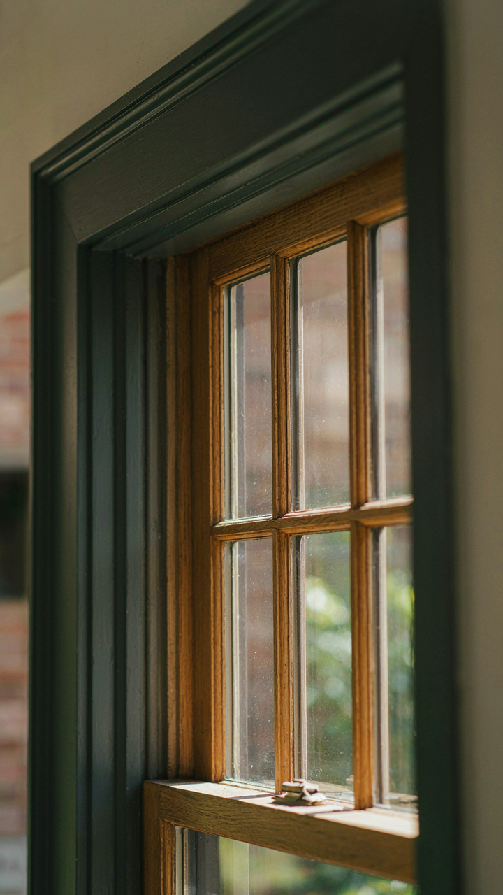
How Trim Frames Natural Elements
You care about this because trim is where most people fail to see the wood and stone you paid for. The real mechanism: trim acts as a visual frame, the way a mat isolates a painting from the wall. Craftsman homes use trim to create contrast that makes materials readable. Dark trim around light stone pulls the eye to the masonry. Light trim against dark wood siding does the opposite. The frame determines what you actually see.

Craftsman designers understood that materials need edges to register as distinct. A stone chimney without trim definition reads as part of the wall. The same chimney with contrasting trim becomes an architectural feature. This isn’t decoration. It’s the difference between material visibility and material invisibility. Trim color selection directly controls whether your stone and wood investments vanish into visual noise or command attention. Choose trim that creates at least a two-value shift from the primary surface it borders.
Creating Architectural Distinction Through Contrast
The common advice says paint trim white. That’s incomplete. White works on certain homes and fails on others because it ignores the actual tonal density of your materials. Craftsman homes need trim to articulate structure, not erase it. A deep charcoal or forest green trim on a honey-toned wood siding creates separation that emphasizes the wood grain. Lighter trim on dark stone does the reverse. The mechanism is contrast hierarchy: your eye follows value change first, then color.
Trim defines where one building plane ends and another begins. On Craftsman homes with mixed materials, trim acts as a boundary marker. Paint it too light and it dissolves into the siding. Paint it too dark and it absorbs the material behind it. The correct trim color reveals the geometry of your home while respecting the materials it frames. Measure the LRV (light reflectance value) of your primary surface, then select trim at least 20 points different on the LRV scale.
Your Craftsman Exterior Isn’t A Canvas For Trends; It’s An Architectural Statement Demanding Intentionality, Not Aspiration

Most people choose craftsman exterior colors the way they pick Netflix shows: fast and forgettable. Stop. Your home’s palette should amplify what’s already there—the wood grain, the stone texture, the bones of the structure. Pick one color today. Walk your property at sunrise, noon, and sunset with paint samples in hand. Watch how light transforms them. The ones that disappear into the architecture, not fight it, win. Your craftsman home either speaks for itself or screams for attention.