
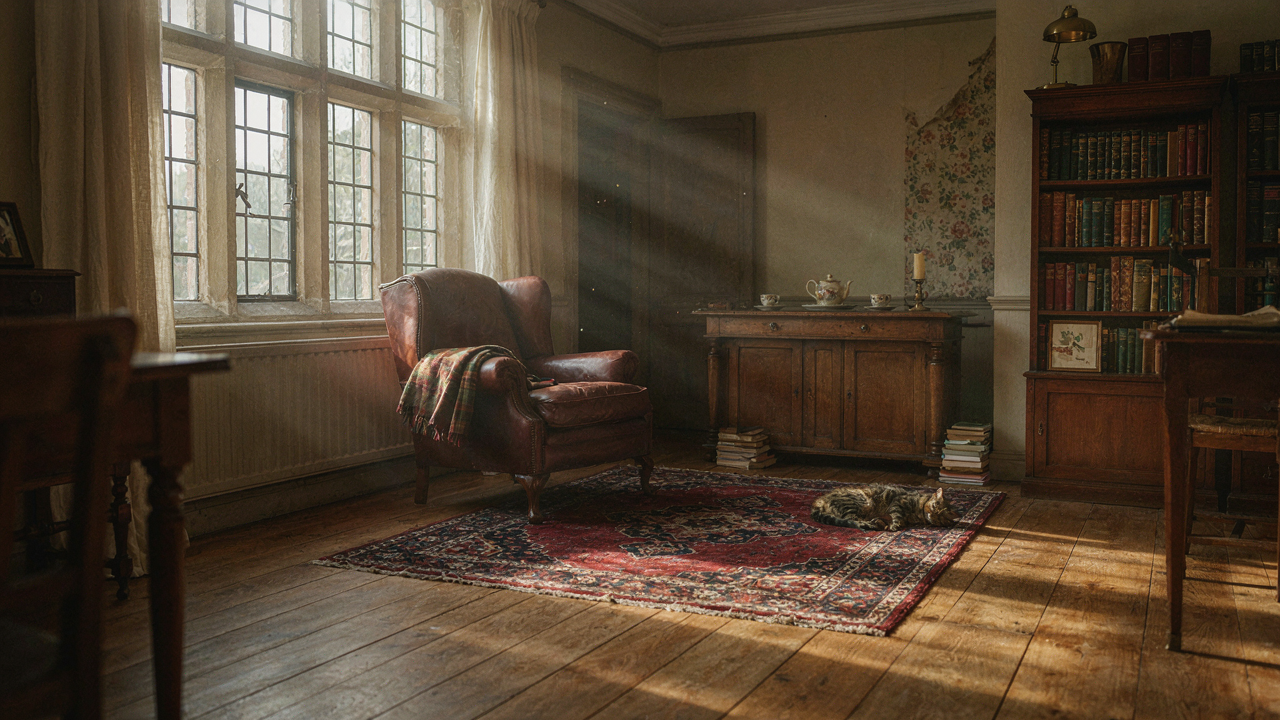
The Old Money House Illusion: Why Your Pinterest Board Lies
Curated Versus Accrued: The Authentic Patina
You want people to think your home happened by accident, which is precisely why you’re scrolling Instagram at midnight looking for intentionality to purchase. The mechanism at work here is archaeology, not decoration. Real country houses didn’t accumulate their character through a weekend shopping trip. They built patina through use, repair, and genuine constraint.
The difference between curated and accrued is the difference between a house that looks lived in and one that actually was lived in across generations. A genuine English country house bears marks of its function: worn floorboards where traffic moved, faded fabrics from decades of sunlight, repairs done with whatever materials matched the budget at the time. These aren’t aesthetic choices. They’re evidence. When you buy a new rug to look old, you’ve inverted the entire premise. The gap between authenticity and performance is where most renovation budgets get wasted.
Avoiding Shabby Chic Cosplay
The common advice says layer textures, embrace imperfection, and mix periods. That’s cosplay, not design. Real country houses don’t perform their own aesthetic. Shabby Chic as a movement was born in the 1980s as a retail category, a deliberate commodification of decay. It’s the opposite of what happens in an actual house that’s been occupied since 1780.
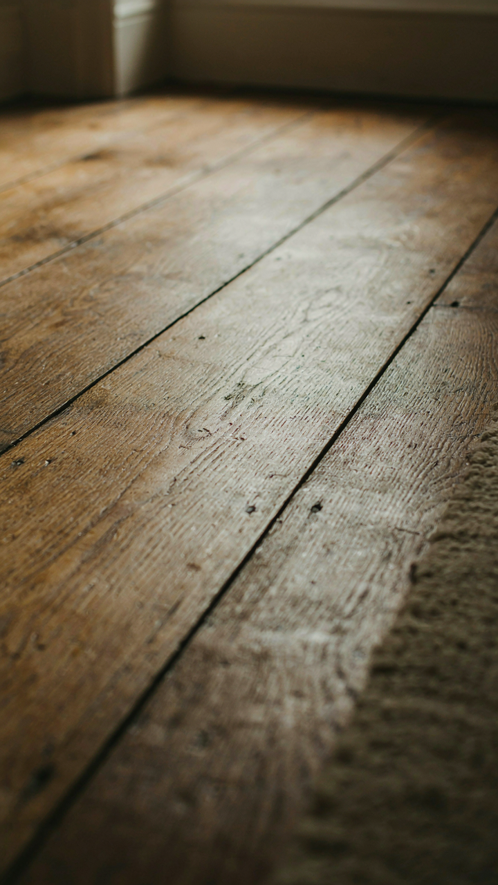
The actual mechanism is constraint, not curation. Old country houses look the way they do because owners couldn’t afford to replace everything at once. Paint stayed on trim for thirty years. Wallpaper faded unevenly. Furniture sat in the same spot so long the rug beneath it bleached differently. When you deliberately engineer that effect, you’ve created a costume. The protocol is simple: buy pieces that function in your life now, keep them longer than current fashion demands, and let actual living create the aesthetic. Don’t aim for shabby. Aim for functional.
The Stone House Foundation: It Starts With The Bones, Not The Wallpaper

Structural Integrity And Timeless Materials
You want the look without admitting you’re buying into a system of permanence and class. Here’s the mechanism: an English country house works because its bones don’t rot, and neither does its resale value. Think of it like load-bearing walls in architecture—some elements carry weight, others are decoration. Stone, slate, and solid timber are load-bearing decisions. Everything else is negotiable.

The common advice says “use period-appropriate finishes.” That’s backward. The finishes change every thirty years. The stone doesn’t. English country houses survive centuries because they’re built on limestone, sandstone, or granite foundations that outlast fashion cycles. Damp-proof membranes, proper drainage, and solid masonry walls become invisible only when they work. When they fail, the entire project collapses into dry rot and structural settlement. Start by auditing what’s already there. If the bones are compromised, no wallpaper saves you.
Function Over Fleeting Trends
Most people decorate around problems instead of solving them. A room that’s cold, damp, and poorly lit will stay that way beneath expensive curtains. English country houses endure because their layouts answered genuine problems: keeping heat in, managing moisture, and maximizing light from the south. Those constraints built the form.
Your decisions on room layout, window placement, and heating should come before style choices. A properly functioning pantry beats a beautiful kitchen that can’t store food. A mudroom that actually controls mud prevents constant floor replacement. Prioritize what the room must do first, then apply finish decisions. This sequence—function locks in, aesthetics decorate around it—is why old houses outperform new ones built for appearance.
English Countryside Houses: The “Lived In” Myth And How To Break It
Wear That Serves A Function
You want people to believe your house has always been this way, that elegance just happened to you. That’s the real game here. But the mechanism everyone misses is that authentic wear comes from use, not from buying distressed furniture and calling it honest. A country house shows its age because things were actually done in it, not because you hired someone to make it look that way.

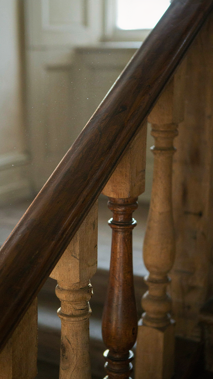
Real patina has a logic. A bannister is worn smooth on one side from 50 years of hands. Floorboards dip where people walked daily, not randomly. Paint cracks follow humidity patterns, not aesthetic whims. The distinction matters because staged aging reads as fraud the moment someone who knows actually looks. Purpose creates believability. Your job is to use rooms the way they were designed, then let time do the work.
Asymmetry Over Arrangement
This runs counter to interior design consensus, which treats rooms like gallery spaces that need “balance.” That’s wrong for country houses. Real imperfection operates like thermodynamics in systems thinking: energy dissipates unevenly over time, creating variation, not uniformity. A room where someone actually lived has one good chair by the window where the light hits, another chair that doesn’t match because it came from upstairs, books stacked on one side of a shelf because that’s where they get read.
The practical move is to stop curating and start inhabiting. One side of a mantel has objects because you use that side. A corner feels settled because a lamp casts shadow there in the evenings. Curtains hang uneven because one side gets tied back more often. This isn’t lazy design; it’s the evidence of preference, proximity, and routine. Build rooms around how you actually move through them, then resist the urge to fix it.
The British Farm House: Engineered Serendipity Protocol
What Actually Changes When You Commit
You want this because you’re tired of rooms that feel like they’re trying too hard, and you suspect that “relaxed elegance” is a real thing you can engineer instead of stumble into. Here’s the mechanism: evolutionary biology calls it the “adjacent possible”—the set of changes you can make from your current state without breaking the whole system. In a farmhouse, this means each design choice expands what the next choice can be, rather than narrowing it. You’re not curating a static vision; you’re building a structure that absorbs new elements without collapsing.

The British farmhouse works precisely because farmers built incrementally. A room gets a new window. A wall gets moved. A hearth expands. Each change didn’t require demolishing what came before. This is why forced color schemes or rigid style rules fail in these spaces—they treat the house as finished when it’s actually still growing. Your job is to make decisions that leave the system open, not closed. Install materials that age into the design rather than deteriorate out of it.
Layering Without Depletion
Permaculture treats soil as a living system where you add and extract simultaneously without degrading the whole. Apply this to your interior: every object you add must either serve function, carry history, or absorb future change. Most people add decoration, which depletes the room’s visual bandwidth. You add nothing. Instead, you expose what was already there. Strip wallpaper to find plaster. Remove carpet to reveal floorboards. Repaint trim to match its original proportion. The room doesn’t feel sparse; it feels intentional because nothing competes for attention.
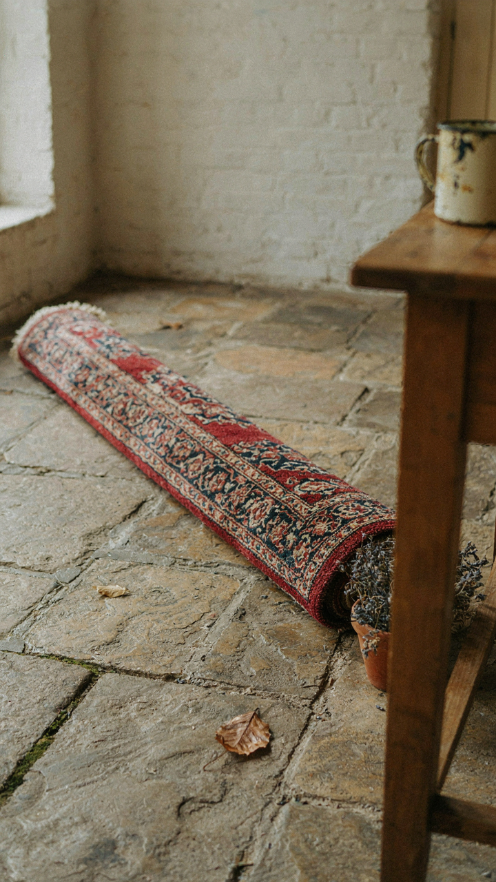
The mechanic works like this: identify one element per room that can be restored rather than replaced. A flagstone floor under carpet. Original timber beams under dropped ceilings. Deep skirting boards under modern trim. Expose it. Let that single honest element set the visual tone. Everything else—furniture, textiles, lighting—then arranges itself around that anchor. This is how farmhouses accumulate beauty over decades without ever feeling cluttered or designed. Each layer serves the ones before it.
English Mansions: Scale Vs. Soul In Grand Spaces
The Furniture Problem Nobody Names
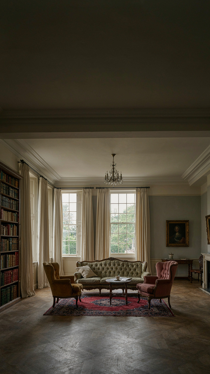
You want to know how to make a big house feel like home instead of a hotel lobby. That’s the real question underneath this. The mechanism is simple: English country houses fail when owners treat square footage as a design challenge instead of a constraint to work against. Vastness demands furniture placement that creates psychological rooms within rooms. Without this layering, your eyes scan 40 feet of empty floor and your body never relaxes.

The Georgian and Victorian estates that still feel lived-in share one trait. They divide massive drawing rooms into conversation zones using furniture clusters, not walls. A sofa, two wingbacks, and a side table in the corner of a 30-by-40 space don’t look lost. They function as a room. Scale disappears when you stop trying to furnish the entire volume and start defining functional pockets within it.
What Kills A Room Dead
Everyone says not to make a country house feel like a museum. That’s meaningless advice. What actually deadens a space is treating it like a showroom where nothing gets used. The real culprit is symmetry enforced across too much distance. Museums use symmetry precisely because it signals “look but don’t touch.” Symmetrical placement of identical pieces across a 50-foot room reads as formal, untouchable, sterile.
Real country houses accumulate asymmetry. A bookshelf runs along one wall at different heights. Artwork hangs where light hits it, not where a designer diagram says it should. Worn leather chairs cluster near the fireplace because that’s where people actually sit. Use objects, don’t display them. Move pieces monthly based on how the room functions, not how it photographs.
The Countryside House Palette: Beyond Beige And Grey

What The Land Actually Dictates
You want permission to use color without looking like you’re trying too hard. That’s the real ask. The mechanism is simple: regional palettes worked because they came from local materials, not from a designer’s mood board. Stone, clay, and plant-based dyes determined what colors existed in a given area. A Cotswold house used honey and grey because those stones were there. A Norfolk property leaned toward red-clay tones for the same reason. Copy the constraint, not the color.

Regional dye traditions shaped what pigments households could actually access and afford. Madder root produced reds and rust tones. Woad gave blues and purples. Weld yielded yellows. These weren’t aesthetic choices first—they were what grew locally or traded easily. The palette of an English country house in Devon differed from Yorkshire not because of taste, but because of geology and agriculture. The constraint created coherence. Ignore the constraint and you get a room that feels assembled from catalog pages.
Texture Builds Depth Where Monotone Fails
The common advice is to add texture for visual interest. Wrong framing. Texture isn’t decoration—it’s contrast that makes a limited palette work. When you layer linen, wool, stone, and timber in a restrained color range, each material catches light differently. A room with five shades of grey and one texture is prison-like. The same five greys across linen, plaster, slate, and weathered wood becomes dimensional and lived-in.
The practical step: choose your base color, then specify materials that express different finishes in that same hue. Soft linen on walls, matte wool upholstery, polished stone on floors, rough timber trim. Light hits each surface differently. The eye reads depth instead of flatness. This is how a Regency drawing room in Somerset held interest without relying on pattern or bright color. You’re working with material variance, not hue variance. Start there.
Old English Farm House: The Function First Fallacy
When A Tool Stops Looking Like One
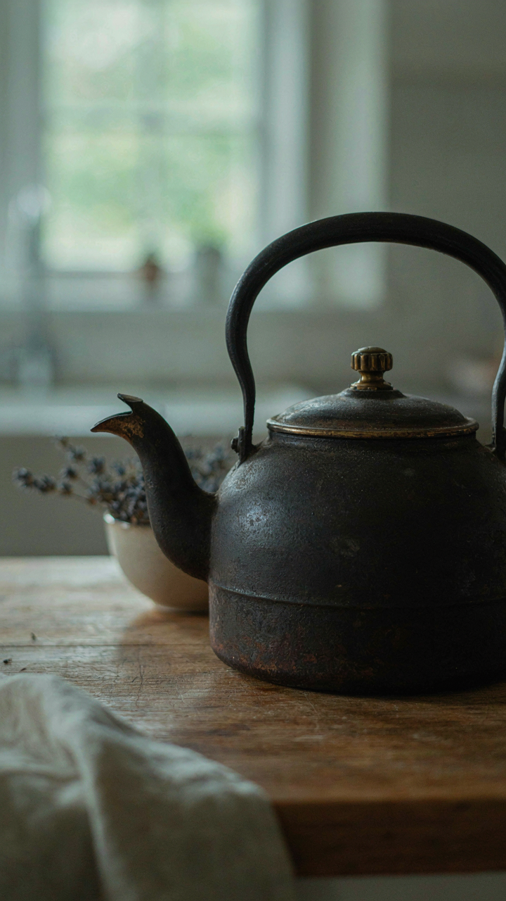
You want permission to buy expensive things without feeling shallow about it. Here’s the mechanism: English farmhouses didn’t separate beauty from purpose because they couldn’t afford to. A cast iron kettle, a wooden hay rake, a stone trough—these objects had to work first. But the craftspeople who made them understood that form follows from honest function, not from decoration applied afterward. A tool that works gets used daily. A tool that works well gets inherited. The aesthetic emerges from the constraints, not despite them.

This is why the farmhouse interior still reads as elegant. The cream-colored pottery vessels stacked on open shelving weren’t chosen for their softness of tone. They were chosen because they stack, pour, and last. The wooden ladder leaning against the pantry wall isn’t rustic décor. It’s how you reach the high shelves in a room with ten-foot ceilings. The real move is recognizing that objects earn their beauty through genuine use, then stopping the impulse to swap them out for something “prettier” once you feel wealthy enough.
Hiding What You Need Without Hiding It
The common advice says blend new systems into old walls. That’s incomplete. Real farmhouses never hid their infrastructure because they didn’t have infrastructure to hide. They had what they needed—water, heat, light—made visible through materials that aged well. Modern comfort demands electricity, HVAC, plumbing that don’t belong in a 300-year-old structure. The protocol is integration through material matching and spatial honesty, not concealment.
Run wiring through existing wall cavities where original plaster and timber allow. Recess radiators into stone alcoves or furniture bases using period-appropriate metalwork. Locate modern bathroom fixtures where a scullery or wash room originally existed. The mechanism works because you’re leveraging the existing spatial logic rather than fighting it. A contemporary kitchen tucked into the original service wing reads as coherent. One grafted onto the formal dining room reads as a renovation mistake. The farmhouse survives not because you hide modernity, but because you place it where function demanded service spaces all along.
English Countryside Manor: The Asymmetrical Advantage

When Formal Balance Becomes A Liability
You want permission to break the rules because you think rule-breaking is what separates expensive taste from generic taste. That’s the real move here. Symmetry reads as control. Asymmetry reads as confident. English country houses from the 17th and 18th centuries didn’t evolve toward balance because designers suddenly felt artistic. They abandoned rigid symmetry because rooms built for actual living refused to cooperate with grid-based thinking. Wings were added when families grew. Windows faced views instead of matching opposite walls. The architecture adapted to use. Asymmetry became the fingerprint of a house that had survived real life.

Modern rooms that mimic this don’t copy the accident. They engineer it deliberately. The mechanism works like load-bearing in structural engineering: you distribute visual weight unevenly across the space so the eye keeps moving instead of settling. A fireplace doesn’t center the wall. A painting doesn’t hang between two sconces. Furniture clusters on one side with negative space breathing on the other. The room feels inhabited because it refuses to perform for you. That refusal is what costs money to achieve.
Anchoring The Eye Without The Grid
Visual weight doesn’t mean size alone. A dark, textured object pulls attention harder than a pale, smooth one occupying the same footprint. Country houses exploit this by clustering their heaviest pieces—dark wood furniture, deep upholstered seating, stone hearths—on one side of a room, then balancing with lighter elements like tall windows or pale walls rather than matching furniture on the opposite side. The space feels resolved because the tension resolves through contrast, not duplication. Nobody sits in an asymmetrical room wondering if something is wrong. They sit in it wondering why it feels more complete than symmetrical alternatives.
Focal points operate on visual hierarchy, not location. Place a substantial object where sightlines naturally flow—beside a window, at the end of a diagonal sight line, anchoring the deep corner most rooms waste. Paintings or textile pieces over furniture reinforce the anchor. The secondary elements scatter without pattern because the primary focal point has already answered the eye’s question about where to land. Rooms designed this way need fewer objects because each one operates functionally. Install the primary anchor first. Everything else fills gaps based on traffic and use, not a predetermined layout.
The True Cost Of Relaxed Elegance: Beyond The Price Tag
The Curation Tax Nobody Admits
You want the look without admitting you’re buying taste. That’s the real friction. The mechanism is simple: relaxed elegance demands constant, invisible labor. You can’t just buy a English country house aesthetic and live in it. You curate it, endlessly, or it collapses into either sterile showroom or actual chaos within months.

The time sink isn’t the initial purchase. It’s the maintenance of restraint. A country house demands you know what to remove, not add. This requires pattern recognition you only develop through sustained exposure to the genre. You visit estates. You study period rooms. You fail at placement decisions and adjust them. The people who make it look effortless have already invested hundreds of hours in visual literacy nobody sees.
Materials That Outlast Your Attention Span
The common advice says buy quality and it lasts. Wrong. Buy the wrong quality and it costs more in replacement cycles and visual degradation than cheap goods ever would. Economics teaches opportunity cost: the real expense is replacing inferior materials while the room’s aesthetic collapses around your mistakes.
English country houses survived because their owners selected materials that age deliberately. Oak floorboards darken and gain character. Linen fades into softer tones. Stone weathers. Wool thickens with use. These aren’t trends you chase. They’re trajectories you select for once, then trust.
- Solid Wood Furniture: Hardwoods like oak, elm, and walnut develop patina rather than show wear. They resist refinishing fatigue and hold structural integrity across decades without the expense of replacement.
- Natural Fabrics: Linen and wool age into deeper, more refined appearance. They don’t break down like synthetics do. Cost per year of use drops sharply compared to trend-based textile cycles.
- Stone Flooring: Reclaimed flagstone or slate was selected centuries ago for this reason. Imperfections accumulate as evidence of longevity, not failure. New stone costs less initially but lacks the visual authority that compounds over time.
- Plaster Over Drywall: Original lime plaster in Georgian and Victorian homes develops micro-cracks that add depth without structural risk. Repairs blend seamlessly. Drywall requires full panel replacement and visible patching.
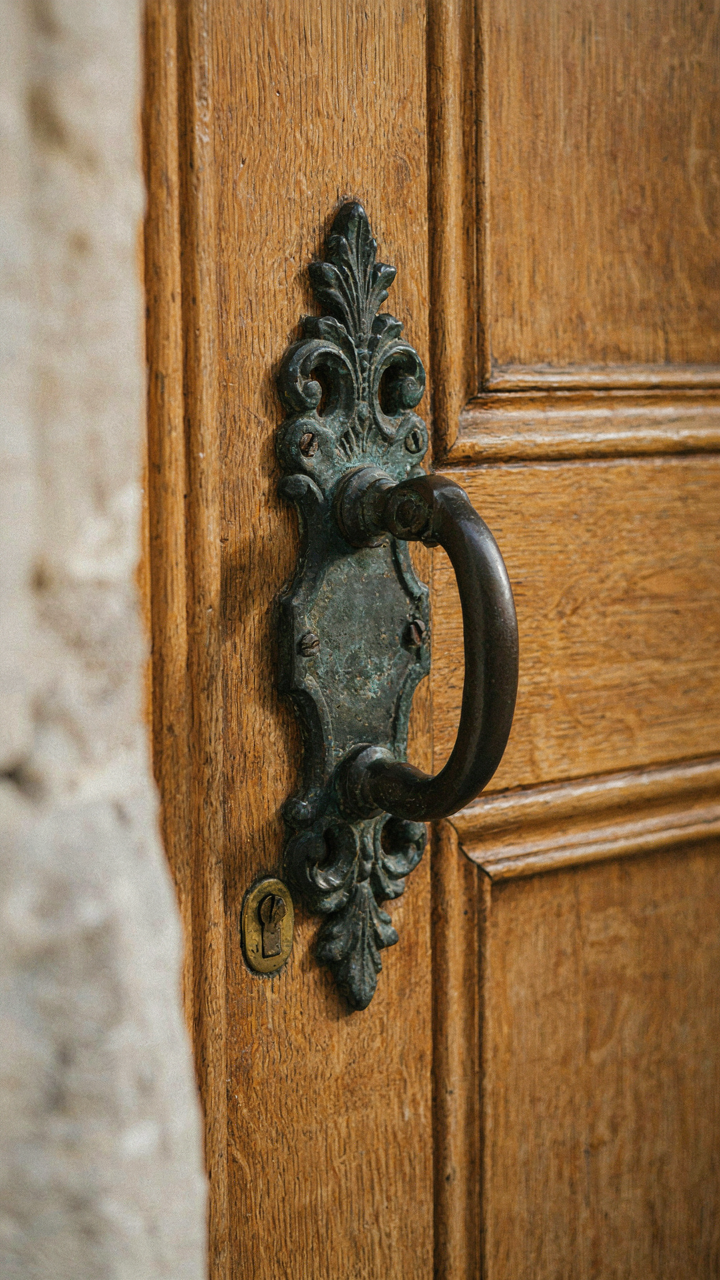
- Cast Iron Hardware: Door handles, hinges, and brackets improve with age and patina. They never trend out. Cheaper hardware corrodes or tarnishes unevenly and demands constant polishing or replacement.
The protocol is deliberate: select materials you’re willing to live with for twenty years minimum. If you’re unsure, you haven’t done enough research. Test the material in your actual light, with your actual usage patterns, for at least one season before committing to room-wide installation.
Old Money House: The Art Of Deliberate Discomfort
When Flaws Signal Ownership
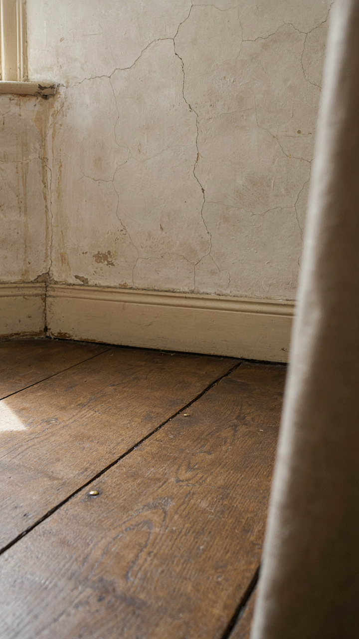
You want this section because you’re terrified of looking like you’re trying. Old money doesn’t perform comfort. It performs indifference to comfort. The mechanism is simple: real wealth allows you to ignore the consensus that everything must be pristine and functional. English country houses preserve original features—warped floorboards, drafty sash windows, plaster that cracks—not because owners can’t afford repairs, but because removing them signals you care too much about perfection. That anxiety is the tells.
Georgian and Victorian-era country houses still contain their original materials and proportions intentionally. A room with uneven floors, cold corners, and inadequate heating isn’t broken. It’s proof the house wasn’t gutted for Instagram. The owners of these estates lived with constraints their contemporaries accepted as normal. Maintaining those constraints now means you’re comfortable enough with your status to reject the modern impulse to optimize everything.
The Trap Of Curated Coziness
Everyone says country houses should feel “cozy” and “intimate.” That advice is wrong. Coziness implies effort to make things comfortable for guests. Old money doesn’t make that effort. The distinction matters. A genuinely old English country house contains long corridors that stay cold, sitting rooms with insufficient seating, and kitchens positioned far from dining areas. These aren’t design flaws that taste can fix. They’re architectural evidence of how people actually lived before central planning became possible.
The performative version floods a house with throw pillows, matching upholstery, and warm lighting. That’s a hotel lobby masquerading as heritage. Authentic country house living accepts that some rooms are uncomfortable. The library stays cool. The entrance hall stays drafty. You don’t soften this with design choices. You acknowledge it by wearing layers and moving between spaces intentionally. The comfort comes from knowing the house’s logic, not from engineering comfort into it.
Your True Obstacle Isn’t The House; It’s Your Inability To Define Elegance For Yourself
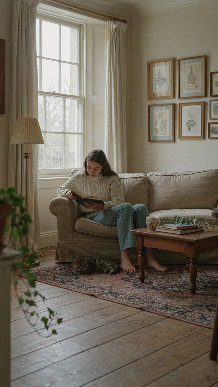
Most people chase English country house aesthetics because they saw it on Instagram, not because they understand what relaxed elegance means to them. You’ll waste money on chandeliers and antique furniture until you sit down and write what elegance actually looks like in your life. Do that today. Spend thirty minutes describing one room that makes you feel at home, then build backward from that feeling. Stop copying other people’s houses and start building your own. Elegance isn’t about the pieces you buy. It’s about knowing exactly why each one stays.



