The Cognitive Load Fallacy Of “Bright And Airy” Cottage Core Colors
Visual Simplicity Actually Reduces Mental Clutter
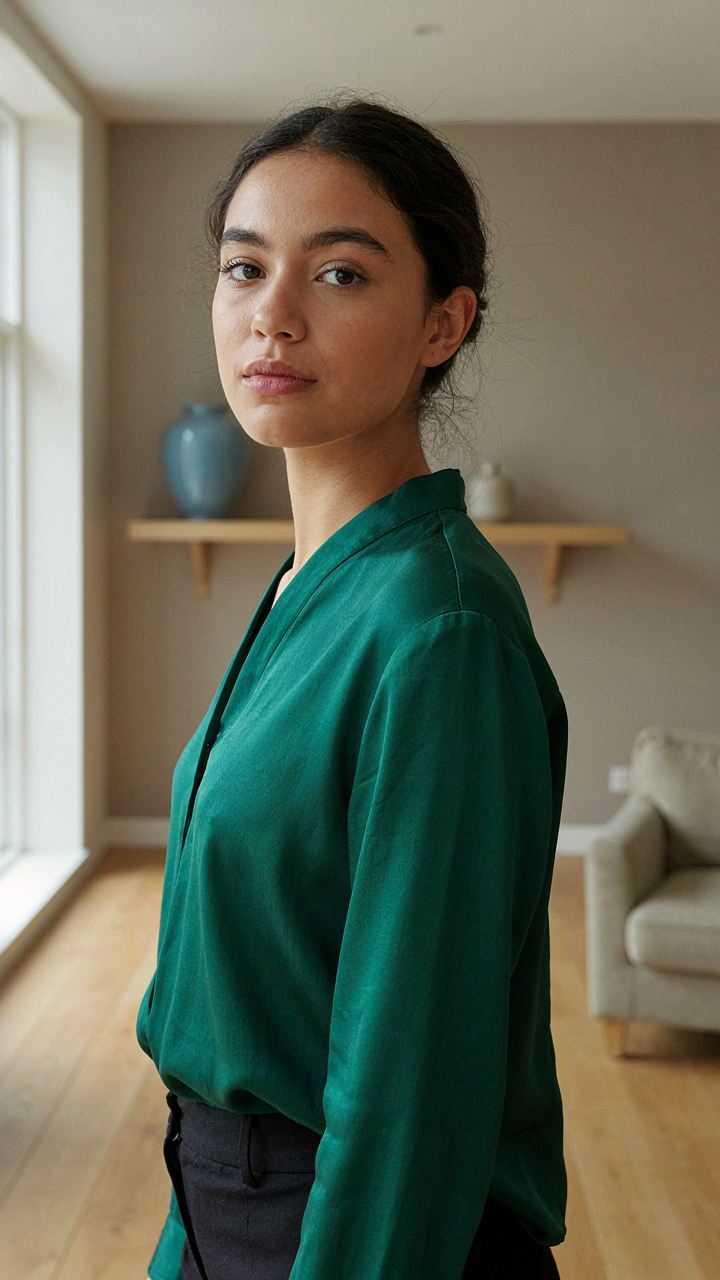
You want people to think your small space feels bigger because you believe that signals wealth and control. Here’s the mechanism: your brain processes color variety as environmental complexity. In cognitive psychology, this is called visual load, and it directly impacts spatial perception. A tiny cottage with twelve different colors forces your brain to catalog and organize that data before it can assess room dimensions. Fewer colors lower processing demand, which frees mental resources to perceive depth and openness. This is why constraint works.
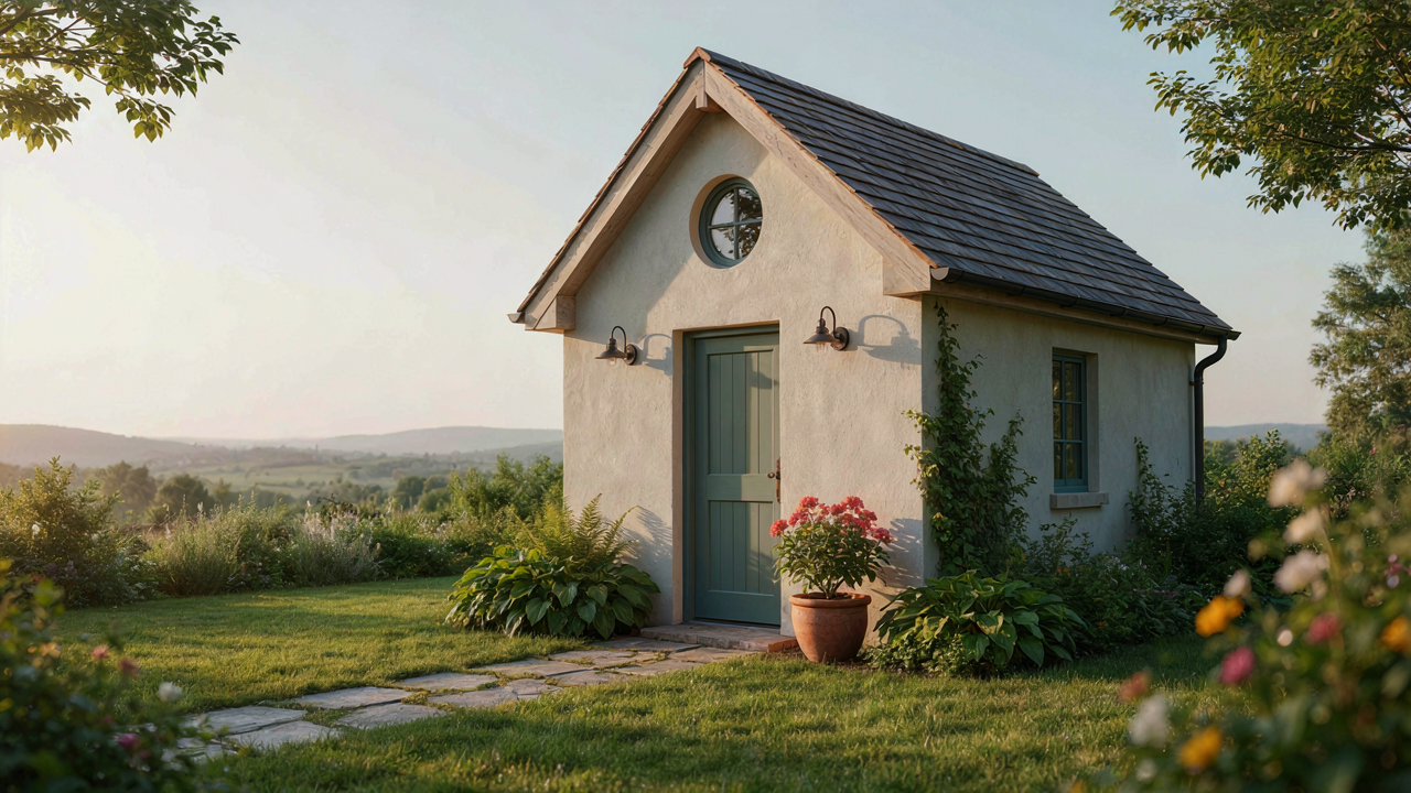
The cottage aesthetic thrives on this principle because it emerged from material scarcity, not design theory. Historical cottages used whatever pigments were locally available, which meant two to four dominant colors per room. That limitation created the perceptual effect of spaciousness by accident. Modern cottage design tries to replicate that feeling by adding “neutral palettes” and “soft tones,” but those are just descriptions, not mechanisms. The real work happens when you actively remove color options, not when you add softer ones. Reduction is the tactic.
Too Much White Collapses The Space Illusion
The standard advice says white walls make rooms bigger. This is wrong, or at least incomplete. Pure white creates visual fatigue and spatial flattening in confined areas. In architectural lighting, this happens because undifferentiated white reflects light uniformly, eliminating the subtle shadow gradation that gives walls depth and dimension. A tiny cottage painted entirely white reads as dimensionless and hollow, not open. Your eye has no reference points to measure distance.
The solution isn’t adding color back indiscriminately, but using warm neutrals with actual tonal variation. Cream, soft taupe, and muted greige create shadow play that enhances perceived depth. Cottage spaces work better with one dominant neutral and a secondary accent in a single hue family, often a muted sage, warm gray, or dusty blue. This combination gives the brain enough visual information to map the room while staying within the constraint framework. Paint strategy becomes the mechanism for opening up a cottage, not color abundance.
The “Depth Perception” Protocol For Tiny Cottage Color Palette
Dark Accents Create Visual Anchors
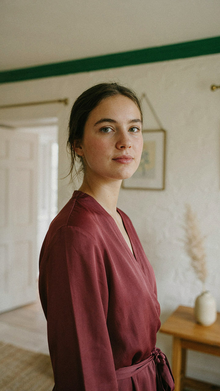
You want the room to feel bigger without admitting you’re anxious about living small. The mechanism is this: your eye needs a visual anchor to process depth, and dark colors function as depth cues in the same way atmospheric perspective works in landscape painting. A distant mountain appears lighter and hazier. A dark object appears closer. Place deep charcoal, navy, or forest green strategically on trim, a single wall, or built-ins and your brain registers spatial layers instead of flat constraint.

The mistake most people make is painting an entire wall dark and wondering why the room contracted. That’s backwards. You need the dark accent small and positioned at the room’s perceived edge or entry point. Paint the wall opposite your seating area a soft cream. Paint the wall beside you a deep forest green. Your eye lands on the dark color first, registers it as a visual boundary, then travels backward into the lighter field. The room doesn’t shrink. It acquires architecture.
Saturation Controls Perceived Distance
Color saturation is borrowed from optics: saturated colors advance toward the viewer while desaturated colors recede. This isn’t metaphor. It’s how the eye actually processes chromatic information. In a tiny cottage, you weaponize this principle by placing high-saturation accent colors near the room’s entry and progressively desaturating as you move deeper into the space. A rust or terracotta accent wall reads closer. The walls beyond it, rendered in muted sage or taupe, read farther back.
The common advice says to use one color throughout for cohesion. That advice denies the spatial mechanics available to you. Start with a warm, moderately saturated base like cream or soft putty on your largest wall. Introduce one jewel-tone accent—deep teal, burgundy, or ochre—on no more than thirty percent of the room’s visual field. Desaturate complementary tones on secondary surfaces. This stratification teaches your eye distance. The room stops feeling like a box and starts feeling like it has actual depth.
Cottagecore Color Palette: Beyond Beige And Into Biometric Design
Light Shifts Shape How Rooms Feel
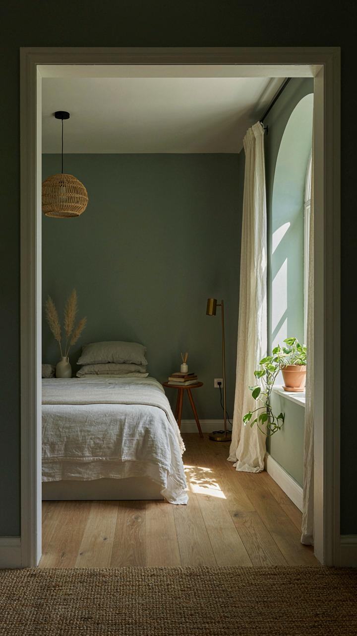
You’re hoping that the right color will make your small space feel bigger without admitting that light, not paint, actually controls perception. Here’s the mechanism: cottagecore palettes work because they mirror circadian biology. Your body tracks light wavelengths throughout the day. Warm yellows and creams at dawn signal wakefulness. Cool grays and soft blues at dusk signal rest. A tiny cottage with one window needs colors that track the sun’s actual path through that room, not colors that fight it.

Placement matters more than shade names. East-facing rooms get warm morning light, so cream and pale gold accent walls amplify that cycle without overheating the space. West-facing rooms fight harsh afternoon sun, so muted sage and soft taupe absorb that glare and keep the room from feeling washed out by 3 PM. The color does work only when it aligns with what light is already doing. Paint the north wall—which never gets direct sun—in deeper woodland tones. Paint the south wall in lighter, reflective hues. This isn’t decoration. This is biology applied to square footage.
Color Psychology Scales Down In Compact Rooms
The common advice about color psychology is incomplete. Most design writing treats every room the same regardless of size. A cottage bedroom has maybe 80 square feet. A color’s emotional impact multiplies in confined space because you have nowhere to escape it. Green walls feel peaceful in a 400-square-foot living room and claustrophobic in a 100-square-foot bedroom. The mechanism is saturation density, not the color itself.
Saturated colors in small spaces trigger stress faster than in larger rooms because your eye has no distance to process the hue. Desaturated versions of the same color hit differently. Pale sage instead of forest green. Dusty rose instead of hot pink. A tiny cottage palette works by trading intensity for presence. Use one muted accent color per room, applied to a single wall or detail, then anchor the rest with near-white or warm gray. This ratio creates mood without collapse. The accent becomes a focus point instead of a prison wall.
The Contrast Conundrum: Home Color Scheme Ideas For Function
When Contrast Actually Works Against You
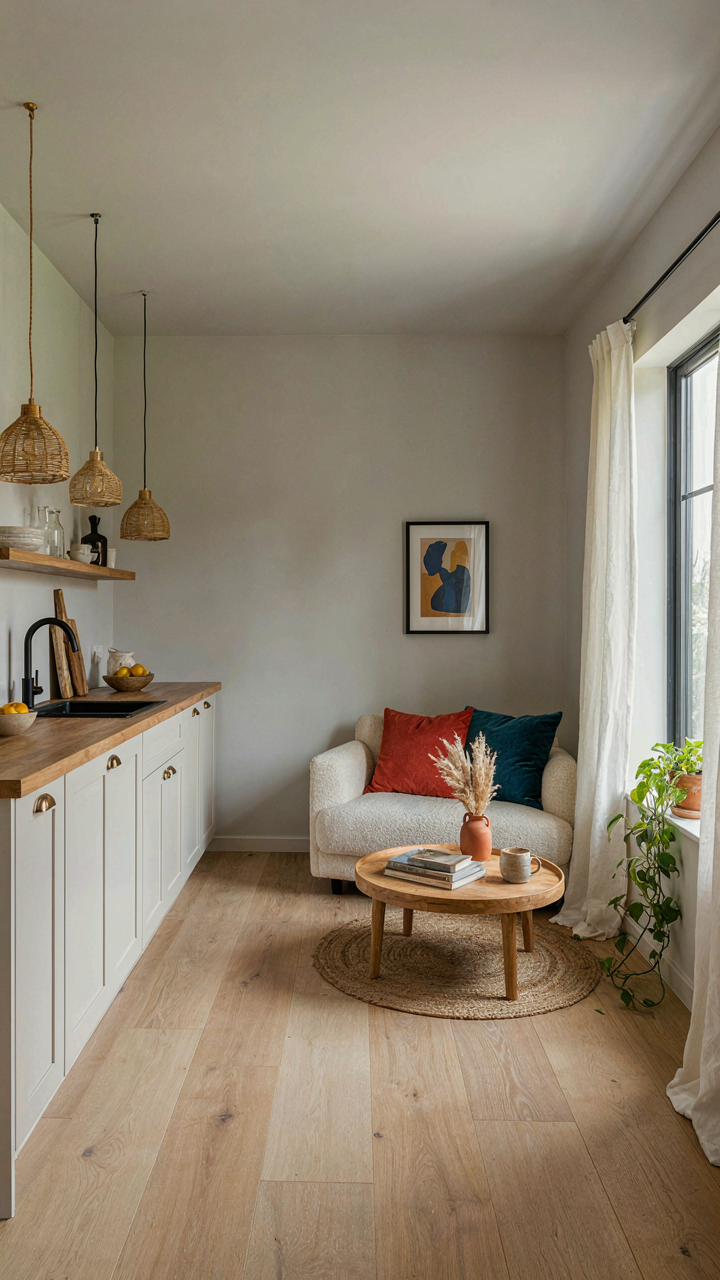
You want high contrast because you’ve been told it creates visual interest. That’s the real reason. But in a tiny cottage, contrast doesn’t expand the room—it fragments it. Think of contrast as a signal in information theory: the stronger the signal, the more the brain must process each distinct zone separately. Your eye lands on a dark wall, registers it as a boundary, stops. You’ve just made the room feel smaller by forcing your brain to see it as multiple compartments instead of one continuous space.
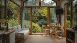
High contrast works tactically when you need to define function zones in open layouts. A darker accent wall behind a kitchen nook tells your brain “this is a different activity.” A contrasting trim around a bedroom entrance establishes a threshold. Use contrast surgically—one or two intentional spots—to signal purpose, not to cover every surface. The mechanism works because your brain respects visual barriers as actual barriers, even though they’re not. This is useful when it’s intentional. It becomes the problem when it’s accidental.
Seamless Surfaces Create Invisible Expansion
Low contrast doesn’t make spaces feel bigger through some vague visual trick. It works because low contrast reduces the number of distinct visual events your brain must process. Fewer events mean less cognitive load, which creates a psychological sensation of openness. Paint your walls and trim within one or two shades of each other—warm white trim on a warm white wall, soft gray walls with slightly deeper gray cabinetry—and the boundary between surfaces dissolves.
This creates unified flow. Your eye moves through the space as one continuous surface rather than stopping at edges. In a cottage where square footage is fixed, this psychological continuity is the real expansion. Apply this across your main living areas: pick a narrow value range (light to medium, or warm to cool within the same tone family) and lock it in. Skip the accent wall impulse. The mechanism is straightforward—fewer visual breaks mean the space reads as larger and more cohesive than it physically is.
Applying The Tactical Camouflage Method To Cottage Colour Palette
Hide Storage In Plain Sight With Color
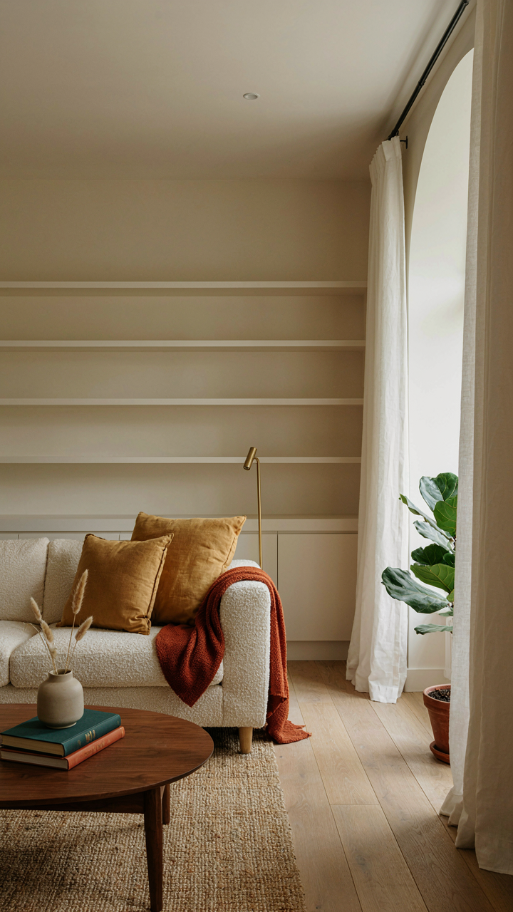
You want your cottage to feel larger without admitting you’re cramped for space. Military strategy calls this “concealment through integration”—making the target disappear into the environment. Apply this to cottage storage: paint built-in shelving, cabinets, and wall niches the exact same color as surrounding walls. The storage mass vanishes. Your eye travels past it instead of stopping to catalog every box and container taking up visual real estate.
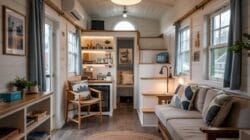
This works because the human eye tracks edges and contrast. Remove contrast and you remove the visual weight. A cream wall with cream cabinetry doesn’t read as storage clutter—it reads as continuous surface. Limit yourself to one accent color per room if you use this method. Your brain needs at least one visual anchor, or the space feels unsettling rather than open.
Bleed Colors Into Each Other To Erase Boundaries
The common advice says “use light colors to open up small spaces.” That’s incomplete. Light colors alone don’t work if they fight each other. The real mechanism is color continuity—eliminating the visual breaks that make rooms feel segmented. Use analogous colors from the same family: soft sage transitioning to warm taupe, then to a barely-perceptible cream. Each shift is subtle enough that your eye doesn’t register a hard boundary.
Pick colors that sit within two to three steps of each other on a standard color wheel. Paint trim, walls, and even door frames in shades from this narrow band. Your cottage reads as one flowing space rather than a series of compartments. The strategy: move between rooms and notice where your eye expects a visual pause. That’s where you soften the color shift, not sharpen it.
Cottagecore Aesthetic Color Palette: Strategic Use Of Warm And Cool Tones
Warm Tones For Inviting Intimacy, Not Claustrophobia
You want your cottage to feel lived-in without feeling like a box closing in on you. That’s the real tension. Warm tones work through a principle borrowed from thermodynamics: they advance visually. Cream, terracotta, warm gray, and soft gold push forward in your visual field, which means they shrink perceived distance. Most people get this backward and pile warm colors everywhere, then wonder why their small space feels suffocating. The mechanism is saturation and value, not temperature alone. A desaturated warm tone (muted mustard instead of screaming gold) sits back further than a vibrant one.

Deploy warm tones on receding surfaces: ceilings, back walls, or trim. This inverts the natural visual weight and tricks the eye into seeing depth. A warm ceiling in a cottage bedroom actually opens the room up because your brain doesn’t expect it there and has to recalibrate spatial perception. Keep warm accent walls to one per room, and pair them with plenty of white or cool neutrals to give the eye a visual rest. The balance prevents warmth from collapsing the space.
Cool Tones For Perceived Depth And Psychological Calm
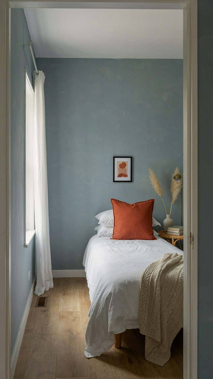
Psychology research shows cool colors recede and reduce cortisol response, which means they literally make rooms feel larger while lowering stress. Sage, soft blue, cool gray, and pale lavender pull away from the viewer, creating atmospheric depth even in a twelve-by-ten bedroom. The mistake most people make is thinking cool means cold. It doesn’t. A cool color with high value (pale, not dark) feels airy, not harsh. Use cool tones on feature walls or larger surfaces like the main living area wall to anchor perceived space.
Pair cool tones with warm accents through textiles and small furnishings to maintain coziness. A cool-toned wall with a terracotta throw pillow or warm wood shelf creates visual interest without erasing the depth benefit. The protocol: paint walls cool and muted, introduce warmth through movable elements. This gives you flexibility because you’re not locked into a color that ages badly or feels dated in two years.
The “Single Statement” Rule: Country Cottage Color Palette Edition
Pick One Color, Build Everything Around It
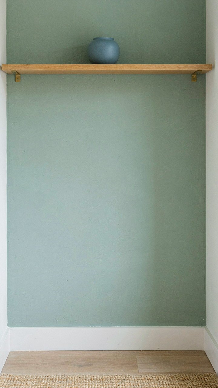
You want permission to use multiple colors without the room feeling chaotic. That’s the real ask here. The mechanism is simple: your brain processes visual hierarchy through dominance. One color must claim 60-70% of the visible surface area. The remaining palette supports it without competing. This isn’t opinion. It’s how human perception organizes space.

In country cottage design, the dominant color typically lands on walls or large upholstered pieces. Cream, soft sage, or muted terracotta work as anchors because they recede visually while still commanding presence. Subdued supporting colors—dusty blue, warm gray, or pale ochre—fill secondary surfaces like trim, smaller furniture, or accents. The math matters more than the aesthetic preference. Violate the ratio and the room fragments.
When Breaking The Rule Actually Works
The common advice says never break this rule. That’s incomplete. You break it strategically, not randomly. Think in terms of contrast ratios from graphic design. A tiny cottage with low ceilings can handle a second statement color when it occupies less than 15% of the room and sits at maximum visual distance from the dominant color.
- Opposite wall accent: Paint the far wall a muted contrast color while keeping three walls neutral. Distance minimizes visual conflict and creates perceived depth.
- Concentrated focal point: A single painted bookshelf or door frame in a deeper tone works because it’s bounded and intentional, not sprawling.
- Textured rather than saturated: Use a patterned wallpaper with two colors on one wall only. Pattern diffuses color intensity better than flat paint.
- Ceiling as secondary statement: Painting ceilings a soft warm white or pale color creates overhead interest without floor-level chaos.
- Narrow vertical elements only: Picture rail trim, doorframe reveals, or a single kitchen cabinet in a supporting tone reads as detail, not competition.
Breaking the rule requires intentional placement and reduced saturation. A second dominant color at full intensity creates visual noise that shrinks perceived room size. The break only works when the secondary color operates as emphasis, not equality. Apply this test: if you remove that color, does the room still read as complete? If no, you’ve made it dominant. Redesign accordingly.
Mastering The Colour Palette House: Materials As Color
Natural Textures As Intrinsic Color, Not Added Paint
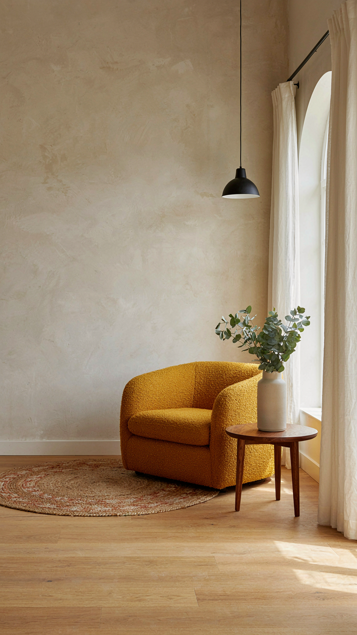
You want to believe paint is doing the heavy lifting because it’s cheap and reversible. It isn’t. In material science terms, you’re looking for albedo—the reflectivity of a surface—which materials provide naturally and paint only approximates. Whitewashed timber walls don’t work because of the white. They work because the grain and texture break light into micro-shadows that make a room feel larger than its square footage. The surface itself is the color system.

Stop treating materials as neutral backdrops waiting for paint. Raw plaster, exposed beam ends, and stone chimney breasts already carry color information your eye reads as depth. A cottage with unfinished walls shows spatial complexity that a uniform painted surface erases. The unevenness becomes the palette. You’re not adding color—you’re revealing it.
Wood, Stone, And Fabric As Color Blocks
Color blocking in interior design borrows from graphic design’s principle of contrast and containment. A tiny cottage achieves this through material placement, not paint swatches. Warm honey-toned floorboards naturally create a base layer. Cooler stone—grey or slate—grounds a hearth. Linen or wool textiles in neutral tones break up visual monotony without introducing another hue. Each material occupies its own spatial zone, making rooms read as segmented rather than cramped.
The mechanic is simple: materials with distinct undertones create visual separation without relying on color. Wood grain reads as movement. Rough stone reads as weight and stillness. Woven fabric reads as texture. These three elements working in concert make a six-by-eight-foot room feel organized and intentional instead of cluttered. Apply this by anchoring your largest surface (floor or walls) in one material, then introduce contrasting materials in secondary zones like seating or storage.
The Real Obstacle Isn’t The Size Of Your Cottage, But The Smallness Of Your Design Ambition
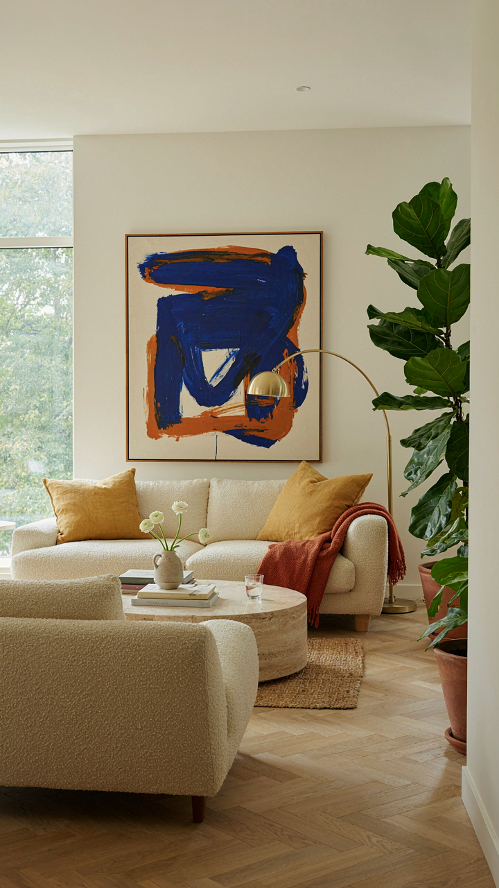
Most people shrink their color choices because they think small spaces demand timid interiors. They’re wrong. Your cottage doesn’t need beige apologies. Pick one bold color today. Paint a single accent wall this weekend. Stop designing for the space you have and start designing for the person you want to be in it. Your tiny cottage becomes massive the moment you stop treating it like a problem to hide.