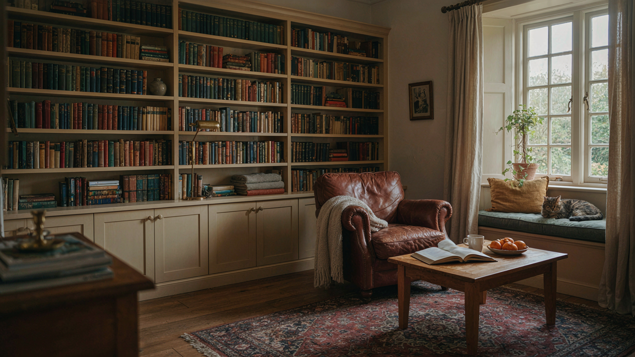
The Illusion Of Open Space: Why Less Furniture Is More Clutter
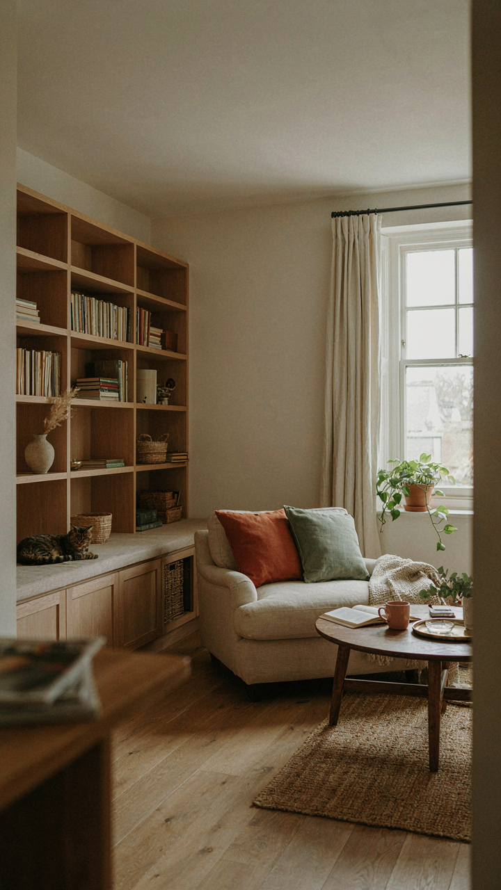
The Minimalist Trap That Backfires
You want to feel in control of your space. The truth is, an empty room with scattered objects creates visual noise your brain can’t process, so it defaults to feeling chaotic. Minimalism sold you a lie: that removing furniture solves clutter. It doesn’t. It just exposes the real problem—objects without boundaries demand constant attention. Your eye bounces between things with nowhere to land.
Built-ins solve this through spatial anchoring. Borrowed from visual hierarchy in graphic design, anchoring means establishing fixed reference points so the eye knows where information begins and ends. When you embed storage, seating, or shelving into the wall, you’re not reducing usable space. You’re creating visual endpoints that make the remaining open floor feel intentional instead of sparse.
Visual Calm Requires Structure, Not Absence
Empty floor doesn’t mean peaceful. A room with five freestanding pieces on open hardwood reads busier than a room where those same pieces are integrated into the wall as one unified component. Cottage built-ins work because they collapse visual weight into a single architectural statement. The wall becomes the furniture. The space breathes because your eye stops searching.
The mechanism is elimination of silhouettes. Free-standing furniture creates multiple outlines against negative space, forcing your brain to process each object as separate. Built-ins eliminate those edges. When a bench, storage, and shelving are one continuous element anchored to the wall, you’ve removed 80 percent of the visual clutter before you’ve even placed the first item. This is why cottages feel larger with more storage than modern minimalist homes with nothing.
Beyond The Bookshelf: Repurposing Built In Shelf Concepts
When Shelves Become Infrastructure
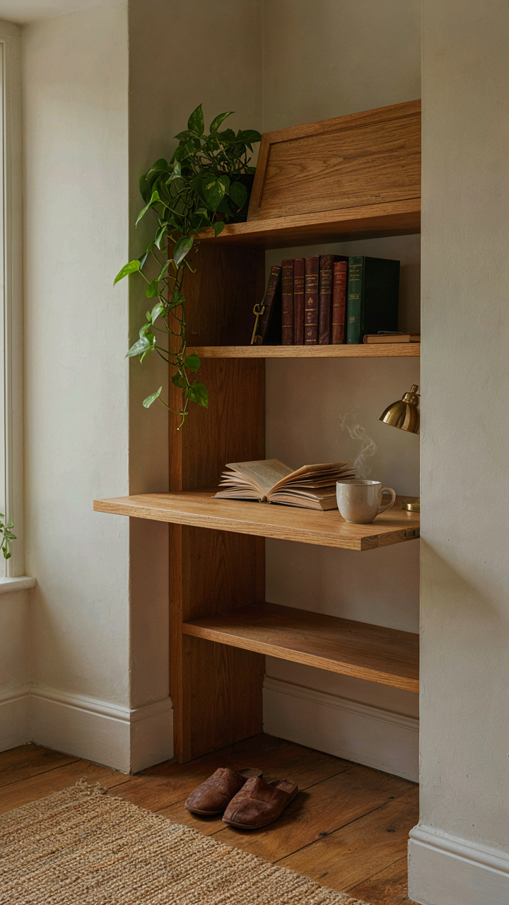
You want built ins because you think they look intentional and expensive, but the real reason you need them is because you’re running out of floor space. The mechanism is simple: vertical storage that integrates seating, hidden compartments, and work surfaces doesn’t just hold objects—it collapses multiple functions into one footprint. A shelf becomes a desk when you add a hinged top. A shelf becomes a bench when you frame it with legs and add a cushion. The cottage aesthetic masks what’s actually happening: ruthless spatial efficiency.

Hidden compartments work because they operate on the principle of false bottoms and concealed depth. Victorians understood this, building secretaries and built in desks with compartments specifically to hide clutter while maintaining a clean visual line. Modern cottage interiors borrow this directly. Install a shelf 18 inches deep with a recessed toe kick, then add pull out baskets or a hinged section in the middle. You’ve created three layers of storage in the footprint of one shelf. The eye sees order. The space does four times the work.
The Wall As Wasted Real Estate
Nobody talks about walls as inventory, so most people leave them empty until furniture won’t fit anywhere else. But walls are your highest-value square footage in a cottage because floor space is scarce. Built in shelving from baseboard to eight feet high converts dead wall area into active storage without stealing footprint. Install floating shelves with proper brackets rated for load, or frame out a recessed unit in the 2×4 studs already there. The cottage trend of floor to ceiling shelving works tactically, not aesthetically. It’s not about looking quaint. It’s about solving the math problem of a 300-square-foot bedroom.
The most overlooked potential sits in corner walls and dead zones beside doors or windows. These areas typically stay blank because freestanding furniture doesn’t fit the angle. Built ins exploit the exact dimensions that store-bought pieces can’t handle. Measure corner-to-corner, wall-to-wall, floor-to-ceiling. Frame out a unit that runs the perimeter if the wall allows it. You’re not decorating. You’re reclaiming usable volume that’s been wasting oxygen.
The 1940s Built Ins Advantage: Efficiency Over Aesthetic Trends
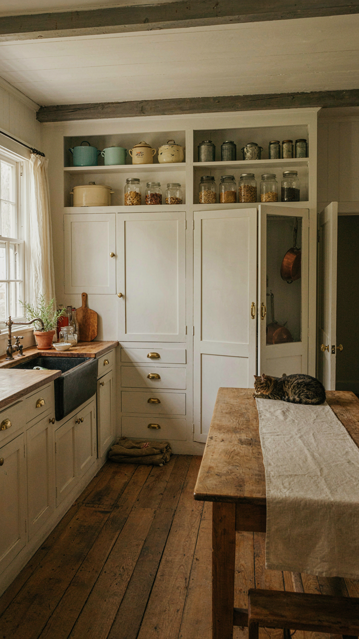
When Space Became Non Negotiable
You want to believe your cottage is charming because of its proportions, but really you’re worried it’s too small to function. The 1940s didn’t have that luxury of sentiment. Wartime material rationing and housing shortages forced architects and builders to eliminate waste. Every inch had to perform. Built-ins emerged not as design flourishes but as the only rational response to scarcity. A shelf wasn’t decoration—it was the difference between storing your life or drowning in it.

The design philosophy was ruthless: if a room couldn’t accommodate freestanding furniture and still function, you built the furniture into the walls. This created a direct feedback loop between available square footage and actual usability. No padding. No excess. The cottage built-in became the structural equivalent of a well-written sentence—nothing extraneous, every element earning its position.
Where Form Followed Real Constraints
Everyone talks about form following function, but that’s borrowed from industrial design and it maps directly onto how vintage built-ins actually work: load-bearing walls became storage walls, window seats became both seating and thermal barriers, and cabinetry followed electrical and plumbing runs instead of fighting them. The constraint was the blueprint. Built-ins didn’t exist to look period-correct; they existed to solve for overlap—to make one structural element do five jobs at once.
This is the opposite of what most people do when they renovate. They add built-ins for atmosphere, then get surprised when they don’t solve the actual storage problem. The 1940s built-in starts by identifying what isn’t working—traffic flow, storage density, wasted wall space—then builds the solution into the room’s skeleton. You measure first, design second, install third. The mechanics demand this sequence; reversing it guarantees failure.
The Cottage Millwork Blueprint: Architectural Integration
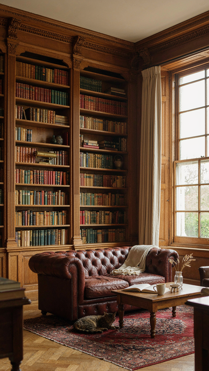
When Built Ins Become Walls
You want built-ins because you think they’ll make your space feel intentional and valuable. They will, but only if you stop treating them as furniture you attach to walls. Built-ins work because they function as structural anchors, not decorative add-ons. Think of load-bearing walls in architecture: they don’t decorate the space, they define it. Built-ins operate the same way—they establish visual and functional boundaries that organize the entire room.

The difference between a bolted-on cabinet and a true built-in is whether it reframes the geometry of the space itself. Real cottage built-ins connect floor to ceiling, span the full width of a wall section, or integrate with existing architectural features like windows and doors. When you install them this way, they don’t compete for attention with the room’s proportions. They become part of the room’s skeleton. This requires planning during the design phase, not after furniture selection.
Transitions That Eliminate Visual Noise
Most designers fail here because they treat each room as a separate problem. Your built-ins should create visual continuity between adjacent spaces, especially in cottage layouts where rooms connect directly without hallways. The mechanism is rhythm—when your eye moves from one room to the next, it should encounter the same design language, the same material palette, the same baseline height for shelving or cabinetry.
Cottage built-ins work across thresholds when they either continue at consistent heights or deliberately shift in a way that signals purpose. A kitchen island built-in might stand at counter height, while the living room’s shelving behind it sits at a different level, but both should use the same materials and reveal patterns. When built-ins stop abruptly at a doorway or shift materials without reason, they create visual fragmentation that makes small spaces feel chaotic. The actual installation happens room by room, but the design decision happens once, across all connected spaces.
Modern Cottage Library: The Intellectual Density Protocol
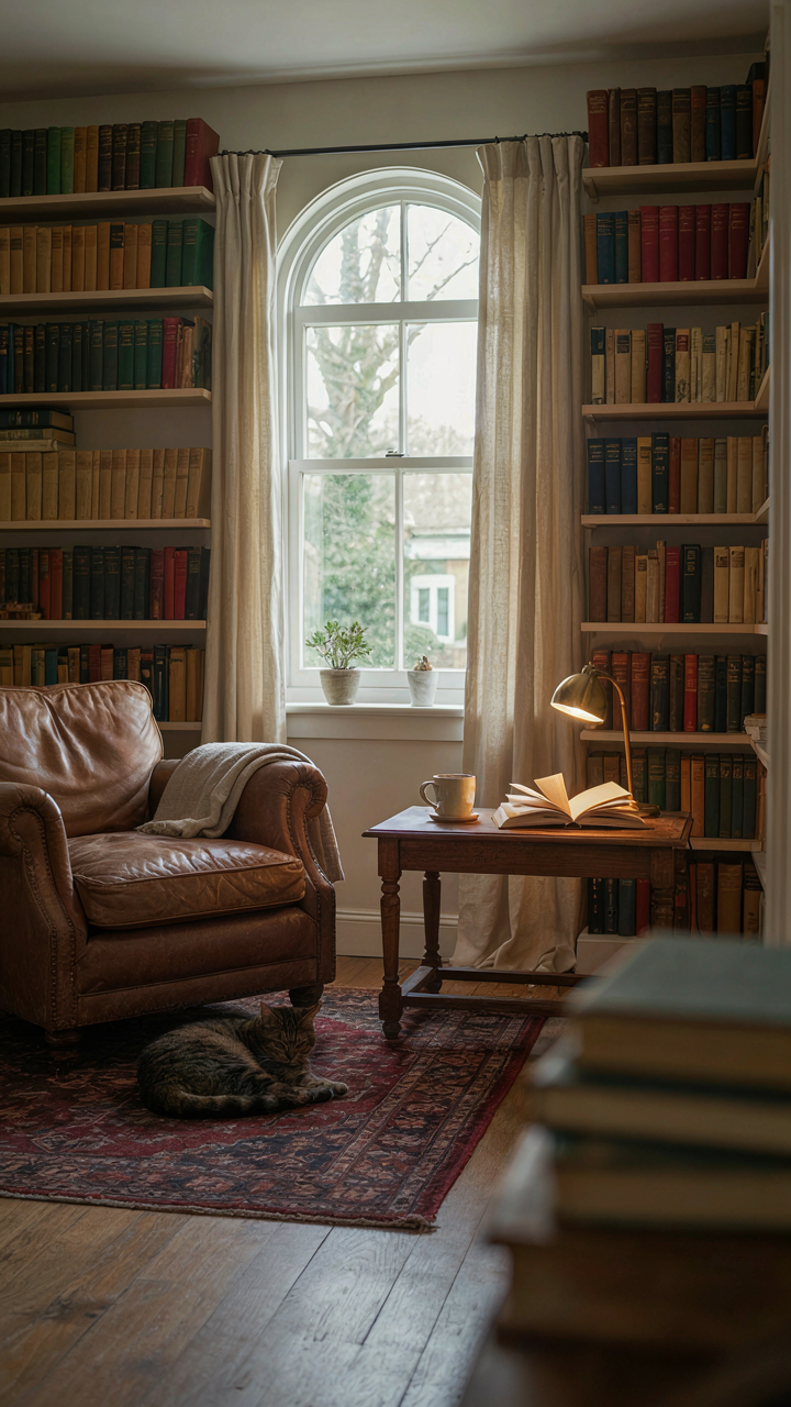
How Your Brain Actually Retrieves Information
You want a library in a small cottage because owning books signals you’re serious—but that status impulse is useless if you can’t find what you need. Cognitive psychology reveals the mechanism: your brain doesn’t store information like a filing cabinet. It anchors memories to spatial location and visual patterns. Cottage built ins leverage this by creating fixed zones where specific information lives permanently.

The reason generic shelving fails is simple. Floating shelves and standalone bookcases force your brain to treat every book as interchangeable furniture. Built ins do the opposite. They make each shelf a distinct territory. Your eye trains to expect certain categories in certain positions. The shelf height, the wall it occupies, the trim detail around it—these become retrieval cues. When you need a reference, your spatial memory finds it faster than any system could, because the location is part of the encoding.
Memory Anchors Shape Physical Navigation
Your body learns the layout before your mind does. In cottage libraries with built ins, you physically walk toward a specific wall, scan a specific zone, and locate information in three seconds instead of three minutes. This is spatial memory at work—the same mechanism that lets you navigate your childhood home in the dark.
Built ins create what architects call “cognitive landmarks.” A tall cabinet with a decorative cornice becomes the “reference corner.” Shelves flanking a window become the “morning reading zone.” These aren’t decorative labels. They’re neural anchors that reduce the cognitive load of finding what you need. Your brain doesn’t have to think. Your feet carry you to the right place. Install built ins at varying heights, use consistent backing or trim details, and space them to match your arm’s reach. This deliberate physical arrangement turns a room into a memory palace instead of a storage problem.
Built In Around Fireplace: The Focal Point Fallacy
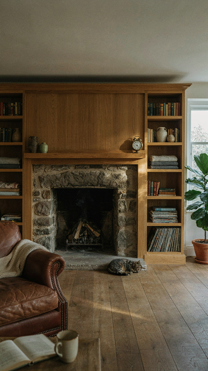
The Fireplace Sits Empty While You Pay Rent
You want the fireplace to justify itself because you’re paying for it, and empty focal points feel like money burning. Here’s the mechanism: a fireplace commands visual attention but creates dead zones on either side and above. The hearth becomes a museum piece instead of a work hub. Without built-ins, you’ve paid for the real estate but surrendered the utility. The fireplace stays pretty while the room stays small.

Fireplaces in cottage spaces operate like anchor points in graphic design—they demand visual weight, so everything else compresses. Most people leave the surround bare and position furniture facing the fire like it’s a television. This wastes the vertical plane above the mantel and the horizontal floor space flanking the firebox. The room feels organized but functionally incomplete. Integration means the fireplace stops being a standalone feature and becomes the spine of a storage and work system.
Shelving That Captures Dead Floor Space
The real play is boxing in the fireplace surround with built-in shelving on both sides, floor to ceiling, so nothing wasted sits beside the hearth. Shelves at standing height give you display depth without narrowing the room visually. Open shelving on the upper sections keeps the ceiling from dropping. Deep shelves beside the firebox work as side tables, reading nooks, or display ledges. You’re converting two useless wall pockets into load-bearing zones. Measure the depth of your fireplace breast first, then build shelves that project just enough to land your forearm when standing. That’s your baseline depth. Anything shallower than twelve inches wastes the real estate. Anything deeper than twenty inches blocks traffic flow in a cottage room.
Build shelves with a fixed frame anchored to the firebox wall studs, not floating. Floating shelves beside fireplaces sag under thermal expansion and look undersized. A cottage fireplace built-in that catches fire or looks unstable destroys the whole room’s credibility. Use birch or pine veneer plywood for shelving in heritage cottages, or reclaimed barn wood if the budget allows. The grain pattern matters because people will study it while sitting. Paint the backing wall a soft contrast color to separate shelf items visually, then install shelves in front of that backing. This gives depth perception without cluttering.
English Decoration Vs. French Country Built Ins: A Cultural Clash Of Utility
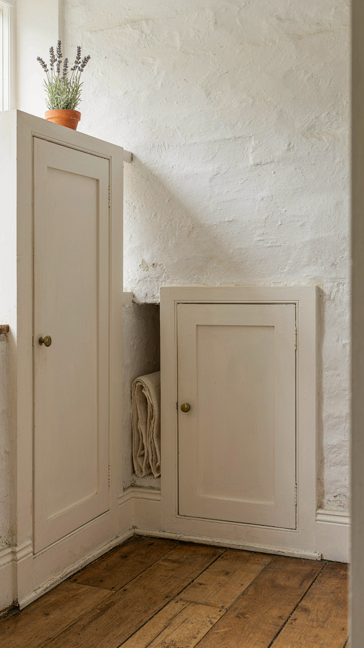
The Pragmatic English Approach To Utility
You want to believe built ins solve your space problem without forcing you to actually confront how you live. They don’t. English built ins reveal the mechanism: constraint forces efficiency. The English tradition treats built ins as load-bearing furniture, not decoration. A corner cupboard holds linens. Shelving follows walls because walls already exist. Window seats store blankets beneath cushions. The logic is architectural, not aesthetic. Every inch serves function first. This mindset emerged from centuries of building small homes on expensive land where waste was literally costly. English cottages packed utility into corners because corners were all they had.

This approach requires discipline most modern decorators lack. You cannot fill shelves with objects for effect. You cannot install a built in and ignore what goes inside. English design forces a contract between space and inhabitant: the built in works only if you stop treating storage as invisible. Your daily life determines the built in’s shape, depth, and height. You measure twice because adding square footage later costs money you don’t have.
French Emphasis On Display Versus Hidden Storage
French country design inverts this. The French built in announces itself as an object worthy of attention, not a utility slot. Open shelving displays ceramics and glassware. Armoires feature carved panels and hardware that draw the eye. The mechanism here borrows from retail design: visible goods sell. Beautiful things displayed trigger purchase justification in the owner’s mind. You keep them because they’re on display, and you display them because they’re kept. This creates a feedback loop where decoration becomes the storage itself.
The cost of this approach is subtle but real. French country built ins demand constant curation. Items must earn their visibility. Clutter destroys the entire system because there’s nowhere to hide it. English built ins solve problems. French built ins create problems you must manage continuously. Choose English built ins when you live in the space. Choose French built ins when you live for the space.
The Built In Shelves In Nook Reimagining: Activating Dead Zones
Where Wasted Space Becomes Real Estate
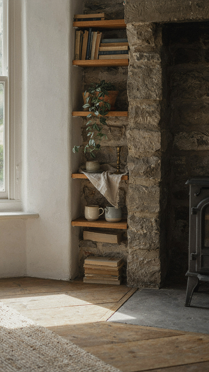
You’re frustrated because your cottage feels smaller than it is, and you think adding furniture will fix it. It won’t. The mechanism is this: most cottage rooms have architectural voids—the space between studs at corners, the gap under sloped ceilings, the alcove beside a chimney—that sit empty while you cram freestanding shelves into walkways. Built in shelves in these voids don’t steal square footage; they steal nothing because the space was already gone. You’re not making the room smaller. You’re converting dead zones into usable capacity.

Cottage architecture creates these voids by accident, not design. Older homes have irregular wall angles, foundation settlement, and room layouts built around function rather than efficiency. Victorian and Arts and Crafts cottages especially feature nooks flanking fireplaces or beneath eaves. The void exists whether you use it or not. The question is whether you acknowledge it or pretend it’s wasted potential. Shelving transforms that acknowledgment into actual storage that doesn’t compete for floor space. This is how a 200-square-foot bedroom stops feeling like a walk in closet.
The Math Of Nook Placement
Placement determines whether built in shelves solve a problem or become decorative liability. Shelves belong where foot traffic already doesn’t flow, where the void has depth of at least eight inches, and where you can reach them without bending into an uncomfortable angle. Under window seats, next to interior walls, in the angle where two exterior walls meet at a corner—these work. Opposite the entry door, across the middle of a narrow hallway, or above seating areas where people’s heads will bump them—these fail.
Measure the actual dimensions of your cottage’s nooks before assuming they’ll work. Existing shelves in other homes might not scale to your space. A nook that’s perfect for five inches deep won’t hold a standard book. Shelves placed too high become unusable visual clutter. The real constraint isn’t aesthetics; it’s reach range and depth. Map where your elbow bends naturally at rest height, then build shelves in that zone. Install them fifteen to eighteen inches deep maximum in tight rooms where you need to pass. Depth deeper than that stops being functional and starts being obstacle course.
The Cottage Built In Bookcase: More Than Just Books
Collections And Objects That Earn Their Space
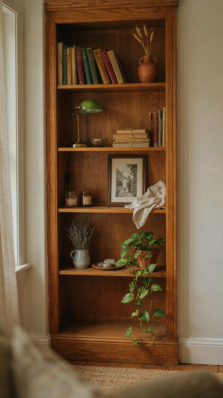
You want people to walk into your small room and think you’re interesting. The real mechanism is this: a built-in bookcase stops being furniture and becomes a display system the moment you treat it like curated inventory instead of storage. Every object on those shelves either tells visitors something true about you or it wastes visual real estate.

Cottage built-ins in tight quarters demand constraint. Pull items that have actual weight—objects with history, function, or craft behind them. A stack of vintage Penguin paperbacks with their spines showing works because the design does the talking. A ceramic piece from a maker you know works. A framed photograph of a specific moment. The bookcase becomes a argument about who you are, not a dump of things you own. This is inventory management applied to identity.
Building Narrative In Nine Square Feet
Visual storytelling isn’t about balance or symmetry—it’s about creating a read path that makes sense when someone scans the shelves for three seconds. Think of it like information design: you’re guiding the eye through what matters in sequence, not spreading weight evenly across the surface like most generic advice suggests.
Group by logic, not by size or color. A section of travel books paired with a small map and one object from that place creates a moment. Another shelf holds tools or craft supplies visible and working. Another holds art and single objects with space around them. The built-in becomes a three-dimensional essay about what you actually do, not what you think you should display. Start by identifying three distinct narratives you want the bookcase to hold, then build each one deliberately into separate zones.
The Anti Clutter Protocol: Built Ins As Your Boundary System
Built Ins Enforce What Willpower Cannot
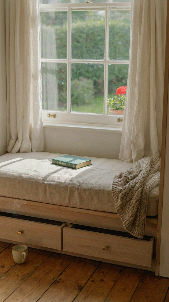
You want built-ins because you’re tired of feeling out of control in your own space. The real mechanism is this: built-ins function like load-bearing walls for behavior. In economics, we call this a constraint. A constraint removes the need for constant decision-making by making certain choices physically impossible. When you install a window seat with fixed storage, you’ve eliminated the option to pile laundry on the floor. The built-in becomes the boundary your brain can’t negotiate around.
Most people think discipline solves clutter. It doesn’t. Environment solves clutter. A cottage built-in works because it creates friction against bad habits and zero friction toward good ones. You don’t choose to put a book on the shelf if the shelf is built into the wall at arm height and the floor is empty. The architecture chooses for you.
Predefined Limits Stop The Accumulation Spiral
Capacity limits work. Here’s the uncomfortable truth: generic storage advice fails because it assumes you’ll somehow become a different person who makes better choices. You won’t. Instead, build fixed capacity into your cottage.
- Shelf depth constraints: A 10-inch-deep built-in shelf physically stops you from buying items that don’t fit. Deeper shelves invite stacking and hidden clutter.
- Closed cabinetry with numbered slots: If a built-in hutch has exactly six compartments for dishes, you own six sets maximum. Closed doors hide nothing and enforce the limit.
- Bench seating with underside storage only: No open surfaces. Items go into the cavity beneath the seat or nowhere. Visible accumulation becomes impossible.
- Wall-mounted cubbies with height stops: Vertical built-ins force you to work within strict dimensional boundaries. You can’t exceed the space without it becoming obvious.
- Drawer dividers fixed at installation: Pre-divide drawers into sections for specific items. When a section is full, you stop buying that category.
The mechanism is predefined scarcity. When capacity is fixed at design time, accumulation hits a hard stop instead of a soft resistance. Measure your cottage built-in cavity before fabrication, then build to exactly 80 percent of that volume. The remaining 20 percent is your buffer against the impulse to squeeze one more thing in.
The Real Problem Isn’t Small Spaces; It’s Your Small Thinking

Most people see a cramped room and accept defeat. You see it as leverage. Cottage built ins force you to design with intention instead of filling space with junk. Stop buying furniture. Start building systems that multiply what your room can do. Pull up a tape measure today and sketch one wall. Constraint isn’t your enemy. It’s your competitive advantage.