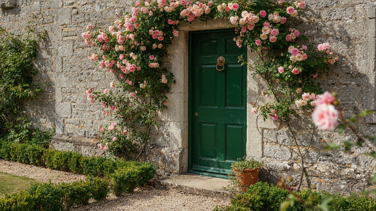
The Unseen Language Of Cottage Front Doors: Beyond Aesthetics

Color Triggers Before Conscious Thought
You want people to feel something the moment they see your door. That’s the real reason you’re reading this. Color psychology isn’t decoration theory—it’s neuroscience applied to your entryway. Your brain processes color in milliseconds, before language kicks in. Red activates the nervous system and signals importance. Green calms and suggests safety. Blue creates distance and formality. Cream and soft yellows trigger comfort without aggression. The door color lands first, and it shapes everything that follows.
This is why generic advice to “pick what you love” fails. You’re not choosing for yourself—you’re choosing the first impression your door makes on someone’s amygdala. Warm earth tones like terracotta and ochre work in cottages because they mirror natural materials the brain already trusts. Deep greens and forest blues work because they echo trees and sky, categories humans evolved to feel safe around. The mechanism is simple: choose a color that matches the emotional state you want visitors to enter into before they knock.
Material Language Communicates Trust
Wood, iron, and glass each send different signals before anyone touches the handle. Wood says permanence and tradition—it ages visibly, which humans read as “this structure has survived.” Iron hardware signals durability and craft, the opposite of cheap. Glass contradicts cottage aesthetics unless it’s period-appropriate, like small paned windows in Victorian cottage doors, which say transparency without vulnerability. Solid wood doors read as substantial. Hollow-core doors, no matter the finish, transmit weakness through sound.
The real work happens in the details nobody consciously notices. A door hung square and level signals competence. Hardware that moves smoothly without resistance suggests maintenance and care. Weathering on authentic materials reads as honest, while peeling paint reads as neglect. The material choices and their condition form a continuous broadcast about whether this cottage is inhabited by someone who pays attention. When selecting materials, prioritize structural integrity first, then visual continuity with the home’s era and construction. This sequence prevents the door from becoming a point of cognitive dissonance.
The “Portal Effect”: Engineering Entry Point Dominance
When Your Door Competes For Attention
You want people to notice your house first. That’s the real reason you care about this section. Here’s the mechanism: visual weight in design borrows from physics. Mass and balance determine where the eye lands. Your door isn’t just an opening—it’s a gravitational center that either anchors or loses the viewer’s attention against everything surrounding it.

Most people get this backwards. They think a bigger door automatically wins. Wrong. A door dominates when its visual weight exceeds the mass of what contains it. A standard six-panel wooden door on a cottage with small windows and tight siding absorbs attention because the surround is proportionally lighter. Scale the surround up—add stone, widen the porch, increase window size—and your door vanishes unless you increase its visual load through color, material contrast, or thickness. The door must weigh more than its frame demands.
Arched Openings And Threshold Recognition
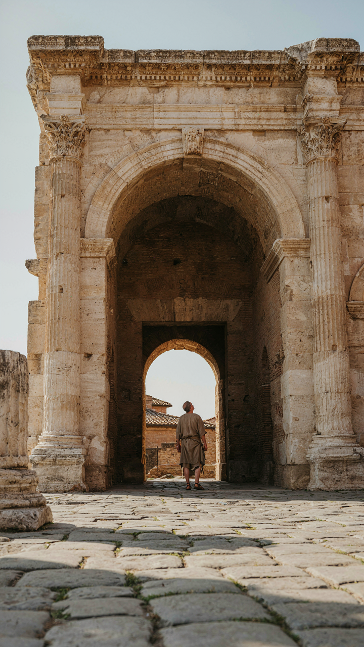
Ancient Roman architecture encoded arches as markers of passage and importance. Medieval builders adopted the same logic: archways announced transitions between spaces. Your cottage front door operates on this same principle whether you use a literal arch or not. The archetype—a framed opening that signals “here begins something different”—tells the human brain to stop and register the threshold.
Straight rectangular frames feel neutral because they match standard wall geometry. Arched frames interrupt that pattern, forcing recognition. A cottage with an arched doorway, even a subtle one, reads as intentional architecture rather than functional hole. The arch creates cognitive pause. Install an arched frame or use an arched door itself, and you’ve harnessed millennia of design precedent without understanding why it works. The mechanism is threshold recognition: your brain marks architectural breaks as decision points worth noticing.
The Green Front Door Imperative: Nature’s Authority
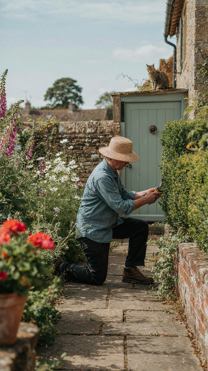
What Green Actually Signals To Your Brain
You want green because it makes you look thoughtful. Here’s the mechanism: color psychology isn’t mystical. Green triggers the same neural pathway that registers safety in natural environments. Your brain evolved to associate green vegetation with resources and stability. A cottage front door in green tells visitors you understand this wiring before you consciously do. The subconscious reads green as competence, not decoration.

Different green shades carry different weight. Forest green reads as established and grounded, communicating that you’ve chosen something permanent. Sage green signals restraint and sophistication. Olive suggests age and authenticity. Bright kelly green dates fast and reads as trend-chasing. The depth of the green matters more than the hue itself. Pale greens fail because they lack the neural punch that deeper tones deliver.
The Ecological Status Play
Green front doors became a status signal because they cost money to maintain correctly. Paint that shade fades under UV exposure, requiring professional repainting every three to five years. This is economics wearing a nature mask. The visible care required to keep green vibrant signals disposable income and attention to detail. Homes with neglected green doors broadcast the opposite message.
Historically, green doors on cottages appeared in regions with strong gardening cultures, particularly England and Northern Europe where cottage aesthetics originated. The connection to horticulture wasn’t accidental. Homeowners with resources invested in both gardens and doors painted in matching green tones. Today, the association persists: a well-maintained green cottage door signals you maintain the entire property with the same rigor. When selecting green, commit to a maintenance schedule or choose a shade that photographs well even during the fade cycle.
Cottage Door Hardware: The Tactile Deception
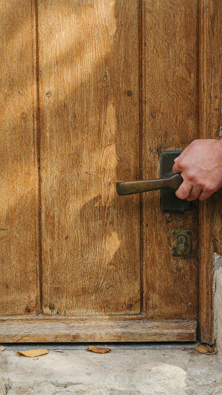
Weight And Finish Shape Perceived Value
You want hardware that signals you didn’t cheap out. That’s the real driver here. Borrowed from economics, hardware operates like a price signal—the material density and surface treatment communicate cost before anyone touches the door. Brass, bronze, and cast iron carry weight. Aluminum and stamped steel feel hollow. A cottage front door with substantial hardware tells visitors the owner invested thought into entry.

Finish matters more than most realize. Lacquered brass oxidizes slowly and stays lustrous. Oil-rubbed bronze develops patina intentionally. Polished chrome reflects light in ways that read as deliberate. The mechanism is simple: durable finishes require specific material choices and manufacturing steps that cost more. Buyers recognize this subconsciously. Your hardware finish becomes proof of commitment to the entrance.
The Grip Reveals Power Dynamics
Door hardware ergonomics aren’t about comfort. They’re about control. When a guest grips your handle, knocker, or latch, they experience either ease or friction. A well-designed cottage door handle sits at the right height, requires minimal force to operate, and feels intentional in the hand. Poor hardware creates micro-frustrations that register as neglect. The person entering notices, whether they admit it or not.
The power dynamic flips at the threshold. Your hardware either welcomes or resists. A smooth, substantial latch or handle says “enter freely.” Stiff hardware, rough finishes, or misaligned mechanisms say “this wasn’t checked.” Install hardware that operates with single-finger ease and sits ergonomically between 36 and 48 inches from the ground. This range matches human proportions and eliminates unconscious strain during entry.
Cottage Core Front Door: Mimicry Or Mastery?

The Real Difference Between Copied And Intentional
You want a cottage front door because you think it signals something about who you are. The mechanism is simpler: most people copy the surface details and wonder why their entrance feels like a costume. Authenticity isn’t about historical purity. It’s about understanding the constraints that shaped the original design, then making deliberate choices within your actual context.

A cottage door wasn’t quaint by accident. It was built with what materials cost and what weather demanded. The paint colors came from available pigments and the goal of visibility in low light. When you reverse-engineer the reasoning instead of just copying the aesthetic, your door becomes coherent instead of nostalgic. The difference shows.
The Mechanism Behind “Quaint”
Quaint is intentional restraint, not decoration for its own sake. Strip away the word and you find this: a cottage front door solves a specific problem with limited resources. The arched top wasn’t romantic; it improved structural load distribution. The narrow panes in older doors weren’t charming; they were the only way to transport and install glass without breakage.
Most cottage door advice tells you to add character through color or hardware. That’s lazy. Real intentionality means deciding what your door actually needs to do first, then choosing details that reinforce that function. Picking paint color comes last, after you’ve established the door’s actual purpose and structural integrity. Build mechanism, then layer appearance.
The “Cottage Doors Front Entrance” Protocol: A Systems Approach

Where Your Door Actually Controls Access
You care about this because a front door isn’t decoration—it’s the mechanism that decides who enters your space and what impression they form before crossing the threshold. Military strategists call these positions “control points,” and your cottage front entrance functions identically: it’s where you manage perception and flow. The door color, hardware, and positioning don’t exist in isolation. They form a filter that determines whether someone feels welcomed or uncertain before they touch the handle.

The real work isn’t picking a pretty shade of blue. It’s understanding that every element of your front entrance—the door itself, the surround, the approach path—operates as a gatekeeper system. Cottage design tradition places the door as the primary visual anchor because historically, cottages were modest structures where the entrance had to communicate safety, belonging, and accessibility in seconds. Your door color strategy works only when it integrates with sightlines, distance from the street, and what precedes it architecturally. Skip the integration, and color becomes decoration that contradicts the door’s actual job.
The Threshold As Boundary Definition
Access management systems, borrowed from cybernetics, teach a critical principle: boundaries function through clarity, not obstruction. Your cottage front door creates a psychological boundary that signals transition from public to private space. The color you select operates as a status signal—it tells visitors whether they’re expected, whether this is an open household or a guarded one. Common advice says “just pick what feels right,” but that ignores how color communicates gatekeeping intention to the human nervous system before conscious thought enters the picture.
Effective cottage front doors use color to manage arrival energy. A welcoming warm tone—cream, soft ochre, or muted coral—doesn’t eliminate boundaries; it reframes them as permeable thresholds rather than walls. The mechanism is straightforward: warm colors lower the psychological distance between approach and entry, making visitors feel their presence was anticipated. Your door’s color becomes the protocol that governs how people calibrate their behavior the moment they see it. Apply this by ensuring your chosen color coordinates with your door’s position relative to landscaping, lighting, and the cottage’s main façade, not just with your personal preference.
Beyond The Folly Of “Cottage Style Front Doors”

The Herd Consensus Trap
You want a cottage front door because you’re afraid yours signals the wrong thing about who you are. The real mechanism: people copy what they see in aggregated inspiration feeds, then assume that consensus equals correctness. It doesn’t. Cottage front doors became a category precisely because marketers needed to sell a feeling, not because your specific house actually needs one.

The term “cottage style” is now so diluted it describes everything from Victorian farmhouses to suburban colonials with a pot of flowers. This vagueness is the trap. When you search for cottage front door ideas, you’re not getting design principles—you’re getting other people’s aesthetic debt. A distinct front door requires you to know what your house actually is, not what the algorithm says cottages should be.
Form Follows Your Actual Building
Architecture has a first principle borrowed directly from engineering: form follows function. Apply this to your cottage front door. The door’s shape, material, and color must solve a specific problem your house presents, not echo a mood board. A north-facing cottage door in Maine handles snow load and cold differently than a south-facing door in the Cotswolds.
Most cottage front door advice ignores this. It sells color and aesthetics while skipping the structural reality underneath. Your door’s proportions, swing direction, weatherproofing demands, and material durability are determined by climate, house age, and foot traffic—not by what feels “welcoming.” Start there. Measure your door opening. Check your house’s original timber dimensions. Determine your regional freeze-thaw cycles. Only then choose a color that works with the material that actually survives your conditions.
Lighting The Cottage Front Door: The Illumination Agenda
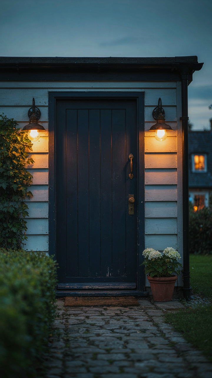
Where You Place Light Matters More Than How Bright It Is
You want people to notice your door the moment they arrive because a visible entrance signals competence and intention. This is psychology borrowed from retail design: a store uses directional light to control where your eye lands first, and your cottage door operates the same way. Strategic placement means positioning your light source to highlight the door’s color and architectural details while obscuring what you don’t want seen, like worn siding or cluttered porch corners. Uplighting from ground level emphasizes height and drama. Wall-mounted fixtures flanking the door create symmetry and frame the entry. Overhead fixtures wash the entire facade but flatten dimension. The mechanism is attention control, not illumination volume.

Placement also determines shadow patterns, which either reinforce or undermine your color choice. A light mounted too high casts the door in its own shadow, negating the color work you’ve done. A light mounted beside the door creates definition and makes the color pop by comparison. The rule is simple: light should reveal your chosen color, not compete with it or hide it. Test placement before installation by positioning a flashlight at different angles during dusk. Watch where shadows fall and whether your door color registers as intentional or accidental.
Color Temperature Controls Perception, Not Just Visibility
Light temperature is measured in Kelvin, and this number directly shapes how your door’s color reads to someone approaching it. Warm light at 2700K enhances reds, oranges, and earth tones, making rust or terracotta doors feel inviting and established. Cool light at 4000K or above flattens warm colors and emphasizes blues and greens, which can make a warm-toned door look washed out or institutional. Most people install whatever bulb comes in the fixture, missing that temperature is a design decision, not a default. The cottage aesthetic typically demands warm light because cottages signal history and comfort, not efficiency or sterility.
Consistency matters more than absolute brightness. If your porch light is warm but your interior visible through windows glows cool, the conflict reads as careless. Choose 2700K or 3000K for cottage doors painted in heritage colors, which includes most cottage palettes. If your door is deep green or navy, you have more flexibility, but warm still reads more welcoming. Install dimmable fixtures with warm bulbs, then set them to 60 to 75 percent intensity at night. This gives you visibility without the harsh glare that makes a door feel exposed rather than inviting. The signal you send is restraint and intention, not maximum output.
The Psychology Of The “Cottage Front Door”: Controlling Perception

Your Brain Decides In 250 Milliseconds
You care about this because you know a cottage front door signals something about you before you even open your mouth. Your real fear is looking like you don’t belong. The mechanism here is borrowed from neuroscience: priming. A door primes the visitor’s limbic system before conscious thought engages. Color, material, condition, and scale all fire neural pathways that activate either approach or avoidance behavior. The cottage front door doesn’t just invite people in. It tells them who lives there and whether they’re welcome.

Your first visual assessment of a cottage front door triggers what neuroscientists call rapid categorization. The brain processes threat level, social status, and authenticity in parallel, not sequentially. A weathered painted door in sage green triggers different neural firing than a pristine mahogany one. This isn’t preference. It’s survival machinery. The cottage front door works because it activates the oldest parts of the visitor’s brain before they rationalize anything.
- Color saturation: Muted, historical colors activate trust pathways. Bright, modern colors trigger novelty and slight disorientation in a cottage context.
- Material patina: Visible wear on wood signals authenticity and time investment. New-looking materials in a cottage setting create cognitive friction and doubt.
- Hardware visibility: Iron hardware signals permanence and craft. Shiny modern hardware in a cottage door broadcasts inauthenticity within milliseconds.
- Door scale relative to porch: Oversized doors trigger grandeur signals. Proportional doors signal intimacy and belonging, the core cottage signal.
- Paint finish type: Matte or satin finishes read as historical and intentional. High-gloss finishes feel commercial and contradictory to cottage psychology.
The cottage front door works because it violates no expectations. When everything aligns—color, material, scale, finish—the visitor’s brain finds no contradiction to process. That silence is the mechanism you’re paying for.
The Unspoken Language Of Entry
Most design advice treats the cottage front door as static decoration. Wrong. It’s a behavioral checkpoint that either escalates or reduces visitor tension. Think of it as a permission slip your guests give themselves without knowing it. A faded blue door with black hardware doesn’t just look good. It communicates that formality isn’t required, that this space has history, that you don’t need to perform.
The cottage front door operates through what I’ll call negative signaling. It’s not about what the door adds but what it refuses to broadcast. No marble, no chrome, no architectural statements. No visible expense. That refusal communicates safety and inclusion more than any overt welcome ever could. A visitor relaxes when they sense they won’t be judged for existing in a space. The cottage front door creates that permission by refusing to look important.
The Cottage Front Door Isn’t About Welcoming; It’s About Declaring Your Terms
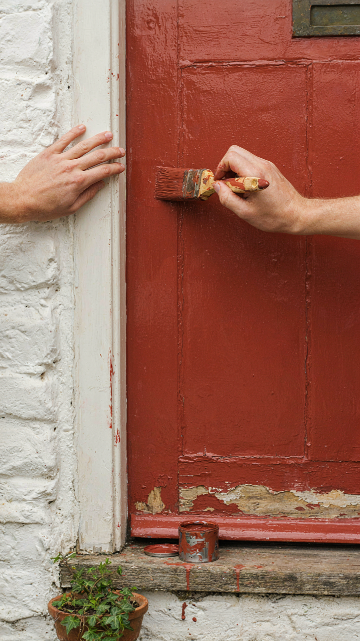
Stop treating your cottage front door like a people-pleaser. That color you pick, the style you choose, the first thing someone sees—it’s not an apology. It’s a statement. It filters who belongs here and who doesn’t. Paint it today. Not next month. Not after you “think about it.” Pick a color that makes you slightly uncomfortable. That discomfort means you’re actually standing for something instead of standing for nothing.