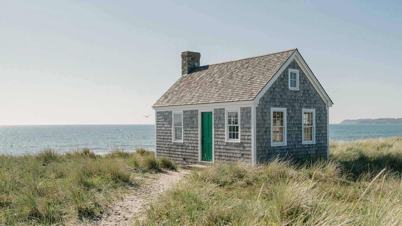
The Faux Coastal Trap: Why Your Beach House Looks Like A Brochure
What Everyone Gets Wrong About Beach House Colors
You want permission to feel like you belong somewhere. That’s why you’re drawn to coastal cottage palettes in the first place. The mechanism is simple: designers and retailers have monetized belonging by packaging it into five predictable colors, and you’ve been trained to believe those five colors equal authenticity. They don’t. The standard advice pins everything on “calming neutrals” and “ocean-inspired blues,” which is incomplete because it ignores how actual coastal regions built their color stories through material limitation, not aesthetic theory.
Coastal cottages in places like Cornwall, New England, and the Outer Banks didn’t choose their palettes because a designer board approved them. They used what weathered well in salt air, what reflected heat, what they could afford to repaint. Lime wash holds different colors than modern latex. Aged wood goes gray through specific mineral processes, not arbitrary choice. When you copy the color without understanding the material constraint that created it, you get a rendered image instead of a lived space.
Color Through Material, Not Mood
Coastal design borrows from material science: the principle of constraint-based emergence. Materials determine which colors survive and which fade, which read as intentional and which read as neglect. A weathered cedar siding isn’t “rustic beige” because someone wanted warmth. It’s that color because salt spray, UV exposure, and time oxidize the wood in a specific direction. Steel-gray driftwood isn’t a design choice. It’s a material fact.
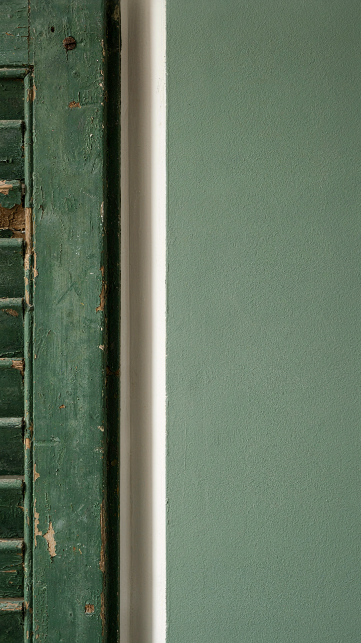
This matters because the moment you introduce paint colors without accounting for what surfaces hold them, you’ve broken the system that made coastal palettes coherent. Flat sage green on drywall reads different than aged linseed-oil green on reclaimed shutters. The color is nearly identical. The perception is opposite. Before you select any color, identify whether the surface is natural material that will age, or finished material that will remain static. That single decision determines which palette subset actually works in your space.
Deconstructing “Sand, Sea, And Sky”: The Unseen Hues Of Nature
Sand’s Subtle Shifts Beyond Tan
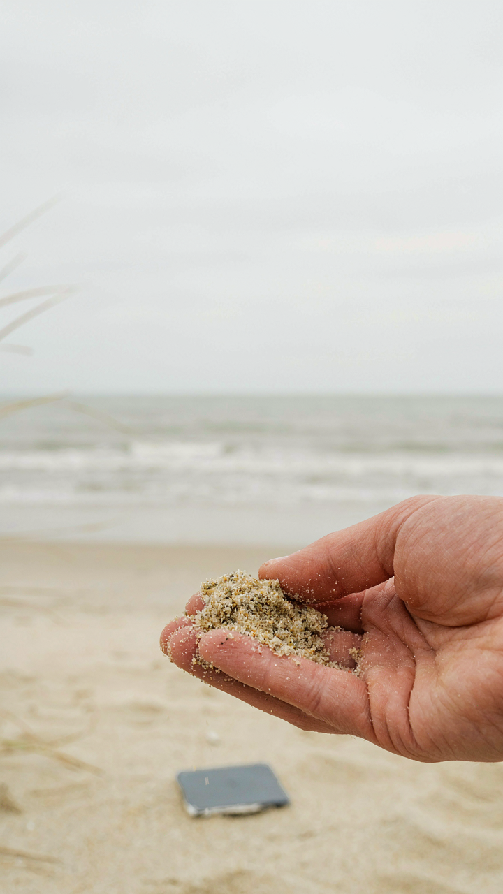
You’re drawn to this section because you want permission to use beige without looking boring. Here’s the mechanism: sand isn’t one color because sand isn’t one material. It’s mineral composition that shifts with geography and light. Warm undertones come from iron oxide. Cool undertones come from silica dominance. The real move is matching your sand tone to your region’s actual sand, not some generic Pinterest beige that works nowhere.

Coastal regions don’t all pull the same sand. Atlantic shorelines run toward cooler, grayer tones because of shell fragments and different mineral profiles. Pacific and Gulf coasts lean warmer because iron-rich sediment is more prevalent. If you’re designing a cottage in Maine and you’re using a Floridian sand tone, you’ve built a visual lie. Pull a actual sand sample from nearby beaches and hold it against paint chips in natural light. That’s your palette constraint. Work within it instead of against it.
Sea’s Depth Beyond Turquoise
Water takes color from what’s underneath and what’s above. This is basic physics: light absorption and reflection. Shallow tropical water reads turquoise because sand reflects light back through clear water. Deep water or water over dark substrate reads as murky green or slate gray. Most coastal cottage palettes ignore this and slap turquoise everywhere, which signals you’ve never actually looked at the sea you’re claiming to reference.
Stormy grays dominate northern coasts because cloud cover and depth create low-light conditions. Murky greens appear in estuaries and bays where sediment and tannins from inland water darken the surface. When you’re selecting sea-inspired colors, identify which water condition you’re actually responding to. Are you drawn to the color of water on a specific day at a specific depth? Use that as your constraint. Don’t borrow turquoise from Caribbean resort marketing and call it authentic to your cottage’s actual coastline.
The Alchemist’s Method: Forging Your Unique Coastal Color Palette
Which Coastal Elements Actually Matter To You
You want permission to break the rules without looking like you don’t know them. The real mechanism here is specificity: generic coastal palettes fail because they treat all beaches as identical. Your nervous system responds differently to a rocky Maine shoreline than to a Florida mangrove swamp. Both are coastal. Neither produces the same color response in you.
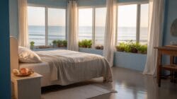
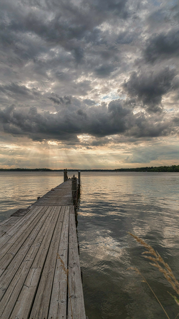
Start by naming one specific coastal location that actually moves you. Not “the beach.” A real place. Walk through what you see there without filtering for design trends. The light at golden hour, the weathered dock wood, the particular gray of storm clouds over that water. This inventory becomes your constraint, and constraints force originality. Generic advice says to pull from “ocean colors.” That’s why every coastal cottage looks like every other one.
Emotional Frequency Into Actual Paint
Psychology borrows the concept of frequency from physics, and your coastal color palette operates on the same principle. Colors vibrate at different psychological frequencies. A pale driftwood beige triggers calm. The same beige mixed slightly warmer reads as anxious or dated. The shift is microscopic but measurable in how your body responds to the room.
Document your emotional response to each color you pulled from your specific location. Not whether it’s “nice.” Whether it makes you feel alert, grounded, or restless. Then test that reaction by living with paint samples on your walls for a full week, through different times of day and lighting. Your palette emerges when you can articulate why each color earned its place, not because a design blog recommended it. This specificity is what separates a thoughtful room from a catalog page.
Coastal Farmhouse Color Palette: The Unspoken Fusion Of Grit And Grace
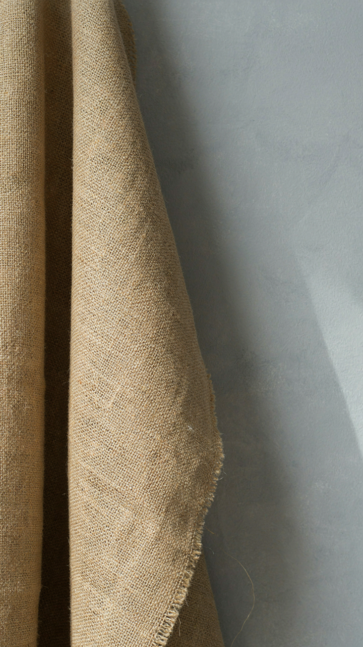
Rustic Textures With Muted Coastal Paint Colors
You want this look because it signals you have taste without trying, that you understand restraint. The mechanism is contrast. Farmhouse design borrows from architecture’s load-bearing principle: you need structural opposition to create visual weight. Muted coastal colors—soft grays, faded whites, dusty blues—act as the load. Rough textures—reclaimed wood, linen, weathered stone—act as the counterforce. Neither works alone. The color grounds the texture. The texture prevents the color from feeling sterile.

Most advice stops at “use soft colors” and calls it done. That’s incomplete. You need the texture to be genuinely aged or authentically rough, not merely distressed. Paint a wall soft gray, then place raw burlap against it. The eye catches the opposition and reads it as intentional. Smooth walls with muted colors read as corporate. The paint color only succeeds when something tactile contradicts it.
Where Raw Elements Meet Sophisticated Hues
Balancing raw and refined is a calibration problem, not an aesthetic one. You either have too much texture and look like a foreclosure, or too much polish and lose the farmhouse entirely. The solution: anchor one wall or zone in raw material, then let sophisticated color do the work elsewhere. Expose brick or whitewashed shiplap in your main living area. Paint adjoining walls in colors that feel expensive but muted—warm greiges, seafoam that’s almost gray, off-whites with barely perceptible blue undertones. The raw element gives permission for the refined color to exist.
Muted coastal colors work here because they read as restraint, not poverty. A dusty sage-green or bleached linen beige paired with weathered wood flooring creates visual hierarchy without decoration. The mechanism is specificity. You’re not choosing random soft colors. You’re choosing hues that actually appear in coastal landscapes and aged structures. That alignment between color and material authenticity is what prevents the space from feeling contrived. When selecting paint, compare swatches directly against your existing wood tones and textures under natural light. If the color doesn’t echo something already present in the room’s materials, it’s decoration masquerading as design.
Beach Color Palettes: The Science Of Visual Calm (Perception Psychology)
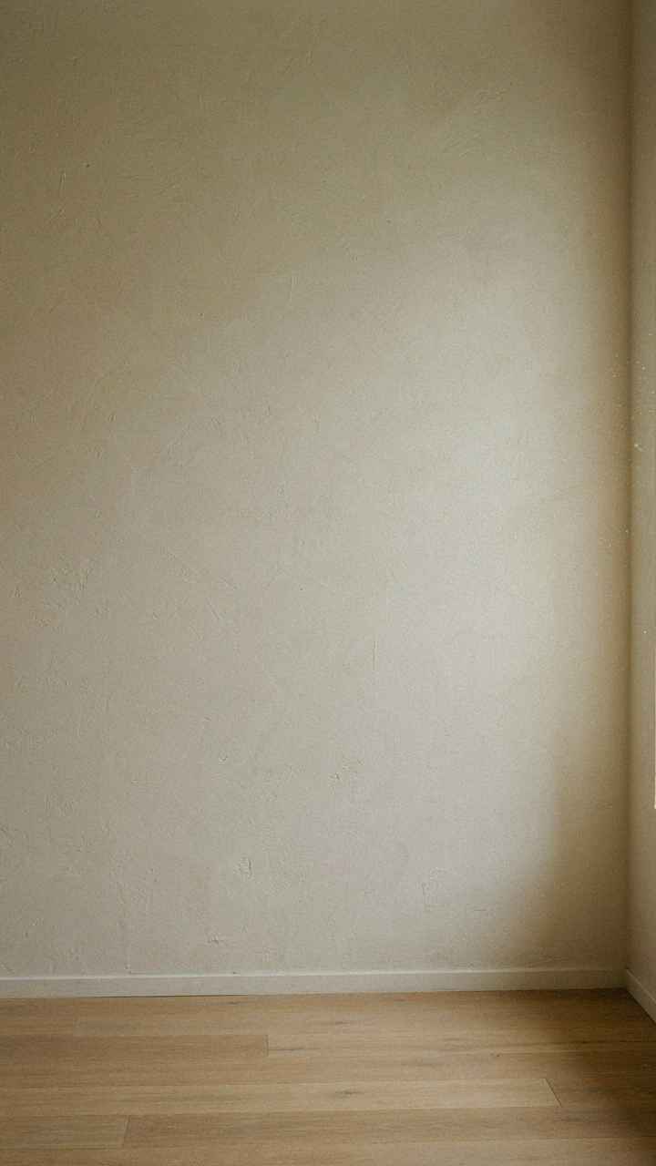
How Light Bends Color Perception
You want this section because you suspect there’s a trick to making a space feel expensive without spending more. There is. Coastal cottage colors work because light doesn’t hit them the way it hits walls in other homes. Physics calls this refraction and absorption. Coastal interiors use low-saturation colors that refract light differently than high-contrast palettes, creating visual softness without effort or expense.

Sand tones, seafoam, and pale blues don’t dominate the eye because they scatter light across the surface rather than reflecting it aggressively. A cream wall in morning sun reads warmer than the same cream under harsh afternoon rays. This isn’t preference. This is measurable behavior. The mechanism: pick colors with high light reflectance values (LRV) between 50 and 75. They’ll feel calm regardless of time of day because they’re physically bouncing light in a way that reduces glare and eye strain.
Colors That Lower Cognitive Load
The common advice says pastels soothe because they’re “soft” or “gentle.” That’s incomplete. Neuroscience shows the brain processes color information before it processes shape or pattern. Low-saturation colors demand less processing power, which leaves mental bandwidth free for other tasks. This is why coastal cottages feel restful.
Your brain isn’t working harder in a room full of muted blues and grays. Highly saturated or contrasting colors fire up the visual cortex. Coastal palettes do the opposite. Soft whites, greyed-greens, and pale neutrals require minimal cognitive effort to process, which creates the feeling of calm instead of the feeling itself. The action step: audit your walls for saturation levels. If a color name includes a number (like “blue 7” or “gray 5”), it’s likely too saturated for a true cottage feeling. Move toward named, unsaturated versions like “driftwood,” “seashell,” or “limestone.”
Beyond The Horizon: Unexpected Hues For A Relaxing Color Palettes
The Weight Of Darkness
You want permission to go dark without feeling like you’ve abandoned the coastal vibe. The real mechanism: contrast creates perceived relaxation, not uniformity. Your brain registers depth when values shift. Deep charcoals, muted purples, and rich terracotta aren’t departures from coastal design—they’re the shadow side of the same palette. Charcoals ground spaces. They absorb light rather than reflect it, which paradoxically makes rooms feel larger because the eye travels deeper before hitting a wall.

Muted purples work because they read as complex without shouting. Rich terracotta connects to clay soil found in Mediterranean coastal regions, so it carries historical weight. These colors appear in nature constantly: storm clouds, wet rock, oxidized metal on old coastal structures. Using them in a coastal cottage signals sophistication through restraint, not through adding more pastels.
Dynamic Range Over Decoration
Most coastal cottage advice keeps you trapped in a narrow band of pale neutrals. That’s incomplete. Contrast between light and dark values creates visual interest faster than any pattern or texture. When you pair bright whites or sand tones with deep charcoal or navy, the brights punch harder because they have something to push against. This is basic value theory from painting, and it transfers directly: the juxtaposition of opposing values generates the eye’s movement through a room.
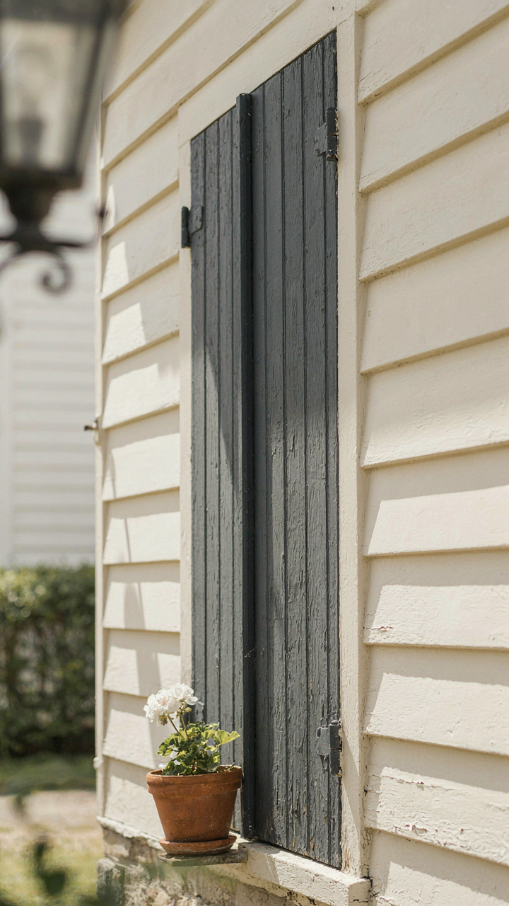
Apply this by anchoring one accent wall or built-in feature in deep tone, then letting the remaining surfaces stay light. A charcoal-painted exterior shutter against cream siding, or a terracotta accent door frame against whitewashed wood. The dynamic effect isn’t about trend. It’s about directing attention and breaking the monotony that happens when every surface whispers the same value. Install one purposeful dark element before committing paint to walls elsewhere.
California Coastal Color Palette: The Maverick’s Manifesto

Where East Coast Pastels Fail
You want validation that your taste aligns with what Instagram calls “coastal”—and you’re hoping a California palette feels more interesting than the millionth blush-and-cream cottage you’ve scrolled past. Here’s the mechanism: East Coast cottage design borrows from foggy maritime climates and centuries of colonial restraint. California’s light is different. It’s unforgiving, direct, and bleaches out anything timid. Pastels don’t read. They vanish.

California coastal homes work with saturation, not pastel dilution. The sun demands color with actual pigment. Warm whites stay warm. Blues lean toward navy or deep teal instead of powder. Grays shift toward greige or taupe with undertones that anchor them to earth. This isn’t trend—it’s optics. The coastal cottage color palette that actually functions in California brightness uses the same saturation logic as desert architecture: darker, more concentrated hues that don’t fade into the glare.
Arid Landscape As Your Actual Reference
Design borrowed from ecology, and coastal California’s ecology is semi-arid. Your walls should pull from what grows there and what the land reflects, not from generic “seaside” associations. Sage doesn’t mean pale and washed. It means the gray-green of California coastal sage scrub—a plant that survives full sun with muted but definable color. Ochre comes from the actual earth: iron oxide that appears in cliffs, dried grass, and adobe structures built along the coast for centuries. Terracotta grounds the palette in material reality, not sentiment.
These three colors work together because they coexist in the landscape without competing. Apply them as your base: sage on walls or cabinetry, ochre as trim or accent panels, terracotta in tile or exterior siding. The California coastal cottage color palette becomes regionally honest instead of generic when you stop thinking “beach” and start thinking “what’s literally outside the window.” Your color selections should mirror the palette of the land, not the fantasy of it.
The Tonal Tide Protocol: Mastering Depth In Your Beach House Colour Scheme
How Value Creates Visual Hierarchy
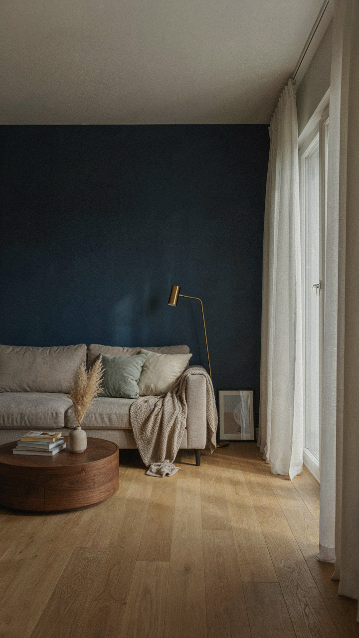
You want your coastal cottage to feel expensive without looking like you’re trying. That’s the real reason you care about this section. The mechanism is tonal layering, borrowed from physics: contrast creates perceived depth. In color, value is the lightness or darkness of a hue, independent of the color itself. A coastal palette without deliberate value separation reads flat and cheap. Dark anchors, mid-tone transitions, and light accents aren’t aesthetic choices, they’re structural.

Start with your darkest tone first. This is typically a deep navy, charcoal-inflected sage, or weathered driftwood gray on trim, doors, or accent walls. This anchor stops visual chaos and gives the eye a place to land. Then build upward. Mid-range tones occupy the majority of wall space and furnishings, creating the transition layer. Lightest values push to ceilings, sheer fabrics, and open wall zones. This sequence forces the eye to move through the space with intention, making rooms feel larger and more organized than they actually are.
Gradient Sequencing For Spatial Expansion
Gradient principles from atmospheric perspective explain why this works: distant objects fade to lighter values, while closer objects hold darker tones. Apply this to your coastal cottage by mapping value shifts across the room, not just up the walls.
- Darkest value at entry points: Place navy or deep sage on the front door or entry wall trim. This creates psychological anchoring and makes interior spaces feel recessed and deeper.
- Mid-tones on primary living surfaces: Walls in soft gray-white, warm beige, or muted seafoam occupy the bulk of visual real estate, creating comfort and allowing furnishings to pop.
- Lightest values at focal points: Ceiling, sheer curtains, and far wall zones in cream or nearly-white reflect light and push perceived boundaries outward dramatically.
- Accent gradients on architectural features: Staircase railings or built-in shelving can step through 3-4 tonal variations, creating rhythm without chaos.
- Window treatments as transition layers: Linen panels in mid-value gray-white sit between dark window frames and light walls, softening contrast and extending visual flow.
Execute this by sampling paint on large swatches under different light conditions. The value shift must be noticeable at arm’s length but not jarring. Map your sequence: anchor dark, transition mid, expand light. This moves viewers through the space methodically, making a 900-square-foot cottage read like 1200.
Weathering The Trends: A Timeless Coastal Color Palette Strategy
Build Your Base Before You Play
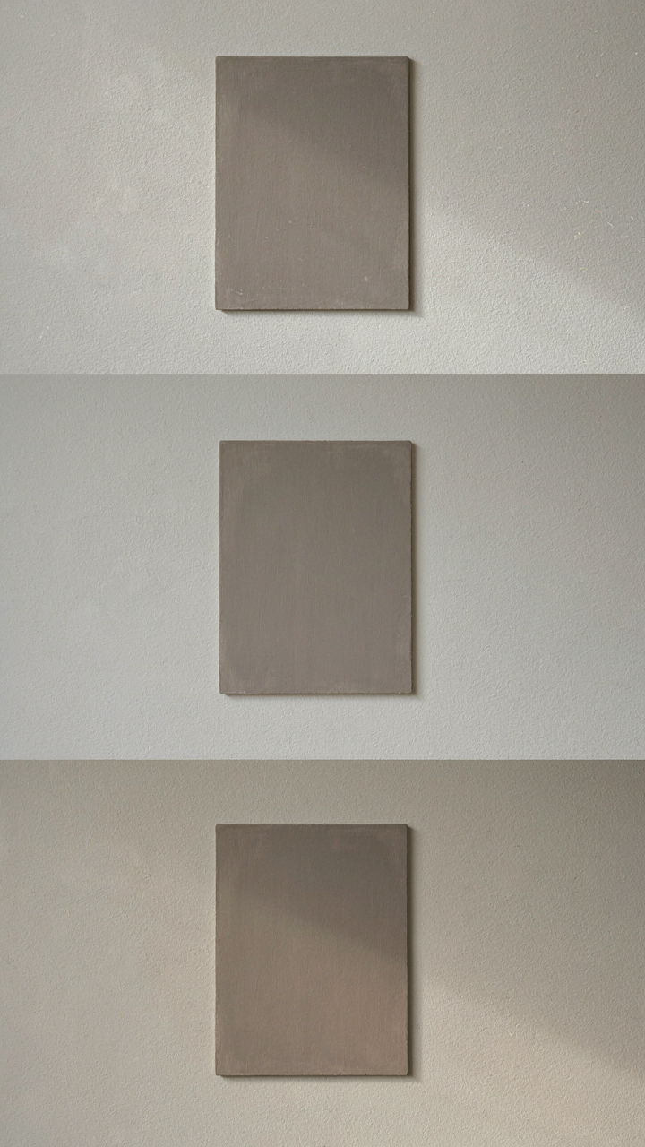
You’re worried about picking the wrong color and looking outdated in five years. The real mechanism is this: you’re treating color selection like fashion when it should work like architecture. Invest your mental energy in three to four foundational neutrals that won’t shift with trends. Warm grays, soft whites, and muted taupes form the structural skeleton. Everything else—your accent colors—can rotate without touching the foundation.

Foundational neutrals absorb light differently depending on time of day and season. A warm gray pulls slightly toward cream in morning light but reads cooler by evening. This subtle shift keeps spaces from feeling static. Your accents—seafoam, soft sage, pale ochre—layer on top and can be refreshed through textiles, paint, or décor without rebuilding the entire scheme. The palette sustains itself.
Colors That Survive Regular Use
Generic advice says “soft and soothing colors last forever.” False. Durability in coastal cottage color palettes depends on pigment quality and how you apply them, not sentiment. Soft colors fade faster under UV exposure than you’d think. Quality paint formulas with better pigment load—particularly in whites and grays—resist yellowing and graying out over years of sunlight exposure.
Muted greens and blues perform better than pale versions because pigment concentration protects against fading. Select paint finishes rated for coastal environments if you live near salt air. Eggshell or satin finishes hold color longer than flat finishes while still reading as soft. Test samples on actual walls, not paint chips, and observe them across three full days and at different times. Document which colors hold their integrity after exposure to your specific light conditions before committing to full application.
The Subtlety Imperative: Why Less Obvious Is More Powerful
Understated Elegance Powers Muted Tones
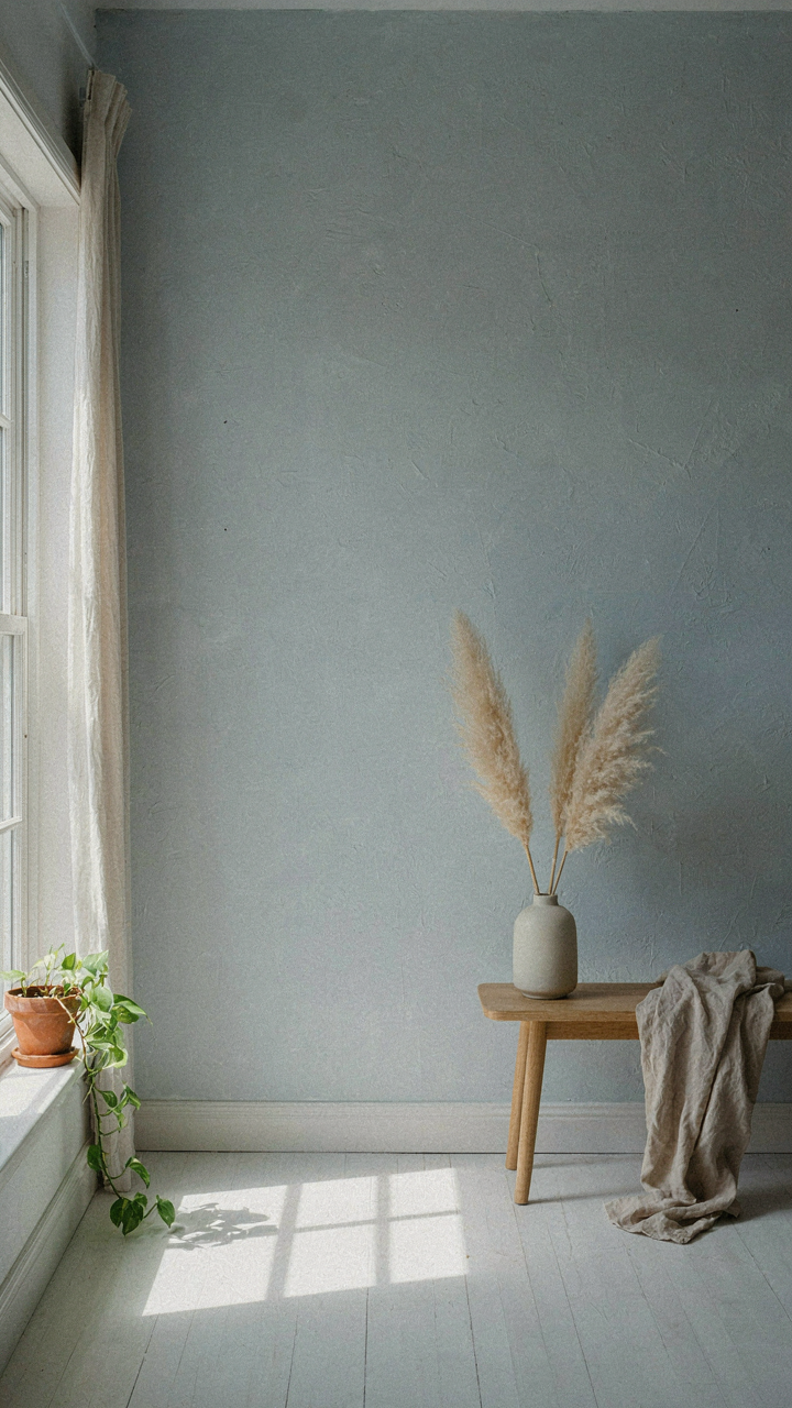
You want your space to feel refined because visible effort signals weakness. The real mechanism here is contrast. Muted tones work in coastal cottage design because they recede visually, which makes the structural bones of a room and the light moving through it become the actual focal point instead of the paint color demanding attention.
Muted doesn’t mean bland or washed out. Greige, soft sage, pale driftwood gray, and warm whites with undertones of cream or sand sit at the threshold between visibility and restraint. These colors were never trendy because they solve a permanent problem: they age without dating and complement natural light without fighting it. The cottage aesthetic deteriorates the moment color becomes louder than the room’s actual purpose.
Evoking Mood Rather Than Copying Nature
Everyone copies coastal palettes wrong by painting walls the exact shade of ocean or sand. That’s mimicry, not design. The real work is using color to generate a specific feeling of being near water without making the walls look like a photograph. Think of this in terms borrowed from neurology: color priming. Your nervous system responds to suggestion faster than to literal representation.
A pale blue-gray doesn’t read as “ocean” consciously. It reads as calm air and space. A warm cream doesn’t shout “sand.” It suggests safety and lightness. The palette succeeds when someone enters the room and feels the coastal mood settle in their body before their mind names what they’re seeing. This requires restraint on saturation, a strategic placement of one deeper accent tone, and consistency across trim and ceiling to maintain the unified field.
Your Fear Of Bold Strokes, Not The Tide, Dictates Your Palette
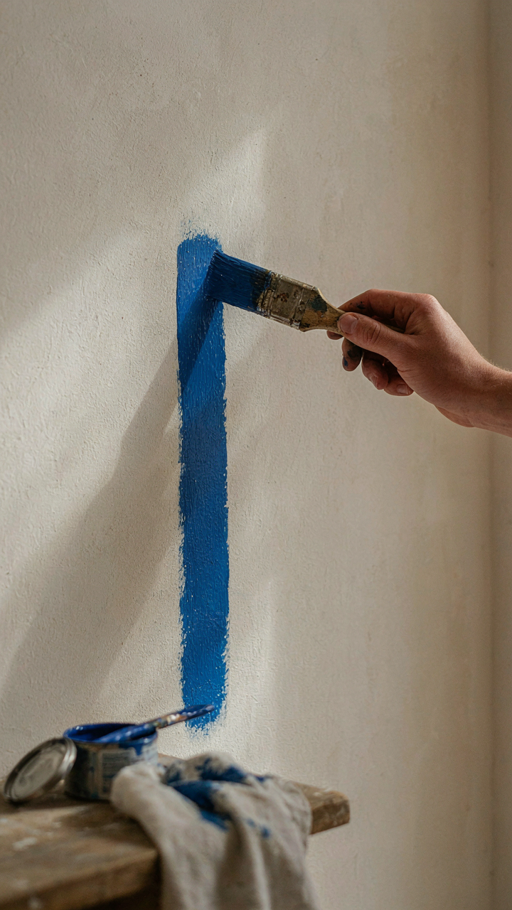
You pick beige because it’s safe. You pick gray because everyone else does. But a coastal cottage color palette isn’t about playing it safe—it’s about deciding what you actually want to live in instead of what you think you should. Pick one color that makes you feel something today. Paint one accent wall this week. Your fear of commitment to color runs deeper than your fear of the ocean, and that’s the real problem you’re solving.